10,000 search results
(0.048 seconds)
- Neubau Pro by TipografiaRamis,
$49.00 Neubau is a condensed geometric display typeface, designed in 2009. The inspiration for this face came from Joost Schmidt lowercase letters developed during 1925-28 in Bauhaus Dessau. Schmidt was one of the proponents of New Typography – a movement advocating the use of only lowercase letters which were constructed strictly geometrically using only ruler and compass. Neubau Pro is the new edition of Neubau fonts. The new typeface is an upgraded version of an old fonts (2009), with careful refinements to glyph shapes, and the extension of glyph amounts which enabled support of more Latin languages as well as Greek and Cyrillic languages. Neubau Pro is released in six styles with small caps, and true italics, and contains OpenType features. This typeface can be used for editorials and print designs.
 - MM Agrafa by MM Fonts,
$19.00 A paper-clip-inspired typeface with character. Agrafa is a technical but versatile display face that works well in both large and small sizes. Most of the glyphs are made from one continuous line and shows the constraints of bending a paperclip/wire. The family consist of four weights, Hairline, Thin, Light and Book, last three also comes with an oblique companion. While Hairline works best for setting large headlines/words, the Book weight can be used even for small size texts.
 - Grotesca Negra by MAC Rhino Fonts,
$59.00 Grotesca Negra is a charming sans serif with a flirt towards the Jugend era. Still its modern enough not to feel outdated. It is briefly inspired by a local typeface named Grotesca chupada negra, found in a Spanish edition of a type specimen book from the German Bauer type foundry. It has an angle on the horisontal strokes on many of the letters. It is one of many display face derived from book cover designs. Intended to work as a display typeface.
 - Windsor by URW Type Foundry,
$35.99 Windsor is an unusual design cut by Stephenson Blake in 1905. Windsor is a bold face with heavy rounded serifs and strong diagonal stress. Capitals M and W are widely splayed, P and R have very large upper bowls. The Lowercase a h m and n of the Windsor font have angled right hand stems, e has an angled cross-stroke. The overall effect is one of friendliness and warmth. Use the Windsor font in advertising, on posters and for general display work.
 - Windsor by Monotype,
$40.99 Windsor is an unusual design cut by Stephenson Blake in 1905. Windsor is a bold face with heavy rounded serifs and strong diagonal stress. Capitals “M” and “W” are widely splayed, “P” and “R” have very large upper bowls. The Lowercase “a”, “h” “m” and “n” of the Windsor font have angled right hand stems, “e” has an angled cross-stroke. The overall effect is one of friendliness and warmth. Use the Windsor font in advertising, on posters and for general display work.
 - Equip Slab by Hoftype,
$49.00 Equip Slab, a new hardline, serif dominated face designed on the same geometric base as the rest of the Equip family. With its clarity it appears strong, imperative and straight forward. The Equip Slab family comprised 16 styles and is well suited for ambitious typography. It comes in OpenType format with extended language support. All weights contain ligatures, proportional lining figures, tabular lining figures, proportional old style figures, lining old style figures, matching currency symbols, fraction- and scientific numerals and matching arrows.
 - Decour Soft by Latinotype,
$26.00 Decour Soft is the rounded-edged version of Decour. It is a slab serif humanist low contrast typeface. The overall design also features strong curves, making it a very friendly face. The font retains the original elegant features of Decour—based on Art Deco design—such as high contrast between upper and lower case characters. Decour Soft is a suitable font for logotypes and packaging. Its design also allows it to be used with certain elegance in book titles and magazines subheadings.
 - ITC Coolman by ITC,
$40.99Pelle Piano is the stage name for Per Ellstrom, a musician in Stockholm with an interest in irregular and informal lettering. ITC Coolman was inspired by lettering styles of the 1950s. “I have a passion for old '50s type lettering,” says Piano, “as seen on posters from B-movies and pocketbooks and cartoons.” Although ITC Coolman is not a script face, its caps work best with the lowercase, rather than together. The funky, bouncy look of Coolman cries out for beach movies. - Promethium by Mysterylab,
$17.00 Promethium is an elegant vintage-style condensed font with lots of ornate detailing. Ideal for western, cowboy and rodeo graphics, as well as circus & carnival themes. Additionally, Promethium can trace some of its design roots to the well established Argentine graphic style known as Fileteado, as well as to Victorian poster and book arts. The stacking & layering of the 4 different versions of the font can yield a great range of eye-catching diverse looks and color schemes that can fit many purposes.
 - Stempel Schneidler LT by Linotype,
$29.99 F .H. Ernst Schneidler, type designer and teacher, originally designed Schneidler Old Style in 1936 for the Bauer foundry. Stempel Schneidler is based on the typefaces of Venetian printers from the Renaissance period and possesses their grace, beauty, and classical proportions. The Stempel Schneidler, a completely reworked and tuned font family made by D. Stempel AG in Frankfurt, is a fine, legible text font that also works well in display. One of Schneidler's more unique features is its question marks.
 - Golos by Hiekka Graphics,
$25.00 Golos is a sleek and authentic font face with two styles: regular and italic. Golos is recommended for use as a display typeface.
 - Buddy Parts by PizzaDude.dk,
$15.0052 cool Buddy Parts, each one with it's own goofy looks on his face. Can you tell which one reminds of you? *g* - PL Brazilia by Monotype,
$29.99PL Brazilia from Albert Boton is an elegant extended sans serif face in two weights. Usable in headlines on books, journals and posters. - Blackwood by Alan Meeks,
$40.00 Blackwood is a sans serif headline face with a woodgrain effect. Based loosely on Grotesk, it has strong, solid forms with distinctive style.
 - CrEAtOR CamPotype by Campotype,
$15.00 So far the Creator Campotype standard version known in the form of free font (published on several websites by license: free for personal use). The font takes the basic form of modern typography, but some user feedback consider it in the medieval look. Whatever it is, the inspiration of the font was originally set off from the logotype of internal student magazine where the designer had studied in the late 80s. Creator Campotype is a pure display font. This fonts do not have faces lowercase, but all caps. Nevertheless forms of different characters can be accessed by pressing the uppercase and lowercase on the keyboard. Maximum usage can be made by combining them as necessary. Some forms of characters were made more stylistic such as slash and backslash which “out of” the conventional form. In addition, the circle effects on several glyphs were created by default (as found on the free version) so that the glyph was enough to generated with the keyboard access as usual. Information for those who have access to the free version, there are significant changes in this version (2001) as described in the file “creator ct pdf” (gallery)
 - ITC Django by ITC,
$29.99Australian designer and art director Wayne Thompson has loved typography “ever since I received a battered second-hand Letraset catalog at the age of 10.” He based ITC Django on the handwriting of an acquaintance -- “a fellow I know who writes and illustrates children's books and is also a commercial artist” -- who called himself Django, after the jazz guitarist Django Reinhardt. “I felt that that name Django suited the funky, lively feel of the face,” says Thompson. But he adds, “Django has a split personality: it appears loose and easy at first, but after looking at it for some time I felt an edginess come through that was slightly psychotic.” The looseness of the lowercase contrasts with the spikiness of the capitals. The “edginess” is especially apparent in words in all caps. - Inoxida by Sudtipos,
$59.00 Inoxida is Oxida's softer and more graceful sister. While Oxida has become quite the common sighting on the packaging of vegetables and organic foods, Inoxida now comes to fit the bill for food packaging that can benefit from more sophisticated script lettering. Inoxida is not just a softening of Oxida’s slightly rough edges. It is a complete reworking of the way its letters were constructed, and the introduction of a smoother size relationship between uppercase and lowercase. Designed by Koziupa and digitized by Ale Paul.
 - Polke by ArtyType,
$29.00 Polke is a single weight display face brimming with style and charm but simultaneously exuding impressive core strength and a vibrant personality. Floating ball terminals rub shoulders with contrasting sharp and rounded letterforms to produce a distinctively decorative headline font built on robust foundations. Polke's name is derived from the striking terminal dots which dominate the character set, creating a Polka-Dot effect throughout. I also had the artist Sigmar Polke in mind which explains the spelling, and so the two ideas simply morphed together.
 - Mynaruse Flare by insigne,
$39.99 Mynaruse Flare is a new version of the Mynaruse superfamily. This version eliminates the elongated serifs of the original, and instead stems end with a flare. You will find that the thinner weights are delicate and beautiful, while the heavier weights provide impact and strength. Mynaruse is inspired by the elegant and regal Roman inscriptional types. The face shines in environments that require elegance and splendor. The eight weights of Mynaruse flare range from a subtle, delicate thin to a heavy and powerful Black weight. Mynaruse Flare includes many useful OpenType features, including a set of swash alternates, alternate titling forms, ligatures and miscellaneous alternates. OpenType-capable applications such as Quark or the Adobe suite can take full advantage of the automatically replacing ligatures and alternates. This family also includes the glyphs to support a wide range of languages. This is a titling font that is ideal for logotypes, posters or other high-end luxury applications.
 - Dutch Mediaeval Book ST by Canada Type,
$39.95 Dutch Mediaeval Book ST is a special version of the popular Dutch Mediaeval Book text fonts, engineered specifically for science writing. It is equipped with SciType, a combination of additional characters and OpenType programming included in the fonts to help in typesetting science text. For more information about SciType, please consult the SciType FAQ available in the Gallery section of this page. The Dutch Mediæval design is the historically renowned one made in 1912 by S. H. de Roos. It stands out as one of the most classic Dutch text faces. This Book version comes in two weights and an italic, optimized for body copy use between 8 and 12 pt. Aside from the SciType additions, all the fonts contain OpenType features for ligatures, ordinals, automatic fractions, eight kinds of figures, and a few ornaments. For details about the functionality of Dutch Mediaeval Book ST, please consult its Access Chart PDF available in the Gallery section of this page.
 - Dutch Mediaeval Pro ST by Canada Type,
$49.95 Dutch Mediaeval Pro ST is a special version of the popular Dutch Mediaeval Pro family, engineered specifically for science writing. It is equipped with SciType, a combination of additional characters and OpenType programming included in the fonts to help in typesetting science text. For more information about SciType, please consult the SciType FAQ available in the Gallery section of this page. The Dutch Mediaeval design is the historically renown one made in 1912 by S. H. de Roos. It stands out as one of the most classic Dutch text faces. This digital version comes in two weights and their italic counterparts. Aside from the SciType additions, all the fonts contain OpenType features for small caps and caps-to-small-caps, ligatures, ordinals, automatic fractions, seven kinds of figures, and a few ornaments. For details about the functionality of Dutch Mediaeval Pro ST, please consult its Access Chart PDF available in the Gallery section of this page.
 - MB NOIR by Ben Burford Fonts,
$30.00 MB NOIR is a 4 weight with italics font family that visually has different layers of style, at first glance its a modern clean geometry based face with some nice retro touches, it also has hints of the vintage about it, with a nod to the art deco style, with alternates and ligatures it gives a lot of scope for its uses and works very well at large and small sizes.
 - Valibuk by Juraj Chrastina,
$39.00 Valibuk is a compact clean typeface for headlines and short text. No details are small and it’s a bunch of details that make Valibuk as it is. It’s a heavy, condensed face with a high x-height and tight spacing and that’s why Valibuk can write loud. The quality of the spacing and kerning is ensured by Igino Marini. Lomidrevo is a grunge stencil family derived from Valibuk.
 - Odyssey Pro by Tim Rolands,
$29.00Odyssey Pro is an elegant and majestic face well suited for display work in books, magazines, posters, invitations, and more. Featuring an abundance of ligatures and alternates, as well as swash capitals. Its design was inspired by the letterforms of classical Roman inscriptions in stone but also strongly influenced by later calligraphic forms. The result is a chiseled authority and dignity tempered by a refined warmth and flow. - Al Crushider by Aluyeah Studio,
$90.00 Crushider Brush, inspired by the feeling when we see your crush, and you will see a lot of butterflies and your heart rate goes up. Crush + hider, mixed feelings that are addictive but you also want to get out of the situation. Very suitable for magazine, headline, website, ads, product package and all type of design project you have. Features: OpenType support Multilingual support (15 languages) PUA Encoded
 - Fathom by Device,
$39.00 Fathom is a refined flared-serif face that is elegant and robust, modern yet suggests a legacy. The generous lower-case x-height make it worm and readable. Seven weights, plus matching italics, cover all headline and text requirements. The addition of old-style numerals and tabular numerals for charts make it a versatile family for brochures, corporations, heritage projects, packaging, book covers, reports, signage, magazines and more.
 - Fantini by Canada Type,
$29.95 Fantini is the revival and elaborate update of a typeface called Fantan, made in-house and released in 1970 by a minor Chicago film type supplier called Custom Headings International. In the most excellent tradition of seriously-planned American film faces back then, CHI released a full complement of swashes and alternates to the curly art nouveau letters. Fantan didn't fare much among the type scene's big players back then, but it did spread like electricity among the smaller ones, the mom-and-pop type shops. But by the late 1980s, when film type was giving up the ghost, most smaller players in the industry were gone, in some cases along with little original libraries that existed nowhere else and became instant rarities on their way to be forgotten and almost impossible to resurrect for future technologies. Fantini is the fun and curly art nouveau font bridging the softness and psychedelia of the 1960s with the flirtatious flare of the 1970s like no other face does. Elements of psychedelia and funk flare out and intermix crazily to create cool, swirly letters packed with a lot of joy and energy. This is the kind of American art nouveau font that made its comeback in the late 20th century and is now a standard visual in the branding drive of almost every consumer product, from coffee labels to book and music covers to your favorite sugar or thirst-crunching fix. Alongside Fantini's enormous main font come small caps and three extra fonts loaded with swashy alternates and variations on plenty of letters. All available in all popular font formats. Fantini Pro, the OpenType version, packs the whole she-bang in a single font of high versatility for those who have applications that support advanced type technologies. In order to make Fantini a reality, Canada Type received original 2" film specimen from Robert Donona, a Clevelander whose enthusiasm about American film type has never faltered, even decades after the technology itself became obsolete. Keep an eye out for that name. Robert, who was computer-reluctant for the longest time, has now come a long way toward mastering digital type design.
 - Sixties Symbols JNL by Jeff Levine,
$29.00The 1960s was the most tumultuous decade of the 20th century. Sixties Symbols JNL collects twenty-six icons and phrases from that time of change and unrest including the peace symbol, a dove, a daisy—even the militant 'power fist' that signified rebellion against mainstream society. There's also a blank lapel button on the Y/y keys and a blank protest poster on the Z/z keys for your own special message. For the more daring, the left and right brace Keys {and } have the 'one finger salute' the radical hippie factions displayed generously. Use that one with discretion! - Colmar JNL by Jeff Levine,
$29.00 French Art Deco lettering found within the pages of the 1934 publication L'Art du Tracé Rationnel de la Lettre (roughly translated to “The Rational Path Art of the Letter”) have provided a number of designs well-suited for digital revival. A hand lettered sans with varying character widths was the basis for Colmar JNL, which is available in both regular and oblique versions. As the source of the lettering design was a French publication, the typeface is named for the city of Colmar, which (according to Wikipedia) is the third-largest commune of the Alsace region in north-eastern France.
 - Simoncini Garamond by Linotype,
$29.99Opinion varies regarding the role of Claude Garamond (ca. 1480–1561) in the development of the Old Face font, Garamond. What is accepted is the influence this font had on other typeface developments from the time of its creation to the present. Garamond, or Garamont, is related to the alphabet of Claude Garamond (1480–1561) as well as to the work of Jean Jannon (1580–1635 or 1658), much of which was attributed to Garamond. In comparison to the earlier Italian font forms, Garamond has finer serifs and a generally more elegant image. The Garamond of Jean Jannon was introduced at the Paris World’s Fair in 1900 as “Original Garamond”, whereafter many font foundries began to cast similar types. Simoncini Garamond was designed by Francesco Simoncini to be true to the Original. - Chicago Ornaments by HiH,
$6.00 Chicago Ornaments is a collection of decorative cuts cast by the Chicago Type Foundry of Marder, Luse & Co. of 139-141 Monroe Street in Chicago, Illinois. This collection was shown in their 1890 Price List. According to William E. Loy, at least some of them were designed by William F. Capitain. Chicago was one of the innovative Midwest type foundries, introducing the American Point System. These designs represent the late Victorian period. After 1890, with the posters of Jules Cheret taking Paris by storm, Art Nouveau gradually began to displace Victorian style. In type design, both styles competed against each other until about the end of the century. Designers may want to consider using these ornaments when using Victorian style typefaces, like our Cruickshank, Edison and Freak - as well as faces by others such as Karnac, Kismet and Quaint Gothic. Included in the font are a set of Dormer-inspired caps, numerals and a few other glyphs - also from the Victorian period.
 - Basic Commercial by Linotype,
$57.99 Basic Commercial is a family of fonts based on historical designs from the hot metal type era. First appearing around 1900, these designs were created by type designers whose names have not been recorded, but whose skills cannot be overlooked. These typefaces were popular among groups and movements as diverse as the Bauhaus, Dadaism, and the masters of Swiss/International-Style typography. They influenced a variety of later grotesque fonts, such as Helvetica and Univers. Basic Commercial was distributed for many years in the United States under the name Standard Series. The typeface worked its way into many aspects of daily life and culture; for instance, it became the face chosen for use in the New York City subway system’s signage. The Basic Commercial family members have a clear and objective design. Their forms exhibit almost nothing unusual, but remain both lively and legible nonetheless. Perhaps for this reason, Basic Commercial’s design has been popular with graphic designers for decades.
 - Bricola by K-Type,
$20.00 Bricola (rhymes with Nicola) is a condensed display face that contrasts soft curved outlines with sharp cuts and counters. Sturdy and idiosyncratic, Bricola is an eye-catching blend of functional and funky, appropriate for headlines, labels and branding. The licensed family includes Regular and Bold weights that both pack a punch, and also two handy italics (obliques).
 - Dupont Serif by Hexagon Foundry,
$20.00 Dupont Serif, a graceful and modern serif font. Embodying clean lines, well-proportioned letterforms, and a unique charm, Dupont Serif stands as a versatile typeface suitable for various applications. The unpretentious nature of Dupont Serif allows it to be employed in a multitude of design scenarios. Offered in 10 weights alongside corresponding oblique characters and 2 style sets.
 - Lignette by FaceType,
$30.00 You are looking for a contemporary upright script family? Lignette Script is an elegant monoline font consisting of 535 glyphs, with a wide range of languages covered (including Greek) and 71 beautiful ligatures. Please make sure to use applications that support OpenType features. Moreover Marcus Sterz created Lignette Deco to complete the graceful look with frames and ornaments.
 - Cyclic Sans by ArtyType,
$25.00 Cyclic Sans is a legible and highly distinctive type family in four weights, running from Light to Heavy. A stoic sans, imbued with strength and charm, the fonts can be paired with their Cyclic Serif counterparts to stunning effect. Cyclic Sans is a stylish modern face and a versatile all-rounder, ideal for both text and headline use.
 - Balboat by Ingrimayne Type,
$9.95 Balboat is a plain calligraphic face with a very small x-height, long descenders, and tall ascenders. Having the appearance of a pen-drawn sans serif, it has four styles: regular, bold, italic, and bold italic. Although Balboat is quite legible, it is condensed and may need to be printed at a larger point size than other typefaces.
 - Loistave by XdCreative,
$20.00 Loistave is a two faced classy and modern, elegant and delicate with modest and symmetrical serif. It is defined by smooth curves and is perfect for fashion branding or editorial designs. Add it confidently to your projects, and you will love the results. What's Loistave included? Uppercase Characters + Alternates Lowercase Characters + Alternates Small Ligatures Numerals Punctuation Multilingual support
 - One Ton by Luke Thompson,
$10.00 One Ton is a really chunky stencil face that sticks to some strict rules, giving it a distinctively industrial, angular look. It's designed so that the spaces between characters all align in a strong grid. It can bring a ton of personality to signage, branding, editorial and packaging projects where you can afford to be a bit experimental.
 - Kuta Bali by Olivetype,
$18.00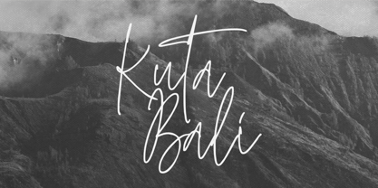 Kuta Bali is an elegant signature script font inspired by the beauty and grace of a beautiful culture. It’s suitable for branding, product packaging, or creating custom logotypes that really stand out. Its unique style strikes a perfect balance between classic and contemporary, adding a touch of sophistication and elegance to any design project. Thank You.