10,000 search results
(0.046 seconds)
- DIN Next Paneuropean by Monotype,
$92.99DIN Next is a typeface family inspired by the classic industrial German engineering designs, DIN 1451 Engschrift and Mittelschrift. Akira Kobayashi began by revising these two faces-who names just mean ""condensed"" and ""regular"" before expanding them into a new family with seven weights (Light to Black). Each weight ships in three varieties: Regular, Italic, and Condensed, bringing the total number of fonts in the DIN Next family to 21. DIN Next is part of Linotype's Platinum Collection. Linotype has been supplying its customers with the two DIN 1451 fonts since 1980. Recently, they have become more popular than ever, with designers regularly asking for additional weights. The abbreviation ""DIN"" stands for ""Deutsches Institut für Normung e.V."", which is the German Institute for Industrial Standardization. In 1936 the German Standard Committee settled upon DIN 1451 as the standard font for the areas of technology, traffic, administration and business. The design was to be used on German street signs and house numbers. The committee wanted a sans serif, thinking it would be more legible, straightforward, and easy to reproduce. They did not intend for the design to be used for advertisements and other artistically oriented purposes. Nevertheless, because DIN 1451 was seen all over Germany on signs for town names and traffic directions, it became familiar enough to make its way onto the palettes of graphic designers and advertising art directors. The digital version of DIN 1451 would go on to be adopted and used by designers in other countries as well, solidifying its worldwide design reputation. There are many subtle differences in DIN Next's letters when compared with DIN 1451 original. These were added by Kobayashi to make the new family even more versatile in 21st-century media. For instance, although DIN 1451's corners are all pointed angles, DIN Next has rounded them all slightly. Even this softening is a nod to part of DIN 1451's past, however. Many of the signs that use DIN 1451 are cut with routers, which cannot make perfect corners; their rounded heads cut rounded corners best. Linotype's DIN 1451 Engschrift and Mittelschrift are certified by the German DIN Institute for use on official signage projects. Since DIN Next is a new design, these applications within Germany are not possible with it. However, DIN Next may be used for any other project, and it may be used for industrial signage in any other country! DIN Next has been tailored especially for graphic designers, but its industrial heritage makes it surprisingly functional in just about any application. The DIN Next family has been extended with seven Arabic weights and five Devanagari weights. The display of the Devanagari fonts on the website does not show all features of the font and therefore not all language features may be displayed correctly. - Horror Party by Ake,
$12.00 Horror Party is a spine-chilling Halloween display font designed to send shivers down your spine. With a ghoulish twist on traditional lettering, this font adds a touch of eerie enchantment to your designs. Perfect for t-shirt designs, party invitations, and all things spooky, Horror Party brings the thrill of the macabre to your creative projects. Unleash your dark side and let this font make a haunting impression!
 - Camijo by Kavoon,
$15.00 Camijo is a contemporary serif typeface with characteristic and defined features. This font was inspired by the idea of mixing different types of terminals in order to give the font a singular appearance. Its design is composed of diverse styles such as Didone and contemporary faces. Camijo comes with a set of 352 characters. This font was specially designed for branding, advertising, editorial design, and use on Tv and social media.
 - Hioganke by ahweproject,
$14.00 Hioganke is An Urban Script Font. This font was created to help you design logotypes with urban style for your brand or your clients, and also you can use it for designing all of the graphic stuff such as badges, signs, Esport, headlines, urban design, T-shirt/apparel, Poster, etc. This font is PUA encoded which means you can access all of the amazing glyphs and ligatures with ease!
 - Prigille Hands by Letterena Studios,
$10.00 Prigille Hands is a modern and clean display (Serif) font create from our talented font designer. The design of Prigille Hands will make your design more beautiful and inspiring. This font will suitable for any project, like branding, print template, logo and etc. This font is inspired by the joining of hands which means good teamwork. Features: Accents (Multilingual characters) Alternates Ligautures PUA encoded Numerals and Punctuation (OpenType Standard)
 - Cheer Forever by Ditatype,
$29.00 Cheer Forever is a delightful display font that merges the timeless simplicity of a sans serif with playful brush-style accents. With its uppercase letterforms and unique design, this typeface adds a touch of cheerfulness and character to your projects. The defining feature of Cheer Forever lies in its combination of a clean and geometric sans serif base with brush-inspired accents. The uppercase letters maintain a sleek and straightforward appearance, while the brush-style elements bring an element of spontaneity and liveliness. This fusion of styles creates a harmonious balance, resulting in a font that is both contemporary and playful. Inspired by the joyful nature of brush calligraphy, Cheer Forever captures the essence of creativity and self-expression. The brush-inspired accents add a touch of whimsy and personality to each letter, as if they were hand-drawn with a brushstroke. This unique style injects a sense of fun and positivity into your designs. Enjoy the various features available in this font. Features: Ligatures Multilingual Supports PUA Encoded Numerals and Punctuations Cheer Forever fits in logos, titles, headlines, and any design that aims to make a bold statement with a touch of playfulness. It is also particularly well-suited for designs related to children's products, event promotions, and any theme that calls for a touch of creativity. Find out more ways to use this font by taking a look at the font preview. Thanks for purchasing our fonts. Hopefully, you have a great time using our font. Feel free to contact us anytime for further information or when you have trouble with the font. Thanks a lot and happy designing.
 - Cedar Heaven by Putracetol,
$22.00 Cedar Heaven - Wild Forest Display Font, a playful and adventurous typeface that encapsulates the spirit of the wilderness and outdoor exploration. This font is meticulously crafted, embodying elements of nature, adventure, and childhood wonder. With eight distinct variations tailored to fit its thematic design, Cedar Heaven is versatile and adaptable. Whether you’re branding an outdoor equipment store or designing invitations for a woodland-themed event, this font elevates your design with its unique character. The letters are imbued with elements of the forest, camping, and playful adventures making it perfect for children’s books, crafters’ creations or any project echoing the call of the wild.
 - Multipolar by MYSTERIAN,
$9.00 This typeface was designed as the house style by and for design studio Mysterian. It was drafted and completed during most of 2020. The intention of the design of the forms was to develop a unique signification in the mind, but one that could have potential relevant associations such as with sci-fi. The solution, brought along with a fascination with this rarely seen pattern in type, was to taper round forms. The name 'Multipolar' was inspired by the term used by game theorist Daniel Schmachtenberger, which is a kind of event that seemed relevant to the Covid-period in which the font was made. Alternate characters include: Two Ampersands Upper and Lowercase PI Upper and Lowercase Eszett Latin Characters
 - Weiss by Linotype,
$29.99The German poet, painter, calligrapher and type designer Emil Rudolf Weiß originally created this eponymous typeface for the Bauer Foundry of Frankfurt. Long known and loved by metal type enthusiasts under the name "Weiss Antiqua," this design was inspired by typefaces from the Italian Renaissance while still distinctly reflecting the artistic and poetic personality of its twentieth-century designer. Weiss has tall ascenders, sharp apex points, and a low-slung midsection on the caps. The italic moves like a classical ballerina. Weiss is one of the earliest contemporary serif types to have italics based on the chancery style of writing. The Weiss family works well for warmly legible text typography; and it's also an original choice for refined headline and display graphics." - Fellaure by MJB Letters,
$17.00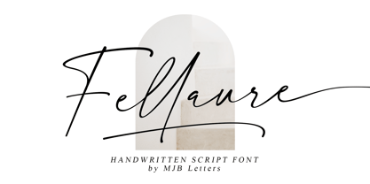 Fellaure is a modern authentic handwritten script, this font has a strong character in each letter that makes the font looks suitable for branding design, packaging, wedding design, logo design, poster design, signature, stationery design, and more. Fellaure comes with beautiful ligature, multilingual support, and additional underline swashes.
 - Doovy Groovy Party by Mofr24,
$11.00 Introducing the Doovy Groovy Party font! This stylized, psychedelic, and round Groove Display Font takes you back to the 90's and 00's era. With its multilingual support, it's perfect for creating a pop, funky, and bold vibe. What sets the Doovy Groovy Party font apart is its unique ability to capture the essence of the vibrant and energetic 90's and 00's era. Its stylized, psychedelic design evokes a sense of nostalgia while still offering a fresh and contemporary look. This font is a true standout, allowing your designs to stand out as well. For designers looking to create harmonious compositions, the Doovy Groovy Party font has a few relatives and typefaces that complement it beautifully. Consider pairing it with "Retro Sans Serif" for a bold and cohesive look, or experiment with "Funky Display" to amplify the funky vibes. These combinations will add an extra layer of creativity and versatility to your design projects. The Doovy Groovy Party font comes in three variations - Regular, Outline, and Shadow - making it a versatile tool for various design needs. The Regular version provides a solid foundation, ideal for headlines and titles that demand attention. The Outline variation adds an element of sophistication and can be used for modern designs, while the Shadow option creates depth and dimension for a more dynamic appearance. Additionally, this font boasts extensive multilingual support, ensuring that it can be used effectively across different languages and cultures. The Doovy Groovy Party font draws inspiration from the bold and expressive typography prevalent in the 90's and 00's. It captures the vibrant and carefree spirit of that era, where music, art, and pop culture collided to create an explosion of creativity. The psychedelic elements incorporated into the font pay homage to the colorful and trippy visuals that defined the time. This font encapsulates the nostalgia and excitement of those years, allowing designers to infuse their projects with a sense of fun and playfulness. We created the Doovy Groovy Party font with a passion for celebrating the bold and expressive designs of the past. We wanted to provide designers with a versatile tool that brings the nostalgic charm of the 90's and 00's to their modern projects. By using this font, you can effortlessly transport your audience to a time when colors were brighter, music was groovier, and creativity knew no bounds. Let your imagination run wild with the Doovy Groovy Party font and infuse your designs with a vibrant touch that will captivate and inspire! Unlock the power of nostalgia and creativity with the Doovy Groovy Party font. Its unique design, versatile variations, and multilingual support make it the perfect choice for posters, marketing materials, T-shirt designs, headlines, and much more. Get ready to groove and let this font elevate your creative projects to a whole new level!
 - Times Europa Office by Linotype,
$50.99The Times Europa Office family is designed after the model of the original serif family produced by Walter Tracy and the Linotype Design Studio in 1974. A redesign of the classic Times New Roman typeface, Times Europa was created as its replacement for The Times of London newspaper. In contrast to Times New Roman, Times Europa has sturdier characters and more open counter spaces, which help maintain readability in rougher printing conditions. Times Europa drastically improved on the legibility of the bold and italic styles of Times New Roman. Overall, text set in Times Europa is easier to read, and quicker to digest. Akira Kobayashi, Linotype’s Type Director, brought Times Europa up to speed for the new millennium in 2006. Now optimized for office communication instead of newspaper design, Times Europa Office offers a familiar yet refreshingly new appearance for serif text. Because of The Times of London’s specific printing conditions in the early 1970s, Times Europa originally had some intentional errors built into its letterform design. These inconsistencies created an even image in newspaper text in the long run. However, these design elements bear no role on modern office communication and its needs. Kobayashi redrew these problem forms, eliminating them completely. Now Times Europa’s font weights appear clearer and easier to read than ever before. - ITC Wisteria by ITC,
$29.99ITC Wisteria was designed by Michael Stacey, a Florida-based artist and graphic designer. An ardent collector and recycler of vintage graphic design and typography, Stacey is especially intrigued by the lettering styles of sign painters and show-card lettering artists from the days when most display typography was hand-rendered. ITC Wisteria is one such style, taken from the 1930s, which he has updated for digital imaging. His goal was to retain the loose, casual feel of handlettering, while imparting what he calls “the crisp finish of current precision typography.” Like the plant it was named after, ITC Wisteria is both rugged and beautiful. The design is a constructed brush script that successfully melds the strength and dynamism of strong character shapes with the grace of script letterforms. The split-brush strokes, although obviously constructed, also impart a sense of immediacy to the design. - Orotund by Canada Type,
$24.95 This is the digitization and considerable expansion of the cheeky and enormously popular film type Eightball, one of the most widely used faces of the 1970s and 1980s. Round and happy like a bouncy ball, these are letters after a sign maker’s own heart. Seen everywhere in its film version, from bingo and pool hall parlor signs to comic books, now this computer version opens the door for the happy roundness to be used on a much larger scale by anyone who designs layouts on a computer. The original film type included a few alternates. We included them, but we added many more as well. So make sure to check out the various OpenType features in your program while using this font. Eightball is great for a variety of applications, including signage, rubber stamps, poster design, titling, cartoons, comics, and pretty much anything where happy and round fit in.
 - Another Stencil JNL by Jeff Levine,
$29.00 With a large variety of stencil fonts contained within the Jeff Levine Fonts library, Another Stencil JNL is simply another stencil design added to this growing collection. Modeled from a lettering guide manufactured in the 1970s, the style is influenced by Franklin Gothic, but has enough differences in the shapes of the stencil characters to be considered a cousin to that classic design.
 - Ozana Pro Text by Mostardesign,
$25.00 Ozana Pro is a bracketed serif font family adapted to the professional requirements of graphic designers, web designers and mobile app developers. Comprised of 24 styles including 12 styles designed especially for headlines and 12 styles for text and long paragraph design. Ozana Pro is a very versatile family of fonts that can be used in many projects such as editorial design, branding or corporate identity creation, design of posters or logos, the creation of websites or the development of mobile applications. With this design of glyphs differentiated by the optical size according to the styles, the titles have a very graphic aspect while the long texts have a more classic design in order to keep an optimal readability in all cases. Ozana Pro is also equipped with powerful OpenType features such as case sensitivity, true small caps, ligatures, tabular figures, old styles figures, numbers circled. Ozana Pro is also available as a variable font family.
 - Ozana Pro Display by Mostardesign,
$25.00 Ozana Pro is a bracketed serif font family adapted to the professional requirements of graphic designers, web designers and mobile app developers. Comprised of 24 styles including 12 styles designed especially for headlines and 12 styles for text and long paragraph design. Ozana Pro is a very versatile family of fonts that can be used in many projects such as editorial design, branding or corporate identity creation, design of posters or logos, the creation of websites or the development of mobile applications. With this design of glyphs differentiated by the optical size according to the styles, the titles have a very graphic aspect while the long texts have a more classic design in order to keep an optimal readability in all cases. Ozana Pro is also equipped with powerful OpenType features such as case sensitivity, true small caps, ligatures, tabular figures, old styles figures, numbers circled. Ozana Pro is also available as a variable font family.
 - ITC Stone Humanist by ITC,
$40.99 Type designers have been integrating the design of sans serifs with serifed forms since the 1920s. Early examples are Edward Johnston's design for the London Underground, and Eric Gill's Gill Sans. These were followed by Jan van Krimpen's Romulus Sans, Frederic Goudy's ITC Goudy Sans, Hermann Zapf's Optima, Hans Meier's Syntax and Adrian Frutiger's Frutiger. Now, ITC Stone Humanist joins this tradition. It is a careful blend of traditional sans serif shapes and classical serifed letterforms. ITC Stone Humanist grew out an experiment with the medium weight of ITC Stone Sans, a design that already showed a relationship to these sans serif-serif hybrids. ITC Stone Sans has proportions based on those of ITC Stone Serif, and its thick-and-thin stroke contrast suggests the bloodline of humanistic sans serif typefaces. But other aspects of ITC Stone Sans are more closely aligned to the gothics and grotesques, a tradition that accounts for the largest portion of sans serif designs. Enter ITC Stone Humanist. During his experiments with the earlier design, Sumner Stone recalls, I was actually quite surprised at how seemingly subtle changes transformed the face," moving the design firmly into the humanist tradition. "The form of the 'g,' 'l,' 'M,' 'W,' and more subtly the 'a' and 'e' are part of the restructuring of the family," he explains. The top endings of vertical lower case strokes have been cropped on an angle, as have the ascender and descender stroke endings. ITC Stone Humanist is a full-fledged member of the ITC Stone family. It has been produced with the same complement of weights, and the x-heights, proportions, and underlying character shapes are completely compatible with the three original designs. The original ITC Stone Sans is a popular typeface, in part because of its notable versatility. ITC Stone Humanist shares this virtue, and can be used successfully at very small sizes, in long passages of text copy, and even as billboard-sized display type."
 - Posterizer KG by Posterizer KG,
$40.00 This slab serif font is inspired by European industrial, machine-made letters. It looks rational and geometric, but optically corrected and balanced. As the name says this font face is designed to be used by mostly for posters, headlines, visual identities and short texts. Font was created for Celebration of the 5 year anniversary of Design Studio Box from the city of Kragujevac (KG), the industrial city of Serbia. Posterizer KG contains all the Latin and Cyrillic glyphs.
 - Abdo Joody by Abdo Fonts,
$29.50 Abdo Joody is a straight style. This is an OpenType Font supporting Arabic, Persian and Urdu and compatible with the various operation systems and modern software. The combination of square Kufi and modern styles made it a beautiful typeface, appropriate to titles and text, and able to meet the desire of the user in the design of ads and modern designs of various types of audio and visual. I will add more weights of this font with Allah willing.
 - RTCO Preizton by Roams Type Co,
$9.00 RTCO Preizton Font made based on the concept of vintage style graphic design. inspired by the matchbooks & advertising in the 60-80s era. There are 3 types of this font, including Sans, Serif, and Script. Sans font has an opentype ligature feature that makes the font dynamic, while in the Script font there are alternatives that make it look better. This font is suitable for graphic designs such as logotypes, merchandise, printed stickers, and other branding needs.
 - Zodchiy by Chvyalev,
$15.00 Cyrillic (and Latin) poster font is limited in composition by uppercase. Monumental, dry, ascetic. Designed for the design of posters, title pages of projects, signage, book covers, building facades. It is formed based on architectural and drawing fonts. It combines Russian traditions and modern trends. The shape of the letters varies from round wide to oblong narrow, in this contrast lies the idea of the font. At first glance, this contradictory decision finds harmony with closer acquaintance.
 - Audebaud by MADType,
$39.00 This wood type revival is a rare specimen, indeed. Audebaud is a charming and bold 19th Century Clarendon of French lineage. With its rounded terminals, and unique proportions; this font will instill a joie de vivre in any design. The design was inspired by the work of Constant Audebaud. Audebaud was an engraver of wooden type that was used for posters and the like. His work appeared in the 1880s in the Deux-Sèvres département of France.
 - Giza RE by Font Bureau,
$40.00 Giza brings back the colorful power and variety of the original Egyptian letterforms, a glory of the Victorian era. Designer David Berlow based the family on showings in Vincent Figgins’ specimen of 1845, the triumphant introduction of this thunderous style. This version of the family is part of the Reading Edge series of fonts specifically designed for small text onscreen, having been adjusted to provide more generous proportions and roomier spacing, and having been hinted in TrueType for optimal rendering in low resolution environments.
 - MFC Peony Monogram by Monogram Fonts Co.,
$19.95 The inspiration source for Peony Monogram was a unique stackable monogram design with floral accents from a vintage embroidery publication. Originally intended to adorn handkerchiefs, this simple pattern has so many design possibilities, from colorizing to formatting options. You can really play around with this monogram font! Peony Monogram can create one, two, or three letter monograms, even basic titling due to its unique design. Because of Peony's unique stackable monogram formatting, make certain that the point size of the font is the same as the leading being applied to the font in order to minimize gapping between stacked forms. While we've adjusted this within the font, your program may override these settings. Download and view the MFC Peony Monogram Guidebook if you would like to learn a little more.
 - Pickey Pop by Nathatype,
$29.00 Pickey Pop is a delightful display font that combines a thick weight, low contrast letters, and charming swinging endings. With its playful and bold design, this typeface brings a sense of joy and vibrancy to any creative project. The thick weight of this font adds a strong and confident presence to each letter. The boldness of the strokes creates visual impact and ensures legibility even at smaller sizes. This display font demands attention and stands out effortlessly in any design composition. In contrast to its bold weight, Pickey Pop features low contrast letters. This design choice gives the font a sense of solidity and consistency. The uniform strokes contribute to a clean and contemporary appearance, making it a versatile choice for a wide range of design applications. What makes this font truly special are the swinging endings found in select letters. These whimsical details add a touch of playful movement and uniqueness to the font. The swinging letter endings bring a sense of rhythm and energy, infusing your designs with a joyful and dynamic quality. For the best legibility you can use it in the bigger text. Enjoy the available features here. Features: Stylistic Sets Ligatures Multilingual Supports PUA Encoded Numerals and Punctuations Pickey Pop fits in headlines, logos, attention-grabbing titles, product packaging, branding materials, editorial layouts and website headers. Find out more ways to use this font by taking a look at the font preview. Thanks for purchasing our fonts. Hopefully, you have a great time using our font. Feel free to contact us anytime for further information or when you have trouble with the font. Thanks a lot and happy designing.
 - Franklin Fracture by WAP Type,
$15.00 Franklin fracture - Blackletter Something New, the fracture blackletter, has been designed with logo designers and typographers in mind. This display font is the perfect addition to your t-shirt, jacket, hat, design studio, ready for your next logo, barber shop, coffee shop label. Modern blend of fracture and blackletter with a touch or vintage
 - Asrog Genos by Product Type,
$19.00 Welcome to the future with Asrog Genos, a futuristic technology font that designs each letter with a modern, sophisticated touch. Every character in Asrog Genos exudes a future feel, giving the appearance of cutting-edge technology. Asrog Genos brings elements of technology into your designs, creating a font that is not only eye-catching but also embraces the essence of innovation. Asrog Genos is an ideal choice for projects that require a touch of futuristic technology. Whether you are designing user interfaces, technology promotional materials, or other futuristic design elements, this font brings an unmatched modern aura. Do not miss this opportunity! Get the Asrog Genos Futuristic Technology Font now and let each character be a portal to your design future. **Uppercase
 - Fawazeernelly by MAKYN,
$20.00 FawazeerNelly is a Bilingual Display Typeface, the Arabic font is based on Kufi Maghribi script with high contrast strike thicknesses. And the Latin font is an italic high contrast font that compliments the Arabic. They work best for titles and Poster Designs. It is an Authentic Design with a modern flavor.
 - Bauer Bodoni by Linotype,
$45.99 Giambattista Bodoni (1740-1813) was called the King of Printers; he was a prolific type designer, a masterful engraver of punches and the most widely admired printer of his time. His books and typefaces were created during the 45 years he was the director of the fine press and publishing house of the Duke of Parma in Italy. He produced the best of what are known as "modern" style types, basing them on the finest writing of his time. Modern types represented the ultimate typographic development of the late eighteenth and early nineteenth centuries. They have characteristics quite different from the types that preceded them; such as extreme vertical stress, fine hairlines contrasted by bold main strokes, and very subtle, almost non-existent bracketing of sharply defined hairline serifs. Bodoni saw this style as beautiful and harmonious-the natural result of writing done with a well-cut pen, and the look was fashionable and admired. Other punchcutters, such as the Didot family (1689-1853) in France, and J. E. Walbaum (1768-1839) in Germany made their own versions of the modern faces. Even though some nineteenth century critics turned up their noses and called such types shattering and chilly, today the Bodoni moderns are seen in much the same light as they were in his own time. When used with care, the Bodoni types are both romantic and elegant, with a presence that adds tasteful sparkle to headlines and advertising. The Bauer Bodoni was done by Heinrich Jost for Bauer Typefoundry in 1927. This version has finer details of the original Bodoni types. It works well for headlines, logos, advertising.
 - Bacca la Hurra by Ilhamtaro,
$17.00 BACCA LA HURRA is a vintage font in the style of sign painting, characterized by bold strokes and squares. Consisting of Uppercase, Lowercase, Numerials and Punctuations, this font is perfect for vintage food packaging designs or other vintage branding. To enable the OpenType Stylistic alternates, you need a program that supports OpenType features such as Adobe Illustrator CS, Adobe Indesign & CorelDraw X6-X7. Cheers!
 - Phenorush by Adriansyah,
$15.00 Phenorush is an abbreviation of Phenomenon Brush, This font building based on hand brush calligraphy. This font is very suitable for any design project, you can make logo design, apparel design, mockup design, or easy to use to your content in your media social. There are some features including the font like terminal forms, ligatures, and alternates.
 - Salty Candy by Dumadi,
$25.00 Salty Candy is a children's font with a cheerful and happy impression. This simple font will make the ordinary one extraordinary that can be collaborated with design projects such as children's t-shirt design, children's web design, logos, event titles, and others. try to feel this font with your design filled with color it will be even more amazing.
 - Veronika by Linotype,
$29.99Veronika is a semi-serif text face, available in three styles: Regular, Italic, and Bold. All three faces are available in OpenType format, with both lining and old-style figures. Grüger, a German artist and designer, first began the design of her typeface by writing out its letterforms with a wooden stylus. She wanted to create a new semi serif face that had uniform stroke widths, but still maintained some aspects of calligraphy. Veronika achieves this; the terminals that begin the first strokes of most letters are round and bulbous, as if the writing instrument added extra emphasis on that spot. This adds a dynamic, movement-like quality to texts designed with Veronika. Aside from some sans serif-ness, Veronika appears similar to old style typefaces from the renaissance: classical inscriptions inspired the proportions of the capital letters, and the lower case letters stem from Carolinian minuscule. These proportions allow Veronika to function very well in text and at small sizes. However, only when you design larger headlines, logos, or other elements with Veronika, will you notice all of its special qualities, like its weight distribution and stroke characteristics. - Carnova by Typotheticals,
$4.00This is a standard, plain face with no special distinguishing features. It was created over a period of four months for use in small text in a cartographer package. While the face was extremely suitable for the purpose it was designed for, the party who was to purchase the family outright decided upon another design, allowing me to offer it up for sale. The original design for this face is nothing new, and has been greatly influenced by many others already in existence. It was not intended to be flashy, nor eye-catching, and I believe I have managed to escape any individuality that could have affected the face. It displays well in the lower text sizes, and, in my own opinion, displays some characters more clearly than some other similar faces that are currently in use (not all, some). While individuality makes a typeface stand out from all the others, this style of design would have been compromised with it. - Black Magica by Designova,
$15.00 BLACK - A typeface born at midnight. A typeface that crawls to the darkness. A typeface with split-personality. A typeface that can conjure the UNKNWN. BLACK is a hybrid / mysterious typeface with a true uniqueness of it's own. This all caps typeface has two different nature: the uppercase is defined by rare dimensions while the lowercase is purely simple & minimal. This typeface is perfectly suitable for anything that needs to stand out from crowd, be it some Ultra Modern Branding, Techno or Cosmic Themed Designs, Haunted Movie Posters, Mysterious Arts and even the Minimal Stuffs. The typeface could be perfect choice for logo / logotype design, branding, marketing graphics, banners, posters, signage, corporate identities as well as for editorial design that can bring uniqueness. Please see the examples shown above to get an idea about the capability of this typeface. Handcrafted and designed with powerful OpenType features in mind, each weight includes extended language support including Western European & Central European sets.
 - Donna Julia by Autographis,
$39.50 Donna Julia is the embellished version of DonJulio. They are designed to be used together.
 - Kaufmann by Bitstream,
$29.99 The most popular type of this kind, designed for ATF by M.R. Kaufmann in 1936.
 - Ethylene by dotHK Studio,
$18.00 Ethylene Display Font come with masculine themes. It matches applies in some designs such as the logotype, brand, packaging, quotes, music poster, t-shirt, cover book and more custom design. The features uppercase, lowercase, numeral, punctuation & symbol, multilingual support. Ethylene Display Font This font has been equipped with OpenType features and has many glyphs. and of course by having many of these glyphs will be able to choose the letters according to your liking, lots of variations and options for each letter, so you can customize your design choices and also have other languages supported. This font is perfect for use with programs that support OpenType features like Adobe Photoshop Cs / Adobe Photoshop CC, Adobe Illustrator CS / Adobe Illustrator CC, Adobe Indesign and Corel Draw and many more programs that support OpenType, and I've also included a special alternative so you can use any program, this font can be used by everyone. if you have any question, please feel free to contact me by email. Thanks and congratulations designing.
 - Egyptian 505 by Bitstream,
$29.99This face was designed by Andre Guertler’s class in room 505 at the Kuenstgewerbeschule in Basel. It follows the principles of Frutiger’s Egyptienne, and won the first of the VGC type competitions.