10,000 search results
(0.101 seconds)
- KING HOSHUN by Twinletter,
$17.00 Welcome King Hoshun, a display font with a superhero style ready to take your projects to a higher level. If you need a strong, bold, and action-packed theme like those in movies, games, or bold designs, King Hoshun is the right choice. With King Hoshun in attendance, your designs will be in the spotlight. Each letter is filled with strength and heroism that will make an unforgettable impact on the audience. The impressive and bold look of this font will make your message feel even more powerful and compelling. Not only does it look impressive, but King Hoshun also offers special features that enrich your creativity. With the available ligatures and alternative characters, you can explore unique and interesting typography combinations. Plus, this font supports multiple languages, so you can present a strong and inspiring message to a global audience. Join the power of King Hoshun and let your projects light up the world. With its bold superhero style and superior features, this font will give your designs an unforgettable impression. Don’t miss the chance to own King Hoshun and create amazing works that amaze and inspire. What’s Included : File font All glyphs Iso Latin 1 Alternate, Ligature Simple installations We highly recommend using a program that supports OpenType features and Glyphs panels like many Adobe apps and Corel Draw so that you can see and access all Glyph variations. PUA Encoded Characters – Fully accessible without additional design software. Fonts include Multilingual support
 - Ballista Style by Nathatype,
$29.00 Is your branding missing something that makes people going WOW? Have you thought about how you can add that touch of magic to your branding and projects? What if we told you that we have solution to maximize your designs? Ballista Style-A Handwritten Font Ballista Style is a relaxed and flowing handwritten font. It encapsulates the essence of playfulness and passion. Incredibly versatile, this font fits a wide pool of designs, elevating them to the highest levels. Add this font to your favorite creative ideas and notice how it makes them come alive. Use it for headings, logos, business cards, printed quotes, invitations of all sorts, cards, packaging, and your website or social media branding. Our font always includes Multilingual Options to make your branding globally acceptable. Features: Ligatures Stylistic Sets Swashes PUA Encoded Numerals and Punctuation Thank you for downloading premium fonts from Natha Studio
 - Ark Monogram SG by Spiece Graphics,
$39.00 Ark is a combination monogram set based on the ATF Virkotype design. By combining variously shaped characters, you can produce initials within an oval frame. Just select a left-hand letter, a center letter, and a right-hand letter. Then place all three on an oval frame of your choice. Great for stationery and company logos. The Ark Monogram Set comes with easy-to-read instructions and a useful character map. Additional alternate characters have been provided for better identification and letter fitting within each font. Ark Monogram is now available in the OpenType Std format. Some new stylistic alternates have been added to this OpenType version. Advanced features work in current versions of Adobe Creative Suite InDesign, Creative Suite Illustrator, and Quark XPress. Check for OpenType advanced feature support in other applications as it gradually becomes available with upgrades.
 - Brotherly by Creativework Studio,
$14.00 Brotherly is a modern san serif font that is very different from the standard san serief form in general, this font is more artistic so it is very flexible to use for various design project needs, both formal and non-formal, but this font is based on the basic san serief font. easy to read and clear.
 - Fire Ladder by The Printers,
$20.00 Please read before purchasing! This font resembles one the of many traditional sign-writer styles used for fire and rescue vehicle lettering. Limited to English and entirely to capitals, numbers and select punctuation characters. The intended purpose for this font is for vehicle lettering and sign design. You may find it useful for other applications as well.
 - Parsifal Oldestyle NF by Nick's Fonts,
$10.00This timeless classic is patterned after the typeface Camelot, designed by Morris Fuller Benton for American Type Founders in 1926. Its elegant lines and pleasing color make it suitable for both headline and text use. Both versions of this font contain the Unicode 1252 (Latin) and Unicode 1250 (Central European) character sets, with localization for Romanian and Moldovan. - Road Work JNL by Jeff Levine,
$29.00 The October 5, 1935 issue of “Universal Weekly” (a publication detailing current film releases from Universal) was promoting the film “Remember Last Night”. Hand lettering used for this advertisement was an ultra-bold sans serif design with chamfered corners and some stylized characters. This is now available digitally as Road Work JNL in both regular and oblique versions.
 - Society Page NF by Nick's Fonts,
$10.00This elegant face with a few semi-script flourishes is based on Morris Fuller Benton’s Announcement Roman, designed for American Type Founders in 1917. It’s perfect for invitations, programs and all kinds of formal ballyhoo. All versions of this font include the Unicode 1250 Central European character set in addition to the standard Unicode 1252 Latin set. - Selauk by Twinletter,
$17.00 Selauk is a window into the futuristic world of typography’s future. With this theme, this font is the ideal answer for projects that need a touch of modern, sci-fi, and future atmosphere. What’s Included : File font All glyphs Iso Latin 1 Alternate, Ligature Simple installations PUA Encoded Characters – Fully accessible without additional design software. Fonts include Multilingual support
 - Dreamy Summer by Letterara,
$14.00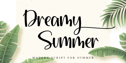 Dreamy Summer is a stylish and incredibly elegant handwritten font. This font was particularly crafted for those who need a beautiful and refreshing look to their designs. Add it confidently to your projects, and you will love the results. This font is PUA encoded which means you can access all of the glyphs and swashes with ease!
 - Penmanship by Essqué Productions,
$9.00 This font was designed with scholastic visuals in mind. Whether advertising for a school event, or creating handwriting worksheets for young children, this font covers all the basics with Latin alphabet languages. Three fonts with identical spacing to make interchangeable. Spacebar adds a regular space between words/sentences. To connect words with ledger lines, use the underscore (_).
 - Gudytha by Hrz Studio,
$13.00 Gudytha is an elegant script font with a contemporary atmosphere and impeccable form, inspired by timeless classic calligraphy. Not too thin and not too thick, balanced and varied, this font was designed to enhance the beauty of your projects. This font is PUA encoded which means you can access all of the glyphs and swashes with ease!
 - Gromvies by ahweproject,
$10.00 Gromvies feels playfully nostalgic and delivers an incredible vintage retro aesthetic. Inspired by unique retro themes, this fun typeface is suitable for any vintage theme concept, Illustration posters, stickers, fun graphics, and more. Masterfully designed to become a true favorite, this font has the potential to bring each of your creative ideas to the highest level!
 - PAG Syndicate by Prop-a-ganda,
$19.99Prop-a-ganda offers retro-flavored fonts inspired by lettering on retro propaganda posters, retro advertising posters, retro packages all the world over. This is perfect font for your retrospective project. PAG Syndicate is rectangle and rather narrow font. This font has squarish face designed only by straight line, it spices up even the short words. - Bloxen by Schaub Design,
$12.00 Hand-hewn along the banks of the mighty River Raisin in Southeast Michigan, this heavy block typeface is the perfect addition to any design project in need of a stout, yet fun typographical treatment. Before this font made its journey into the outside world, it began its life as a 4B pencil sketch on cheap inkjet printer paper, as many of my projects do. This typeface, not unlike me, doesn't waste its time with finesse, or convention, and truly doesn't mind being a little bit on the thick side. There is a time for refinement and propriety, but this ain't it.
 - Bronzo by XO Type Co,
$39.00 This is a 2023 redesign of Bronzo, originally designed by Rick Valicenti and Mouli Marur in 1991. With this redesign, Bronzo now has 6 new weights, for a total of 9, and 587 more glyphs than it was able to in 1991. Bronzo appears to move forward, yet remain still, via a center stroke that only sticks out on the left, a tense curve that only happens on the right, and a width that sits uncomfortably between square and rectangle. Those three things, combined with a balanced light to dark ratio, are what makes Bronzo appear tense and ready. Bronzo accepts Modernist ideals of minimal, rational construction—but it also adopts luxuriant shapes over Modernism’s sandblasted neutrality. It’s almost an alternate reality, a “what if?” of Modernism. Modernism’s fun, interesting, cute reboot.
 - Burgstaedt Antiqua by Linotype,
$29.99At first glance, Burgstaedt Antiqua looks like an old typewriter face, or rather like a typeface from a typewriter that has gone hopelessly wrong! Only after your second glance will you see this font for what it really is - a thoroughly new text face. Several features of Burgstaedt Antiqua, and its companion italic face, are worth special attention: First, the terminal styles of the letters vary throughout the alphabet. This gives text set in Burgstaedt Antiqua a slightly jittery feeling. A second interesting feature is the lowercase q", which takes the form of a shrunken-down uppercase "Q". Burgstaedt Antiqua Regular and Burgstaedt Antiqua Italic may be used in both text and headlines. For use in text, we recommend employing a slightly larger point size (12 pt or 14 pt and above). British designer Richard Yeend designed this family in 2002. - Linotype Scrap by Linotype,
$29.00Linotype Scrap is part of the Take Type Library, chosen from the entries of the Linotype-sponsored International Digital Type Design Contests of 1994 and 1997. The font is available in two weights and was designed by German artist Ingo Preuss. It is as though the forms of the basic weight were cut with scissors out of pieces of paper. There are no inner contours, only the outer silhouettes. The capital letters which make up Scrap Bonus are set on black rectangular backgrounds and are white and framed with a white contour. This weight includes a number of different pictograms which were also not spared the scissors. The decorative Linotype Scrap embodies the comic style of the 1990s and is meant exclusively for headlines of points sizes 18 and larger. - SF Old South Arabian by Sultan Fonts,
$9.99Historical Background Old South Arabian Script (OSA) was used before the Islamic era not only in the southwest corner of the Arabian Peninsula, but actually in the entire Peninsula. In addition, samples of OSA have been found as far as Uruk in Mesopotamia, Delos in Greece, and Giza in Egypt. Archaeological finds show that as far back as the 8th century BCE, OSA was used in trade, religious writing, and in civil records. Following the spread of Islam in Yemen, the decline of OSA began in the 7th century CE as it was gradually supplanted by Arabic script. OSA was typically known by the name of the then-dominant peoples in the Southern Peninsula. At various times, it was known as Sabaean, Qatabani, or Hadramite, among others. Although it was used for a variety of languages, OSA is most strongly associated with Sabaean. Many Peninsular languages borrowed OSA before introducing further changes of their own. Prime examples are the Thamudic, Safaitic, and Lihyanite scripts which eventually developed into independent scripts. The westward migration of the Sabaean people into the Horn of Africa introduced the South Arabian consonantal alphabet into the region. The transplanted script formed the roots of the Geez script of Ethiopia, which, in time and under presumably external influences, developed into a rich syllabary unlike any other Semitic script in history. Even a cursory examination of the letter forms of Modern Ethiopic writing reveal a striking similarity to South Arabian Script. OSA inscriptions typically reveal a dominant right-to-left directionality, although there are also many cases of alternating directions, known as boustrophedon writing. Figure 1 is a fine example of this style of writing. OSA inscriptions were discovered early in the 19th century. Soon thereafter, two orientalists, Gesenius and Rödiger, made great strides towards deciphering the script. Styles of Writing Old South Arabian inscriptions have survived primarily on stone, ceramic, and metallic surfaces. Hundreds of artifacts have been found and, to this day, continue to be discovered. Some of the best examples number of inscriptions on softer materials, such as wood and leather, have also been discovered. Although there is a significant difference between the styles of letters on the hard surfaces and those on the soft. Old South Arabian (Musnad) is composed of 29 letters , that is one letter more than the Arabic alphabet, which is between “S” and “Sh”, and names “Samekh”. Aspects of difference between Musnad and the present Arabic writing is that Musnad is written in separate letters, and the shape of the letters do not change according to its place in the word. However, some letters change according to the beginning of the writing. Musnad is either prominent, or deep. Prominent writings are for important writings and deep writings are for ordinary. The material on which the Musnad was written were stones, rocks, wood, and metal. In the course of its development the Musnad use appeared in the “Lehyanite’, “Thamudic”, “Safaitic”, pen to which many changes and amendments were made. And from it “Habashi’ writing was born. As regards his place among the Arabs of the Peninsula , when we look at the internet and its role in cultural dialogue , the Arabs of the Peninsula considered Musnad inscription which was indisputably their national writing until the dawn of Islam. It was used by people in all parts of Arabia in their homeland and abroad . It was their means of chronology and record of their glories and history.2- Features of Musnad Script: 1. It is written from right to left and vice versa. 2. Its letters are not joined. 3. Shape of letters are uniform despite their positions in the word. 4. Words are separated by vertical lines. 5. A letter is doubled in case of assertion. 6. No points and punctuations. 7. Easy to be learned by beginners. My OSA Musnad Font My design and technical work is only a treatment of the OSA Musnad as a symbol of writing. And it is possible to use in computer.. My design is not aimed at demonstrating the linguistic and intellectual structure of the Old South Arabian (Musnad). It is so simple that it could be easy to learn by learners and those who are interested in the OSA Musnad letters in computer. The basis of such importance is that it spares a lot of time and effort for researchers and students in this field. Formerly they used to write the Musnad texts either by handwriting or scan them , But now they can easily write its texts in OSA Musnad by using keyboard directly, so that they can change , amend and fulfill easily and accurately . So, we made use of speed, easiness and accuracy. And anyone interested in the South Arabian history in any part of the world can due to this design read and write OSA Musnad letters most easily. This design will also be used by historians and archeologists. , as well as specialist linguistics . The design also demonstrates the aesthetics of the Himyarit writing. About this font family Old South Arabian is An Arabic, Old South Arabian and Latin typeface for desktop applications ,for websites, and for digital ads. Old South Arabian font family contains two types: Old South Arabian and Old South Arabian serif. The font includes a design that supports Arabic, Old South Arabian and Latin languages. Old South Arabian typeface comes with many opentype features. - Cocogoose Pro by Zetafonts,
$39.00 Discover Cocogoose Pro Narrow Weights! Designed by Cosimo Lorenzo Pancini in 2013, Cocogoose was first expanded in 2015 with the help of Francesco Canovaro who co-designed the decorative display weights and Andrea Tartarelli who developed the condensed widths. In 2020 a full redesign of the typeface has been published: Cocogoose Pro now includes new widths, weights, open type features and characters, thanks to the help of Mario De Libero. Influenced by vernacular sign-painting and modernist ideals, Cocogoose is drawn on a classic geometric sans skeleton, softened by rounded corners and slight visual corrections. Its very low contrast, dark color and tall x-height make it a solid choice for all designers looking for a powerful display typeface for logos, headings and vintage-inspired branding. The tall x-height makes texts set in Cocogoose very readable even at small sizes, while the bold regular weight allows for maximum impact when used as a branding, signage or decorative typeface. Cocogoose Pro was designed as a highly reliable tool for design problem solving, and given all the features a graphic designer needs, starting from its wide range of widths and weights. Its 2000+ latin, cyrillic and greek characters make sure it covers over 200 languages worldwide, while its comprehensive set of open type features allows faultless typesetting thanks to small capitals, positional numbers & case sensitive forms. A wide range of alternate letterforms, developed along nine different stylistic sets, gives you an extra level of design fine-tuning. The layerable and color-ready display variants include inline, outline, shadow and a letterpress version that can simulate the effect of old print, also thanks to programmed randomization of its letters. Cocogoose Pro has been completely re-engineered in 2020 to include extra features and technologies. A variable font version allows you to fine tune precisely the appearance of the text while minimizing download size on the web. A darkmode weight range has been added to the whole family, to keep consistency of effect when the typeface is used in reverse on the web and in dark mode interfaces. Also, a new text subfamily has been developed for body text usage, to keep the look and feel of Cocogoose while maximizing readability on screen and on the printed page.
 - Sassoon Primary Cond by Sassoon-Williams,
$48.00 Those who design books for young children should consider the different needs of their readers. When laying out pages for young readers, particular care should be taken over word spacing. Don't forget that justifying short lines disrupts spacing. Justification should be used only when absolutely necessary. In the research undertaken with young readers the importance of consistent spacing was clear. It also appeared that the poorer readers profited from wider word spacing, while spacing that suited the poorest readers, positively annoyed the better readers. These typefaces have built-in letter spacing because of their exit strokes, as well as extra clarity designed into them. Sassoon Primary Medium Condensed is a compact style for headlines combining the right amount of weight, yet in a friendly style. When used at large sizes the friendliness of Sassoon types really shines. Why not use it for headings throughout a book. You can find many other new ways to use this typeface. Ideal perhaps for the masthead or a magazine? Free to download resources: How to access Stylistic Sets of alternative letters in these fonts
 - Heinemann by Heinemann Collection,
$39.00 The Heinemann fonts were initially developed by the in-house design team at Heinemann educational publishing out of the necessity to find the perfect font for use in early primary reading books and literacy products. Basic Heinemann is defined by longer ascenders and descenders which help children to distinguish between letters; rounded edges on all letterforms help focus the reader on the individual letter shape; and modified characters (eg. a, g,) ensure instant recognition of letterforms. Heinemann Special offers further modified characters and kerning pairs ideal for dyslexic or special needs use (eg a, d, b). The Heinemann fonts were developed in partnership with children, literacy advisors, teachers of special needs/dyslexia and primary school teachers, and are now released in response to hundreds of requests from publishers, designers and teachers to purchase them. They have been trialled in schools and learning institutions over an 8 year period, and are a favorite for use in both print and electronic product. The modern, clean aesthetic of the fonts ensures that their use can span beyond educational application.
 - Breathy Signature by Nathatype,
$29.00 Reveal your very best design result that makes everyone brainstorming easily with Breathy Signature. It's a versatile monoline signature font. The brushstrokes and curves style applied to the characters that resemblance to actual handwriting gives this font natural yet elegant feels. This font also easy to read and will look great in a variety of sizes. Features: Stylistic Sets Ligatures Swashes Numerals and Punctuations PUA Encoded It can be used for many design projects, such as poster, logo, book cover, branding, heading, printed product, merchandise, quotes, social media campaign, etc. Get more inspiration about how to use it by seeing the font preview. Thank you for purchasing our fonts. Please don’t hesitate to contact us, if you have any further question or issues. We’re happy to help. Happy Designing.
 - Meishu by Create Big Supply,
$15.00 Discover Meishu, a captivating Japanese brush font that combines the beauty of traditional calligraphy with modern design elements. With its strong and natural stroke style, Meishu brings an authentic and artistic touch to your projects. This versatile font is perfect for various applications, including logos, labels, magazines, books, greeting cards, packaging, novels, and advertising materials. Meishu captures the essence of Japanese brushwork, evoking elegance and grace in every character. Its blend of uppercase and lowercase letters adds visual interest and flexibility to your typography. The font also includes numbers and punctuation marks, enabling seamless integration into your designs. In addition to its aesthetic appeal, Meishu ensures multilingual support, allowing you to communicate your message effectively across different languages. Whether you're creating a design for a local or international audience, this font has you covered.
 - Fuse by W Type Foundry,
$25.00 This font is inspired by two typographic styles, incorporating (both) geometry and humanism. It combines the rhythm of such typefaces as Meta Pro and The Sans, as well as terminations and structures from fonts like Din and Futura. This results in a font that plays with condensation and a parallel rhythm, simple and functional. Fuse is perfectly equipped with Opentype, it contains alternative glyphs, fractions, modern and old numbers, superscripts and subscripts, ligatures and Small Caps. We always kept the idea of having Fuse be humanistic, rational and universal, which makes it ideal for graphic design, printed publications, web design, motion graphics, interaction design and branding. Learn about upcoming releases, work in progress and get to know us better! On Instagram W Type Foundry On facebook W Type Foundry wtypefoundry.com
 - Linotype Ergo Paneuropean by Linotype,
$103.99Linotype Ergo was designed by American Gary Munch, and was a winner in Linotype's Second International Digital Design Contest in 1997. Conceived as a blend of traditional and modern type concepts, it works as a legible text family as well as a lively display or headline font. The word ergo means consequently," but it also comes from the Greek word "ergon" for "work." Consequently, Munch sees this family as full of energy -- an ideal font for working hard to make a point, and able to get it across with friendly vigor. The strokes of the characters are carefully designed to accommodate the tendency of the eye to enlarge horizontals and perceive verticals as lighter. The lowercase forms have open, friendly counters and are enhanced by small quirks, such as the slightly leaning s and the wide t. The deep branching of curves from main strokes helps this humanist sans to be very readable at smaller sizes. Linotype Ergo has four normal-width weights, five condensed weights, and two compressed weights - all with companion Italics! The family also includes a clever "Sketch" font for use in headlines, bringing the total number of font styles to 23. Ergo is available with Greek and Cyrillic and as W2G fonts with Hebrew." - Abril Titling by TypeTogether,
$35.00 Abril is an extension of the Abril typographic system that was engineered as a response to a very specific requirement from the editorial design community: a low contrast typeface for head- lines. Given its broad range of styles though, Abril deserves to be considered a separate font family on its own. Based on the original text styles of Abril, the letter shapes are sturdy, very legible, and deliver a newsy and trustworthy feel. The accented editorial style of the Scotch Roman finds continuity in this new type family, but some of the details have been ironed out for improved performance in headline, both in print and on screen. The family is conceived as four series of different widths, with four weights in each series plus matching italics, a total of 32 fonts. This wide range of styles allows for setting titles at almost any size. The wider series are aimed for smaller point sizes while the con- densed weights can deliver a striking and cohesive appearance as front cover headlines. Abril was designed as a versatile tool for those graphic and web designers looking for a workhorse with high impact. It is also an excellent companion for the rest of the Abril type family: Abril Titling and Abril Narrow.
 - Linotype Ergo W2G by Linotype,
$124.99Linotype Ergo was designed by American Gary Munch, and was a winner in Linotype's Second International Digital Design Contest in 1997. Conceived as a blend of traditional and modern type concepts, it works as a legible text family as well as a lively display or headline font. The word ergo means consequently," but it also comes from the Greek word "ergon" for "work." Consequently, Munch sees this family as full of energy -- an ideal font for working hard to make a point, and able to get it across with friendly vigor. The strokes of the characters are carefully designed to accommodate the tendency of the eye to enlarge horizontals and perceive verticals as lighter. The lowercase forms have open, friendly counters and are enhanced by small quirks, such as the slightly leaning s and the wide t. The deep branching of curves from main strokes helps this humanist sans to be very readable at smaller sizes. Linotype Ergo has four normal-width weights, five condensed weights, and two compressed weights - all with companion Italics! The family also includes a clever "Sketch" font for use in headlines, bringing the total number of font styles to 23. Ergo is available with Greek and Cyrillic and as W2G fonts with Hebrew." - Urbani by W Type Foundry,
$25.00 URBANI is the result of a mix between Neohumanist and Neogrotesque types. The subtle narrowness of its proportions makes it ideal for composing extensive blocks of text. The slightly superior height of its ascenders, the wider proportions of its counter-forms, the addition of ink traps at certain stroke intersections; every aspect of URBANI’s design was conceived with reading in mind. The Opentype tool Alternative Glyphs is especially important, since its use is fundamental in achieving a universal and geometrical visual language through the rationalization of the font family. URBANI is inspired upon the works of Adrian Frutiger and Paul Renner, a constant source of admiration and inspiration to W. This type family comes fully equipped with Opentype tools, a huge range of alternate glyphs, fractions, modern and old style numbers, superiors and inferiors, ligatures and smallcaps. Universality is a major goal when it comes to creating our fonts. URBANI is ideally suited for general graphic design, print and digital publications, motion graphics, web design, branding and interaction design. Learn about upcoming releases, work in progress and get to know us better! On Instagram W Foundry On facebook W Foundry wtypefoundry.com
 - Yackien by Java Pep,
$13.00 Introducing the logo font called Yackien. This font is made for branding and logo font purposes, but still elegant for other design projects. In the Indonesian language Yackien (yakin) means believing, trust, and convincing. So Yackien can give off an aura of trust, believe, convincing in your brand's logo and designs. What's the included: - Yackien font and swash - Yackien logo doodles - Multilingual, support 27 languages - PUA encoded - Opentype features I hope you enjoy using Yackien. Please let me know at java.indonesian@yahoo.com if you have any questions.
 - Flat10 Fraktur by Dharma Type,
$14.99 The pixelated blackletter which called Fraktur, the most famous calligraphic letter in Germany. This 8-bit pixel font is designed with respect for 80s game designers and the pixel font pioneers in middle 90s. Use at size 10 pixels or multiples of 10 and anti-alias off is recommended. List of our Pixel Font Project. ·Flat10 Antique ·Flat10 Artdeco ·Flat10 Arts&Crafts ·Flat10 fraktur ·Flat10 Holy ·Flat10 Holly ·Flat10 Segments ·Flat10 Stencil ·Flat20 Gothic ·Flat20 Headline ·Flat20 Hippies ·Flat20 Streamer ·Behrensmeyer Vigesimals ·Civilite Vigesimals
 - Happy Space by Epiclinez,
$18.00 Introducing the Happy Space lettering font - a fun and vibrant addition to any design project. With its playful aesthetic, this font is perfect for creating eye-catching logotypes, memorable branding, engaging product packaging, and attention-grabbing headlines. Imagine your brand standing out in a sea of sameness with the unique personality of Happy Space guiding the way. Happy Space features : Standard Latin All-Caps Numbers, symbols, and punctuations Multilingual Support. Fully accessible without additional design software Simple Installations Works on PC & Mac Thank You.
 - Gloomie Saturday by Timurtype,
$14.00 Introduced by Timurtype Studio! Gloomie Saturday is a Bubbly Handwritten Font this font captures the charm of handcrafted elegance with our cheerful handwritten font collection – where every word dances with personality. Enhance your designs and captivate your audience with custom lettering art. Let your words sparkle with the magic of authenticity. Explore our cheerful fonts and make your message stand out! Gloomie Saturday Font also supports multilingualism. Enhance your designs with our original fonts, feel free to comment or provide feedback, Enjoy the fonts 😊 Thank You
 - Margareth Rosinante by Creative17studio,
$12.00 Introducing "Margareth Rosinante" is a modern serif font family. With luxury and sophistication that are consistent with one another. Margareth Rosinante is designed for an epic comparison between serif and script styles. The stark contrast between the Margaret Rosinante serif and the script makes this font family always suitable to be paired with in any design. Features: - Two different font types (serif and script style) -Standard basic characters -Multilingual support -Numeral and punctuation -Many ligatures (serif) -Beginning and ending swashes (script) Any questions? Jus ask. Free updates,
 - Herra Maddison by Jinan Studio,
$20.00 Herra Maddison is the embodiment of modern elegance, offering you an exquisite script font with exceptional swashes and multilingual support. Whether you’re a designer working on wedding themes, branding, or promotional materials, this font will elevate your work, infusing it with a timeless and stylish charm that captivates the eye and the heart. Make Herra Maddison your choice for sophisticated, elegant designs that leave a lasting impression. Features A set of uppercase and lowercase glyphs Number, symbol, and punctuation Multilingual Support Alternates and ligatures PUA encoded
 - ITC Tot Spots by ITC,
$29.99The symbols in ITC TotSpots include everything from a child's life, except maybe the mess. In this font you'll find diaper pins, alphabet blocks, teddy bears, and even an inchworm-everything a digital baby would need. Polish-Canadian designer Victor Gad has specialized in editorial illustration, and also has extensive experience in poster design. These illustrations maintain his original sketchbook quality, despite being digital renderings. ITC TotSpots offers a clear, new style of symbols, which might be the perfect fit for your next project! - Crust and Crumbs Brush by Redy Studio,
$10.00 Discover the perfect pairing for your culinary creations with the Crust and Crumbs Foodie Font Duo, featuring a harmonious blend of rounded sans-serif and expressive brush fonts. Whether you're a food blogger, restaurant owner, or a passionate home cook, this font duo is designed to add a delectable touch to your food-related designs. Feel free to give me a message if you have a problem or question. Thank you so much for taking the time to look at one of our products. ~Redy
 - Gospel Script by Kaer,
$24.00 This time I touched another classic manuscript for my font. The Lindisfarne Gospels is an illuminated manuscript probably produced around the years 715–720 in the monastery at Lindisfarne, off the coast of Northumberland. It’s the work of a monk named Eadfrith. He was a highly trained calligrapher, and he used insular majuscule script in the manuscript. I’m happy to present you the Regular and Colored styles for your design. --- You can use color fonts in PS CC 2017+, AI CC 2018+, ID CC 2019+, macOS 10.14 Mojave+ Please note that the Canva & Corel & Affinity doesn't support color fonts! --- You’ll get: * Initials & Regular styles * Uppercase and lowercase * Multilingual support * Numbers * Symbols * Punctuation * Ligatures Please feel free to request any help you need: kaer.pro@gmail.com Thank you!
 - Buro by Corentin Noyer,
$34.00 The Buro is a text font, monospace, sans-serif with rounded endings. It is characterized by its monolinear outline (slight optical corrections) and its discontinuous Roman structure. He tries to reproduce the outline of a letter drawn with a pen. The design of the Buro is inspired by the cursive letters used in Olympia typewriters of the 1950s.
 - ITC Styleboy by ITC,
$29.99 Although ITC Styleboy has a retro feel, it isn't based on any earlier typeface. As far as inspiration goes," says designer Chester Wajda, "I'd have to say comic strips of the '20s and '30s, and silent-film marquee lettering from the '20s - with a hint of a Chinese brush?" He originally created the typeface for a children's book he was working on. "I wanted it to be fun, but still somewhat formal in its underlying structure," he says. "It's largely based on right and 45-degree angles, with slight tucks inward on the stems and bowls, and a few flourishes here and there." Styleboy's top-heavy look is most noticeable in the caps, but it's exaggerated too in the "8" and the lowercase "g." Styleboy is Wajda's first typeface design."