10,000 search results
(0.014 seconds)
- Movie Classic JNL by Jeff Levine,
$29.00 The hand lettered title card from the 1935 melodrama “Magnificent Obsession” inspired the digital revival Movie Classic JNL; available in both regular and oblique versions.
 - Movie Night JNL by Jeff Levine,
$29.00 Movie Night JNL was modeled from one of a number of ceramic home movie titling kits on the market that were popular during the 1950s and 1960s. The camera buff would set up the letters against a colored background and photograph clever titles to describe their 8mm home movies of vacations, sightseeing or their darling children (or grandchildren).
 - Movie Screen JNL by Jeff Levine,
$29.00 The hand lettered opening titles from the 1944 Laurel and Hardy comedy “The Big Noise” served as the inspiration for Movie Screen JNL, which is available in both regular and oblique versions.
 - LD Horror Movie by Illustration Ink,
$3.00 - Movie Matinee JNL by Jeff Levine,
$29.00 A 1926 trade ad for the silent comedy “The Nut-Cracker” starring Edward Everett Horton has the film’s title hand lettered in a decorative bold sans serif design complete with highlight lines and accent dots. This festive type face is now available digitally as Movie Matinee JNL in both regular and oblique versions.
 - Movie Arts JNL by Jeff Levine,
$29.00 In the June 18, 1929 issue of “The Film Daily”, the curvy and casual hand lettering found within the ad for the movie “Such Men are Dangerous” belies that this was actually a pre-code drama. Digitally redrawn as Movie Arts JNL, it is available in both regular and oblique versions.
 - Movie Producer JNL by Jeff Levine,
$29.00 The Nov. 13, 1915 and Nov. 27, 1915 issues of Moving Picture World carried ads for Jesse L. Lasky Productions in which the titles of the upcoming films were hand lettered in an elegant Art Nouveau spurred serif style. This stylish alphabet is now available digitally as Movie Producer JNL in both regular and oblique versions.
 - Home Movies JNL by Jeff Levine,
$29.00 A set of cling vinyl letters and numbers for titling home movies or slides is the basis for Home Movies JNL. The set was made by the Clingtite Letters Company of Chicago and retailed for $2.95. It was advertised in many photographic publications of the 1950s.
 - Movie Set JNL by Jeff Levine,
$29.00 The hand lettered title on the poster for the 1929 film comedy “Why Leave Home?” inspired Movie Set JNL, which is available in both regular and oblique versions. A classic “thick-and-thin” design with early Art Deco influences, this condensed typeface is perfect for any period projects.
 - Movie House JNL by Jeff Levine,
$29.00 Double Feature JNL reworks the classic Huxley Vertical into an elegant trilinear Art Deco display face.
 - B-Movie Splatter by Die Typonauten,
$19.00
- The Love Movies by Putracetol,
$18.00 The Love Movies is a quirky love font with 7 different versions of the font, the difference between each version is in the shape of the heart decoration. This font is basically soft and fun, and coupled with heart decorations of various shapes and choices, will make this font suitable for the projects you are working on, especially those themed on love, valentine, children, babies, weddings, etc. In addition, this font is also suitable for invitation cards, greeting cards, logos, branding, posters, crafting, stickers, social media, packaging, headers, merchandise and others. This font is also support multi language.
 - Movie Nouveau JNL by Jeff Levine,
$29.00 A 1920s magazine featuring behind-the-scenes stories about the motion picture industry had its name [“Shadowland”] lettered in an Art Nouveau sans serif style. This has been recreated digitally as Movie Nouveau JNL, and is available in both regular and oblique versions.
 - Movie Show JNL by Jeff Levine,
$29.00 A 1911 movie poster for a film called “How Bella Was Won” from the Edison studios had the name “Edison” hand lettered in a bold, spurred sans serif design. These few letters became the basis for Movie Show JNL, which is available in both regular and oblique versions.
 - B-Movie Retro by Die Typonauten,
$19.00
- Movie Palace JNL by Jeff Levine,
$29.10 Decorative, Display, Headline, Sans Serif, 1930s, Hand Lettered, Monoline, Retro, Vintage, Nostalgic, Stylized, Elegant Some beautiful and stylized Art Deco hand lettering found in the Jan. 6, 1934 issue of the British movie fan publication Picturegoer Weekly inspired Movie Palace JNL, which is now available in both regular and oblique versions. This monoline design adds a touch of elegance to any retro projects.
 - Midnite Movie JNL by Jeff Levine,
$29.00 Midnite Movie JNL was inspired by the hand lettered title credits from the 1961 Hammer Pictures film "Curse of the Werewolf" and is available in both regular and oblique versions.
 - Movie Production JNL by Jeff Levine,
$29.00 Inside the pages of the August, 1930 issue of “The New Movie Magazine” is an ad for Warner Brothers-First National Pictures – hand lettered in a bold Art Deco sans. This was the basis for Movie Production JNL, which is available in both regular and oblique versions.
 - Monster Movies JNL by Jeff Levine,
$29.00 A 1967 ad for Aurora “Monster Scenes Custom Builder Kits” featured the drippy, gooey hand lettering long associated with science fiction and horror movies. The letters in the ad were auto-scanned and additional characters were completed with the end result being a horror-themed font with sharper angles and lines instead of drips. This is now available as Monster Movies JNL, which is available in both regular and oblique versions.
 - Trumania EEN - 100% free

- Times Ten by Linotype,
$40.99In 1931, The Times of London commissioned a new text type design from Stanley Morison and the Monotype Corporation, after Morison had written an article criticizing The Times for being badly printed and typographically behind the times. The new design was supervised by Stanley Morison and drawn by Victor Lardent, an artist from the advertising department of The Times. Morison used an older typeface, Plantin, as the basis for his design, but made revisions for legibility and economy of space (always important concerns for newspapers). As the old type used by the newspaper had been called Times Old Roman," Morison's revision became "Times New Roman." The Times of London debuted the new typeface in October 1932, and after one year the design was released for commercial sale. The Linotype version, called simply "Times," was optimized for line-casting technology, though the differences in the basic design are subtle. The typeface was very successful for the Times of London, which used a higher grade of newsprint than most newspapers. The better, whiter paper enhanced the new typeface's high degree of contrast and sharp serifs, and created a sparkling, modern look. In 1972, Walter Tracy designed Times Europa for The Times of London. This was a sturdier version, and it was needed to hold up to the newest demands of newspaper printing: faster presses and cheaper paper. In the United States, the Times font family has enjoyed popularity as a magazine and book type since the 1940s. Times continues to be very popular around the world because of its versatility and readability. And because it is a standard font on most computers and digital printers, it has become universally familiar as the office workhorse. Times™, Times™ Europa, and Times New Roman™ are sure bets for proposals, annual reports, office correspondence, magazines, and newspapers. Linotype offers many versions of this font: Times™ is the universal version of Times, used formerly as the matrices for the Linotype hot metal line-casting machines. The basic four weights of roman, italic, bold and bold italic are standard fonts on most printers. There are also small caps, Old style Figures, phonetic characters, and Central European characters. Times™ Ten is the version specially designed for smaller text (12 point and below); its characters are wider and the hairlines are a little stronger. Times Ten has many weights for Latin typography, as well as several weights for Central European, Cyrillic, and Greek typesetting. Times™ Eighteen is the headline version, ideal for point sizes of 18 and larger. The characters are subtly condensed and the hairlines are finer. Times™ Europa is the Walter Tracy re-design of 1972, its sturdier characters and open counterspaces maintain readability in rougher printing conditions. Times New Roman™ is the historic font version first drawn by Victor Lardent and Stanley Morison for the Monotype hot metal caster." - Tee Franklin by Suomi,
$19.00 The British Vogue commissioned this typeface for their magazine re-design in 2001. After studying the originals of Morris Fuller Benton and the existing versions, this font was designed with all new thin weights. Just when the family was finished, Vogue informed that they had decided to use American Typewriter instead. Bastards. But here is a true classic typeface with a facelift. The pun intended. Tee Franklin has seven weights with obliques, the Heavy being just slightly heavier than the existing versions from Adobe and ITC, and moving down to totally new Ultra Light, using Luc(as) de Groot's formula to keep the weights optically correct. The glyphs are the same as the Morris Fuller Benton's original from 1902, except for the upper case Q, which was re-designed with a loop in the counter for added differentiation.
 - Ten Mincho by Adobe,
$69.00Ten Mincho is a Japanese typeface design from Adobe Originals, designed by Ryoko Nishizuka and useful for a broad range of settings, such as advertising copy, book titles, and headings. As a traditional Mincho-style design the strokes are slightly heavy and rounded, and exhibit smaller counter spaces. Ten Mincho also features a full set of Latin glyphs, collectively known as Ten Oldstyle and designed by Robert Slimbach. This relatively feature-rich Latin subset includes OpenType features such as small caps and old-style figures. Finally, look for a small number of color emoji in an SVG table, some of which are accessible as alternates. - Ten Till by Atavistic,
$10.00
- Ten Pounds by Up Up Creative,
$29.00 Introducing Ten Pounds, a fun, hand-drawn serif font with tons of character (and tons of characters!). Ten Pounds is perfect for branding, poster design, t-shirts, invitations, design for children, and editorial design. It comes with more than 1300 glyphs, including more than 100 ligatures. OpenType features include stylistic sets, character variants, initial and final forms, and multilingual support (including multiple currency symbols). The OpenType features can be very easily accessed by using OpenType-savvy programs such as Adobe Illustrator and Adobe InDesign. (To access these awesome features in Microsoft Word, you'll need to get comfortable with the advanced tab of Word's font menu.)
 - Ten Oldstyle by Adobe,
$35.00Ten Oldstyle is a four-weight type family from Principal Designer Robert Slimbach at Adobe. He designed it as the Latin component of Ten Mincho, a Japanese typeface by Adobe?s Chief Designer Ryoko Nishizuka. As it began to take the form of a small type family, Robert decided to release Ten Oldstyle on its own as well. - Prop Ten by Galapagos,
$39.00Some years ago we developed a monospaced 12 pitch sans serif for a client. We also created a 10 pitch version that was later discarded. PropTen is the 10 pitch version modified to proportional widths. The name PropTen refers to 'Proportional 10 Pitch'- which is a technical impossibility. It does have a slight 'its time to vote' twist to it. You know, after you pick your candidate you also need to vote yes or no on the following Propositions, don't forget Prop10, the team needs those uniforms. - Old Miami Beach JNL by Jeff Levine,
$29.00 The grandeur of what was Miami Beach had its golden years peak in the 1940s. One of the grande dame hotels that stood at Collins Avenue and 23rd Street was the Roney Plaza; built in the 1920s and demolished around 1969. An online auction offered a pair of gummed labels provided by the hotel to be used by their guests for shipping souvenir packages back home, thus also giving the hotel a promotional plug. Jeff Levine not only created two typefaces from this hand-lettered label - Old Miami Beach JNL and Old Miami Beach Nights JNL (a solid black version), but painstakingly recreated the look of the label for the promotional flag and banner for the fonts.
 - Moving Mouse by URW Type Foundry,
$39.99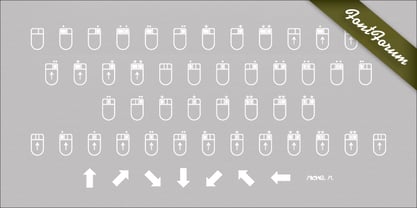
- Moxie Twist by Hipfonts,
$17.00 Introducing Moxie Twist, a captivating revival typeface that pays homage to the timeless elegance of 1930's design. Inspired by the iconic typography of the era, this font seamlessly blends nostalgia with a modern twist. With its unique flair and charming details, Moxie Twist breathes new life into vintage aesthetics, infusing your designs with a touch of sophistication and character. Whether you're working on branding materials, editorial layouts, or poster designs, this font will transport your audience to a bygone era while maintaining a fresh and contemporary feel. Rediscover the spirit of the past with Moxie Twist and let it lend an air of classic elegance to your next project, adding a touch of timeless allure that is sure to captivate.
 - Mobie FA by Fontarte,
$39.00 FA Mobie is a contemporary decorative fat face. For use on posters, leaflets, ads.
 - Just Moving by Colllab Studio,
$15.00 Presenting Just Moving! A Chic Handwritten Font with natural strokes. This font made with the perfect combination of each character. You can combine with Extra to get a unique combination. It looks original and can be used for all your project needs. Each glyph has its own uniqueness and when meeting with others will provide dynamic and pleasing proximity. This font can be used at any time and in any project. You can see in the presentation picture above, Just Moving looks unique and so flow style on design projects. So, Just Moving can't wait to give its touch to all your design projects such as quotes, poster design, personal branding, promotional materials, website, logotype, product packaging, etc. WHAT'S INCLUDED? Just Moving • It comes with uppercase, lowercase, ligatures, numeral, punctuation, symbols, Many Ligatures, Alternates, and Standard Latin Multilingual Support (Afrikaans, Albanian, Catalan, Danish, Dutch, English, French, German, Icelandic, Indonesian, Italian, Malay, Norwegian, Portuguese, Spanisch, Swedish, Zulu, and More). Extra Swashes • Included 10 Underline Swashes. You can feature all with typing c_1 until c_10 A Million Thanks Colllab Studio
 - Moai Variable by Unio Creative Solutions,
$16.00 A neo-brutalist variable typeface conceived with flexible proportions and a singular heavy weight, including the oblique. Useful for any quirky display uses. Designed with extra-wide contrasting shapes, as a result of an extreme simplification of traditional typographic letterforms, “Moai” has a variable width that adapts to your needs, pushing for maximum readability. It's perfect for logos, headlines, posters, art projects, social media, visual identity, corporate image, film posters, music cover art, and books. Specifications: - Files included: Moai Variable including obliques - Multi-language support (Central, Eastern, Western European languages) - OpenType Features Thanks for viewing, Unio.
 - Moving Formula by Supfonts,
$10.00 Moving Formula Funny Sans Moving Formula is a cute handwritten font with multilingual support. It is perfect for branding, wedding invitations, menu design, YouTube covers and many more Font includes a full set of gorgeous uppercase and lowercase letters, numbers, a large selection of punctuation marks & multilingual support Test it out below to see how it could look for your next project! Includes: Regular Script Latin languages support Uppercase and lowercase Numbers and punctuation Check out my blog: https://www.instagram.com/superdizigner https://pinterest.com/dmitriychirkov7
 - Moxy Rush by Alit Design,
$21.00 Introducing "Moxy Rush" Font: Redefining Modern Blackletter Elegance Unleash the power of typography with "Moxy Rush," a remarkable font that seamlessly blends the timeless essence of blackletter style with a captivating contemporary twist. This font is a true masterpiece, meticulously designed to elevate your designs, projects, and artworks to new heights of sophistication and creativity.
 - Moving Forward by Crumphand,
$20.00 Introducing, Moving Forward a Slab Serif Font. inspired by vintage and modern letterforms with alternate characters and full symbol sets. Moving Forward can be used for posters, web headers, and display text of all kinds. good kerning and readable.
 - Southern Accent Belch - Unknown license

- Peach Daisy (Duplicate) by Nathatype,
$29.00 Ready to make your branding spark? If you need to create a big, bold logo for your business, work on a poster for an event, or whatever your project may be-then this is the perfect font for you. Peach Daisy-A Sans Serif Font Peach Daisy is a new modern sans serif font. This font was carefully crafted and inspired by luxury fashion in the world. It creates a luxurious, rich, exclusive and elegant look in design. It’s thin brush strokes and imperfect baseline give it a fun and stylish. So beautiful on invitation like greeting cards, branding materials, business cards, quotes, posters, lettering and more. Features: Ligatures Alternates Swashes PUA Encoded Numerals and Punctuation Thank you for downloading premium fonts from Natha Studio
 - Honey Beachy Sh by Sohel Studio,
$14.00 Honey Beachy is a retro display serif font that exudes a classic charm and bold character. With its design inspired by retro styles, this font brings an elegant touch and evokes a sense of the past. Each letter is meticulously crafted with careful attention to detail and proportion, resulting in a visually appealing and unique appearance. Honey Beachy is perfect for projects that require a vintage feel, such as posters, logos, packaging, and promotional materials that aim to capture a nostalgic and sophisticated atmosphere. This font will add a special touch to your designs and captivate viewers with its retro allure and distinctiveness. Honey Beachy Features: - Regular And Outline - Uppercase And Lowercase - Alternates And Ligature - Numerals & Punctuation - Accented characters - Multilingual Support - Unicode PUA Encoded While using this product, if you encounter any problem or spot something we may have missed, please don't hesitate to drop us a message. We'd love to hear your feedbacks in order to further fine-tune our products. Thanks and have a wonderful day .
 - Peaches And Cream by Fenotype,
$35.00 Peaches and Cream is a bold brush style script family of three weights, ornament set and an all caps font. Peaches and Cream is equipped with plenty of OpenType features: To activate the alternates click on Swash, Stylistic or Titling Alternates in any OpenType savvy program or manually select the characters from Glyph Palette. Combine Peaches and Cream with Peaches and Cream Ornaments and Peaches and Cream Caps to complete your designs. Peaches and Cream is an effective font for creating ambitious headlines, logos & posters with a custom-made feeling. For the best price purchase the complete Peaches and Cream.

