After researching the type styles contemporary graphic designers have been using over the past few years, I noticed a consistent use of Copperplate Gothic, and its derivative designs, for various corporate advertising campaigns. That level of usage gave me the inspiration to design a display font possessing subtle characteristics of Copperplate Gothic, and various Latin Condensed designs. The font I ended up designing was semi-condensed, with more contrast between thicks and thins than in Copperplate. Baltra also has a subtle flair in its otherwise traditional lowercase, while possessing a larger than average lowercase x-height. Copperplate Gothic, on the other hand, has minimal contrast and uses small capitals for its lowercase. After examining extensive type specimens from wood type, metal type, phototype and digital type, I was not able to find a single design possessing a majority of Baltra's characteristics. Consequently, I consider Baltra to be a truly unique design, sharing with Copperplate Gothic only its flairs on stems, and having only subtle characteristics in common with traditional Latin designs.

Clocko automatically turns the time stamp text into an analog clocks using the OpenType ligatures. Even when the ligatures are turned off, the time is still visible and readable, and it does not change or ruin the layout. Perfect for web usage and even for small sizes. For a crisp look, please use sizes divisible by 30, for example 30pt or 60pt. To make a custom analog clock, type any uppercase or lowercase letter to have a border (see previews for examples), and then type the time in 12 hour or 24 hour format with or without seconds. Use colon, comma, semicolon, hyphen, period or plus as a separator. Few examples: 12:45 9:25:46 10.50 13:30.10 The borders can be mixed together for more interesting look, please see the screenshots above. An additional background shape can be added to the clocks by typing a symbol (! # $ % & ( ) < = > ) as a first character, for example %A12:40:55. Please note that in order to keep the clocks visible, the background shape and the clocks need to have a different colors.

stajn-type.com — Stajn Pro Type Family Website where you can get DEMO version of Stajn Pro Book Stajn Pro was designed upon a main goal of using this typeface to set larger amount of text. The slightly condensed proportion allows for more content per page while large x height with its larger counters improves legibility and readability while used on smaller sizes. Despite the fact that Stajn Pro was designed as a body text Type Family, it works as well as a display too. Wide variety of weights as well as interesting, strong and at the same time beautiful character along with some stylistic alternate makes Stajn Pro a useful typeface in a field of editorial, magazine and promotional materials design. The Stajn Pro character includes some humanistic typeface characteristics, which add some softness and elegance in its strong and stable presence. More information about development, usage and characteristics of a Stajn Pro Type Family at stajn-type.com If you have any other questions please do not hesitate to write me at info@stajn-type.com
A decorative display font great for large header-like usage.

Compendium is a sequel to my Burgues font from 2007. Actually it is more like a prequel to Burgues. Before Louis Madarasz awed the American Southeast with his disciplined corners and wild hairlines, Platt Rogers Spencer, up in Ohio, had laid down a style all his own, a style that would eventually become the groundwork for the veering calligraphic method that was later defined and developed by Madarasz. After I wrote the above paragraph, I was so surprised by it, particularly by the first two sentences, that I stopped and had to think about it for a week. Why a sequel/prequel? Am I subconsciously joining the ranks of typeface-as-brand designers? Are the tools I build finally taking control of me? Am I having to resort to “milking it” now? Not exactly. Even though the current trend of extending older popular typefaces can play tricks with a type designer’s mind, and maybe even send him into strange directions of planning, my purpose is not the extension of something popular. My purpose is presenting a more comprehensive picture as I keep coming to terms with my obsession with 19th century American penmanship. Those who already know my work probably have an idea about how obsessive I can be about presenting a complete and detailed image of the past through today’s eyes. So it is not hard to understand my need to expand on the Burgues concept in order to reach a fuller picture of how American calligraphy evolved in the 19th century. Burgues was really all about Madarasz, so much so that it bypasses the genius of those who came before him. Compendium seeks to put Madarasz’s work in a better chronological perspective, to show the rounds that led to the sharps, so to speak. And it is nearly criminal to ignore Spencer’s work, simply because it had a much wider influence on the scope of calligraphy in general. While Madarasz’s work managed to survive only through a handful of his students, Spencer’s work was disseminated throughout America by his children after he died in 1867. The Spencer sons were taught by their father and were great calligraphers themselves. They would pass the elegant Spencerian method on to thousands of American penmen and sign painters. Though Compendium has a naturally more normalized, Spencerian flow, its elegance, expressiveness, movement and precision are no less adventurous than Burgues. Nearing 700 glyphs, its character set contains plenty of variation in each letter, and many ornaments for letter beginnings, endings, and some that can even serve to envelope entire words with swashy calligraphic wonder. Those who love to explore typefaces in detail will be rewarded, thanks to OpenType. I am so in love with the technology now that it’s becoming harder for me to let go of a typeface and call it finished. You probably have noticed by now that my fascination with old calligraphy has not excluded my being influenced by modern design trends. This booklet is an example of this fusion of influences. I am living 150 years after the Spencers, so different contextualization and usage perspectives are inevitable. Here the photography of Gonzalo Aguilar join the digital branchings of Compendium to form visuals that dance and wave like the arms of humanity have been doing since time eternal. I hope you like Compendium and find it useful. I'm all Spencered out for now, but at one point, for history’s sake, I will make this a trilogy. When the hairline-and-swash bug visits me again, you will be the first to know. The PDF specimen was designed with the wonderful photography of Gonzalo Aguilar from Mexico. Please download it here http://new.myfonts.com/artwork?id=47049&subdir=original
As of my last update in April 2023, there is no widely recognized or commercially popular font specifically named "Milky" within the standard typographic circles or among major font foundries. Howeve...
The font AnglosaxOblique, crafted by the renowned type designer Manfred Klein, is a distinctive and stylistically unique typeface that captures the essence of historical elegance with a modern twist....
Nu School Munitions isn't a font that I can specifically reference as of my last knowledge update in early 2023, suggesting it might either be a very new, specific, custom, or possibly not widely rec...
As of my last update in April 2023, "GarbageG" does not refer to a widely recognized or standard font within the typographic community or within mainstream font repositories. Nonetheless, the imagina...
As of my last knowledge update in April 2023, the font Crakos by Phuxer Designs might not be among the broadly recognized or extensively documented typefaces in the realms of graphic design or typogr...
"Porn Star Academy" is a font that, as provocative as its name might imply, embodies a blend of playfulness, audacity, and a touch of rebellion. Designed with an intention to stand out and capture at...
As of my last update in 2023, "Sonic Empire" isn't a widely recognized font within mainstream typographic resources, which suggests it might be a custom or lesser-known typeface, perhaps specifically...
The VINTAGE COLLEGE DEPT_DEMO_worn font by Fontsandfashion is a distinctive typeface that embodies the spirit of classic collegiate and varsity aesthetics, with a distinctly retro feel that harks bac...
As of my last update in early 2023, Gartentika may not be widely recognized in mainstream font directories or among the most commonly cited fonts by designers. Nonetheless, the description provided h...
Certainly! Picture this: You're strolling through the whimsical alleyways of Typography Town, where the buildings stretch impossibly tall, framing the sky in slivers of blue. Suddenly, you stumble up...
Ah, Lein Bold, the typeface that struts into the typographic scene with the confidence of a peacock at a bird show. Picture this: if fonts were people, Lein Bold would be that one friend who's always...
As of my last update in 2023, SlabStruct Too is not a widely recognized or documented font in mainstream typographic resources or among well-known font libraries. Its name suggests it could either be...
Virgin, as a hypothetical font, is not known in my list of documented fonts up to my last update in 2023. However, let's imagine what Virgin might encapsulate as a typeface design concept, given its ...
As of my last update in early 2023, the specific details about the font named "HAPPY DONUTS" by Ana Putka are not widely documented in major design resources or font directories. However, based on th...
Spund, as it sounds, might evoke the idea of a font that is playful and perhaps rounded, suggesting a certain whimsy and casualness in its design. As there isn't a widely recognized typeface by this ...
The unique font "Broken 15" by Misprinted Type, also known as Eduardo Recife, is an evocative and highly characteristic typeface that dives into the artistic realms of the unconventional. Nestled wit...
Picture this: you're about to pen a love letter, the old-fashioned way. You dip your quill in ink, but instead of pressing it to parchment, you tap away at your keyboard and, voilá, out comes Jayne S...
Futura by URW Type Foundry, $89.99 Futura is THE prototype of a geometric or constructed linear sans serif and the font most commonly font of its kind used to date. Futura, very much influenced by the Bauhaus movement in Germany, was designed in 1927 by Paul Renner. Although being around for almost 90 years, Futura seems eternally young and fresh which also explains its continuous popularity with designers and typographers. Futura simply means efficiency and functionality documented by both its many usages as corporate type (e.g. Volkswagen, formerly IKEA, Vuitton, Shell, formerly HP, SMA and many more) as well as in various famous film projects (e.g. Kubrick, Anderson etc.). Futura’s iconic status was probably established when it walked on the moon with the Apollo 11 crew in 1969. It was used for the lettering of the plaque that was left up there.
Zin Display is a contemporary typeface designed for various situations of typographic usage. Characteristic feature is a large x-height and balance between neutral construction of letters (strictly vertical axis), dynamic open forms (opened terminals) and sharp instrokes, outstrokes and serifs. Another typical feature is a visually narrower connection between stems and strokes. The complete font family consist of three width proportions (Normal, Condensed and Extended). Every sub-family has 5 weights, ranging from Light to Black with matching Italics. Zin Display can be effectively used especially for display typesetting but works for longer text as well. It can be used especialy in magazine layouts and editorial design, as well in advertising typography, orientation systems, corporate identities and many other situations. Zin Display is a member of the Zin super family, which also includes Zin Sans, Zin Slab and Zin Serif fonts.
Nomina is a family of sans serif fonts for use from large to small sizes. The weights of the family itself contain 16 styles plus italic, ranging from ExtraLight to Black. The font family takes was inspired by classic Grotesk typefaces such as Venus and Akziden Grotesk. Unlike any other modern Grotesk typefaces, the details of the contrast in this font family are quite subtle and yet still harmonize while standing in between another character, the open apertures help them to increase the quirkiness accompanied by the sharp terminals on each rounded glyphs. The Nomina family is well equipped with lots of selective alternates and OpenType features, and the main usage of this font is universal, this means this can use it any design style as long as the look and feel keep match with its characteristics.
Usage recommendations: Captions, packaging, cards, posters, ads, book jackets, manuals, menus.
Lard Pro Regular is an extreme contrasted extra black typeface designed for usage at larger sizes. Lard Pro Bold is an extra black typeface designed for usage at larger sizes. They contain extended Latin, Cyrillic and Greek alphabets to support a very wide range of languages.
Dick Jensen (USA) designed Serpentine, is a contemporary-looking display font, for the Visual Graphics Corporation in 1972. With the rise of digital typesetting and desktop publishing, this typeface quickly became both popular and ubiquitous. This dynamic, wide, boxy design is identifiable via tiny triangular swellings at the stroke endings - what might be called semi-serifs. Serpentine is available in six different font styles: Light, Light Oblique, Medium, Medium Oblique, Bold, and Bold Oblique. Serpentine" is a greenish rock that sometimes resembles a serpent's skin, and is often used as a decorative stone in architecture. Though this font doesn't seem at all snaky or sinuous, it does have an architectural, stone-like solidity. The subtle, almost non-existent curves and semi-serifs keep it from being too stern or cold. Although the underlying strokes of each weight are similar, the six members of the Serpentine font family all present their own individual personalities. Serpentine Light lends itself well to text for onscreen displays, for instance, while the numbers from typeface's heavier weights are seen around the world on soccer jerseys! Additionally, the oblique styles convey a streamlined sense of speed, furthermore lending Serpentine well to sport and athletic applications (especially the faster, high-speed varieties). Because of its 1970s pedigree, Serpentine has come to be known as a genuine "retro" face. This makes the typeface even more appropriate for display usage, in applications such as logo design, magazine headlines, and party flyers. If you like Serpentine, check out the following similar fonts in the Linotype portfolio: Copperplate Gothic (similar serifs) Eurostile (similar width) Princetown (another "athletic" font) Insignia (similar "techno" feeling)"
Dick Jensen (USA) designed Serpentine, is a contemporary-looking display font, for the Visual Graphics Corporation in 1972. With the rise of digital typesetting and desktop publishing, this typeface quickly became both popular and ubiquitous. This dynamic, wide, boxy design is identifiable via tiny triangular swellings at the stroke endings - what might be called semi-serifs. Serpentine is available in six different font styles: Light, Light Oblique, Medium, Medium Oblique, Bold, and Bold Oblique. Serpentine" is a greenish rock that sometimes resembles a serpent's skin, and is often used as a decorative stone in architecture. Though this font doesn't seem at all snaky or sinuous, it does have an architectural, stone-like solidity. The subtle, almost non-existent curves and semi-serifs keep it from being too stern or cold. Although the underlying strokes of each weight are similar, the six members of the Serpentine font family all present their own individual personalities. Serpentine Light lends itself well to text for onscreen displays, for instance, while the numbers from typeface's heavier weights are seen around the world on soccer jerseys! Additionally, the oblique styles convey a streamlined sense of speed, furthermore lending Serpentine well to sport and athletic applications (especially the faster, high-speed varieties). Because of its 1970s pedigree, Serpentine has come to be known as a genuine "retro" face. This makes the typeface even more appropriate for display usage, in applications such as logo design, magazine headlines, and party flyers. If you like Serpentine, check out the following similar fonts in the Linotype portfolio: Copperplate Gothic (similar serifs) Eurostile (similar width) Princetown (another "athletic" font) Insignia (similar "techno" feeling)"
Ladies and gentlemen, gather round, for I have the pleasure of introducing you to one of the most charmingly whimsical typefaces to ever grace the digital page: akaDora, crafted by the one and only J...
The "Strong Display Font" is a derivative of the Clinto slab serif font, originally designed by. Faldy Kudo. This font is specifically crafted to exude strength and impact, making it an ideal choice for display and headline usage. It incorporates the unique typographic feature of ink traps, enhancing its readability even at larger sizes. The font family comprises 6 distinct styles: "Normal, Normal Rounded, Medium, Medium Rounded, Condensed, and Condensed Rounded.” offering versatility in design choices. Additionally, the font provides multi-language support, ensuring that it can be effectively used for a wide range of global content and projects.
Inspired by Japanese robot animations in 80s such like Gundam and Ideon, Geom Graphic is a square geometric sans serif for wide range of usage. The family give an impression similar to Eurostile but is more squared and geometric. The letterforms of Geom Graphic are designed slightly rounded to appear natural, warm and retro. This family consisting of 4 weights with matching Italics. The wide range of languages is designed targeting use for futuristic product of game, movie, logo and so on. We released 4 big Sci-Fi families in 2013. Check it out! Clonoid Controller Geom Graphic Space Colony
Kinn is an industrial san-serif typeface with an essence of squared structure inspired by a futuristic look. Kinn is robust but portray a friendly touch with a little roundness to its shape, it can also be very formal when it needs to but it is flexible and fun to use at the same time. Its wide proportion makes it ideally suited a wide range of modern applications and variety of usage from heavy display, headlines or even text. Kinn comes in 9 consecutive weights, each weight accompany with italics. Equipped with Alternates, Ligatures and 10 Cryptocurrency signs.
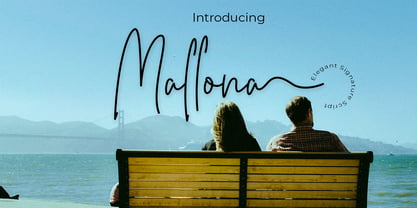
Mallona is monoline script font which natural movement and elegant for signature style. is perfect for branding projects, logo, wedding designs, social media posts, advertisements, product packaging, product designs, label, photography, watermark, invitation, stationery and any projects that need handwriting taste. What’s Included : Standard glyphs Ligature Works on PC & Mac Simple installations Accessible in the Adobe Illustrator, Adobe Photoshop, Adobe InDesign, even work on Microsoft Word. PUA Encoded Characters – Fully accessible without additional design software. Fonts include multilingual support for; ä ö ü Ä Ö Ü ß ¿ ¡ for questions and usage license please contact us Mohamadcandirah@gmail.com
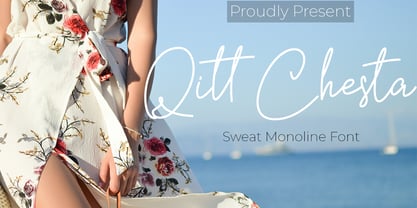
Qitt Chesta is monoline script font which natural movement and cute style. is perfect for branding projects, logo, wedding designs, social media posts, advertisements, product packaging, product designs, label, photography, watermark, invitation, stationery and any projects that need handwriting taste. What’s Included : Standard glyphs Ligature Works on PC & Mac Simple installations Accessible in the Adobe Illustrator, Adobe Photoshop, Adobe InDesign, even work on Microsoft Word. PUA Encoded Characters – Fully accessible without additional design software. Fonts include multilingual support for; ä ö ü Ä Ö Ü ß ¿ ¡ for questions and usage license please contact us Mohamadcandirah@gmail.com
Allin Priska is monoline script font which natural movement and romance style. is perfect for branding projects, logo, wedding designs, social media posts, advertisements, product packaging, product designs, label, photography, watermark, invitation, stationery and any projects that need handwriting taste. What’s Included : Standard glyphs Ligature Works on PC & Mac Simple installations Accessible in the Adobe Illustrator, Adobe Photoshop, Adobe InDesign, even work on Microsoft Word. PUA Encoded Characters – Fully accessible without additional design software. Fonts include multilingual support for; ä ö ü Ä Ö Ü ß ¿ ¡ for questions and usage license please contact us Mohamadcandirah@gmail.com
Bahn is heavily inspired by the sturdiness in the simplicity of the Autobahn together with the German highway typeface DIN 1451. Designed with straight-forward concept, clean and simple, direct and comprehensible. Nevertheless, Bahn still mange to insert the friendliness touch to the character which makes it easy to use and well-suited with other typefaces, letters or in various styles and possibilities of layouts that may occurred in the future. Bahn comes with 9 weights from the thinnest to the heaviest possible, accompanied with Italics for extensive usage. Not satisfied? Bahn also comes with Variables that will sure suited your needs.