10,000 search results
(0.051 seconds)
- Beam Rider 3D - Unknown license
- Beam Rider Italic - Unknown license
- Beam Rider Laser - Unknown license
- Beam Rider Laser - Unknown license
- Beam Rider Condensed - Unknown license
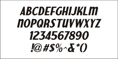
- Term Paper JNL by Jeff Levine,
$29.00Jeff Levine's collection of stencil fonts based on original source material has grown by one with the addition of Term Paper JNL, a bold sans serif based on a stencil lettering guide from the 1950's. - Tsa - Unknown license
- Asa - Unknown license
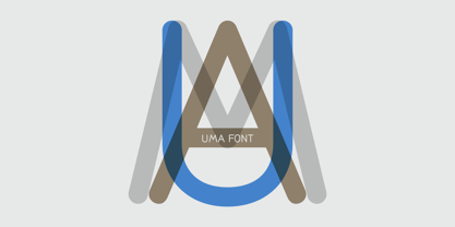
- Uma by Sudtipos,
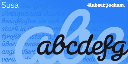
$39.00Uma is a typeface family consisting of two weights: light and bold. The typography is fresh, informal and friendly at first glance, but the constructive architecture makes it elegant and modern. It works equally as well in large or small sizes, and the combination between the two weights is very interesting to work with. It is a contemporary typeface, ideal for use in magazines, brochures, flyers and advertising among other applications. Uma may seem simple at a first glance, but it is very functional and professional, with aesthetic enchanting details. Uma has a wide range of functionality and has a great personality. Designed by Ariel Di Lisio and digitized by Ale Paul, Uma includes alternates, fractions, ligatures and a wide range of latin languages. - Susa by Hubert Jocham Type,
$29.90 - LICENSE PLATE USA - Personal use only
- Wild West USA - Unknown license
- KR Magic Tea - Unknown license
- KR Tea Time - Unknown license
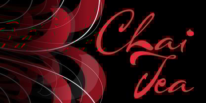
- P22 Chai Tea by IHOF,
$24.95P22 Chai Tea is unique among brush lettering scripts. Its sweeping strokes and luxurious use of horizontal space lend personality and warmth to any project. Its sturdy letterforms make it ideal for logos, stationery, titling and packaging. The Pro version is stacked with alternative characters and ligatures programmed to substitute contextually in programs that support OpenType features. In addition, Chai Tea Pro contains Central European Language support that also includes many ligatures with accented characters. - Sweet Tea PW by Patty Whack Fonts,
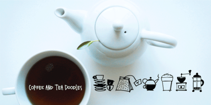
$24.00 - Coffee & Tea Doodles by Outside the Line,
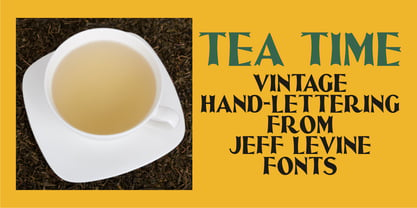
$19.00 - Tea Time JNL by Jeff Levine,
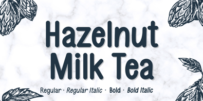
$29.00 - Hazelnut Milk Tea by Fikryal,
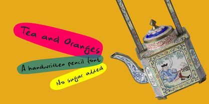
$18.00Introducing this very simple sans serif font that is Hazelnut Milk Tea font. I created this font with the inspiration of simplicity and it is very friendly to look at, with four versions, namely regular, italic, bold, bold italic. Very suitable to be applied in various aspects of design, Also it’s perfect for logo, branding, title, social media posts, advertisements, product packaging, product designs, label, photography, watermark, special event, magazine, web designs, etc. Features : Hazelnut Milk Tea Regular ( Uppercase, Lowercase ) Hazelnut Milk Tea Regular Italic ( Uppercase, Lowercase ) Hazelnut Milk Tea Bold ( Uppercase, Lowercase ) Hazelnut Milk Tea Bold Italic ( Uppercase, Lowercase ) Symbols multilingual support If you have any questions please don’t hesitate to contact me follow my Instagram: @fkryall Thank you - Tea And Oranges by Hanoded,
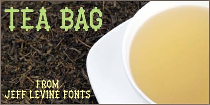
$15.00Tea And Oranges is a line from Leonard Cohen’s song Suzanne. “She feeds you tea and oranges that come all the way from China”… The song was a favourite of my brother Rizja who, sadly, recently passed away. Tea And Oranges is a a handwritten ‘pencil’ style font. It comes with impressive language support and a bunch of Discretionary ligatures for you to play with! - Tea Bag JNL by Jeff Levine,
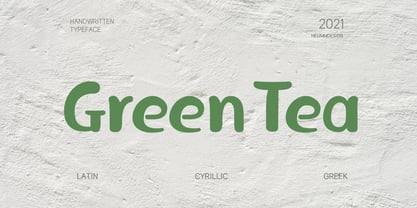
$29.00 - HU Green Tea by Heummdesign,
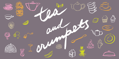
$15.00English HU Green Tea is a brush-type calligraphic display font for headlines with round shape and smooth strokes. This font gives you beautiful, natural and relaxed impression and is suitable for natural pictures, magazines, logos, posters, product designs and etc. Greek Το HU Green Tea είναι μια γραμματοσειρά καλλιγραφικής οθόνης τύπου πινέλου για τίτλους με στρογγυλό σχήμα και απαλές πινελιές. Αυτή η γραμματοσειρά σας δίνει όμορφη, φυσική και χαλαρή εντύπωση και είναι κατάλληλη για φυσικές εικόνες, περιοδικά, λογότυπα, αφίσες, σχέδια προϊόντων κ.λπ. Cyrillic HU Green Tea - каллиграфический дисплейный шрифт кистевого типа для заголовков с круглой формой и плавными мазками. Этот шрифт создает красивое, естественное и непринужденное впечатление и подходит для естественных изображений, журналов, логотипов, плакатов, дизайна продуктов и т. Д. - Tea And Crumpets by Kate Brankin,
$17.00 - Tea Chest Stencil by Apply Interactive,
$30.00 - KR Mad Tea Party - Unknown license
- Tea Chest Stencil EF by Elsner+Flake,
$35.00 - USIS 1949 - Personal use only
- Varsity - Unknown license
- Quadrus by ITC,
$29.99Quadrus is the work of New York graphic designer Peter Fahrni, a condensed open slab serif typeface. Fahrni was inspired by the lettering styles typical of baseball, basketball and American football sportswear. Quadrus is an all caps alphabet ideal for a variety of applications, particularly for those related to sports. - Good Sport JNL by Jeff Levine,
$29.00Good Sport JNL has nothing to do with any of the major sports activities such as baseball, football, basketball or soccer. Instead, the typeface gets its name from the sport of camping, as the lettering was spotted on an image of an old ad for the Colonial Forest-Master boy’s pocket knife. Good Sport JNL is available in both regular and oblique versions. - Jigger Statz by Poole,
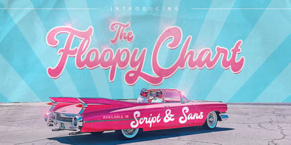
$32.00During the spring of 2006, while creating this typeface, I was reading Praying For Gil Hodges, by Tom Oliphant, who grew up a Brooklyn Dodgers fan. I grew up a Los Angeles Dodgers fan. My mother worked as secretary to the president of the old Triple A LA Angels Baseball Team. In 1952 when she was pregnant with me, she left the team. They gave her an autographed baseball and a puppy named Angel. That's the dog I grew up with. Toward the end of the book the author talks about Gil Hodges' favorite ballplayer, a slugger for the LA Angels, Jigger Statz. I thought, could it be? My mother died two years ago and I got the team baseball. Sure enough, the first name after the dedication to my mother was Jigger Statz. - Floopy Chart by Wacaksara co,
$15.00Floopy Chart | Font Duo ? is a pair of script and sans font, this font is truly inspired by retro and groove music vibes also from American sport scene like baseball and basketball culture. Floopy Chart comes with uppercase, lowercase, numerals, punctuations and so many variations on each character include OpenType alternates and common ligatures to let you customize your designs. Perfect to use for Logotype, Letterhead, Poster, Apparel Design, Label and etc. Thanks, Wacaksara - Fan Script by Sudtipos,
$99.00A friend of mine says that sports are the ultimate popular drug. One of his favorite things to say is, “The sun’s always shining on a game somewhere.” It’s hard to argue with that. But that perspective is now the privilege of a society where technology is so high and mighty that it all but shapes such perspectives. These days I can, if I so choose, subscribe to nothing but sports on over a hundred TV channels and a thousand browser bookmarks. But it wasn't always like that. When I was growing up, long before the super-commercialization of the sport, I and other kids spent more than every spare minute of our time memorizing the names and positions of players, collecting team shirts and paraphernalia, making up game scenarios, and just being our generation’s entirely devoted fans. Argentina is one of the nations most obsessed with sports, especially "fútbol" (or soccer to North Americans). The running American joke was that we're all born with a football. When the national team is playing a game, stores actually close their doors, and Buenos Aires looks like a ghost town. Even on the local level, River Plate, my favorite team where I grew up, didn't normally have to worry about empty seats in its home stadium, even though attendance is charged at a high premium. There are things our senses absorb when we are children, yet we don't notice them until much later on in life. A sport’s collage of aesthetics is one of those things. When I was a kid I loved the teams and players that I loved, but I never really stopped to think what solidified them in my memory and made them instantly recognizable to me. Now, thirty-some years later, and after having had the fortune to experience many cultures other than my own, I can safely deduce that a sport’s aesthetic depends on the local or national culture as much as it depends on the sport itself. And the way all that gets molded in a single team’s identity becomes so intricate it is difficult to see where each part comes from to shape the whole. Although “futbol” is still in my blood as an Argentinean, I'm old enough to afford a little cynicism about how extremely corporate most popular sports are. Of course, nothing can now take away the joy I got from football in my childhood and early teens. But over the past few years I've been trying to perceive the sport itself in a global context, even alongside other popular sports in different areas of the world. Being a type designer, I naturally focus in my comparisons on the alphabets used in designing different sports experiences. And from that I've come to a few conclusions about my own taste in sports aesthetic, some of which surprised me. I think I like the baseball and basketball aesthetic better than football, hockey, volleyball, tennis, golf, cricket, rugby, and other sports. This of course is a biased opinion. I'm a lettering guy, and hand lettering is seen much more in baseball and basketball. But there’s a bit more to it than that. Even though all sports can be reduced to a bare-bones series of purposes and goals to reach, the rules and arrangements of baseball and basketball, in spite of their obvious tempo differences, are more suited for overall artistic motion than other sports. So when an application of swashed handlettering is used as part of a team’s identity in baseball or basketball, it becomes a natural fit. The swashes can almost be visual representation of a basketball curving in the air on its way to the hoop, or a baseball on its way out of the park. This expression is invariably backed by and connected to bold, sleak lettering, representing the driving force and precision (arms, bat) behind the artistic motion. It’s a simple and natural connective analysis to a designer, but the normal naked eye still marvels inexplicably at the beauty of such logos and wordmarks. That analytical simplicity was the divining rod behind Fan Script. My own ambitious brief was to build a readable yet very artistic sports script that can be a perfect fit for baseball or basketball identities, but which can also be implemented for other sports. The result turned out to be quite beautiful to my eyes, and I hope you find it satisfactory in your own work. Sports scripts like this one are rooted in showcard lettering models from the late 19th and early 20th century, like Detroit’s lettering teacher C. Strong’s — the same models that continue to influence book designers and sign painters for more than a century now. So as you can see, American turn-of-the-century calligraphy and its long-term influences still remain a subject of fascination to me. This fascination has been the engine of most of my work, and it shows clearly in Fan Script. Fan Script is a lively heavy brush face suitable for sports identities. It includes a variety of swashes of different shapes, both connective and non-connective, and contains a whole range of letter alternates. Users of this font will find a lot of casual freedom in playing with different combinations - a freedom backed by a solid technological undercurrent, where OpenType features provide immediate and logical solutions to problems common to this kind of script. One final thing bears mentioning: After the font design and production were completed, it was surprisingly delightful for me to notice, in the testing stage, that my background as a packaging designer seems to have left a mark on the way the font works overall. The modern improvements I applied to the letter forms have managed to induce a somewhat retro packaging appearance to the totality of the typeface. So I expect Fan Script will be just as useful in packaging as it would be in sports identity, logotype and merchandizing. Ale Paul - Among Us - Unknown license
- US Army - Unknown license
- UA Squared - Unknown license
- WhatPoss-Use - Unknown license
- UA Serifed - Unknown license
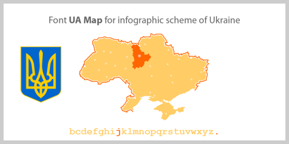
- UA Map by 2D Typo,
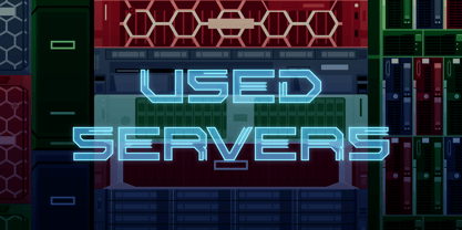
$- - Used Servers by AltaTech,
$17.99Jump back to the future with both faces of the Used Servers family. This blocky titling font comes ready with ligatures and diacritics for all of your English, French, and German retro-future needs. Art Deco density combines with subtly-weighted horizontals for a slight 3D effect. As a retro omni-technical font with roots in OCR and n-segment displays, Used Servers is equally at home as: Titling in an 80s cassette-punk text adventure Environmental advertising in a cyberpunk megalopolis Art Deco filigree worked into a sacred orb Glyphs holding secrets from before time


