9,382 search results
(0.051 seconds)
- Song Sheet JNL by Jeff Levine,
$29.00 Sheet music for the 1930s song "Josephine" had its title hand lettered in a simple, bold sans design that is recreated in Song Sheet JNL. This bold sans is perfect for titling wherever strong emphasis is necessary.
 - Mr Eaves Modern by Emigre,
$59.00 Mr Eaves is the often requested and finally finished sans-serif companion to Mrs Eaves, one of Emigre’s classic typeface designs. Created by Zuzana Licko, this 2009 addition to the Emigre Type Library expands the versatility of the original Mrs Eaves with two complimentary families: Mr Eaves Sans and Mr Eaves Modern. Mr Eaves was based on the proportions of Mrs Eaves, but Licko took some liberty with its design. One of the main concerns was to avoid creating a typeface that looked like it simply had its serifs cut off. And while it matches Mrs Eaves in weight, color, and armature, Mr Eaves stands as its own typeface with many unique characteristics. The Sans version relates most directly to the original serif version, noticeably in the roman lower case letters a, e, and g, as well as in subtle details such as the angled lead in strokes, the counter forms of the b, d, p, and q, and the flared leg of the capital R, the tail of the Q. The distinctly loose-fitting letter spacing of Mrs Eaves was applied also to the Sans version. This, together with generous built-in line spacing due to a small x-height and extended ascenders and descenders, renders the same kind of lightness and airiness when setting text that is so characteristic of Mrs Eaves. Deviations from the original Mrs Eaves are evident in the overall decrease of contrast, as well as in details such as the flag and tail of the f and j, and the finial of the t, which were shortened to maintain a cleaner, sans serif look. And the lower case c had to be balanced out differently after it lost its top ball terminal. And with the loss of serifs, Mr Eaves set width is slightly narrower. Mr Eaves Italic also carries over many forms from its Mrs Eaves model, most notably the v, w, and z, which are unusually flamboyant for a sans italic design. It also utilizes lead in and terminal tails that are reminiscent of the serif italic. The biggest departure here is the width of the characters. The extra narrow gauge and delicate features seemed more appropriate for the Serif than the Sans. To allow for a comfortable fit, Mr Eaves Italic has a more robust design and wider character width. Meanwhile, the Modern family provides an overall less humanistic look, with simpler and more geometric-looking shapes, most noticeably in the squared-off terminals and symmetric lower case counters. This family has moved furthest from its roots, yet still contains some of Mrs Eaves’ DNA. The Modern Italic is free of tails, and overall the Modern exhibits more repetition of forms, projecting a cleaner look. This provides stronger differentiation from the serif version whenever a more contrasting look is desired. Each version (Sans and Modern) contains its own set of alternates providing unique options for applications such as headlines, word logos, letterheads, pull quotes, and other short text settings. Both the Sans and Modern come in six weights. The simpler forms of a sans-serif provide the opportunity of more weights than do serif letter forms, which are more complex in structure, making it difficult to accommodate additional weight without distortions. Regular and Bold match the original Mrs Eaves weights, while the Heavy provides an additional weight for extra emphasis.
 - Mr Eaves Sans by Emigre,
$59.00 Mr Eaves is the sans-serif companion to Mrs Eaves, one of Emigre’s classic typeface designs. Created by Zuzana Licko, this 2009 addition to the Emigre Type Library expands the versatility of the original Mrs Eaves with two complementary families: Mr Eaves Sans and Mr Eaves Modern. Mr Eaves was based on the proportions of Mrs Eaves, but Licko took some liberty with its design. One of the main concerns was to avoid creating a typeface that looked like it simply had its serifs cut off. And while it matches Mrs Eaves in weight, color, and armature, Mr Eaves stands as its own typeface with many unique characteristics. The Sans version relates most directly to the original serif version, noticeably in the roman lower case letters a, e, and g, as well as in subtle details such as the angled lead in strokes, the counter forms of the b, d, p, and q, and the flared leg of the capital R, the tail of the Q. The distinctly loose-fitting letter spacing of Mrs Eaves was applied also to the Sans version. This, together with generous built-in line spacing due to a small x-height and extended ascenders and descenders, renders the same kind of lightness and airiness when setting text that is so characteristic of Mrs Eaves. Deviations from the original Mrs Eaves are evident in the overall decrease of contrast, as well as in details such as the flag and tail of the f and j, and the finial of the t, which were shortened to maintain a cleaner, sans serif look. And the lower case c had to be balanced out differently after it lost its top ball terminal. And with the loss of serifs, Mr Eaves set width is slightly narrower. Mr Eaves Italic also carries over many forms from its Mrs Eaves model, most notably the v, w, and z, which are unusually flamboyant for a sans italic design. It also utilizes lead in and terminal tails that are reminiscent of the serif italic. The biggest departure here is the width of the characters. The extra narrow gauge and delicate features seemed more appropriate for the Serif than the Sans. To allow for a comfortable fit, Mr Eaves Italic has a more robust design and wider character width. Meanwhile, the Modern family provides an overall less humanistic look, with simpler and more geometric-looking shapes, most noticeably in the squared-off terminals and symmetric lower case counters. This family has moved furthest from its roots, yet still contains some of Mrs Eaves' DNA. The Modern Italic is free of tails, and overall the Modern exhibits more repetition of forms, projecting a cleaner look. This provides stronger differentiation from the serif version whenever a more contrasting look is desired. Each version (Sans and Modern) contains its own set of alternates providing unique options for applications such as headlines, word logos, letterheads, pull quotes, and other short text settings. Both the Sans and Modern come in three weights. The simpler forms of a sans-serif provide the opportunity of more weights than do serif letter forms, which are more complex in structure, making it difficult to accommodate additional weight without distortions. Regular and Bold match the original Mrs Eaves weights, while the Heavy provides an additional weight for extra emphasis.
 - KG Why You Gotta Be So Mean by Kimberly Geswein,
$5.00 Tall, chunky title-friendly sans serif capitals.
 - Brams by La Boîte Graphique,
$21.00 Funny font designed for use in titles.
 - Cooper Black by URW Type Foundry,
$89.99Cooper Black The Cooper Black font should be used in display sizes only. Cooper Blacks serifs are rounded and the counters are small. Cooper Black was designed by Oswald B. Cooper for Barnhart Brothers & Spindler in 1921 for advertising and posters. The capital O and Q of the Cooper Black font are tilted back; in the lowercase, the dot on the I and j become elliptical. The extra bold Cooper Black font has a remarkable personality and reproduces well in sizes over 18 point in titles, subheadings and generally short sentences. - Occam by Veil of Perception,
$20.00 Occam is an informal calligraphic script face. The letter forms were drawn and constructed rather than penned or brushed but reflect a definite flat pen influence. The ascenders and descenders incorporate an abstract implied loop form. Some curves that would normally be round are pointed and some transitions that would normally be sharp and pointed have been made round. A few exit strokes curve back instead of moving up and out for a little different look. This font could be put to good use as a contrasting style combined with sans and serif faces in applications such as newsletters, brochures, invitations and annual reports. It could be used for heads, subheads, pull quotes, drop caps and as a title font for covers.
 - Inkarus by Scratch Design,
$10.00 Introducing Inkarus a playful font with a bold and all uppercase characters style. This font is perfect for posters designs, packaging, logotype, title, label, print ads, gift card, magazine title, movie title, sign, and the beautiful and curvy shape will give your designs that alternative look to your creative work looks innovative. Amazing curvy was hand-drawn and make the outlines look irregular and beautiful. This font has a lot of hand-lettered looks and the characters give a retro or urban feel. Inkarus has a serif style but can collaborate with sans-serif style together because the modern bold sans serif typeface has been the alternatives and ligatures of this font. Combine that bold shapes together will make your work a more unique, retro attitude. Ligatures Inkarus has 32 ligatures that you can turn on via the glyphs panel in Adobe applications. The ligatures make a innovative difference in the look of this font. It switches out between serif and sans serif styles that make your designs look still unity. Opentype The Alternatives and Ligatures use OpenType features. First, you will need a design app to access these options an application such as Adobe Photoshop, Illustrator, or InDesign. Alternatives All lowercase a,d,e,h, I, j,k,l,m,n, p,r, t, r you can switch out letters for other and makes your design look more like hand-lettering and innovative although you using in a repetitive way. Inkarus font includes; All uppercase characters 32 ligatures option Support for multi-languages characters Punctuation, Symbols, and Numbers Alternative lowercase characters ( a,d,e,h, I, j,k,l,m,n, p,r, t, r ) The font format is OTF So what you are waiting for? Grab it fast this font and make your innovative design. If you have any questions drop me a message.
 - Duck Soup NF by Nick's Fonts,
$10.00A 1928 poster by Italian designer Neri Nanetti for Snob Cognac provided the inspiration for this attention-getting offering, named after one of the Marx Brothers' most memorable movies. Both versions of this font include the complete Latin 1252 and CE 1250 character sets, with localization for Romanian and Moldovan. - Lonestar Western by FontMesa,
$25.00Lonestar Western is a revival of the old classic slab serif font named Hellenic which was very popular in the middle to late 1800s. While watching an old western movie the opening credits caught my attention, it was the Hellenic font with spurs added which gave it a more western look. - Checkout by Hanoded,
$15.00 Checkout is a fat, slightly cursive, poster font. It was modeled after 'clearance sale' signs and a 1950 Mexican movie poster for Los Olvidados (directed by Luis Buñuel). Checkout can be used for headlines, posters and, of course, for your clearance sale! Comes with a hard-to-beat amount of diacritics.
 - Stranger Creature by Putracetol,
$22.00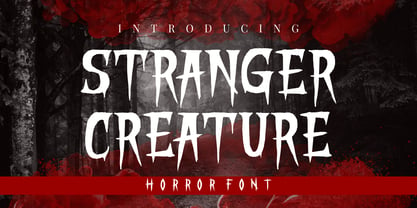 Stranger Creature is a horror style display font. Inspired from horror and thriller movies, this font is designed for Halloween, horror, thriller and scary theme projects. Stranger Creature would be perfect for logos, quotes, apparel, comics, book covers, cards, posters, or anything that requires a horror or scary look to it.
 - Endless Sixties JNL by Jeff Levine,
$29.00 Sunny summer days, white sand beaches and radical waves come to mind with Endless Sixties JNL, inspired by a poster for a surfing movie entitled "Planet Aura". The image of the poster was provided by Gene Gable, who has on many occasions supplied Jeff Levine with many interesting font inspirations.
 - Parisian Playboy JNL by Jeff Levine,
$29.00 Sheet music for the song "My Ideal" (from the 1930 Paramount picture "Playboy of Paris" starring Maurice Chevalier) had the name of the movie hand lettered in an Art Deco, Broadway-influenced type design. This became the inspiration for Parisian Playboy JNL, which is available in both regular and oblique versions.
 - Circus Stars by Vladislav Ivanov,
$20.00 Circus stars is Vladislav Ivanov font with a retro touch, inspired by the look of old circus and movie posters. It works well with normal size text, but it works even better for large displays, short words, or even just to incorporate a few or single characters in a design.
 - Ridgewood JNL by Jeff Levine,
$29.00 While watching a movie filmed on location in New York, one scene stood out with a classic neon sign for a neighborhood restaurant. Ridgewood JNL is based on the lettering from that sign, and emulates many of the Art Deco elements that was so unique to sign work of the day.
 - Space Journey by Vozzy,
$10.00 Introducing retro sci-fi label font duo named Space Journey. This display font is inspired by movie posters from the 60s and 70s. Font family has two styles: Regular and Rough. This font will look good on any retro sci-fi styled designs like a poster, T-shirt, label, logo, etc.
 - Ninja Hirosi by Yoga Letter,
$16.00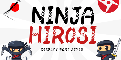 "Ninja Hirosi" is a very unique and cute display font. This font is equipped with uppercase, lowercase, numerals, punctuation, and multilingual support. Very suitable for comics, book titles, promotions, business branding, stickers, banners, branding, logos, film titles, and others.
 - Anabela Christmas by Yoga Letter,
$20.00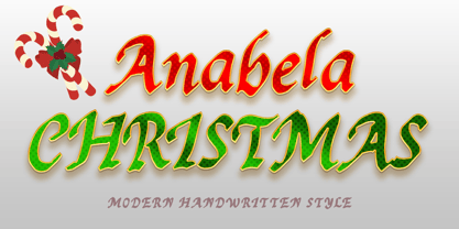 "Anabela Christmas" is an elegant handwritten font. This font is equipped with uppercase, lowercase, numerals, punctuation, and multilingual support. Very suitable for business branding, Christmas, Christmas invitations, weddings, Halloween, logos, film titles, book titles, posters, banners, stickers, and others.
 - Santa Display by Yoga Letter,
$18.00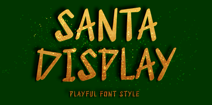 "Santa Display" is a unique and cute display font. This font is equipped with uppercase, lowercase, numerals, punctuation, and multilingual support. Very suitable for Christmas, weddings, birthdays, engagements, posters, branding, stickers, logos, tattoos, book titles, film titles, and others.
 - Sparose by Dhan Studio,
$21.00 Sparose fonts is handwritten specifically designed to get texture, also have ligature and beautiful Swash. Suitable for use in design titles such as invitations, signboards, book titles, stationery designs, quotes, branding, logos, greeting cards, packaging designs, posters, and more.
 - BK Bird by Konst.ru,
$10.00 Font for names, logotypes, titles, headers, topics etc.
 - Kermel by La Boîte Graphique,
$25.00 Handwriting font. Usage recommendations: Title, short text, logo.
 - Dynasty by Device,
$39.00 Dynasty is an extensive and versatile family that exploration and modernisation of the typographic quirks associated with the 'American Gothic' type school (in much the same way as English Grotesque was an exploration of Gill/Johnston idea-space) and adds chamfered elements to dots and tails to emphasise and extend the early machine-made aesthetic. Elegantly clean and readable at headline and small text settings, where (as with all fonts in small sizes) the introduction of tracking will improve legibility.
 - Brightown by MJB Letters,
$24.00 Introducing Brightown, our latest font creation that seamlessly blends authenticity with a contemporary signature style. Crafted to emulate natural hand strokes, this font exudes a casual yet refined demeanor. With additional features such as ligatures, alternates, tail swashes, and underline swashes, 'Brightown' offers a versatile toolkit for creative expression. Ideal for branding, signatures, posters, packaging, stationery, and beyond, this font elevates your design projects with a touch of personalized elegance. Step into a world where your typography speaks volumes – embrace 'Brightown.'
 - Lethbridge by Factory738,
$15.00 Introducing Lethbridge a luxury handwritten font with a personal touch. Lethbridge script is ideal for a variety of projects that require a handwritten touch, such as branding and logo designs, wedding invitations and stationery, social media posts and advertisements. Lethbridge Script (Regular, Caps, and Tails) Basic Latin A-Z and a-z Numerals & Punctuation Stylistic Ligatures Multilingual Support for ä ö ü Ä Ö Ü … OTF file format Free updates and feature additions Thanks for looking, and I hope you enjoy it.
 - Aquawax Pro by Zetafonts,
$39.00 Aquawax Pro PDF Specimen Aquawax Graphic Project on Behance Created as a custom brand typeface in 2008 by Francesco Canovaro, Aquawax is one of Zetafonts most successful typefaces - having been chosen, among the others, by Warner Bros for the design of the logo for the Aquaman movie. Its logo design roots are obvious in the design details, from the blade-like tail of the Q and the fin-like right leg of the K to the intentionally reversed uppercase W, as well as the rounded edges softening the stark modernist lettershapes. While this details make the typeface extremely suitable for logo and display design, especially in the bolder weights, the open, geometric forms of the letters and a generous x-height make it extremely readable at small sizes, making it perfect for body text and webfont use. In 2019 the family was completely redesigned by the Zetafonts team, expanding the original glyph set to include Cyrillic and Greek and adding three extra weights and italics to the original six weights, for a total of 27 weights (including 9 pictograms). The restored and revamped version, named Aquawax Pro, also includes full Open Type features for Positional Figures, Stylistic Alternates, Discretionary Ligatures and Small Caps, and adds to the typeface new alternate glyph shapes, accessible as Stylistic Alternates. Optimized for maximum screen readability, it covers over 200 languages that use the Latin, Cyrillic and Greek alphabet, with full range of accents and diacritics.
 - Cute Dog by Yoga Letter,
$15.00 "Cute Dog" is a display font with decorative bones, dog heads, and dog paws. This font is equipped with lowercase, uppercase, numerals, punctuation, and multilingual support. Suitable for posters, business branding, logos, banners, stickers, magazine titles, film titles, and more.
 - Kigelio by Ivan Rosenberg,
$15.00 KIGELIA is a stylish display serif font inspired by fashion magazines and romance. It is great for short headlines and titles, but it looks great in advertising, vintage mood board, branding, logotypes, packaging, titles, editorial design and modern and vintage design.
 - Morque by Craft Supply Co,
$20.00 Morque – Sans Serif Font: Bold and Expressive Boldness in Every Letter: Morque – Sans Serif Font stands out with its all caps design. It’s perfect for impactful titles and displays. This font commands attention in any visual space. Ideal for Titles and Displays: Morque’s bold structure makes it ideal for titles and visual displays. It enhances the readability of headlines. This font is a go-to for designers aiming for a strong statement.
 - Screenplay JNL by Jeff Levine,
$29.00Screenplay JNL was modeled from the signage seen in an old photo of the RKO movie studios building circa the 1930s. This multi-line lettering is so classic of the Art Deco period. For best effect and readability, use wider spacing between letters. For single words or initials, regular spacing should do fine. - Theater Lobby JNL by Jeff Levine,
$29.00 A vintage photo (circa 1950s) taken outside one of the movie houses owned at the time by Miami-based Wometco Theaters showed a small hand lettered sign with the word “Wometco” painted in a stylized Art Deco alphabet. This inspired Theater Lobby JNL, which is available in both regular and oblique versions.
 - Flirtation Walk JNL by Jeff Levine,
$29.00 Flirtation Walk JNL was inspired by the lettering on the covers of sheet music for songs taken from the 1934 Dick Powell-Ruby Keeler movie "Flirtation Walk". The typeface features some stylized characters as well as the more familiar Art Deco character designs, and is available in both regular and oblique versions.
 - Self Promotion JNL by Jeff Levine,
$29.00 The July 26, 1934 of the movie industry trade paper The Film Daily contained an ad for Paramount promoting its most recent releases. Hand lettered in an ultra bold Art Deco sans serif style, it was the working model for Self Promotion JNL, which is available in both regular and oblique versions.
 - Serif Formal Oblique JNL by Jeff Levine,
$29.00 An advertisement in a 1936 issue of “The Film Daily” for the movie “Mr. Deeds Goes to Town” had much of its copy set in an extrabold typeface similar to the Beton/Stymie/Karnac group of slabserif designs. This is now available digitally as Serif Formal JNL in both regular and oblique versions.
 - Natural Born Designer by Fonts of Chaos,
$10.00 True bold font, only available in uppercase but with different styles. This font of 106 characters is really easy to use in your design and takes his inspiration from the old school post graffiti. The name comes from the movie "Natural Born Killers" by Oliver Stone. UPPERCASE lowercase Numerals Punctuation 106 characters
 - Dynatomic by PintassilgoPrints,
$24.90 A vigorous typeface suited for bold designs, Dynatomic is inspired by an amazing hand-drawn lettering of a 1964 polish movie poster designed by Andrzej Krajewski. It's a very eye-catching typeface that works surprisingly well even at not-so-big sizes, making it a great choice for a wide range of applications.
 - Caliny by Marc Lohner,
$21.00 This cheerful font family combines cuteness and fun, making it a great choice for any kid’s app, book, toy, packaging, movie, theme park and so much more. Caliny’s curves are drawn with care and love. It covers more than 200 languages and has some advanced typographic features, like case sensitive forms to offer.
 - Film Critic JNL by Jeff Levine,
$29.00 An ongoing movie review column known as the "Critic's Forum" (such as was found in the May 23, 1936 issue of The Film Daily) had a simple Art Deco monoline hand lettering of the column's name. Redrawn digitally as Film Critic JNL, this typeface is now available in both regular and oblique versions.
 - Lichtspiele by Typocalypse,
$29.00 Cinemas from the early 20th century are called “Lichtspiele” in Germany. “Lichtspiele” transports you back to a time where neon lights and marquee letters decorated cinema façades. Of the five styles, three have two versions of italics — the left-leaning italic evokes looking up from lower-left, the right-leaning italic is as if we are looking from lower-right. Display is the basic style, while Neon is inspired by the old neon letters found outside cinemas. Try placing Neon Outline on top of Display or Neon to add another layer to your artwork. Neon 3D is a extruded version of Neon. The Screen Credits style is based on the notes — producers, cast, crew and so on — on movie posters. Get more out of life, go out to a movie.