10,000 search results
(0.033 seconds)
- Cursed Stone by Ditatype,
$29.00Cursed Stone is a spine-chilling display font that will transport your designs to a realm of dark enchantment. Designed in large letters and with a bold weight, this typeface demands attention and exudes an aura of haunting mystery. Each letter is meticulously crafted with eerie stone texture details, adding an ominous and cursed touch to the font. The large size of the letters enhances the font's imposing presence, making it impossible to ignore. The stone texture details in each letter of this font bring an authentic and sinister feel, as if the font was chiseled from the depths of an ancient cursed monument. These haunting details add an element of mystique and darkness, immersing the viewer into a world of malevolent enchantment. The combination of bold weight and stone texture gives Cursed Stone a rugged and formidable look, evoking images of cursed relics and forbidden ruins. The letters appear to hold secrets from the past, carrying a haunting energy that captures the imagination. For the best legibility you can use this font in the bigger text sizes. Enjoy the available features here. Features: Alternates Multilingual Supports PUA Encoded Numerals and Punctuations Cursed Stone fits in headlines, logos, movie posters, flyers, invitations, branding materials, print media, editorial layouts, headers, and any horror-themed project. Find out more ways to use this font by taking a look at the font preview. Thanks for purchasing our fonts. Hopefully, you have a great time using our font. Feel free to contact us anytime for further information or when you have trouble with the font. Thanks a lot and happy designing. - Moonlight And Wine by The Gelato,
$12.00The Moonlight & Wine Font is a Handwritten Monoline Font that is perfect for the Neon effect! It can be used as a Neon Handwritten Script Font, Monoline Script Font, Signature Script Font, Summer Handwriting Font, Neon Party Font, Neon Signboard Font, Neon Banner Font, Neon Font for Party Invitations, DJ Logo Font, Y2K Neon Font, Neon Sign Font, Neon Light Font, Neon Wedding Font Perfectly suitable for numerous use such as quotations, banners, logos, product packaging, titles, headers, Business cards, menu lists, and invitation cards! _________________________________ Language Support: Multilingual Support _________________________________ **The preview images are to showcase fonts only and are NOT included.** **The Font comes with a solid version. To add a NEON effect, You can use programs like Canva, Illustrator, Photoshop etc.** _________________________________ 🍦COMPATIBLE PROGRAMS (NOT LIMITED TO): Canva Pro, GoodNotes, Notability, Keynote, Pages, Numbers, Procreate, Photoshop, Illustrator, Cricut, Silhouette, InDesign, Microsoft Word, and more! ++ _________________________________ - Reo by Our House Graphics,
$9.00 - Beardman Outline by Jafar07,
$10.00Beardman is a condensed sans-serif font designed specifically for bold and powerful headlines and titles. With four variants available: regular, italic, regular outline, and italic outline, this font allows you to express yourself with a style that suits your design project. The name "Beardman" is inspired by the meaning of a man who is masculine but has a soft heart, and it is reflected in the font's design. With strong and sturdy letterforms, the font also has a gentle and smooth touch that gives an elegant and modern impression. With its strong and expressive appearance, "Beardman" is suitable for use in graphic design projects such as posters, brochures, magazines, websites, and much more. Add a touch of masculine yet gentle to your design with the "Beardman" font. What did you get? Regular, Italic, Regular Outline & Italic Outline Alternates & Ligatures Numbers & Punctuation Multilingual Support Works on PC & Mac Simple Installations - Desmo by Craft Supply Co,
$20.00Introducing Desmo Reversed Contrast Slab Serif Font Unique Design Meet Desmo Reversed Contrast Slab Serif Font. Its reversed contrast sets it apart. Thick horizontal lines and thin verticals create a striking look. This design choice grabs attention, perfect for impactful displays Versatile Display Font Desmo shines in display settings. Whether for headlines, posters, or advertising, it stands out. Its bold features ensure readability from a distance. Moreover, its unique style makes every design engaging. Engaging Typography Desmo’s typography is designed to captivate. Its slab serifs add a touch of elegance. The font’s balanced spacing ensures clarity in every word. Therefore, it’s ideal for brands aiming to make a statement. Accessibility and Ease of Use This font is accessible to a wide range of users. Its simplicity avoids complex vocabulary. Easy to install and use, Desmo suits various design projects. Additionally, its compatibility with multiple software enhances its versatility. - Beardman by Jafar07,
$10.00Beardman is a condensed sans-serif font designed specifically for bold and powerful headlines and titles. With four variants available: regular, italic, regular outline, and italic outline, this font allows you to express yourself with a style that suits your design project. The name "Beardman" is inspired by the meaning of a man who is masculine but has a soft heart, and it is reflected in the font's design. With strong and sturdy letterforms, the font also has a gentle and smooth touch that gives an elegant and modern impression. With its strong and expressive appearance, "Beardman" is suitable for use in graphic design projects such as posters, brochures, magazines, websites, and much more. Add a touch of masculine yet gentle to your design with the "Beardman" font. What did you get? Regular, Italic, Regular Outline & Italic Outline Alternates & Ligatures Numbers & Punctuation Multilingual Support Works on PC & Mac Simple Installations - Hawkes by Kimmy Design,
$15.00Hawkes is an extensive handmade typeface family that comes with a bundle of weights, widths and styles, all designed to work cohesively. Here is a breakdown of the Hawkes family. Hawkes Sans: The primary subfamily is a sans-serif typeface that includes nine fonts: three weights (light, medium and bold) and three widths (narrow, regular and wide). Within this set are an array of stylistic features; including small capitals, character style alternatives, discretionary ligatures and contextual alternatives. See details below for more information on OpenType Features. Hawkes Variable Width Sans: The secondary subfamily is the same base sans-serif fonts but combined in variating widths. Essentially, it takes all three widths of each weight and randomly mixes them together. This creates a funky and creative alternative to the more traditional sans-serif set. The variations are for the uppercase, lowercase, small capitals, ligatures and numbers. Hawkes Script: The last subfamily is the script typeface. It’s a quirky script with variations of its own, including ligatures, swashes and contextual alternatives (again, see below for further details.) The script font works great as a complimentary style to the sans-serif, or on it’s own. FEATURES Alright, let’s get into all the extra goodies this typeface has to offer. Small Capitals: Small caps are short capital letters designed to blend with lowercase text. These aren’t just capital letters just scaled down but designed to fit with the weight of both the lowercase and capitals. With Hawkes, small caps can either sit on the baseline (in line with the base of the capital and lowercase) or to be lifted to match the height of the capital letters by applying the discretionary ligature setting in the OpenType panel. These small capitals have a dot underlining them that sit along the baseline. The feature offers a unique display affect that is great for logos, titles and other headline needs. Discretionary Ligatures: A discretionary ligature is more decorative and unique combination than a standard ligature and can be applied at the users discretion (as the name indicates.) The specific styling for these ligatures varies for different fonts. With Hawkes, they are used as an all capital styling feature, or to lift the small capitals to align with the height of the capitals. In the former setting, both lowercase and uppercase letters are first changed to all capitals, then a specialized set of letter combinations are transitioned so small characters are positioned within a main capital letter. These combinations only happen with main characters that include an applicable stem, such as C F K L R T Y. Some of these combinations include two or three characters. When Small Caps is turned ‘on’, this feature will lift the small caps to the height of the capital letter. For more information, please check out the user guide! Stylistic Alternatives: Stylistic alternates are a secondary form of a character, often used to enhance the look or style of a font. For Hawkes, these alternatives provide a slightly more handmade feel. A - the capital and small capital A will lose its pointed apex and become rounded. Think of it more as an upside-down U than an up-side-down V ;-) Oo, G, Ss, Cc- these characters’ topmost terminal becomes a loop. The O is applied automatically, the G S and C need to be turn on individually. Titling Alternatives: This feature does sort of the opposite of what it intends. Instead of being used for titling purposes, this feature makes the text look better in paragraph text settings. Kk Rr h n m - curved terminals on the are straightened e - the counter stroke also gets straightened from a more looping motion y - the shape of y is changed from a rounded character to a sharper apex (think more like a ‘v’ than ‘u’) Contextual Alternatives: Contextual alternates are glyphs designed to work within context of other adjacent glyphs. With Hawkes Sans, there are three slightly different variations per character. The feature rotates the application of each variation. This helps with organic authenticity, so if you have two e’s next to each other, they won’t look identical (reflecting the natural variations in handwriting and lettering.) With Hawkes Variable width fonts, I have created a contextual pattern that randomizes the widths of each character. So, when the feature is turned ‘on’ in the OpenType panel, the widths would alternate in a pattern such as: Narrow, Wide, Regular, Narrow, Regular Wide, Narrow, etc. It happens automatically so the user doesn’t have to think or worry about getting a random seed. With Hawkes Script, contextual alternates allow strokes to connect properly from one character to the next while maintaining a believable, natural flow. Connecting strokes are present for two letters next to each other but are replaced by a shorter stroke when located at the end of a word or sentence. Some characters have in-strokes when located at the start of a word. When a character is preceded by a capital letter that doesn’t connect, it too needs an in-stroke or altered spacing. This feature is complicated and messy, but luckily you don’t really have to think about it! I’ve done all the coding so all you have to do is turn ‘on’ the feature in the OpenType panel and you are off to the races! I’m just letting you know what’s happening behind the scenes. Swashes: These are just for Hawkes Script and provide tail swashes to the start and ends of letters. There are three different options. You can pick the basic option by turning ‘on’ the swash feature in the OpenType panel, or you can pick using the Glyph panel. Stylistic Sets: This feature work in new versions of Illustrator CC and InDesign CC. You can pick specific styling sets instead of turning on an entire feature. For example, let’s say you want to have a loopy S, but not a loopy C or O, you can just turn on the S in the Style Set. It also helps create the little drop box that pops up when you hover over a character, showing you the alternates associated with that character. This makes it easy to pick and choose specific styles you want in a word or headline. ---------- And there it is folks! That’s all the basic info on Hawkes, I know it’s been a lot and I appreciate you hanging on. If you are like me and need more of a visual reference to accessing all these goodies, I’ve made a user guide to help navigate Hawkes and everything it has to offer. Altogether this extensive family boasts 14 total fonts in a wide array of styles, weights and widths, making it a great addition to any handmade type collection. Enjoy! - Kungfu Brush by Ditatype,
$29.00Kungfu Brush is a captivating game-themed display font designed in uppercase, infusing the essence of martial arts and the artistry of brush strokes. It features a distinct brush-style accent that brings a sense of handcrafted artistry to each letter. Inspired by the fluid movements of martial arts, the font captures the energy and elegance of brush strokes. This unique feature adds a touch of creativity and authenticity, making this font stand out from conventional display fonts. Designed with fairly low contrast, Kungfu Brush prioritizes a balanced and harmonious visual experience. The subtle differences in stroke width across the letters create a smooth and comfortable reading experience. With its uppercase design, Kungfu Brush exudes power and strength. Each letter commands attention and showcases the boldness of martial arts. The font's uppercase style adds a sense of authority and captures the spirit of determination found in the martial arts realm. You can also enjoy the available features here. Features: Multilingual Supports PUA Encoded Numerals and Punctuations Kungfu Brush fits in headlines, logos, posters, titles, branding materials, print media, editorial layouts, website headers, and any projects that aim to capture the essence of combat, adventure, and discipline. Find out more ways to use this font by taking a look at the font preview. Thanks for purchasing our fonts. Hopefully, you have a great time using our font. Feel free to contact us anytime for further information or when you have trouble with the font. Thanks a lot and happy designing. - Treacherous by Comicraft,
$29.00Midnight, Pacific Coast Highway. You're driving home alone at night and your battery's dying. Your headlights have dimmed and you can barely see the road or the signpost up ahead. But there's an eerie green light glimmering in your rear view mirror and that strange warning uttered by the pump attendant at the Devil's Elbow gas station has put the frighteners on you. Is that Satan's face glowering at you through the mist, or something far worse? The only way to handle this font is with one foot on the gas pedal and one foot on the brake. Originally designed by John Roshell for GAMBIT titles, this sharp font has appeared on vampire & rock magazine covers, Star Wars & Star Trek merch, and the logo for the INHUMANS comic & TV show! - Coestral by Nathatype,
$29.00Coestral is a captivating capital serif font designed with elegance and a touch of interconnected charm. Each letter is meticulously crafted to exude sophistication without being overly heavy, creating a harmonious and visually pleasing appearance. The capitalized letterforms of this font showcase clean lines and refined serifs, striking the perfect balance between elegance and readability. The font's moderate weight ensures a versatile and adaptable design, making it suitable for a wide range of creative projects. What sets Coestral apart is its subtle yet delightful feature of connected letters. Some letters are gracefully linked, creating a seamless and flowing look that adds a touch of uniqueness and artistic flair. This interconnected style adds a sense of continuity and grace to the font, enhancing its overall elegance. On the other hand, its legibility and graceful appearance ensure that it makes a bold statement without overwhelming the viewer. Enjoy the available features here. Features: Ligatures Multilingual Supports PUA Encoded Numerals and Punctuations Coestral fits in headlines, logos, posters, flyers, invitations, greeting cards, branding materials, print media, editorial layouts, website headers, and many more. Find out more ways to use this font by taking a look at the font preview. Thanks for purchasing our fonts. Hopefully, you have a great time using our font. Feel free to contact us anytime for further information or when you have trouble with the font. Thanks a lot and happy designing. - Hostrange by Ditatype,
$29.00Hostrange is a captivating handwritten font that brings a touch of authenticity and personality to your designs. With its brush-style letterforms and varying brush stroke thicknesses, this typeface captures the essence of handcrafted charm. The special feature of this handwriting lies in its dynamic brush stroke variations, where each letter showcases a range of thicknesses. This adds a sense of organic movement and visual interest to the font, mimicking the natural variations found in hand-drawn brush calligraphy. The result is a font that feels alive and full of character. The brush strokes create a natural and flowing appearance, as if they were crafted by hand with a brush. The varying thicknesses add depth and dimension, enhancing the font's authenticity and handcrafted feel. The letterforms of Hostrange strike a balance between legibility and artistic expression. While each letter maintains its distinctive shape, the varying brush stroke thicknesses bring a sense of uniqueness to each character. Features: Alternates Ligatures Multilingual Supports PUA Encoded Numerals and Punctuations Hostrange fits in headlines, logos, posters, invitations, packaging, branding materials, or any project that calls for a handwritten aesthetic. Find out more ways to use this font by taking a look at the font preview. Thanks for purchasing our fonts. Hopefully, you have a great time using our font. Feel free to contact us anytime for further information or when you have trouble with the font. Thanks a lot and happy designing. - Stengkol by Viaction Type.Co,
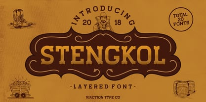
$10.00Stengkol Font Family of 20 fonts and 1 font cowboy illustration. Slab serif with various font styles with layered fonts. It's easy to use various fonts in one design and combined with cowboy illustrations. Stengkol Font Family comes with: - Uppercase. - Lowercase. - Numerals. - Punctuation. - Multilingual. Stengkol Font Family is perfect for t-shirt designs, merchandise, posters, qoute, tickets, logotype and other designs. Thanks. - Phantom Urbanism Graffiti by Sipanji21,
$22.00"Phantom Urbanism" is a monoline font with a monoline graffiti theme and an option with stylistic set with arrow effect to add depth and decoration to the font. It is perfect for a wide range of urban or street-themed design projects, such as streetwear design, logo design, car/motosport decals, skateboard decals, and other similar designs. With its edgy and bold appearance, "Phantom Urbanism" brings a sense of energy and attitude to your designs. The font's monoline style and arrow effect optional to adds visual interest and makes your designs stand out. Whether you're looking to create a strong and impactful design or add a touch of urban style to your projects, "Phantom Urbanism" is the font for you. - Street Of Exodus by Sipanji21,
$18.00"Street of Exodus" is a monoline font with a graffiti theme and a slight shadow effect to add depth and decoration to the font. It is perfect for a wide range of urban or street-themed design projects, such as streetwear design, logo design, car/motosport decals, skateboard decals, and other similar designs. With its edgy and bold appearance, "Street of Exodus" brings a sense of energy and attitude to your designs. The font's monoline style and slight shadow effect create a 3D effect that adds visual interest and makes your designs stand out. Whether you're looking to create a strong and impactful design or add a touch of urban style to your projects, "Street of Exodus" is the font for you. - Bostvina by Aluyeah Studio,
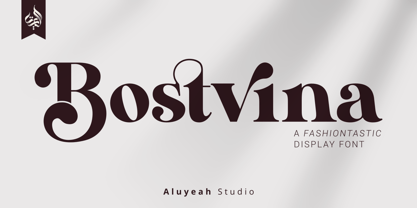
$110.00Bonjour! Bostvina is a fashiontastic display font. This font was carefully crafted and inspired by one of leading fashion brand in the world. In general, it creates a luxurious and elegant look in design. Coming to you with 90+ luxury alternate to create a perfectly beautiful, classy, chic, elegant, glamorous and luxurious design. Use this font for your fashion brand, resort, cosmetics, invitations, wedding, branding, packaging, magazines, boutique, social media, restaurant, spa, greeting cards, headers, headline and many more. Features: OpenType support Multilingual support (15 languages) PUA Encoded Super Easy to Use alternates - It's OpenType support but you can easly call alternates character using special combination like A.2 B.4 D.3 etc so you dont need special software - Egal by Koral Creative,
$30.00Introducing EGAL, the highly sophisticated and premium font inspired by the symbol of equality, the equals sign (=). Meticulously crafted with the utmost attention to detail, EGAL is the epitome of luxury typography, perfect for elevating your brand's image. Egal is a contemporary display font inspired by old sans fonts, designed to provide a premium feel to any project. It is designed to fit any logo or branding project and supports over 70 languages, including Cyrillic. With 395 glyphs, Egal is the perfect choice for anyone looking to add a stylish and sophisticated touch to their project. The word "egal" itself is derived from the French word for "equal", emphasizing the font's intent to provide a sense of balance and harmony to any project. - Stribe by Fateh.Lab,
$10.00Stribe, this is an amazing work. Why? ... because this is not just talking about fonts, but more than that, with the spirit of Street Art, stribe invites you to explore with your wild ideas, I'm sure this will really make you feel happy in creating the work that you will wake up to the front. Supported by 3 font choices that are very sweet and also strong, stribe answers all your difficulties in choosing font support that suits your taste. And the most exciting thing is, you get a free bonus vector illustration that is very detailed and also has a very strong Street Art spirit, and is made very original, so what are you waiting for, have Stribe as soon as possible. Thank You - Rozelle by Asenbayu,
$12.00Rozelle Fonts are serif fonts with rounded edges. These fonts are formed as a unique multipurpose font, you can use them in vintage, retro, and modern designs. These fonts are perfect for a variety of projects, such as branding, poster displays, logo designs, magazine covers, and more. These fonts are perfect for you who need unique serif fonts! Rozelle fonts feature opentype, kerning, and alternates packed in 4 fonts: Regular, Italic, Bold, Bold-italic. Rozelle fonts include uppercase letters, lowercase letters, numeral, punctuation and multilingual support. - Steiner - Unknown license
- Nerve Agent - Personal use only
- Old Earthy by Gustav & Brun,
$16.00Old Earthy is a hand drawn font inspired by the mid 19th-century art movement with William Morris and the Pre-Raphaelite Brotherhood in the front line. The art and the patterns from that time is reflected in Old Earthy. It comes with a set of basic English/Latin letters and some west European diacritics. - Youth Heritage by Heyfonts,
$15.00Youth Heritage Font is a vintage bold script font that pays homage to the rich visual heritage associated with youthful exuberance and retro aesthetics , This typeface combines bold, expressive strokes with a script style reminiscent of classic hand-lettering from bygone eras, capturing the spirit of vintage design. Here's a detailed explanation of the key features and characteristics of the Youth Heritage Font: Features: Vintage Aesthetics: The Youth Heritage Font is designed to evoke a sense of nostalgia, drawing inspiration from vintage typography prevalent during the mid-20th century, Its design elements reflect the bold and charismatic lettering styles associated with retro signage and advertising. Bold and Expressive Strokes: One of the defining features of this font is its bold and expressive strokes. Each letter is crafted with confidence, making a strong visual impact. This characteristic contributes to the font's ability to command attention and stand out in various design applications. Script Style: The script style of the font imparts a handwritten and personalized feel. The cursive letterforms flow seamlessly, creating a sense of dynamism and adding a touch of informality to the overall design. Distinctive Lettering: Each letter in the font is crafted with attention to detail, featuring unique and distinctive characteristics. This ensures that the font maintains its individuality and offers a distinct typographic personality. Applications: Vintage Branding: The Youth Heritage Font is well-suited for vintage branding projects. Apparel Design: Designers in the fashion industry can leverage this font for apparel branding and graphic designs. Its bold script style adds a retro flair to T-shirts, hoodies, and other clothing items, giving them a timeless and stylish appeal. Retro Signage: The bold and expressive nature of the font makes it a perfect choice for retro signage and display purposes. Event Posters and Flyers: When designing promotional materials for events, concerts, or parties with a vintage theme, the Youth Heritage Font can contribute to a cohesive and visually appealing poster or flyer design. Social Media Graphics: Its bold and expressive script style can make posts and announcements more engaging and shareable. - Modern Neon by Ditatype,
$29.00Modern Neon is an audacious display font that combines the allure of neon lights with an array of captivating lines. With its uppercase letterforms, this typeface commands attention, creating a visually stunning experience that leaves a lasting impression. The defining feature of Modern Neon lies in its bold and adventurous lines that adorn each letter. These radiant lines flow dynamically throughout the characters, adding an element of complexity and intrigue. The interplay of these luminous lines creates a visual spectacle, captivating the viewer's gaze and drawing them into a world of electrifying typography. Inspired by the vibrant glow of neon signs, Modern Neon exudes a futuristic energy. The font's luminosity casts a vivid hue, evoking a sense of innovation and modernity. Each letter pulsates with an otherworldly glow, creating a striking visual impact that cannot be ignored. Each letter of this font has been meticulously crafted to strike a balance between legibility and decorative intricacy. The interconnected lines add depth and movement to the characters, enhancing the overall composition without compromising readability. The result is a font that exudes creativity and boldness while ensuring your message remains clear and impactful. You can also enjoy the various features available in this font. Enjoy the various features available in this font. Features: Alternates Ligatures Multilingual Supports PUA Encoded Numerals and Punctuations The strong and bold strokes demand attention, making this font perfect for headlines, titles, and impactful statements. Whether you're creating posters, branding materials, digital artwork, or anything in between, this font will add a daring and captivating element. It particularly shines in applications related to technology, gaming, fashion, and futuristic themes. Find out more ways to use this font by taking a look at the font preview. Thanks for purchasing our fonts. Hopefully, you have a great time using our font. Feel free to contact us anytime for further information or when you have trouble with the font. Thanks a lot and happy designing. - Boisterous Script by Dhan Studio,
$15.00Boisterous is a fashionable and elegant handwriting font, which looks like a signature, This font is intentionally made with unique ligatures and alternates. Boisterous fits perfectly for branding, logos, business cards, posters, invitations, greeting cards, news, product packaging, blog posters, all including personal charms etc. This font is also equipped with unique and interesting ligatures. By using these ligatures you can give your text a real hand-lettered style: tt ss ow os on oh nn ll il et en eb ch an ak ut st oy ot ont oi nt mm in ff er el ck ar al ab wh th sh ou oo ol of ng it ht es em co at am ah - Nesora GT by Gartype Studio,
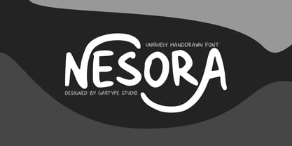
$10.00Lookin for unique logo font? we present to you Nesora, a bold handwritten font that was comes with alternates font and multilingual glyphs to easily use this uniwue logotype font Nesora is very suitable like as logo, tagline, adventure project, posters, book cover & etc.To use alternate this font just change the regular font to alternate font. - Magical Source by Java Pep,
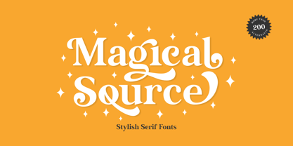
$19.00Introducing Magical Source is a stylish serif font, every character uppercase and lowercase have alternates font. This font is equipped with more than 200 alternative fonts so you can mix and match every alternate based on your taste. This font still outstanding look, although you don't switch on the alternate. Magical Source font is a versatile font, the font can covering to headlines, titles, logotype, branding, pull quotes & monograms, and etc. - Ghost Terror by Ditatype,
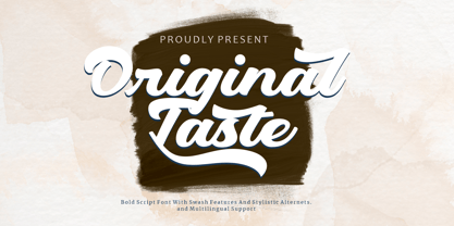
$29.00Ghost Terror is a captivating display font that will haunt your designs with an eerie allure. Designed in uppercase and bold, this typeface commands attention and exudes an aura of fear. Each letter is meticulously crafted with a rounded shape, and some have sharp edges, adding a sense of unpredictability and suspense. The haunting brush details on each letter further enhance the font's chilling theme, immersing your audience in a world of ghostly terror. With its bold weight and rounded shape, this font brings a sense of familiarity while maintaining an air of otherworldly mystery. The mix of rounded shapes and sharp edges in this font adds a dynamic contrast, giving the font an unsettling and unpredictable appearance. The letters seem to dance between the realms of the living and the undead, capturing the essence of ghostly entities that lurk in the shadows. The brush details in Ghost Terror lend a haunting and handcrafted touch, as if the letters were inscribed by spectral beings. These eerie details add a sense of craftsmanship and an element of horror, creating an atmosphere of supernatural presence. For the best legibility you can use this font in the bigger text sizes. Enjoy the available features here. Features: Alternates Multilingual Supports PUA Encoded Numerals and Punctuations Ghost Terror fits in headlines, logos, movie posters, flyers, invitations, branding materials, print media, editorial layouts, headers, and any horror-themed project. Find out more ways to use this font by taking a look at the font preview. Thanks for purchasing our fonts. Hopefully, you have a great time using our font. Feel free to contact us anytime for further information or when you have trouble with the font. Thanks a lot and happy designing. - Original Taste by Arttype7,
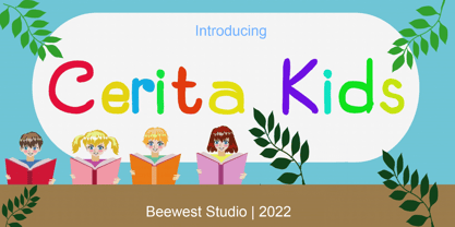
$12.00 - Cerita Kids by Beewest Studio,
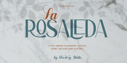
$10.00 - La Rosaleda by Mevstory Studio,
$15.00La Rosaleda Font Duo is a ligature font pair with 30 amazing chic logo templates. With this open type font duo you can explore your creativity in unlimited way. To recreate your brand all you need is mix and match from the La Rosa font duo. This font duo is full of stylish ligatures, so that your writing with La Rosaleda can stand out. - Font Features: All fonts are OpenType fonts All fonts are fully vector designed Accurate kerning for all serif family Amazing ligatures to look natural in script font Alternative characters for script lowercase alphabets Multilingual Support for Both Scrip and Serif All OpenType fonts, Serif and Script. 30 Fully editable logos for Adobe Photoshop or Adobe Illustrator Font installing help file for PC and Mac Web-fonts for Script and Serif - Couture Facile by Nathatype,
$29.00Adding some beauty touches and perfect, unique styles to your designs, without which your designs will be incomplete and ignored, may be tough work and time-consuming. Therefore, Couture Facile is here to help you. Couture Facile is a handwriting-like script font to add combinations of beauty and styles to your designs properly. Its dissimilar, more natural shapes looking spontaneously written are the font’s main characters. In addition, its letters’ details show high contrasts in curvy, sharp scratches on the letters’ edges. Couture Facile shows personal, elegant, creative impressions to the designs and is suitable to apply for either big or small text sizes due to its great legibility. You can also enjoy the available features here. Features: Stylistic Sets Ligatures Multilingual Supports PUA Encoded Numerals and Punctuations Couture Facile fits best for various design projects, such as brandings, headings, magazine covers, quotes, invitations, greeting cards, printed products, merchandise, social media, etc. Find out more ways to use this font by taking a look at the font preview. Thanks for purchasing our fonts. Hopefully, you have a great time using our font. Feel free to contact us anytime for further information or when you have trouble with the font. Thanks a lot and happy designing. - Darksame by Alit Design,
$23.00"DARK SAME" is a unique and versatile font that combines the striking and bold elements of blackletter with the elegant and refined features of a serif font. This font is perfect for anyone looking to add a touch of sophistication and style to their design projects. With over 701 characters, "DARK SAME" offers support for PUA Unicode and multilingual use. Its extensive range of alternate glyphs, ligatures, and swashes allow for endless creative possibilities and customization. The font's classic modern and beauty dark style makes it an excellent choice for various design projects, including branding, logos, invitations, book covers, posters, and more. "DARK SAME" will add a touch of timeless elegance to any project and will make your designs stand out from the crowd. Overall, "DARK SAME" is a must-have font for anyone looking for a versatile and sophisticated typeface that combines the best of both worlds: the boldness of blackletter and the elegance of a serif font. Language Support : Latin, Basic, Western European, Central European, South European,Vietnamese. In order to use the beautiful swashes, you need a program that supports OpenType features such as Adobe Illustrator CS, Adobe Photoshop CC, Adobe Indesign and Corel Draw. but if your software doesn't have Glyphs panel, you can install additional swashes font files. - Brawner by IKIIKOWRK,
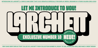
$25.00Proudly present Brawner - Y2K Liquid Font, created by ikiiko. Brawner is the ultimate Y2K font with a liquid edge, developed for the fashion-forward and streetwear trendsetters. Brawner's flowing shapes encourage movement and vitality, resulting in a visual experience as bold and edgy as the streetwear culture it embodies. The font's liquid features offer a touch of avant-garde flair, making it an ideal match for firms looking to radiate cutting-edge style and stay ahead of the fashion curve. Brawner, the Y2K font that embodies the essence of hypebeast style and current streetwear, ushers you into the future of fashion. Elevate your brand's visual identity with a typeface that speaks the language of the fashionable, pushing limits and establishing trends with each letter. This font is very suitable for making a streetwear brand, poster, magazine layout, fashion design, quotes, or simply as a stylish text overlay to any background image. What's Included? Uppercase & Lowercase Numbers & Punctuation Alternates Ligatures Multilingual Support Works on PC & Mac - SG Larchett by Studio Gulden,
$20.00SG Larchett is a stunning new sans serif font perfect for display. It features clean, elegant lines and a modern, minimalist design that is stylish and versatile. The font is characterized by its balanced proportions, uniform stroke width, and subtle variations in letterform, giving it a distinctive and sophisticated appearance. The unique features of SG Larchett make it ideal for use in a wide range of design applications, including branding, advertising, packaging, and web design. The font's clean, uncluttered lines and legibility make it easy to read even at small sizes, while its bold, striking appearance ensures that it stands out in any design. SG Larchett is a font that commands attention, yet remains understated and refined. It is the perfect choice for designers looking to make a bold statement with their typography while maintaining a sense of elegance and sophistication. Whether used in headlines, logos, or body copy, SG Larchett is a font that will impress. - AL Hermaiona by Aluyeah Studio,
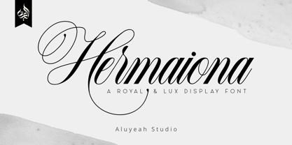
$90.00Bonjour! Hermaiona a royal and lux display font. This font was carefully crafted and inspired by luxury fashion in the world. It creates a luxurious, rich, exclusive and elegant look in design. Coming to you with 100+ rich and luxury alternate to create a perfectly beautiful, classy, rich, elegant, and luxurious design. Use this font for your luxury brand, fashion brand, resort, cosmetics, invitations, wedding, branding, packaging, magazines, boutique, social media, restaurant, spa, greeting cards, headers, headline and many more. Features: OpenType support Multilingual support (15 languages) PUA Encoded Super Easy to Use alternates - It's OpenType support but you can easily call alternates character using special combination like A.2 B.2 a.2 a.5 b.3 etc so you dont need special software You will receive: Al_Hermaiona.otf Al_Hermaiona.ttf Thanks for checking out my font. I really hope you enjoy using it! If you have any questions I'd be more than happy to answer them, just send me a message! linggarsundoro@gmail.com Stay Healthy & Stay Strong - Al Magensburg by Aluyeah Studio,
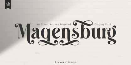
$99.00Hallo alle! Magensburg is an ethnic arches inspired display font. This font was carefully crafted and inspired ethnic arches in the world. In general, it creates a luxurious and mysterious look in design. Coming to you with 160+ stunning alternate to create a perfectly mystical, beautiful, classy, elegant design. Use this font for your fashion brand, resort, cosmetics, invitations, wedding, branding, packaging, magazines, boutique, social media, restaurant, spa, greeting cards, headers, headline and many more. Features: OpenType support Multilingual support (15 languages) PUA Encoded Super Easy to Use alternates - It's OpenType support but you can easly call alternates character using special combination like A.2 R.4 h.8 etc so you dont need special software. To get results like the preview just type M.8ag.3en.3sb.6urg Thanks for checking out my font. I really hope you enjoy using it! If you have any questions I'd be more than happy to answer them, just send me a message! - Sunskin by Teweka,
$15.00 - Duckface by Raditya Type,
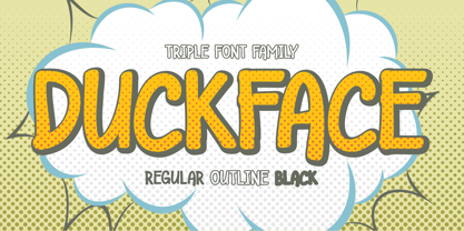
$15.00Duckface. Fun display font. A cartoon font. Fonts for cheerful and explosive mood. Duckface consists of three font styles. Regular, outline and black. Bold and fun font display with lots of impact! Use it as a comic book font. Use it as a cartoon font. It's fun and powerful. Suitable for children's and children's equipment but still cool and unique for products with character bags. And impact! Create your own fantastic design! Perfect for designs including comic fonts or cartoon fonts. That's good!!! Multilingual Fonts Full uppercase characters. It is also multilingual and contains all standard Western, Central and Southeast European language support. - Daymore by Rillatype,
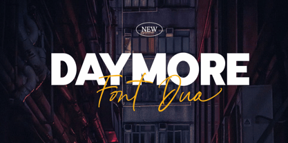
$15.00Introducing, Daymore Font duo! Daymore is a duo font that complements each other. By using Daymore, you can simply use one font family without thinking about other fonts to complete the design you need. In the process of making this font, I was careful in choosing what font concept would be able to complement a bold sans serif font so that it could be balanced so that it would produce a blend of firm and strong sans serif fonts, as well as handwritten fonts that flowed naturally. The Daymore font duo is perfect for use as wedding invitations, branding, logos, etc. - Ventoux by Wiescher Design,
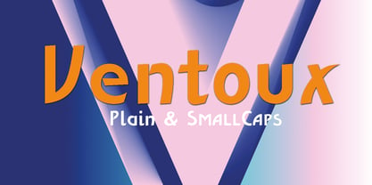
$39.50The highest and windiest mountain of Provençe is the Mont Ventoux. That is where I saw a pretty windy signpost in a very windy typeface that inspired me to design Ventoux. I recently added a Small-Caps style to it and overhauled the font a little bit without destroying its shaky appearance. Your not so windy Gert Wiescher


