10,000 search results
(0.087 seconds)
- New Cuisine by Stephen Rapp,
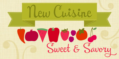
$59.00New Cuisine is a departure from formal, handwriting, and retro scripts. Influenced by the DIY lettering generation New Cuisine is a joyful looking script with all the right moves. Its bold graphic presence makes it ideal for packaging, online journals and blogs, signage, logos, and menus. Under the hood of New Cuisine lie precise connections, unique ligatures and alternates, and OpenType programming to orchestrate it all. Because of this, typesetting turns into a simple and playful experience. Also included are a simple fraction feature as well as Central European language support. - Slinkster by Will Ryan,
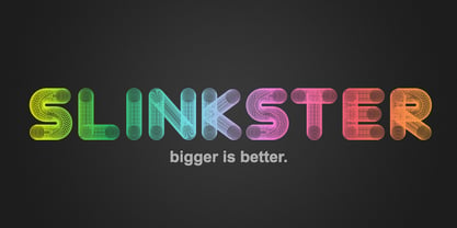
$-Big. Bold. Beautiful. Slinkster is an intricately unique display face created by carefully overlapping equally-sized circles. The geometric patterns formed become increasingly mesmerizing the larger the type is set. Slinkster works best for display, headers, logotypes, and any other large-scale applications that allow the viewer to become hypnotized by its complexity. Due to how detailed Slinkster is, you may experience some lagging as it can take a while to render. Like this font? Consider donating to encourage further development and new fonts! Donations accepted through this Paypal address: willryan042@gmail.com - Racetrack by Type Innovations,
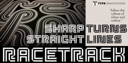
$39.00Racetrack is the work of American type designer, Alex Kaczun, and was conceived as a result of developing a logo for a client. Alex was experimenting with a uniform grid pattern, outline and inline, connecting the dots which lead to this interesting typeface effect. Racetrack is a bold display font, which also works well at many point sizes. It has a futuristic appeal with straight lines and sharp corners. The uniform strokes, inline treatment and symmetry make for a powerful headline. The applications for this font design are endless. - Masio by IbraCreative,
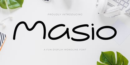
$37.00Masio is a vibrant and captivating display font that embodies the essence of fun and excitement. Its bold and exaggerated letterforms command attention and make a powerful visual statement. With its playful curves and dynamic angles, Masio injects a sense of energy and liveliness into any design. The exaggerated serifs and unique character shapes add a touch of whimsy and personality, making Masio an ideal choice for headlines, logos, and eye-catching signage. Whether used in print or digital mediums, Masio captivates viewers with its exuberant charm and creates a memorable and enjoyable visual experience. - SK Clumster Sans by Shriftovik,
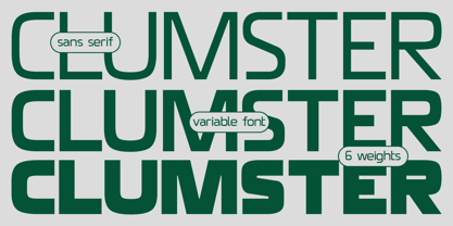
$32.00SK Clumster Sans is an extravagant multilingual geometric grotesque, developed under the impression of the unique and exciting aesthetics of font design. Its structure is enlivened by an innovative combination of geometric and organic shapes that transform the familiar letter pattern. SK Clumster Sans creates a unique visual impression through a combination of shapes, a large symbolic and weights set, in addition to lively and dynamic angles and lines. The font is suitable for creating original design works that reflect the creative potential of the author and his bold experiments in the field of design. - Generisch Mono by Akufadhl,
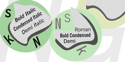
$29.00Generisch Mono is a monospaced version of Generisch Sans. Generisch - a german equivalent of generic - sans serif typeface has gain its own place among designers and earn such popularity due to its "simple" design. Generisch is influenced by early grotesk typefaces from early 1900's when sans was starting to get popular and used as a body type. Some old ligatures such as ch ck and ng are present in generisch (not the ct and st tho), old style numeral for better typesetting experience and more. - News Gothic BT by Bitstream,
$29.99The standard American sanserif of the first two thirds of the twentieth century, prepared for ATF by Morris Fuller Benton in 1908 under the name News Gothic, with a matching lightface known as Lightline Gothic. Linotype’s Trade Gothic follows News Gothic except for its widely-spaced straight-sided boldface based on ATF Alternate Gothic No.3. Linotype matches News Gothic Bold, a boldface version that originated at Intertype, with Trade Gothic Bold No.2. Ludlow Record Gothic follows News Gothic more loosely. News Gothic BT™ font field guide including best practices, font pairings and alternatives. - Oddity Script by Resistenza,
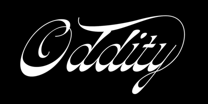
$45.00Oddity is a calligraphic script font with reversed contrast with some exceptions in some letters, adding more legibility and rhythm. This new typeface has a nostalgic Lo-Fi vibe, a tribute to a past era. When experimenting we were finally breaking rules to create a really openminded letterset. Using ideas from English calligraphy and our own Nautica family as a starting point, we created this classy 70s flavour type design. Its modern concept transforms a vintage design trend into an absolutely contemporary typeface. Oddity is a perfect match for quote designs, it is simply outstanding when used at very large sizes. You will love to use this font for posters, branding, magazines, book covers, packaging, or products. - Baldufa by Letterjuice,
$66.00Baldufa is a charming typeface with strong personality, which looks very comfortable in text. There is a search to obtain complicated curves and detailed features, which give the typeface a touch of beauty and elegance. However, this is also a self-conscious design that claims appreciation for quirkiness and human imperfection through the rounded serifs and irregular vertical stems. The typeface family is also a multi script project, containing Latin and Arabic scripts. The Latin consists of Regular, Bold and Italic styles, including Small Caps and many other typographic features. Whereas Arabic Naskh includes Regular and Bold weights. The whole family has been designed to work harmoniously together to help to produce catalogues and small publications of cultural content. We believe that Baldufa is a tiny but nice contribution to build bridges between cultures and this make us very happy. The letterforms in the Latin are inspired by the slight distortions and idiosyncrasies that came with old printing methods. It has distinct, features such as rounded serifs, irregular vertical streams, ink traps and extremely thin junctions. In the Italic, serifs have been removed to enhance movement and expressivity. These experiments in form have not come at the cost of legibility: The typeface remains suitable for both small and display text. To certain extent, the design of the Arabic gathers the same interest for experimentation than its Latin companion. Baldufa Arabic respects the basic features of Arabic script such as thick stokes in the baseline, multiple vertical axis, genuine stem modulation and good linking between words. However, it steps away from traditional Calligraphic Style. It has rounded top terminals and the traditional contrast between curves and straight stokes has been softened. Letter shapes sometimes slightly differs from tradition in order to obtain more expressivity. Overall, Arabic has been designed to acquire the same elegant and quirky aspect of the Latin. - Dulcyna Hand by Michael Browers,
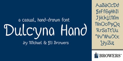
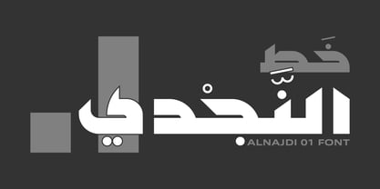
$25.00Dulcyna Hand is a casual hand-drawn typeface developed by Michael Browers and his son Eli. Seeking to bond over a collaborative creative project, this father-son duo leveraged Eli’s emerging interest in lettering and Michael’s font development experience to create Dulcyna Hand. Embedded with Eli’s youthful energy and fun personality, Dulcyna Hand is ideal for greeting cards, invitations, scrapbooking, children’s books and other projects in need of a light-hearted touch. - Alnajdi 01 by Hasan Alnajdi,
$150.00Immerse yourself in the beauty of Arabic calligraphy with our new and modern font, inspired by the Kufic script, distinguished by its boldness and contemporary flair. This font is characterized by intricate details that highlight its elegance and strength, making it perfect for prominent headlines and verses from the Holy Quran. A masterpiece that seamlessly blends the rich heritage of Kufic script with the spirit of modern design, showcasing bold characteristics that emphasize the power of the letters and convey simplicity and sophistication. These designs offer a perfect balance between tradition and innovation, where the beauty of traditional fonts harmonizes with the boldness of modernity. This distinctive font highlights the unique details of each letter, making it ideal for emphasizing the beauty of Quranic texts and shedding light on verses with strength and elegance. Enjoy a fresh and modern experience with Alnajdi 01 font, adding a touch of allure and sophistication to your artistic and design projects. - LT Festive Medium - 100% free
- Goth Stencil Premium - Personal use only
- Tombstone - Unknown license
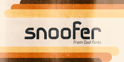
- Snoofer by Cool Fonts,
$19.95 - Bad Coma - Personal use only
- tekken 6 2 - Unknown license
- Mogata - 100% free
- Rolloglide - Personal use only
- Rockabye - Personal use only
- Debitant - 100% free
- Blade Runner Movie Font - Unknown license
- Disparador - Personal use only
- SONY's Logo - Unknown license
- derail - Personal use only
- Got heroin? - Personal use only
- Gunship Italic - Personal use only
- Negotiate Free - Unknown license
- Barbaric - Personal use only
- Brawl - Unknown license
- Azteak - Unknown license
- Punch Label - Unknown license
- Nuku Nuku - Unknown license
- DepotTrapharet - Unknown license
- Rexlia Free - Unknown license
- MoneyGoRound - Personal use only
- Mathmos Original - Unknown license
- El&Font - Unknown license
- Pouttu - Unknown license
- HoMicIDE EFfeCt - Unknown license
