10,000 search results
(0.051 seconds)
- Kabos Gyula - Unknown license
- BN Jinx - Unknown license
- Dreamland Stars - 100% free
- BN FontBoy - Unknown license
- SF Espionage Light - Unknown license
- Freak Show - Unknown license
- SF Foxboro Script Extended - Unknown license
- Megaton - 100% free
- Magyar Serif - Unknown license
- Grave Dirt - Unknown license
- BN Kuktus - Unknown license
- Fundamental Rush - Unknown license
- Vaporbyte Slim - 100% free
- Hydro - Unknown license
- Jumbo - 100% free
- BN Smash - Unknown license
- SF Cartoonist Hand SC - Unknown license
- Powerpuff - Unknown license
- Sci Fied Bitmap - 100% free
- Face plant - Unknown license
- Du Bellay - Unknown license
- SF Espionage Heavy - Unknown license
- Ardour 3D GM - Personal use only
- Redhead Goddess - Unknown license
- Craftopia Love - Unknown license
- Snake Venom - Unknown license
- 5x5 Dots - 100% free
- Subatonik - Unknown license
- Space worm - Unknown license
- Baby Universe - Unknown license
- Alonso Flair by BA Graphics,
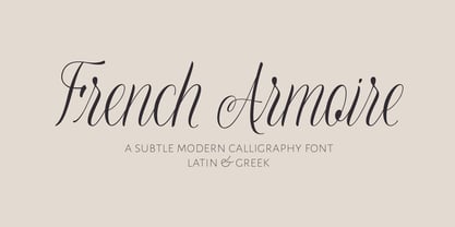
$45.00 - French Armoire by DimitriAna,
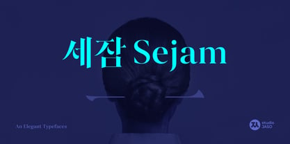
$22.00 - Sejam by StudioJASO,
$56.00 - Livia - Unknown license
- Bughouse - Unknown license
- Neuropol - Unknown license
- Honesty Sans by Océane Moutot,
$32.90 - PF Bodoni Script Pro by Parachute,
$79.00 - The font named "2006" by Denise Bentulan is a creative and contemporary typeface that embodies a unique blend of personality and functionality. Designed by the talented typeface designer Denise Bentu...
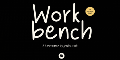
- Workbench by Graphicfresh,
$14.00


