41 search results
(0.018 seconds)
- Spencerian Constancia by Intellecta Design,
$24.90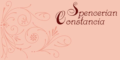
- Davison Spencerian by House Industries,
$33.00 As one of the most distinguished lettering artists of the 20th century, Meyer “Dave” Davison’s greatest contribution to the American visual landscape is arguably Davison Spencerian. The alphabet made its first appearance in Photo-Lettering’s 1946 catalog and remains a benchmark of the ornamental script genre. Thanks to the skillful hands of Mitja Miklavčič and the tireless eyes of House Industries designers Ben Barber and Ken Kiel, we have preserved the poise and precision of Davison’s masterwork in this faithfully-rendered digital incarnation. From automotive exhaust accessories and pirate-themed wedding invites to New Orleans sissy bounce hip-hop CD covers and upmarket bivalve ambrosia packaging, Davison Spencerian offers sober sophistication and unparalleled flexibility. DAVISON SPENCERIAN CREDITS: Typeface Design: Meyer “Dave” Davison Typeface Digitization: Mitja Miklavčič Typeface Direction: Ben Kiel and Ken Barber Like all good subversives, House Industries hides in plain sight while amplifying the look, feel and style of the world’s most interesting brands, products and people. Based in Delaware, visually influencing the world.
 - Antique Spenserian by Dharma Type,
$24.99 This antique script is based on Spencerian script released from MacKellar, Smiths, & Jordan in the 19th century. This family comes in two varieties, Standard and ornamented capitals. The Standard has orthodox style for formal text and display. This makes it possible you to use this style for any projects. The unique Ornamented is suitable for eye-catching part of your project: headlines, wedding invitations and logo. Every glyphs were added antique and distressed effect by hand work with great care to be looked like natural. Use your ideas to enjoy this exclusive script.
 - Spencerian By Product by Intellecta Design,
$28.90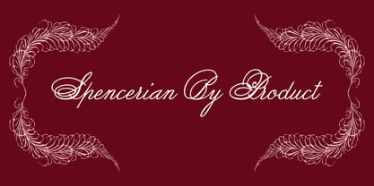
- Spencerian Palmer Penmanship by Intellecta Design,
$26.90 The concepts of this font come from the Palmer’s Penmanship guides and manual from XIX century.
 - Spencerian Palmer Penmanship Pro by Intellecta Design,
$38.90 The concepts of Spencerian Palmer Penmanship PRO come from the Palmer’s Penmanship guides and calligraphy manuals from XIX century. This enhanced OpenType version has complete set in Latin alphabet with Central European, Vietnamese, Baltic and Turkish complete resources with all diacritic signs and punctuation marks plus extra characters belonging this ranges. Spencerian Palmer Penmanship PRO presents you with extra sets of stylistic alternates, swashes, ornaments, tails (to artistic increase any letter of this font) and plus over of 120 contextual alternates solutions - ligatures providing a lot of letterform variations that make this type family looks like a real handwriting on a page or the exact fancy text you wish. Over 500 glyphs which you have total access using software such as InDesign, Illustrator, QuarkXpress and others.
 - Arakne by Scriptorium,
$12.00While working on a font based on Spencerian Script (a popular late 19th century handwriting style) we did some experimenting with original designs which created the general feel of Spencerian and brought to mind the spidery handwriting of old ladies and Dickensian clerks. The result was Arakne, a spidery script font with a really striking look. - Alexandra Script by BA Graphics,
$45.00 Alexandra Script is a beautiful Spencerian in the finest tradition. This script will lend that exquisite look to all your fine designs.
 - Ashby by Corien’s Handwritingfonts,
$24.00 Ashby is a Spencerian based handwritten script, with elegant capital letters. Written with a flexible nib, which results in some beautiful line width variation.
 - English Script by Wiescher Design,
$39.50 English Script is the classic Spencerian English script. I always wanted to do one of these; now finally I did. Your classical designer Gert Wiescher
 - MommieBrush by Hubert Jocham Type,
$29.90 MommieBrush is a brush script headline typeface. It is based on the Spencerian Mommie that won the 2008 TDC award. But as a brush script it works in a different area. Like my other brush script typefaces it is made for food packaging and product branding.
 - Madisonian by Présence Typo,
$36.00Madisonian has been found in a catalogue of the New York Bruce type-foundry, dated 1859. The lower cases have the feeling of a Bodoni Italic and the initials have a "spencerian" touch. This font did exist originaly in a single weight. The family has been extended with a bold and an engraved version. - La Bodeguita by Resistenza,
$39.00 La Bodeguita is a new calligraphic font carefully designed with walnut ink and a Spencerian feather on an oblique penholder. Bodega means "wine cellar", Bodeguita small "wine cellar"_ This font contains 2 styles, La Bodeguita Regular & La bodeguita Slanted + one Swashes and ornament. More than 400 glyphs We recommend to use La Bodeguita for Labels design, notes, cards, wedding cards etc.
 - English 157 by ParaType,
$30.00 The Bitstream version of Englische Schreibschrift by H. Berthold, 1970–72. An unconnected copperplate script of the English nineteenth-century fashion, so-called Spencerian. Based on pressure pointed quill calligraphy. Unlike other copperplate scripts, the letters in this face do not link up. For use in advertising and display typography in relatively small sizes. Cyrillic version was developed at ParaType in 2000 by Vladimir Yefimov.
 - PGF Business by PeGGO Fonts,
$49.90 PGF Business inspired by script used on maps, spencerian aka "Business Script" and manual and confident signature strokes. Organized in 5 individual styles, for making it easier to use, and gathered all at one in a bigger unique file called "PGF Bussiness Full" where you will find way much more options, but requires a more advance editing skill to use. Accompained with a useful set of Dingbats and a set of complementary Ornaments to enhance more versatile typographic compositions.
 - WT Hilton Script by Winston Type Co.,
$19.00 WT Hilton is a font family of royal script that inspired from the Spencerian era in 1840. The strokes are graceful and rhythmic, and letterforms are characterized by flowing loops and flourishes. WT Hilton consists of four styles that variables from the Monoline to the thicker one called Hilton Fancy, each style are stands on its own character. With 100+ language support, WT Hilton is well-suited for any project such as prints, branding, magazine, headline, poster, packaging, weddings, headline, movie, title, logos, branding, invitations, quotes, social media, websites, magazine and so much more.
 - Commercial Script by Monotype,
$29.99Commercial Script is a sophisticated copperplate script design. Its capitals are elaborate initials, and the lowercase letters join together in the style of real handwriting. Commercial Script's elegant refinement makes it a classic and ever-popular typeface. The spark behind this typeface comes from centries-old English Spencerian copperplate calligraphy. In 1985, the American typefoundry Barnhart Brothers & Spindler released a typeface in this style. This was redesigned by ATF's Morris Fuller Benton in 1906, and ATF released Commercial Script" in 1908. In 1994, Letraset' released this digital version of the typeface." - Commercial Script by URW Type Foundry,
$35.99 Commercial Script is a sophisticated copperplate script design. Its capitals are elaborate initials, and the lowercase letters join together in the style of real handwriting. Commercial Script's elegant refinement makes it a classic and ever-popular typeface. The spark behind this typeface comes from centries-old English Spencerian copperplate calligraphy. In 1985, the American typefoundry Barnhart Brothers & Spindler released a typeface in this style. This was redesigned by ATF's Morris Fuller Benton in 1906, and ATF released Commercial Script" in 1908. In 1994, Letraset' released this digital version of the typeface."
 - Rachele by Resistenza,
$39.00 Rachele is a mono line based script thin font. Inspired on the cute “Italian Bella Scrittura” handwriting but influenced by Spencerian. Ornaments and ligatures make this hand more expressive offering round stroke endings and a flowing shape. Rachele is a big family, its stroke expand into extra light till medium and passing through a calligraphic/ribbon effect. At the same time the width varies, that’s make this script even more flexible, from Ultra Condensed to Super Extended. Enjoy it. Check out also Check out also ‘Mentha’ based on Rachele’s skeleton. We recommend to combine Rachele with: Turquoise
 - Glenda by Hubert Jocham Type,
$39.00 Since I designed Mommie you can see a lot of script typefaces with big contrast for big sizes. With Narziss I created a roman interpretation with the very expressive Swirls version. Glenda is again an italic script like Mommie. In the Regular the characters join and it looks like a neatly written sprencerian handwriting. But like Narziss it has got a Swirls version too. Every glyph and swirl is carefully designed to work in every connection. Use Glenda at only very large sizes.
 - Woshingtan by Sealoung,
$15.00 Have you ever had a dream to write as a professional calligrapher? Penmanship or spencerian script? Now you have this unique opportunity to try the early American handwriting. Introducing Washington calligraphy scrpt. This font is calligraphy font with a classic style and a touch of elegance, inspired by the handwriting of Italian women and ancient manuscripts. Carefully designed to work together in harmony that makes it very suitable for any design work that requires a classic, formal or luxurious. Try Desirable Calligraphy, enjoy the richness of OpenType features and let her fun and elegant excitement make you happy and enhance your creativity! You can use this font very easily.
 - Brittes by Eurotypo,
$60.00 Brittes is a fontface inspired in a formally English round hand, also called anglaise or Copperplate script. The calligraphy was the dominant style among 18th-century writing masters, whose copybooks were splendidly printed from models engraved on copper. In the mid-1800's, the Spencerian form of penmanship became a standard. An elegant handwriting was much prized. Today, in our computer age, a fine, beautiful, and legible handwriting brings a warm personal touch to your graphic design and visual communications projects. This font comes with three different kinds of capitals, regular and swashes to choose from, a full set of stylistic alternates, standard and discretional ligatures. Old style numerals ornaments and tails.
 - Narziss Pro Cyrillic by Hubert Jocham Type,
$59.90 Since Mommie, I gradually got more into swirly ornaments. The massive contrast in the neoclassic style is perfect for thin swirly extentions to the characters. Even in an upright typeface. Narziss is very elegant in big headlinesizes. Use it only very big. What was the inspiration for designing the font? spencerian calligraphies and neoclassic contrast What are its main characteristics and features? Narziss is very elegant in very big sizes. The Regular version is without any ornament. The Drops version has some character like the e and the k that are more unique. The Swirls version has got carefully added swirls, that come out of the basic stroke and flow into other characters. Usage recommendations: Big headlines in magazines, brochures and invitations
 - Seashore Pro by Sudtipos,
$59.00 A feminine, graceful script whose thicker horizontals create a wave-like rhythm — hence the name. Seashore is loosely based on an "eccentric" (left-leaning) penmanship style of the late 19th century. Used mainly by professional "engrossers" in certificates and tributes, or by society ladies in their stationery and invitations, it sent a message of true refinement, as the style would have been only been mastered after the more common business, Spencerian, and standard ornamental styles. In fact, unusual script styles were in such demand that type foundries of the era exploded with metal-type knockoffs of increasing fanciness. Seashore includes a wide variety of swash capitals, alternate endings, and contextual ligatures, over 900 glyphs in all. Seashore is best used in short display settings — in names and addresses on formal invitations, in menus and food packaging, or fashion and beauty contexts.
 - Dorset by Positype,
$49.00 Dorset marks Léon Hugues first script typeface and first release with the Positype Flourish label. Built crosscurrent to a strict revival or calligraphic digitization, Dorset’s aim was to understand how a font could interact with various calligraphic influences in a single execution and how that interpretation by Léon would lead to new, exclusive design choices. The design purposely chose to connect various gestures from Spencerian handwriting and copperplate calligraphy and meld that with his initial experiments with fine, flat nibs. The result is wholly unique and useful when clear, open, and legible script typography is desired. OpenType features included in this typeface allow the user to seamlessly move from an italic to connected script, while the various stylistic sets can lead you to variations of texture and rhythm, allowing for a more personal and exact expression.
 - Prestissimo Classy by Burntilldead,
$20.00 Prestissimo Classy is a combination font package between copperplate script and retro serif style. A perfect combo for you who need elegant, stylish, retro, casual & professional look on the same plate. Save your priceless time with the best solution! The easiest way to bring professional calligrapher, Penmanship or spencerian script. Now you have this unique opportunity to try the early American handwriting. Really bring classy vibes & easy to use, powered with opentype features & PUA encoded. Our Prestissimo Classy is feature with contextual alternates and stylistic sets to broaden your possibilities - Common and extended ligatures are included. The set is supplemented by flourish ornaments to round out your design. Each style feature full Western Latin character support (multi language), formatted in OpenType (OTF) and will work on your Machintosh or PC. Perfect For: wedding invitations stationary logos postcards letterpress address titles
 - Courtesy Script Pro by Sudtipos,
$59.00 As in Victorian times, the precious, hand-lettered look of custom stationery is back in vogue. Enter Courtesy Script, an original creation by Alejandro Paul. Courtesy captures the elegance and propriety of finely practiced Spencerian penmanship, in particular the Zanerian school. Its lowercase is notably understated, a simple monoline with very wide connections that ease readability. In the capitals, Courtesy adds variety in both the weight of the strokes, and in degrees of flourish — from merely fancy to over-the-top engrossery. Based on an alphabet found in a 19th-century penmanship journal, Ale created hundreds of additional, stylistically complementary letterforms. Alternate capitals and lowercase letters, swashed lowercase forms, and ending and ornamental swashes; numerals, punctuation, and non-English and accented characters. With virtually endless ways to customize its use, Courtesy helps designers create fluid, signature looks on stationery and invitations, book covers, fashion layouts, and packaging.
 - Plinc Beaux Arts Didot by House Industries,
$33.00 Firmin Didot is credited with establishing the Modern genre of serif typefaces, of which Beaux Arts Didots stands as an exemplary model. Like the French neoclassical architecture of its namesake, Beaux Arts has all the hallmarks of the early nineteenth-century style: a clear and confident construction consisting of simple yet strong lines. Use it for elegant and formal settings, or when a direct typographic tone is desired. Mix it with styles of similar sensibilities such as Plinc Hanover and Davison Spencerian. Digitized from the original Photo-Lettering film matrix in 2014 by Jean-Baptiste Levée. BEAUX ARTS DIDOT CREDITS: Typeface Design: Photo-Lettering Staff Typeface Digitization: Jean-Baptiste Levée Typeface Production: Ben Kiel Typeface Direction: Ken Barber Like all good subversives, House Industries hides in plain sight while amplifying the look, feel and style of the world’s most interesting brands, products and people. Based in Delaware, visually influencing the world.
 - Silk Script by Canada Type,
$29.95Silk Script is a revival and elaborate expansion of a 1956 Helmut Matheis script called Primadonna, which strangely remained a metal face and never made the leap into the film age. Silk Script has the unmistakable high contrast and elegance of formal scripts, yet both its majuscules and minuscules show much more complex and visually appealing art than traditional copperplate or Spencerian calligraphy. When set properly, it adds just the needed extra touch of artistic flair to designs that are not visually satisfying with the usual high-contrast elegant scripts. Silk Script comes in two styles, with the Alt font containing form variations on almost every letter, allowing for flexibility and precision in choice typesetting. Plenty of more alternates are available throughout the character sets of both fonts. Both styles also boast expanded character sets that include support for Central and Eastern European languages, as well as Baltic, Celtic, Esperanto, Maltese and Turkish. Silk Script Pro unifies both styles in one font, for 550 characters of sheer elegance and handy OpenType features including stylistic alternates, discretionary ligatures and class-based kerning. - Mommie by Hubert Jocham Type,
$59.90 In the early 1980s, at the start of my career, I had the opportunity to work in a print shop with classic lead setting. In those days I would study issues of U&lc magazine from ITC. What really caught my attention were scripts in the Spencerian style. I’ve been fascinated by this American penmanship tradition ever since. A few years ago I developed a font. Boris Bencic used it when he was redesigning L’Officiel magazine in Paris. I took these initial forms and developed them into the font Mommie when I started my own foundry. Although I usually design text typefaces, working on Mommie taught me how complex it can be to create a script headline font. The biggest challenge in this process has been to keep it alive and fresh. The Regular weight is only made for very big headlines. The thin lines with the bold drops are very elegant. For smaller sizes use the Medium and Small weight. It won the TDC 2008 award and was Judges Choice of Christian Schwartz.
 - Elicit Script by Monotype,
$40.99 Elicit Script is a hybrid script family, that can be as casual or formal as the occasion demands. Created by Laura Worthington and Jim Wasco, the design is based on pointed pen Spencerian Script handwriting. “It’s like one of those German italics from the early 20th century, that have beautiful shapes that hold their own,” says Wasco. Elicit Script spans five weights, from Extra Light to Bold, and three styles – Formal, Normal and Casual. This makes it an incredibly versatile script design, easily paired with other typefaces and able to be dressed up or down, depending on what it’s used for. The monoline Casual style offers a more relaxed tone of voice, while Formal sits at the more decorative end of the spectrum. Designers can keep things straightforward, tidy and practical with the typeface’s simple caps, or add in swash caps if they need more exuberance and expression. Generous spacing means Elicit Script works well at smaller sizes as well. Elicit Script Variable Set is a single font file that features two axes: Weight and Contrast. The Weight axis has instances from Extra Light to Bold. The Contrast axis has instances from Casual (low contrast) to Formal (high contrast).
 - Ephemera Sickles by Ephemera Fonts,
$35.00 A debut from the most anticipated vintage digital typefoundry by Gilang Purnama and Ilham Herry, who stucked their mind, body and soul back into the first era of 18th century. They build this intense visual-time machine that no one capable before. Started by the visual branding of the Ephemera Fonts, they bring every letters of it to the another level of journey. They called it Ephemera Sickles. Ephemera Sickles is a ornamented letterhead style typeface-inspired by the era of victorian (1800-1900) and this style was commonly used by engrossers at the turn of the century to embellish official documents, such as diplomas and other certificates. Carefully crafted for every single letters with the soul of Sickels Lettering, Spencerian, and some research from the Penmanship Journal book. The style is named after Charles Sickels, who headed the art department of Electro-Light Engraving Co. in New York City during the early 20th century. There’s no doubt that such a very strong presence typeface like Ephemera Sickles will bring a powerful identity to your visual project. Will be a perfect joint for a logo, visual branding, poster, beer label, packaging, classic bar decor, vintage hotel, et cetera.
 - Sildetas by insigne,
$22.00 Sildetas is an elegant high-contrast script face. Sildetas was conceived as non-connected, high-contrast and ultra heavy script, as best exemplified by the Black weight. However, it was too much of a temptation to design a hairline variant, and this exploration gave the family’s lighter weights an elegant, graceful feel. The script was modified further to use connected letterforms as the primary glyphs. With its unique swirled ball terminals, this versatile script draws immediate attention. The face glides and flows across the page and the swirling ball terminals provide an interesting diversion to the flow. The lighter weights have an almost spencerian look. Sildetas includes six weights and is a very unique script face. Lighter weights can be used for elegant invitiations. Sildetas can get the job done for many unique design tasks. Sildetas includes many useful OpenType features, including a set of non-connecting and titling alternates, ligatures, and two types of end swashes. Opentype features include simplified swashed stylistic alternates without ball terminals, swash endings, ending contextual alternates, discretionary ligatures, ligatures and five different stylistic sets filled with alternates. In total, there are over 60 alternate letterforms. OpenType-capable applications such as Quark or the Adobe suite can take full advantage of the automatically replacing ligatures and alternates. This family also includes the glyphs to support a wide range of languages.
 - String by Lián Types,
$45.00 Inspired by the sound of acoustic guitars, delicacy of harps and elegance of the engrossers script, String is a trendy monoline font which will for sure make unique layouts for your pieces of design. Combining String with String Hole in the same word is a good idea when a more playful rhythm is needed. The font works particularly well when standing on photographs, so be ready to use it in magazines with food, landscapes or super models. I like thinking of String as a distilled version of Erotica. A more “pure” relative of hers. When I designed Erotica, I was so in love with the spencerian style that I knew it'd be hard to just abandon it. With that in mind, this time my aim was to take the subtlety of it to the limit. So, in order to do that I had to find out what was actually the secret of its beauty. I found that the essence of Erotica, in other words, its ductus was the most responsible. The result is a font made of hairlines with a lot of emphasis on the pureness of the form and, (with a lot of inspiration in music) the sensation of continuity between its letters as if they were written with a string. Try String and its flowing melody.
 - Parfait Script by Lián Types,
$37.00Parfait Script Pro takes its inspiration from Spencerian script and pointed brush lettering. Technical Parfait Script has more than 850 glyphs. It’s up to you to choose, it’s up to you to have fun. Parfait would love to play. The font has lots of alternates. They'll certainly either embellish your words or provide more legibility. The alternates are: Standard Ligatures; Contextual Alternates; Discretionary Ligatures; Swashes; Stylistic Alternates; Titling Alternates; Terminal Forms; Historical Alternates * ; Stylistic Ligatures; Stylistic Set 1 and 2 * ; Ornaments. (* These Alternates are only included in Parfait Script Pro). Parfait Script Pro contains everything. Advice: Use designing programs that support the OpenType features named above, so you can easily alternate glyphs. However, for those who don't have this kind of program, or for those who don't want the entire font, we offer Parfait Script Pro as several separate fonts: Parfait Script Standard (the best for text); Parfait Script Contextual (decorative); Parfait Script Stylistic (decorative); Parfait Script Swashes (for giving the last letter a nice touch); Parfait Script Titling (both decorative and more Roman); Parfait Script Endings (for giving the word the look of a signature); and Parfait Script Ornaments (a set of swirls). These versions of Parfait Script Pro are Open-Type programmed too, in order to include the Standard, Discretional and Stylistic Ligatures. Pssst!... Take a look at Parfait Script Pro’s Guide in the gallery section in order to discover this beauty! - Brownstone Sans by Sudtipos,
$59.00 One design sparks another. As Alejandro Paul experimented with the strokes and curves of the monoline script Business Penmanship, he discovered interesting new forms and shapes that didn't fit the Spencerian theme of that typeface. These forms simmered in Ale’s subconscious over the next three years, during which time he visited New York City, pored over rare type specimen books in the New York Public Library, and explored Brooklyn’s neighborhoods. Brownstone, the face born from these explorations, is an original 21st-century design, yet one subtly infused with historical and cultural references -- keen observers might spot influences from decorative typefaces of 19th-century foundries. And just as faces from that era were influenced by contemporary architecture, the frames included with Brownstone echo the ornate iron railings of Park Slope’s row houses. (There’s also a slight 1960s vibe to Brownstone, of novelty swash-sans photocompositing faces, that can be played up at your discretion.) Influences aside, Brownstone has broad appeal to modern audiences. A soft, monoline sans-serif, with elements of Swiss geometry (see the ‘k’ and ‘x’), its marriage of highly legible, draftsman-like letterforms with decorative swashes and ornaments reflects the old-meets-new aesthetic of the DIY craft culture seen in Brooklyn and other urban centers. It’s ornamental but unfussy, romantic but understated. Brownstone includes character sets for Latin-based languages, including Western and Eastern European, Baltic, Turkish, Maltese, Celtic and Welsh. Over 1500 glyphs, including small capitals, swash characters, alternates, and ligatures, in both Light and Thin weights. Ornamental frames are also included in both weights. The Brownstone Frames fonts are available as separate fonts in the new Brownstone Slab family.
 - Rafaella by Lián Types,
$37.00 To Rafaella, a menina dos cachos. We, designers, have grown accustomed to seeing that lowercase letters—not only in calligraphy but also in typography (1)—may be very playful and decorative. Almost every part of them can become a potential swash, ligature or decorative accolade (2) if the designer has some expertise regarding this matter. However, since we are living in an era that elevates the status of handcrafts, lettering has gained a lot of ground in different kinds of mediums, and with it there’s a sort of overuse of capitals. This may be due to the reason that lettering pieces need a high impact to convey their messages and many times why big capitals are the only solution. With this in mind, I started Rafaella: A font consisting entirely of capitals which go from unadorned to very decorative. Rafaella has ductus and forms vaguely based on the 1970s Bookman-like styled fonts. The presence and behaviour of serifs and ball terminals in this style were the perfect excuse to make really attractive aternates which the user can choose from the glyphs panel. The result is a font full of life. Able to be both very playful and formal due to its roman style which can be combined with (and between) a wide range of other styles of expressive scripts or geometric fonts with nice results (3). Also try Rafaella Shade Solo combined with Rafaella or Rafaella Bold for a layer effect to emphasize any given word or phrase. NOTES (1) See my fonts Erotica from 2013 or Dream from 2014. (2) Accolades is a wonderful word that refers to the ornaments made around the words in the spencerian style of calligraphy (3) Combinations often seen in different pieces of lettering were usually a contrast of style is wanted.
 - Compendium by Sudtipos,
$99.00 Compendium is a sequel to my Burgues font from 2007. Actually it is more like a prequel to Burgues. Before Louis Madarasz awed the American Southeast with his disciplined corners and wild hairlines, Platt Rogers Spencer, up in Ohio, had laid down a style all his own, a style that would eventually become the groundwork for the veering calligraphic method that was later defined and developed by Madarasz. After I wrote the above paragraph, I was so surprised by it, particularly by the first two sentences, that I stopped and had to think about it for a week. Why a sequel/prequel? Am I subconsciously joining the ranks of typeface-as-brand designers? Are the tools I build finally taking control of me? Am I having to resort to “milking it” now? Not exactly. Even though the current trend of extending older popular typefaces can play tricks with a type designer’s mind, and maybe even send him into strange directions of planning, my purpose is not the extension of something popular. My purpose is presenting a more comprehensive picture as I keep coming to terms with my obsession with 19th century American penmanship. Those who already know my work probably have an idea about how obsessive I can be about presenting a complete and detailed image of the past through today’s eyes. So it is not hard to understand my need to expand on the Burgues concept in order to reach a fuller picture of how American calligraphy evolved in the 19th century. Burgues was really all about Madarasz, so much so that it bypasses the genius of those who came before him. Compendium seeks to put Madarasz’s work in a better chronological perspective, to show the rounds that led to the sharps, so to speak. And it is nearly criminal to ignore Spencer’s work, simply because it had a much wider influence on the scope of calligraphy in general. While Madarasz’s work managed to survive only through a handful of his students, Spencer’s work was disseminated throughout America by his children after he died in 1867. The Spencer sons were taught by their father and were great calligraphers themselves. They would pass the elegant Spencerian method on to thousands of American penmen and sign painters. Though Compendium has a naturally more normalized, Spencerian flow, its elegance, expressiveness, movement and precision are no less adventurous than Burgues. Nearing 700 glyphs, its character set contains plenty of variation in each letter, and many ornaments for letter beginnings, endings, and some that can even serve to envelope entire words with swashy calligraphic wonder. Those who love to explore typefaces in detail will be rewarded, thanks to OpenType. I am so in love with the technology now that it’s becoming harder for me to let go of a typeface and call it finished. You probably have noticed by now that my fascination with old calligraphy has not excluded my being influenced by modern design trends. This booklet is an example of this fusion of influences. I am living 150 years after the Spencers, so different contextualization and usage perspectives are inevitable. Here the photography of Gonzalo Aguilar join the digital branchings of Compendium to form visuals that dance and wave like the arms of humanity have been doing since time eternal. I hope you like Compendium and find it useful. I'm all Spencered out for now, but at one point, for history’s sake, I will make this a trilogy. When the hairline-and-swash bug visits me again, you will be the first to know. The PDF specimen was designed with the wonderful photography of Gonzalo Aguilar from Mexico. Please download it here http://new.myfonts.com/artwork?id=47049&subdir=original
 - Madison Street by Studioways,
$40.00 Madison Street is a font family with 8 fabulously fun typefaces! Eliza Gwendalyn & Jim Lyles of Studioways have teamed up with Spencerian calligrapher Elaina DeBoard to create a classic pointed pen calligraphy font. From its ornamental monograms, to its variety of complimentary text styles, and to its Madison Street Pro, with its elegant stylistic swashes and OpenType goodies, there is a font for every designer. Enjoy the sleek Madison Street Sans, Serif or Script, paired with the Ornaments font, complete with ornate monograms, or use each typeface on its own! Madison Street Pro has all the OpenType bells and whistles. The Ligature feature automatically substitutes beginning and ending letterforms, as well as 100 ligatures. Turn on the Swash feature for elegantly sweeping swash lowercase forms. Enable Stylistic Alternates for even more variations. There are also 10 Style Sets to chose from. And many more OT features! Madison Street is a basic version of the Pro font, intended for users who do not have OpenType savvy applications. Madison Street Stylistic is also a basic version of the Pro font, intended for users who do not have OpenType savvy applications. It has stylistically different ascenders and descenders. Madison Street Swash is intended to be used with the basic fonts, Madison Street and Madison Street Stylistic. It has lowercase beginning and ending swash glyphs and cannot be used to set text by itself. Madison Street Sans, Serif, and Script are text fonts modeled after the handwriting of Elaina. They are intended to be complimentary to any of the script fonts. However, you'll need to set them at a smaller point size (about 1/3 the size) in order to get the preferred scale and weight. Finally, the hairline weight of the Madison Street script fonts is very thin, and at small sizes up to 40 pt, you may notice some breaking up when printing to desktop printers. To remedy this, we recommend outline stroking the text a small amount (.1 -.3 value). this should improve the output without adding to much weight overall.
 - Selfie Neue Rounded by Lián Types,
$29.00 INTRODUCTION When I started the first Selfie back in 2014 I was aware that I was designing something innovative at some point, because at that time there were not too many, (if any) fonts which rescued so many calligraphy features being at the same time a monolinear sans. I took inspiration from the galerías’ neon signs of my home city, Buenos Aires, and incorporated the logic and ductus of the spencerian style. The result was a very versatile font with many ligatures, swashes and a friendly look. But… I wasn’t cognizant of how successful the font would become! Selfie is maybe the font of my library that I see the most when I finally go out, (type-designers tend to be their entire lives glued to a screen), when I travel, and also the font that I mostly get emails about, asking for little tweaks, new capitals, new swashes. Selfie was used by several renowned clients, became part of many ‘top fonts of the year’ lists and was published in many magazines and books about type-design. These recognitions were, at the same time, cuddles for me and my Selfie and functioned as a driving force in 2020 to start this project which I called Selfie Neue. THE FONT "Selfie for everything" Selfie Neue, because it’s totally new: All its glyphs were re-drawn, all the proportions changed for better, and the old and somehow naive forms of the first Selfie were redesigned. Selfie Neue is now a family of many members (you can choose between a Rounded or a Sharp look), from Thin to Black, and from Short to Tall (because I noticed the feel of the font changed notoriously when altering its proportions). It also includes swashy Caps, which will serve as a perfect match for the lowercase and some incredibly cute icons/dingbats (designed by the talented Melissa Cronenbold) which, as you see in the posters, make the font even more attractive and easy to use. You'll find tons of alternates per glyph. It's impossible to get tired with Selfie! Like it happened with the old Selfie, Selfie Neue Rounded was thought for a really wide range of uses. Magazines, Book-covers, digital media, restaurants, logos, clothing, etc. Hey! The font is also a VF (Variable Font)! So you can have fun with its two axes: x-height and weight, in applications that support them. Let me take a New Selfie! TECHNICAL If you plan to print Selfie Neue VF (Rounded or Sharp), please remember to convert it to outlines first. The majority of the posters above have the "contextual" alternates activated, and this makes the capitals a little smaller. I'd recommend deactivating it if you plan to use Selfie for just one word. Use the font always with the "fi" feature activated so everything ligatures properly. The slant of the font is 24,7 degrees, so if you plan to have its stems vertical, you may use Selfie with that rotation in mind. THANKS FOR READING
Page 1 of 2Next page