10,000 search results
(0.019 seconds)
- Kis FB by Font Bureau,
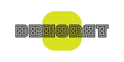
$40.00 - KD Dekorat by Kassymkulov Design,
$12.00 - Paper Cut - Personal use only
- Stars From Our Eyes - Personal use only
- Our Pal Hal NF by Nick's Fonts,
$10.00 - KG Keep Your Head Up - Personal use only
- Magical Mystery Tour Outline Shadow - Unknown license
- 101! Your FontZ Are Served - Unknown license
- KR Kick Up Your Heels - Unknown license
- the monkey's ate my soul - Unknown license
- The Monkies Ate My Soul - Unknown license
- KG Keep Your Head Up by Kimberly Geswein,
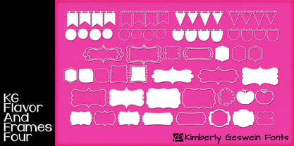
$5.00 - KG Flavor And Frames Four by Kimberly Geswein,
$5.00 - KG Who Tells Your Story by Kimberly Geswein,
$5.00 - Oh You Klid NF by Nick's Fonts,
$10.00 - Gentium - 100% free
- Janda Shine Your Light On Us - Personal use only
- You Can Make Your Own Font - 100% free
- Eat your face with a fork - Unknown license
- Eat your face with a spoon - Unknown license
- Janda Shine Your Light On Us by Kimberly Geswein,
$5.00 - id-Kaiou-LightOT - Personal use only
- id-Kaze2OT-Light - Personal use only
- id-POPMARU-LightOT - Personal use only
- id-Cinema-LightOT - Personal use only
- id-isi-LightOT - Personal use only
- id-kairyu1OT-Light - Personal use only
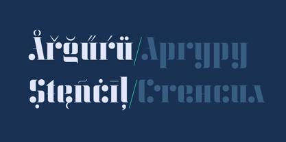
- KD Arguru Stencil by Kassymkulov Design,
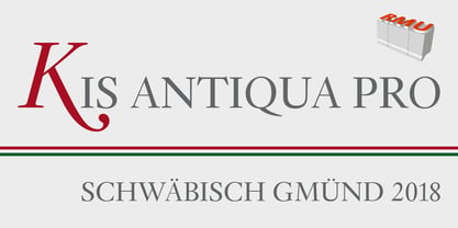
$20.00 - Kis Antiqua Pro by RMU,
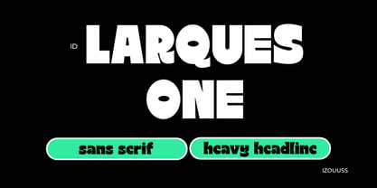
$45.00 - ID Larques One by Izouuss Design,
$16.00 - Zone23_Two Kinds of Love III - Unknown license
- ChunkFive Roman - 100% free
- All your font are belong to us - 100% free
- Monoid - 100% free
- Tuffy - 100% free
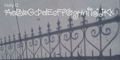
- Curly Q by Outside the Line,
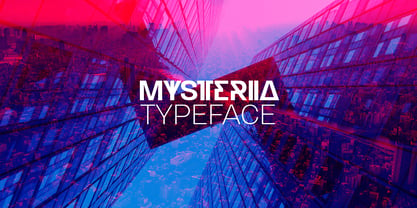
$19.00 - Mysteria by Juraj Chrastina,
$29.00 - DejaVu Sans Condensed - Unknown license
- Kis Antiqua Now TB Pro by Elsner+Flake,
$99.00 - Kis Antiqua Now TH Pro by Elsner+Flake,
$99.00

