10,000 search results
(0.068 seconds)
- St Ryde by Stereotypes,
$- St Ryde is a humanistic sans-serif with a slight touch of a script typeface. The most significant aspect of the typeface is the combined sharp and round treatment of the stroke endings. The complete Ryde Family contains five weights including real matching italics, so you can choose from thin, light, regular, medium and bold. St Ryde has a wide range of characters, including small caps, lining proportional and tabular figures plus small caps figures, too.
 - Manufactory JNL by Jeff Levine,
$29.00 Manufactory JNL and its oblique counterpart were re-drawn from examples of a now-antique typeface used within many advertisements found throughout the pages of The American Stationer magazine, circa 1879. The term ‘manufactory’ was popular during this era; the word being a more archaic form of ‘factory’. There is a bit of Western flavor to this type design, as the spurred serifs and the top and bottom strokes are heavier than the vertical and mid-point stroke weights.
 - Vasari NF by Nick's Fonts,
$10.00The pattern for this font was found in the 1906 specimen book for the Keystone Type Foundry under the name Ancient Gothic, which is a pretty accurate description of the particular appeal of this typeface. Use it liberally anytime you want to add an air of mystery or menace...or simply some quaint charm. Both versions of the font include complete Latin 1252, Central European 1250 and Turkish 1524 character sets, with localization for Moldovan, Romanian and Turkish. - Audebaud by MADType,
$39.00 This wood type revival is a rare specimen, indeed. Audebaud is a charming and bold 19th Century Clarendon of French lineage. With its rounded terminals, and unique proportions; this font will instill a joie de vivre in any design. The design was inspired by the work of Constant Audebaud. Audebaud was an engraver of wooden type that was used for posters and the like. His work appeared in the 1880s in the Deux-Sèvres département of France.
 - Sunfleur by Valley Type,
$17.00 Sunfleur is a high dose of peace and love. With flared edges and rounded terminals, its playful forms were inspired by the flower child style of the 1960s. The waxing and waning curves of the letters complement each other for optimal readability and flow. Sunfleur also features a series of happy flower icons. Bring positive energy to logos, headlines, packaging, editorial, and posters. Includes all uppercase characters with punctuation, glyphs, diacritics, numerals, icons, and multilingual support.
 - Reliquaire AOE by Astigmatic,
$24.95 Historical elegance finds its place in the digital era with Reliquaire AOE. Reliquaire AOE is the historical revival and elaboration of the "Memorial" typeface created by Boston Type Foundry in January of 1881. What began as a basic character set of Capitals, lowercase, numerals, and a small handful of punctuation characters has been expanded to a full character set including unlimited fractionals, superiors & inferiors, ordinals, tabular & proportional figures, and an expanded language glyph set. History has found new life.
 - Schnitz by Linotype,
$29.99Linotype Schnitz is part of the Take Type Library, selected from the contestants of Linotype’s International Digital Type Design Contests of 1994 and 1997. Designed by the Finnish artist Osmo Niemi, the characters seem to contain no round forms at all. Linotype Schnitz looks as though it were chiseled and has an angular, almost brittle feel. The restless and lively appearance makes Linotype Schnitz particular well-suited to headlines and shorter texts with point sizes of 12 and larger. - Fuel by VersusTwin,
$39.00 The Fuel typefaces are a modern update on the techno sans, complete with soft rounded corners as well as decorative inktraps. Stylistic Alternates included within all styles are alternates for the capital B, E, G, and R characters, as well as all of their accented siblings. The Fuel Complete package bundles all of the dynamic styles of the Fuel, Fuel Extended, Fuel Uni, Fuel Uni Extended, and Fuel Script typefaces into one powerhouse of a collection.
 - Queen Sea by HansCo,
$12.00 Queen Sea is a fun script font with a curly alternate and swash look that is perfect for multipurpose projects. This font looks feminine and will fit well in any design and very recommended for crafts, posters, books, branding, quotes, print templates, packaging, invitations, music labels, product labels, logos and more. This typeface comes in uppercase and lowercase, with punctuation, symbols, numerals, swashes, alternates and also has multilingual support. Swashes is alternate from numeral 0 - 9, You can access swashes from your OpenType panel in your design software. Tutorial how to Install & use Alternate / Special Character : https://hanscostudio.com/tutorial/ Enjoy !
 - Radja Wolly by Alit Design,
$19.00 ✒️Radja Wolly✒️is a font inspired by the Blackletter typeface, made with a modern impression but still looks strong and stencil tyle. Supported by alternative options such as swash, ligature and alternative characters, making The Radja Wolly Typeface very easy to create designs with strong or vintage themes. In addition, The Radja Wolly Typeface font is also supported with multilingual characters that can be used in several international languages. The Radja Wolly Typeface is very suitable for use in making music album cover designs, tattoo logos, wishkey labels, packaging pomades and so on which are made with dark and strong concepts.
 - Dorris by Creativemedialab,
$20.00 Dorris - Swirly font family Unique, cute and versatile serif family with alternates and ornaments to create a more stunning display. Try capital letters for groovy vintage style look or Capitalize for a happy, cute and beauty. This Family has 9 weights from thin to black with a soft and curly tail that makes this font look funky and fresh. Suitable for use in many design forms, for example, magazines, DIY projects, quotes, ice cream, postcards, logos, vintage look badges, old classic music, the 60s, 70s, 80s era, stickers, label, kids, baby, wedding projects and many more. We recommend using Adobe Programs.
 - Belong Faith by Alit Design,
$18.00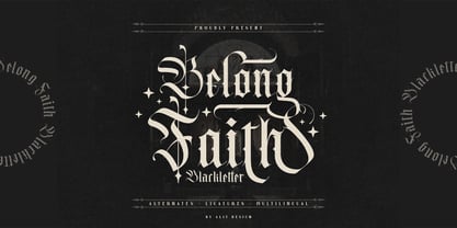 ✒️Belong Faith✒️is a font inspired by the Blackletter typeface, made with a modern impression but still looks strong and unique. Supported by alternative options such as swash, ligature and alternative characters, making the Belong Faith font very easy to create designs with strong or dark themes. In addition, the Belong Faith font is also supported with multilingual characters that can be used in several international languages. The Belong Faith font is very suitable for use in making music album cover designs, tattoo logos, wishkey labels, packaging pomades and so on which are made with dark and strong concepts.
 - Belligoes by Alit Design,
$16.00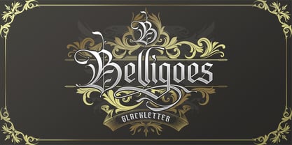 ✒️⬛Belligoes⬛✒️ Font is a font inspired by the Blackletter typeface, made with a modern impression but still looks strong and unique. Supported by alternative options such as swash, ligature and alternative characters, making the Belligoes font very easy to create designs with strong or dark themes. In addition, the Belligoes font is also supported with multilingual characters that can be used in several international languages. The Belligoes font is very suitable for use in making music album cover designs, tattoo logos, wishkey labels, packaging pomades and so on which are made with dark and strong concepts.
 - Hello Mytoys by Alit Design,
$18.00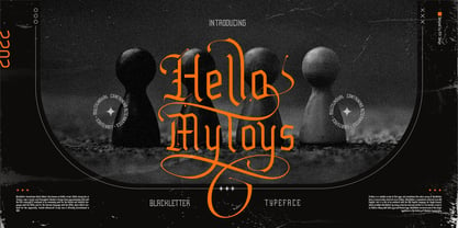 ✒️Hello Mytoys✒️is a font inspired by the Blackletter typeface, made with a modern impression but still looks strong and unique. Supported by alternative options such as swash, ligature and alternative characters, making The Hello Mytoys Blackletter very easy to create designs with strong or dark themes. In addition, The Hello Mytoys Blackletter is also supported with multilingual characters that can be used in several international languages. The Hello Mytoys Blackletter is very suitable for use in making music album cover designs, tattoo logos, wishkey labels, packaging pomades and so on which are made with dark and strong concepts.
 - The Quality Brave by Alit Design,
$19.00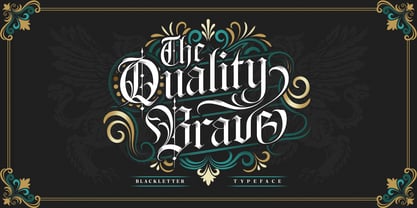 ✒️The Quality Brave✒️is a font inspired by the Blackletter typeface, made with a modern impression but still looks strong and unique. Supported by alternative options such as swash, ligature and alternative characters, making The Quality Brave font very easy to create designs with strong or dark themes. In addition, The Quality Brave font is also supported with multilingual characters that can be used in several international languages. The Quality Brave font is very suitable for use in making music album cover designs, tattoo logos, wishkey labels, packaging pomades and so on which are made with dark and strong concepts.
 - Ghosthey by Alit Design,
$14.00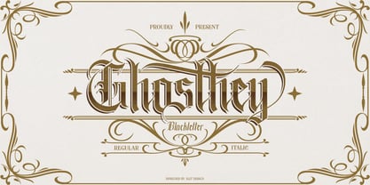 ✒️Ghosthey Typeface✒️is a font inspired by the Blackletter typeface, made with a modern impression but still looks strong and unique. Supported by alternative options such as swash, ligature and alternative characters, making The Ghosthey Typeface Blackletter very easy to create designs with strong or dark themes. In addition, The Ghosthey Typeface Blackletter is also supported with multilingual characters that can be used in several international languages. The Ghosthey Typeface is very suitable for use in making music album cover designs, tattoo logos, wishkey labels, packaging pomades and so on which are made with dark and strong concepts.
 - Maboth Typeface by Alit Design,
$12.00 ✒️Maboth Typeface✒️is a font inspired by the Blackletter typeface, made with a modern impression but still looks strong and unique. Supported by alternative options such as swash, ligature and alternative characters, making The Maboth Typeface very easy to create designs with strong or dark themes. In addition, The Maboth Typeface font is also supported with multilingual characters that can be used in several international languages. The Maboth Typeface is very suitable for use in making music album cover designs, tattoo logos, wishkey labels, packaging pomades and so on which are made with dark and strong concepts.
 - Remboland by Alit Design,
$18.00 ✒️Remboland Typeface✒️is a font inspired by the Blackletter typeface, made with a modern impression but still looks strong and unique. Supported by alternative options such as swash, ligature and alternative characters, making The Remboland Typeface Blackletter very easy to create designs with strong or dark themes. In addition, The Remboland Typeface Blackletter is also supported with multilingual characters that can be used in several international languages. The Remboland Typeface is very suitable for use in making music album cover designs, tattoo logos, wishkey labels, packaging pomades and so on which are made with dark and strong concepts.
 - Sticky Melody by Nathatype,
$29.00 Sticky Melody is a charming display font that combines cuteness with a bold and prominent style. With its thick weight, rounded shapes, and distinct contrast, this typeface is designed to capture attention and infuse your designs with a playful and lively energy. The thick weight of Sticky Melody gives each letter a robust and substantial presence, making it stand out effortlessly. The rounded shapes add a touch of softness and friendliness, creating an endearing and approachable feel. The font's unique feature lies in its prominent contrast, which accentuates the curves and contours of each character, elevating the overall visual impact. Let the thick weight, rounded shapes, and prominent contrast of this font bring your creative visions to life, ensuring that your message stands out in the most charming and captivating way possible. You can use it in big text sizes to be greatly legible and enjoy the available features here. Features: Stylistic Sets Ligatures Multilingual Supports PUA Encoded Numerals and Punctuations Sticky Melody fits in children's books, toy packaging, posters, headlines, logos, social media designs, and any design project that require a touch of delightful playfulness. Find out more ways to use this font by taking a look at the font preview. Thanks for purchasing our fonts. Hopefully, you have a great time using our font. Feel free to contact us anytime for further information or when you have trouble with the font. Thanks a lot and happy designing.
 - PF Fuel Pro by Parachute,
$79.00 This typeface was inspired by the rough surroundings of a modern city and reflects the contradicting nature of an emerging global youth culture. Ever since its first release—back in late 1999— it is constantly on our ‘most wanted’ list and has been part of numerous product campaigns. Music, mobile telephony, food and beverages, politics, you name it. Coca-Cola used it, José Cuervo used it for about 3 years. The new ‘Pro’ version goes one step ahead. You may now capture the essence of the younger generation in every major European language. PF Fuel has been extended with the full array of Cyrillic characters as well as matching frames for this extra stamped look. Furthermore there more alternate characters than ever. Create a custom look, when same characters sit close, or one next to the other. You may find these useful—alternate characters either in the lowercase positions, or access them through the ‘stylistic alternates’ OpenType Pro feature. If you need some extra fuel, this is where to get it!
 - Jazmo by URW Type Foundry,
$49.99 Jazmo is an offspring of an assignment I did for a Dutch architect. A classic building and coincidently the place of my studio in my hometown Zwolle, Netherlands, needed to be renovated. My job was to design the house numbers and signs for this building. This building I refer to was built in 1932 and designed according to the ‘New objectivity’ architecture. Now it accommodates several artist and craftsmen and also houses students. In my design I used elements of the Art Nouveau, which is related to the ‘New Objectivity’. Words as stately, angular, linear, stylish, artful, playful and frolic came to mind. It should be a design with a hint of the past and a flirt with the future. This house numbering is the root wherefrom Jazmo arises. The name Jazmo cites to the Jazz scene, which was a new and very popular artistic influence that time and age and is still a vibrant source of musical renewal. Mo stands for my Name Marit Otto. Together with my intern Arie Blok I created the missing characters and completed the font. Welcome Jazmo!
 - P22 Saarinen by IHOF,
$39.95 P22 Saarinen is a typeface based on the architectural lettering of Finnish American architect Eero Saarinen.The Saarinen fonts were created to help commemorate the 75th anniversary of Kleinhans Music Hall in Buffalo, NY, which was designed by Saarinen in collaboration with his father Eliel Saarinen and is recognized as one of the greatest concert halls ever built in the United States. Saarinen’s own lettering styles were combined with various lettering manual suggestion for proper lettering to create a flexible casual lettering style in regular and bold weights. The Pro fonts include multiple variations of each letter for a more natural lettering style as well as stylist in variants to achieve various highs for crossbars and other customizable variants. The Pro fonts also include Central European character set, fractions, small caps and an array of hand drawn directional arrows. Individual non-pro versions feature: Saarinen Regular - characters with low cross bars Saarinen Alt 1 - characters with high cross bars Saarinen Alt 2 - characters with mid cross bars and old style figures Saarinen Arrows - bold and regular arrows combined in one font
 - Cenzo Flare by W Type Foundry,
$20.00 Cenzo Flare is a mixture of modern sans serif base with a touch of flare to it. The inspiration is drawn from all kinds of old Americana advertising, Italian posters, old century logos and signs. All that plus the strong trend on retro fonts now displayed on tv series and current music imagery results on Cenzo Flare. A typeface designed for headlines, posters, advertising and corporate identity. With its appealing curvy smooth edges it is sure to catch the eye. Also enjoy multiple styles that work on their own or as overlapping layers with the InLine & Line variants to create colorful designs. This 40 font family consists of four 5-weight subfamilies: Regular, InLine, Line & Condensed. All of them with matching italics. Designed with powerful opentype features, each weight includes alternate characters to play with, extended language support and many more. We’re proud to introduce: Cenzo Flare. Learn about upcoming releases, work in progress and get to know us better! On Instagram W Foundry On facebook W Foundry wtypefoundry.com
 - Balshan MF by Masterfont,
$59.00 Derived from old signage, this serif font is unique and readable in titles and text as well.
 - Mimi MF by Masterfont,
$59.00 Simple yet decorative serif stroked font . Use for titles, signage, captions etc. Highly legible at children books.
 - Soul by VisualizeUnited Fonts,
$65.00 Soul, is a display typeface in lower characters. It is suggested for posters, product labels and titles.
 - Fleischmann Gotisch PT by preussTYPE,
$29.00 Johann Michael Fleischmann was born June 15th, 1707 in Wöhrd near Nuremberg. After attending Latinschool he started an apprenticeship as punchcutter in the crafts enterprise of Konstantin Hartwig in Nuremberg, which ought to last six years. For his extraordinary talent Fleischmann completed his apprenticeship after four and a half years, which was very unusual. 1727 his years of travel (very common in these days) began, during which he perfected his handcraft by working in different enterprises as journeyman. First location was Frankfurt/Main where he worked for nearly a year at the renowned type foundery of Luther and Egenolff. Passing Mainz he continued to Holland, where he arrived in November 1728 and stayed till he died in 1768. In Amsterdam he worked for several type founderies, among others some weeks for Izaak van der Putte; in The Hague for Hermanus Uytwerf. Between 1729 and 1732 he created several exquisite alphabets for Uytwerf, which were published under his own name (after his move to Holland Fleischmann abandoned the second n in his name), apparently following the stream of the time. After the two years with Uytwerf, Fleischmann returned to Amsterdam, where he established his own buiseness as punchcutter; following an advice of the bookkeeper and printer from Basel Rudolf Wetstein he opened his own type foundery 1732, which he sold in 1735 to Wetstein for financial reasons. In the following Fleischmann created several types and matrices exclusively for Wetstein. In 1743 after the type foundery was sold by Wetstein’s son Hendrik Floris to the upcoming enterprise of Izaak and Johannes Enschedé, Fleischmann worked as independent punchcutter mostly for this house in Haarlem. Recognizing his exceptional skills soon Fleischmann was consigned to cutting the difficult small-sized font types. The corresponding titling alphabets were mostly done by Jaques-Francois Rosart, who also cut the main part of the ornaments and borders used in the font examples of Enschedé. Fleischmann created for Enschedé numerous fonts. The font example published 1768 by Enschedé contains 3 titling alphabets, 16 antiquacuts, 14 italic cuts, 13 textura- and 2 scriptcuts, 2 greek typesets (upper cases and ligatures), 1 arabic, 1 malayan and 7 armenian font systems, 5 sets of musicnotes and the poliphonian musicnotesystem by Fleischmann. In total he brought into being about 100 alphabets - the fruits of fourty years of creative work as a punchcutter. Fleischmann died May 27th, 1768 at the age of 61. For a long time he was thought one of the leading punchcutters in Europe. A tragedy, that his creating fell into the turning of baroque to classicism. The following generations could not take much pleasure in his imaginative fonts, which were more connected to the sensuous baroque than to the bare rationalism of the upcoming industrialisation. Unfortunately therefore his masterpieces did not survive the 19th century and person and work of Fleischmann sank into oblivion. The impressive re-interpretation of the Fleischmann Antiqua and the corresponding italics by Erhard Kaiser from Leipzig, which were done for the Dutch Type Library from 1993 to 1997, snatched Fleischmann away from being forgotten by history. Therefore we want to place strong emphasis on this beautiful font. Fleischman Gotisch The other fonts by Fleischmann are only known to a small circle of connoisseurs and enthusiasts. So far they are not available in adequat quality for modern systems. Same applies the "Fleischman Gotisch", which has been made available cross platform to modern typeset-systems as CFF Open Type font through the presented sample. The Fleischman Gotisch has been proved to be one of the fonts, on which Fleischmann spent a good deal of his best effort; this font simply was near to his heart. Between 1744 and 1762 he created 13 different sizes of this font. All follow the same principles of forms, but their richness of details has been adapted to the particular sizes. In later times the font was modified more or less sensitive by various type founderies; letters were added, changed to current taste or replaced by others; so that nowadays a unique and binding mastercopy of this font is missing. Likewise the name of the font underwent several changes. Fleischmann himself probably never named his font, as he did with none of his fonts. By Enschedé this textura was named Nederduits, later on Nederduitsch. When the font was offered by the german type foundery Flinsch in Frankfurt/Main, the more convenient name of Fleischmann-Gotisch was chosen. In his "Masterbook of the font" and his "Abstract about the Et-character" Jan Tschichold refered to it as "Duyts" again. To honour the genious of Johann Michael Fleischmann we decided to name the writing "Fleischmann Gotisch PT" (unhyphenated). Developing the digital Fleischman Gotisch I decided not to use one of the thirteen sizes as binding mastercopy, but corresponding to the typical ductus of the font to re-create an independent use of forms strongly based on Fleischmann´s language of forms. All ascenders and descenders were standardised. Some characters, identified as added later on, were eliminated (especially the round lower case-R and several versions of longs- respectively f-ligatures) and others were adjusted to the principles of Fleischmann. Where indicated the diverse characters were integrated as alternative. They can be selected in the corresponding menu. All for the correct german black letter necessary longs and other ligatures were generated. Through the according integration into the feature-code about 85% of all ligatures in the type can be generated automatically. Problematic combinations (Fl, Fk, Fh, ll, lh, lk, lb) were created as ligatures and are likewise constructed automatically. A historically interesting letter is the "round r", which was already designated by Fleischmann; it is used after preceding round letters. Likewise interesting is the inventive form of the &-character, which is mentioned by Tschichold in his corresponding abstract. Nevertheless despite all interpretation it was very important to me to maintain the utmost fidelity to the original. With this digital version of a phantastic texturfont of the late baroque I hope to contribute to a blossoming of interest for this genious master of his kind: Johann Michel Fleischmann. OpenType features: - Unicode (ISO 10646-2) - contains 520 glyphes - Basic Latin - Latin-1 Supplement - Latin Extended-A - Latin Extended-B - Central European Glyhps - Ornaments - Fractions - Standard ligatures - Discretionary ligatures - Historical ligatures - Kerning-Table
 - Spring Fashion JNL by Jeff Levine,
$29.00Spring Fashion JNL was modeled after an example of hand lettering from an old book displayed on an online auction. Rendered in lower case only with basic punctuation, this type design was made specifically for headlines. Its light, airy personality adds charm to simple ad copy or titles. - Training Film JNL by Jeff Levine,
$29.00 The title card “Airplane Hydraulic Brakes” in the beginning of a WWII armed services training film had the words "hydraulic brakes" hand lettered in an Art Deco slab serif style. This served as the model for Training Film JNL, which is available in both regular and oblique versions.
 - Tangled PW by Patty Whack Fonts,
$25.00 Tangled PW is suitable for display use for titles, etc. This font contains the basic characters. Uppercase, lowercase, numerals, and basic punctuation. See the character map for all of the included characters. Tangled PW is available in OpenType and TrueType format which are both included in the same package.
 - HU Cheonggye by Heummdesign,
$15.00 HU Cheonggye is a typeface for titles with thick strokes and wide flats, mainly produced with a retro feel. In order to bring out the characteristics of the retro typeface, a difference in thickness between horizontal and vertical strokes was applied, and obtuse right-angled serifs were applied.
 - Mordie by Gian Studio,
$18.00 Mordie vintage display font is suitable for logos, branding, greetings, themes, screen printing, social media and wedding invitation designs. It is also a great typeface for titles because of its unique design and attractive appearance. If you have any questions please feel free to contact me! Thank You,
 - Fatty Fatty Boombalatty PW by Patty Whack Fonts,
$24.00Fatty Fatty Boombalatty PW is suitable for display use for titles, as well as short paragraphs of text. This font contains some alternates and ligatures for your creative pleasure. Fatty Fatty Boombalatty PW is available in OpenType and TrueType format which are both included in the same package. - Viva Moira by Creativemedialab,
$22.00 Viva Moira is an experimental psychedelic display font inspired by the delicate and curled leaves of Monstera esqueleto. This font has an all-caps format with charmingly connected letters or ligatures, making it an ideal choice for posters, titles, and designs that require a distinctive and vibrant theme.
 - PL Barnum Block by Monotype,
$29.99 Designed by Dave West and released in 1960, the name Barnum associates this face with the famous nineteenth-century traveling American circus and showman P.T. Barnum. The wood-cut influence of the letter makes the PL Barnum Block font ideal for posters, signage and creative titling and packaging.
 - Parekraf by Nirmana Visual,
$17.00 Parekraf is a natural Handwritten typeface, with 2 style : Regular & italic. full set of lowercase and uppercase letters, numerals and punctuation, multilingual symbols. Very suitable for the title, logo, typography, clothes, magazines, brochures, packaging and much more for your design needs, making your designs more modern and professional.
 - Recline by Digitype Studio,
$20.00 Recline comes in a modern style featuring 10 weights, 5 straight & angled, making it easy to adapt to your design. An elegant typeface, Recline is perfect for corporate identities, websites, publishing, titles, books, magazines, business cards, logos, product labels, packaging, or any kind of advertising purpose. Thanks for watching
 - Varmint PB by Pink Broccoli,
$14.00 Varmint is an offbeat flair serif font inspired by the titling of the early 1970's "Yosemite Sam & Bugs Bunny" comics from Gold Key. Playing up a Capitals and Alt-Capitals character set, with just a few ligatures, this wonderful typeface is funky and fun to type with.
 - AT Hazchel by Amera Type,
$15.00 Hazchel was inspired by experimental fonts that we visualized subconscious shapes capable of immersing our souls even more deeply . The decorative typeface makes this font easy to read and thus acquires a modern value for titles, signage and more decoration. This font also comes with 80+ special ligature style
 - Onagri by Ali Hamidi,
$15.00 Onagri is a handwritten font with a personal touch so as to give an authentic handwritten impression. This font is expected to be suitable for all display needs of posters, flyers, logos, branding projects, titles, quotes, product packaging and all writing that requires stylish text for any background image.