10,000 search results
(0.069 seconds)
- Dissonus by Dawnland,
$13.00 DisSonus X is ideal for: Initial characters - give your text an unparalleled facelift! Headlines - create a unique look for your posters, event graphics, book covers & music/media/game packaging. Preamble - reanimate the introduction... The bread text on the gallery images is written in Nihil . DisSonusX was revised 2012 and now hold a full character set of basic english/latin letters and west european diacritics! Note that there are no digits in this font. Use a fitting antiqua such as Berkeley Book or (insert your favourite version here) Garamond.
 - Skid Rock by HansCo,
$12.00 Skid Rock is a modern, bold and clean font that will be perfect for multipurpose projects. This font looks cool in any design and is very recommended for craft, posters, books, branding, quotes, print templates, packaging, invitations, music labels or anything else that needs a touch of something bold and clean. Skid Rock comes in uppercase and lowercase, with punctuation, symbols, numerals, swashes and it also has multilingual support. Swashes is alternate from numeral 0 - 9. You can access swashes from your OpenType panel in your design software.
 - Kinstag by Alphabet Agency,
$15.00 Kinstag is a all caps serif display font. The typography was originally developed during work on a country rock music project. The initial characters were then evolved into a workable font for use in rural, rustic, vintage, outdoor and adult beverage related themes. The thick serif with an angled edge is a key characteristic of the font; pairing fantastically well with the thick stems and spurs protruding from them. These elements all work together to give the font a strong bold expression as well as a unique look.
 - FF Dirty One by FontFont,
$41.99 British type designer Neville Brody created this display FontFont in 1994. The family contains 2 weights: Regular and Bold and is ideally suited for advertising and packaging, music and nightlife as well as poster and billboards. FF Dirty One provides advanced typographical support with features such as ligatures, alternate characters, and case-sensitive forms. It comes with tabular oldstyle and tabular lining figures. This FontFont is a member of the FF Dirty super family, which also includes FF Dirty Four, FF Dirty Seven, FF Dirty Six, and FF Dirty Three.
 - Knicknack by Great Scott,
$12.00 It's here! Lumbering down the grassy slope towards us, the lovable round sans serif of KNICKNACK. It's warm, it's smooth, it's round and it's fuzzy. It's perfect for display use, print, posters, branding, packaging or kids friendly apps and web! KNICKNACK is a typeface that will put a smile on your face. It features 2 styles, regular and fuzzy and comes in at least 5 weights.
 - Picturesque Stencil JNL by Jeff Levine,
$29.00 Picturesque Stencil JNL gets its name and design from the title of a circa-1920s children’s stencil activity book entitled “Dean’s Picturesque Stencil Book No. 10 - Series 75”; published by the F. Weber Company of Philadelphia and printed in England by Dean. The book’s stenciled title was hand lettered in a bold Roman design in the Art Nouveau style. Picturesque Stencil JNL is available in both regular and oblique versions.
 - Sociato by insigne,
$35.00 Introducing Sociato: a typographic trendsetter. It's a quirky font that perfectly blends modernity and antiquity. The French Revolution was a period of uncompromising innovation in art and fashion, with celebrity artists, notably Jacques Louis David, creating propaganda for the new regime. This regime failed, but we have rare historical artifacts related to this historical upheaval. The typeface was inspired by a declaration published during the French Revolution that extolled the development of a new religion, the cult of the Supreme Being. It's a stunning piece of work, with a wild, baroque layout and hand drawn typography. Words leap off the page in a cascade of sounds and shapes, and quirky letterforms give it a lively, almost mischievous character. It's a veritable goldmine of typographic ideas. This typeface is based on the hand lettering in the original manuscript, but it has been enhanced by adding a full variety of characters. The typeface comes with a comprehensive range of diacritics, including old-style figures. The typeface is suitable for a wide range of uses, including titles and headers, and it should look beautiful in any typographic setting. Use Sociato to create a revolutionary identity, as bold and audacious as the French Revolution!
 - P22 Latimer by IHOF,
$24.95 Latimer is one of a series exploring a fusion of Roman and Gothic forms. Characteristics of each genre can be seen: the fluid tapering serifs and rounded shapes of the Roman form, contrasted with the angular diamond and hexagonal shapes of Gothic.
 - Cooper BT by ParaType,
$30.00Bitstream Cooper was designed at Bitstream in 1986 by means of adding light, medium, and bold styles, with the corresponding italics, to the existing black ones. Based on Cooper Black, 1919, by Oswald Bruce Cooper, which was firstly released as a hand composition font in 1922 by Barnhart Brothers & Spindler of Chicago and later spread by ATF. Cooper Black is an extra bold face based on Cooper Old Style. Bitstream Cooper is an old style face with rounded serifs and tilted back ovals. For use both in text (normal weights) and in advertising and display typography (heavy weights). Cyrillic version was developed for ParaType in 2000 by Manvel Shmavonyan and based on TM Oswald face of TypeMarket, 1996, by Victoria Grigorenko. - Nalom by Afkari Studio,
$13.00 Nalom is a modern sans serif typeface font family . The family consist of 8 weights; light, regular, bold, rounded, italic, light italic, bold italic and rounded italic. It comes in uppercase and lowercase with special alternate and ligatures. This modern family font are great for user interfaces, logotypes, short text, long text, magazines etc. Features; 8 Weights; Nalom Light, Nalom Light Italic, Nalom Regular, Nalom Italic, Nalom Bold, Nalom Bold Italic, Nalom Rounded, Nalom Rounded Italic. Uppercase, Lowercase, Number and Punctuation Works on PC & Mac Simple installations Accessible in the Adobe Illustrator, Adobe Photoshop, Adobe InDesign, even work on Microsoft Word Fully accessible without additional design software. Mültîlíñgúãl Sùppört for; ä ö ü Ä Ö Ü ß ¿ ¡ Hope you enjoy with our font and this font usefull font your projets!
 - Gutters Butter by Omotu,
$20.00 Gutters Butter! A handwrittent marker font with 8 styles, Gutters Butter Regular, Gutters Butter Regular Italic, Gutters Butter Regular Bold, Gutters Butter Regular Bold Italic, Gutters Butter Rounded, Gutters Butter Rounded Italic, Gutters Butter Rounded Bold, Gutters Butter Rounded Bold Italic. Gutters Butter font is suitable for branding, logotype, apparel, T-shirt, Hoodie, product packaging, quotes, flyer, poster, advertising, etc. Whats Include? Uppercase and lowercase characters Supports international languages Opentype feature: ligatures, alternate Accessible in the Adobe Illustrator Glyphs panel, or under Stylistic Alternates in the Adobe Photoshop OpenType menu, Adobe InDesign, Corel Draw, even work on Microsoft Word Please message me if you’re unsure of any language support. Thanks for looking, and I hope you enjoy it! Please don’t hesitate to drop me a message if you have any issues or queries.
 - Mazzard Soft by Pepper Type,
$35.00 Mazzard Soft is a rounded version of Mazzard – a superfamily of three geometric grotesques with three different x-heights (H, M, and L). It features rich language support, includes Cyrillic, and offers a wide variety of alternate forms.
 - Capstone by Rivet Designworks,
$10.00 Capstone is a display typeface influenced by the bold angular features of stone architecture, especially that of cathedrals and archways. It works well for short bold titles or brands.
 - KG Say Something by Kimberly Geswein,
$5.00 This quirky font features tons of personality in curls and swirls. Use it for titles & small snippets of text. (Don't try turning a term paper written in this font!)
 - Tabac Sans by Suitcase Type Foundry,
$75.00 Tabac Sans is a linear, dynamic sans serif type that blurs the lines between text and title typefaces. Drawing on the rich tradition of European lettering, the humanist basis supports excellent readability even at the smallest letter sizes, while unique details and a wide array of alternative glyphs prove highly effectual in titles and headlines. The broad variety of types and weights make this font family a versatile aid when composing complex magazine and newspaper layouts.
 - Ekko by L'île Foundry,
$30.00 Ekko is a typeface that gives you tools to be creative. Indeed, it contains more than 1300 alternate glyphs. By combining these alternate glyphs between them, you can design real vertical ligatures. The graphic possibilities are numerous and various. Ekko gives you the opportunity to play, to experiment and to discover, in order to associate the various vertical ligatures between them, in a balanced and harmonious way. Thus, Ekko makes it possible to express the musicality of each word, and to give a specific, original and unique rhythm to each composition. Following the spirit of jazz music: nothing is predefined, but everything remains open. Be creative and enjoy! We recommend that you use Ekko with a line spacing suitable to the font size with a ratio between 0,54 and 0,6. For example, if the font size is 100 pts, the best line spacing will be between 54 and 60 pts. In order to give the best flexibility to Ekko, you can also find, through other alternate glyphs, different widths for each letter (except: M, N, V and W in uppercase). Each letter, lowercase and uppercase combined, is thus available in dimensions: 3x8, 5x8 and 7x8. Ekko also contains 28 horizontal ligatures.
 - Italienne by Linotype,
$29.99Inspired by the large American wood type of the Wild West, Richard Yeend created Italienne Std in 2002. Italienne Std is both very condensed and very decorative. It sports heavy, band like serifs, reminiscent of other italienne-style fonts, like Westside. Italienne-style fonts rose in popularity during the early 19th Century, when designers were first beginning to experiment with extreme contrast within letterforms, and across lines of text. Interestingly enough, letterforms with similar designs were just as common during the 1970s as during the 1870s, so you may use Italienne Std for applications ranging from country music concerts to disco parties. Italienne Std is part of the Take Type 5 collection from Liinotype GmbH." - Andreae by Proportional Lime,
$9.99 Hieronymus Andreae or latter in life Hieronymus Formenschneider as he proudly took a new surname to proclaim his success in the printing industry as the man who introduced the Fraktur script to the world of print. This project was undertaken at the orders of Emperor Maximilian I. One of Fraktur’s first appearances was in a joint venture with the great Albrecht Dürer. This font was based on a later work, Andreae’s magnus opus in the music field, the Coralis Constantini by Henry Isaac. Andreae worked as woodblock cutter and then became a publisher in the city of Nuremberg until his death in 1565. We at PLTF are proud to revive this enormously influential typeface.
 - Insans by Gassstype,
$23.00 Hello Everyone, introduce our new product Insans - Bold Handmade Carefully All Caps Display, inspired by the title of the sports poster and We make it very energetically. Insans font with strong and challenging nuances. very suitable for the title, typography, Poster, magazines, brochures, packaging,Websites and much more for your design needs, making your designs more modern and professional.
 - Hiany Lau by Attype Studio,
$14.00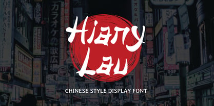 Hiany Lau is Font that inspired by chinese letter style, perfect for any Asian theme of design & promotion to create spectacular designs! Hiany Lau is perfect for branding, logo, invitation, stationery, social media post, product packaging, merchandise, blog design, game titles, cute style design, Book/Cover Title and more. Hope you enjoy with our font! Attype Studio
 - Worker Class by Gassstype,
$25.00 Hello Everyone, introduce our new product Worker Class - Classic Boldmark Font,inspired by the title of the sports poster and We make it very energetically. Worker Class font with strong and challenging nuances. very suitable for the title, typography, Poster, magazines, brochures, packaging,Websites and much more for your design needs, making your designs more modern and professional.
 - Absalon by Michael Nordstrom Kjaer,
$39.00 Absalon has square letter shapes. It has some characteristics semi-sharp and semi-rounded corners and it has a relatively tall x-height for legible text. To create the perfect typesetting the spaces between individual letter forms has been precisely adjusted. The Absalon font family is perfect for the web as well as for print, for display as well as longer text, for motion graphics, on the side of a van, t-shirts, logotypes and so on. The font family consist of 5 weights or 10 styles and it has 410 glyphs. A total of more than 4000 glyphs. The styles are: Light, Light Italic, Regular, Italic, Medium, Medium Italic, Bold, Bold Italic, Extra Bold & Extra Bold Italic. It has OpenType features such as automatic fractions, subscript, superscript, numerators, denomerators, ordinals and the “f” ligature set. Absalon has extended language support (most Latin-based scripts are supported). The name of the font family is Absalon and it is a reference to a Danish bishop in the middle ages. He was a key figure in the founding of Copenhagen, the Capital of Denmark.
 - Soprano by TypeThis!Studio,
$54.00 A well-polished typeface is like the sweet sound of a melodious voice. Soprano is designed for elegant and luxury design elements. Whether it's brands for watches, jewelry, cars or fine wines, Soprano adds the undeniable and outstanding beauty of a professional designed elegant typeface. Soprano offers 5 weights and a full set of upper & lowercase letters, ligatures, old-style & lining figures as well as broad Latin language support. www.typethis.studio
 - Marcinelle by Fando Fonts,
$4.00 The origin of this family is the classic French-Belgian comics. The screams and onomatopoeia of these comics have so much personality that I needed to create a typeface family that would allow the designer to really replicate them. But this family has many more applications: packaging, logos, posters, signage, packaging, branding, etc. With its wide variety of glyphs you can make your sound effects, logos, etc. in most Latin languages.
 - Neuland by Linotype,
$29.99 A rough sanserif titling cut by Rudolf Koch for Klingspor in 1923. The letters give the appearance of being crudely cut in wood.
 - Damasquine by DePlictis Types,
$31.00 Damasquine works well for headlines and titles mostly, could be a sharp Art Deco reinterpreted typeface with a touch of archaic lettering inspiration.
 - WEAR FAT SHIRT by TypoGraphicDesign,
$15.00 CONCEPT/ CHARACTERISTICS A display font that allows you to »Kleckern und Klotzen« (modified German proverb »to not take half-measures«) The fat and square character to the font, a bold and loud statement. The motto is square, practical, fat. The font styles ranging from high-contrast line difference "beanpole" over mediocrity "slim" to the fattest and blackest "okay" style. A font with humor ^^ APPLICATION AREA The modern, square lightweight »Fat Wear Shirt« would be happy as a display typeface in headline size on the following areas and would find this very real bold: Editorial Design (Magazine or Fanzine) or Webdesign (Headline Webfont for your website), party flyer, movie poster, music poster, clothing, fashion, t-shirts, music covers or webbanner. And and and… TECHNICAL SPECIFICATIONS Headline Font | Display Font | Fat Techno Font »Wear Fat Shirt« OpenType Font (Mac + Win) with 3 styles (okay, slim, beanpole) & 268 glyphs. Alternative letters and ligatures (with accents & €) Desktop Font (.otf) + Web Font (.svg, .eot, .woff) KONZEPT/BESONDERHEITEN Eine Display-Schrift bei der Kleckern und Klotzen erlaubt ist! (Verändertes deutsches Sprichwort »nicht kleckern sondern klotzen«) Der fette und eckige Charakter verleihen der Schrift eine plakative und laute Aussage. Das Motto lautet quadratisch, praktisch, fett. Die Schriftschnitte reichen von kontrastreichen Linienunterschied »beanpole«, über mittelmaß »slim« bis zum fettesten und schwärzesten »okay« Style. Eine Schrift mit Humor ^^ EINSATZGEBIETE Das moderne, quadratische Leichtgewicht »Wear Fat Shirt«, würde sich als Auszeichnungsschrift in Headlinegröße über folgende Einsatzgebiete sehr freuen und fände dies echt fett: Logos/Wortmarken aller Art, Flyer für fast jede Party, Platten Cover, CD-Cover und Icon Design, Plakat Design, Kleidung, T-Shirts, Comics und Graphicnovels, Game– und Videospiel Design aller Genres, als Headlineschrift für print und digitale Magazine, Bücher und Webseiten u.v.m. TECHNISCHE INFORMATIONEN Headline Font | Display Font | Fat Techno Font »Wear Fat Shirt« OpenType Font (Mac + Win) mit 3 Schriftschnitten (okay, slim, beanpole) & 268 Glyphen. Inkl. diakritisches Zeichen, alternative Buchstaben, Ligaturen & €. Desktop Font (.otf) + Web Font (.svg, .eot, .woff)
 - Machismo by Fontasmic,
$16.99 Machismo is a seductively suave display font with a plump and plush persona. Bubbling with personality, this friendly font has a weighted look that gives a bold and striking feel to it. Ideal for various uses from small bursts of copy in children's books to poster work, logos, and titling. The "titling" variation swaps shortcaps into the lowercase positions, giving the font even more of a macho persona. It's smooth, it's bold, it's friendly, it's the ultimate pickup artist font, luring in onlookers to get a closer look at what you have to say. Say what you've been wanting to say with Machismo Titling.
 - VVDS Fifties by Vintage Voyage Design Supply,
$15.00Fifties is a mix of classic geometric and a bit of humanistic grotesque. The goal was to create the font for present with look to the past. In other words, I tried to came back the Modernism aesthetics of XX century into nowadays. The result gives you 60 styles including Italic (Slanted). Your typography may be airy and elegant with Expanded Thin, catchy and expressive with Condensed Bold or dynamic and sharp with Expanded Bold Italic. You will find your way to use this family certainly. Theatre posters or party flyers, vintage t-shirt or modern web service, movie titles or magazine header and even infographic – Fifties will suit you everywhere. You may use the completed styles or may use a Variable Font. To make it as you want to. Weights: Thin / Light / Regular / Medium / Semi Bold / Bold. Widths: Condensed / SemiCondensed / Medium / SemiExpanded / Expanded OTF and Variable Font (TTF) OpenType features: Stylistic alternates for A, G, K, M, N, R, W, a, e, g, j, m, n, r, t, u, w, y; Fraction figures; Subscript and Superscript figures; Tabular figures; Typographic spaces: Em / En / Third / Quarter / Thin / Sixth / Hair - Poster Slabserif JNL by Jeff Levine,
$29.00 Based on one of the many hand lettered typefaces found with in the 1960 edition of Sam Welo’s “Studio Handbook for Artists and Advertisers”, Poster Slabserif JNL is available in both regular and oblique versions.
 - SolKing by Fo Da,
$15.00 Solking is an Arabic typeface of a three weights : Sharp, Curved and Rounded . the main focus is on blending traditional and modern rules in the formulation and design of the Kufi type in new style .
 - Handhuel by PojolType,
$12.00 The font is great for logos, branding, apparel and headlines. This typeface encapsulates a wide range of nuances, seemingly, opposite elements such as technology with friendly rounded shapes.
 - Kids Activities JNL by Jeff Levine,
$29.00 Kids Activities JNL is based on the hand lettering found on the covers of some 1955 Cub Scouts activity books. It's available in both regular and oblique versions.
 - Sabotage by Monotype,
$29.99Adam Roe founded in 1991 Lunchbox Studios as an experiment. Adam is also president and founder of his second company Reelhouse Footage und FK in Los Angeles, California. - Printers Stuff JNL by Jeff Levine,
$29.00 A generous assortment of cartoons, catch words, ornaments, embellishments and even a pointing hand tourist sign modeled from an actual vintage metal one round out Printers Stuff JNL.
 - Zone 52 by Haiku Monkey,
$10.00Zone 52 is a carefully crafted, slightly rounded, futuristic font that excels at large point sizes. Comes fully kerned, hinted, and with a large supply of discretionary ligatures. - Radical Brush by Hanoded,
$15.00 Radical Brush is a rather radical font: I made it with a really wild brush and Chinese Ink. I’d probably use it for revolutionary posters, packaging design for extreme products or for R-rated movie posters.
 - Liebelei Variable by Wannatype,
$138.00 The typeface Liebelei has its roots back in 1932, when Vienna-based painter Rudolf Vogl created the poster for a movie called Liebelei after the popular play by Arthur Schnitzler. Now also available as Variable font!
 - Gummies by Heyfonts,
$15.00 Gummies - The fat bubble font is a stylish and playful typeface that features rounded and inflated letterforms, resembling bubbles. The letters are often chunky, with exaggerated curves and soft edges, giving them a plump and rounded appearance. This type of font is popular for its fun and whimsical nature, making it suitable for designs targeting a young audience or those looking to create a lighthearted and energetic atmosphere. The thick and rounded letterforms give a sense of friendliness and approachability, adding a touch of playfulness to any text. The fat bubble font is versatile and can be used in various design applications, such as logos, headlines, posters, invitations, stickers, or website headers. It adds a touch of personality and uniqueness to designs, helping them stand out and grab attention. Overall, Gummies font is an eye-catching and cheerful typeface that captures the joy and energy of bubbles, making it a popular choice for designs that want to exude a sense of fun and playfulness.
 - Mirantz by insigne,
$32.00 Y’all ready for this? Now starting for Insigne: the new serif Mirantz. This rookie all-star plays a precise game every game, cutting at all the right angles to leave your reader impressed and ready to see more. You can always count on Mirantz to lead with solid mechanics and a clean style, but don’t be surprised when the face keeps it real with a little individual flare and creativity. This personal touch is nothing short of elegance in every appearance. So what makes us love this rookie above the other great players in the field? Contrast, for one. Mirantz brings more contrast to the game than most serifs out there. The serifs on this face have a crisp, sharp wedge that naturally draws the reader’s eye. You can’t help but fall in love with its clean, natural style. Mirantz also features a tall x-height and regular proportions that can play a number of positions on the page and still stay strong through the last half of the copy or even the final period. Mirantz is a solid powerhouse player, containing a complete set of small capitals and nine weights from thin to bold. It can play well both down low and up top with its subscripts and superscripts and can move your reader’s eye easily across the copy with its titling capitals, condensed and extended variants, and open style figures. With its options covering more than 72 Latin-based languages, look for this newcomer to have international success in the near future. It you haven’t set your draft picks for this next round of projects, think hard before passing up Mirantz. A capable serif like this one is a guaranteed asset to any team of fonts. Production assistance from Lucas Azevedo.