10,000 search results
(0.041 seconds)
- Montreal Serial by SoftMaker,
$15.99 - Casablanca Serial by SoftMaker,
$- - Nevada Serial by SoftMaker,
$- - Jessica Serial by SoftMaker,
$15.99 - Steiner Special by Canada Type,
$24.95 - Benedict Uncial by Monotype,
$29.99 - Helium Serial by SoftMaker,
$15.99 - Palermo Serial by SoftMaker,
$- - LD Socialite by Illustration Ink,
$3.00 - Penthouse Serial by SoftMaker,
$- - Plymouth Serial by SoftMaker,
$- - Saxony Serial by SoftMaker,
$- - Korinth Serial by SoftMaker,
$- - Lingwood Serial by SoftMaker,
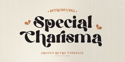
$- - Special Charisma by Say Studio,
$17.00 - Bernstein Serial by SoftMaker,
$- - Generation Uncial by ABC Types,
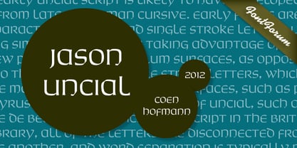
$45.00 - Jason Uncial by URW Type Foundry,
$49.99 - Potus Uncial by Jonahfonts,
$40.00 - Hoboken Serial by SoftMaker,
$- - Evangeliaire Uncial by Intellecta Design,
$14.90 - Sydney Serial by SoftMaker,
$15.99 - Granada Serial by SoftMaker,
$- - Cal Uncial by Posterizer KG,
$16.00 - American Uncial by URW Type Foundry,
$35.99 - Leamington Serial by SoftMaker,
$7.99 - Special Seals by Monotype,
$29.99 - Cyclic Uncial by ArtyType,
$29.00 - Digital Serial by SoftMaker,
$15.99 - Heinemann Special by Heinemann Collection,
$39.00 - Sunset Serial by SoftMaker,
$15.99 - Seagull Serial by SoftMaker,
$15.99 - Special Birthday by Allouse Studio,
$16.00 - Adelon Serial by SoftMaker,
$15.99 - Garamond Serial by SoftMaker,
$- - Gascogne Serial by SoftMaker,
$- - Plakette Serial by SoftMaker,
$- - Bamberg Serial by SoftMaker,
$15.99 - Chantilly Serial by SoftMaker,
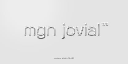
$15.99 - MGN Jovial by Morgana Studio,
$17.50
