10,000 search results
(0.036 seconds)
- Posterizer KG Rounded by Posterizer KG,
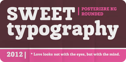
$40.00Posterizer Kg Rounded, is basically rounded version of Egyptian, Slab Serif font Posterizer Kg. By adding rounded corners on serifs, the strict form disappears, in that way, the font gets softer form. Posterizer Kg Rounded is useful for sweet themes like cookies, puppies, love, joy, or some other similar things. - DotumChe by Microsoft Corporation,
$129.00DotumChe™ features plain strokes similar to sans serif designs with half-width Latin characters, and works well for on-screen display such as user interfaces. This DotumChe font file is 5.2 MB in size. DotumChe is a trademark of Microsoft Corporation. DotumChe Character Set: Latin 1, Korean code page 949 - GulimChe by Microsoft Corporation,
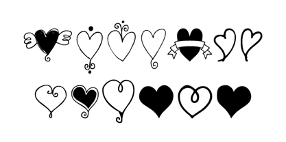
$129.00GulimChe™ features plain strokes similar to sans serif designs with half-width Latin characters, and works well for on-screen display such as user interfaces. This GulimChe font file is 5.2 MB in size. GulimChe is a trademark of Microsoft Corporation. GulimChe Character Set: Latin 1, Korean code page 949 - Heart Doodles by Outside the Line,
$19.00 - MV Boli by Microsoft Corporation,
$49.00MV Boli™ was first introduced with Windows XP to support Thaana script, which is used for the Dhivehi language of the Maldives. Thaana font is similar to the Arabic script and is written right to left. Thaana font uses vowel signs and spaces between words. Character Set: Latin-1, Thaana - Ian Segoe by Ingrimayne Type,
$6.00The faces of IanSegoe were early attempts by IngrimayneType to construct medieval-looking faces. They drew inspiration from several medieval-themed fonts that were available at the time (1990). The upper-case letters are similar but not identical in the two faces but the lower-case letters are completely different. - MS Gothic by Microsoft Corporation,
$39.00MS Gothic™ Japanese font features plain strokes similar to sans serif designs, and works well for on-screen display such as user interfaces. This file is 4.4 MB in size. MS Gothic is a trademark of Microsoft Corporation. MS Gothic font Character Set: Latin-1, Japanese (Code Page 932) - Moonshine Script NF by Nick's Fonts,
$10.00This casually elegant script, similar to the logotype lettering found on Mason jars (hence the name), is patterned after an offering from the 1930s chapbook 60 Alphabets by The Hunt Brothers. The Opentype version of this font supports Unicode 1250 (Central European) languages, as well as Unicode 1252 (Latin) languages. - Marking Device JNL by Jeff Levine,
$29.00Similar to date and numbering stamps, there once was manufactured rotary band stamps with different letter and number configurations that were used for various identification purposes. From a set of vintage bands acquired from a now-closed rubber stamp shop, Marking Device JNL replicates the serif typeface used on these devices. - Escobeta One - Personal use only
- Posteratus Rex - Personal use only
- Cienfuegos - Personal use only
- Buttered Toast by Hanoded,
$15.00Buttered Toast is something a lot of people enjoy every day; when I was working on this font I was hoping to create something similar: an uncomplicated font enjoyed by many. The resulting typeface is exactly what is promised on the package: Buttered Toast is unobtrusive, yet quite refined. It may even be taken for granted, but I sure hope it will be used and enjoyed by many. Buttered Toast comes with a generous helping of diacritics. - Gothic 13 by Linotype,
$29.99Gothic 13 is a bold condensed sans serif typeface. Originally designed in small sizes, Gothic 13 is very similar to Modern Gothic Condensed, which was a turn-of-the-20th-century modernization of a popular nineteenth century style. Until Linotype integrated it into their technology, it did not exist in sizes larger than 24 point. The design used for digitization was the 18-point. Gothic 13 is ideal for display work, especially where space is at a premium. - Juggling Squad by Bogstav,
$19.00The name of the font is from the hilarious movie "21 Jump Street" - and that is where the similarity ends. While the movie is quite funny, it is also super goofy! I can't say the same about the font, because terms like organic and organic comes to my mind. Strange, yes! And I have really no good reason for this naming, other that its an odd way to tribute this one of my all time favourite comic movies! :) - Mano by Linotype,
$29.99Linotype Mano is a fresh new font from the Swiss designer Marco Ganz. Urgent and vital, the typeface suggests swift communication or the latest trends: spontaneous and informal, personal and individual. Ganz deliberately gave the characters a marked lean to the right, similar to that of quick handwriting. But Linotype Mano is not only nimble and quick, it also retains its legibility as a text font. Linotype Mano is as dynamic, brisk and casual as modern pop music. - Distill by MADType,
$19.00Distill draws its inspiration mainly from Theo van Doesburg's De Stijl era lettering. The type he designed for the Aubette Café, De Stijl Magazine, etc was used as a starting point and then expanded upon. While this typeface was inspired by historical references, it also has the ability to invoke a contemporary feel under the right conditions. Distill will work hard whether you are designing a neo-constructivist poster or a futuristic website. Distill is a family of 12 fonts: 4 weights, each containing condensed, regular, and expanded widths. It also features several alternate characters. - Clean Deco JNL by Jeff Levine,
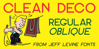
$29.00Normally, a short paragraph or two on this page tells the backstory to a font design. In this particular case, that story has been lost to time. Whatever the original source – whether a vintage bit of typography or an original idea – the beginnings of this font lay unfinished for quite a while as it was perceived to duplicate another previous release. However, after recently checking a sample of the design against other Jeff Levine Fonts, it’s reasonably certain this type face may have similar characteristics, but can stand on its own merit. That said, Clean Deco JNL is available in both regular and oblique versions. - Henry VII by Greater Albion Typefounders,
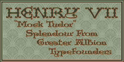
$15.00Henry VII draws it's inspiration from an inscription in Westminster Abbey dedicated to the memory of His Late Majesty of the same appellation. However, it is also in large part in the best tradition of 19th and 20th century Tudor revival. The inscription consisted wholly and completely of Capital Letter forms and we have 'imagined' all the rest in similar style, so Henry VII is very much a Mock Tudor work. Never the less, we feel it is great fun and ideal for lending an aire of 'Olde England' to any piece of design. Best used with 'Greensleeves' playing ever so softly in the background! - Jandys by Alit Design,
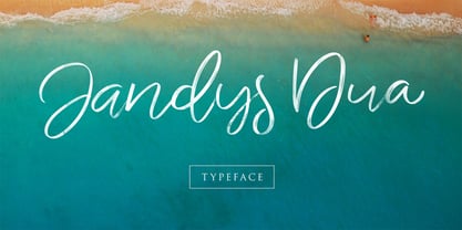
$10.00Introducing Jandys Typeface which has a fast dry brush and elegant style. So it looks natural, like handwritten. This font is best used for your design project that has the concept of elegant, cool and fun. Can also be applied to the design of a logotype, header website, make some lettering a quote, t-shirt design, wedding card design etc. Jandys has two font styles that are similar but different, namely Jandys Dua and Jandys Swash, a dry brush formatted like a used font. Jandys Typeface deserve to be in your fonts collections, because it is unique, elegant and has many options of alternative glyphs. - Billy Ohio by Alit Design,
$10.00Introducing Billy Ohio Typeface which has a fast dry brush style. So it looks natural like a handmade. This font is best used for your design project that has a concept of fun, brave and sporty. Can also be applied to the design of a logotype, header website, make some lettering a quote, t-shirt design etc. Billy Ohio has two font styles that are similar but different, namely Billy Ohio Dua and Billy Ohio Swash of dry brush formatted like a used font. Billy Ohio Typeface deserve to be in your fonts collections because it is unique and has many options of alternative glyphs. - Subatomic Tsoonami - Unknown license
- Zone by Aboutype,
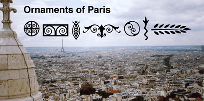
$24.99Graphically drawn face with a somewhat mono weight thick to thin contrast. Zone was designed for all media and can be used in a wide range of point sizes. Similar to FreeZone but with small flared endings. Family includes common capitals and alternate lowercase characters. Zone requires subjective display kerning and compensation. - Ornaments of Paris by Outside the Line,
$19.00 - Girder Poster by GroupType,
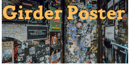
$15.00Girder Poster, also named Spurred Gothic, was inspired by showcard lettering samples featured in the book, Commercial Art Of Show Card Lettering, published in 1945. Although similar to Cooper Bold, Girder Poster's serifs are spurred and the design's inception came out of theatrical poster studios of the mid 1900's in New York. - Calling Card JNL by Jeff Levine,
$29.00In today's day and age, the term "calling card" refers to a prepaid means of making long distance phone calls. In a more gentler time, the calling card (similar to a business card) was what a gentleman presented to a housekeeper or butler when visiting (calling) on a friend or business contact. - Nettally by Twinletter,
$12.00Nettally is a lovely signature font with a delicate and feminine vibe about it. This typeface gives off a sense of elegance, simplicity, and charm. Please feel free to use this typeface in your own project. This typeface was created with a refined natural touch of handwriting to produce parts and compositions that meet your demands. As a result, this typeface is ideal for crafts, children’s writing, adventure posters, and other similar applications. - Froga by Roman Melikhov,
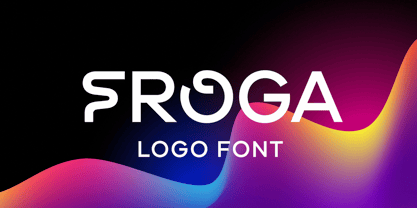
$15.00Froga font is designed to create minimalistic logos, wordmarks, titles, taglines. The place of lowercase letters is taken by usual sans serif letters, in place of uppercase letters there are unusual letters. You can use unusual characters to emphasize separate letters in your text. Use Mixcase Unmixed font if you need suitable usual lowercase letters. It has similar proportions and the same weight. For any questions about the font please contact: arbuzzu@gmail.com - Caliban by Adobe,
$29.00In 1994, John Benson designed the typefaces Caliban, Alexa and Balzano, all with similar characteristics. The typefaces are distinguished by their calligraphic style and their closeness to handwritten script. Caliban looks as though it were written with a broad tipped pen, with reserved yet lively figures which retain their legibility. Caliban is a good typefaces to use in short and middle length texts as well as headlines, wherever a personal touch is desired. - Umbilical Noose by Hanoded,
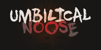
$15.00Umbilical Noose is a rather scary typeface. It is quite similar to an older font of mine: Nyctophobia. The name comes from a Nirvana song called Heart Shaped Box, in which Kurt Cobain sings: "throw down your umbilical noose, so I can climb right back". I have always liked that phrase a lot. Umbilical Noose is an all caps font, but upper and lower case are different and you can easily interchange the glyphs. - Prolexia by Dyslexica,
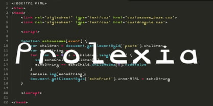
$10.00Prolexia is designed to make the font friendly towards those with dyslexia. All the characters are unique with no rotation or mirroring, this makes it harder for the mind to mix up similar glyphs. The characters are made with the illusion of perspective: this helps orient characters in the correct direction to make mental reorientation harder. Finally the o shape is somewhat flattened, this also helps to counteract mental rotation of characters. - VT Showcard by VarsityType,
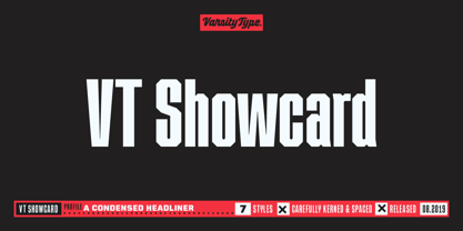
$15.00This condensed block is a true knockout. VT Showcard is a heavy-hitting headliner with presence. Inspired by the boxing showcards of the 60’s and 70’s, VT Showcard towers over body copy and demands attention. This tall and mighty athletic display typeface features chiseled corners and subtle embellishments that reinforce a steady rhythm across its dramatic letterforms. With 7 weights, VT Showcard provides a versatility for sports headlines and similar projects. - Erato by Hoftype,
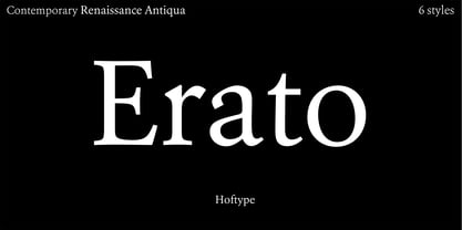
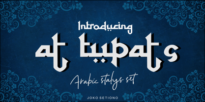
$49.00Erato follows the structure of french and dutch 17th century types. But instead of being historical, it uses modern formal elements. The simplification of similar formal elements creates a homogeneous and contemporary impression. Erato comes in six weights and in OpenType format. All weights contain standard and discretional ligatures, small caps, proportional lining figures, tabular lining figures, proportional old style figures, lining old style figures, matching currency symbols, fraction- and scientific numerals. - At Tupats by Arttype7,
$12.00At Tupats is inspired by the name of a common food from Indonesia during Eid: ketupatfood. This font is in the Arabic style but for writing latin characters and words. The ligatures, stylistic sets, and contextual features of this font will make your writing similar to Arabic calligraphy. It is very suitable for writing in a Middle Eastern style and for use in restaurants, magazines, souvenirs, web, and many Ramadhan-themed projects. - Newark JNL by Jeff Levine,
$29.00Inspired by a set of vintage alphabet game tile pieces, Newark JNL has similar traits to other slab serif Romans, but enough 'quirky' letter widths to break the rules and have it stand out on its own merits. The name derives from font work files in progress, often saved as 'new work' until a fitting name is decided upon. It seemed only right that this phrase be turned around into a font name itself. Newark JNL is available in both regular and oblique versions. - Bernhardt Standard by Linotype,
$40.99Bernhardt Standard, which was designed in 2003 by Julius de Goede, is a flowing Bastarde script. Bastarde is one of the sub-categories of Blackletter typefaces. The term Blackletter refers to typefaces that have evolved out of Northern Europe’s medieval manuscript tradition. Often called gothic, or Old English, these letters are identifiable by the traces of the wide-nibbed pen stroke within their forms. Of all of the various sorts of Blackletter styles, Bastarde scripts are the most flowing, or Italic. The first Bastarde typefaces, cut in the late 1400s, were based on French handwriting styles, especially those styles popular in Burgundy. The flowing nature of Bernhardt Standard makes it similar to some other sorts of Blackletter typefaces as well. Bernhardt Standard, because of its handwritten roots, is also similar to Kurrent, a style of handwriting that was popular in Germany prior the 20th Century. Bernhardt Standard is a very calligraphic face, suitable for formal applications. This typeface would be an excellent choice for certificates or awards. The old style figures in the font allow for nice short settings of text as well. - Accord Alternate by Soneri Type,
$48.00The main difference between Accord Alt and Accord is in the way curved strokes join with vertical stems in letters such as “bpn”. The Italics are designed at an italic angle of 10 degrees. All the letter forms have been kept similar while designing italic instead changing the form e.g. 'a' remains same double story in italic also instead changing it to single story. The intention is to keep it simple and neutral which helps communicate the corporate sense of professionalism. - Gabriel Sans by Fontfabric,
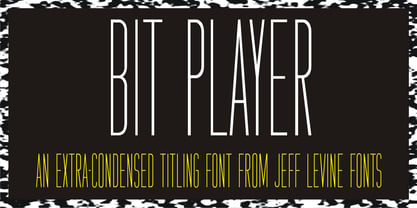
$45.00Gabriel Sans is a font family inspired by the original Sans Serif fonts of the Transitional age like Futura and Grotesk, but with a modern twist. It is clean, elegant and straight-to-the-point. It has features similar to the classic Helvetica - like the endings of the capital C - but goes one step further. It also has a quadratic look, which makes it easily distinguishable and easy to use - the height is nearly as long as the width. It is professional and equally suited to your business or your personal lifestyle; it can be used in logotypes as well as in typeset text. It’s an all-purpose font offering the best of both worlds! Gabriel Sans comes in six weights, italic and normal. - Bit Player JNL by Jeff Levine,
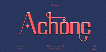
$29.00Bit Player JNL is the extra-condensed companion font to Cast and Crew JNL, and features an additional oblique version. Useful wherever a large block of copy text needs to fit into a constrained space, Bit Player JNL can be applied to movie title credits, disclaimers, warranty information, end user license agreements and similar projects. - Achone by Jadatype,
$15.00Achone is a sans serif font with a stylish alternative. Achone is able to show a serious impression, and can also be elegant. Achone has regular & italic versions. contains standard English letters and some letters that support multilingualism. Achone can be installed easily on applications such as the adobe family, affinity, or similar applications.
