10,000 search results
(0.027 seconds)
- Al Boulevard Signature by Aluyeah Studio,
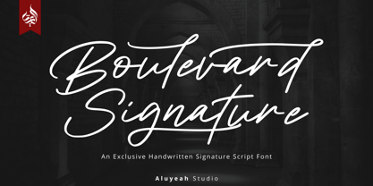
$125.00Hello Aluyeaholics! Boulevard Signature, an exclusive handwritten signature font. Coming with 100+ stunning and super easy to use alternates and ligatures. Very suitable for your wedding invitation, packaging, apps, magazine, headline, website, ads and all type of design project you have. Super Easy to Use alternates - You can easily call alternates using special combination like a.2 k.3 b.4 t.h c.c etc. To get results like the preview just type Boul.4evard.3 Sig.4nature - Al Badlooking Brush by Aluyeah Studio,
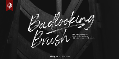
$90.00Badlooking Brush, the ugly duckling modern script font. Coming with 52 alternates, 9 stunning swash and super easy to use alternates. Very suitable for magazine, headline, website, ads, product package and all type of design project you have. Features: OpenType support Multilingual support (15 languages) PUA Encoded Super Easy to Use alternates - It's OpenType support but you can easily call alternates character using special combination like A.2 R.2 a.2 h.2 etc so you don't need a special software. To get results like the preview just type Badloo.2king B.2ru.2sh - Al Lonely Bridges by Aluyeah Studio,
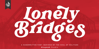
$125.00Hello Aluyeaholics! Lonely Bridges a stunning display font inspired by the soul of solitude. Lonely Bridges carries an italic style giving the impression of an unstable, rebellious, and indecisive soul. Make your design project more emotional to convey. Coming with 150+ stunning and super easy to use alternates and ligatures. To get results like the preview just type L.4onel.4y B.3r.idges.2 - Al Britania Ligatura by Aluyeah Studio,
$99.00Britania Ligatura, a Ligature Addict Display Font Coming to you with 170+ stunning alternate and ligature to create a perfectly fashionable, beautiful, fancy, and elegant design. Features: OpenType support Multilingual support (15 languages) PUA Encoded Super Easy to Use alternates - It's OpenType support but you can easily call alternates character using special combination like A.2 B.2 a.2 b.2 etc. so you don't need special software. For special ligature you can use combination like a.n a.m u.b d.h etc To get results like the preview just type B.4r.ita.ni.2a.2 Liga.tur.a Thanks for checking out my font. I really hope you enjoy using it! - Al Beauty Ballerina by Aluyeah Studio,
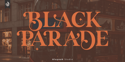
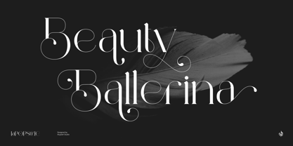
$125.00Introducing Beauty Ballerina, the top choice for those looking for a typeface that exudes beauty and grace. Every exquisite detail of this typeface mirrors the strength, passion, and elegance innate to each ballerina, making it an embodiment of the beauty and grace that ballet dancers exude. Featuring an extensive collection of over 360+ quick-access ligatures and alternatives, it allows everyone to delve deeper into their imagination and reshape their creations with luxury. - TE Al Thuluth by Tharwat Emara,
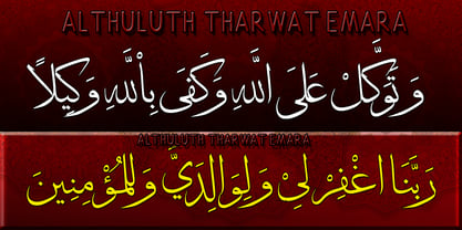
$75.00This Font is similar to the calligraphic style AL THULUTH. I added many glyphs to each other to get this feature and it become easier to graphic designer to write with Arabic AL THULUTH font without being a real calligrapher. It works beautiful in Headlines of Arabic books and photos and it is Fine Art . It also used in writing on T-shirts and clothes . This Font contains many Glyphs in Latin, Farsi, Urdu, Arabic ). - Alte DIN 1451 Mittelschrift gepraegt - 100% free
- A Fire Inside The Walls - 100% free
- Picz JNL by Jeff Levine,
$29.00Picz JNL is a rockin' font made up of guitar picks and is perfect for any projects representing good times. Use it moderately in short phrases or as initial caps, or combine it with Sock Hop JNL for a matching look. Limited character set. - Ale and Wenches BB - Personal use only
- HS Al Basim A by Hiba Studio,
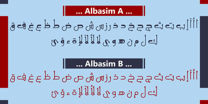
$59.00HS Albasim A is an Arabic display typeface. It is useful for headlines, books covers and other graphic projects. It is a collaborative effort, as "HS Albasim A" first letters were designed and drawn by Basim Salem Al Mahdi from Iraq and then developed and digitalized as a typeface by Hasan AbuAfash from Palestine. The font is based on the simple lines of Fatmic Kufi but was it distinguished by two main ideas: First, it contains a nice serf in the vertical strokes of its letters. The second, some of storks in its letter differ in the thickness instead of being similar, as it is in the Fatmic Kufi style. The font contains only two weights: regular and bold. Both of them support the OpenType features of Arabic, Persian and Urdu. - Gauche Display by Megami Studios,
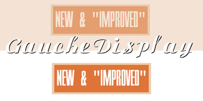
$7.50Gauche Display is a "tasteless and awkward" script font for those who don't exactly want sophistication in their typographic script usage. Er, um, uh..."inspired" by several script fonts (all of which look much, much prettier), you can't take your eyes off this font, much in the same way you can't stop looking at a trainwreck. In other words, it sucks on purpose and lives up (or down, take your pick) to its name. - Bebas Neue - 100% free
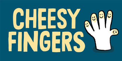
- Cheesy Fingers by PizzaDude.dk,
$18.00I love cheese snacks in all kinds of variations. As a kid I even loved having chessy fingers, but as an adult I prefer to wash my hands (instead of licking and sucking each finger "clean") So, as a loving memory of an all time favourite snack, I made this all caps organic looking sans. Obviously handmade, and cleaned up digitally...just a little bit. Furthermore I have made 5 different versions of each letter and made sure that there is plenty of multilingual support! - Mittelhorn by High Peak,
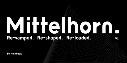
$23.00Mittelhorn is a clean, readable, distinctive neo-grotesque. Use it for logotypes, web, signage, or editiorial design. Make a statement and choose one of the alternate sick glyphs… Main features: The family comes in three weights and matching italics Reinterpreted numbers and punctuation Comprehensive character sets for Western and Central European language Selected alternate uppercase sick glyphs for extra character Each glyph in this family was crafted with intention and care. It is a creative yet versatile and very readable font that you can easily use on a range of applications - headlines, billboards, signage, web copy, editorial, publishing… Most of all, have fun with it! - Pascual Ferry by Comicraft,
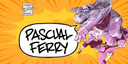
$39.00The slick and sexy letterforms of Ace ACTION COMICS artist, Pascual Ferry, are the latest to join our MASTERS OF COMIC BOOK ART font line. Pascual's work on the SUPERGIRLS storyline in ACTION made us want to lick each page -- but, y'know, not when anyone was looking... we know they're just comic book characters, they're not REAL and we don't fancy them or anything -- Uhhh... so we were delighted when Pascual invited us to create this stylin' sans souciant family of fonts for him. All we asked for in return was this smokin' alternate cover for the next issue of HIP FLASK... Hey, don't lick your monitor, you might get an electric shock... - Bebas - Unknown license
- Mushmouth PB by Pink Broccoli,
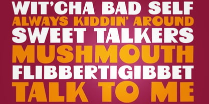
$14.00If your looking for a vintage animated typestyle that still feels current today, you've just found it! Mushmouth PB started as a digitization of a film typeface called "Albert" by LetterGraphics. This all capitals font has a super subtle bounce and a playful heavy weight. An extruded film variation of this typeface was used back in the day on Post's Frosted Rice Krinkles cereal. Named in tribute to the original font name "Albert", we picked a fellow member of Fat Albert's gang for the name of this font. We think it is fitting, even though the original film font naming had nothing to do with the cartoon at all. Give Mushmouth a spin and pick it up today! - VLNL Duct by VetteLetters,
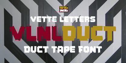
$35.00Duct tape is one of the most versatile adhesive materials known today. From fixing the bumper of your car that keeps falling off, to creating a sturdy wallet. From alternative wrapping to sticking a friend to the wall, Duct tape is there. And it will stay there. It will stick to anything and hold for a very darn long time too! The cloth-backed tape was invented some time during World War II, and also proved itself useful as a base material for lettering. VLNL Duct was originally designed by DBXL as a logo for temporary Amsterdam restaurant BAUT. DBXL imagined an owner taping the name on the window of his shop using Duct tape. The font was used for all communication of the restaurant. Duct is a sturdy, rough all-caps typeface that will stick to anything. - Occoluchi Minicaps - Personal use only
- Deadline Remastered by Comicraft,
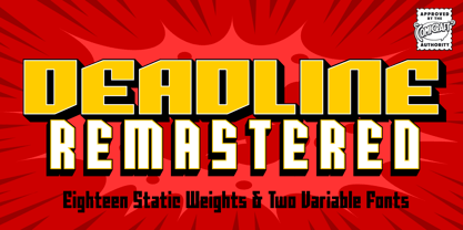
$29.00The hands on the clock tick inexorably on... the numbers on the digital display roll inevitably toward zero... time is tight, the fuse is getting shorter and the beads of sweat on your forehead are glistening in the red light of the LCD... you have come to a place where the only thing you feel are loaded guns in your face... can YOU handle the DREADED DEADLINE DOOM?!? TICK TICK TICK TICK TICK TICK TICK TICK TICK THRAKAKAKATHOOM! Uh oh… you blew it. Deadline Remastered features 18 static weights, including the new nearly square "Block", each with complete Western & Central European language support. Use the Solid & Open Variable fonts to access unlimited width and angle options. - SteelTongs - Unknown license
- CosmosCaps - Unknown license
- Bronzo by XO Type Co,
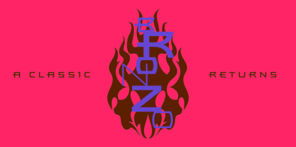
$39.00This is a 2023 redesign of Bronzo, originally designed by Rick Valicenti and Mouli Marur in 1991. With this redesign, Bronzo now has 6 new weights, for a total of 9, and 587 more glyphs than it was able to in 1991. Bronzo appears to move forward, yet remain still, via a center stroke that only sticks out on the left, a tense curve that only happens on the right, and a width that sits uncomfortably between square and rectangle. Those three things, combined with a balanced light to dark ratio, are what makes Bronzo appear tense and ready. Bronzo accepts Modernist ideals of minimal, rational construction—but it also adopts luxuriant shapes over Modernism’s sandblasted neutrality. It’s almost an alternate reality, a “what if?” of Modernism. Modernism’s fun, interesting, cute reboot. - KG Like A Skyscraper - Personal use only
- LED Counter 7 - Personal use only
- MondoRedondo - Unknown license
- AT Orlando by Monotype,
$29.99Orlando is the work of British designer Freda Sack. It is an all capital, outline typeface including a complete set of swash initials and an array of stunning flourishes designed especially for this typeface. Orlando was inspired by and modelled upon 19th century antique type styles. - Orlando by ITC,
$29.99Orlando is the work of British designer Freda Sack. It is an all capital, outline typeface including a complete set of swash initials and an array of stunning flourishes designed especially for this typeface. Orlando was inspired by and modelled upon 19th century antique type styles. - Spotted Fever - Unknown license
- Slugfest - 100% free
- BoogieNightsNF - 100% free
- Grasshopper - Unknown license
- TestarossaNF - 100% free
- NotMaryKate - 100% free
- StonyIslandNF - 100% free
- CampGranadaNF - 100% free
- GingerPeachy - Unknown license
- HamburgerHeaven - Unknown license
- PayzantPen - Unknown license
