10,000 search results
(0.03 seconds)
- Wordy Diva by Chank,
$99.00Take a gander at this jaunty, journal-inspired handwriting style. Wordy Diva was drawn in 1995 by Lisa Bralts and faxed to Chank Diesel. The fax was converted to font format, and it soon became one of Chank's most popular handwriting fonts. You can download this hurried yet intelligent lady's handwriting font today. - Dominatrix BB by Blambot,
$20.00Dominatrix is a dirty little font who won't let up until you say the safe word. And I'm not telling you what the safe word is. This font comes with autoligatures so consecutive duplicate letters won't look identical. It also has more European characters than you can shake a leather whip at. - Rankensteen by Ingrimayne Type,
$9.00 Many blackletter and calligraphic typefaces are elegant and can be used for items like invitations and liturgical or religious texts. Rankensteen is probably not one of them. It is crude and bizarre and with a somewhat menacing appearance. It seems more appropriate for a letter from a pirate than for a formal invitation.
 - Dolcissimo by Resistenza,
$39.00 Dolcissimo is a sans serif typeface with a geometric skeleton that has been built drawn by hand which makes it a friendly typeface. This font has more than 28 decorative styles, that can be overlapped, because Dolcissimo is a layered font. We highly recommend to use Dolcissimo for packaging design, logo branding, ads.
 - City Tour by Jehansyah,
$9.00 City Tour This theme font is very beautiful when used as wall hangings or as your trade product, make logos, symbols, and several other design works, there are several families that you can choose and adjust to your design, make sure this will change the way you see the font design more modern
 - Vendor JNL by Jeff Levine,
$29.00Vendor JNL is Jeff Levine's take on the popular ribbon font of the Victorian Era, but using a vertical type (Trade Journal JNL) rather than skewed letters. End caps for the ribbon can be found on the left and right parenthesis, and a blank panel is on the hyphen key. Limited character set. - Sonderlina by Craft Supply Co,
$9.00 Sonderlina is a convenient and modern grotesk sans serif features low contrast details to cover small text purposes. It can be used to create almost all types of design projects like print materials. Just use your imagination and your project will become more alive and look great than ever with this typeface.
 - Sweetie Autumn by Balpirick,
$15.00 Sweetie Autumn is a Beautiful Calligraphy Font. Sweetie Autumn is an elegant script font with a contemporary atmosphere and impeccable form, inspired by timeless classic calligraphy. Not too thin and not too thick, balanced and varied, this font was designed to enhance the beauty of your projects. Sweetie Autumn also multilingual support. Thank you!
 - Madani by NamelaType,
$49.00 Madani is a geometric sans serif consisting of 9 weights ranging from Thin to Black and matching Oblique. With a touch of character choice, adding tails to some glyphs on the stylistic set 1 and pointing joined at some of the tapered characters in the stylistic set 2, suitable for display and body text font.
 - Kammerlander by Juraj Chrastina,
$29.00 Kammerlander is a sans typeface with a distinctively strong thick/thin contrast. It’s based on Messner- a hairline font with a constant stroke weight, so their combination looks very natural. They look great in fashion magazines, in the expensive world of beauty and glory. Kammerlander is an all caps face, especially suitable for larger sizes.
 - Asterism Clean by Great Lakes Lettering,
$30.00 Asterism Clean is the smooth lined version of Asterism. It is a calligraphy style font with a moving baseline and lots of shining personality. Also contains a bold and a monoline version. This hand written style font is based on one of Molly’s signature calligraphy styles and pairs beautifully with Frosted, Icing, Saint Agnes.
 - Civic Triline by Greater Albion Typefounders,
$20.00 Civic Triline was inspired by a beautifully lucid (and hand lettered) example of municipal signage. It is a clear and easy to read sans serif display face, constructed of one thick and two thin lines. Civic Triline is an ideal typeface for making stylish signage or lettering posters with a modern yet distinctive look.
 - Lehmann by ParaType,
$30.00 PT Lehmann™ was designed for ParaType in 2002 by Tagir Safayev. Inspired by letterforms of Shiroky (Wide) Renaissance typeface and other fonts of Ossip Lehmann foundry, St.-Petersburg, c. 1874. A face of the so-called Elzevir type has thin triangular serifs and sharp spiral-like terminals. For use in advertising and display typography.
 - Willful by Mr. Typeman,
$12.00 Take a look at my new font Willful with its light and airy outlines, which will add something cute and soft to your designs. The font is amazing in itself and will be perfectly combined with thin handwritten typefaces. Willful comes with uppercase, lowercase, standard punctuation, numerals, special letters for most of the European languages.
 - PAG Tekov by Prop-a-ganda,
$19.99Prop-a-ganda offers retro-flavored fonts inspired by lettering on retro propaganda posters, retro advertising posters, retro packages all the world over. This is perfect font for your retrospective project. PAG Tekov is designed by extreme bold line, extreme thin line, circle, and triangle. It is so decorative, but with light and cute touch. - Genius by Artegra,
$19.00 Genius is a clean, geometric typeface with great legibility and modern look, which makes it a perfect typeface for any kind of use. It's especially suitable for branding, advertising, magazines, web design and so on. Created by Ceyhun Birinci, the Genius family consists of 9 weights from thin to black along with their italics.
 - Klyson by Abbasy Studio,
$15.00 Klyson Font Duo is a clean bold brush script and thin sans. This script font comes with multiple alternates that will make your words look more cool. With additional sans font you will be able to create the beautiful combination. Both of these font is great for Logos, Lettering, Clothing Design, Poster, Label, Quotes, etc.
 - Apprentice Signwriter JNL by Jeff Levine,
$29.00 Inside the book “New Zanerian Alphabets” (1900) by C.P. Zaner is a set of thin monoline letters and numbers along with many chamfered characters offered as alternates to the main design. This simple, but effective type style has been redrawn digitally and is now available as Apprentice Signwriter JNL in both regular and oblique versions.
 - Samy by Soda,
$20.00 Samy is pure warm in a rational world. Yet its features cover uses of any kind. From very thin to chubby weights, this typeface offers a wide range of styles. This work is composed of two subfamilies: Samy, which gives a more conventional font looking, and the Alt version, conveying more fun and joy.
 - Accent Graphic by G-Type,
$46.00 Accent Graphic was developed as the corporate typeface for a London design consultancy in 1997. The starting point was the word ‘accent’ in lower case. It is essentially a sans typeface with the thick/thin contrast of a serif and is the only family in the G-Type collection that was designed for a client.
 - Neue Konstrukteur Round by HouseOfBurvo,
$15.00 Neue Konstrukteur Round is an engineered, mechanical typewriter font with a hint of heritage blackletter. Inspired by a trip to Germany this font has five weights from Thin to Black with accompanying italics. That makes 10 font files in total, enough for the most demanding projects. Also check out its sister font Neue Konstrukteur Square.
 - MGN Jovial by Morgana Studio,
$17.50 MGN Jovial (2023) by Morgana Studio is a sleek font perfect for futuristic logotypes, embodying a minimalist and avant-garde design. Its versatility shines in tech logos and futuristic app interfaces. The color palette, featuring metallic tones and futuristic blues, amplifies its high-tech appeal. Scalable and legible, it encapsulates modernity and sophistication in design.
 - Free Form Retro JNL by Jeff Levine,
$29.00 The titles and credits from the 1960 French film “Le Passage Du Rhin” (English release title: “Tomorrow is My Turn”)” are hand made in a free form bold alphabet resembling both cut paper and quickly sketched lettering. This avant garde style inspired the digital type revival, which is available in both regular and oblique versions.
 - Regarn by Craft Supply Co,
$15.00 Regarn Font Family is a sans serif font with 9 weight options to choose from thin to black, Regarn is versatile enough for any type of project. Whether you’re a designer looking for a new font to add to your collection, or just need some basic text fonts on hand, Regarn has you covered.
 - Elfeylasting by Allouse Studio,
$16.00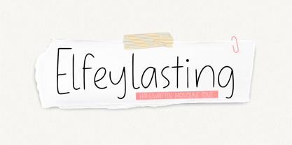 Proudly Presenting, Elfeylasting A Handwrittten Thin Font. Elfeylasting is perfect for any titles, logo, product packaging, branding project, megazine, social media, wedding, or just used to express words above the background. Elfeylasting also come with Multi-Lingual Support. Enjoy the font, feel free to comment or feedback, send me PM or email. Thank You!
 - ALS Agrus by Art. Lebedev Studio,
$63.00 Agrus in Ukrainian means "gooseberry". The letters are rounded like the berries and the sharp end elements remind of the barbs. In fact, the font is an intricate italic type. Optical compensations are purely decorative and rhyme with thin connecting lines. Design of this font is one hundred percent due to “strength of material”
 - Statendam by Hanoded,
$15.00 Statendam is an all caps Art Deco font. It reminds me of the bold lettering used for cruise ship posters from the interbellum, especially those used for the Holland America Line (HAL) ads. It is not a recreation of a particular typeface; merely my salute to a bygone era. Statendam comes with all diacritics.
 - Neue Konstrukteur Square by HouseOfBurvo,
$15.00 Neue Konstrukteur Square is an engineered, mechanical typewriter font with a hint of heritage blackletter. Inspired by a trip to Germany this font has five weights from Thin to Black with accompanying italics. That makes 10 font files in total, enough for the most demanding projects. Also check out its sister font Neue Konstrukteur Round.
 - Autumn Voyage by Hanoded,
$15.00 Autumn is my favourite time of the year: I love the colors in the forest, the colder temperature and the stormy winds. Autumn Voyage is a very nice set of hand made fonts: a fat one, a thin one and a lovely autumn leaves doodle pack. Comes with a heap of diacritics as well.
 - Magical Smiles by Tlatous Type,
$19.00 Introducing Magical Smiles by Tlatoustype A fancy and fun handcrafted font that create to impress your audience and make your branding shine. Make your projects dance with this elegant and wonderful font wherever you use it. Use it for your headings, logos, ads, printed quotes, packaging, and even your website or social media branding.
 - Bonjourno by Aestherica Studio,
$9.00 Bonjourno is a beautiful modern calligraphy font based on manual handwriting. The stylistic alternate, ligatures, and the tick and thin strokes make this font looks like real handwriting. This font is perfect for logos, invitations, labels, magazines, books, greeting/wedding cards, packaging, fashion, make-up, stationery, novels, labels, or any type of advertising purpose.
 - Sarion by Lemonthe,
$17.00 Sarion is an elegant signature font with a monoline style, featuring a lovely flow. It has a clean, thin and smooth vibe and it will be a hit for any design that you want to add it to. It’s perfect for many different projects such as logos and branding, invitations, signature, labels, photography, and more!
 - Pringle by Arendxstudio,
$20.00 Pringle - Display Variable Font is a versatile, bold and unique font. Combination between high contrast and Brutalism style, Pringle has a unique style with stylistic, alternates,and supports multilingual languages. Features : • Character Set A-Z • Numerals & Punctuations (OpenType Standard) • Accents (Multilingual characters) Weights: Thin / Light / Regular / Medium / Semi Bold / Bold. OTF and Variable Font (TTF)
 - Ring Quad by Ochakov,
$9.00 Ring Quad is brave and confident from thin to black. A cleaner, geometrical and professional aesthetic. Ring Quad is a modern & minimalist font. It’s perfect for branding, logos, quotes, posters, name card, stationary, and every other design that needs a striking typeface. Now, Ring font family prepared for any insane adventure life throws our way!
 - Secretsoul by Balpirick,
$15.00 Secretsoul is a Monoline Handwritten Font. Secretsoul Monoline is a thin lettered, refined script font that emanates sophistication and elegance. Its stylish alternates and ligatures make this font the perfect match for any project. Secretsoul also multilingual support. Enjoy the font, feel free to comment or feedback, send me PM or email. Thank you!
 - Travel Plans JNL by Jeff Levine,
$29.00 A 1930s travel poster from American Airlines had the airline’s name in a classic thick-and-thin Art Deco design of hand lettering. With the addition of angular spurs, some of the characters become semi-serif in nature. This type style is now available as Travel Plans JNL, in both regular and oblique versions.
 - Benoa by Creativemedialab,
$20.00 Benoa is a versatile font family for your design, consist of 6 weights from thin to black with dozens of alternates. Benoa works well with any style of design concept, from branding to a nice bold modern look! Benoa also available in Variable format, multilingual support, numbers, and currency symbols, and dozens of alternates.
 - Calhoun by Josh Grzybowski,
$19.99 Built with both thick and thin lines this display font uses heavy round terminals giving this almost didone-style font a more playful and slightly stylish look. Perfect for magazines and publications as well as for identity and branding. The character set contains typical OpenType features in addition to small caps, and old style numbers.
 - Erotica by Lián Types,
$49.00 “A picture is worth a thousand words” and here, that’s more than true. Take a look at Erotica’s Booklet; Erotica’s Poster Design and Erotica’s User’s Guide before reading below. THE STYLES The difference between Pro and Std styles is the quantity of glyphs. Therefore, Pro styles include all the decorative alternates and ligatures while Std styles are a reduced version of Pro ones. Big and Small styles were thought for better printing results. While Big is recommended to be printed in big sizes, Small may be printed in tiny sizes and will still show its hairlines well. INTRODUCTION I have always wondered if the circle could ever be considered as an imperfect shape. Thousands of years have passed and we still consider circles as synonyms of infinite beauty. Some believe that there is something intrinsically “divine” that could be found in them. Sensuality is many times related to perfectly shaped strong curves, exuberant forms and a big contrasts. Erotica is a font created with this in mind. THE PROCESS This story begins one fine day of March in 2012. I was looking for something new. Something which would express the deep love I feel regarding calligraphy in a new way. At that time, I was practicing a lot of roundhand, testing and feeling different kinds of nibs; hearing the sometimes sharp, sometimes soft, sound of them sliding on the paper. This kind of calligraphy has some really strict rules: An even pattern of repetition is required, so you have to be absolutely aware of the pressure of the flexible pen; and of the distance between characters. Also, learning copperplate can be really useful to understand about proportion in letters and how a minimum change of it can drastically affect the look of the word and text. Many times I would forget about type-design and I would let myself go(1): Nothing like making the pen dance when adding some accolades above and below the written word. Once something is mastered, you are able to break some rules. At least, that’s my philosophy. (2) After some research, I found that the world was in need of a really sexy yet formal copperplate. (3) I started Erotica with the idea of taking some rules of this style to the extreme. Some characters were drawn with a pencil first because what I had in mind was impossible to be made with a pen. (4) Finding a graceful way to combine really thick thicks with really thin hairlines with satisfactory results demanded months of tough work: The embryo of Erotica was a lot more bolder than now and had a shorter x-height. Changing proportions of Erotica was crucial for its final look. The taller it became the sexier it looked. Like women again? The result is a font filled with tons of alternates which can make the user think he/she is the actual designer of the word/phrase due to the huge amount of possibilities when choosing glyphs. To make Erotica work well in small sizes too, I designed Erotica Small which can be printed in tiny sizes without any problems. For a more elegant purpose, I designed Erotica Inline, with exactly the same features you can find in the other styles. After finishing these styles, I needed a partner for Erotica. Inspired again in some old calligraphic books I found that Bickham used to accompany his wonderful scripts with some ornated roman caps. Erotica Capitals follows the essentials of those capitals and can be used with or without its alternates to accompany Erotica. In 2013, Erotica received a Certificate of Excellence in Type Design in the 59th TDC Type Directors Club Typeface Design Competition. Meet Erotica, beauty and elegance guaranteed. Notes (1) It is supossed that I'm a typographer rather than a calligrapher, but the truth is that I'm in the middle. Being a graphic designer makes me a little stubborn sometimes. But, I found that the more you don't think of type rules, the more graceful and lively pieces of calligraphy can be done. (2) “Know the forms well before you attempt to make them” used to say E. A. Lupfer, a master of this kind of script a century ago. And I would add “And once you know them, it’s time to fly...” (3) Some script fonts by my compatriots Sabrina Lopez, Ramiro Espinoza and Alejandro Paul deserve a mention here because of their undeniable beauty. The fact that many great copperplate fonts come from Argentina makes me feel really proud. Take a look at: Parfumerie, Medusa, Burgues, Poem and Bellisima. (4) Some calligraphers, graphic and type designer experimented in this field in the mid-to-late 20th century and made a really playful style out of it: Letters show a lot of personality and sometimes they seem drawn rather than written. I want to express my sincere admiration to the fantastic Herb Lubalin, and his friends Tony DiSpigna, Tom Carnase, and of course my fellow countryman Ricardo Rousselot. All of them, amazing.
 - Chaco by Tipo,
$69.00 The idea behind the font called Chaco originated after testing the deficiency shown in road signs in Latin America. The design began after a long documenting period. Throughout the various stages of the work, there were several tests and checks conducted of the formal solutions implemented which, based on the results, would gradually be changed until we finally reached, in this way, its definite design. The original project for the font features three steps, namely: regular, light and bold, yet by making progress in the development, it was possible for us to perceive that by enlarging the black and thin variances, the family with 5 different weights could offer very good results in mass media, such as newspapers, magazines and television. In order to expand its possibilities of utilization, the set was completed with italics and small capitals.