10,000 search results
(0.034 seconds)
- Selaive by Latinotype,
$39.00 Selaive is a geometric typeface that has an air of rebelliousness. The thick and thin versions give you the chance to play a coquettish and seductive game. Its flourishes make it a very dynamic typeface when composing a text, ideal for those who want to add a personal and glamorous touch to their compositions. Selaive is an excellent choice for fashion magazines, logotypes and shops. Languages include: Basic Latin, Western European, Euro, Catalan, Baltic, Turkish, Central European, Romanian and Pan Africa Latin. Programed by Daniel Hernández
 - Gilly Fleurs by Maulana Creative,
$14.00 Gilly Fleurs Signature is casual signature font, with clean thin mono-line stroke, slanted, condensed and fun character. It has Opentype features ligatures of character and lowercase alternates, To give you an extra creative work. Gilly fleurs font support multilingual more than 100+ language. This font is good for logo design, Social media, Movie Titles, Books Titles, a short text even a long text letter and good for your secondary text font with sans or serif. Make a stunning work with Gilly Fleurs Signature font.
 - Terrakota by Maulana Creative,
$13.00 Terrakota is casual signature and Sans font duo, with clean thin mono-line stroke, slanted, condensed and fun character. It has Opentype features ligatures of character and lowercase alternates, To give you an extra creative work. Terrakota font duo support multilingual more than 100+ language. This font is good for logo design, Social media, Movie Titles, Books Titles, a short text even a long text letter and good for your secondary text font with sans or serif. Make a stunning work with Terrakota font duo. Cheers, MaulanaCreative
 - Brolian by Ekahermawan,
$23.00 Brolian is playful and stylish designed font for any display use with 9 weights from Thin to Black. Brolian also includes with more than 200+ alternates characters (PUA Encoded) and 50+ ligatures to give you a wide range for create a beautiful typographic design results. Brolian is versatile font for many different projects such as logo, branding, poster, magazines, labels, merchandise, invitation, presentation, advertising, quotes and so much more! FEATURES: OpenType support Playfull to use (with ligatures and alternates options) Multilingual support PUA Encoded
 - Offenders Club by Maulana Creative,
$14.00 Offenders Club is a signature script and sans serif font. With thin felt tip stroke condensed sans serif Display, fun character with a bit of ligatures. To give you an extra creative work. Offenders Club font support multilingual more than 100+ language. This font is good for logo design, Social media, Movie Titles, Books Titles, a short text even a long text letter and good for your secondary text font with sans or serif. Make a stunning work with Offenders Club font. Cheers, MaulanaCreative
 - Brozas by Pesotsky Victor,
$12.00 «Brozas» is a contemporary font for modern design. Created for digital art, Web-design, magazine layout. Brozas font is an unusual experience and an experiment on the edge of decorativeness. Drawing letters has a sharp, contrasting character and combined with smooth arcs. Different weights change not only the thickness of the strokes but also their shape. Brozas supports Basic Latin and Extended Latin, Cyrillic — in total about 200 languages are supported. The font has three weights: Thin, Regular and Black. Brozas font was designed by Viktor Pesotsky.
 - Tilson by Marc Lohner,
$28.00 Meet Tilson, a versatile workhorse family for both texts and headlines based on a geometric and straight-lined design. It will give your apps, websites, logos, posters and so much more a techy and masculine look and feel. However, some friendly rounded details, such as the i-dot, add a rather pleasant personality to this family. With more than 200 languages covered, many opentype features on board, obliques, and weights ranging from Thin to Black, Tilson is a truly versatile companion for your next design project.
 - SbB Intermodal Stencil by Sketchbook B,
$9.00 Inspired by stenciled lettering on crates and shipping containers, Intermodal is a 18-typeface family consisting of six widths and corresponding italics in two different angles. Intermodal uses only vertical stencil cuts— creating a dynamic rhythm and a unique, industrial feel. The variable font allows for customization of weight, slant and stencil opening size. 18 fonts Six widths: A-F Regular and two different oblique angles Tabular Opentype Numbers and an alternate "9" Variable font allows you to change weight, slant and stencil opening size
 - Milatones Signature by Maulana Creative,
$15.00 Milatones is casual signature font, with clean thin mono-line stroke, super slanted, condensed and fun character. It has Opentype features ligatures of character and lowercase alternate "t", To give you an extra creative work. Milatones font support multilingual more than 100+ language. This font is good for logo design, Social media, Movie Titles, Books Titles, a short text even a long text letter and good for your secondary text font with sans or serif. Make a stunning work with Milatones font. Cheers, MaulanaCreative
 - Potomac by Context,
$15.00 A hearty utilitarian face inspired by stenciled type found on train cars and shipping crates. Ideal for posters, headlines, and titling.
 - Skippie by RodrigoTypo,
$25.00 Skippie - a typeface specially designed for children's titles - contains different weights from Thin to DemiBold, with extras, dingbats and many alternates.
 - Lagniappe by Funk King,
$5.00 Lagniappe is a thin decorative font. Kerning is not the best on this one. You may want to adjust as needed.
 - Tant Lilian by Cercurius,
$19.95 A thin, very elegant caps-only cross-stitch font, based on an embroidery pattern from the end of the 19th century.
 - Elongated Roman by Aboutype,
$24.99An ultra light thins all caps Victorian design with a slight stroke contrast. Elongated Roman requires subjective display kerning and compensation. - New York Line by Kustomtype,
$30.00 When you go traveling you always fall in love with something… At this time, it is the inscription of Holland America Line which is sparkling on ‘New York Hotel’, Rotterdam-Holland. Based on the letters I had at my disposal from the Holland America Line inscription at ‘Hotel New York,’ I started to complete the alphabet in the same style as the original text. Eventually, I digitized everything in order to acquire a usable and modern font to be able to use it for all graphic purposes. The font is ideal for head text, posters, logos, editorial, branding, signage, web applications, modern design, etc... Don't hesitate to use this unique historical font! It will give your work that glamour that you will find in this extraordinary font. Enjoy the New York Line. The Holland America Line was founded in 1873 as the Dutch-America Steamship, a shipping, and passenger line. Because it was headquartered in Rotterdam and provided service to the Americas, it became known as Holland America Line (HAL). From 1901 the iconic building on the Kop van Zuid shines. It previously housed the Holland America Line; now it houses the hotel-restaurant, Hotel New York. A building with a great history. Hotel New York has a beautiful history. Built in 1901, many ships sailing away and opened in 1993 as a hotel and restaurant. The New York Line Font comes with uppercase, lowercase, numerals, punctuations so you can use it to customize all your designs. Perfect for Logos, Letterhead, Poster, Apparel Design, Package design, Label design etc. The New York Line Font is designed by Coert De Decker in 2018 and published by Kustomtype Font Foundry. Enjoy your journey with the New york Line!
 - Ripped Bam Boom by Comicraft,
$19.00 It’s stronger than the Thing AND the Hulk! It can bench press 500 pound gorillas and send them scurrying into the corner. RIPPED BAM BOOM is a font that can tear through the alphabet faster than you can say “A to Z” and will work your chest, shoulders and triceps and help YOUR characters gain upper-body strength and muscle mass! Features alternate uppercase characters, Western & Central Europe, Vietnamese & Cyrillic support, Crossbar I Technology™ and 18 Chinese Sound Effects
 - Hot Script by Lián Types,
$49.00 Say hello to another of my hot and trendy scripts, Hot Script! I got the inspiration for this one in the world of sign painters. My neighbourhood, and more specifically the avenue were I live, is very well known for its ''parrillas'': For those who don't know what this means, well, it may be better to live the experience rather than reading these lines. Villa Urquiza is full of restaurants with an argentinian flavour, with a ''gauchezco'' feel. Here you can taste some of the best ''asados'' in the entire world. Ok, this made me hungry, let's go back to type: These amazing venues still mantain genuine elements from the past, and try to preserve the beauty of the handcrafted. Parrillas of Buenos Aires have all their walls, windows and doors lettered with chalk or paint. I've always wanted to make a font out of that, and Hot Script is my first attempt. I believe the results are great! Hot Script follows some rules of the flat brush (see terminals, and tails especially in caps) but its contrast of thicks and thins was manually altered to make the font better for a wider range of uses. Although the sexy curves and versatility of Hot seemed to be enough, I decided to spice it a little more by creating some layers for it: Hot Script Shine Solo or Hot Script Shades Solo combined with Hot Script will give outstanding results. (Look for them combined in the posters above and dare to deny it!) Go make your project more savory! This font is Hot, hot, hot!
 - James Harden by Lucky Type,
$15.00 hello designers, meet my newest font James Harden Script. This is a classic thin font in italic style. This font comes with modern ligatures that can make your work look elegant, sweet, and perfect. With this style, this font will be suitable for logos, branding projects, product packaging, mugs, quotes, posters, shopping bags, logos, t-shirts, book covers, business cards, invitation cards, greeting cards and all your other projects. The James Harden Script font includes multiple language support. You can use this font for your work very easily because it contains many features. Contains a full set of uppercase and lowercase letters, punctuation, numbers, and multilingual support.
 - Mollas by Alit Design,
$15.00 Introducing Mollas Typeface Thank you for clicking this page and finding Mollas Typeface, one of the best font collections I've made. Mollas typeface is formal, elegant and can be applied to any design concept. For branding design, header text, online shop, logo design, social media and so on. Mollas typeface has 14 total families from Thin to Heavy, besides that there are many amazing and unique alternative glyphs for your design creation. Its use is very easy and simple. It can be run in design or non-design programs because the Mollas typeface has PUA unicode support. Besides that, the Mollas typeface also has multilingual support. Thank you and enjoy
 - Antapani by Monoco Type,
$15.00 Antapani is a grotesk sans style with some stylistic style to some letter. Designed for readability but can also function as a display text. Come with 9 style from Thin to Black so you can choose which style you want. Designed with opentype features in mind. Each weight includes extended language support (+ Cyrillic), fractions, tabular figures, arrows, ligatures and more. Perfectly suited for graphic design and any display use. It could easily work for web, signage, corporate as well as for editorial design. Designed by Abdurrahman Hanif, a young Jakartans Graphic Designer who fell in love into type design after his graduation. Published by Monoco Type
 - Desmo by Craft Supply Co,
$20.00 Introducing Desmo Reversed Contrast Slab Serif Font Unique Design Meet Desmo Reversed Contrast Slab Serif Font. Its reversed contrast sets it apart. Thick horizontal lines and thin verticals create a striking look. This design choice grabs attention, perfect for impactful displays Versatile Display Font Desmo shines in display settings. Whether for headlines, posters, or advertising, it stands out. Its bold features ensure readability from a distance. Moreover, its unique style makes every design engaging. Engaging Typography Desmo’s typography is designed to captivate. Its slab serifs add a touch of elegance. The font’s balanced spacing ensures clarity in every word. Therefore, it’s ideal for brands aiming to make a statement. Accessibility and Ease of Use This font is accessible to a wide range of users. Its simplicity avoids complex vocabulary. Easy to install and use, Desmo suits various design projects. Additionally, its compatibility with multiple software enhances its versatility.
 - Aroxima by Prestige Artsy Studio,
$12.00 Introducing the stunning modern serif font family, Aroxima Serif. This font family takes the traditional serif design and puts a fresh, contemporary spin on it. Avenir Serif features clean, crisp lines and sharp edges that give it a sleek and sophisticated look. Its high contrast between thick and thin strokes create a beautiful visual rhythm that draws the eye in and makes for easy reading. Aroxima Serif comes in a variety of weights, from Regular to Black, making it a versatile option for any design project. Its elegant and refined appearance makes it the perfect choice for branding materials, editorial layouts, and websites. Avenir Serif also includes a range of special characters and ligatures for added flair and customization. Overall, Aroxima Serif is a modern serif font family that combines classic design elements with a contemporary twist, making it a timeless choice for any design project.
 - Yorkten Slab by insigne,
$- The Yorkten family of fonts is back with another satisfying addition to its clean style. The rhythmic, new Yorkten Slab expands Yorkten’s basic, contemporary form of geometric and simple lines and adds a level of self-confidence and elegance to your work. Slab's basic structure is compact. It’s more condensed than most slabs, so you can save space yet still have clear, consistent readability. The added serifs create a fresh text color, too, that syncs well with the new font’s inherited features. Like its predecessor, Yorkten Slab offers its natural, simple structure with more than fifty fonts in the family and three different widths - extended, normal or condensed. Each group has eight weights from a lean thin to tough looking black, giving Yorkten Slab plenty of bragging rights among its peers. And like Yorkten, too, Yorkten Slab’s greatest value is the ability of its members to work easily and well together and with a variety of other fonts. Yorkten Slab ensures that you have the necessary tools for any challenge. In combination with its superior functionality and excellent readability, this versatile font can be effectively used for many print and screen operations: e-books, applications, headlines, banners, posters and websites to name a few options. Don’t wait any longer. Start tapping the possibilities that Yorkten Slab offers your work.
 - Isolde by Linotype,
$29.99There is not much I can tell about Isolde. It is a plain typeface, rather wide and with dominant serifs. Its italics are more slanted than usual. In fact only Caslon's italic can compete about that. Its width makes it more suitable for decorations than for larger amounts of text. The name comes from the medieval tale about Tristan and Isolde. Isolde was released in 1993. - Latim by Ixipcalli,
$26.00 Latim es una tipografia inspirada en el esitlo románico latino La fuente amplía su uso proporcionando 4 pesos desde delgado hasta negrita; mientras que los pesos más delgados han reducido el contraste y las correcciones ópticas para crear una apariencia cálida y suave. Los tamaños de letra grandes, puede apreciar las formas de las letras, mientras que la misma moderación y enfoque crean una textura uniforme para tamaños de letra pequeños y lectura larga. ------- Latim is a typeface inspired by the Latin Romanesque style The font expands its use by providing 4 weights from thin to bold; while thinner weights have reduced contrast and optical corrections to create a warm, soft look. Large font sizes, you can appreciate the shapes of the letters, while the same restraint and focus create an even texture for small font sizes and long reading.
 - Neue Aachen by ITC,
$40.99 Impressed by the quality of the Aachen typeface that was originally designed for Letraset in 1969 and extended to include Aachen Medium in 1977, Jim Wasco of Monotype Imaging has extended this robust display design to create an entire family. Derived from the serif-accented Egyptienne fonts dating to the early 20th century, Aachen has serifs that are very solid but considerably shorter than those of its precursor. The incorporated geometrical elements, such as right angles and straight lines, provide the slender letters of Aachen with a slightly technological, stencil-like quality. Despite this, the effect of Aachen is by no means static; its dynamism means that this typeface, originally designed for use in headlines, has come to be used with particular frequency in sport- and fitness-related contexts. Jim Wasco, for many years a type designer at Monotype Imaging, recognized the potential of Aachen and decided to extend the typeface to create an entire typeface family. He appropriated the existing Aachen Bold in unchanged form and first created the less heavy cuts, Thin and Regular. Wasco admits that he found designing the forms for Thin a particular challenge. It took him several attempts before he was able to achieve consistency within the glyphs for Thin and, at the same time, retain sufficient affinity with the original Aachen Bold. But he finally managed to adapt the short serifs and the condensed and slightly geometrical quality of the letters to the needs of Thin. The weights Light, Book, Medium and Semibold were generated by means of interpolation. Supplemented by Extralight and Extrabold, the new Neue Aachen can now boast a total of nine different weights. Wasco initially relied on his predilection for genuine cursives in his designs for the Italic cuts. But it became apparent with these first trial runs that the soft curves of cursives did not suit Aachen and led to the loss of too much of its original character. Wasco thus decided to compromise by using both inclined and cursive letters. Neue Aachen Italic is somewhat narrower than its upright counterparts; the lower case 'a' has a closed form while the 'f' has been given a descender, but the letters have otherwise not been given additional adornments. The range of glyphs available for Neue Aachen has been significantly extended, so that the typeface can now be used to set texts not only in Western but also Central European languages. Wasco has also added a double-counter lowercase 'g' while relying on the availability of alternative letters in the format sets for the enhancement of the legibility of Neue Aachen when used to set texts. The seven new weights and completely new Italic variants have enormously increased the potential applications of Aachen and the range of creative options for the designer. While the Bold weights have proved their worth as display fonts, the new Book and Regular cuts are ideal for setting text. And the subtlety of Ultra Light will provide your projects with a quite unique flair. The new possibilities and opportunities in terms of design and applications that Neue Aachen offers you are not restricted to print production; you can also create internet pages thanks to its availability as a web font.
 - Etymon by A New Machine,
$15.00 Etymon is upscale and stylish - great for magazines, books, music, or luxury packaging that requires clean, classic typography with a modern spin.
 - Enphand by Dieza Design,
$10.00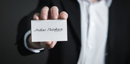 Enphand is a stylish and easy handwritten font with a contemporary touch. This will add a unique spin to each design project!
 - TXT Modern Mom by Illustration Ink,
$3.00Find style and flair in this downloadable font. Its thin lines and handwritten look are perfect for scrapbook journaling, cards, and more. - Eurotypo Bodoni by Eurotypo,
$48.00 Talking about the numerous types that today bear the name of Giambattista Bodoni are a kind of tribute as much to his reputation as a printer as to his ability as designer and engraver. In fact, all of them tent to be more in the way or style of Bodoni than simply copy of his letterforms. Like many other type designers, we’ve been seduced also to develop our own point of view of his work, nowadays enriched by some features of OpenType format that allows a variety of combinations: standard ligatures, discretional ligatures, stylistic alternates and old styles figures. Whereas the Bodoni serif in the capitals was of the same weight as the thin stroke but joined with a very slight fillet (Bracket) and the lowercase serif were like his French rivals, the Didots, featured straight- edged serifs that were unbracketed. The ascenders and descenders of this new Bodoni are shorter, giving in this way, more space for enlarge x high. Specially designed for editorial design and advertising, can be used in magazines, annual reports and all kind of fine print materials or web pages. The beauty of his letterforms can enrich headlines; this font can also be used as body text for its good legibility and accurate kerning.
 - Mozer by Fontfabric,
$29.00 Mozer is a semi-condensed neo-grotesque type family of 16 styles ranging from Thin to Black matched with true italics. With a generous x-height, economical width, moderate contrast and overall solid appearance this typeface shows an uncompromising legibility merged with a contemporary spirit that has not lost its individuality, even in the small details like the discreet ink traps. Mozer covers Extended Latin, Cyrillic and Greek and is suited with plenty of OpenType features, such as localisations, ligatures; four type of numerals including figures and tabular; case-sensitive forms; alternatives etc. Mozer comes accessible and closer to all designer’s needs. Features: • Over 790 glyphs in 16 styles (Thin to Black); • Extended Latin, Cyrillic and Greek scripts for more than 130 languages; • Tall and balanced x-height; • Semi-condensed width proportions; • Moderate contrast and vertical stress; • Neo-grotesque characteristics and terminals with humanistic flavor. Designers: Ani Petrova, Mirela Belova, Nikolay Petroussenko
 - ITC Modern No. 216 by ITC,
$40.99 Modern typefaces refer to designs that bear similarities to Bodoni and other Didone faces, which were first created during the late 1700s. Ed Benguiat developed ITC Modern No. 216 in 1982 for the International Typeface Corporation (ITC). Showing a high degree of contrast between thick and thin strokes, as well as a large x-height, this revival is more suited to advertising display purposes than the setting of long running text, or books. Many traits in Benguiat's design are worth further notice. The thick stems of the roman weights have a very stately, solid presence. Their thin serifs have been finely grafted on, a masterful solution to the challenge of bracketing presented by Modernist designs. The italic weights have a very flowing, script-like feel to them, and the letters take the form of true italics, not obliques. The ITC Modern No. 216 family contains the following font styles: Light, Light Italic, Medium, Medium Italic, Bold, Bold Italic, Heavy, and Heavy Italic.
 - Leaf by Journey's End,
$12.00This "Leaf" font has been swirling in my head for years - I remember my sister and I making letter formations like these when I was young. It was exciting to see the lettering look even better on paper than it did in my mind! "Leaf" surprised me by having two distinct looks: in size 24 or smaller, the look is delicate, because your eye doesn't see any space in the letters. In size 28 or larger, the eye can discern spaces, which gives a different facet to its personality. As much as I like this font when viewed on a monitor screen, it really shines when printed. The "Leaf" font is a perfect blend of quaint hand-written style mixed with crisp letter formations. This font has a very "happy" quality to it. May using it bring a little more happiness to your day! - RM Luceat by Ray Meadows,
$19.00 With a nod to the Golden Age of children's stories, this delightful font will have many uses. 'Luceat' is the Latin for 'shine' and we arer sure you will agree that this is a shining example of the genre. Due to the modular nature of this design there may be a very slight lack of smoothness to the curves at extremely large point sizes (around 200 pt and above).
 - Broaek by Linecreative,
$10.00 Broaek is a display typeface with a modern impression. This font consists of 3 types of styles, namely regular, thin, and outline. This font is perfect for use in headlines, posters, branding, titles, and other graphic designs. What you get dear, you will get : 1. Broaek- A clean San serif font including Upper & Lowercase characters(Regular,thin,Outline) 2. Numbers and Pointing 3. Supports Multi linguage (Latin Western Europe)
 - Opheline by Nasir Udin,
$19.00 Opheline is modern display serif family of 9 fonts. The family consists of 9 weights, ranging from thin to black. The thin version reflects elegance and soft texture, while the black version represents modern and strong appearance. The vast range of Opheline family will help you to tackle your designs problem that need professional or classical touch; from the professional-look branding of law firm to classic-historical product branding.
 - Bomiro by Issam Type,
$22.00 Bomiro is a modern classy ligature serif typeface comes with joining ligatures that give it a fancy and unique style. This awesome font is perfect for branding, logos, invitation, watermark and so much more. Bomiro typeface comes with regular, italic, Thin and Thin Italic font styles. Uppercase & lowercase letters, numbers, punctuation, ligatures, alternates and multilingual support. If you have any questions, please feel free to get in touch. Thank you
 - Umba Slab by TypeThis!Studio,
$29.00 The best thing about Umba Slab is its surprise! UMBA Slab is a clean but eye-catching typeface designed by Anita Jürgeleit. It adds an amazing touch to your corporate design and titling by developing a more dynamic shape from thin to bold. It’s especially designed for a wide range of variety and to create a highly recognizable branding and titling. Twenty styles from thin to bold and matching italics help you to create design with a strong essence. Separate styles for alternate and small caps will show up in your font menu, making sure that you always stay aware of the wide range of possibilities of your new favourite font. Finally, for all those who love caps, there are extra caps-only fonts added to the collections. Would you like to see more of how UMBA can improve your design? Let’s get in touch! INSTAGRAM @anitajuergeleit +++ FACEBOOK AnitaJuergeleitTypefaces
 - Costanera by W Type Foundry,
$29.00 Costanera is a neohumanist typeface with both soft strokes and endings, which is inspired by 90s typefaces. It has an organic aspect and curved finials associated to the early calligraphy, while its straight angles give Costanera a technological and futuristic impression. Costanera weights go from thin to black, thus it can be used in short-impact phrases ideally using Black or Thin weight and extensive texts selecting the Book version. On the other hand, due to its calligraphic-futuristic features Costanera is perfectly suitable for different fields, such as vanguard technology, architecture, and signage topics. This typeface is composed of a Normal and Alternative version, adding 32 weights in total. Stylistic sets, small caps, ligatures, lining and old style numbers, fractions, circle numbers and arrows are part of the Opentype features. Moreover, this project comes with 790 glyphs that allows to write in 219 languages.
 - Satigof by holyline design,
$19.00 Satigof by Holyline is a playful sans serif font family, This font very playful and unique comes in nine weight, thin to black . It's very unique, fancy, playful very easy to combine with multiple design style. Satigof perfect for headline, sub headline ,custom logo,packaging, quote, invitations, watermark,social media posts, label, anything for your creativity and Satigof is perfect font if you want something new with your project, and you can pairing this font with the weight, its very satisfy. Happy creating!