10,000 search results
(0.059 seconds)
- Neo Contact by Linotype,
$40.99Neo Contact is the typeface used on the packaging of Marlboro cigarettes (Marlboro “Reds,” the main line of the brand). The typeface is bold and condensed, designed in the Egyptienne style. Egyptienne types were first designed in the 1800s, as type founders - especially in the westward-expanding United States - began to dream up newer, bolder styles of letters for advertising usage. During the 1800s, it became increasingly important for businesses to set themselves, and their products, apart from competitors. This desire has remained with corporations, as well as with advertisers and designers, into the 21st century. In addition to cigarette packaging, Neo Contact (as part of Marlboro’s branding efforts) can be seen on numerous items, including Ferrari’s F1 racers, and at Formula 1 race tracks. The letters in Neo Contact are filled with personality. Their forms display two distinct weights of line, and the serifs are made up of tiny, strict slabs. Ball terminals round out the design. Neo Contact is a complete font, with a complete western character set. Typefaces in the Egyptienne style preceded the development and distribution of larger, crazier wood typefaces, but also share many similarities with these descendents. More traditional, text faces in the Egyptienne manner are also available from Linotype GmbH (e.g., Adrian Frutiger’s Egyptienne F). On the opposite end of the spectrum, we offer interesting, personality-filled wood display types, like Ponderosa as well. - Bushcraft by Cultivated Mind,
$35.00 Bushcraft is a fun geometric monoline script and sans serif font. This family includes five weights, a sans serif font and art. Bushcraft Basic and Pro scripts are simplistic with a geometric look. Bushcraft Basic scripts comes with one set of 63 alternates and ligatures. Bushcraft Pro scripts includes 278 alternates and ligatures. Both versions supports extended Latin Pro and OpenType. Bushcraft Sans is an all caps, vintage inspired font that pairs nicely with the scripts and artwork. Bushcraft is well-suited for type art, murals, product design, books, film, television, branding, magazines, signage and other creative projects. To use the OpenType ligatures/alternates you will need to use any program that supports OpenType features such as Adobe Illustrator CS and Adobe InDesign. Fonts designed by Cindy Kinash.
 - Itaca by Tipo Pèpel,
$21.00 Known sometimes as “utopia”, “journey” other times, but also named with name´s place where one wants to go, “Ithaca” home of Ulysses. Typographic Cartesian coordinates are usually two, from the skeleton, the narrower, to the black, the widest. Nowadays, Maese Patau had traveled a road made by four Cartesian axes of typographic geography. A road from thick to thin, from expanded to condensed, to offer us a new family, a larger and extensive series than the traditional family. 48 “relatives” in a pure neo-grotesque font, with a large “eye” that makes it especially suitable for display. Solid hinting in small sizes due to it´s pure and simple basic forms. The jazzy cursive, available in all weights, looks as a simply slanted letter, but when works in conjunction with its regular version, generates an outstanding typographic game. As usual, Maese Patau offer us a extensive typeface in weights, extensive on supported languages, and all kind of OpenType´s capabilities.
 - Mantika Informal Paneuropean by Linotype,
$67.99Jürgen Weltin's Mantika Informal is pretty difficult to categorize, but very easy to like. This particularly reader-friendly typeface in regular and bold weights, brings to the table the informal fluidity of a script, the consistency of an inclined italic, and the open and airy forms and contrast of a humanist sans. The result is a warm, approachable, and very legible typeface that is never static and staid, but rather invites an attentive, reading eye. The original idea behind Mantika Informal lay in the challenge to create a typeface for setting children's books. German designer Jürgen Weltin aimed to create a reading typeface for those just starting to learn how to read. On the one hand, it should help create clear word-images; on the other, its letterforms should remain uncomplicated but resist mechanical and industrial sterility. Mantika?s subtle cursive lines stress the printed word's connection with handwriting, in addition to making the transition from school writing exercises to printed texts seamless and effortless. The resulting slightly organic and cursive forms that developed during the design process are so captivating that Mantika Informal may be used for a multitude of unintended applications - anywhere a friendly and informal yet sophisticated character could lend a helping hand, Mantika is there, giving a fresh accent to anything from packaging design to food products. With a broad character set encompassing support for Cyrillic and Green, Mantika Informal's two fonts make for a versatile and dynamic typeface that surely will find its place in a broad range of applications. - Mantika Informal by Linotype,
$50.99 Jürgen Weltin's Mantika Informal is pretty difficult to categorize, but very easy to like. This particularly reader-friendly typeface in regular and bold weights, brings to the table the informal fluidity of a script, the consistency of an inclined italic, and the open and airy forms and contrast of a humanist sans. The result is a warm, approachable, and very legible typeface that is never static and staid, but rather invites an attentive, reading eye. The original idea behind Mantika Informal lay in the challenge to create a typeface for setting children's books. German designer Jürgen Weltin aimed to create a reading typeface for those just starting to learn how to read. On the one hand, it should help create clear word-images; on the other, its letterforms should remain uncomplicated but resist mechanical and industrial sterility. Mantika?s subtle cursive lines stress the printed word's connection with handwriting, in addition to making the transition from school writing exercises to printed texts seamless and effortless. The resulting slightly organic and cursive forms that developed during the design process are so captivating that Mantika Informal may be used for a multitude of unintended applications - anywhere a friendly and informal yet sophisticated character could lend a helping hand, Mantika is there, giving a fresh accent to anything from packaging design to food products. With a broad character set encompassing support for Cyrillic and Green, Mantika Informal's two fonts make for a versatile and dynamic typeface that surely will find its place in a broad range of applications.
 - Woolen by Magpie Paper Works,
$32.00 Woolen is a hand-inked & italicized serif, based upon a 17th century type specimen by Jean Jannon. Many of the capital letters are decorated with subtle sprigs and leaves, while the lowercase letters remain classically styled, giving the font a warm and natural look with just the right amount of dignity. Woolen is perfect for logos and branding – she shines in retail identities, particularly for farms, markets, and restaurants. Even though the font is slanted, it reads beautifully as body text and display headlines. Multi-language support is included in the font.
 - Rhinos Pero by Sipanji21,
$20.00 "Rhinos Pero" is a quirky graffiti font that embodies a playful and unconventional style. Fonts in this category often feature eccentric and unique letterforms, incorporating creative elements that deviate from traditional typographic norms. This particular font might showcase irregular shapes, whimsical characters, or unconventional design traits, offering a distinct and unconventional appearance. With its quirky attributes, "Rhinos Pero" is suitable for designs aiming to convey a fun and offbeat visual impression. It could be applied in various creative projects seeking a playful and distinct graffiti-inspired typographic style. **Uppercase
 - Antique Olive by URW Type Foundry,
$35.99 The first Antique Olive fonts were produced by the French type foundry Olive, in 1962-1966 and designed by poster designer Roger Excoffon (1910-1983). All Excoffons fonts are flamboyant, elegant and highly stylistic. They include the Banco, Mistral, and Calypso fonts. Antique Olive was launched to rival Helvetica and Univers, but the shapes it took were totally refreshing. Antique Olive is probably the most striking Sans Serif since Futura and Gill, and more refined than either. It is perfect for posters and display material as it works well in larger sizes.
 - Horrified Tonight by Arendxstudio,
$16.00 Horrified Tonight - Halloween Font Horrified Tonight - Halloween Font is a display font that is inspired by horror style because its shape is very unique and is perfect for any project that you will use with this theme. Horrified Tonight came with opentype features such stylistic alternates, stylistic sets & ligatures good for logotype, poster, badge, book cover, tshirt design, packaging and any more. Features : 1.Uppercase & Lowercase 2.Multilingual support 3.Number 4.Symbol 5.Punctuation 6.Extra Dingbat 7.Support in Mac and Windows OS -Support in design application (photoshop, illustrator, and more)
 - Brighter Sunday by Din Studio,
$25.00 What is the right font to beautify your designs? Brighter Sunday is the answer. Brighter Sunday is a duo font mixture of script and serif font from which you can either combine as a set of beauty or separate a part based on their own beautiful style. The curves and strokes resembling a handwriting style on the script expresses elegant, natural vibrations. In addition, the serif style weights will leave strong, modern impressions to all of your designs. Enjoy the interesting features available on this font. Features: Ligatures Stylistic Sets Multilingual Supports PUA Encoded Numerals and Punctuations Brighter Sunday fits for any design projects, such as posters, banners, logos, invitations, magazine covers, quotes, headings, printed products, social media, etc. Find out more ways to use this font by taking a look at the font preview. Thanks a lot for purchasing our font. Happy Designing.
 - Jeunesse Sans by Monotype,
$29.99The design of the Jeunesse font family derives from a study of primers which the designer undertook earlier in his career. Jeunesse was designed with the intention of combining excellent legibility and character recognition with the ability to create compact, distinctive words and lines while maintaining basic flourishless letterforms. The sans serif style is pre-dominant in this design, but serifs or rather parts have been added where necessary, mostly at the top left hand parts of the characters, to aid readability. Use Jeunesse as a text and display face. There are also fully sans serif and slab serif versions available which can be used on their own or mixed with each other and the parent fonts. - Jeunesse Slab by Monotype,
$29.99The design of the Jeunesse font family derives from a study of primers which the designer undertook earlier in his career. Jeunesse was designed with the intention of combining excellent legibility and character recognition with the ability to create compact, distinctive words and lines while maintaining basic flourishless letterforms. The sans serif style is pre-dominant in this design, but serifs or rather parts have been added where necessary, mostly at the top left hand parts of the characters, to aid readability. Use Jeunesse as a text and display face. There are also fully sans serif and slab serif versions available which can be used on their own or mixed with each other and the parent fonts. - Jeunesse by Monotype,
$29.99The design of the Jeunesse font family derives from a study of primers which the designer undertook earlier in his career. Jeunesse was designed with the intention of combining excellent legibility and character recognition with the ability to create compact, distinctive words and lines while maintaining basic flourishless letterforms. The sans serif style is pre-dominant in this design, but serifs or rather parts have been added where necessary, mostly at the top left hand parts of the characters, to aid readability. Use Jeunesse as a text and display face. There are also fully sans serif and slab serif versions available which can be used on their own or mixed with each other and the parent fonts. - Mato Sans by Picador,
$29.00 Legible and dynamic shape, tons of OpenType options, different scripts – that’s Mato Sans. Difficult small size, long text in Vietnamese, huge heading in Russian or table full of figures to create? It’s not a problem with this family. There are over 2000 glyphs in every weight with such features: superscript and subscript characters, tabular lining and old style figures, small caps, fractions, arrows or even case sensitive parenthesis. Mato Sans was designed for use in Latin as well as in Cyrillic script. Every font contains an extended set of Cyrillic characters including special, local glyphs for Bulgarian, Macedonian and Serbian.
 - Decoral Soft by Totem,
$30.00 Decoral Soft depicts the character of Art Deco period typography and reinterprets it into modern approaches. This typeface is a friendly and flexible family that is fun to use. It comes with a set of 670 characters per weight, supporting over 50 different languages using the Latin alphabet. Decoral Soft also comes with special stylistic sets and swash characters that allow the user to be creative and playful with the type, helps enhance many different possibilities that certainly will spice up your design. Decoral Soft will satisfy all your typographic needs, from book jackets to monograms to packaging, logos, and even wedding invitations—timelessly elegant, with a distinctive flair that exudes Art Deco typography in a fresh, modern way. The wide selection of titling alternates and ligatures make copyfitting a delight.
 - Scary Things by Sarid Ezra,
$15.00 Scary Things is a sharp serif with horror & creepy vibes! This serif is so clean that will make your design pop up. This font is suitable for poster movies especially thriller & horror movies. With unique & sharp shape, this font will make your poster more stand out! You also can use this font for any design because of the versatility in this font. Also, this font support multi language. Let's make your next halloween poster with this font!
 - Rigid Square by Dharma Type,
$19.99 Rigid Square There is a rule, Octagonal shape and 45 degree cuts. Very geometric shape but designed especially for body text, long sentence such like a mechanical instructions. Capital I and lower l have distinguishable shape. Neo-humanist shape on lowercase b.d.g.p.q is for further smooth readability. However, Also useful for display, titling, captions by their sophisticated glyph shapes and their eye-catching geometry. Consists of seven weights and their matching italics. Supporting almost all latin languages.
 - Lexington by Canada Type,
$24.95A revival and major expansion of a 1926 Ludwig Wagner Schriftgiesserei typeface called Titanic, Lexington is the ultimate art deco expression of the high times of signage and theater during the first half of the twentieth century. Big feminine caps and cozy direct minuscules make for a unique combination rarely found in other deco faces. Topped off with the humorous and quite suave tall and pointy ascenders and descenders of the alternates, Lexington makes for a versatile and uniquely eye-catching display face beneficial to poster art, book covers, classy menus, product packaging and music paraphernalia. The original specimen Hans van Maanen worked from showed the majuscules, minuscules, figures, and 4 alternates of some ascending minuscules. This new digital version includes all of the above, plus many more additions: - Plenty more alternates, for some caps as well as for all the ascending and descending lowercase. - Three different size variations for the comma and the period. - Oldstyle figures. - A full complement of accented characters to support more Latin-based languages than ever, including Baltic, Celtic, Turkish, and Central/Eastern European languages. - A Handtooled style variation that covers both the main character set and the alternates. Lexington was named after Manhattan's Lexington Avenue, home of the some of the most famous and polished art deco architecture of the 1920s and 1930s. Lexington and Lexington Handtooled come in all popular font formats. The OpenType versions combine their respective alternates with the main character sets, for ease of use within OpenType-savvy applications. - Bronzo by XO Type Co,
$39.00 This is a 2023 redesign of Bronzo, originally designed by Rick Valicenti and Mouli Marur in 1991. With this redesign, Bronzo now has 6 new weights, for a total of 9, and 587 more glyphs than it was able to in 1991. Bronzo appears to move forward, yet remain still, via a center stroke that only sticks out on the left, a tense curve that only happens on the right, and a width that sits uncomfortably between square and rectangle. Those three things, combined with a balanced light to dark ratio, are what makes Bronzo appear tense and ready. Bronzo accepts Modernist ideals of minimal, rational construction—but it also adopts luxuriant shapes over Modernism’s sandblasted neutrality. It’s almost an alternate reality, a “what if?” of Modernism. Modernism’s fun, interesting, cute reboot.
 - CAL Bodoni Terracina by California Type Foundry,
$47.00 Bodoni Terracina is a legible, fun-formal script face, with lots of curls. Sometimes script faces are hard to read. Sometimes being formal means that there’s no personality and there’s no fun. Enter Terracina: one of the masterpieces of font design. Some of the most personable italics ever carved. Includes powerful new features for: • Dates • Pricings • Addresses Not is only Terracina formal but fun, it’s also fun to use! In a program like Adobe Indesign or Illustrator, just highlight a word and see lots of fun options. Bodoni himself etched these symbols, and his fun-loving personality shines through. As a semi-script, it can go together with many script fonts, but it is more readable. When you need something equal parts elegant and whimsical, Terracina strikes a perfect balance to let the fun shine through, such as for holiday designs or fairytales. Terracina is a subheads font, but Bodoni also used it for paragraphs. So Terracina works well doing subhead paragraphs, especially when contrasting with the mood of the first font. And because of the swash variety, it works well for setting German and other European languages. CAL Bodoni Terracina is a member of our Origins Series. Origin Fonts are designed to be true to the original designer's intentions and fonts. Our Bodoni origin fonts ARE Bodoni fonts, not imitations or interpretations. They were drawn by Bodoni, our team just expanded it for modern use. For Terracina, Bodoni's original weight is the "Quasi-Lite" option, all other weights have been meticulously matched by the CAL Origins Team.
 - Ski Alpin NF by Nick's Fonts,
$10.00 A Swiss travel poster from 1927 offered the pattern for this idiosyncratic Art Deco face. Use it and add a little personality and charm to your next project. Both versions of this font support the Latin 1262, Central European 1250, Turkish 1254 and Baltic 1257 codepages.
 - The Urbanists by Arendxstudio,
$18.00 The Urbanists is a free style font that has the characteristics of street art that shows freedom and is filled with unique characters. Features : • Character Set A-Z • Numerals & Punctuations (OpenType Standard) • Accents (Multilingual characters) • Ligature • Swash There it is! I really hope you enjoy it.
 - Fortune Coin by Gassstype,
$25.00 Fortune Coin is a Cartoon Display Font with alot of ligature. it will make your designs look modern, unique and fun. It’s perfect for labels, quotes, posters, DIY projects, branding, packaging, greeting cards, websites, photos, photography overlays, signs, window art, scrapbooking, tags and so much more!
 - Vorvalla by Agny Hasya Studio,
$9.00 Vorvalla is a Gothic Decorative Display Serif Font Featured with Uppercase and Lowercase, Numerals, Punctuation, and OpenType Features. Perfect for your design projects like logos, branding, advertising, product designs, stationery, magazine designs, book/cover title designs, photography, art quotes, Special events, labels, product packaging, and more.
 - Alizarine by Mysterylab,
$18.00 Alizarine is an elegant and luxurious serif font with flowing embellishments. This posh typeface features medium weight with a matching italic, and includes many capital ligature pairs. Excellent for high fashion couture, jewelry, boutique logos, perfume branding, arts organizations, museums, book titles, web banners, and much more.
 - Roasted lime by Gassstype,
$27.00 Roasted Lime is a Cartoon Display Font with alot of ligature. it will make your designs look modern, unique and fun. It’s perfect for labels, quotes, posters, DIY projects, branding, packaging, greeting cards, websites, photos, photography overlays, signs, window art, scrapbooking, tags and so much more!
 - Prebuga Signature by Balevgraph Studio,
$12.00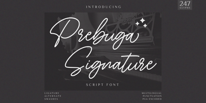 Prebuga Signature is a fragile, elegant and versatile script font. Fall for its ravishing style and use it to create gorgeous wedding invitations, beautiful stationary art, eye-catching social media posts, and much more! What's Included? Uppercase & Lowercase Numbers & Punctuation Alternate & Ligature Multilingual Support PUA Encoded
 - Moon Rays by Epiclinez,
$18.00 Moon Rays is a bold and playful display font, suitable for all children's designs, product packaging, stationary art, apparel designs, and more fun and creative ideas! So what's included: Basic Latin A-Z & a-z. Numbers, symbols, and punctuations Multilingual Support. Accented Characters : ÀÁÂÃÄÅÆÇÈÉÊËÌÍÎÏÑÒÓÔÕÖØŒŠÙÚÛÜŸÝŽàáâãäåæçèéêëìíîïñòóôõöøœšùúûüýÿžß Thank You.
 - Qoxiem by Almarkha Type,
$29.00 Introducing our latest Modern Slab called Qoxiem can make your logotype become more interesting. inspired by the decorative arts and architecture movement Qoxiem fonts is perfect for your project and allows you to create designs, headlines, posters, logos, badges, t-shirts and many more that are beautiful.
 - Walahard by JprintStudio,
$10.00 Introducing Walahard, Walahard is a sweet, soft handwritten font. Get inspired by its authentic feel and use it to create gorgeous wedding invitations, beautiful stationary art, eye-catching social media posts, and cute greeting cards. Ready to use for projects, texts, letters, or whatever you want!
 - Street Power by Arendxstudio,
$17.00 Street Power is a free style font that has the characteristics of street art that shows freedom. It is filled with unique characters. Features : • Character Set A-Z • Numerals & Punctuations (OpenType Standard) • Accents (Multilingual characters) • Ligatures • Alternates There it is! I really hope you enjoy it.
 - The Overcook by Arendxstudio,
$22.00 The Overcook is a free style font that has the characteristics of street art that shows freedom and is filled with unique characters Features : • Character Set A-Z • Numerals & Punctuations (OpenType Standard) • Accents (Multilingual characters) • Ligature • Alternate There it is! I really hope you enjoy it
 - Quick Notes Cyrillic by Ira Dvilyuk,
$16.00 Quick Notes playful script font Cyrillic is a pretty monoline font that will look gorgeous on all your designs, wedding stationery, love stories, branding materials, monoline logos, pretty teenage stickers, business and wedding cards, calligraphy Insta quotes, elegant fashion sketches, calligraphy love monograms and much more. Quick Notes playful script font contains the Cyrillic glyphs too. Quick Notes playful script font is a graceful cursive calligraphic script font, plus a Symbols font with 26 lovely hand-drawn swashes and illustrations!
 - Jetworld by Nelson Borhek Press,
$12.00 Jetworld is the space-age typeface with the retro-forward look. Jetworld’s tapered and weighted parabolic-arch curves interplay with its rigid, straight verticals and horizontals to create an unexpected but pleasing motion and a rhythm that is constantly changing. Jetworld is an OpenType font that speaks of clean space-age design, midcentury optimism, and the promise of new frontiers. Jetworld gives a midcentury-modern or retro-futuristic look to book covers, magazine layouts, posters, and album covers. But Jetworld is adaptable, too. With hints of ancient cuneiform writings mixed with the look of markings on an alien spaceship, Jetworld spans eons. And Jetworld’s large character set includes multi-lingual support and many other special characters. That means Jetworld can be used for more than just headlines and more than just English. Jetworld combines a distinctive personality with surprising readability. Jetworld is unusual in that it is not descended from handwriting or calligraphy. Instead, Jetworld was inspired by midcentury modern architecture and consumer goods. Think of the parabolic arches seen in midcentury masterpieces like the Theme Building at Los Angeles International Airport, the TWA terminal at JFK Airport in New York, and even the cartoon architecture of “The Jetsons” television show. Think of boomerang-patterned Formica countertops and tabletops, or arch-shaped “hairpin” legs on midcentury furniture. Jetworld’s character shapes were inspired by all of these. Jetworld—direct from the world of the future to you.
 - Graff Burner by Krafted,
$10.00 Wish to add some urban spirit to your design? Looking for a font that makes an impact? Introducing Graff Burner - an Urban Graffiti font. Turn your design into real street art with a font that understands the urban culture. Print or digital, Graff Burner will catch the attention of your audience. Give it a go and see your brand grow. What you’ll get: Multilingual & Ligature Support Full sets of Punctuation and Numerals Compatible with: Adobe Suite Microsoft Office Keynote Pages Software Requirements: The fonts that you’ll receive in the pack are widely supported by most software. In order to get the full functionality of the selection of standard ligatures (custom-created letters) in the script font, any software that can read OpenType fonts will work. We hope you enjoy this font and that it makes your branding sparkle! Feel free to reach out to us if you’d like more information or if you have any concerns.
 - Berling by Linotype,
$29.99The productivity of the Berlingska Stilgjuteriet was made possible by the development of modern typeface art in Sweden in the 1950s. The typeface Berling was designed by Karl-Erik Forsberg for the Berlingska Stilgjuteriet in Lund. It belongs to the modern text typefaces and like most of these markedly shows the influece of the Neorenaissance. Berling Antiqua appeared in 1951 with a matching italic and by 1959, it was expanded to include five weights. Linotype offers Berling in four of them, roman and bold with their respective italics. In 2004 the Swedish publisher Verbum commissioned a complete redesign of Berling for the 21st century. Linotype assisted the designers of this new typeface, which came to be called Berling Nova. - Xylo by ITC,
$29.99Xylo is a rugged, no-nonsense typeface that was originally designed in 1924 by the Benjamin Krebs type foundry in Frankfurt am Main, Germany. Even back then, Xylo must have been very popular; the design made it at least as far as England. In 1995, after finding its design in an old London printer's reference book, the Letraset Type Studio faithfully converted Xylo into digital format. A time-proven display face, Xylo will convey a feeling of power and strength in any application. Best used big in headlines or logos; Xylo exudes an expressionistic and art deco spirit that just as much at home today as it was during the roaring 20s! - Mestika Arabic by Boharat Cairo,
$20.00 Mestika is a resinous spice, in Arabic means gum, the name is Mestika cause the mestika has a mixture of sharp edges and cursive connections, that mixture gives the typeface an edge to stand out, a low contrast sharp design with 9 weights making it works well with text and headlines. The design is a collaboration with the Iranian designer Kamyab Jafari, The typeface is a modern design, and has a wide range of ligatures and features for better justifications. The typeface comes with 9 weights, and works in variable axes, the typeface now supports only Arabic-based languages, but in the near future, it would support Latin-based languages, the Typeface is based on Naskh calligraphy, something in between the Iranian and the Arabic styles.
 - Hostilica by Heypentype,
$20.00 Hostilica is a semi-serif family designed by mixing classic serifs in the age of romanticism era with contemporary modern shape and curves. It gives a warm, friendly, and inviting feeling without losing a formality of text fonts. Every weight was designed carefully to provide a unique look while maintained the unity of the type family. A thin weight gives your content an elegant, luxurious design feel. While the regular weight, designed for body text, gives your content a warm and friendly design feel. The bold weight will make your headlines stand-out with its fat counters and curves. Therefore, Hostilica will accomodate all your design needs, from text to display, from catchy to luxury. The italics of each weight will spice up your design project especially with letter 'f,s,r,k, and y'. Those italic versions paired with alternate and discretional ligatures will add an organic feeling to your designs. The italic styles are designed by emulating a handwriting stroke, and will give a more personal feel while still maintained a formal sense.
 - Toshiko by Thinkdust,
$10.00 Toshiko is an experimental typeface which mixes techno and traditional designs, creating a straight edged but curly serif font. The characters themselves are very carefully crafted, with precise, accurate lines and predictable forms, but the serifs, as well as the indecision between curved and square corners, gives the font an impression of unpredictability that shows off its creative freedom. Whether you’re looking to brand something technological or express rebellion, Toshiko can create the mix of conformist and nonconformist that will draw readers into interest and attentiveness.