10,000 search results
(0.065 seconds)
- Mane by BaronWNM,
$14.00 Mane is a display font with a slant block shape. thick on the vertical line and thin on the horizontal line. have a firm and solid impression. Suitable for writing titles, posters, games, ad taglines, sports, space, etc. has an alternate start and end on each capital letter and several ligatures in order to add variations to each usage.
 - Sunny Weather by Hanoded,
$15.00 Spring is in the air! My chickens are broody and are sitting on an ever increasing pile of eggs; my fruit trees are budding and the sun is shining! Sunny Weather is a happy kind of font: it was handwritten, using a Sharpie pen. It comes with double letter ligatures and a good dose of vitamin D!
 - Embossanova by Emboss,
$29.00 Embossanova was initially sketched to be a monospaced typeface but quickly took on a life of its own. It developed serifs and numerous arcs and stroke weights. I wanted it to retain a pre computer/unmathematical feel so there is a slight variation on curved characters and their relationship to the X height.
 - Varius by Linotype,
$29.99The shapes of the f-holes on a violin reminded German designer André Maaßen of an italic letter "f". Maaßen used these captivating contours as the theme for his type family, Varius. The name "Varius" is an homage to the manufacturer of the violin that inspired Maaßen's project, Antonio Stradivarius, the most famous manufacturer of violins in music history. Varius has three separate styles. Varius 1 and its italic are the base style of the family, and are typefaces in the baroque serif manner. Varius 2 and its italic are slab serif egyptiennes, slightly heavier than Varius 1's more classical forms. Varius 3 and its italic are semi serif faces; their characters are serifed, but some of the serifs have been cut off. The family is rounded out with two pi faces: an ornaments font (which can be used in conjunction with the text fonts, or on its own to create beautiful borders or individual decorative elements), and a font of musical symbols and notations. Each of the six text fonts has dozens of supplemental ligatures included in their character sets. When these fonts are used in an OpenType-supporting application, such as Adobe InDesign, these ligatures automatically appear in text when the "Discretionary Ligatures" feature is activated. Additionally, the character sets include added alternate glyphs, such as a swash "m" or "n" to finish off a line of text. These can be inserted manually in applications that include glyph palettes (e.g., Adobe InDesign or Illustrator CS). All of the Varius family's letterforms appear slightly narrow, and traces of the wide-nibbed pen can be seen within their forms. Additionally, the shape of a violin's f-hole is a reminiscent element within all of the family's curves. Varius is particularly suited for use many applications, such as body text, newspaper text, display text, headlines, posters, books, screen design, and corporate identity. Use in sizes ranging from body copy text to display and poster format allow the different facets of the typeface to effectively present themselves. The effects can be as versatile as the possibilities! Due to its special character, the typeface could be used in the design of a logo, or within an appropriate corporate design context, to particularly stress individuality. - LTC Globe Gothic by Lanston Type Co.,
$24.95 This series of faces was designed initially by Morris Fuller Benton, circa 1900. The design is a refinement of Taylor Gothic from 1897. It features a sans serif thick and thin design with angular stems. Pre-dating art deco, this design feels quaint, yet it still has a touch of modernism. Frederic Goudy designed a bold version of Globe Gothic in 1905 for ATF. The Bold and Bold Italic digital versions have been added to the LTC library in early 2007.
 - Santerini Initials by Celebrity Fontz,
$24.99Elaborate high-quality three-dimensional initials, with shadows, in various styles including numerous exotic letters, incorporating vignettes, flourishes, stems, flowers, vines, and other decorative elements. These masterpieces of typographic art were inspired by Italian hand-etched designs dating back to 1839. Includes one set of A-Z ornamental initials conveniently assigned to both the upper and lower case alphabet characters. Perfect for starting off the beginning of paragraphs in artistic publications, storybooks, fairy tales, and texts conveying the feel of the 1800s. - Love And Peace by Fenotype,
$25.00 What's so funny 'bout peace love & understanding? Nothing really. Love and Peace is an Art Nouveau style typeface inspired by Eckmann-Schrift by Otto Eckmann in 1900. Love and Peace is filled with ethereal elegance and it's great for posters, magazines and psychedelic LP covers. Love and Peace is equipped with few Contextual Alternates and Standard Ligatures to prevent characters from colliding. In addition it has Stylistic Alternates for lowercase a, k, r and s, and Swash Alternates for ampersand and dollar sign.
 - Bs Monofaked by Feliciano,
$37.92Monospaced become very popular among graphic designers. Nevertheless, I’ve noticed that in most cases that designers use monospaced typefaces is not because of their particular features caused by the strict rules of design — all characters share the same advanced width — rather because of it’s ‘electronic derived’ appearance. So, I decided to create a typeface that keeps the characteristics that, in my opinion attract designers to this particular sort of types, but deliberately break the main rule: characters do not share the same width — but they they look like they do! Characters are better balanced compared to truly monospaced types, giving more even typographic color while used in text setting. One weight might enough to please electronic type lovers. Designed in 2000. - Essay Text by TypeTogether,
$49.00 Essay is an elegant serif typeface intended for setting books, with many stylistic alternates and other typographic goodies, designed by Stefan Ellmer. It is a highly legible text face with a natural flow of reading. This is enhanced by a slight slant of the roman, the combination of open and closed apertures and the amalgamation of organic strokes and counters with a static, fully straight baseline. Essay Text Regular looks back to the spirit of the french Renaissance, when the roman typographic letterforms came to full emancipation. Departing from that historical reference, Essay Text gets rid of all sentimental antiquity and becomes a contemporary interpretation of the “archetypes” of that period. Essay Text Italic refers to that more vaguely, resulting in a formalised look with fairly upright and open shapes and little cursiveness. As in the Renaissance, before the mating of roman and italic, Essay Text Italic works as a separate text face and a perfect secondary type. The name Essay derives from the literary meaning of the word, attempt or trial. Therefore, the typeface Essay can be seen as an attempt to express an opinion about reading, the omnipresence of history, the importance of calligraphy and the importance to deviate from that calligraphic source; as well as an attempt to crystallise lettershapes in balance between convention and the designer’s personal idiom.
 - Vanilla Bubble by Insan Perkasya,
$12.00 Introducing the "Vanilla Bubble" font, a fat handwriting font with a unique shape plus a few strokes to add a striped impression, this font is made directly by hand so it produces a cute and natural shape. This font is very suitable for all designs such as logos, wedding invitations, greeting cards and others, please try it. If you have any questions, don't hesitate to contact us.
 - Namile by Craft Supply Co,
$20.00 Introducing Namile – Playful Sans Serif A Playful Twist on Sans Serif Namile, our Playful Sans Serif font, is a delightful departure from the ordinary. Its quirkiness and fun factor set it apart from the crowd. Eccentric Display Font Crafted especially for eccentric displays, Namile injects a delightful dash of whimsy and vibrancy into your creative projects. Versatile for a Range of Designs Namile’s versatility truly shines in various design contexts. This makes it an ideal choice for a broad spectrum of creative endeavors, from branding to posters. A Playful and Memorable Experience Namile ensures that your content is not only playful but also memorable. It captivates your audience, leaving a lasting and cheerful impression. In Conclusion In summary, Namile – Playful Sans Serif is the font that brings a playful and quirky twist to the world of sans serif fonts. Its versatility allows it to shine in various creative projects, ensuring they stand out with a sense of fun and vibrancy. Whether it’s for branding, posters, or any other design endeavor, Namile captivates your audience, leaving a memorable and cheerful mark, making it accessible to a diverse readership.
 - Monkey Kids by Agny Hasya Studio,
$12.00 Monkey Kids is a Playful, Fun, and Cute Typeface. It comes in 2 (two) styles (regular & slant) and is created with some alternate and ligature. Featured with Uppercase and lowercase, Numeral and punctuation, Multilingual Support, and Opentype Features Perfect for your design projects like Children or School Projects, Branding, Advertising, Product Designs, Magazine Designs, Book/Cover Title Designs, Art Quotes, Special Events, Labels, Product Packaging, and more.
 - Rail Travel JNL by Jeff Levine,
$29.00 Here’s yet another interpretation of the classic “thick and thin” sans serif lettering most popular during the Art Deco era. This particular design comes to you through the courtesy of a hand lettered 1930s travel poster from the Pennsylvania Railroad. Some capitals are much wider than others, while the lower case ‘i’ is somewhat truncated. Rail Travel JNL is available in both regular and oblique versions.
 - St Friska by Stereotypes,
$34.00 St Friska, based on old movie title lettering, is made just for headlines. It comes with a slight touch and feeling of art deco but it’s designed to be contemporary in 2010 and beyond. Friska comes with a big bunch of OpenType features, so a designer can play with it like Lego, using it alongside old or new typefaces. It has stylistic sets and lots of ligatures.
 - Song Publisher JNL by Jeff Levine,
$29.00 Song Publisher JNL features a design based on the 1945 Art Deco-era hand lettered sheet music title "When the Old Gang's back on the Corner (Singin' Sweet Adeline Again)". It's a good thing sheet music wasn't sold by the word count found in song titles, because this twelve word example would have been more costly than titles such as "Nola", "Tenderly" or "Ciribiribin".
 - Cumbanchera by JVB Fonts,
$5.00CUMBANCHERA, inspired by the old albums cover art of Latino music. Cumbanchera reminds of the iconic, classic, and recognized musical theme «El Cumbanchero» composed by Rafael Hernández Marín «El Jibarito». CUMBANCHERA can be used mainly in titles, display and short texts. Supports East Europe languages. Includes standard and discretionary ligatures, alternative style of upper and lowercase, fractions, numerators and denominators, and other OpenType features. - Wood Gothic JNL by Jeff Levine,
$29.00 One of the classic designs of the wood type era is Hamilton Gothic Bold [from the Hamilton Wood Type Foundry circa 1889]. Clean and timeless, it even had found a resurgence during the rock and roll posters of the 1960s, where vintage wood types and Art Nouveau influences merged with the “Hippie Counterculture”. Wood Gothic JNL is available in both regular and oblique versions.
 - Deco Roundpoint JNL by Jeff Levine,
$29.00 On the sheet music cover of the 1931 song "When the Autumn Leaves of Life Begin to Fall", the title is hand-lettered using a round tipped nib pen. The combination of both an Art Deco lettering style and the rounded ends of the characters creates an exquisite, yet simple type design digitally preserved as Deco Roundpoint JNL; available in both regular and oblique versions.
 - Blue Jay Way NF by Nick's Fonts,
$10.00Modern Caps—and lowercase, too—was how Ross George described the pattern for this typeface in his Speedball Text Book. Not surprisingly, the design was used on the Beatles' original Magical Mystery Tour album, which suggested the current name. Art Deco meets Psychedelia! Both versions include the complete Unicode Latin 1252, Central European 1250 and Turkish 1254 character sets, with localization for Moldovan and Romanian. - Umbertone by Mysterylab,
$21.00 Umbertone is a modern sans serif with roots in classic hardcover book design and the Art Nouveau movement. It takes the inventiveness of the early 20th century designers and brings it a century forward with some unique letterforms and a collection of subtle but elegant ligatures. Excellent for typographic book cover concepts, and also great for high-end branding for luxury and fashion products.
 - Buddy Play by Agny Hasya Studio,
$12.00 Buddy Play is a Playful, Fun, and Cute Typeface. Come in 2 (two) styles (regular & slant) and is created with some alternate and ligature. Featured with Uppercase & Lowercase, Numeral & Punctuation, Multilingual Support, and Opentype Features Perfect for your design projects like Children or School Projects, Branding, Advertising, Product Designs, Magazine Designs, Book/Cover Title Designs, Art Quotes, Special Events, Labels, Product Packaging, and more.
 - Praha Deco by Deniart Systems,
$20.00 Praha Deco was inspired by the Prague art deco movement at the turn of the 20th century. Spiced with our own creative blend, this is our tribute to that wonderful era in architecture. The Praha Deco typeface contains a large assortment of extended characters to support many of Europe's languages, including Czech, Danish, Dutch, Esperanto, Finnish, French, German, Italian, Hungarian, Polish, Portuguese, Romanian, Spanish, Swedish, Turkish & Welsh.
 - ASM by Extratype,
$40.00 The initials ASM represent the acronym of the Santa Monica Arts cultural center located in Barcelona, Spain, where this typeface, with the same name, has served as the custom corporate typeface since 2008 till today (2013). ASM is an energetic monospaced with extreme legibility consisting of two original weights, with an underlined version – used on some of corporate applications – all with their corresponding italics.
 - HS Decomage by Hemphill Studio,
$19.00 HS Decomage was created by a desire for a more modern approach and as an homage to the Art Deco period. HS Decomage has a large set of ligatures to make optimum spacing easier to accomplish and stylistic alternatives give design choices. HS Decomage works great for headlines but also handles descriptive text quite well. Multi-lingual characters, numbers and punctuation are included in HS Decomage.
 - Lettering Book JNL by Jeff Levine,
$29.00 A circa-1940s textbook for the Esterbrook Drawlet Pens (similar to Speedball pens) offered numerous samples of lettering that could be obtained by following the simple directions and using the book as a guide. One example was a classic Art Deco design made with a round nib pen, and it has been redrawn digitally as Lettering Book JNL in both regular and oblique versions.
 - Manchester Condensed by Vástago Studio,
$23.90 Every day we are faced with designing on small screens and new formats; This is where condensed fonts have great potential, as they make the most of tight spaces in big headlines. Manchester Condensed is a typeface family designed by Vástago to be applied in large headlines in different formats, such as web, editorial or packaging. Just to mention a few. Different Manchester weights enhance performance at large type sizes, providing hierarchy and imposing style with its elongated shapes. Its use in capital letters is remarkable and fits perfectly into very precise diagramming spaces.
 - Savior Sans by Sudtipos,
$39.00 Savior Sans is the third collaboration between Sudtipos and Vástago, this is a 9 weight typeface in 3 different widths, condensed, regular and expanded. Its simple design with open shapes offers a different texture that works in different uses, such as web design, packaging or branding. Savior Sans offers a contemporary look at traditional sans fonts, maintaining the identity in each of its weights. In its variable version, it allows multiple options when designing, adapting to different composition solutions. We hope you enjoy it and get the most out of it.
 - Sho by Linotype,
$29.99Karl Georg Hoefer’s Sho first appeared in 1992 with Linotype-Hell. The font is a part of the package Calligraphy for Print, which also contains Ruling Script and Wiesbaden Swing. Calligraphy for Print 2 completes the set. These packages offer modern calligraphy fonts particularly well-suited to use in posters, magazines and advertisements. Sho distinguishes itself in the extreme contrast between the strokes. A unique characteristic of the font is the way it uses simple round forms in some of its letters, giving it a peppy and playful feel. - Ornable by Casloop Studio,
$16.00 Meet Ornable Typeface, your font of choice for a captivating blend of Renaissance, Art Nouveau, Medieval, and Art Deco vibes. This single-weight typeface is designed for those seeking a font that embodies a rich tapestry of artistic nuances. With 35 meticulously crafted ligatures, Ornable ensures your text is not just seen but experienced. Dive into the charm of fractions for precise numerical representation and case-sensitive forms for a perfect interplay of uppercase and lowercase letters. Stand out effortlessly with the inclusion of a unique arrow symbol, adding a modern touch to your designs. Ornable adapts seamlessly to various themes, from the classic allure of Renaissance to the bold geometry of Art Deco. Whether you're crafting posters or logos, Ornable celebrates your creativity with sharp lines and intricate details. It's the ideal choice for projects that demand a touch of mystique and retro charm. Capture the essence of artistic movements with this typeface and step into a world where past and future converge – embrace Ornable and redefine the boundaries of your creative expression.
 - Atrament by Suitcase Type Foundry,
$75.00The Atrament font family was originally conceived in 2003 as the corporate display type family for Suitcase Type Foundry. Its original source of inspiration is the front cover of the Devetsil - Revolucni slovn’k almanac (1922), designed by Karel Teige. The lettering on this cover is a condensed sans serif with rounded stroke terminals. Atrament is significantly broader than the model and its characters are better balanced, reflecting the evolution of semi-condensed sans serifs throughout the 1960s. The horizontal strokes of both lower and upper case are less stressed than the vertical stems. Noteworthy are the unusual tiny gaps in the apex and vertex of letters with diagonal strokes, designed to prevent ink from spreading and smudging the letter shapes. This detail is one of the main features of the font's character. The general feel of the italics closely matches the strictly vertical, parallel character of the regular cut. When converting the family to OpenType the alternate character shapes from the Alternator weights were incorporated in the regular cut, which allows the user to switch selected characters from one shape to another within the same font. A number of glyphs and accents were corrected, and all the glyphs missing in the Suitcase Standard character set were added, along with the relevant kerning pairs. The individual weights of Atrament Std thus contain accented upper and lower case, small caps, alternate glyphs for most European languages, nine types of numerals, superscript characters, caps glyph versions, and much more. Its narrow proportions make Atrament the perfect choice whenever economy of space is a must. It is however not very well suited for setting long texts. Ideal for headlines and display use, it is perfect for situations where the text needs to make a great impact in a little space. - Chuglet by Maulana Creative,
$14.00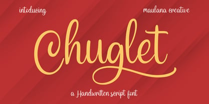 Chuglet is a cursive script font. With bold contrast stroke, fun character with a bit of ligatures and alternates. To give you an extra creative work. Chuglet font support multilingual more than 100+ language. This font is good for logo design, Social media, Movie Titles, Books Titles, a short text even a long text letter and good for your secondary text font with sans or serif. Make a stunning work with Chuglet font. Cheers, Maulana Creative
 - Hollyfur by Maulana Creative,
$11.00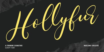 Hollyfur is a cursive beauty and feminine script font. With high contrast stroke, fun character with a bit of ligatures and alternates. To give you an extra creative work. Hollyfur font support multilingual more than 100+ language. This font is good for logo design, Social media, Movie Titles, Books Titles, a short text even a long text letter and good for your secondary text font with sans or serif. Make a stunning work with Hollyfur font. Cheers, MaulanaCreative
 - Hindyloft by Maulana Creative,
$12.00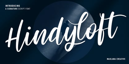 Hindyloft is a modern cursive script font. With high contrast stroke, fun character with a bit of ligatures and alternates. To give you an extra creative work. Hindyloft font support multilingual more than 100+ language. This font is good for logo design, Social media, Movie Titles, Books Titles, a short text even a long text letter and good for your secondary text font with sans or serif. Make a stunning work with Hindyloft font. Cheers, MaulanaCreative
 - Castilock by Maulana Creative,
$14.00 Castilock is a casual cursive script font. With regular mono-line consist stroke, fun character with a bit of ligatures and alternates. To give you an extra creative work. Castilock font support multilingual more than 100+ language. This font is good for logo design, Social media, Movie Titles, Books Titles, a short text even a long text letter and good for your secondary text font with sans or serif. Make a stunning work with Castilock font. Cheers, Maulana Creative
 - Boyflare by Maulana Creative,
$12.00 Boyflare is a cursive handwritten script font. With bold mono-line stroke, fun character with a bit of ligatures and alternates. To give you an extra creative work. Boyflare font support multilingual more than 100+ language. This font is good for logo design, Social media, Movie Titles, Books Titles, a short text even a long text letter and good for your secondary text font with sans or serif. Make a stunning work with Boyflare font. Cheers, Maulana Creative
 - Core Dodam by S-Core,
$59.00 CoreDodam is a geometric shaped title font with unique structure. The shape of each character is very simple and modern. Depending on shape, some characters have different heights. It makes the line of text rhythmically. Supported codepages are MS Windows 1252 Latin1 and MS Windows 949 Korean consisting of 11,172 Korean letters and Symbols except Chinese. We recommend to use for the title or short sentence on posters and especially useful for design works.
 - Fastenating JNL by Jeff Levine,
$29.00 Since the 1800s, many patents were issued for methods to hold papers together. The two most popular and enduring tools still in use today are the stapler and the paper clip. In recent times a number of clips in novelty shapes have been available in just about every size, shape and color imaginable. Back in the beginning there were many variations as well, but the purpose of these design variants was to try and command the majority of sales in the fledgling market of bent wire clips by offering a unique and hopefully better product. Fastenating JNL contains twenty-five images based on those early clip designs as well as one classic paper fastener (on the Z and z keys). The standard gem clip has been the most enduring design and is well over one hundred years old.
 - CF Nixt by CozyFonts,
$20.00 The Nixt Font Family is a new font with currently seven styles. As an alternative to Helvetica, Arial, Gill Sans, Futura, & Gotham, Nixt has a similar design aesthetic to those aforementioned in that its design, structure, and feel crosses decades of appeal. From Mid-Century, through the stark '60s, decades of succeeding modern architecture through the turn of the 21st Century, Nixt's glyphs are timeless, clear, ultra-legible in all styles and weights. Best use in Advertising, Branding, Signage, Architecture, Fashion, Posters, Headlines, and By-Lines, Print & Digital, and of course Labels. There are currently, at first release, 7 Styles: Extra Light, Light, Regular, Italic, Book, Bold, & Extra Bold. There are more in process and will be added when completed. The inspiration behind the Nixt Fonts is the Bauhaus, Mid Century Industrial Design, Art Deco through Moderne Era Architecture, American Pottery and American Design of The Twentieth Century.
 - Private Sans by ParaType,
$30.00 Private Sans is a three styles family of humanistic sans serif based on broad pen calligraphy. Its noticeable distinctions -- a vivid irregular nature which is not typical for usual Cyrillic text faces. Characters of the font have visible “inthasis”, soft terminals and slanted axis in internal ovals. The name of the font reflects an intention to design a typeface for personal messages. It can be used in blogs, e-mails, personal Web pages -- the places where author wants to show his personal attitude and invite visitors to enter his intimate space. It also usable for memoirs, autobiographies, interviews, and for those kind of literature that deals with feelings and emotional experience. The font family was designed by Olga Karpushina on the base of her graduate work of Type and Typography course in British Higher School of Art and Design. Released by ParaType in 2010.
 - Kifisia Antigua NF by Nick's Fonts,
$10.00This rough-and-ready display face is based on El Greco Antique, released by the Fundición Richard Gans of Madrid in the 1930s. Distressed but not distressing, rough yet charming, ragged around the edges but curiously refined. Named after a village in Greece which is the ancestral home of the forebears of the Curtii. Both versions of the font include 1252 Latin, 1250 CE (with localization for Romanian and Moldovan).