10,000 search results
(0.052 seconds)
- Tresdias - Unknown license
- Siseriff by Linotype,
$29.99 - Beret by Linotype,
$29.99 - Krete by BluHead Studio,
$29.00 - Wind Factor by Thaddeus Typographic Center,
$25.00 - Ekorre PERSONAL USE ONLY Black - Personal use only
- Potrzebie - Unknown license
- Genghis Khan - Personal use only
- LetterOMatic! - Personal use only
- Designosaur - 100% free
- NFL Falcons - Unknown license
- the EV$NT - Personal use only
- I Want My TTR! (Condensed) - Unknown license
- LC Bagira - Unknown license
- XXII ARMY - Unknown license
- Warzone97 - Unknown license
- PassCaps - Unknown license
- Qbicle 2 BRK - Unknown license
- Oneworldonefuture - Unknown license
- Vipertuism - Unknown license
- West point - Unknown license
- Broad - Unknown license
- Omega Sentry - Unknown license
- Querencia Army DEMO VERSION - Unknown license
- Faktos - Unknown license
- Heavy Heap - Unknown license
- Plasmatica Outline - Unknown license
- Iron Lounge Smart - Unknown license
- Chain_Reaction - Unknown license
- Alecto Demo - Unknown license
- WalrusGumbo - Unknown license
- ShampooSW - Unknown license
- BASEHEAD - Unknown license
- REDRING 1969 - Unknown license
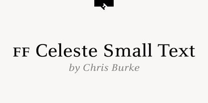
- FF Celeste Small Text by FontFont,
$65.99 - New Millennium Linear by Three Islands Press,
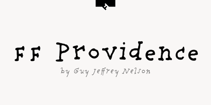
$24.00 - FF Providence by FontFont,
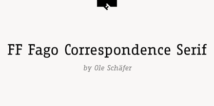
$72.99 - FF Fago Correspondence Serif by FontFont,
$68.99 - Ascender Sans Narrow by Ascender,
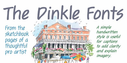
$89.00 - Dinkle by Chank,
$30.00


