10,000 search results
(0.04 seconds)
- Kalimaya Soultice by Allouse Studio,
$16.00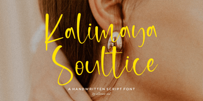 Proudly Presenting, Kalimaya Soultice A Handwritten Script Font. Kalimaya Soultice is perfect for any titles, logo, product packaging, branding project, megazine, social media, wedding, or just used to express words above the background. Kalimaya Soultice also come with Multi-Lingual Support. Enjoy the font, feel free to comment or feedback, send me PM or email. Thank You
 - Trilogi Materialism by Allouse Studio,
$16.00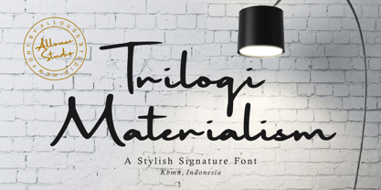 Proudly Presenting, Trilogi Materialism A Stylish Signature Font. Trilogi Materialism is perfect for any titles, logo, product packaging, branding project, megazine, social media, wedding, or just used to express words above the background. Trilogi Materialism also come with Multi-Lingual Support. Enjoy the font, feel free to comment or feedback, send me PM or email. Thank You!
 - Girlish by Balpirick,
$15.00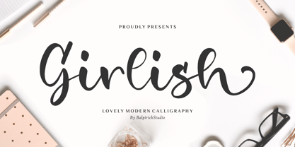 Girlish is a Lovely Modern Calligraphy Font. Girlish is perfect for product packaging, branding project, megazine, social media, wedding, or just used to express words above the background. Girlish also multilingual support. Lowercase font Stylistic Alternates Ligatures Symbols & Punctuation OpenType Features. Enjoy the font, feel free to comment or feedback, send me PM or email. Thank you!
 - Dhaelzot by Aisyah,
$12.00 Dhaelzot is a stylish, modern handwriting font with a relaxed, informal feel. With its unique, flowing letters, Dhaelzot adds a personal touch to any design project, making it perfect for use in greeting cards, invitations, and social media posts. The font is highly legible and easy to read, making it ideal for body text as well.
 - Employed by Prioritype,
$23.00 Presents a new typeface. Say hello to the "EMPLOYED" font. A serif font display with a modern and classic style, perfect for you to use in your projects such as branding, logos, or social media posts. A clean and attractive typeface with some awesome alternative character features. Features: Uppercase, Lowercase, Numeral, Punctuation, Multilingual, Ligatures, Alternates & PUA Encoded. Thanks!
 - Jakarta Brittany by Allouse Studio,
$16.00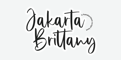 Proudly Presenting, Jakarta Brittany A Handwritten Script Font. Jakarta Brittany is perfect for any titles, logo, product packaging, branding project, megazine, social media, wedding, or just used to express words above the background. Jakarta Brittany also come with Multi-Lingual Support. Enjoy the font, feel free to comment or feedback, send me PM or email. Thank You!
 - The Brande and Lotaline by Arterfak Project,
$25.00 A beautiful bold serif specially designed for display. Inspired by modern fashion and classic typography, this font equipped with hundreds of alternative characters and ligatures. The Brande and Lotaline typeface represented luxurious, elegant, glamour, fashion, and wealthiness. This font works perfectly for logotype, invitation, cards, magazine, apparel, fashion, lifestyle, poster, social-media kit, and many more!
 - Freaky Bouncy by Allouse Studio,
$16.00 Proudly Presenting, Freaky Bouncy A Bold Handwritten Font. Freaky Bouncy is perfect for any titles, logo, product packaging, branding project, megazine, social media, wedding, or just used to express words above the background. Freaky Bouncy also come with Multi-Lingual Support. Enjoy the font, feel free to comment or feedback, send me PM or email. Thank You!
 - Spicy Garlic by Allouse Studio,
$16.00 Proudly Present, Spicy Garlic a Handwritten Brush Font. Spicy Garlic is perfect for any titles, logo, product packaging, branding project, megazine, social media, wedding, or just used to express words above the background. Spicy Garlic also come with Multi-Lingual Support. Enjoy the font, feel free to comment or feedback, send me PM or email. Thank You!
 - The Saily by Stringlabs Creative Studio,
$25.00 The Saily feels equally charming and elegant. This stunning script font is a stylish homage to classic calligraphy. It features a varying baseline, smooth lines, gorgeous glyphs and stunning alternates. Fall in love with its authentic feel and use it to create gorgeous wedding invitations, beautiful stationary art, eye-catching social media posts, and cute greeting cards.
 - Jingle Balle by Allouse Studio,
$16.00 Proudly Presenting, ingle Balle A Christmas Font With Two Styles. Jingle Balle is perfect for any titles, logo, product packaging, branding project, megazine, social media, wedding, or just used to express words above the background. Jingle Balle also come with Multi-Lingual Support. Enjoy the font, feel free to comment or feedback, send me PM or email. Thank You!
 - Gecko Moria by Allouse Studio,
$16.00 Proudly Presenting, Gecko Moria a Horror Handdrawn Font. Gecko Moria is perfect for any titles, logo, product packaging, branding project, megazine, social media, or just used to express words above the background. Gecko Moria also come with Multi-Lingual Support. Enjoy the font, feel free to comment or feedback, send me PM or email. Thank You!
 - Burnfolk by Allouse Studio,
$14.00 Burnfolk a Brush Font that bring an a natural brush impression. Come with separate alternate and Multi-Lingual Support. Burnfolk is perfect for any tittles, logo, product packaging, branding project, megazine, social media, wedding, or just used to express words above the background. Enjoy the font, feel free to comment or feedback, send me PM or email. Thank You!
 - Comickes by Allouse Studio,
$16.00 Proudly Presenting, Comickes A Handwritten Comic Font with 4 Styles. Comickes is perfect for any titles, logo, product packaging, branding project, megazine, social media, wedding, or just used to express words above the background. Comickes also come with Multi-Lingual Support. Enjoy the font, feel free to comment or feedback, send me PM or email. Thank You!
 - Sticky Buttercup by Allouse Studio,
$16.00 Proudly Presenting, Sticky Buttercup a Quirky Handwritten Font. Sticky Buttercup is perfect for any titles, logo, product packaging, branding project, megazine, social media, wedding, or just used to express words above the background. Sticky Buttercup also come with Multi-Lingual Support. Enjoy the font, feel free to comment or feedback, send me PM or email. Thank You!
 - Gothic Tuscan One by HiH,
$12.00 Gothic Tuscan One is a all-cap condensed gothic with round terminals and decorative “tuscan” center spurs. It was first shown by William H. Page of Norwich, Connecticut among his wood type specimen pages of 1859. Gothic Tuscan One exemplifies the strength of decorative wood types: large, simple type forms that provide the visual boldness sought by advertisers of the Victorian period. While our marketing has gotten so very sophisticated, there is always a place for simple, visually strong typeface. Although about 14 miles inland, Norwich lies at the head of the Thames River. The river is both wide and deep, and therefore was not bridged in the early 20th century. From the 17th century until then, if you wanted to get from Groton on the west bank to the whaling port of New London on the east bank by land, you had to had to go by way of Norwich. Because of its size, the Thames is navigable all the way from Norwich to New London. Docks were built in Norwich around 1685 and the city became Connecticut’s 2nd largest port by 1800. With the construction of the Norwich & Worcester Railroad in 1835, Page could easily ship his wood type north by rail or south by coastal schooner. Included with our font, Gothic Tuscan One, are two 19th century printer’s ornaments of sailing ships similar to those that sailed up the Thames to Norwich. There is also a more contemporary glyph of a whale, looking quite pleased that the only whaling ship left in Connecticut is the Charles W. Morgan, permanently moored at Mystic Seaport. Reference: Moon’s Handbooks, Connecticut 2nd Edition (Emeryville CA 2004). Gothic Tuscan One ML represents a major extension of the original release, with the following changes: 1. Added glyphs for the 1250 Central Europe, the 1252 Turkish and the 1257 Baltic Code Pages. Added glyphs to complete standard 1252 Western Europe Code Page. Special glyphs relocated and assigned Unicode codepoints, some in Private Use area. Total of 332 glyphs. 2. Added OpenType GSUB layout features: pnum, ornm and dlig. 3. Added 330 kerning pairs. 4. Revised vertical metrics for improved cross-platform line spacing. 5. Redesigned mathamatical operators 6. Included of both tabular (std) & proportional numbers (optional). 7. Refined various glyph outlines. Please note that some older applications may only be able to access the Western Europe character set (approximately 221 glyphs). The zip package includes two versions of the font at no extra charge. There is an OTF version which is in Open PS (Post Script Type 1) format and a TTF version which is in Open TT (True Type)format. Use whichever works best for your applications.
 - Movember - Personal use only

- African Jungle by Scholtz Fonts,
$19.00Dominated by a vigorous, african-inspired, jungle-like pattern, this contemporary, 21st century, sans serif font - African Jungle - contains an eclectic mix of elements from the 20th century. It combines gentle curves with base and caps-line transgressions but is substantially more rounded than in most commercial-style sans serif faces. Terminal strokes are slightly rounded and occasional elements are strongly rounded. The African-inspired pattern fill is suggestive of dense vegetation without being too literal. African Jungle is readable and can be successfully used for headers in presentations, magazines etc, and for display use in newspapers, advertising and promotions. Professionally kerned and spaced with 256 characters. - Caerphilly by Hanoded,
$15.00 I really like Wales; I like the culture, the people and the language. I also like the Welsh legends, especially the ones about King Arthur and Merlin. I am reading a book about Arthur right now, so when I was working on this font, I wanted to give it a Welsh name. Caerphilly is a town in Southern Wales and is home to an immense 13th century castle (Castell Caerffili). Caerphilly font is based on a 16th century manuscript. I kept the glyphs rough, to give it ‘ye olde’ look. Comes with a hoard of diacritics, a bunch of double letter ligatures and some alternate glyphs as well.
 - Core Circus by S-Core,
$20.00 Core Circus is a layered type family consisting of seven 3D effect layers, eight 2D effect layers and one shadow effect layer. Uppercase and lowercase letters are separated by such features that counters are opened or closed. Core Circus provides other closed counter styles such as numbers with opentype feature (Stylistic Alternatives). Also available Core Magic (Slab- Serif version of Core Circus) and Core Circus Rough(Textured version) The shape of Core Circus is simple but the combinations of effect fonts are impressive. Core Circus makes your works charming and special with endless combinations (at least 262,551 kinds). This family is really nice for book titles, headlines, logotypes and any artworks.
 - Fulmar by CAST,
$45.00Named after a practical seabird, Fulmar is a modern Scotch intended for extended reading. More European than American, it draws on a range of influences from around the North Sea, from Fife’s Alexander Wilson to 17th-century French experiments in modulation and 18th-century Belgian flash, and combines them with contemporary structure and proportions. The result is crisp yet warm, steadfast yet lively, sharp yet robust, rational but humane. It can be appropriate for new translations, new histories and new understanding. With five weights, ten styles, small caps, a clamjamfry of OpenType features and unicorn manicules, Fulmar dispenses with sprawl while retaining range and dexterity. - Reba Samuels by Samuelstype,
$24.00 Reba Samuels is based on the 2007 release Rebecca Samuels. While Rebecca was largely intended for text use Reba aims to be more versatile with an extended weight scope and added cut varieties. While Rebecca’s slab character is developed in the Reba serif, the ’seriffed’ italic of Rebecca is abandoned in favor of a simple italic sans, better matching the serif in plain text. The weight extremes are very useful for headlines while the middles do better in text. The robust and angular shapes of the serif matches the straightforward sans. The extreme contrast between the thin and the black cuts opens up great opportunities in any design project.
 - Core Magic by S-Core,
$20.00 Core Magic is a slab-serif version of Core Circus which is a layered type family consisting of seven 3D effect layers, eight 2D effect layers and one shadow effect layer. Uppercase and lowercase letters are separated by such features that counters are opened or closed. Core Magic provides other closed counter styles such as numbers with opentype feature (Stylistic Alternatives). Using Core Magic with Core Circus could make your works more charming and special with endless combinations (at least 262,551 kinds). This family is really nice for book titles, headlines, logotypes and any artworks. Also available the rough version of this family - Core Magic Rough.
 - Clementhorpe by Greater Albion Typefounders,
$7.95 Clementhorpe is inspired by the lettering on an early 20th century enamel advertisement-for chocolate. From the dozen or so hand drawn letters found in that source Greater Albion Typefounders have constructed a family of Roman faces for display and text work, with bold weights, an italic form as well as condensed, small capital and title forms, all preserving the fun of their inspiration. The Clementhorpe family provides a complete solution for early 20th century inspired design work with Character, offering all the faces needed to complete a project or a range of projects within one family. Give this flexible family a try in your next project!
 - Fette Fraktur by Linotype,
$29.99 This font is one of the most used broken letter fonts today. Fette Fraktur is used to invoke a nostalgic or rustic feeling and found often on restaurants with hearty homemade food’ or breweries who use the good old recipes’ of the founder. The font was designed in the 19th century and from the beginning intended as an advertisement typeface. The lower case letters have a gothic character with only the ornamental flourishes making them broken letters, while the capital letters are more characteristic of broken letter typefaces. One could say Fette Fraktur is a true mix of styles, not unusual for typefaces created at the turn of the 19th century.
 - Cochin by URW Type Foundry,
$35.99 The Cochin font is based on the work of eighteenth-century punchcutter, Cochin. Charles Peignot commissioned the revival of this strong typeface in 1912. The capitals are squarish. The lowercase has long ascenders and sharp serifs, giving Cochin an unusual elegance. The curved ascender in the italic lowercase d is a major characteristic and the p and q lack foot serifs. Cochins overall vivacity derives from the engravings on copper, produced in France in the eighteenth century. Cochin is a trademark of Linotype Corp. registered in the U.S. Patent and Trademark Office and may be registered in certain other jurisdictions in the name of Linotype Corp. or its licensee Linotype GmbH.
 - Plywood by Canada Type,
$24.95 Plywood is based on a long lost American film classic: Franklin Typefounders's Barker Flare from the early 1970s. Plywood is a surprisingly effective mix between the rigid confidence of nineteenth century wood types and the smooth feminine curves of twentieth century art nouveau ideas. With many variations on almost every letter in the alphabet, it's a versatile typeface that can make itself timelessly at home in multiple design environments, with motifs ranging from the strong and western to the crafty and artsy. Plywood's very expanded character set comes in all popular font formats, including a Pro version that takes advantage of OpenType's many character alternating features in supporting programs.
 - Beneta by Linotype,
$29.99Karlgeorg Hoefer designed Beneta in 1991, inspired by the Littera beneventana, the script of the Benedictine scribes from the 10th to the 12th century. During this time, scribes began to use wider pens and set them at a 45 degree angle to the paper, which caused their scripts to have radical stroke contrasts. This script was mainly used for books and certificates but disappeared by the end of the 13th century. Beneta revives the characteristics of this historic script, changing a line of text into an almost ornamental space. Beneta should be used in middle to larger point sizes for shorter texts and headlines. - Nylon and Draylon by Barnbrook Fonts,
$30.00 Nylon is an interpretation of pre-16th century letterforms, in particular those found in mediaeval portraits at the National Gallery, London. The source material contains many unusual and manic shapes—it appears as if these classical forms have, over time, become perverted, almost demonic. Draylon is the more restrained counterpart to Nylon; it is based on letterforms found on 18th century ceramics—some 200 years after the source material of Nylon. Nylon and Draylon have been designed so that they can be mixed together with ease. Both typefaces have been drawn with a kind of crude digital awkwardness—acknowledging the tool of the present moment, the computer, in the design process.
 - Ongunkan Northern Arabian Scrip by Runic World Tamgacı,
$49.99 The Ancient North Arabian scripts Ancient North Arabian is the name given to a group of scripts belonging to the South Semitic script family, which also includes the Ancient South Arabian alphabets (musnad and zabūr) and the vocalized alphabets used in Ethiopia for Geʿez, Amharic, etc. The Ancient North Arabian scripts were used both in the oases (Dadanitic, Dumaitic, Taymanitic,) and by the nomads (Hismaic, Safaitic, Thamudic B, C, D, and possibly Southern Thamudic). There are tens of thousands of inscriptions and graffiti in these scripts which were used in the period roughly between the sixth century BC and the fourth century AD. See the descriptions of the individual scripts below
 - Acre by Jonathan Ball,
$24.00 Acre is a geometric sans-serif type family of eight weights that's both inspired by and named after my great grandfather, Tex Acre. Tex was an artist and sign maker whose handcrafted signs illuminated the roadsides of the American Midwest and typified mid-century Americana. Acre is a tribute to him, his work, and many of my favorite early 20th century geometric typefaces. With eight weights ranging from Thin to Black, Acre is an extremely versatile family that can be used for display, text, or anything in between. Acre offers full European language support plus many OpenType features such as tabular and oldstyle figures.
 - Fournier by Monotype,
$29.99 Fournier was made by Monotype in 1924. The design is based on types cut by Pierre Simon Fournier circa 1742, some of the most influential designs of the eighteenth century. Fournier's types were among the earliest of the transitional" style of typeface and were a stepping stone to the more severe "modern" style made popular by Bodoni later in the century. They had more vertical emphasis than the old style types, greater contrast between thick and thin strokes and little or no bracketing on the serifs. Fournier has a light, clean look on the page, provides good economy in text and retains an even colour.
 - Van Dijck by Monotype,
$29.99 The seventeenth century Dutch old faces have a distinct character of their own, and were the source for eighteenth century English type designs, such as Caslon. Christoffel van Dijck was one of the great Dutch typefounders, although this face, which bears his name, may not have been cut by him, it is nevertheless representative of the best designs from that period. The Van Dijck italic, for which original punches survive, is almost certainly the work of van Dijck. Drawn at Monotype under the supervision of Jan van Krimpen. The Van Dijck font is a graceful typeface, best used for setting books, quality magazines and articles.
 - Whitenow by Proportional Lime,
$15.99 In the year 1528 Pierre Attaignant led a revolution in music printing. His method of once-press moveable type, greatly simplifying the original 3 impression process developed by Petrucci, remained in use till near the end of the 17th century. The method could only realize one line of music per staff, and the introduction of barlines as a common means of aligning multiple staves brought this method to a close after nearly two centuries of use. This font is meant to allow the printing of music using that method with the notation of that era. It is largely based on an exemplar printed by Snodham of London.
 - Clay Handwriting Pro by SoftMaker,
$7.99 Digitized handwriting fonts are a perfect way to give documents the “very special touch”. Invitations look simply better when handwritten than when printed in bland Arial or Times New Roman. Short handwritten notes look authentic and appealing. There are numerous occasions where handwritten text makes a better impression. Clay Handwriting Pro is a beautiful typeface that mimics true handwriting closely. Use Clay Handwriting Pro to create stunningly beautiful designs easily. This typeface comes with alternative characters for sophisticated typography – all easily accessible as OpenType features. A “random” feature even allows for automated random switching between variations of the same character, resulting in type that looks authentically handwritten.
 - Boncaire Titling by insigne,
$22.00 Inspired by the type elements of 17th century Dutch mapmaking, Boncaire Titling provides you with a historic yet adventurous look for your library. This addition from insigne found its muse in a map of Curacao by Dutch cartographer Gerard Van Keulen, a member of the prosperous Van Keulen family from Amsterdam, who were engaged in the manufacture of maps for seafaring. Much thanks on this project goes to The Norman B. Leventhal Map Center, housed at the Boston Public Library. Through the centers kindness, I was able to view a number of period maps in person and to meet with curators, who explained more about the Van Keulen family and the way maps of the period were created. While I studied the maps, I narrowed in on some of the original types unique idiosyncrasies. For instance, the long, exaggerated serifs, which give the forms a sense of stability, aid in the faces legibility--largely a byproduct of the engraving method that was used to create the metal plates for manufacturing these maps. In creating Boncaire Titling, I decided to capture these unique idiosyncrasies, embracing the character of the engravings rather than removing them entirely through over-refining the forms. The result is an elegant family with far more than seafaring potential. This font has a full range of six weights, from thin to black. It also includes a wide variety of OpenType alternates. All insigne fonts are fully loaded with OpenType features. Boncaire Titling is also equipped for complex professional typography, including alternates, smaller titling caps and plenty of alts, including normalized capitals and lowercase letters. There are over 30 autoreplacing ligatures, and the face includes a number of numeral sets, including fractions, old-style and lining figures with superiors and inferiors. OpenType capable applications such as Quark or the Adobe suite can take full advantage of automatically replacing ligatures and alternates. You can find these features demonstrated in the .pdf brochure. Boncaire Titling also includes the glyphs to support a wide range of languages, including Central, Eastern and Western European languages. In all, Boncaire Titling supports over 40 languages that use the extended Latin script, making the new addition a great choice for multi-lingual publications and packaging. Maps are fascinating; they come with the promise of treasure to be uncovered. Examining the map itself, too, you can find great wealth in the details so artfully condensed to that single piece of paper--details carried over into this new insigne font. For your next project, explore the imagination potential in Boncaire Titling.
 - Really Gold by Yumna Type,
$12.00 If you have a dream to create an awesome designs or projects? Whatever your project it is-then we've got what you want. Really Gold, the gold combination between script and uppercase display font. The display font is fun, playful, readable and has a youthful touch that make it up to date while the script shows the simple but yet elegant style. As extras you will get 15 illustrations to maximize your design. Features: Ligatures Stylistic Sets Swashes Multilingual Supports Uppercase and lowercase PUA Encoded Numerals and Punctuation It is best to be apply on your branding, logos, social media quotes, stickers, posters, wall art, merchandise, social media, and many more. Get more inspiration about how to use it by seeing the font preview. Thank you for purchasing our fonts. If you have any further questions, don't hesitate to contact us. Happy Designing.
 - Hello Mango by Yumna Type,
$12.00 Need that perfect statement fonts for your designs? Hello Mango knows how to make your designs go from good to be ultra good. It is harmonious uppercase display and script font duo. The display font is beautifully designed and add a distinctive touch wherever they are used. On the other hand, the script style expresses elegant and modern look. In this package, you can also get 15 illustrations as special extra. Features: Ligatures Stylistic Sets Swashes Multilingual Supports Uppercase and lowercase PUA Encoded Numerals and Punctuation This font would looks great on your branding, logos, social media quotes, stickers, posters, wall art, merchandise, social media, and many more. Get more inspiration about how to use it by seeing the font preview. Thank you for purchasing our fonts. If you have any further questions, don't hesitate to contact us. Happy Designing.
 - Lolotte by Nantia.co,
$22.00 The Lolotte Multilingual Signature Font is a signature decorative font with which you can achieve a handwritten-type lettering feeling. Lolotte Multilingual Signature Font is a multilingual lettering font with Greek (of course), extended Latin characters and diacritics. This signature style is perfect for your modern graphic design projects. This font has a really nice flow so you can use it in a large body of text if you want to give it a handwritten vibe. It can also be used on social media content, for branding or packaging applications. Also, Lolotte Multilingual Signature Font is the ideal typeface for branding and packaging. Additionally, you can use Lolotte Multilingual Signature Font on wedding invitation designs. Especially if you are looking for a font for Instagram quote posts or any other social media content, this typeface is for you!
 - Woreby by ryan creative,
$10.00 Creative greetings... Introducing the Woreby font which has a unique looking design. This font has additional large and small arches. You can use Woreby in modern and contemporary designs, and is suitable for use in various media such as stickers, posters, covers, typography and other digital media. FEATURES; -Uppercase. -Support Foreign, Numbers and Punctuation. -Works on PC. -Simple installation. -Accessible in Adobe Illustrator, Adobe Photoshop. Adobe InDesign, it even works in Microsoft Word. -Fully accessible without additional design software. Woreby is encoded with Unicode PUA, which allows full access to all additional characters without having to design any special software. Mac users can use the Font book, and Windows users can use the Character map to view and copy any extra characters to paste into your favorite text editor/app. Thanks for visiting, have a nice day ;)
