9,742 search results
(0.025 seconds)
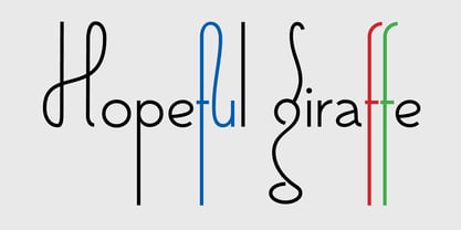
- Hopeful Giraffe by JBFoundry,
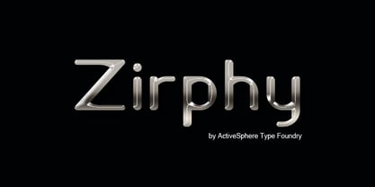
$18.00 - Zirphy by ActiveSphere,
$30.00 - Nergisha by Sealoung,
$25.00 - Al Seg23 by Nihar Mazumdar,
$0.50 - Bruce Old Style by Bitstream,
$29.99This is the Bruce Foundry’s Old Style No.20, which was loosely based on the Miller & Richard Old Style. It was recut at Lanston under Sol Hess’ direction in 1909, and survives as the second text face in the Sears Roebuck Catalogue. - Votrag Texture by Putracetol,
$20.00 - LD Engraved by Illustration Ink,
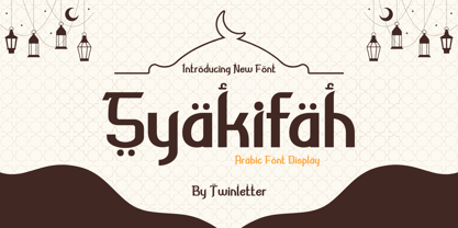
$3.00This font looks as if it was engraved on a plaque. Each letter has a top and bottom line. When you put the ending parts using the [ and ] keys, it forms a beautiful plaque. It is great for a more formal title. - Syakifah by Twinletter,
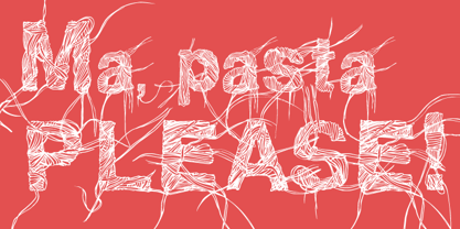
$15.00 - Strands by J. DeAngelis Design,
$35.00 - Couple Valentine by Selvia Design,
$15.00 - Handmade Beautiful by Rhd Studio,
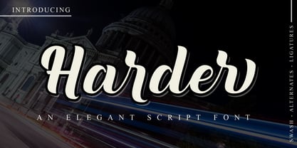
$12.00 - Harder by Doehantz Studio,
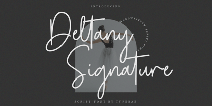
$20.00 - Deltany Signature by Typebae,
$15.00 - Tangy Cream by Bogstav,
$18.00 - Herbal Medicine by Wildan Type,
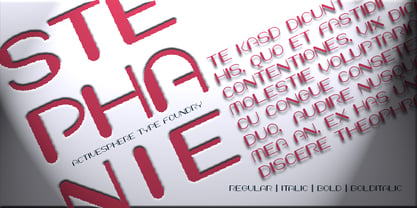
$12.00 - Stephanie by ActiveSphere,
$30.00 - Foppish Birdie by Natalie Thomson,
$15.00 - Historina by MJB Letters,
$17.00 - Hallo Witch by Sakha Design,
$12.00 - P22 Latimer by IHOF,
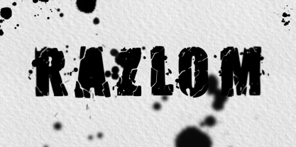
$24.95 - Razlom by Pavel Boog,
$11.00 - Antique Dubplate by Okaycat,
$29.95A gritty, deeply textured font where each letter was sketched by hand! Need to create an artistic, rich & friendly feeling with your text? Use Antique Dubplate. Antique Dubplate is extended, containing West European diacritics & ligatures, making it suitable for multilingual environments & publications. - Mafond by Etewut,
$25.00 - The TPF Senseless Strokes font, crafted by the talented Samuel Marcius, offers an intriguing journey into the realm of abstract and expressive typography. This font stands out due to its distinctive ...
- Green Dinosaur - Unknown license
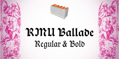
- RMU Ballade by RMU,
$25.00In the years 1937 and 1938 Paul Renner drew these both styles of the Ballade font family. Now freshly redesigned and extented for contemporary use, both styles have reappeared. These fonts contain the historical long s, which can be reached by typing the integral sign [ ∫ ] or by turning the round s into the long s via using the OT feature historical forms. It is also recommended to activate the OT feature discretionary ligatures. - RMU Edelgotisch by RMU,
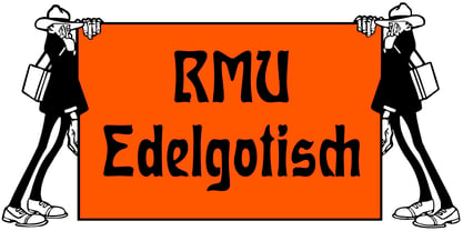
$30.00RMU Edelgotisch is a carefully redrawn revival of the then trend-setting Schelter & Giesecke hot-metal original from the fin-de-siècle period. This fine vintage font elevates all your projects in an Art Nouveau style. To reach the historical long s, either type the integral sign [ ∫ ] or turn the round s into the long s by using the OT feature historical forms. It is also recommended to activate the OT feature discretionary ligatures. - Zoney by Mans Greback,
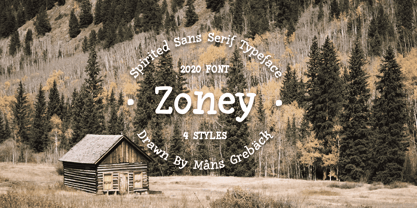
$59.00Zoney is a rustic slab serif typeface family. The lettering was hand-painted by Mans Greback between 2019 and 2021. It will give any project a handmade, natural and down-to-earth look. The font comes in four styles: Regular, Italic, Bold and Italic Bold It has very extensive lingual support, covering all European Latin scripts as well as Cyrillic. The font contains all characters you'll ever need, including all punctuation and numbers. - Galactica by Melonaqua,
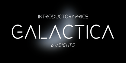
$10.00The universe always made me curious as to what could be found beyond earth. For the past few weeks, I’ve been staring outside my bedroom window looking at the same star. Every day at one in the morning, it shone beautifully in the cloudless night sky as I face West. That same star paved way for some inspiration to create a futuristic typeface. Every day, I watch it before it disappears into the oblivion. - Cosmic Dust by Kitchen Table Type Foundry,
$16.00Cosmic Dust is dust that occurs in outer space or has fallen onto earth. Cosmic Dust font isn’t a dusty or celestial affair, no, it is a nice and useful font I made with a Sharpie pen. It is a little uneven, a little wobbly, but comes with a lot of character. Use it for your book covers, product packaging or posters. Cosmic Dust comes with extensive language support and a cool set of alternates. - ZenoPotion AOE by Astigmatic,
$19.95ZenoPotion is a geometric styled typeface influenced by alien stories and nostalgia. It carries a techno look with a regular lined top and dipped thick bottom throughout, highly readble, though not best for large bodies of text. Use the alien technology, let ZenoPotion be the type for your designs and stories. From the far reaches of space, another lifeform sent a message, now you can use their typestyle to convey your own! - Sweetmaroon by Lunas Type,
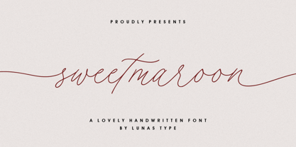
$19.00Sweetmaroon is a sweet and modern handwritten font. Sweetmaroon comes with begining and ending swashes. Just type "-" at the beginning or the end of the letters. Or you can access it via alternates option. Sweetmaroon is perfect for many design needs such as merch, T-shirts, titles, wedding, book covers, social media posts, websites, events, and many more. What's you get : - Beginning & Ending Swashes - Numeral & Punctuation. - Ligature. - Multilingual Support. Enjoy Designing! Thanks! Lunas Type - Fondamento Pro by Stiggy & Sands,
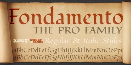
$29.00Fondamento and Fondamento Italic are calligraphic lettering styles based on the traditional Foundational Hand, a basic teaching style created by Edward Johnston in the early 20th century. The letterforms are clear and cleanly legible, basic and formal. Opentype features include: - Stylistic Alternates for a collection of alternate Small Caps - Full set of Inferiors and Superiors for limitless fractions - Lining and Proportional figure sets, several discretionary ligatures/alternates as well as a collection of ligatures. - Now Appearing JNL by Jeff Levine,
$29.00Now Appearing JNL is a digital version of some hand-lettering spotted on an early 1960s ad for a Miami Beach night club. Its fun, casual appearance makes it perfectly suitable for any project that conveys a relaxed atmosphere. The font was intentionally not kerned, so the free-flowing form of the lettering is at its best, but it can be set tight by hand if a more compact look is desired. - Early Hours by Epiclinez,
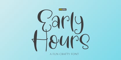
$18.00Early Hours is a fun crafty font. A little bit quirky, this font looks incredibly adept in a wide variety of contexts, such as children's craft, teaching material, quotes, apparel, or any other design that needs a touch of fun and playfulness. The font Early Hours contains 203 glyphs, supporting 66 languages from Africa, Albanian to English, and Zulu. The font Early Hours contains 8 ligatures in 1 OpenType feature. Thank You - Testify by Epiclinez,
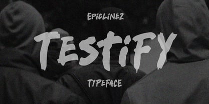
$19.00Testify is a cool and fun typeface, carefully handcrafted to become a true favorite. Its old school charm makes it appear wonderfully down-to-earth, readable, and ultimately, incredibly versatile. Testify will look outstanding in any context, whether it’s being used on busy backgrounds or as a standalone headline! This font is supporting Multi-Languages, which includes: Afrikaans Albanian Catalan Danish Dutch English Estonian Finnish French German Italian Norwegian Portuguese Spanish Swedish Zulu. - Baby Dastheg by IRF Lab Studio,
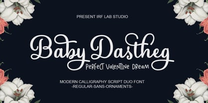
$10.00Baby Dastheg is a feminine modern handwritten font, carefully handcrafted to become a true favorite. Its casual charm makes it appear wonderfully down-to-earth, readable and, ultimately, incredibly versatile. Baby Dastheg will look outstanding in any context, whether it’s being used on busy backgrounds or as a standalone headline. Equipped with alternative letters for beginning and ending. and also "stylistic alternates" which makes this letter very beautiful and attractive. Thank you - Monumentum by Harvester Type,
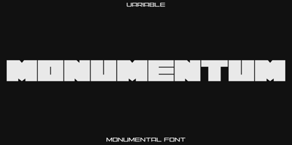
$15.00Monumentum is a font that matches its name, it is wide and large. It creates an atmosphere of significance, perseverance and seriousness. Its application is very wide. With 5 scales and great language support, everything is limited only by your imagination. Perfect for covers, logos, text, posters, banners, merch, headlines, and much more. If you find an error or an error in kerning somewhere, write to me and I will fix it: bunineugene@gmail.com - Meier Kapitalis by Elsner+Flake,
$39.00As a late work the “Meier Kapitalis” forms an arch within the typographic creations of the Swiss type designer Hans Meier who died in 2014. The first sketches of this typeface can be found in the teaching manual “The Development of Script and Type” (German: “Die Schriftentwicklung”; French “Le développement des caractères”) which was published in 1994, however, under the title “Roman Lapidary, 1st Century”. The booklet was first published by the Syntax Press, Cham, Switzerland and contains an introduction by Max Caflisch in which he writes: „The present work, „The Development of Script and Type“ is a concise, authoritative textbook, concentrating on the essentials in a wide survey from ancient Greek inscriptions to the printer’s typefaces of the present day. His (Meier’s) 72 varieties of letterforms enable the student or general reader to understand the history of script and type, while more than 60 of his own calligraphic specimens provide excellent models for all who practice this art.“ Unfortunately, the “Meier Kapitalis” is one of the few typeface families in this publication which has been digitized. It was to be the last type project fully realized by Meier. In cooperation with Elsner+Flake, the typeface family was developed and expanded and now contains the four cuts: Roman, Medium, Demi Bold and Bold with either a complement of characters for 78 Latin-based languages (EL=EuropaPlus) or in West-Layout. - BIENUG by Twinletter,
$17.00Welcome to a world of elegance and grace with BIENUG, the unrivaled classic serif font. Designed specifically for projects with a classic modernism theme, this font is the perfect solution for bringing a stunning, classic touch to your designs. With ligature and alternate features, BIENUG provides unlimited creative freedom. You can combine unique character variations to create an interesting look that is different from the others. Available in a variety of styles, this font lets you explore different nuances and moods in each design. In addition, BIENUG supports multilingualism, enabling you to convey messages fluently in multiple languages. There are no limitations in reaching an international audience with this font. Enhance your designs with the beauty and elegance of BIENUG. Make an unforgettable impression with subtle details and strong characters. Add a touch of classic modernism to your project and present a stunning visual experience. Explore the BIENUG collection now and find power in the beauty of this classic serif. Let this font be your loyal partner in creating eye-catching and memorable designs. What’s Included : File font All glyphs Iso Latin 1 Alternate, Ligature Simple installations We highly recommend using a program that supports OpenType features and Glyphs panels like many Adobe apps and Corel Draw so that you can see and access all Glyph variations. PUA Encoded Characters – Fully accessible without additional design software. Fonts include Multilingual support
