2,028 search results
(0.037 seconds)
- Sassoon Infant by Sassoon-Williams,
$48.00 An upright typeface family developed to meet the demand for letters to produce pupil material for handwriting as well as for reading. Upright letters with extended ascenders and descenders are ideal on screen. They facilitate word recognition. The exit strokes link words together visually, and in handwriting they lead to spontaneous joins along the baseline leading logically to a joined-up hand. Teachers can print desk strips, charts of letter families and alphabet friezes, as well as consistent material across the curriculum. Together these typefaces provide a valuable resource for special needs teachers. When starting point and stroke direction has been learned, the arrow font (Tracker B) can be dropped and the simpler Tracker font used. Tracker B font, with its direction arrows helps pupils to start in the correct place. Motor movements can be refined by keeping inside the line. When starting and direction is no problem, the arrow can be dropped and the plain Tracker font used. When starting point and stroke direction have been learned, the arrow font (Dotted B) can be dropped and the simpler Dotted font used. Free to download resources How to access Stylistic Sets of alternative letters in these fonts Purchasers of this font package may use their Order Number to receive a free Copybook PDF by Rosemary Sassoon recommended for effective teaching
 - Sassoon Primary by Sassoon-Williams,
$48.00 The Regular typeface was researched with children and developed specially for use in children’s reading books - bridging the gap between reading and handwriting. Short ascenders and descenders may not trouble literate adults but it is quite a different matter for children struggling to read. These fonts include extended ascenders and descenders and slight slant makes blocks of text easier to read. Free to download resources How to access Stylistic Sets of alternative letters in these fonts
 - Sassoon Infant Pro by Sassoon-Williams,
$66.00 An upright typeface family developed to meet the demand for letters to produce pupil material for handwriting as well as for reading. Upright letters with extended ascenders and descenders are ideal on screen. They facilitate word recognition. The exit strokes link words together visually, and in handwriting they lead to spontaneous joins along the baseline leading logically to a joined-up hand. Teachers can print desk strips, charts of letter families and alphabet friezes, as well as consistent material across the curriculum. Together these typefaces provide a valuable resource for special needs teachers. Typefaces developed to meet demand for letters that can be used to produce pupil material for reading as well as handwriting. Regular and Bold typefaces covering pan-European languages: 9 Latin, 6 Cyrillic, Greek, Turkish, 13 Baltic, 8 Rusyn, 6 Nordic, Vietnamese. How to access Stylistic Sets of alternative letters in these fonts Cyrillic Stylistic Sets examples Greek Stylistic Sets examples Vietnamese Stylistic Sets examples
 - Sassoon Primary Cond by Sassoon-Williams,
$48.00 Those who design books for young children should consider the different needs of their readers. When laying out pages for young readers, particular care should be taken over word spacing. Don't forget that justifying short lines disrupts spacing. Justification should be used only when absolutely necessary. In the research undertaken with young readers the importance of consistent spacing was clear. It also appeared that the poorer readers profited from wider word spacing, while spacing that suited the poorest readers, positively annoyed the better readers. These typefaces have built-in letter spacing because of their exit strokes, as well as extra clarity designed into them. Sassoon Primary Medium Condensed is a compact style for headlines combining the right amount of weight, yet in a friendly style. When used at large sizes the friendliness of Sassoon types really shines. Why not use it for headings throughout a book. You can find many other new ways to use this typeface. Ideal perhaps for the masthead or a magazine? Free to download resources: How to access Stylistic Sets of alternative letters in these fonts
 - Primaria by PeGGO Fonts,
$18.00 Primaria is a display font, inspired on the very first basic handwrite style teaching at primary school, designed in cursive and print styles in three weights each one: light, Regular and Bold, considering stylistic and typographic needs, it also contain OpenType initial lowercase alternative forms in order to get better links in those case where pairs of letters could be look better. Recommended playful and friendly design, teaching and learning stuff, children toys projects, food & drink and soft stuff.
 - Primark by Cititype,
$17.00 Primark is a chic, modern and elegant script font with a prominent appearance, it's a great choice for logotypes, brand names, digital signatures, online portfolios, website banners, posters, wedding invitations, book titles, and headlines. The Primark font consists of 3 fonts, the primamark regular, alternate and swash. they are designed in the same metric so that the two fonts can be combined with each other. Come with ligatures to make it more natural impression and supported by diacritic that supports various language. Chic, Modern, elegant and stand out are words that can describe the definition of this font.
 - Incantation - Unknown license

- Sassoon Montessori by Sassoon-Williams,
$48.00 Typefaces following Montessori Institute guidelines for reading and handwriting. With these fonts, the crucial stages of letter formation are made easier for parents and teachers to produce consistent worksheets. Children should then progress towards an efficient and mature joined-up handwriting. Free to download resources: How to access Stylistic Sets of alternative letters in these fonts
 - Sassoon Patterns by Sassoon-Williams,
$48.00 Many children start school with their hands not ready and trained to produce the precise strokes required for forming letters and starting to write. Pattern is essential preparation. It is fun for children, building their confidence as well as training their muscles for the task. Each font has normal letters and pattern characters. Free to download resources: How to access Stylistic Sets of alternative letters in these fonts Purchasers of this font package may use their Order Number to receive a free Copybook PDF by Rosemary Sassoon recommended for effective teaching
 - Sassoon Write by Sassoon-Williams,
$66.00 These fonts will join-as-you-type in your OpenType application as shown in the posters above. Choose Use Contextual Alternates option in your app to get basic recommended baseline joins for teaching. Additionally, use can choose from 7 Stylistic Sets of alternative letterforms that are so important for Teachers. Create 'pen-lifts' too! Fonts display unjoined by default on this website and are delivered that way - joining is controlled by you. A mature ‘joined-up’ hand is the result of correct instruction from an early age. Sassoon Write typefaces are a direct progression from the separate letters of Sassoon Infant or Sassoon Primary and were specially created for teaching cursive handwriting in a flexible way. Designed for older pupils and adults, rather than children. A family of 4 fonts than join, or enter " | " between letters for unjoined text. For use with OpenType compatible applications such as Word. Enables progressive pupil exercises for a smooth transition between separate letters and teaching joined handwriting. Free to download resources Stylistic Sets and how to access the alternative letters feature in these OpenType fonts Purchasers of this font package may use their Order Number to receive a free Copybook PDF by Rosemary Sassoon recommended for effective teaching
 - Sassoon Book by Sassoon-Williams,
$48.00 Semi-Serif Roman and Italic for typefaces for setting legible children’s reading books. A gentle introduction for young readers to seriffed letterforms they will encounter. Free to download resources: How to access Stylistic Sets of alternative letters in these fonts
 - Sassoon Felt by Sassoon-Williams,
$48.00 Sassoon Felt’s more casual letterforms can be used either as informal text or for the teaching of reading and handwriting; having the letterforms most taught in UK schools. These fonts are an educators alternative to Comic Sans (from Microsoft) and Chalkboard (from Apple), which are more appropriate for ‘Print’ style writing in United States Elementary schools and may also be appropriate for parts of Australia, which can be identified usually by crucifix t, diagonal y downstroke, short f, two-stroke and there may be more. Free to download resources: How to access Stylistic Sets of alternative letters in these fonts
 - Sassoon Sans by Sassoon-Williams,
$48.00 A more mature font retaining the clarity of the Sassoon typefaces that accentuate word shape, while omitting the exit strokes. A more legible alternative to standard Sans serif typefaces - superb on the screen. Many alternative letters are included in each font. A typeface designed with the computer screen in mind. It retains maximum legibility even in the most unusual layout - ideal for multi media uses and giving unimagined clarity to menus and navigational aids. Avoid eyestrain with a typeface that accentuates word shape as well as the identity of individual letters. Legible in print at tiny point sizes so ideal for captions. Ideal for older pupils, perhaps at Secondary school, or adults, who no longer require ‘exit strokes’ to clump the letters together. Free to download resources: How to access Stylistic Sets of alternative letters in these fonts
 - Plantin Infant by Monotype,
$29.99Plantin is a family of text typefaces created by Monotype in 1913. Their namesake, Christophe Plantin (Christoffel Plantijn in Dutch), was born in France during the year 1520. In 1549, he moved to Antwerp, located in present-day Belgium. There he began printing in 1555. For a brief time, he also worked at the University of Leiden, in the Netherlands. Typefaces used in Christophe Plantin's books inspired future typographic developments. In 1913, the English Monotype Corporation's manager Frank Hinman Pierpont directed the Plantin revival. Based on 16th century specimens from the Plantin-Moretus Museum in Antwerp, specifically a type cut by Robert Granjon and a separate cursive Italic, the Plantin" typeface was conceived. Plantin was drawn for use in mechanical typesetting on the international publishing markets. Plantin, and the historical models that inspired it, are old-style typefaces in the French manner, but with x-height that are larger than those found in Claude Garamond's work. Plantin would go on to influence another Monotype design, Times New Roman. Stanley Morison and Victor Larent used Plantin as a reference during that typeface's cutting. Like Garamond, Plantin is exceptionally legible and makes a classic, elegant impression. Plantin is indeed a remarkably accommodating type face. The firm modelling of the strokes and the serifs in the letters make the mass appearance stronger than usual; the absence of thin elements ensures a good result on coated papers; and the compact structure of the letters, without loss of size makes Plantin one of the economical faces in use. In short, it is essentially an all-purpose face, excellent for periodical or jobbing work, and very effective in many sorts of book and magazine publishing. Plantin's Bold weight was especially optimized to provide ample contrast: bulkiness was avoided by introducing a slight sharpening to the serifs' forms." - Bembo Infant by Monotype,
$45.99The origins of Bembo go back to one of the most famous printers of the Italian Renaissance, Aldus Manutius. In 1496, he used a new roman typeface to print the book de Aetna, a travelogue by the popular writer Pietro Bembo. This type was designed by Francesco Griffo, a prolific punchcutter who was one of the first to depart from the heavier pen-drawn look of humanist calligraphy to develop the more stylized look we associate with roman types today. In 1929, Stanley Morison and the design staff at the Monotype Corporation used Griffo's roman as the model for a revival type design named Bembo. They made a number of changes to the fifteenth-century letters to make the font more adaptable to machine composition. The italic is based on letters cut by the Renaissance scribe Giovanni Tagliente. Because of their quiet presence and graceful stability, the lighter weights of Bembo are popular for book typography. The heavier weights impart a look of conservative dependability to advertising and packaging projects. With 31 weights, including small caps, Old style figures, expert characters, and an alternate cap R, Bembo makes an excellent all-purpose font family. - Afons Infant by Andy Peat,
$9.00 About this font family Afons Infant has been designed for children’s storybooks; using round, single-decker letter forms to create simple, clear and readable stories that children are familiar. Features 5 weights (from thin to bold) Multi language Lowercase Numerals to blend with text Ligatures To be able to access alternative fonts, make sure the software you use can support opentype features such as Microsoft Word, Paint, Adobe, Corel draw and other applications. Designed and published by Andy Peat. Released April 2022
 - National Primary - Unknown license

- Primary Elector - Unknown license

- Julius Primary by Monotype,
$40.99
- Linkpen Primary by Linkpen Handwriting Fonts,
$10.00 Linkpen Primary is a font family for teaching handwriting. It is designed to be used by teachers and parents to help children or adult learners practice their handwriting, at home or at school. Linkpen Primary gives you endless possibilities for creating your own educational resources - worksheets, signs, labels, etc. - to appeal to your learners and get them interested and passionate about learning to write. This versatile font family contains 24 styles, each with special features that support learning to write. For ultimate flexibility, styles are available with and without guide lines, and in regular and italic versions. The styles can each be purchased separately or as a complete family value pack. The letter shapes have been designed to be clear, simple and easy to read. There are 12 print styles designed for beginners or younger children, to allow them to practice writing the letter shapes. The print fonts all come in Regular, Guide, Dotted, Dotted Guide, Outline, and Arrow styles, to give learners different ways to build their confidence creating the letter shapes. There are 12 Join fonts, for when your learners are ready to progress onto joined up handwriting. The Join fonts automatically join up as you type on your computer, tablet, or interactive whiteboard, producing beautiful, neat, clear joined up text for your classroom or home resources. The Join fonts come in Regular and Dotted styles, as well as a special Connect style which highlights the join between letters, to help your learners make the transition from printed writing to joined up. The Join fonts are created with OpenType Contextual Alternate rules, which ensure that the joins are always formed correctly, depending on the context of each letter within a word. Compatible with Microsoft Word and Publisher 2010 onwards (desktop version), SMART Notebook 18 onwards, Pages and Keynote for iOS, TextEdit for macOS, LibreOffice 6, Notepad for Windows, and Promethean ActivInspire Version 2.21 onwards.
 - Exuberance Primary by T-26,
$29.00 - Salloon by Ingrimayne Type,
$8.95 The original version of Salloon was what has become Salloon-Wide. It was designed a year or two before 1990. The narrower version, which is now the regular version of the face, was constructed a few years later. There never has been a true lower-case set of letters for these fonts, but the narrower version introduced a second set of caps by removing the side bumps from the letters. Although Salloon may look like an old font, no historic font closely resembles it. Fonts with bold, thick stems such as Salloon invite interior decoration. The five striped versions and the shattered version of the font were produced a year or two after the construction of the narrower Salloon when the arrival of a font distortion program made it easy to cracked and stripe fonts. In 2019 an outline style and two highlighter styles were added to be used in layers with the Salloon-Regular and one highlighter style was added to be used with Salloon-Wide.
 - Balsoon by Attype Studio,
$12.00 Introducing Balsoon - Inspired by urban typeface with texture style, Balsoon has strong character perfect for urban street design. Balsoon is perfect for branding, logo, invitation, stationery, product packaging, merchandise, monogram, blog design, game titles, cute style design, Book/Cover Title and more. Features : - Ending swash - Ligatures - Multilingual Support - Made it into separated file to make it easier to use by beginner & separated file user can use the font with software which doesn't accept open type features. Hope you enjoy with our font! Attype Studio
 - Sessions by Afrojet,
$19.00 Afrojet Type Foundry presents Sessions, a heavyweight modular typeface with a quirky personality. The design is a fresh reimagination of Joseph Albers' classic Kombinationsschrift alphabet. It utilizes modular, repeating stylized forms to bring dimensionality and personality to the page. Sessions takes advantage of OpenType’s Stylistic Alternates feature with: two numeral options (cap-height and x-height), the option to ‘turn off’ the splayed bottoms of certain glyphs, and numerous alternate characters. All together, these options allow you the designer to create unique and custom designs.
 - Privacy - Unknown license

- Gramary by Maulana Creative,
$14.00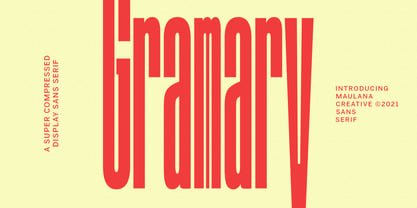 Gramary is a Super Compressed display font. With bold weight stroke, upright and fun character with a bit of ligatures. To give you an extra creative work. Gramary font support multilingual more than 100+ language. This font is good for logo design, Social media, Movie Titles, Books Titles, a short text even a long text letter and good for your secondary text font with script. Make a stunning work with Gramary font. Cheers, MaulanaCreative
 - Primordial by Hanoded,
$15.00 Primordial is a chaotic handmade script font. It is rough around the edges, glyphs are shaky and don’t follow a baseline. Yet, in all this chaos, you will find the budding of a new idea, a glimpse of hope and a glint of something beautiful. Primordial comes in a regular and italic style, plus a back slanted style called Primordial Chaos.
 - Afsoon by Naghi Naghachian,
$104.00 Afsoon is a decorative headline font designed by Naghi Naghashian.This font is a contribution to modernisation of Arabic typography, gives the font design of Arabic letters real modern arrangement und provides more typographic flexibility. Afsoon supports Arabic, Persian and Urdu. It also includes proportional and tabular numerals for the supported languages.
 - Sassoon Sans US by Sassoon-Williams,
$48.00 North American version for teaching children’s first letterforms With dots and arrows these print script fonts have no ‘exit stroke’ found in the European version. An upright typeface family developed to meet the demand for letters to produce pupil material for handwriting as well as for reading. Upright letters with extended ascenders and descenders are ideal on screen. They facilitate word recognition. Teachers can print desk strips, charts of letter families and alphabet friezes, as well as consistent material across the curriculum. Together these typefaces provide a valuable resource for special needs teachers. Free to download resources How to access Stylistic Sets of alternative letters in these fonts
 - Sassoon Handwriting Starter by Sassoon-Williams,
$45.99 Sassoon fonts package for handwriting starters The three upright "infant" fonts developed to meet the demand for letters to produce pupil material for handwriting as well as for reading. Letters have extended ascenders and descenders ideal on screen and print. They facilitate word recognition. The exit strokes link words together visually, also crucially, they space the letters for improved legibility. The "joined" font puts the skills gained into practice producing joined-up handwriting. Together these typefaces provide a valuable resource for Teachers to create consistent material across the curriculum. Sassoon Infant Tracker B font: This font with its direction arrows helps pupils to start in the correct place. Motor movements can be refined by keeping inside the line. When starting and direction is no problem, the arrow font can be dropped and the Dotted font used. Sassoon Infant Dotted B font: Writing over the dots of this font refines motor skills. The aim here is to give confidence by reinforcing starting points, exits and to now encourage fluidity. Sassoon Infant font: With some words in this font and a baseline beneath to copy onto, pupils can use their learned starting points and exit strokes to write freely along the baseline - still unjoined. Once learned, this leads to spontaneous joins along the baseline leading logically to a joined-up hand. Sassoon Joined font: Having learned to write letters with correct starts and exits, this is when the joined font for teaching handwriting can be used. With some words in this font and a baseline beneath to copy onto, pupils can use their learned starting points and simply extend their exit strokes to make joined-up writing. The default joins the font provides are recommended, however there are alternative letterforms that are so important for some Teachers which can be accessed. Create ‘pen lifts’ anytime too! NOTE: Fonts display unjoined by default on this website and are delivered that way - joining is controlled by your text editing application such as Word or TextEdit, read more for instructions… Free to download PDF resources: Stylistic Sets and how to access the alternative letters feature in these OpenType fonts. Using the separate letter fonts Using the joined font Teachers copybooks using these fonts: How to teach pre-cursive Copybook How to teach cursive handwriting Copybook
 - Sassoon Joined NORDIC by Sassoon-Williams,
$66.00 These fonts will join-as-you-type in your OpenType application as shown in the posters above. Choose Use Contextual Alternates option in your app to get basic recommended baseline joins for teaching. Additionally, use can choose from 7 Stylistic Sets of alternative letterforms that are so important for Teachers. Create ‘pen lifts’ anytime too! Fonts display unjoined by default on this website and are delivered that way - joining is controlled by your application. Designed for teaching children, these fonts enable progressive pupil exercises for a smooth transition between separate letters and the teaching of joined handwriting. Purchase a single font or the complete package contains the typeface ‘Sassoon Joined’ in a Regular weight only, for the 5 Nordic languages; Finnish (Suomi), Danish (Dansk), Icelandic (íslenska), Norwegian (Norsk), Swedish (Svenska), with English as the default language in all fonts. These fonts are for use with a compatible OpenType applications such as Word to get joined text. Or, enter " | " between letters for unjoined text. Free to download resources Stylistic Sets and how to access the alternative letters feature in these OpenType fonts Purchasers of this font package may use their Order Number to receive a free Copybook PDF by Rosemary Sassoon recommended for effective teaching
 - Sassoon Joined ENGLISH by Sassoon-Williams,
$66.00 These fonts will join-as-you-type in your OpenType application as shown in the posters above. Choose Use Contextual Alternates option in your app to get basic recommended baseline joins for teaching. Additionally, use can choose from 7 Stylistic Sets of alternative letterforms that are so important for Teachers. Create ‘pen lifts’ anytime too! Fonts display unjoined by default on this website and are delivered that way - joining is controlled by your application. Free to download resources Stylistic Sets and how to access the alternative letters feature in these OpenType fonts Purchasers of this font package may use their Order Number to receive a free Copybook PDF by Rosemary Sassoon recommended for effective teaching
 - Intention by T-26,
$29.00 - Infection by Ronin Design,
$15.00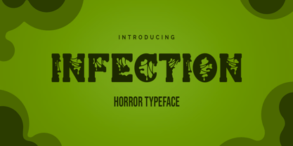 Infection is a horror and halloween font. Designed with a zombie virus touch will give a creepy impression, This font is ideal for labels, posters, or pretty much anything else that requires a creepy touch.
 - Andante by Ckhans Fonts,
$34.00 Andante is a modern sans serif with a geometric touch that support for 87 languages. It comes in 6 weights, 12 uprights and its matching Italic, so you can use them to your heart’s content, in each of which there are more than 883+ glyphs. Andante comprises 24 fonts, consisting of three distinct optical sizes: Display. Each one has been carefully tailored to the demands of its size. The larger Display versions are drawn to show off the subtlety of Andante and spaced with headlines in mind, while the Text sizes focus on legibility, using robust strokes and comfortably loose spaces. In the typeface, each weight includes extended language support, icons, fractions, tabular figures, arrows, ligatures and more. Perfectly suited for graphic design and any display use. It could easily work for branding, web, signage, corporate as well as for editorial design. documents and folders, mobile interface. Support for 87 languages. Afrikaans Albanian Asu Basque Bemba Bena Breton Catalan Chiga Colognian Cornish Croatian Czech Danish Dutch English Estonian Faroese Filipino Finnish French Friulian Galician Ganda German Gusii Hungarian Inari Sami Indonesian Irish Italian Jola-Fonyi Kabuverdianu Kalenjin Kinyarwanda Latvian Lithuanian Lower Sorbian Luo Luxembourgish Luyia Machame Makhuwa-Meetto Makonde Malagasy Maltese Manx Morisyen Northern Sami North Ndebele Norwegian Bokmål Norwegian Nynorsk Nyankole Oromo Polish Portuguese Quechua Romanian Romansh Rombo Rundi Rwa Samburu Sango Sangu Scottish Gaelic Sena Serbian Shambala Shona Slovak Soga Somali Spanish Swahili Swedish Swiss German Taita Teso Turkish Upper Sorbian Uzbek (Latin) Volapük Vunjo Welsh Western Frisian Zulu
 - Invention by Create Big Supply,
$15.00 Invention Font is a unique, This will add a very unique and powerful touch to your design. This font is PUA encoded which means you can access all the glyphs and sweeps easily! Features: Uppercase & lowercase Numbers and punctuation Multilingual PUA Encoding Full Character Set !"#$%&()*+,-./0123456789:;=?@ABCDEFGHIJKLMNOPQRSTUVWXYZ[\]^_abcdefghijklmnopqrstuvwxyz{|}~ ¡¢£¤¥§©ª«®°±²³·¹º»¿ÀÁÂÃÄÅÆÇÈÉÊËÌÍÎÏÑÒÓÔÕÖ×ØÙÚÛÜÝÞßàáâãäåæçèéêëìíîïñòóôõö÷øùúûüýþÿıŒœŠšŸž–—‘’‚“”„†•‹›€−
 - Inlander by Edignwn Type,
$12.00 The Inlander perfectly represents crafted stuff of serif display typeface. This project inspired by beautiful retro labels. The product include 4 styles (regular, smooth, rough and texture). Some letters contains beautiful ligatures characters and multilingual supported. The Inlander matches applies in some designs such as the logotype, poster, label, badge, packaging, branding, and more custom design. The features all-caps, numeral, punctuation & symbol, ligatures, multilingual support, PUA encoded.
 - FinFang by !Exclamachine,
$9.99 Make a splash, or perhaps a crash, with this energetic typeface. FinFang is immediately readable, but loaded with character.
 - Infantry by Gassstype,
$25.00 INFANTRY - Modern Army Typeface Military Serif Font, first conceptualize was inspired by the classic vintage military stencil design . I wanted a typeface that could be a solid base for any military inspired project INFANTRY Fonts can be used for wallpaper, pattern fills, web page background, surface textures. Perfect for making army posters , scrapbooking,invitation cards, stationary, gift wrap, packaging, buttons, pendants, holiday gifts, print on fabrics and so much more.
 - Infamy by Latinotype,
$36.00 Infamy is a display typeface inspired by graffiti and street art, featuring the ‘bubble letter’ style of writing which was very popular among subway and suburban graffiti artists in the early days of American graffiti. This font recovers graffiti horizontal alignment, tight tracking and colourful lettering. The OpenType version includes many different ligatures which provide multiple options when composing a text. Multiple layers make Infamy a bright, shaded and colourful font, allowing you to dress up your writing. This font incorporates a pictorial rendering of character faces (instead of small caps), capturing the essence of the graffiti: the ‘childish’ and the ‘irresponsible’, which is present in the experimental side of the typeface.


Page 1 of 51Next page