1,119 search results
(0.017 seconds)
- Lectores by Cuda Wianki,
$20.00Lectores is based on 18th century chronicles of Benedictine monastery manuscript, so it is definitely oldish, rough but elegant. Thanks to many ligatures and alternate characters it is varied handwriting font. Lectores is decorative, it works nice with many occasional papers such as invitations, stationery and quotations. It is perfect not only for oldstyle and antique typography but also for modern designs. - Charta by Studio K,
$45.00The Charta family of fonts draws its inspiration from the letter styles used in early manuscripts and printed books. Charta is also remarkably versatile: it’s equally at home in a traditional or modern context and can be used for a wide range of applications from an automobile badge to a newspaper masthead and from a fashion label to a candy bar wrapper. - Rileno Sans by Degarism Studio,
$40.00Rileno Sans is sharp with geometric forms and strong personality. It is constructed in a geometric manner and inspired by the constructivist typefaces of the 1920s with a humanistic quality. It comes in 6 weights, 6 uprights and their matching italics. Rileno Sans is equipped with opentype features like Alternate charates, Fractions, Monospace Numbers, Superscript/subscript, Arrow, Roman Numbers, Ligatures and More. - FF Hardsoul by FontFont,
$41.99Dutch type designer Donald Beekman created this display FontFont in 2006. The family has 10 weights, ranging from Light to Ultra and is ideally suited for festive occasions, music and nightlife as well as poster and billboards. FF Soul provides advanced typographical support with features such as ligatures, case-sensitive forms, fractions, and super- and subscript characters. It comes with proportional lining figures. - Night Still Comes by Ana's Fonts,
$16.00Night Still Comes is a serif font in 4 weights, including italics, and includes over 550 glyphs for each font, including: - A-Z | a-z | 0-9 | Punctuation marks | Accents - Small caps - Ligatures - Old style & lining numbers - Superscript & subscript numbers and letters - Fractions - Swashes With classic and elegant lines, Night Still Comes is perfect for branding, magazines, resumes, and social media posts. - FF Eboy by FontFont,
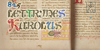
$41.99German type designer Kai Vermehr created this display FontFont between 1998 and 1999. The family has 12 weights and is ideally suited for advertising and packaging, film and tv, poster and billboards as well as software and gaming. FF Eboy provides advanced typographical support with features such as ligatures, case-sensitive forms, and super- and subscript characters. It comes with proportional lining figures. - 825 Lettrines Karolus by GLC,
$20.00We have created this font as a complement for the 825 Karolus. It is a set of decorated letters in the style of those used by the scribes during the early medieval era. It is inspired from a manuscript copy of "The Hobbit" (in Caroline style) that we obtained in the year 2000 as a present for our daughter’s 15th birthday. - Cabrion by Lafontype,
$25.00Cabrion is a sans serif typeface designed with OpenType features to support advanced typography needs such as ligature, fraction, superscript, subscript, old-style figure, tabular figure and many more. The family contains 7 weights from thin to black with multilingual support and is ideally suited for branding, logo, advertising and packaging needs, editorial and publishing as well as web design and screen design. - Los Niches by Latinotype,
$39.00Los Niches is a stylized sans serif typeface that combines modern, monoline characters with strokes and loops reminiscent of manuscript lettering. With a consistant, harmonious style Los Niches takes on a youthful flair when presented in bright colors, but is elegant and contemporary when dressed all in black. The flexible personality of Los Niches makes it ideal for catalogs, magazines or product packaging. - Suprema by Artegra,
$29.00Suprema is a modern sans serif family that will bring supreme geometric perfection to any piece of typography. It has 7 weights with matching true italics. When it comes to Opentype it has lots of features such as tabular lining, proportional oldstyle, tabular oldstyle, ligatures, superscript, subscript, fractions and language localisations for languages such as Polish, Dutch, Romanian, Moldovian and Catalan. - FF Atomium by FontFont,
$41.99Dutch type designer Donald Beekman created this display FontFont in 2007. The family contains 4 weights and is ideally suited for advertising and packaging, logo, branding and creative industries, music and nightlife as well as sports. FF Atomium provides advanced typographical support with features such as ligatures, case-sensitive forms, fractions, and super- and subscript characters. It comes with proportional lining figures. - Picador Sans by Picador,
$29.00Picador Sans is a modern sans serif typeface. Intriguingly condensed. Distinctively eye-catching. Interestingly well-developed. This family covers latin script – every weight has more than 1200 glyphs. The whole family consist of 10 weights and italics, small caps, superscript and subscript letters, oldstyle, tabular figures, ligatures and fractions. Picador Sans is a perfect match for the elegance of serif Praho Pro. - Stefania Antique by insigne,
$21.99Stefania Antique is an aged version of Stefania, an elegant italic script. Stefania Antique is perfect for creating unique and ancient looking chancery manuscripts. A regular version and a more distressed alternate are available. Stefania Antique includes 64 OpenType ligatures that are used to automatically replicate the natural appearance of letterpress printing. Stefania Antique works great in conjunction with insigne Splats! - Mangal by Microsoft Corporation,
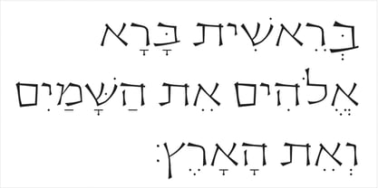
$49.00Mangal™ is an OpenType font for the Indic script Devanagari. Mangal can be used to write Hindi, Sanskrit, Marathi, Nepali, Punjabi and other Indic scripts. Mangal is based on Unicode, contains TrueType outlines and was designed by Raghunath Joshi for use as a UI font. Copyright ™ 2001 Microsoft Corporation. All rights reserved. Character Set: Latin-1, Devanagari. - OL Hebrew Cursive by Dennis Ortiz-Lopez,
$30.00This font contains every variant found in the Hebrew Bible such as the “mutilated” Waw in Numbers 25: verse 12, the small Heh in Genesis 2: verse 4 and the Nun Inversum before Numbers 10: verse 35 and after verse 36 and elsewhere as well as oversized consonants and various double-wide consonants used in inscriptions. - Bonega by Locomotype,
$16.00Bonega is a display font inspired by classic typography on ancient stone inscriptions. Consist of 4 weight (light, regular, bold, black) with each matching italics. With sharp and manly characteristics, Bonega family is suitable for powerful headlines, logotypes, beautiful signs, posters and more. Contains more than 400 glyphs including stylistic sets that make your typographic design more attractive. - Canterbury by Studio K,
$45.00Canterbury is named after the English cathedral city in the county of Kent, chiefly because its sculptural qualities are reminiscent of ecclesiastical architecture. It's a monumental font in the sense that it is well suited to plaques, certificates and other formal inscriptions. It's also suitable for any application that strives for a sense of elegance and dignity. - Goudy Titling by Matteson Typographics,
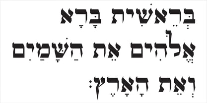
$19.95Goudy Titling was designed by Steve Matteson. It is based on the 2" wood engravings Frederic Goudy made for his book ‘The Trajan Capitals’ - a seminal book about the history of the Roman letter. These letterforms predate the work of Father Catich’s exhaustive study of the Trajan Column and, while remarkably faithful to the inscription, have Goudy’s interpretive fingerprints. - OL Hebrew Formal Script by Dennis Ortiz-Lopez,
$30.00This font contains every variant found in the Hebrew Bible such as the “mutilated” Waw in Numbers 25: verse 12, the small Heh in Genesis 2: verse 4 and the Nun Inversum before Numbers 10: verse 35 and after verse 36 and elsewhere as well as oversized consonants and various double-wide consonants used in inscriptions. - Ongunkan Karamanli Turkic Scrip by Runic World Tamgacı,
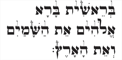
$50.00The font I made based on the Greek alphabet used by the Karamanlı Turks, who are Orthodox Christians, by adapting it to Turkish, which I deduced by looking at the inscriptions and translations. In order to write in Turkish, Turkish special characters are loaded with letter combinations and sounds. But it can still be easily written in Greek. - OL Hebrew Formal Script With Tagin by Dennis Ortiz-Lopez,
$30.00This font contains every variant found in the Hebrew Bible such as the “mutilated” Waw in Numbers 25: verse 12, the small Heh in Genesis 2: verse 4 and the Nun Inversum before Numbers 10: verse 35 and after verse 36 and elsewhere as well as oversized consonants and various double-wide consonants used in inscriptions. - Bemis by Leksen Design,
$29.00I accidentally fell in love with type design, and more specifically, the inscription on the historic Bemis building in Seattle. A high waist and great contrast are characteristics of this classic caps lettering that inspired my debut typeface, with additions of 3/4 caps and ornaments to boot. Read and hear more about the creation of this digital revival. - Beata LP by LetterPerfect,
$39.00Beata is a delicate, attenuated design with elegant proportions, modeled on the fifteenth-century inscription by Bernardo Rossellino for the Tomb of Beata Villana in Santa Maria Novella, in Florence. The font, consisting of caps and small caps, was designed by Garrett Boge and Paul Shaw in 1997. Beata is part of the LetterPerfect Florentine Set. - Wile by Monotype,
$29.99This exclusive Monotype design by Cynthia Hollandsworth is named after a popular executive, Don Wile of Agfa Compugraphic as a gift on his retirement. Agfa Wile is a classic Old Style font with wedge-shaped serifs and open proportions, and is suitable for both text and display uses. Agfa Wile's capital letters are influenced by inscriptional forms. - FF Justlefthand by FontFont,
$65.99Dutch type designer Just van Rossum created this script FontFont in 1990. The font is ideally suited for advertising and packaging, festive occasions, editorial and publishing as well as poster and billboards. FF Justlefthand provides advanced typographical support with features such as ligatures, small capitals, alternate characters, case-sensitive forms, fractions, and super- and subscript characters. It comes with tabular oldstyle and proportional oldstyle figures. - Sovereign Display by G-Type,
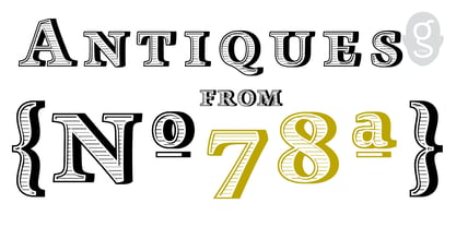
$46.00Sovereign Display is a decorative all caps headline face in one style with small caps on the lower case positions. Thin horizontal crossrules underpinned by a heavier solid shadow give the typeface a prominent three dimensional appearance and an air of formal distinction. Ornate and iconic, Sovereign Display is perfect for certificates, manuscripts, titling or anything requiring a more sombre, elaborate or engraved slab serif style. - FF Dora by FontFont,
$68.99The family has 5 weights, including a Display style, and is ideally suited for book and magazine design as well as small text. FF Dora provides advanced typographical support with features such as ligatures, small capitals, alternate characters, case-sensitive forms, fractions, and super- and subscript characters. It comes with a complete range of figure set options – oldstyle and lining figures, each in tabular and proportional widths. - FF Erikrighthand by FontFont,
$65.99Dutch type designer Erik van Blokland created this script FontFont in 1990. The font is ideally suited for advertising and packaging, festive occasions, editorial and publishing as well as poster and billboards. FF Erikrighthand provides advanced typographical support with features such as ligatures, small capitals, alternate characters, case-sensitive forms, fractions, and super- and subscript characters. It comes with proportional oldstyle and tabular oldstyle figures. - Glence by Nine Font,
$25.00Glence family is a geometric sans-serif type family with 9 weights, from thin to black,with corresponding italics. Glence is designed based on geometric shapes that looks simple and clean. Each font includes opentype features such as Stylistic Alternates, Proportional Figures, Tabular Figures, Numerator, Superscript, Subscript, Case-Sensitive, Denominators, Scientific Inferiors, Ordinals, Ligatures and Fractions. Glence will make your artworks better with its simple & clean shapes. - ITC Braganza by ITC,
$29.99ITC Braganza is the work of British designer Phill Grimshaw, an elegant typeface steeped in historical inspiration. Reminiscent of the handwritten manuscript styles of the 16th century, the name Braganza refers to Catherine, Duchess of Braganza, who was a prominent figure in Portugal at the time. The vertical script style displays the elegance and refinement which distinguished the Royal Courts of the 16th century. - P22 Posies by IHOF,
$24.95P22 Posies is a six-font system for creating multi-colored initial caps in the spirit of illuminated manuscripts. Four layer fonts can be built upon each other to create any chromatic effect you desire. The Posies Initial font combines all four layers to allow easy one-color drop-caps, while the Solid font features the unadorned roman capitals for setting companion titling text. - ITC Kallos by ITC,
$29.99ITC Kallos is the work of British designer Phill Grimshaw, a text typeface family with traditional calligraphic flair. It is the result of Grimshaw's first experiments with text typeface design. The long ascenders and descenders of the lowercase alphabet lend them a look of sophisticated elegance. The capitals display the unmistakable influence of the pen and the proportions of classic inscriptional forms. - Mahameru by NamelaType,
$29.00Mahameru is the name of the peak of Mount Semeru, mean "The Great Mountain" in Sanskrit. This font gives a firm and soft character, with the terminal point on straight and curved strokes. The family has 9 weights ranging from Thin to Black and offers a lot of features flexibility that will help you find the best typographic color for your project. - Centaur by Monotype,
$29.99A refinement of Roman inscriptional capitals designed by Bruce Rogers as a titling design for signage in the Metropolitan Museum. Rogers later designed for the Monotype Corporation a lowercase based on Jenson’s work, turning the titling into a full typeface, Centaur, the most elegant and Aldine of the Jenson derivatives. Centaur® font field guide including best practices, font pairings and alternatives. - Ongunkan Tolkien English Runic by Runic World Tamgacı,
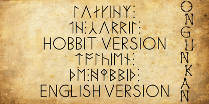
$50.00Cirth was invented by J.R.R. Tolkien for use in his novels. It is modelled on the Anglo-Saxon Runic alphabet, and is used to write the language of the Dwarves (Khuzdul) in The Hobbit and The Lord of the Rings in inscriptions in wood and stone. It is also used as a alternative alphabet for English. This font is english version. - London Court by Greater Albion Typefounders,
$16.50London Court is a family of three 'Tudor Revival' display faces, inspired by an inscription seen underneath a clock in a splendid Tudor revival arcade in Perth, Western Australia. The resulting typeface designs are similarly 'Tudor Revival' or if you prefer 'Tudorbethan'- Roman with Blackletter details. Ideal for creating headings and posters which have an 'Olde-Worlde' feel with modern legibility. - Canto by Lipton Letter Design,
$29.00Inspired by Edward M. Catich’s seminal thesis on the origins of the Roman inscriptional style, such as that found on Trajan’s column, Richard Lipton’s Canto traces the path from an expressive, preparatory Brush (with Brush Open to preserve gestural details at smaller sizes), through informal Pen, to the formal Roman. Classical capitals are accompanied by Lipton’s own calligraphic lowercase, small caps, and swashes. - Ongunkan South Arabian Script by Runic World Tamgacı,
$49.99The Ancient South Arabian script (Old South Arabian 𐩣𐩯𐩬𐩵 ms3nd; modern Arabic: الْمُسْنَد musnad) branched from the Proto-Sinaitic script in about the 9th century BCE. It was used for writing the Old South Arabian languages Sabaic, Qatabanic, Hadramautic, Minaean, and Hasaitic, and the Ethiopic language Ge'ez in Dʿmt. The earliest inscriptions in the script date to the 9th century BCE in Yemen. There are no letters for vowels, which are marked by matres lectionis. Its mature form was reached around 800 BCE, and its use continued until the 6th century CE, including Ancient North Arabian inscriptions in variants of the alphabet, when it was displaced by the Arabic alphabet In Ethiopia and Eritrea, it evolved later into the Ge'ez script, which, with added symbols throughout the centuries, has been used to write Amharic, Tigrinya and Tigre, as well as other languages (including various Semitic, Cushitic, and Nilo-Saharan languages). - Conversation Hearts by Harald Geisler,
$-Conversation Hearts are inspired by the sweethearts and conversation hearts that can be found all over the US and Britain, but not in Germany. A source of endless fun and surprise. As a typographer to me they are also a surprising document of written communication. Most people complain that nowadays the inscriptions are not as sweet as they used to be. While they used to held romantic and promising inscriptions like “Be True” “Sweet Talk”, today they carry “Tweet me” “Ur Hot” and “Party Girl”. So i took this as a motivation to work with conversation sweetheart on a conceptial inspirational and typographical level. The obvious: every letter pressed on the keyboard brings out a conversation heart that starts with the letter - i.e. L = Loverboy, H = Heartless but what to write? Since i didn't want to reproduce the old “Fax me” and “Email me” I had to come up with something new. Something with a personal relation and of course something that I Love - what else could i write in the shape of the heart? So I tried to access my upper subconsciousness and looked for two words for every letter in the alphabet. One for the capital letter pressed and one word for the lowercase letter. Resulting in a Kurt Schwitters worthy assemblage of vocables "Post-office" “Internship” “Zebra” “Answers” etc. It is not easy to read a text set in Conversation Hearts but easier as a text set in Zapf-Dingbats. To sparkle the visual appearance uppercase letters are filled hearts with “carved” inscription, while lowercase letters are an outlined heart with written inscription. Conversations Hearts is a part of the Light Hearted Font Collection that is inspired by a recording of Jean Baudrillard with the title, "Die Macht der Verführung" (The Power of Seduction) from 2006. Further inspiration came from the article, "The shape of the heart: I'm all yours". The heart represents sacred and secular love: a bloodless sacrifice. by British writer Louisa Young printed in EYE magazine (#43) London, 2002. - Ongunkan South Picene by Runic World Tamgacı,
$50.00South Picene (also known as Paleo-Sabellic, Mid-Adriatic or Eastern Italic) is an extinct Italic language belonging to the Sabellic subfamily. It is apparently unrelated to the North Picene language, which is not understood and therefore unclassified. South Picene texts were at first relatively inscrutable even though some words were clearly Indo-European. The discovery in 1983 that two of the apparently redundant punctuation marks were in reality simplified letters led to an incremental improvement in their understanding and a first translation in 1985. Difficulties remain. It may represent a third branch of Sabellic, along with Oscan and Umbrian (and their dialects), or the whole Sabellic linguistic area may be best regarded as a linguistic continuum. The paucity of evidence from most of the 'minor dialects' contributes to these difficulties. The corpus of South Picene inscriptions consists of 23 inscriptions on stone or bronze dating from as early as the 6th century BC to as late as the 4th century BC. The dating is estimated according to the features of the letters and in some cases the archaeological context. As the known history of the Picentes does not begin until their subjugation by Rome in the 3rd century, the inscriptions open an earlier window onto their culture as far back as the late Roman Kingdom. Most are stelai or cippi of sandstone or limestone in whole or fragmentary condition sculpted for funerary contexts, but some are monumental statues.


