587 search results
(0.02 seconds)
- Amirtha by Asd Studio,
$12.00 Introducing the new font Amirtha - A Beauty Calligraphy. This font suitable for use in a variety of design fields, such as event advertisements, product promotions, book titles, activity titles, logos, adventure, and others. This font can when paired with serif font types will make your design project more beautiful and perfect. Features: - Uppercase - Lowercase - Number & punctuations - Multilingual - Ligatures, swashes and alternates character - PUA encoded I highly recommend using a program that supports OpenType featuresand Glyphs panels such as Adobe Illustrator, Adobe Photoshop CC, Adobe InDesign, or CorelDraw, so you can see and access all Glyph variations. This font is encoded with Unicode PUA, which allows full access toall additional characters without having special design software. Mac users can use Font Book, and Windows users can use Character Map to view and copy one of the extra characters to paste into your favorite text editor / application. I hope you enjoy the font, thank you.
 - Biscotti by Letritas,
$30.00 The concept of Biscotti rised from a personal research into a system of styles that we commonly consider “vintage”. One above all, the Victorian typography that has been rediscovered and widely re-studied during the 70s. Today, thanks to the technology innovation in digital typography fields, Biscotti is certainly an interesting subject which expresses an appassionate and nostalgic homage to a vintage font, seen from the perspective of a technical inspiration. Biscotti is composed of two styles: the “default” and the alternative one. The first is of course more conservative and formal, while the alternative formally chooses a change of the diagonal lines into curves, so it creates a much more friendlier reading. Biscotti consists of 4 styles that can be combined by layers in order to form different ways of reading. This renewed effect increases exponentially the potential use range of this typography. Biscotti has 517 characters; and are composed for 220 latin languages.
 - Sandy Antoniuss by Asd Studio,
$12.00 Introducing the new font Sandy Antoniuss - Natural Handwritten. I made by using a brush pen that makes the impression seem natural. This typeface is suitable for use in a variety of design fields, such as event advertisements, product promotions, book titles, activity titles, logos, adventure, and others. This font can when paired with serif font types will make your design project more beautiful and perfect. I highly recommend using a program that supports OpenType featuresand Glyphs panels such as Adobe Illustrator, Adobe Photoshop CC, Adobe InDesign, or CorelDraw, so you can see and access all Glyph variations. This font is encoded with Unicode PUA, which allows full access toall additional characters without having special design software. Mac users can use Font Book, and Windows users can use Character Map to view and copy one of the extra characters to paste into your favorite text editor / application. I hope you enjoy the font, thank you.
 - The Bride by Asd Studio,
$15.00 Introducing the new font The Bride a bold script. This font suitable for use in a variety of design fields, such as event advertisements, product promotions, book titles, activity titles, logos, adventure, and others. This font is equipped with 7 models stylistic set that will make your design look more attractive and beautiful. Features: - Uppercase - Lowercase - Number & punctuations - Multilingual - 7 Models Stylisticset - Ligatures and alternates character - PUA encoded I highly recommend using a program that supports OpenType featuresand Glyphs panels such as Adobe Illustrator, Adobe Photoshop CC, Adobe InDesign, or CorelDraw, so you can see and access all Glyph variations. This font is encoded with Unicode PUA, which allows full access toall additional characters without having special design software. Mac users can use Font Book, and Windows users can use Character Map to view and copy one of the extra characters to paste into your favorite text editor / application. I hope you enjoy the font, thank you.
 - Band of Brothers by Asd Studio,
$14.00 Introducing the new font Band of Brother, simple, natural, and natural handwritten font. This font suitable for use in a variety of design fields, such as event advertisements, product promotions, book titles, activity titles, logos, adventure, and others. This font can when paired with serif font types will make your design project more beautiful and perfect. Features: - Uppercase - Lowercase - Number & punctuations - Multilingual - Ligatures and alternates character - PUA encoded I highly recommend using a program that supports OpenType featuresand Glyphs panels such as Adobe Illustrator, Adobe Photoshop CC, Adobe InDesign, or CorelDraw, so you can see and access all Glyph variations. This font is encoded with Unicode PUA, which allows full access toall additional characters without having special design software. Mac users can use Font Book, and Windows users can use Character Map to view and copy one of the extra characters to paste into your favorite text editor / application. I hope you enjoy the font, thank you.
 - Egyptian Slate by Monotype,
$34.99 Just as the camera adds weight to human faces, serifs can add weight to typographic faces. Rod McDonald trimmed and adjusted his new Egyptian Slate design as it emerged from its sans serif predecessor, the Slate typeface family. Slate is a great sans serif design, and the addition of his Egyptian Slate to your typeface library will make it even more versatile. Egyptian Slate is a solid and stylish slab serif design that will look superb in the spotlight of your choosing. Available in six weights – from a svelte light to a commanding black – each upright member of the Egyptian Slate family has a complementary italic. Egyptian Slate fonts are available as either OpenType Std or OpenType Pro fonts; the later options offers an extended character set that supports most Central European and many Eastern European languages. Egyptian Slate™ font field guide including best practices, font pairings and alternatives. Featured in: Best Fonts for Logos, Best Fonts for Websites
 - P22 Counter by IHOF,
$39.95 Canadian designer Patrick Griffin made P22 Counter as an exercise in exploring the limits of counter-space and interchangeability between extremely geometric and standard calligraphic forms. Within a field of solid stems and horizontal strokes, parallel lines and curves play the role of counterparts to define square and round shapes, making what’s revealed just as interesting as what’s withheld. Each of the three basic Counter fonts stakes its own aesthetic territory, from clean basic minimalism, through the nostalgia of exuberantly pixel-based design, and on to calligraphic-cum-typographic, all within clear and precise geometric parameters. Counter Pro comes with that entire range included in a single font, giving its user the ability to move freely in a visual space and counter-space that can be defined by more than 1450 glyphs. While all the fonts come with extended Latin language support, P22 Counter Pro includes all three fonts in one font, many alternates, swashes and ending forms that are not available in the basic fonts.
 - The Imaginations by Asd Studio,
$14.00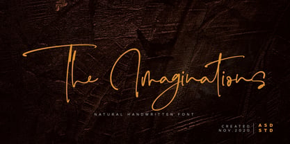 Introducing the new font The Imaginations, simple, natural, and natural handwritten font. This font suitable for use in a variety of design fields, such as event advertisements, product promotions, book titles, activity titles, logos, adventure, and others. This font can when paired with serif font types will make your design project more beautiful and perfect. Features: - Uppercase - Lowercase - Number & punctuations - Multilingual - Ligatures and alternates character - PUA encoded I highly recommend using a program that supports OpenType featuresand Glyphs panels such as Adobe Illustrator, Adobe Photoshop CC, Adobe InDesign, or CorelDraw, so you can see and access all Glyph variations. This font is encoded with Unicode PUA, which allows full access toall additional characters without having special design software. Mac users can use Font Book, and Windows users can use Character Map to view and copy one of the extra characters to paste into your favorite text editor / application. I hope you enjoy the font, thank you.
 - Smart Bars12 by Postage Saver Software,
$15.00 This is a special font for use creating US Postal Service "Intelligent Mail" barcodes. Those are the barcodes you see on most cards and envelopes. Commercial mailers get the best pricing by printing barcodes when they address the mail, saving the Postal Service a step. The barcodes are also used on reply mail and Share mail, and for "Informed Visibility" tracking. Software to create these barcodes, including the USPS Intelligent Mail Small Business (IMsB) tool, typically provide an output of 65 characters, each character being an A, D, T or F, corresponding to each of the styles of bar. SmartBars 12 replaces those characters with the corresponding bar. When doing a mail merge to print addresses, the user would set the barcode field on their merge template to be printed using SmartBars 12, at 12 point, regular, and the barcode will print with the correct bars and at the required size to meet USPS requirements.
 - Cute Smile by Asd Studio,
$10.00 Introducing the new font Cute Smile, simple, natural, and cute font. This font suitable for use in a variety of design fields, such as event advertisements, product promotions, book titles, activity titles, logos, adventure, and others. This font can when paired with serif font types will make your design project more beautiful and perfect. Features: - Uppercase - Lowercase - Number & punctuations - Multilingual - Ligatures and alternates character - PUA encoded I highly recommend using a program that supports OpenType featuresand Glyphs panels such as Adobe Illustrator, Adobe Photoshop CC, Adobe InDesign, or CorelDraw, so you can see and access all Glyph variations. This font is encoded with Unicode PUA, which allows full access toall additional characters without having special design software. Mac users can use Font Book, and Windows users can use Character Map to view and copy one of the extra characters to paste into your favorite text editor / application. I hope you enjoy the font, thank you.
 - Marteks by Nathatype,
$20.00 Ready to make your branding spark? If you need to create a big, bold logo for your business, work on a poster for an event, or whatever your project may be-then this is the perfect font for you. Marteks-A Sans Serif Font Family If we can give you many options then why not? Marteks is a package that will makes you super excited. With this family you will get many options to maximize your designs with stylish fonts. This font is more than just another sans serif font. It encapsulates the essence of luxury and modernity. Lose yourself in the romance of a crisp Fall morning, or soaking up the last drops of the sun in a golden harvest field. Perfect for headings, logos, business cards, printed quotes, wedding invitations, cards, packaging, and your website or social media branding. Features: Multilingual Support PUA Encoded Numerals and Punctuation Thank you for downloading premium fonts from Nathatype
 - Hi Ashoka by Asd Studio,
$9.00 Introducing the new font Hi Ashoka - Fancy and Sweety Display Font. This font suitable for use in a variety of design fields, such as event advertisements, product promotions, mug design, book titles, activity titles, logos, and others. This font can when paired with serif font types will make your design project more beautiful and perfect. Features: - Uppercase - Lowercase - Number & punctuations - Multilingual Accents - Regular and Italic version - PUA encoded I highly recommend using a program that supports OpenType featuresand Glyphs panels such as Adobe Illustrator, Adobe Photoshop, or CorelDraw, so you can see and access all Glyph variations. This font is encoded with Unicode PUA, which allows full access toall additional characters without having special design software. Mac users can use Font Book, and Windows users can use Character Map to view and copy one of the extra characters to paste into your favorite text editor/ application. I hope you enjoy the font, thank you.
 - HS Albadr by Hiba Studio,
$59.00 HS Albadr is an Arabic display typeface. It is useful for book titles and graphic projects where a contemporary, geometrical and streamlined look is desired. The font is based on the simple lines of modern and simplified Kufi calligraphy that support Arabic, Persian and Urdu. It has one weight only which is similar to the bold weight. This typeface is created for being used in technical and engineering companies under strict geometric conditions . The company desires to follow the geometrical shape with uniform and equal dimensions in both vertical and horizontal storks; where some parts of the letters are to be cut at a slanting angle of 45 degree to give the impression of a coherent geometrical nature for this font. The typeface HS Albadr is considered as a chain of geometric fonts series designed for engineering companies. After HS Almohandis and HS Alhandasi were designed we are looking forward to giving some additions to the geometric typefaces field.
 - Lesthary by Asd Studio,
$10.00 Introducing the new font lesthary - Sweet Handwritten Calligraphy. This font suitable for use in a variety of design fields, such as event advertisements, product promotions, book titles, activity titles, logos, adventure, and others. This font can when paired with serif font types will make your design project more beautiful and perfect. Features: - Uppercase - Lowercase - Number & punctuations - Multilingual - Ligatures, swashes and alternates character - PUA encoded I highly recommend using a program that supports OpenType featuresand Glyphs panels such as Adobe Illustrator, Adobe Photoshop CC, Adobe InDesign, or CorelDraw, so you can see and access all Glyph variations. This font is encoded with Unicode PUA, which allows full access toall additional characters without having special design software. Mac users can use Font Book, and Windows users can use Character Map to view and copy one of the extra characters to paste into your favorite text editor / application. I hope you enjoy the font, thank you.
 - Mollen Crispy by Asd Studio,
$12.00 Mollen Crispy - Sweet Handwritten Introducing the new font Mollen Crispy - Sweet Handwritten. This font suitable for use in a variety of design fields, such as event advertisements, product promotions, book titles, activity titles, logos, adventure, and others. This font can when paired with serif font types will make your design project more beautiful and perfect. Features: - Uppercase - Lowercase - Number & punctuations - Multilingual - Ligatures - PUA encoded I highly recommend using a program that supports OpenType featuresand Glyphs panels such as Adobe Illustrator, Adobe Photoshop CC, Adobe InDesign, or CorelDraw, so you can see and access all Glyph variations. This font is encoded with Unicode PUA, which allows full access toall additional characters without having special design software. Mac users can use Font Book, and Windows users can use Character Map to view and copy one of the extra characters to paste into your favorite text editor / application. I hope you enjoy the font, thank you.
 - Making Signature by Asd Studio,
$17.00 Introducing the new font Making Signature Font. This font suitable for use in a variety of design fields, such as event advertisements, vintage design, product promotions, mug design, book titles, activity titles, logos, and others. This font can when paired with serif font types will make your design project more beautiful and perfect. Features: - Uppercase - Lowercase - Number & punctuations - Multilingual Accents - StylisticSet - Stylistic Alternate - Swashes ligatures - 72 Standard ligatures - PUA encoded I highly recommend using a program that supports OpenType featuresand Glyphs panels such as Adobe Illustrator, Adobe Photoshop, or CorelDraw, so you can see and access all Glyph variations. This font is encoded with Unicode PUA, which allows full access toall additional characters without having special design software. Mac users can use Font Book, and Windows users can use Character Map to view and copy one of the extra characters to paste into your favorite text editor/ application. I hope you enjoy the font, thank you.
 - TT Tsars by TypeType,
$39.00 TT Tsars useful links: Specimen | Graphic presentation | Customization options The TT Tsars font family is a collection of serif display titling fonts that are stylized to resemble the fonts of the beginning, the middle and the end of the XVIII century. The project is based on title fonts, that is, the fonts that were used to design book title pages. The idea for the project TT Tsars was born after a small study of the historical development of the Cyrillic type and is also based on Abram Shchitsgal’s book "Russian Civil Type". At the very beginning of the project, we had developed a basic universal skeleton for the forms of all characters in all subfamilies of the family, and later on, we added styles, visual features, artifacts and other nuances typical of the given period onto the skeleton. Yes, from the historical accuracy point of view it might be that such an approach is not always justified, but we have achieved our goal and as a result, we have created perfectly combinable serifs that can be used to style an inscription for a certain time period. The TT Tsars font family consists of 20 fonts: 5 separate subfamilies, each of which consists of 4 fonts. Each font contains 580 glyphs, except for the TT Tsars E subfamily, in which each font consists of 464 characters. Instead of lowercase characters in the typeface, small capitals are used, which also suggests that the typeface is rather a display than text one. In TT Tsars you can find a large number of ligatures (for Latin and Cyrillic alphabets), arrows and many useful OpenType features, such as: frac, ordn, sinf, sups, numr, dnom, case, onum, tnum, pnum, lnum, salt (ss01), dlig. Time-related characteristics of the subfamilies are distributed as follows: • TT Tsars A—the beginning of the 18th century (Latin and Cyrillic) • TT Tsars B—the beginning of the 18th century (Latin and Cyrillic) • TT Tsars C—the middle of the 18th century (Latin and Cyrillic) • TT Tsars D—the end of the 18th century (Latin and Cyrillic) • TT Tsars E—conditionally the beginning of the 18th century (only Latin) TT Tsars A and TT Tsars B families (both the beginning of the 18th century) have different starting points: for TT Tsars A it is Latin, for TT Tsars B it is Cyrillic. The development of the TT Tsars A family began in Latin, the font is based on the royal serif Romain du Roi. The Cyrillic alphabet is harmoniously matched to the Latin. The development of the TT Tsars B family began in Cyrillic, which is based on a Russian civil type. Characteristic elements are the curved one-sided serifs of triangular characters (A, X, Y), drops appear in the letter ?, the middle strokes ? and P are adjacent to the main stroke. Latin was drawn to pair with Cyrillic. It is still based on the royal serif, but somewhat changed: the letters B and P are closed and the upper bar of the letter A rose. This was done for the visual combination of Cyrillic and Latin and at the same time to make a distinction between TT Tsars A and TT Tsars B. TT Tsars C is now the middle of the 18th century. Cyrillic alphabet itself did not stand still and evolved, and by the middle of the 18th century, its forms have changed and become to look the way they are shown in this font family. Latin forms are following the Cyrillic. The figures are also slightly modified and adapted to the type design. In TT Tsars C, Cyrillic and Latin characters are created in parallel. A distinctive feature of the Cyrillic alphabet in TT Tsars C is the residual influence of the flat pen. This is noticeable in such signs as ?, ?, K. The shape of the letters ?, ?, ?, ? is very characteristic of the period. In the Latin alphabet, a characteristic leg appears at the letter R. For both languages, there is a typical C characterized by an upper serif and the appearance of large, even somewhat bolding serifs on horizontals (T, E, ?, L). TT Tsars D is already the end of the 18th century when with the development of printing, the forms of some Cyrillic characters had changed and turned into new skeletons of letters that we transposed into Latin. The figures were also stylized. In this font, both Cyrillic and Latin are stylistically executed with different serifs and are thus logically separated. The end of the century is characterized by the reduction of decorative elements. Straight, blueprint-like legs of the letters ?, R, K, ?. Serifs are very pronounced and triangular. E and ? are one-sided on the middle horizontal line. A very characteristic C with two serifs appears in the Latin alphabet. TT Tsars E is a steampunk fantasy typeface, its theme is a Latinized Russian ?ivil type (also referred to as Grazhdansky type which emerged after Peter the Great’s language reform), which includes only the Latin alphabet. There is no historical analog to this typeface, it is exclusively our reflections on the topic of what would have happened if the civil font had developed further and received a Latin counterpart. We imagined such a situation in which the civil type was exported to Europe and began to live its own life.
 - ANVIL is a font that truly lives up to its name, embodying strength, resilience, and solidity in every character. Designed with an intention to make a bold statement, ANVIL draws inspiration from the...
- Octin Sports by Typodermic,
$11.95 Octin Sports is a typeface that commands attention and exudes a sense of strength and resilience. The seven available weights—light, book, regular, semi-bold, heavy, and black—provide a range of options for designers looking to add a bold, dynamic element to their work. But make no mistake, this typeface is not just for the sports world. Octin Sports has a versatility that extends beyond the playing field and can lend a rugged, no-nonsense vibe to a variety of themes. Whether you’re designing for a school, construction site, or law enforcement agency, Octin Sports is up to the challenge. The sleek, angular lines of this typeface give it a distinct sporty feel, making it an ideal choice for designs that seek to convey energy and excitement. The bold weight options are particularly striking and provide a strong visual impact that demands attention. Overall, Octin Sports is a solid choice for designers who want to infuse their work with a sense of toughness and vitality. Its versatility and sporty design make it a font that can rise to any challenge, whether it’s on the field or in the boardroom. Check out the rest of the Octin families: Octin College, Octin Prison, Octin Stencil, Octin Vintage & Octin Spraypaint. Most Latin-based European writing systems are supported, including the following languages. Afaan Oromo, Afar, Afrikaans, Albanian, Alsatian, Aromanian, Aymara, Bashkir (Latin), Basque, Belarusian (Latin), Bemba, Bikol, Bosnian, Breton, Cape Verdean, Creole, Catalan, Cebuano, Chamorro, Chavacano, Chichewa, Crimean Tatar (Latin), Croatian, Czech, Danish, Dawan, Dholuo, Dutch, English, Estonian, Faroese, Fijian, Filipino, Finnish, French, Frisian, Friulian, Gagauz (Latin), Galician, Ganda, Genoese, German, Greenlandic, Guadeloupean Creole, Haitian Creole, Hawaiian, Hiligaynon, Hungarian, Icelandic, Ilocano, Indonesian, Irish, Italian, Jamaican, Kaqchikel, Karakalpak (Latin), Kashubian, Kikongo, Kinyarwanda, Kirundi, Kurdish (Latin), Latvian, Lithuanian, Lombard, Low Saxon, Luxembourgish, Maasai, Makhuwa, Malay, Maltese, Māori, Moldovan, Montenegrin, Ndebele, Neapolitan, Norwegian, Novial, Occitan, Ossetian (Latin), Papiamento, Piedmontese, Polish, Portuguese, Quechua, Rarotongan, Romanian, Romansh, Sami, Sango, Saramaccan, Sardinian, Scottish Gaelic, Serbian (Latin), Shona, Sicilian, Silesian, Slovak, Slovenian, Somali, Sorbian, Sotho, Spanish, Swahili, Swazi, Swedish, Tagalog, Tahitian, Tetum, Tongan, Tshiluba, Tsonga, Tswana, Tumbuka, Turkish, Turkmen (Latin), Tuvaluan, Uzbek (Latin), Venetian, Vepsian, Võro, Walloon, Waray-Waray, Wayuu, Welsh, Wolof, Xhosa, Yapese, Zapotec Zulu and Zuni.
 - Teutonia by HiH,
$10.00 How can Teutonia be called “Art Nouveau” with all those straight lines? It seems like a contradiction. In fact, however, Art Nouveau embraces a rather wide variety of stylistic approaches. Five well-known examples in the field of architecture serve to illustrate the range of diversity in Art Nouveau: Saarinen’s Helsinki Railroad Station, Hoffman’s Palais Stocklet in Brussels, Lechner’s Museum of Applied Arts on Budapest, Mackintosh’s Glasgow School of Art and Gaudi’s Sagrada Familia in Barcelona. Only the last fits comfortably within the common perception of Art Nouveau. Whereas Gaudi would avoid the straight line as much as possible, Macintosh seemed to employ it as much as possible. The uniting factor is that they all represent “new art” -- an attempt to look things differently than the previous generation. Even when they draw on the past -- e.g. Lechner in the use of traditional Hungarian folk art -- the totality of the expression in new. Teutonia clearly shows its blackletter roots in the ‘D’ and the ‘M.’ Roos & Junge of Offenbach am Main in Germany produced Teutonia in a "back-to-basics" effort that has seen many quite similar attempts in the field of topography. In 1883, Baltimore Type Foundry released its Geometric series. In 1910, Geza Farago in Budapest used a similar letter design on a Tungsram light bulb poster. In 1919 Theo van Doesburg, a founder with Mondrian and others of the De Stijl movement, designed an alphabet using rectangles only -- no diagonals. In 1923 Joost Schmidt at Bauhaus in Weimer took the same approach for a Constructivist exhibit poster. The 1996 Agfatype Collection catalog lists a Geometric in light, bold and italic that is very close to the old Baltimore version. Even though none of these designs took the world by storm, they all made a contribution to our understanding of letterforms and how we use them. Teutonia is compact and surprisingly readable at 12 points in print, but does not do as well on the screen. Extra leading is suggested. Four ligatures are supplied: ch, ck, sch and tz. The numerals are tabular.
 - Winsel Variable by insigne,
$129.99 At this pivotal juncture, where every choice casts long shadows, the imperative of pinpointing the archetype of typefaces is of paramount importance. One mere oversight, and the soul of your endeavor risks being lost in the mists of time. Yet, amidst these crossroads, "Winsel" emerges as the North Star in your typographical odyssey. Birthed in the revered sanctums of insigne design, this typeface is a magnum opus, echoing the artistic brilliance of British poster craft from epochs of golden jazz to times of renaissance. Winsel, in its sheer magnificence, stands as a testament to artistry, each stroke demanding undivided reverence. Be it the valiant weights reminiscent of a guardian sentinel or the graceful finesse mirroring a maestro's touch, Winsel is an unparalleled behemoth. Imbued with the finesse of OpenType, it's poised to embrace the multifaceted European Latin tapestry, while its Small Caps and Titling Caps take pride of place across its grand suite of nine weights. Sculpted with precision, Winsel is the beacon that challenges the ordinary and pledges to be an immortal testament. Seldom has the cosmos aligned to present such an illustrious moment. Fortified with Winsel, you stand on the precipice of legend. Carve your tales into the annals of perpetuity, voice your ethos with unyielding conviction, and let each letter be a symphony of undying commitment. In this epoch, in this narrative, Winsel beckons you to etch history.
 - Porte by Groteskly Yours,
$18.00 - Unique Modernist Look - 590+ characters per font - Standard & Discretionary Ligatures - Multiple Stylistic Sets - Old Style Figures - Case-Sensitive Punctuation - Multilingual - Cyrillic Included - Uppercase + Lowercase Porte is an elegant sans serif font inspired by stone carving and modernist typefaces of early 20th century. While at its core Porte is a display font, it can also be used for larger bodies of text and in a variety of projects. Thanks to its unique proportions and feel Porte is reminiscent of early 20th century type, wherein aesthetic qualities often overweighed matters of practicality and applicability. Porte is at once delicate and sturdy, subtle and unyielding. Porte is very OpenType friendly, boasting an awesome selection of useful OpenType features, precise and exhaustive kerning (around 1000 pairs) and lots of discretionary ligatures to make your designs look amazing. A selection of wider and narrower alternate glyphs allow the designer to modify the rhythm of the typeface, extending its application and impact. With 590+ characters on board, Porte supports all major Latin based languages as well as a number of Cyrillic languages. Porte received its first major update in fall 2022. Not only was the character set expanded considerably, but also some glyphs were re-drawn to fix visual inconsistencies, and a large number of stylistic alternates was added. The kerning, too, was re-done to accommodate new letterforms. Trials available upon request.
 - Hispania Script by HiH,
$10.00 Hispania Script is a distinctive and distinctly nineteenth century script. It was released by Schelter & Giesecke of Leipzig, Germany around 1890. Particularly noteworthy are the sharply-pointed legs of the upper case ‘K’ & ‘R’ that seem to be characteristic of the period. Similar strokes, often with a slight curve, may be seen in typefaces like Alt-Romanish and Tinteretto by Schelter & Giesecke, Artistic and Lateinsch by Bauer and Berthold and the poster lettering of Edward Penfield. The angle of this script (approximately 24 degrees) and the sharp delicate points must have made the manufacture of this face in metal type a challenge. The resulting type was probably quite fragile and subject to accidental damage. Additionally, the sharp points would be subject to wear. With digital type, these concerns are eliminated. As far as I know, no one has ever dropped a digital letter on the floor. Nonetheless, creating a digital outline for a typeface like Hispania Script, with many crossing strokes, can be quite time-consuming. Even with an accurate scan of a good quality original, it is usually necessary to construct each crossing stroke separately and then remove the overlap in order to obtain a sharp and convincing intersection. Steep internal angles are often defined with two points, rather than one, to minimize ink or toner fill that can muddy the rendering in smaller sizes. Like all formal scripts, Hispania Script is always useful for announcements and invitations. However, the distinctiveness of of this design strongly suggests that there are other applications that may benefit from its use. Step outside the box and try it in some unexpected places. It is the unexpected that often draws a person’s eye.
 - Cotford by Monotype,
$49.99 New from the Monotype Studio, Cotford is a contemporary serif from Creative Type Director, Tom Foley. Dynamic, adaptable, and surprising—Cotford is a languid serif that ranges from delicate thins, bending and reaching like flower stems, to bold heavy weights that command the page and screen with confidence and vintage charm. And as a variable font, Cotford allows designers to explore and refine the design almost endlessly, unearthing its many visual tones and hidden secrets. Foley set out to design a soulful, contemporary serif typeface that delivers all the versatility and robustness today's designers expect. The variable font unlocks an expandsive spectrum of visual expression that allows designers to explore, tweak, and adjust the typeface until they find the perfect weight, contrast, and optical size for their project. At the same time, Cotford’s static weights follow a traditional model of 3 text and 5 display weights, making it a strong choice for brands looking for simple implementation. A pop serif for the digital age, Cotford takes you places. Cotford font field guide including best practices, font pairings and alternatives.
 - Plantin by Monotype,
$29.99 Plantin is a Renaissance Roman as seen through a late–industrial-revolution paradigm. Its forms aim to celebrate fine sixteenth century book typography with the requirements of mechanized typesetting and mass production in mind. How did this anomalous design come about? In 1912 Frank Hinman Pierpont of English Monotype visited the Plantin-Moretus Museum in Antwerp, returning home with “knowledge, hundreds of photographs, and a stack of antique typeset specimens including a few examples of Robert Granjon’s.” Together with Fritz Stelzer of the Monotype Drawing Office, Pierpont took one of these overinked proofs taken from worn type to use as the basis of a new text face for machine composition. Body text set in Plantin produces a dark, rich texture that’s suited to editorial and book work, though it also performs its tasks on screen with ease. Its historical roots lend the message it sets a sense of gravity and authenticity. The family covers four text weights complete with italics, with four condensed headline styles and a caps-only titling cut. Plantin font field guide including best practices, font pairings and alternatives.
 - Abdo Rajab by Abdo Fonts,
$29.50 Abdo Rajab is the second version of the font FS Rajab which was designed by the type designer Abdulsamiea Rajab Salem for Future Soft company fonts. It is a leading company in Arabization field and producing the Arabic and Islamic programs beside the children programs. This font appeared between 1998 and 2000. In this version there were a lot of adjustments to keep the font in its spirit and uniformity between the various characters. Also added some new characters, which gave him another beautiful addition to be used in both title and text designs. Three weights (Regular, light and bold) have been created. Then the font was converted to OpenType to support Arabic, Persian and Urdu to be compatible with the various operation systems and modern software. The combination of modern Kufi and Naskh styles and varying between straight and curved parts made it a beautiful typeface appropriate to the titles and text, and able to meet the desire of the user in the design of ads and modern designs of various types of audio and visual.
 - Gridlite PE Variable by Rosetta,
$290.00 The two great technical constraints a type designer can tackle are low resolution, which limits detail and dictates proportions between negative and positive shapes, and uniform width, which restricts each letter to a fixed horizontal space. Wrestle with both at once, and each letter becomes a black-and-white chessboard that challenges every design decision. Sometimes battling these constraints gets in the way of a good idea, but other times, tinkering with fewer options can make the job irresistibly easy and lead straight to a grid addiction. Gridlite, an experiment with a modular negative space, is the side effect of such an addiction. It’s simplified, monospaced, and variable: foreground and background alike are ready to be animated, typed, scaled up, scaled down, rounded, or otherwise deformed. Gridlite is primarily a variable font with axes that control the size of the elements, their shape, and the background (one for the rectangular field and one for the compact envelope around the letters). The fonts cover Cyrillic, Greek, and Latin scripts. Small caps are included, for no apparent reason ... and there is a monospaced elephant, too.
 - ITC Avant Garde Gothic by ITC,
$42.99 ITC Avant Garde Gothic is a font family based on the logo font used in the Avant Garde magazine. Herb Lubalin devised the logo concept and its companion headline typeface, then he and Tom Carnase, a partner in Lubalin’s design firm, worked together to transform the idea into a full-fledged typeface. The condensed fonts were drawn by Ed Benguiat in 1974, and the obliques were designed by André Gürtler, Erich Gschwind and Christian Mengelt in 1977. The original designs include one version for setting headlines and one for text copy. However, in the initial digitization, only the text design was chosen, and the ligatures and alternate characters were not included. The font family consists of 5 weights (4 for condensed), with complementary obliques for widest width fonts. When ITC released the OpenType version of the font, the original 33 alternate characters and ligatures, plus extra characters were included. ITC Avant Garde Gothic® font field guide including best practices, font pairings and alternatives. Featured in: Best Fonts for Logos, Best Fonts for Websites, Best Fonts for PowerPoints
 - TT Norms Std Condensed by TypeType,
$35.00 TT Norms® Std Condensed useful links: Specimen | Graphic presentation | Customization options TT Norms® Std Condensed is the logical development of our bestselling TT Norms®. Since the release of TT Norms®, we received a bunch of requests to create its narrow version and even managed to make several custom projects of the narrow TT Norms® before we decided to start creating a full-fledged commercial version of the typeface. At the very beginning of the project, we did some research and tested several options for the possible width of the typeface. Despite the fact that TT Norms® Std Condensed has narrower proportions than the original family, it inherited the classic proportions of characters, attention to detail and meticulous elaboration of each character in the typeface. The TT Norms® Std Condensed font family consists of 18 faces (9 upright and 9 italics). Each style includes a sufficient set of characters that allow you to solve most of the problems that arise in the field of graphic design, branding, packaging design or website design.
 - Shackle One by Christoph Reichelt,
$18.00 Shackle One is a geometric Sans Serif with a twist. As a modern classic that does not wear out visually it is suitable, for example, for luxury items, leather goods, watches and jewelry, high-class sports, documentation of historical technology or graphics in the field of art and design. It works excellently for huge headlines, but can also show particular strengths in continuous text – its gray value is almost flawlessly uniform. All line connections and terminations are perpendicular, which means that slopes or curves have a light bend at their ends, similar to the lordosis of the cervical spine. This makes the font look upright and straight and at the same time agile and dynamic, like an athlete with good posture – a typeface that is powerful and confident without appearing steely or violent. Shackle One is a classic but casual looking font with sophisticated details. It has a classy appearance without being pretentious. It can appear stern and serious as well as playful and humorous. Its strong character also makes it an excellent corporate font for certain branches. You will love it.
 - Galvantur Grand by Ivangard Studios,
$10.00 Galvantur Grand is an uppercase-only display font, intended to be used for attention demanding titles and headers, or generally any form of text that needs to take center stage. An offshoot of the Galvantur font, Galvantur Grand takes things one step further towards the extreme, to really give your design projects that special flair. Characterized by the double lines and negative space between them, this powerful font can make any form of text stand out strongly. The multiple styles included can further help customize your designs and projects, to get the perfect feeling you're going for. Comes in 7 different styles - Regular, Oblique, Light, Light Oblique, Outlines, Light Outlines and Oblique Outlines. To get an idea of the various styles, please check out the images or use the preview field to type in text. Galvantur Grand supports Latin and Cyrillic based languages. IMPORTANT: This is an uppercase-only font. Typing out lowercase characters will look exactly like typing out uppercase ones. Furthermore, it is recommended that this font is used with bigger sized text.
 - Stajn Pro by Anže Veršnik,
$45.00 stajn-type.com — Stajn Pro Type Family Website where you can get DEMO version of Stajn Pro Book Stajn Pro was designed upon a main goal of using this typeface to set larger amount of text. The slightly condensed proportion allows for more content per page while large x height with its larger counters improves legibility and readability while used on smaller sizes. Despite the fact that Stajn Pro was designed as a body text Type Family, it works as well as a display too. Wide variety of weights as well as interesting, strong and at the same time beautiful character along with some stylistic alternate makes Stajn Pro a useful typeface in a field of editorial, magazine and promotional materials design. The Stajn Pro character includes some humanistic typeface characteristics, which add some softness and elegance in its strong and stable presence. More information about development, usage and characteristics of a Stajn Pro Type Family at stajn-type.com If you have any other questions please do not hesitate to write me at info@stajn-type.com
 - Poeta by Tarallo Design,
$18.99 Poeta is an ornamental font for making patterns and text decoration. It contains floral and nature motifs. The symbols are versatile enough for simple decoration or festive holiday moods. Designers can use Poeta to make unique lines, fields, borders, or ornamentation within or around text. Try replacing a simple straight line with repeated symbols. Make a background to add visual interest to a design. Use the forms to decorate a chapter title or to mark the end of a magazine article. Replace a letter in a word with a symbol to create a memorable statement. Poeta will add visual poetry to any design project. This font began with sketches of patterns seen in ceramic tiles around Sicily. It is named Poeta because Sicily is an island rich in poetry traditions. Using this font is simple. Install it and type. Symbols will appear instead of letters. Choose the precise symbols through a software’s glyph palette. Use the type/character menu controls to vary the spacing and density of patterns.
 - Mont by Fontfabric,
$39.00 *Mont Specimen: http://bit.ly/montsp *Scroll down for the FREE DEMO fonts Features: • 744 glyphs in 20 styles; • Extended Latin, Cyrillic and Greek; • Perfect for headlines and logos; • Prominent x-height; • Distinctive pointed triangular bracketed “t”; • Coverage of multiple OpenType features; • Suitable for web, print, motion graphics etc. Mont is a geometric sans serif consisting of 10 weights ranging from Hairline to Black with matching italics. It supports Extended Latin, Cyrillic and Greek — more than 130 languages all together. The balanced characteristic of Mont with unique details, such as the pointed “t” and the prominent x-height makes it perfect for strong headlines and outstanding logos, but also suitable for long text. Mont comes with a range of OpenType features — including tabular figures, advanced typographic features such as ligatures, fractions, case-sensitive forms, superscripts, subscripts etc. The typefaceʼs versatility and merits make it easy to confront any graphic design challenge — web, print, motion graphics etc. Up with Mont to the top and beyond!Mont™ Font Field Guide including best practices, font pairings and alternatives.
 - Axios Pro by TipoType,
$24.00 In Axios Pro the rational language of the early XX century geometric sanserifs is complemented with an structure deeply attached to the renaissance typefaces; the uppercase proportions proceed form the roman canon while its lowercase was constructed following the humanist ductus. This blend produce a typeface of modern, clean and contemporary appearance that has implicit on its core a classic vibe, nourishing the text with a timeless elegance.In use, the form and function balance of its design allow it freely travel through a diverse range of fields and possibilities like short text settings, brands, headlines or signage systems with grace and naturality. Axios Pro is available in variable font format and in 20 different individual styles (10 weights), with a set of more than 1000 glyphs per style, supports over 200 latin languages and including an extensive repertoire of opentype features like small caps, ligatures, stylistic alternates, proportional and tabular figures, swashes, borders and many other resources to please your typographic urges. Designed by Rodrigo López Fuentes & Sergio Leiva Whittle
 - Abdo Salem by Abdo Fonts,
$29.50 Abdo Salem is the second version of the font FS_Salem which was designed by the type designer Abdulsamie Rajab Salem for Future Soft company fonts. It is a leading company in Arabization field and producing the Arabic and Islamic programs beside the children programs. This font appeared between 1998 and 2000. In this version there were a lot of adjustments to keep the font in its spirit and uniformity between the various characters. Also added some new characters, which gave him another beautiful addition to be used in both title and text designs. Three weights (Light, bold and black) have been created. Then the font was converted to OpenType to support Arabic, Persian and Urdu to be compatible with the various operation systems and modern software. The combination of modern Kufi and Naskh styles and varying between straight and curved parts made it a beautiful typeface appropriate to the titles and text, and able to meet the desire of the user in the design of ads and modern designs of various types of audio and visual.
 - SCR-N by URW Type Foundry,
$39.99 SCR fonts are screen optimized (also called 'pixel fonts'). Unlike standard fonts (and like the few well-hinted fonts like Verdana or Arial), they give a crisp look on screen at very small sizes, thus increasing legibility. The perfect applications for those fonts are web pages and software user interfaces (computer, cellular phones, console games and any other system that uses a screen interface). Unlike most pixel fonts, SCR fonts contain kerning information. Kerning is the adjustment of space between certain pairs of characters (like 'AV') to make text look more fluid, thus increasing legibility and appeal. To benefit from this feature, auto-kerning must be activated in the application. In Photoshop, kerning must be set to 'Metrics'. Although SCR fonts are optimized for screen, they can be used for print (in Illustrator or Indesign for example) for a decorative 'computer text' effect. In this case, there is no constraint: they can be used as any other font. For screen use (in Photoshop, Fireworks, Flash... ), they have to keep aligned with the screen pixel grid not to look blurred or distorted. To achieve this, here are the guidelines to follow: RESOLUTION If the application permits it (Photoshop, Fireworks), document resolution must be set to 72 pixels per inch. SIZE The font size must be set to 10 (or multiples of 10) points. POSITIONING & ALIGNMENT The reference points of text fields and text blocks (upper left corner for left aligned text, upper right for right aligned text) must be positioned at integer values of pixels. In Photoshop, text can be precisely moved with [Edit Free Transform]. In Flash, movie clips containing text fields must also be positioned at integer values on the stage. Text must be aligned to the left or right only. Center alignment can be simulated with left alignment by adding spaces at the begin of each line. To dispense with the positioning and alignment constraints, text anti-aliasing can be turned off if the application permits it (Photoshop, Flash MX 2004). OTHER SETTINGS Leading (line spacing), tracking (letter spacing), manual kerning and baseline shift must be set either to integer values of points or to multiples of 100 units (depending on the application). Vertical and horizontal scaling must be set to 100%. Faux bold or Faux italic must not be used. The document must neither be resized on export, nor allow resizing (Flash Movies).
 - SCR-I by URW Type Foundry,
$39.99 SCR fonts are screen optimized (also called 'pixel fonts'). Unlike standard fonts (and like the few well-hinted fonts like Verdana or Arial), they give a crisp look on screen at very small sizes, thus increasing legibility. The perfect applications for those fonts are web pages and software user interfaces (computer, cellular phones, console games and any other system that uses a screen interface). Unlike most pixel fonts, SCR fonts contain kerning information. Kerning is the adjustment of space between certain pairs of characters (like 'AV') to make text look more fluid, thus increasing legibility and appeal. To benefit from this feature, auto-kerning must be activated in the application. In Photoshop, kerning must be set to 'Metrics'. Although SCR fonts are optimized for screen, they can be used for print (in Illustrator or Indesign for example) for a decorative 'computer text' effect. In this case, there is no constraint: they can be used as any other font. For screen use (in Photoshop, Fireworks, Flash... ), they have to keep aligned with the screen pixel grid not to look blurred or distorted. To achieve this, here are the guidelines to follow: RESOLUTION If the application permits it (Photoshop, Fireworks), document resolution must be set to 72 pixels per inch. SIZE The font size must be set to 10 (or multiples of 10) points. POSITIONING & ALIGNMENT The reference points of text fields and text blocks (upper left corner for left aligned text, upper right for right aligned text) must be positioned at integer values of pixels. In Photoshop, text can be precisely moved with [Edit Free Transform]. In Flash, movie clips containing text fields must also be positioned at integer values on the stage. Text must be aligned to the left or right only. Center alignment can be simulated with left alignment by adding spaces at the begin of each line. To dispense with the positioning and alignment constraints, text anti-aliasing can be turned off if the application permits it (Photoshop, Flash MX 2004). OTHER SETTINGS Leading (line spacing), tracking (letter spacing), manual kerning and baseline shift must be set either to integer values of points or to multiples of 100 units (depending on the application). Vertical and horizontal scaling must be set to 100%. Faux bold or Faux italic must not be used. The document must neither be resized on export, nor allow resizing (Flash Movies).
 - Futura by Linotype,
$42.99 First presented by the Bauer Type Foundry in 1928, Futura is commonly considered the major typeface development to come out of the Constructivist orientation of the Bauhaus movement in Germany. Paul Renner (type designer, painter, author and teacher) sketched the original drawings and based them loosely on the simple forms of circle, triangle and square. The design office at Bauer assisted him in turning these geometric forms into a sturdy, functioning type family, and over time, Renner made changes to make the Futura fonts even more legible. Futura’s long ascenders and descenders benefit from generous line spacing. The range of weights and styles make it a versatile family. Futura is timelessly modern; in 1928 it was striking, tasteful, radical — and today it continues to be a popular typographic choice to express strength, elegance, and conceptual clarity. NEW: the new Futura W1G versions features a Pan-European character set for international communications. The W1G character set supports almost all the popular languages/writing systems in western, eastern, and central Europe based on the Latin alphabet including Vietnamese, and also several based on Cyrillic and Greek alphabets Futura® font field guide including best practices, font pairings and alternatives.
 - RF Takt by Russian Fonts,
$34.00 RF Takt is a condensed geometric grotesque with closed forms of signs. 14 fonts from Ultralight to Black. 878 glyphs and 3738 kerning pairs. 16 opentype features. Multilingual support: Latin, latin extended, cyrillic and cyrillic extended (more than 91+ languages) We have tried to make RF Takt feel as good as possible in the field of graphic design and became a versatile tool for solving a wide range of graphic tasks. The specific feature of the font is that having condensed forms of characters allows you to place a large amount of information in a limited space. RF Takt will be a bright accent in a large size and will keep the readability in a small size. A large amount of opentype features opens up a wide range of options for experiments and original solutions. RF Takt is ideal for poster design, web design, newspaper design, magazine layout and covers, video titles, infographics, logos and branding, packaging, navigation solutions. Opentype features: ligatures, alternative symbols, ordinary and tabular numbers, old-style and old-style tabular numbers, tabular currency signs, fractions and automatic fraction, arrows and alternative arrows, case sensitive forms, upper and lower case numbers, small capitals.