10,000 search results
(0.035 seconds)
- Stink Buster by Bogstav,
$16.00 There’s nothing stinky about this font, don’t worry! But what’s is up with Stink Buster is a whole lot of serifs gone bad! Each letter is loosely based upon the classic slab serif style, but influence by grafitti and comics just made them crooked and off the grid. But despite that, the font works great if you have a message that you want shouted out loud!
 - Nothing So Childish by PizzaDude.dk,
$20.00 If you're looking for cuteness, something whimsical and unpredictable madness - then Nothing So Childish is something for you. The font is 100% handmade with a slightly dry pen. With a closer look, the font reveals several scribbles and scratches - only to make the font look more authentic! Your next birthday- or greeting card will love this font! :) Comes with ligatures which substitutes double letters!
 - Astrology by Monotype,
$40.99Astrology signs that had been designed for newspaper and printers purposed in the hotmetal aera from the Monotype caster. - YT metaphor Latin by Yangtype,
$9.00This font is artistic. The shape of the letters was taken from the dot art that I worked on consistently. Letters are read by habit and feeling. Sometimes I also think for a moment about what this letter is. But, you soon find out. A brief pause and continuation is refreshing. - Fulcanelli by Illuminaut Designs,
$10.00 A clean and balanced humanist grotesque. Like many an alchemical process, this font had to be designed and redesigned from the ground up many times. Each time it blew up in the designer's face until finally the conditions and process were in perfect alignment and this new font was born.
 - Barth by Remedy667,
$18.00 If you’re in need of some serious typography, stop scrolling. Barth. Yoooou heard that right. Designed with a love for horror movies and 90s Nickelodeon nostalgia, Barth is the best font. Get serious about your design work, get Barth. It’s burgery. Looking for a horror font that is as fun and nostalgic as it is eye-catching? Barth. Yoooou heard that right. This retro font is sure to get your viewers hooked on your work with its bold style and innocent yet spooky lettering. It’s perfect for posters, books, movies, even restaurant signage and beyond. Features Doubles Elimination gives you a more natural look. Stands out and get noticed…. be heard. Includes a Remedy667 Font Catalog PDF, all your favorite fonts in one handy catalog. Additional Information Some fonts may require special graphic design software to access OpenType features. Examples of these programs are Adobe Illustrator, Adobe Photoshop, Adobe Indesign, and Corel Draw. Feedback is always welcome. If there is anything missing from our typefaces that you would like to see, or if there are any issues that occur when using them. Please don’t hesitate to contact us or email me at nick@remedy667.com and let us know.
 - Hasta La Pasta NF by Nick's Fonts,
$10.00This loopy offering is patterned after a typeface from the 1888 specimen book from the Central Type Foundry of St. Louis, called simply "Spiral". The ragged contours on the original face have been smoothed out, but it still is an attention-getter. Both versions of this font include the complete Unicode Latin 1252 and Central European 1250 character sets. - Filthy Creation by Wing's Art Studio,
$9.00 Filthy Creation; An Outrageously Cartoonish Slime Font - Barf Bag Optional! Creeping off my ink-drenched drawing board, these illustrated slime fonts offer designers a unique set of diabolical tools for use in their gruesome creations. The five hand-drawn font styles are reminiscent of the best in vintage horror comics, 80s trading cards, gross-out movies, paperbacks and Saturday morning cartoons. Each style comes with uppercase and lowercase characters, plus numerals, punctuation, language support and symbols. Added to this is a complete set of alternatives (no need to repeat those oo’s, tt’s and ee’s) and an extra collection of grotesque illustrations that’ll leave you reaching for the barf bag! When you need the most gory, disgusting and slimy looking titles, look no further than this Filthy Creation.
 - Glogalex by ZultypeFonter,
$21.00 We designed this Glogalex font inspired by today's rapid digital technology, where the art of typography is very much needed to support various digital needs, both for software and for other print media needs. Glogalex is a display font designed with the main focus aimed at the needs of various brands of digital products or other technology products, but not limited to the use of various kinds of printing, both mass media or for the needs of various titles of books, magazines, newspapers, and various other kinds of tabloids, the wealth of Glyph Alternate and Ligature can add to the creation of typography art, you can be creative in using various letters that we have designed by combining ordinary letters with alternative letters and also ligatures, we have combined several ligatures to make it easier for you to use, but if If you have difficulty using Alternate letters and ligatures, we recommend you to manually combine each Alternate and ligature you want to use. We highly recommend the use of this Glogalex font for the needs of displaying company brands, trademarks, logo designs, use in digital media, such as movie titles, online game names, and for various vehicle brands, if you can maximize its use it will be very interesting. for each display that has been designed, pleasing to the eye and easy to read. we are very happy if you are satisfied in using our products, and if there are problems in using our products you can tell us via email zulfikarzul80@yahoo.co.id, we will respond as soon as possible, thank you.
 - Boedimant by Fype Co,
$14.00 Pleased to introduce you to Boedimant new grunge display font! The letterforms have slight quirks to them, giving this bold sans-serif display font a perfect imperfection. You can use it for making special event logos, such as a skateboard or off-road bike races. This unique font is perfect for posters, T-shirt prints, and other promo designs.
 - Ongunkan Old Turkic Predetor by Runic World Tamgacı,
$49.99 The version of the script belonging to the languages of the fantastic Predator aliens, adapted to the old Turkish runic script. Looks great with the red color.
 - SP Tanya by Remote Inc,
$39.00I found her in a German market while searching for the perfect parsnip. She was smoking catnip cigarettes and squeezing kumquats to test their ripeness. She had hair like a camel and index fingers like a Viking. - Mothman Legend by Mvmet,
$9.00 Mothman Legend is a grunge spooky font, inspired by 90s horror movies. It will be perfect for your horror and Halloween-themed needs! You can use it for anything ranging from t-shirts and clothing, to your book designs, Halloween party needs, greeting cards, stickers, posters, banners, or anything that needs a cool touch. Try it to create fabulous designs and feel the gothic and Halloween vibes with it!
 - HS Monsnow by Helipad Space,
$21.00 Introducing, HS Monsnow! An Experimental Condensed Display Font with the unique touch. It looks authentic and stylish that can be used for all your project needs.This font can be used at any time and on any project. So, HS Monsnow Font can't wait to give its touch to all your design projects such as magazine, movie, poster design, printing, personal branding, promotional materials, logotype, product packaging, etc. Thank You HS
 - Brody Rawk by Inumocca,
$25.00 Brody Rawk is modern gothic font. inspired by a traditional carved wooden Powerfull and has a very distinct and unique Character The Typeface comes with Stylistic Set Features Exellent Font to use for covering your Project, like Branding, Movie Title, Headline Letter, Bookcover or Book Content, Magazine cover, Poster, Quotes Lettering, Logos, and more your project design. - Multilingual Characters Support - UPPERCASE - Lowercase - Numeric - Symbol - Punctuation Character - Stylistic Set (ss01) inumoccatype
 - Supertall by wearecolt,
$11.00 Supertall, ultra condensed and very large. Supertall is a massive statement display font designed to command a page by filling a lot of space. Taking inspiration from hard-hitting movie titles, Supertall brings some 80s video game vibes with a modern touch. The Supertall type family features Regular and bold weights with obliques and reverse obliques for added speed and style. Features: 357 Glyphs Fractions Extensive language support.
 - Migoan by Surotype,
$20.00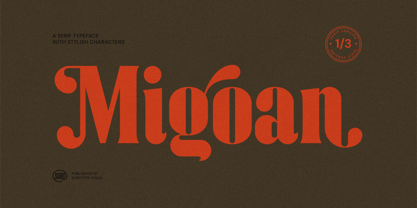 Migoan Serif is a display typeface with dynamic curve ,very suitable as to make a design choice for Headline, Movie Title, packaging, branding and more other creative project. Migoan's also has alternative characters such as Stylistic Alternates, Stylistic Set, and Swash variant. To enable the OpenType Stylistic alternates, you need a program that supports OpenType features such as Adobe Illustrator CS, Adobe Indesign & CorelDraw X6-X7. and more
 - Tricky Ghost by Senekaligrafika,
$12.00 “Tricky Ghost” Has hard unique and a signature styles with spider webs details in every letter, that speak to instant halloween sensations. “Tricky Ghost” will help you to create special and touching typographical design for your halloween and spooky projects, for greeting card, halloween project, branding, labeling, clothing, movie title, album cover, logos and many more. It is really universal and modern font. The owner of endless possibilities!
 - Gumball Machine by Rachel McBride Creative,
$9.00 Gumball Machine Typeface is everything you ever wanted in retro type design. With eight font styles, its disconnected and eccentric nature is enough to give any project some funk. Amazing for the spring and summertime! Use for website and brand design, product labeling, album/movie/project graphics, t-shirts and clothing, and anything else that needs a spark! Gumball Machine has 440 glyphs and supports most western languages.
 - Dansburg by Uncurve,
$30.00 Dansburg is an aesthetic vintage font, inspired from the past typography , elegant signage, gold leaf , sign painting and old label product. Dansburg comes with tons of alternates characters to make more eye cacthy . Dansburg Font is suitable for authentic logos, headings, sign painting, posters ,letterhead, branding, magazines, album covers, book covers, movies, apparel design, flyers, greeting cards, product packaging, and more. Finally BOOM..!! you get a great design for your project.
 - HS Broxy by Helipad Space,
$18.00 Introducing, HS Broxy! An Experimental Display Font with the contrast geometric touch. It looks authentic and personality that can be used for all your project needs.This font can be used at any time and on any project. So, HS Broxy Font can't wait to give its touch to all your design projects such as magazine, book, poster design, movie, personal branding, promotional materials, logotype, product packaging, etc. Thank You HS
 - Talking Cat by Bogstav,
$12.00 There is no such thing as a talking cat, however, you can often find these in adventures, movies and other stories. At least, now you can have your own font called "Talking Cat", and perhaps even your cat will like it! Mine did! Talking Cat works very well with packaging, toys, posters, postcards or perhaps even flyers - the smoothly rounded edges makes sure your design keeps that handmade look!
 - Lioney by Surotype,
$25.00 Lioney is a display typeface with dynamic curve ,very suitable as to make a design choice for Headline, Movie Title, packaging, branding and more other creative project. Over 350 glyphs Lioney's also has alternative characters such as Stylistic Alternates, Stylistic Set, and Swash variant. To enable the OpenType Stylistic alternates, you need a program that supports OpenType features such as Adobe Illustrator CS, Adobe Indesign & CorelDraw X6-X7. and more
 - Film P3 by Fontsphere,
$16.00 Film P3 - Ultra Condensed sans-serif typeface. It refers to characteristic typefaces such as Film Poster or Film P2 (which were inspired by futuristic movie posters). Film P3 is deliberately more versatile and designed to be used successfully in a huge variety of projects. In addition, the letters retain their unique and distinctive style, which allows them to stand out from the crowd. The Film P3 family has 9 members that are complementary and allow the expression of the projects to be very varied and adapted for appropriate use. They look good in many sizes, single words, slogans, titles, sentences as well as longer texts. Fonts include multilingual support, numerals, and a large range of special characters. Film P3 typeface offers many creative possibilities in graphic design and digital art. For print, brand identity, web design, and much more.
 - Blue Highway Linocut - Unknown license

- Berylium - Unknown license

- Lemonheads - Unknown license

- Baby Boss by Nirmalagraphics,
$14.00 Baby Boss was inspired by the writing style of my brother who focused on learning to write and read. This font works well for children themed uses and has multi-lingual support.
 - Amber & Margot by Keristyper Studio,
$14.00 Introducing Amber & Margot the Sanserif Fun Font It's a modern, chic and stylish handwritten font, that gives the catchy designThis font is good for logo design, Social media, Movie Titles, Books Titles, short text even long text letters, and good for your secondary text font with sans or serif. Featured: OTF Standard Uppercase & Lowercase Numeral & Punctuation Multilingual : ä ö ü Ä Ö Ü ß ¿ ¡ Alternate & Ligature PUA encoded We recommend programs that support the OpenType feature and the Glyphs panel such as Adobe applications or Corel Draw. so you can use all the variations of the glyphs. Hope you enjoy our fonts!
 - Burlesk Queen JNL by Jeff Levine,
$29.00 Burlesk Queen JNL was inspired by the hand lettered title “Gypsy” on the sheet music for "Everything's Coming Up Roses" from the movie musical based on the autobiography of famed stripper Gypsy Rose Lee. With just four basic letters to work with [G,Y,P and S], a full character set was drawn from scratch. The design features bold spur serif characters on individual ‘marquees’ bordered with lights. Burlesk Queen One JNL is the original version with white characters on black panels, while Burlesk Queen Two JNL has those panels stripped away to provide black letters on a white background.
 - Disclover by Zang-O-Fonts,
$25.00Disclover came about when I was doodling on a pad of paper. I was thinking about contemporary font designs, and disclover came to mind. The original sketches were scanned and then re-drawn in Illustrator. The name is just made up. - Typist Slab Mono by VanderKeur,
$25.00 The typeface Typist originated during an extensive research on the origin and development of typewriter typestyles. The first commercially manufactured typewriter came on the market in 1878 by Remington. The typestyles on these machines were only possible in capitals, the combination of capitals and lowercase came available around the end of the nineteenth century. Apart from a few exceptions, most typestyles had a fixed letter width and a more or less unambiguous design that resembled a thread-like structure. A lot of this mechanical structure was due to the method the typestyles were produced. Looking at type-specimens for print before the first typewriters were good enough to came on the market we can see that in 1853 and in 1882 Bruce’s Type Foundry already had printing type that had a structure of the typewriter typestyles. Of course printing types were proportional designed as typewriter typestyles had a fixed width. So it is possible that except from the method of production for typewriter typestyles, the design of printing types were copied. In the design of the Typist, the purpose was – next to the monospace feature – to include some of the features of the early typewriter typestyles. Features such as the ball terminals and the remarkable design of the letter Q. This new typeface lacks the mechanical and cold look of the early typewriter typestyles. The Typist comes in six weights with matching italics in two versions. One that resembled the early typewriter typestyles (Typist Slab) and a version designed with coding programmers in mind (Typist Code).
 - Typist Code Mono by VanderKeur,
$25.00 The typeface Typist originated during an extensive research on the origin and development of typewriter typestyles. The first commercially manufactured typewriter came on the market in 1878 by Remington. The typestyles on these machines were only possible in capitals, the combination of capitals and lowercase came available around the end of the nineteenth century. Apart from a few exceptions, most typestyles had a fixed letter width and a more or less unambiguous design that resembled a thread-like structure. A lot of this mechanical structure was due to the method the typestyles were produced. Looking at type-specimens for print before the first typewriters were good enough to came on the market we can see that in 1853 and in 1882 Bruce’s Type Foundry already had printing type that had a structure of the typewriter typestyles. Of course printing types were proportional designed as typewriter typestyles had a fixed width. So it is possible that except from the method of production for typewriter typestyles, the design of printing types were copied. In the design of the Typist, the purpose was – next to the monospace feature – to include some of the features of the early typewriter typestyles. Features such as the ball terminals and the remarkable design of the letter Q. This new typeface laks the mechanical and cold look of the early typewriter typestyles. The Typist comes in six weights with matching italics in two versions. One that resembled the early typewriter typestyles (Typist Slab) and a version designed with coding programmers in mind (Typist Code).
 - Laurentian by Monotype,
$29.99 Maclean's is a weekly Canadian newsmagazine with a broad editorial mission. A typical issue covers everything from violence on the other side of the globe to the largest pumpkin grown in a local county. In 2001, Maclean's invited Rod McDonald to become part of the design team to renovate" the 96-year-old publication. The magazine wanted to offer its readers a typographic voice that was professional, clean, and easy to read. Above all, the typeface had to be able to speak about the hundreds of unrelated subjects addressed in each issue while remaining believable and uncontrived. A tall order, perhaps? Now add in that this would be the first text typeface ever commissioned by a Canadian magazine. McDonald, who some have called Canada's unofficial "typographer laureate," took on the challenge. McDonald used two historic models as the basis for Laurentian's design: the work of French type designer Claude Garamond, and that of the English printer and type founder, William Caslon. From Garamond Laurentian acquired its humanist axis, crisp serifs and terminals that mimic pen strokes. Caslon's letters are less humanistic, with a more marked contrast in stroke weight and serifs that appear constructed rather than drawn. These traits also made their mark on Laurentian. Using these two designs as a foundation, McDonald drew Laurentian with the narrow text columns and small type sizes of magazine composition in mind. He gave his letters strong vertical strokes and sturdy serifs, a robust x-height and a slightly compressed character width A tall order, per McDonald's genius is evident in the face's legibility, quiet liveliness and in the openness of the letters. The result is a typeface that not only met Maclean's demanding design brief, but also provides exceptional service in a wide variety of other applications. Laurentian is available in three weights of Regular, Semi Bold and Bold, with complementary italics for the Regular and Semi Bold, and a suite of titling caps."
 - Witch Whirlwind by Vozzy,
$14.00 Description: Step into the hauntingly nostalgic world of 80s horror films with 'Witch Whirlwind' a meticulously handcrafted font that channels the chilling essence of vintage movie posters. This font will infuse your designs with the eerie charm and crafty appeal you've been seeking. What Awaits You: Unique Font: 'Witch Whirlwind' boasts meticulously designed letters, numbers, and additional characters inspired by the spine-tingling aesthetics of the 80s. Multilingual Mastery: Your audience knows no bounds with our font, offering complete multilingual support. Why 'Witch Whirlwind' is the Choice for You: Recreate the authentic atmosphere of vintage horror films with this unique font. Elevate your poster designs, t-shirt graphics, and logos with an unmistakable crafty touch. Seamlessly adapt to different projects with multilingual support and versatile font formats. Seize this opportunity to infuse your designs with the spirit of the 80s. Download 'Witch Whirlwind' now and start creating captivating visuals.
 - Coffin Secrets by Vozzy,
$14.00 Description: Step into the hauntingly nostalgic world of 80s horror films with 'Coffin Stories,' a meticulously handcrafted font that channels the chilling essence of vintage movie posters. This font will infuse your designs with the eerie charm and crafty appeal you've been seeking. What Awaits You: Unique Font: 'Coffin Stories' boasts meticulously designed letters, numbers, and additional characters inspired by the spine-tingling aesthetics of the 80s. Multilingual Mastery: Your audience knows no bounds with our font, offering complete multilingual support. Why 'Coffin Stories' is the Choice for You: Recreate the authentic atmosphere of vintage horror films with this unique font. Elevate your poster designs, t-shirt graphics, and logos with an unmistakable crafty touch. Seamlessly adapt to different projects with multilingual support and versatile font formats. Seize this opportunity to infuse your designs with the spirit of the 80s. Download 'Coffin Stories' now and start creating captivating visuals.
 - Burnt Dreams by Vozzy,
$14.00 Description: Step into the hauntingly nostalgic world of 80s horror films with 'Burnt Dreams,' a meticulously handcrafted font that channels the chilling essence of vintage movie posters. This font will infuse your designs with the eerie charm and crafty appeal you've been seeking. What Awaits You: Unique Font: 'Burnt Dreams' boasts meticulously designed letters, numbers, and additional characters inspired by the spine-tingling aesthetics of the 80s. Multilingual Mastery: Your audience knows no bounds with our font, offering complete multilingual support. Why 'Burnt Dreams' is the Choice for You: Recreate the authentic atmosphere of vintage horror films with this unique font. Elevate your poster designs, t-shirt graphics, and logos with an unmistakable crafty touch. Seamlessly adapt to different projects with multilingual support and versatile font formats. Seize this opportunity to infuse your designs with the spirit of the 80s. Download 'Burnt Dreams' now and start creating captivating visuals.
 - Graveyard Wind by Vozzy,
$14.00 Description: Step into the hauntingly nostalgic world of 80s horror films with 'Graveyard Wind' a meticulously handcrafted font that channels the chilling essence of vintage movie posters. This font will infuse your designs with the eerie charm and crafty appeal you've been seeking. What Awaits You: Unique Font: 'Graveyard Wind' boasts meticulously designed letters, numbers, and additional characters inspired by the spine-tingling aesthetics of the 80s. Multilingual Mastery: Your audience knows no bounds with our font, offering complete multilingual support. Why 'Graveyard Wind' is the Choice for You: Recreate the authentic atmosphere of vintage horror films with this unique font. Elevate your poster designs, t-shirt graphics, and logos with an unmistakable crafty touch. Seamlessly adapt to different projects with multilingual support and versatile font formats. Seize this opportunity to infuse your designs with the spirit of the 80s. Download 'Graveyard Wind' now and start creating captivating visuals.
 - Vianova Serif Pro by Elsner+Flake,
$59.00 The font superfamily Vianova contains each 12 weights of Sans and Slab and 8 weights of the Serif style. The design from Jürgen Adolph dates back into the 1990s, when he studied Communication Design with Werner Schneider as a professor at the Fachhochschule Stuttgart. Adolph started his carrier 1995 at Michael Conrad & Leo Burnett. He was responsible for trade marks as Adidas, BMW, Germanwings and Merz. He has been honored as a member of the Art Directors Club (ADC) with more than 100 awards. On February 26, 2014, Jürgen Adolph wrote the following: “I was already interested in typography, even when I could not yet read. Letterforms, for instance, above storefronts downtown, had an irresistible appeal for me. Therefore, it is probably not a coincidence that, after finishing high school, I began an apprenticeship with a provider of signage and neon-advertising in Saarbrücken, and – in the late 1980s – I placed highest in my field in my state. When I continued my studies in communications design in Wiesbaden, I was introduced to the highest standards in calligraphy and type design. “Typography begins with writing” my revered teacher, Professor Werner Schneider, taught me. Indefatigably, he supported me during the development of my typeface “Vianova” – which began as part of a studies program – and accompanied me on my journey even when its more austere letterforms did not necessarily conform to his own aesthetic ideals. The completely analogue development of the types – designed entirely with ink and opaque white on cardboard – covered several academic semesters. In order to find its appropriate form, writing with a flat nib was used. Once, when I showed some intermediate designs to Günter Gerhard Lange, who occasionally honored our school with a visit, he commented in his own inimitable manner: “Not bad what you are doing there. But if you want to make a living with this, you might as well order your coffin now.” At that time, I was concentrating mainly on the serif version. But things reached a different level of complexity when, during a meeting with Günther Flake which had been arranged by Professor Schneider, he suggested that I enlarge the offering with a sans and slab version of the typeface. So – a few more months went by, but at the same time, Elsner+Flake already began with the digitilization process. In order to avoid the fate predicted by Günter Gerhard Lange, I went into “servitude” in the advertising industry (Michael Conrad & Leo Burnett) and design field (Rempen& Partner, SchömanCorporate, Claus Koch) and worked for several years as the Creative Director at KW43 in Düsseldorf concerned with corporate design development and expansion (among others for A. Lange & Söhne, Deichmann, Germanwings, Langenscheidt, Montblanc.”
 - Vianova Slab Pro by Elsner+Flake,
$59.00 The font superfamily Vianova contains each 12 weights of Sans and Slab and 8 weights of the Serif style. The design from Jürgen Adolph dates back into the 1990s, when he studied Communication Design with Werner Schneider as a professor at the Fachhochschule Stuttgart. Adolph started his carrier 1995 at Michael Conrad & Leo Burnett. He was responsible for trade marks as Adidas, BMW, Germanwings and Merz. He has been honored as a member of the Art Directors Club (ADC) with more than 100 awards. On February 26, 2014, Jürgen Adolph wrote the following: “I was already interested in typography, even when I could not yet read. Letterforms, for instance, above storefronts downtown, had an irresistible appeal for me. Therefore, it is probably not a coincidence that, after finishing high school, I began an apprenticeship with a provider of signage and neon-advertising in Saarbrücken, and – in the late 1980s – I placed highest in my field in my state. When I continued my studies in communications design in Wiesbaden, I was introduced to the highest standards in calligraphy and type design. “Typography begins with writing” my revered teacher, Professor Werner Schneider, taught me. Indefatigably, he supported me during the development of my typeface “Vianova” – which began as part of a studies program – and accompanied me on my journey even when its more austere letterforms did not necessarily conform to his own aesthetic ideals. The completely analogue development of the types – designed entirely with ink and opaque white on cardboard – covered several academic semesters. In order to find its appropriate form, writing with a flat nib was used. Once, when I showed some intermediate designs to Günter Gerhard Lange, who occasionally honored our school with a visit, he commented in his own inimitable manner: “Not bad what you are doing there. But if you want to make a living with this, you might as well order your coffin now.” At that time, I was concentrating mainly on the serif version. But things reached a different level of complexity when, during a meeting with Günther Flake which had been arranged by Professor Schneider, he suggested that I enlarge the offering with a sans and slab version of the typeface. So – a few more months went by, but at the same time, Elsner+Flake already began with the digitilization process. In order to avoid the fate predicted by Günter Gerhard Lange, I went into “servitude” in the advertising industry (Michael Conrad & Leo Burnett) and design field (Rempen& Partner, SchömanCorporate, Claus Koch) and worked for several years as the Creative Director at KW43 in Düsseldorf concerned with corporate design development and expansion (among others for A. Lange & Söhne, Deichmann, Germanwings, Langenscheidt, Montblanc.”


