10,000 search results
(0.047 seconds)
- Ongunkan Atlantis Hollow by Runic World Tamgacı,
$40.00 Atlantis: The Lost Empire is a 2001 I made the alphabet prepared for Atlantis Lost Empire, the first feature-length animated movie of Walt Disney in 2000 years, in 2 versions in accordance with the original. It is suitable for today's use.
 - Sayso Chic - Unknown license

- Quirkophonic by Tymime Fonts,
$35.00 Quirkophonic mimics hand-drawn letters and logos of the 1960s. Suitable for album covers, movie posters, rock concerts, or whimsical fantasy. From secret spy capers to magic mushrooms, it's all groovy.
 - Chemicalife by IKIIKOWRK,
$15.00 Proudly present Chemicalife - Hand Drawn Letterpress Type, created by ikiiko Take advantage of "Chemicalife," a stunning hand-drawn letterpress typeface created to take your poster designs to new heights, and embrace its retro appeal and aesthetic attraction. The distinctive "Regular" and "Rough" forms of this typeface, each with its own compelling personality, provide your projects an unsurpassed degree of versatility. Discover the world of purposeful imperfection with Chemicalife's "Rough" aesthetic. This variation celebrates the natural flaws of handcrafted artwork and is inspired by the genuine charm of vintage letterpress prints. Every word and character exudes an artistic rawness that gives your posters a sense of true craftsmanship. These imperfections and uneven edges are the telltale signs of an artist's touch. This typeface is perfect for an vintage poster, movie title, packaging, food & beverages, magazine design, fashion brand, classic stuff, quotes, or simply as a stylish text overlay to any background image. What's Included? 2 Weight : Regular & Rough Uppercase & Lowercase Numbers & Punctuation Multilingual Support Works on PC & Mac
 - Horrifal by Khoir,
$15.00 Displays the appearance of a serif font that has a spooky impression but with elegant characteristics that make this horror-themed font different from other horror fonts, with the addition of sharp alternative letters that make the impression even more gripping so it is perfect for movie titles, posters, logotypes and many others. Thank you for seeing
 - Supper Club JNL by Jeff Levine,
$29.00After creating the all-caps version of Supper Club JNL, a conversation between Jeff Levine and fellow font designer Ray Larabie brought forth the idea that one of Ray's freeware fonts had a lower case that would perfectly fit Jeff's design. With Ray's permission, Jeff adapted the lower case to his capital letters and the final version of Supper Club was born. Two separate ideas become one stylish Art Deco type design. - Misdirection JNL by Jeff Levine,
$29.00Fonts can be both functional and attractive, but there's no rule against them being fun. Misdirection JNL is an assortment of 52 outrageous road signs - perfect for protests against government inefficiency or used on novelty note pads... as attention-getting spot art for ads or for whatever your imagination can deliver... - Exercise by Dumadi,
$25.00 Exercise – Handbrush Typeface created with a brush application consisting of Uppercase only. This font will help you in making titles and will be more suitable for movie titles. equipped with extraordinary ligatures that will turn an ordinary design into a perfect one. Exercise is perfect for design, movie titles, logos, social media, branding, advertising, product design, handwritten quotes, product packaging, headers, posters, merchandise, and other designs.
 - Space Journey by Vozzy,
$10.00 Introducing retro sci-fi label font duo named Space Journey. This display font is inspired by movie posters from the 60s and 70s. Font family has two styles: Regular and Rough. This font will look good on any retro sci-fi styled designs like a poster, T-shirt, label, logo, etc.
 - Bodoni Classic Initials by Wiescher Design,
$55.00 I became interested in designing Bodoni Classic because of a lazy graphic designer at Jacques Damase publishing house. He had to change a single letter on a bookcover about J. B. BODONI. The French call him Jean Baptiste instead of Giambattista! And that unknown graphic designer just took any old “J” from some newly cut Bodoni. All the new Bodoni cuts have square serifs, whereas the originals had rounded serifs and slightly concave feet. The single letter “J” with the squared off serif was for me like a road sign to start redesigning the entire Bodoni family. That’s exactly what I started in 1993 and a dozen years later I am finished. Okay, I am still adding new Bodoni Classics, but those are my personal additions. Yours very retro, Gert Wiescher
 - Bodoni Classic Chancery by Wiescher Design,
$55.00 I became interested in designing Bodoni Classic because of a lazy graphic designer at Jacques Damase publishing house. He had to change a single letter on a bookcover about J. B. BODONI. The French call him Jean Baptiste instead of Giambattista! And that unknown graphic designer just took any old “J” from some newly cut Bodoni. All the new Bodoni cuts have square serifs, whereas the originals had rounded serifs and slightly concave feet. The single letter “J” with the squared off serif was for me like a road sign to start redesigning the entire Bodoni family. That’s exactly what I started in 1993 and a dozen years later I am finished. Okay, I am still adding new Bodoni Classics, but those are my personal additions. Yours very retro, Gert Wiescher
 - Bodoni Classic Text by Wiescher Design,
$55.00 I became interested in designing Bodoni Classic because of a lazy graphic designer at Jacques Damase publishing house. He had to change a single letter on a bookcover about J. B. BODONI. The French call him Jean Baptiste instead of Giambattista! And that unknown graphic designer just took any old “J” from some newly cut Bodoni. All the new Bodoni cuts have square serifs, whereas the originals had rounded serifs and slightly concave feet. The single letter “J” with the squared off serif was for me like a road sign to start redesigning the entire Bodoni family. That’s exactly what I started in 1993 and a dozen years later I am finished. Okay, I am still adding new Bodoni Classics, but those are my personal additions. Yours very retro, Gert Wiescher
 - Bodoni Classic Hand by Wiescher Design,
$55.00 I became interested in designing Bodoni Classic because of a lazy graphic designer at Jacques Damase publishing house. He had to change a single letter on a bookcover about J. B. BODONI. The French call him Jean Baptiste instead of Giambattista! And that unknown graphic designer just took any old “J” from some newly cut Bodoni. All the new Bodoni cuts have square serifs, whereas the originals had rounded serifs and slightly concave feet. The single letter “J” with the squared off serif was for me like a road sign to start redesigning the entire Bodoni family. That’s exactly what I started in 1993 and a dozen years later I am finished. Okay, I am still adding new Bodoni Classics, but those are my personal additions. Yours very retro, Gert Wiescher
 - Jeeves by Red Rooster Collection,
$79.00 The inspiration for Jeeves came from Leslie Carbarga's wonderful book LETTERHEADS, One Hundred Years of Great Design, 1850-1950. It was based on a secondary type usage for the letterhead for Sutherland in New York. The rest of the letterhead had features that were more typical of the Art Deco period, but this script added a touch of timeless elegance. And since at the time I was reading every scrap of P.G. Wodehouse I could get my hands on, the name Jeeves seemed like a perfect fit. The font is loaded with a plethora of extra glyphs, ligature characters and OpenType features.
 - Heartsome by Hanoded,
$15.00 Heartsome is a ‘forgotten’ word. It was mostly used in Scotland and it means: ‘giving cheer, spirit or courage’. I had never heard of it, but I thought it deserved a second chance, so I named this font Heartsome! Heartsome is a handmade Didone; I used a brand new bottle of Chinese ink and a brand new synthetic pencil to paint the glyphs. Brand new, because all of my drawing materials seem to have evaporated when we moved into our new house… A synthetic brush, because I don’t want animals to suffer because I feel the need to create fonts.
 - Kora Vibes by Jehansyah,
$15.00 Kora Vibes is an elegant and modern serif font with a luxurious feel. Perfect for any title or large font, emails, magazines, book titles, movies, notes, brands, logos and more. This font is PUA coded, which means you can easily access all the glyphs and swashes!
 - Expressway Free - 100% free

- Expanse by Alfareaniy,
$500.00 Expanse is a retro futuristic typeface. The font has a bold and big vibe and mixes sharp and round corners, kind of like the very old sci-fi movie titles. Expanse includes uppercase multilingual letters, numbers and punctuation.
 - Hyper Super by Bisou,
$15.00 Made in La Chaux-de-Fonds Switzerland, Hyper Super is born while the hyperdesigner Bisou watches "Blow up", a french film-lover show. This episode about Paul Newman quotes the 1969 movie "Winning". The Italian poster with the title "Indianapolis pista infernale" uses a striking handmade font that inspire Hyper Super, a very fast font. Hyper super is thought from ground up to give a strong impact and an impression of speed. Its retro 70’s car racing movies style makes it best suitable a dog race stadium. It works perfectly with short texts for advertisement like a tuning garage sign or delivery pizza menu. Just use it for your pizza restaurant and see Paul Newman in person apply for a delivery boy job.
 - Jazz Trumpeter JNL by Jeff Levine,
$29.00 Jazz Trumpeter JNL is an unusual type design modeled after the title card for the 1945 movie comedy “The Horn Blows at Midnight” starring Jack Benny and is available in both regular and oblique versions. This Art Deco sans serif font has the distinction of being somewhat calligraphic, yet futuristic in its visual appearance… and even has some subtle hints of Blackletter influences.
 - College Game JNL by Jeff Levine,
$29.00 The hand lettered credits for the 1940 horror film “The Invisible Woman” look more like they would show up in a movie about a college football game. A bold, condensed slab serif type design, it’s perfect for many sports-themed graphics projects. The digital version has been aptly named College Game JNL, and is available in both regular and oblique versions.
 - Buena by mazefonts,
$53.00 Hello Buena - From Wood to Digital Type Buena is the first word I read on a letterpress paper, printed by my colleague and friend Wolfgang Wick. I was fascinated by the power of this fat wooden letters at first glance. So I started to create a digital version of it and »Buena Black« was born. Due to the fact that the original punches had only upper- case glyphs, I created the lowercase characters by myself. After that it was time to design the family... Buena is full of OpenType features. To get fully acces, go to www.mazefonts.de and Download the Type Specimen.
 - Paiute by insigne,
$9.99 Feast your eyes on Paiute, the sultry script that'll have your design looking hotter than a Vegas summer! This font is so seductive, it'll make your audience swoon harder than when Elvis was at the Sands. The exaggerated top stroke and sharply slanted terminals give Paiute a look that's straight out of the vintage Vegas scene. It's like the Rat Pack meets Marilyn Monroe in a smoky casino bar. Whether you're designing a magazine cover, book cover, or movie poster, Paiute is the perfect choice for that extra touch of va-va-voom. It's like sprinkling glitter on your design - except it won't get stuck in your hair. So why settle for boring fonts when you can make your project stand out like a sequined jumpsuit? Let Paiute help you bring that authentic 1960s Vegas vibe to your marketing. Your audience will be shouting "Viva Las Paiute" in no time!
 - BD Kickrom Mono by Typedifferent,
$25.00 BD Kickrom Mono is a retro futuristic monospaced, uppercase font with the main characters set on the small keys and variants on the capital characters. It is great for the use as headlines in magazines, logotypes on posters, game titles, movies or music packaging.
 - Air Crash by Jehansyah,
$12.00 Air Crush is a modified font of the previous design, I tried to give it a touch of brush, because it will look very strong and bold, and after finishing this boomb the result, looks very energized and very exotic, very suitable for all kinds of designs, titles, books, movies, t-shirts, and much more
 - Cartoon Book by PojolType,
$12.00 I made this cartoon book font in my own handwriting. This type of font is great for writing comic stories, children's games, and is perfect for making cartoon movies.
 - Stocks and Bonds JNL by Jeff Levine,
$29.00 The hand lettered opening title for the 1935 movie “Thanks a Million” is rendered in a condensed, thick and thin Art Deco sans serif design. It is now available as the digital typeface Stocks and Bonds JNL – in both regular and oblique versions.
 - Pandorum by design-tourist,
$29.00 The Pandorum font was especially designed by Alejandro Lecuna and Henning Brehm for film sets in the science fiction movie “Pandorum” starring Ben Foster, Antje Traue and Denis Quaid. It was used for all signage, logos, posters and monitors in the spaceship “Elysium”.
 - Tea Chest by Linotype,
$29.99The English typographer Robert Harling created Tea Chest in 1939 with the Stephenson Blake foundry. Today, this classic design is available in digital format from Linotype GmbH. Tea Chest is a bold stencil face. The font's narrow letters are all caps, and they sport small, slab serifs. Harling's design was most likely reminiscent of the old industrial lettering painted onto boxes and wooden crates that used to be shipped all over the world on the high seas. These letters had to be simple to reproduce, easy to read, and not take up too much space! Try out Tea Chest for large signage displays, on exotic product packaging, or in magazine or newsletter headlines. - Navarone by Stiggy & Sands,
$24.00 A Roman Stylized Font of War. Navarone is a display sans typestyle that was inspired by the movie titling sequence from the 1962 movie "The Guns of Navarone". It's an all capitals typeface that has alternate caps in the lowercase slots to convey all of the roman stylized lettering of the original inspiration. See the 5th graphic for a comprehensive character map preview. Navarone comes with features for customisation options: - An all capitals typeface with alternate capitals in the lowercase slots - A Basic Ligatures feature that swaps out FI and FL ligatures. Approx. 386 Character Glyph Set: Navarone comes with a glyphset that includes standard & punctuation, international language support, and basic ligatures.
 - Inferno Dingbats by Just in Type,
$20.00Nobody knows what God looks like but we know that the Devil has a thousand different faces. Samuel Casal sees the demon everywhere. In the streets, the movies, rock music, books, gambling, other things and even in Hell. Devilishly, he captures it all with his magical design. Purchase the font Inferno Dingbats now and take control of the forces of Evil. - Hiragino Sans by SCREEN Graphic Solutions,
$210.00 Mindful that Hiragino Sans (Kaku Gothic) would be used in conjunction with Hiragino Serif (Mincho), SCREEN developed a font that anticipated today’s world where most people do their reading on displays and yet still has an orthodox letterform that does not blur when printed on paper. In short, our goal with this font was to create a new concept that responds to the demands of today’s times. This font offers weight variations from W0 to W9 and is extremely versatile. This makes it well-suited to all visual expression media including paper, metallic textures, resins, cloth, television, movies, broadcasting, websites, and electronic displays. One of the design’s strongpoints is that it elides serif on the right side of each stroke, thus delivering more spacious counters and a comfortable appearance. Thanks to this, the typeface not only delivers a contemporary, lively impression same as Latin sans serif typefaces, but also heightens the natural continuity and readability of text whether it is set vertically or horizontally. As a result, it makes it possible to bring a strong appealing power to text. Without a doubt, this is typeface that above else embodies the role of Sans Serif.
 - Astagie by Slide Shoot,
$12.00 Astagie Serif is a balanced, smooth, elegant and stylish serif font. It has a beautiful character. It fits perfectly with invitation card designs, company logos, movie titles, movie names, business cards, book titles, brand names and various other designs. Astagie Serif is a subtle serif font that exudes sophistication and elegance. Its stylish alternations and ligatures make this font the perfect partner for any project. FEATURE : - Ligatures - Uppercase and lowercase - Numbering and Punctuation - Works on PC or Mac - Simple Installation - Supports Adobe Illustrator, Adobe Photoshop, Adobe InDesign, also works in Microsoft Word Hope you like it. Thank you.
 - Cinema Serif JNL by Jeff Levine,
$29.00 Advertisements in the September, 1936 French movie publication “La Cinématographie Française” featured a hand lettered slab serif type design that is now available as Cinema Serif JNL in both regular and oblique versions.
 - Blastday by Beary,
$10.00 Blastday is a cool and stylish serif font, featuring its own unique style and modern look. Masterfully designed to become a true favorite, this font has the potential to bring each of your creative ideas to the highest level! This typeface is perfect for an elegant & luxury logo, book or movie title, fashion brand, magazine, clothes, lettering, quotes and more.
 - Monster Scratch by Letterara,
$12.00 Monster Scratch is a display font created to complement each of your Halloween parties. Spooky and incredibly unique, this font will elevate each of your designs to the highest level. Add it to your Halloween crafts, horror movie posters, and anything else that requires a spectacular look. This font is PUA encoded which means you can access all of the glyphs.
 - Call Me Ishmael NF by Nick's Fonts,
$10.00 That she blows! Another disco-era delight, this typeface is based on an Affolter and Gschwind release called Moby Dick. Both versions of this font support the Latin 1252, Central European 1250, Turkish 1254 and Baltic 1257 codepages.
 - Reluctant Aviator by Hanoded,
$15.00 I read something interesting the other day: in 1910 a cat called Kiddo snuck on board an airship and was found by aeronaut Walter Wellman - after he had already taken off in an attempt to cross the Atlantic Ocean. Wellman and Kiddo spent 71 hours aboard the airship, but never completed the journey, due to engine problems and foul weather. Luckily, they were both rescued. It was a funny story, so I decided to name a font after it. Reluctant Aviator is a handmade font (pen and paper). It has a rough edge, some shaky glyphs and a lot of bravado. Comes with diacritics and swashes.
 - Jordan by Letterena Studios,
$10.00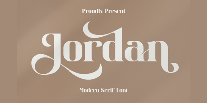 Jordan is a stylish and distinct serif font. This typeface is perfect for an elegant & luxury logo, book or movie title design, fashion brand, magazine, clothes, lettering, quotes, and various other creations. Jordan is PUA encoded which means you can access all of the glyphs and swashes with ease!
 - Oak Ridge JNL by Jeff Levine,
$29.00Oak Ridge JNL gives a Westernized treatment to Flivver JNL; which in turn is a serif derivative of Two Reeler JNL. Although all three fonts come from the same root source—inter-title cards from an old Charlie Chaplin movie, they each take on a personality of their own.

