1,167 search results
(0.034 seconds)
- Slabserif Grotesk JNL by Jeff Levine,
$29.00 Slabserif Grotesk JNL was modeled from an example of a wood type design called Antique Light Face, and is available in both regular and oblique versions. The numerals (although an odd fit to the overall design) make this vintage font quite unusual and charming.
 - Grotesk S SB by Scangraphic Digital Type Collection,
$26.00Since the release of these fonts most typefaces in the Scangraphic Type Collection appear in two versions. One is designed specifically for headline typesetting (SH: Scangraphic Headline Types) and one specifically for text typesetting (SB Scangraphic Bodytypes). The most obvious differentiation can be found in the spacing. That of the Bodytypes is adjusted for readability. That of the Headline Types is decidedly more narrow in order to do justice to the requirements of headline typesetting. The kerning tables, as well, have been individualized for each of these type varieties. In addition to the adjustment of spacing, there are also adjustments in the design. For the Bodytypes, fine spaces were created which prevented the smear effect on acute angles in small typesizes. For a number of Bodytypes, hairlines and serifs were thickened or the whole typeface was adjusted to meet the optical requirements for setting type in small sizes. For the German lower-case diacritical marks, all Headline Types complements contain alternative integrated accents which allow the compact setting of lower-case headlines. - Europa Grotesk SH by Scangraphic Digital Type Collection,
$26.00 Since the release of these fonts most typefaces in the Scangraphic Type Collection appear in two versions. One is designed specifically for headline typesetting (SH: Scangraphic Headline Types) and one specifically for text typesetting (SB Scangraphic Bodytypes). The most obvious differentiation can be found in the spacing. That of the Bodytypes is adjusted for readability. That of the Headline Types is decidedly more narrow in order to do justice to the requirements of headline typesetting. The kerning tables, as well, have been individualized for each of these type varieties. In addition to the adjustment of spacing, there are also adjustments in the design. For the Bodytypes, fine spaces were created which prevented the smear effect on acute angles in small typesizes. For a number of Bodytypes, hairlines and serifs were thickened or the whole typeface was adjusted to meet the optical requirements for setting type in small sizes. For the German lower-case diacritical marks, all Headline Types complements contain alternative integrated accents which allow the compact setting of lower-case headlines.
 - CF Arche Grotesk by Contrafonts,
$22.00 Without serifs and without exaggeration. A project that seeks simplicity, with focus on reading and coverage in many languages. Arche has 5 weights and its italics. 10 fonts ranging from Light to Black. It also has a set of styles, old and modern numbers, arrows and ornaments. Excellent alternative to standards such as Akzidenz Grotesk or Helvetica, with a contemporary look, focus on legibility and with Latin American freshness. For more information visit our website Contrafonts.cl
 - North Bay Grotesk by FoxType,
$16.00 Introducing NorthBay Grotesk new generation Typeface with 5 Weights. NorthBay Typeface created with the vision of to attract the audience to your brand . The finest details of this typeface are methodically and mathematically created. NorthBay is created with all the tasks of a corporate font and also for the usage in a variety of projects, including branding, logos, titles, headlines, servers, posters, screens, display, digital ads, and everything else. We are putting a lot of effort on this font as a long-term project. The Typeface includes Five Weights. Light, Regular, Medium, SemiBold and Bold Features: Numerals, extended punctuation & Basic Symbols(200+ Glyphs). Uppercase Letters & Lowercase Letters 24x7 Support Thank you for taking the time to look into the font.
 - Platz Groteske FJ by Frncojonastype,
$27.00 fj Platz Groteske™ is the new font from frncojonastype project that culminates after almost 5 years of learning and development. fj Platz Groteske™ is a Neo-grotesk font with slight geometrical proportions with humanistic terminations. For this occasion, this font will show the normal version, however, the entire project contemplate condensed family, extended and the development of alphabets as Cyrrilic and Greek. This proposal is to improve the legibility in the Neo-grotesk fonts with generous gaps, vertical and square counter form and ascendents that exceed slightly the capitals. Counts with old numbers, small caps, modern numbers, tabular, numerators and denominators to fraccions, reference numbers to notes and formulas to face confidant and complex different stages. Ideal to editorial projects of informative content - scientific and titular of a huge impact because of the various alternative characters, stylistic options and a optometrical version to risky designers. To exclusive licenses and to follow the develop of this project, please visit frncojonas.com (WIP) Learn about upcoming releases, work in progress and get to know us better! Instagram: @frnco.jonas
 - Grotesk S SH by Scangraphic Digital Type Collection,
$26.00Since the release of these fonts most typefaces in the Scangraphic Type Collection appear in two versions. One is designed specifically for headline typesetting (SH: Scangraphic Headline Types) and one specifically for text typesetting (SB Scangraphic Bodytypes). The most obvious differentiation can be found in the spacing. That of the Bodytypes is adjusted for readability. That of the Headline Types is decidedly more narrow in order to do justice to the requirements of headline typesetting. The kerning tables, as well, have been individualized for each of these type varieties. In addition to the adjustment of spacing, there are also adjustments in the design. For the Bodytypes, fine spaces were created which prevented the smear effect on acute angles in small typesizes. For a number of Bodytypes, hairlines and serifs were thickened or the whole typeface was adjusted to meet the optical requirements for setting type in small sizes. For the German lower-case diacritical marks, all Headline Types complements contain alternative integrated accents which allow the compact setting of lower-case headlines. - FF Bauer Grotesk by FontFont,
$50.99 FF Bauer Grotesk is a revival of the metal type Friedrich Bauer Grotesk, released between 1933 and 1934 by the foundry Trennert & Sohn in Hamburg Altona, Germany. The geometric construction of the typeface, infused with the art déco zeitgeist of that era, is closely related to such famous German designs as Futura, Erbar, Kabel and Super Grotesk that debuted a few years earlier. However, Bauer Grotesk stands out for not being so dogmatic with the geometry, lending the design a warmer, more homogenous feeling. The oval “O” is a good example of that, as well as characteristic shapes like the capital M or the unconventionally differing endings of “c” and “s” which make for a less constructed look. Watch the FF Bauer Grotesk introduction video on Vimeo
 - DIN Neuzeit Grotesk by Linotype,
$40.99 The German Standards Committee suggested the light Neuzeit-Grotesk’ font in 1970 for use in official signage, traffic directional systems, etc. The typeface had been designed by Wilhelm Pischner and appeared with the font foundry D. Stempel in 1928. The font Neuzeit Grotesk was once the standard in the print industry, as a timeless typeface with no real distinguishing features. Like other typefaces of the 1920s, DIN Neuzeit Grotesk reflects the philosophy of the times, Form is Function.’
 - Gothic Grotesk JNL by Jeff Levine,
$29.00 In a specimen book from Stevens, Shanks & Sons, Ltd. of London (circa1930s) “Royal Gothic” was their version of a classic grotesk sans that had been in use as far back as 1899 when the Keystone Foundry called it “Charter Oak”. The terms "gothic" and "grotesk" were equally applied to early sans serif typefaces – at first not well embraced by printers as being too ugly (grotesque) for use. One familiar characteristic of early grotesk fonts (such as this one) is the numerous variations of character widths and shapes. By combining those two terms into a font name, the digital version of this design is called Gothic Grotesk JNL, and is available in both regular and oblique versions.
 - SK Synonym Grotesk by Shriftovik,
$48.00 SK Synonym Grotesk is a geometric neo-grotesk typeface, which was developed under the influence of Swiss type design and adapt to modern realities. Its sturdy and simple structure is characterized by angular joints that accent details of the letters. The font design uses a strict geometric and stable construction it's combining with organic and lively forms, it creates an unusual attractive aesthetic of the character set. SK Synonym Grotesk consist of a variety of tools for various design needs, including OpenType alternatives and a wide range of styles from Thin to Black. This typeface is multilingual, supports more than 40 languages including Extended Latin and Cyrillic sets and contains more than 450 characters.
 - Paul Grotesk Soft by artill,
$29.00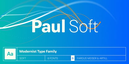
- LTC Obelysk Grotesk by Lanston Type Co.,
$24.95 Obelysk Grotesk was designed by the Lanston Drawing Office in the late 1980s. This face is a reconstruction of Spire (1937) drawn by Sol Hess. The skeleton of Spire Roman stands with the serifs removed. Like Spire, this font has no lower case, but does offer alternate cap styles in some of the lower case positions. Spire and Obelysk have both been used prominently in the fashion industry.
 - Brush Poster Grotesk by TypoGraphicDesign,
$19.00 The typeface Brush Poster Grotesk is designed in 2017 for the children exhibition 1,2,3 Kultummel from Labyrinth Kindermuseum Berlin by xplicit, Berlin (Annette Wüsthoff, Alexander Branczyk, Mascha Wansart (illustrations)). Manuel Viergutz extended the font with some further glyphs & extras. The rough sans serif display typeface is created analogous by hand and brush. 875 glyphs incl. 150+ decorative extras like arrows, dingbats, emojis, symbols, geometric shapes, catchwords, decorative ligatures (type the word LOVE for or SMILE for as OpenType-Feature dlig) and stylistic alternates (3+ stylistic sets). For use in logos, magazines, posters, advertisement plus as webfont for decorative headlines. The font works best for display size. Have fun with this font & use the DEMO-FONT (with reduced glyph-set) FOR FREE! Font Name: Brush Poster Grotesk Font Weights: Regular + Misprint + EXTRAS (Illustration) + DEMO (with reduced glyph-set) Font Category: Display for headline size Glyph Set: 875 glyphs Language Support: 28+ for extended Latin. Afrikaans, Albanian, Catalan, Croatian, Czech, Danish, Dutch, English, Estonian, Finnish, French, German, Hungarian, Icelandic, Italian, Latvian, Lithuanian, Maltese, Norwegian, Polish, Portugese, Romanian, Slovak, Slovenian, Spanisch, Swedish, Turkish, Zulu Specials: 150+ decorative extras like arrows, dingbats, emojis, symbols, geometric shapes, catchwords, decorative ligatures (type the word “LOVE” for ❤ or “SMILE” for ☺ as OpenType-Feature dlig ) and stylistic alternates (3+ stylistic sets), German Capital Eszett Design Date: 2017 Type Designer: Annette Wüsthoff, Manuel Viergutz, Alexander Branczyk, Mascha Wansart (Illustration)
 - Grotesk Polski FA by Fontarte,
$39.00 Grotesk Polski FA developed in 1998-2006, was inspired by the Polish eminent pre-WWII text typeface - Antykwa Półtawskiego. Adam Półtawski designing his antiqua had took into consideration the special qualities of Polish language. He designed unique letters: k, w, y, z and R, K, Y. Another unique element of his typeface was polygonal dot. Grotesk Polski keeps all that shapes and goes further. It is a contemporary sans serif in four cuts: Regular, Italic, Bold and Stencil. The proportions of the typeface were rebalanced to give it a neo-grotesque form with a Polish twist.
 - Drystick Geo Grotesk by deFharo,
$14.00 Drystick is a Sans Serif typographic family of Geo-Grotesque style with 8 pesos plus the italic versions all include small capital letters the symbol of Bitcoin (b #) and other cryptocurrency symbols. It is a geometric typography, minimalist, with neo-grotesque modulations. The typeface has alternative letters and numbers, small caps and advanced OpenType functions. The Italic versions have some of their own characters (&, @, Q, a, g, y), these versions have many optical corrections to balance the deformations created in many curves by the mere inclination of the letters, which in the case of This typography is 9 °. The drawn of the vectors is careful to obtain smooth curves and elegant appearance, the thicker versions have ink traps in the joints of the joints to use in small sizes. The Metric and the Kerning of all the versions I have reviewed individually to obtain maximum readability in any type of text and size.
 - TG Haido Grotesk by Tegami Type,
$35.00 Haido is a new contemporary grotesk typeface influenced by post-modernism style. This typeface is has very neutral look, thus making this new typefaces has versatility for use in all kinds of modern design. Haido comes with 18 Styles including 9 Weight, italic and variables font. The small detail of inktrap in this typeface, making Haido is has high legibility in small size and very useful especially for printing needs. And last but not least, Haido has several alternates characters, ligatures and covered more than 100 languages including 2 script latin and cryllic.
 - Drescher Grotesk BT by Bitstream,
$50.99 Mr. Gogoll's successful revival of Arno Drescher’s Super Grotesk was awarded the 1999 Kurt Christians Award. The Drescher Grotesk family consists of seven roman weights, including a version designed for use at small point sizes. Drescher Grotesk is a classic German geometric design, complete with the original “angled” brackets.
 - Globe Grotesk Display by Jan Charvát,
$26.50 Globe Grotesk is modern art deco inspired sans serif. Its root goes to beginning of last century into Czechslovakia. The design is inspired in Universal Grotesk – font made by unknown designer. There are some really unique details in the font, especially letters a, g, u, E, F, R, & and many more. It primary intended for display usage or rather shorter texts. The original is extended with full latin support, ligatures, small caps, alternates, inktraps, oldstyle figures and many more features necessary for contemporary type design. Also true italics are no doubt in this font.
 - Neue Alte Grotesk by VisualWorks,
$20.00 Inspired by German grotesk from XIXth century. Driven by the spirit of 1950s Swiss Style. Designed with a hint of constructivist approach. Neue Alte Grotesk is a minimalistic typeface with a distinct character. It is created to connect both new and old. It will look good in juxtaposition with retro-styled illustrations and ultra-modern graphics.
 - Kross Neue Grotesk by Designova,
$15.00 Kross Neue Grotesk is a minimalist sans-serif typeface family of 16 fonts featuring the finest design made with attention to every detail. Created with a special focus on minimalism and simplicity in typography, this typeface can transform your design projects to another level of visual appeal. Handcrafted and designed with powerful OpenType features in mind, each weight includes extended language support including Western European & Central European sets. A total of 268 glyphs are included. Kross Neue Grotesk is a perfect choice for graphic design, text presentation, web design, print and display use. The typeface can be an amazing option for beautiful branding, logo / logotype design projects, marketing graphics, banners, posters, signage, corporate identities as well as editorial design. Adding extra letter-spacing for the Caps will make this font perfect for minimal headlines and logotypes as shown in promo images here. Kross Neue Grotesk typeface family comes with a total of 12 fonts having 6 weights (Thin / Light / Book / Regular / Bold / Heavy) as well as Italic versions of all weights.
 - Simply Grotesk JNL by Jeff Levine,
$29.00 Up until the advent of vinyl plotters, computers and a myriad of other typesetting and printing changes the world has experienced over the past few decades, the art of hand lettering flourished. An early 1900s book on show card writing displayed a nice example of a Grotesk typeface (a popular style of sans serif of the time). This has been redrawn digitally as Simply Grotesk JNL and is available in four varieties - regular, oblique, condensed and condensed oblique.
 - Europa Grotesk SB by Scangraphic Digital Type Collection,
$26.00 Since the release of these fonts most typefaces in the Scangraphic Type Collection appear in two versions. One is designed specifically for headline typesetting (SH: Scangraphic Headline Types) and one specifically for text typesetting (SB Scangraphic Bodytypes). The most obvious differentiation can be found in the spacing. That of the Bodytypes is adjusted for readability. That of the Headline Types is decidedly more narrow in order to do justice to the requirements of headline typesetting. The kerning tables, as well, have been individualized for each of these type varieties. In addition to the adjustment of spacing, there are also adjustments in the design. For the Bodytypes, fine spaces were created which prevented the smear effect on acute angles in small typesizes. For a number of Bodytypes, hairlines and serifs were thickened or the whole typeface was adjusted to meet the optical requirements for setting type in small sizes. For the German lower-case diacritical marks, all Headline Types complements contain alternative integrated accents which allow the compact setting of lower-case headlines.
 - HT Arcadia Grotesk by Hype Type,
$34.00 The versatile neo-grotesk typefamily, inspired by the swiss academia with a contemporary mood. The shape of the letters are more pliable compared to classics grotesk typefaces. -- Taking inspirations from classic grotesk letterforms, both from the European tradition (specifically the Swiss school) and the American tradition, HypeType's Arcadia Grotesk is modernized with its shorter ascenders and descenders to give more compact blocks of text and with its more contemporary and dynamic forms. -- hype-type.com // kidstudio.it
 - Albeit Grotesk Caps by Cloud9 Type Dept,
$40.00 Albeit Grotesk Caps is a graphic geometric all caps display font family of four weights (Light, Regular, Medium and Bold) with slightly exaggarated diacritics for better readability making it ideal for headlines.
 - Fat Font Grotesk by Intellecta Design,
$9.00a naive grotesque font - Rotek - 100% free

- Aron Grotesque - Personal use only

- Voyager grotesque - Personal use only

- Grotesque BRK - Unknown license

- French Grotesque - Unknown license

- Lota Grotesque by Los Andes,
$29.00 Lota Grotesque was designed by Daniel Hernández with the collaboration of Rodrigo Fuenzalida and Latinotype Team in digital editing. The family comes in 7 weights with matching italics and includes alternative versions that provide high versatility and functionality. The whole font family is composed of 4 subfamilies that share exactly the same number of characters and styles but with differences in programming and default characters. Lota Grotesque contains a 760-character set that supports 219 languages and includes alternative characters, discretionary ligatures, small caps, and a variety of figures and fractions—a wide range of typographic tools to meet different design needs.
 - Quartz Grotesque by Hustle Supply Co,
$18.00 Quartz was originally published on the shop Font Forestry, but they are planning on closing - So now Quartz will live on Hustle Supply Co. Quartz is a minimalist All-Caps Sans Serif typeface that comes in 7 different weights. It's perfect for projects looking for that minimalist / clean aesthetic. Quartz includes regular, oblique, thin, bold & outlined versions. Western European Characters are included. Thanks!
 - Halis Grotesque by Ahmet Altun,
$19.00 The Halis Grotesque font family comes in eight weights of Normal and Italic. In addition, all weights contain small caps in both italic and normal. The name of the font means “pure, clean.” The Halis Grotesque Font Family has the new Turkish Lira Sign as well as an alternative ampersand created by Prof. Halis Biçer, renowned in Turkey for his expertise in typography, calligraphy, and graphic design. That’s why this font’s name is inscribed with a dedication to the venerable Halis Biçer. The spaces between characters are wide enough to be legible even at very small sizes. With the HALIS GROTESQUE FONT FAMILY, you can create beautiful works for the web, including logos, banners, body copy, and presentations. Halis Grotesque also works nicely in print formats such as posters, T-shirts, magazines, and affiches. Because of its eye-pleasing style, this font is both effective and versatile.
 - Murat Grotesque by Bülent Yüksel,
$69.00 "Murat Grotesque" is a sans serif font inspired by the "Impact" character. The corners were softened and many glyph forms were completely changed. It was transformed into a modern line, which is the result of the harmony of width and height, in particular to promote legibility in lowercase letters. You can enjoy using it...
 - MD Grotesque by Margarita Dyakovich,
$12.00 MD Grotesque is sans serif font family with a modern and minimalist feel with high readability. It’s extremely versatile and can be used for a big variety of design projects. Perfect for any simple text. It comes in 3 weights and its matching italics. Each style includes Latin and Cyrillic character set.
 - Galano Grotesque by René Bieder,
$30.00 Galano Grotesque is a geometric sans in the tradition of Futura, Avant Garde, Avenir and the like. It has a modern streak which is the result of a harmonization of width and height especially in the lowercase letters to support legibility. Galano Grotesque aims to be a universal weapon not only because it works great in headlines, short and long copies but also because of its subtle neutrality. It comes in 10 different weights with matching italics and is equipped with a set of powerful opentype features including alternative glyphs, fraction, arrows, ligatures and many more. An extended character set, supporting Central, Western and Eastern European languages, rounds up the family. During the design process of the alternative glyph shapes of Galano Grotesque, the interest of creating a standalone version emerged rapidly. This was the birth of Galano Grotesque Alt. Not only because of the legible and unique character created by the alternatives, but also because this could be the small copy embracing stylistic companion to Galano Grotesque. In addition to the alternative glyphs, the height of descender and ascender was increased, supporting structure and rhythm. When finishing Galano Grotesque Alt, it turned out to not only work great in small and long copies but also to be a great performer in headlines and short copies. I'm proud to introduce: Galano Grotesque and Galano Grotesque Alt.
 - Oblivian Grotesque by Jörg Schmitt,
$36.00 Oblivian Grotesque is a sans serif type family of ten weights. The typeface is based on geometric forms with bits and pieces of modern humanistic grotesque fonts. Due to the rounded edges it has a very soft / warm look and feel. It comes along with varius OpenType features such as table and old style figures. Oblivian Grotesque as an extended character set that support Central and Eastern European as well as Western European.
 - Neubau Grotesque by TipografiaRamis,
$29.00 Neubau Grotesque is an upright italics variation of Neubau Sans and is built in three weights. The main difference of this typeface is that it presents a softer and more human look (less techno), while retaining the condensed geometric structure of its counterpart. Neubau Grotesque is recommended for use as a display font, and has been generated in a single OpenType format with Western CP1252 character set..
 - Grotesca Negra by MAC Rhino Fonts,
$59.00 Grotesca Negra is a charming sans serif with a flirt towards the Jugend era. Still its modern enough not to feel outdated. It is briefly inspired by a local typeface named Grotesca chupada negra, found in a Spanish edition of a type specimen book from the German Bauer type foundry. It has an angle on the horisontal strokes on many of the letters. It is one of many display face derived from book cover designs. Intended to work as a display typeface.


