8,827 search results
(0.071 seconds)
- MFC Bindi Monogram by Monogram Fonts Co.,
$19.95 The inspiration source for Bindi Monogram is a 1915 publication by Cartier-Bresson of Paris containing classic and modern monogram patterns for embroidery. This Art Deco style monogram has been redrawn, balanced, and brought forward into the digital age for your type-setting use and enjoyment. Like so many monograms from this period, it is only a two letter monogram format, but this particular monogram comes with an accent color block character to add pop! Download and view the MFC Bindi Monogram Guidebook if you would like to learn a little more.
 - Eurostile Round by URW Type Foundry,
$89.99 Eurostile, created in 1962 by Aldo Novarese for the Nebbiolo type foundry, is one of the most popular sans serif fonts of all, and has been for about 50 years. Originally designed as a screen font it was very popular from the beginning, even though it is only a slightly modified version of the 10-year-older Microgramma, but completed with lower case characters. On public demand, URW++ has expanded its range of Eurostile with Eurostile Round with 19 additional styles. Quite like Futura Round by URW++, Eurostile Round works perfectly well as webfont.
 - Egon Sans by TipografiaRamis,
$29.00 Egon Sans is a geometric sans serif typeface family built in ten styles (extra-light, light, regular, bold and black weights all in roman and italic). Egon Sans is an extension to the Egon (Slab Serif) family, designed in 2008. The typeface is designed with industrial and architectural flavor, as homage to Egon Eiermann, one of Germany’s great architects of 20th century. Egon Sans is ideal as text and display font for publication use. Egon Sans is released as OpenType single master with a Western CP1252 character set.
 - Swansea by Mysterylab,
$17.00 Swansea font is an ornate and elegant serif typeface providing both roman and italic variants. The old world strokes and flourish embellishments are fused with a modern uniformity that makes this type versatile and useful in many contexts. A collection of two character ligatures bring out additional possibilities (It's easy to override these ligatures in the Glyphs menu of most design software packages.) It's excellent for posh specialty branding applications, antique themes, fine art publications, fashion, and much more. This font also includes the complete Cyrillic character set for Russian, Belarusian, and Ukrainian.
 - Snowflake Drop Caps by Celebrity Fontz,
$15.99The Snowflake Drop Caps font is a set of highly ornate block letters with rich embedded snowflake designs, perfect for winter and holiday themes and publications or any text where you want to add some texture, pizzazz, and depth to make your message stand out. This one-of-a-kind font has the feel of a homemade embroidered or quilted design and comes with both upper and lower case letters to give you more design flexibility. (Numbers, special characters, and punctuation are a neutral sans serif typeface and are included for convenience only.) - Travel East JNL by Jeff Levine,
$29.00 “Tropical Type” was Alf Becker’s 148th submission to “Signs of the Times” magazine (a publication for the sign trade) where for years Becker would provide a monthly lettering design to inspire other sign writers. This particular design has more of a Far East flair to it, and was redrawn digitally as Travel East JNL, which is available in both regular and oblique versions. Special thanks to Tod Swormstedt of the American Sign Museum and S.T. Media Group for providing the sample image from which the font was derived.
 - Megumi by Eclectotype,
$70.00 Megumi was originally commissioned as a headline face for a fashion and lifestyle magazine with a heavy Japanese influence. The uppercase letters are narrow and have an almost monospaced aesthetic, being influenced by Romaji letterforms. Serifs are severe, and curves sinuous. Although experiments were made with extra weight, it was decided that only this ultra light weight would be developed, to be set large in headlines. The italic has an over-the-top 35° slant (so slanted in fact that the backslash from the italic is the exact same shape as the forward slash in the Roman) and a discretionary ligature feature that can be engaged to add extra interest to headlines. The Roman has a few wide alternate glyphs for round uppercase characters. Both styles have a stylistic set (ss03) feature which switches regular parentheses for angle brackets, which the Art Director thought “looked cool”. In a mess of venture capitalist pull-outs and Covid related issues, the publication never came to be, but the Hipster Japanophile Magazine World’s loss is your gain, as this beautifully crafted, editorial oddity is now available to license. Use it editorially, obviously, but it would also look great on posters, perfumes, postmodern publications, and perhaps some other things that don’t begin with p.
 - Lektorat by TypeTogether,
$35.00 Florian Fecher’s Lektorat font family is one for the books, and for the screens, and for the magazines. While an editorial’s main goals are to entertain, inform, and persuade, more should be considered. For example, clear divisions are necessary, not just from one article to the next, but in how each is positioned as op-ed or fact-based, infographic or table, vilifying or uplifting. From masthead to colophon, Lektorat has six concise text styles and 21 display styles to captivate, educate, and motivate within any editorial purpose. Magazines and related publications are notoriously difficult to brand and then to format accordingly. The research behind Lektorat focused on expression versus communication and what it takes for a great typeface to accomplish both tasks. In the changeover from the 19th to 20th century, German type foundry Schelter & Giesecke published several grotesque families that would become Lektorat’s partial inspiration. Experimentation with concepts from different exemplars gave birth to Lektorat’s manifest character traits: raised shoulders, deep incisions within highly contrasted junctions, and asymmetrical counters in a sans family. After thoroughly analysing magazine publishing and editorial designs, Florian discovered that a concise setup is sufficient for general paragraph text. So Lektorat’s text offering is concentrated into six total styles: regular, semibold, and bold with their obliques. Stylistic sets are equally minimal; an alternate ‘k, K’ and tail-less ‘a’ appear in text only. No fluff, no wasted “good intentions”, just a laser-like suite to focus the reader on the words. The display styles were another matter. They aim to attract attention in banners, as oversized type filling small spaces, photo knockouts, and in subsidiary headings like decks, callouts, sections, and more. For these reasons, three dialed-in widths — Narrow, Condensed, and Compressed — complete the display offerings in seven upright weights each, flaunting 21 headlining fonts in total. If being on font technology’s cutting edge is more your goal, the Lektorat type family is optionally available in three small variable font files for ultimate control and data savings. The Lektorat typeface was forged with a steel spine for pixel and print publishing. It unwaveringly informs, convincingly persuades, and aesthetically entertains when the tone calls for it. Its sans serif forms expand in methodical ways until the heaviest two weights close in, highlighting its irrepressible usefulness to the very end. Lektorat is an example of how much we relish entering into an agreed battle of persuasion — one which both sides actually enjoy.
 - Normandia by Canada Type,
$30.00 Designed over three years after the second World War, and published in 1949 by the Nebiolo foundry, Normandia was Alessandro Butti’s take on the fat face. As it usually was with Butti’s designs, this face effectively injected a catchy yet expertly calculated calligraphic spin into its source of inspiration — which was the essentially geometric/deco, thicker model of Bodoni’s very popular aesthetic. The metal Normandia saw some widespread use for a handful of years after its publication, not least because of the multitude of sizes in which it was available. It stepped out of the limelight by the mid-1950s, due to a combination of the popularity of cold type and Nebiolo’s refusal to retool its faces for new technologies. It was copied by a few small film typesetting outfits on both sides of the Atlantic, but never really found its way back to the mainstream. By the time computer type became the norm, Normandia was pretty much relegated to a type historian’s collection of anecdotes. This digital update of the classic series revives and refines the three original metal designs (Tonda/Regular, Corsiva/Italic, and Contornata/Outline) and expands the character set to more than 600 glyphs per font, including small caps, six types of figures, fractions and nut fractions, a full set of f-ligatures, some stylistic alternates, and other fine typography niceties.
 - Ashby Extra Bold - Unknown license

- RollerCoaster - Unknown license

- Windstone by Variatype,
$14.00 Windstone is a Black Ultra Condensed display sans font published by Variatype, available in regular and italic. FONT FEATURES Additional Accents 66 Languages Kerning Alternates Ligatures
 - Bulmer by Bitstream,
$29.99Morris Fuller Benton’s ATF version of Baskerville’s design cut by William Martin for the British printer and publisher William Bulmer. ATF released the design in 1928. - Tipo Metro CDMX by Ixipcalli,
$- La tipografía “Tipo Metro CDMX” fue desarrollada por Lance Wyman como parte del proyecto “Metro” desde los años setenta, y es uno de los elementos clave de la cultura visual del transporte del Sistema de Transporte Colectivo Metro (STC Metro). Este estilo se ha convertido en el icónico fundamental del trasporte público para los residentes de la Ciudad de México. En esta edición, los tipos minúsculas son una adaptación “no oficial” para el Tipo Metro CDMX, enriqueciendo la tipografía a un estilo visual de altas y bajas, por lo que se prescinde del diseño base como trabajo propio para enfatizar los tipos minúsculas exclusivamente, además de que se han añadido algunos caracteres de acentuación extendiendo su uso a otros lenguajes. Los tipos son una nueva propuesta por Ixipcalli en el presente año 2023. The “Tipo Metro CDMX” typeface was developed by Lance Wyman as part of the “Metro” project since the 1970s, and is one of the key elements of the visual culture of transportation of the Metro Collective Transportation System (STC Metro). This style has become the iconic fundamental of public transportation for the residents of Mexico City. In this edition, the lowercase types are an “unofficial” adaptation for the Tipo Metro CDMX, enriching the typography with a visual style of highs and lows, so the base design is dispensed with as my own work to emphasize the lowercase types exclusively, In addition, some accentuation characters have been added, extending their use to other languages. The types are a new proposal by Ixipcalli in the current year 2023.
 - XLeefMeAlone by Ingrimayne Type,
$14.95 XLeafMeAlone is a collection of leaf silhouettes from common Indiana trees based on actual leaves. Various leaves, selected for their good looks not their intelligence, were scanned and hand-traced. Some species, such as some oaks, are over-represented because they are more picturesque than others, such as apple or peach. LeafMeAlone was featured in the “Type Drawer” column of Personal Publishing (later renamed Business Publishing--I do not know if it still exists) in November of 1990.
 - Cervo Neue by Typoforge Studio,
$29.00 Cervo Neue is the new perfected and extended version of Cervo, containing 18 variants. It differs from the previous version with the higher accents over glyphs, enlarged punctuation, old-style numerals and the newly added varieties Semi Bold, Bold, Extra Bold and Black. Additionally, there is the variety of grotesque. Font Cervo is inspired by a “You And Me Monthly” published by National Magazines Publisher RSW „Prasa” that appeared from Mai 1960 till December 1973 in Poland.
 - Renner Antiqua by Linotype,
$29.99First published in 1939 by Stempel, Renner Antiqua is a classic serif text typeface. Designed by Paul Renner, the father of Futura, this design stands out as strikingly different from his other designs. The letterforms are relatively compact and space saving and the strokes have a strong contrast to look as if made by a pen. This design is extremely distinctive and individualized, but without being overly distracting. Notice many of the small details such as the serifs on the uppercase C, E, and L and the bar at the top of the uppercase A. Also observe the special curve in the bowl of the lowercase b, the dot of the i, and the tail of the y. This design is wonderful for extended amounts of text at 10pt, but the subtle details will be fully appreciated when used larger for titles and display settings. - Art Lesson JNL by Jeff Levine,
$29.00The hand-lettered title of a vintage Walter Foster "how to draw" book inspired the Deco-influenced alphabet of Art Lesson JNL. Bold and retro in nature, this typeface gets the message across in a straightforward way, yet still has a bit of a casual feel to it. - Allentown by Nurf Designs,
$16.00 Allentown is a script font with a vintage and retro style. This font is great for your next creative project such as logos, printed quotes, invitations, cards, product packaging, headers, logotypes, letters, posters, apparel designs, labels, and etc. Allentown comes with uppercase, lowercase, numerals, punctuations, ligatures & multilingual support characters.
 - Heft by Device,
$39.00 Heft is a heavy slab serif that packs a powerful punch. Available in square-cornered and rounded versions, each with italics, plus two distressed variants — an inky version that evokes the urgency of cheap hot-metal printing, and a worn, distressed version that suggests vintage woodtype or photocopied text.
 - Weekend Plans JNL by Jeff Levine,
$29.00 A piece of vintage British sheet music from 1941 entitled “That Lovely Week-End” featured the song’s name in a bold Art Deco sans serif with rounded edges. This lettering design is now the digital type face Weekend Plans JNL, which is available in both regular and oblique versions.
 - Original Absinthe by Vozzy,
$10.00 Introducing a vintage look label font named "Original Absinthe". This family includes seven styles - Regular, Inline, Shadow, Inline FX, Shadow FX, Full and Aged. The posters show the result of combining them. This font will be great for any retro design like poster, t-shirt, label, logo etc.
 - Lugo Rockwell by madeDeduk,
$16.00 Introduce Lugo Rockwell is a brush vintage handwritten font to give an incredible impression for all your project design come with a lot ligatures and Alternative to make everything look realistic handmade handwritten. Included: Uppercase & Lowercase Number & Symbol International Glyphs Multilingual Support Ligature Alternative Hope you enjoy it.
 - Andovine by Stringlabs Creative Studio,
$25.00 Andovine is a strong and powerful display font with a vintage feel. Fall in love with its raw authenticity. Andovine is a handbrush font with authentic style. This font is made with a brush pen with very careful techniques, so the results are charismatic and have enchanting characteristics.
 - Major by Fox7,
$14.00 Major Font is designed to be versatile. Compatible with both modern and vintage design styles. You can use it for various projects, such as blog posts, logos, branding, ads, invitations, greeting cards, planners, photo albums, decorations, and much more. Hope you are happy and enjoy your creations. Thank you!
 - Green Berry by Gassstype,
$28.00 Introducing of our new product Green Berry it is a unique font and also has vintage display 2 style font. Can make it easier to convey the message in your design. Use for awesome display, labeling, movie sceen, poster, movie title, gigs, album covers, logos, and much more.
 - Western Whiskey by Vozzy,
$10.00 Introducing a vintage look label font named Western Whiskey. All available characters you can see at the screenshot. This font have 6 styles - Regular, Full, Shadow, Texture, Shadow FX and Texture FX. This font will good viewed on any retro design like poster, t-shirt, label, logo etc.
 - Northfield by Uncurve,
$20.00 Northfield is a combination vintage and modern typography font, inspired from the elegant poster and old label product. Northfield comes with ton of alternates characters. It is suitable for authentic logos, headings, posters, branding, magazines, album covers, book covers, movies, apparel design, flyers, greeting cards, product packaging, and more.
 - Lux Royale JF by Jukebox Collection,
$32.99 Lux Royale is a stylish script font from Jukebox that is classy and sophisticated. It seems to fit with upscale soirées and a night out with the Rat Pack. The heavier weight and small x-height give Lux Royale a unique look that is both timeless and vintage.
 - Gokil by Eotype,
$12.00 Gokil is an unique bold display font with rounded edges. You can use this font in retro, vintage, and hipster designs. This font is perfect for a variety of projects, such as branding, poster displays, logo designs, magazines, headlines, stickers, and more.This font also has alternate and ligature features.
 - Hukiran by SSI.Scraps,
$10.00 Hukiran is a Victorian font that features carefully engraved characters. There is beautiful crafting in every glyph. You can use it will to your design look vintage awesome. It is an authentic style of Jepara's crafting font. For a Hukiran bonus package with editable SVG files, click here.
 - Barbar Shop by WAP Type,
$20.00 Something New, a serif blackletter, has been designed with logo designers and typographers firmly in mind. This display font is a perfect addition to your design studio, ready for your next logotype, barber shop, coffe shop label. A modern mix of serif and blackletter with a touch or vintage
 - Golden Beach JNL by Jeff Levine,
$29.00 Art Deco monogram initials on a vintage business card from the Miami area inspired Golden Beach JNL. The font was named for a small upscale South Florida residential community located between Sunny Isles Beach in the Northern part of Miami-Dade County and Hallandale Beach in Southernmost Broward County.
 - The Secret Library by PeachCreme,
$21.00 “The Secret Library” perfectly encapsulates the vintage scribbled italic while adding a contemporary twist. It intentionally retains inky edges in an effort to convey the feel of antiquity. This font looks great in books, illustrations, posters, and on stationery. All uppercase/lowercase letters have at least one alternative glyph.
 - Deco Revival JNL by Jeff Levine,
$29.00 Some time back, a few basic characters were drawn out (possibly inspired by some vintage sheet music) and set aside for a future font project. Despite being incomplete for a few years, this once-forgotten design is now available as Deco Revival JNL, in both regular and oblique versions.
 - Inline Retro JNL by Jeff Levine,
$29.00 Inline Retro JNL is Art Deco in style, featuring condensed characters and its namesake inline. While not a true revival of a vintage design, the same influences are utilized throughout the font to give it retro appeal. Inline Retro JNL is available in both regular and oblique versions.
 - Christmas Festival by Doehantz Studio,
$18.00 Christmas Festival. A magnificent curved monoline font with christmas theme. Use it to add vintage and mystique flavor to any design! It’s ready and perfectly fit for your logo designs, headline, music projects & social media posts, event poster, brand imagery, product packaging, quotes, merchandise, gift card, wedding invitation, etc.
 - Olde Nouveau JNL by Jeff Levine,
$29.00 Olde Nouveau JNL is an interesting Art Nouveau typeface based on lettering found on some vintage sheet music. It's name is a contradictory pun, since "Nouveau" means new in French, and Olde (spelled in the archaic form) is the total opposite of what the Art Nouveau movement embodied.
 - Bean by Eotype,
$14.00 Bean is unique retro condensed display font. The Bean font has extraordinary curved characteristics with a thick size. This font is suitable for modern vintage retro designs. You can use this font on posters, banners, logos, headline projects and more. This font features alternate, ligature and multilingual supports.
 - Attomi Gilbert by Motokiwo,
$16.00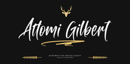 Organic handwriting gesture from a cool brush that useful for multipurpose projects. This is Attomi Gilbert, an elegant script font with passionate handmade feels in each characters. You can use it for vintage or urban projects style. Features: Ligatures Swashes Access All Alternates Special Characters (Multilingual) PUA Encoded

