4,683 search results
(0.025 seconds)
- Toppo Giggio - Personal use only
- Dreary Home by Seemly Fonts,
$14.00 - Lauthan by Nurf Designs,
$16.00 - Scary Envision by Seemly Fonts,
$14.00 - Rockford by Typadelic,
$19.00Completely computer generated, Rockford exudes an energetic, yet quirky handwritten quality. Rockford doesn't follow many typographical rules which make it perfect for casual notes, scrapbooking and greeting cards. - Doodles the Alphabet by Outside the Line,
$19.00 - Sweetheart Script by Typadelic,
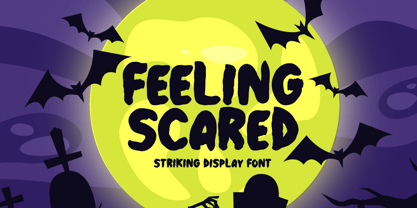
$19.00 - Feeling Scared by Seemly Fonts,
$14.00 - Tooned Out JNL by Jeff Levine,
$29.00Tooned Out JNL gives a serif treatment to the cartoon-inspired lettering of Toon-In JNL. Both fonts are great for any casual or fun messages or themes. - Hearts Love Smile by TypoGraphicDesign,
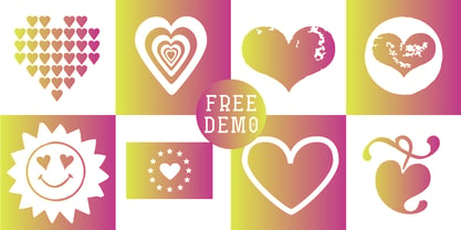
$9.00The typeface Hearts Love Smile (All We Need Is LOVE) is designed in 2018–2021 for the font foundry Typo Graphic Design by Manuel Viergutz. A font-collection from rough hand-printed old wood letters, rubber-stamps and plastic stamps till clean vectors, photos … 302 glyphs of LOVE. Decorative extras like icons, arrows, dingbats, emojis, symbols, decorative ligatures (type the word LOVE for ♥ or SMILE for ☻ as OpenType-Feature dlig). For use in logos, magazines, posters, advertisement and packaging plus as webfont for decorative headlines. The font works best for display size. Have fun with this font & use the DEMO-FONT (with reduced glyph-set) FOR FREE! ■ Font Name: Hearts Love Smile ■ Font Styles: 1 Icons + DEMO (with reduced glyph-set) ■ Font Category: Display for headline size ■ Glyph Set: 302 glyphs / decorative extras like arrows, dingbats, emojis, symbols ■ Design Date: 2021 ■ Type Designer: Manuel Viergutz - NO culture no SOUL by TypoGraphicDesign,
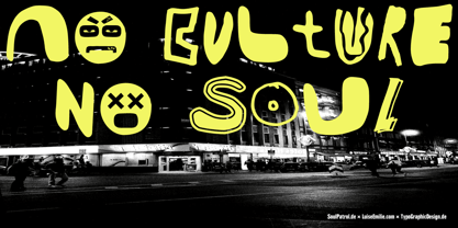
$9.00The typeface No Culture No Soul is designed from 2021–2022 for the font foundry Typo Graphic Design by Luise Herke × Manuel Viergutz as a project for support the culture. Special THX to Michael Rütten of soulpatrol.de The display font with 254 glyphs incl. numbers, punctation, marks & symbols is inspired in the past and present. Extras like OpenType-features and 7 sylistic sets. For use in logos, magazines, posters, advertisement plus as webfont for decorative headlines. The font works best for display size. Have fun with this font & use the DEMO-FONT (with reduced glyph-set) FOR FREE! Font Specifications ■ Font Name: No Culture No Soul ■ Font Styles: 1 (Rough) + DEMO (with reduced glyph-set) ■ Font Category: Display for headline size ■ Glyph Set: 254 glyphs incl. extras like icons (decorative extras like dingbats, emojis, symbols) ■ Design Date: 2021–2022 ■ Type Designer: Luise Herke, Manuel Viergutz, THX to Michael Rütten (Soulpatrol) - Hello Sunrise Script by Zane Studio,
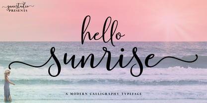
$20.00Hello Sunrise Script is a modern signature font. It's perfect for every signature, business card design, branding project, product packaging, quotes, logos, book covers, and many other great projects. With a combination of elegant and casual styles, this font contains the complete set of lower and uppercase letters. Features: Alternative styles and ligature A-Z Character Set Numbers and Punctuation (OpenType Standard) · Accent (Multilingual Character). With an elegant and casual design, I hope this font can meet your design needs. - Chuckybits by Maulana Creative,
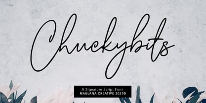
$15.00Chuckybits is a fancy casual script font With clean monoline stroke and fun character. It has Opentype features of ligatures, To give you an extra creative work. Chuckybits script script font support multilingual more than 100+ language. This font is good for logo design, Social media, Movie Titles, Books Titles, a short text even a long text letter and good for your secondary text font with sans or serif. Make a stunning work with Chuckybits casual script font. Cheers, MaulanaCreative - DT Stoner Toon by Dragon Tongue Foundry,
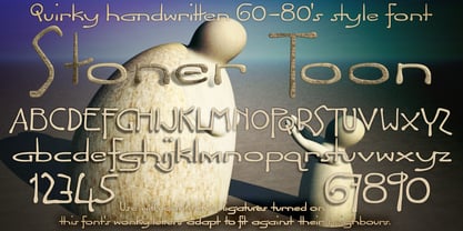
$10.00Inspired by early cool cartoon fonts, early rock and hippie posters, I created this casually organic 'DT Stoner Toon' font. Please use with contextual ligatures turned on when possible. These letters like to adapt to their neighbours. 60's 60s artdeco artnouveau cartoon cartoonesque Cartoon Font cartoonish cartoony casual contextual cool cool font cool typeface dots fun fun font gigposter hippie hippy joined party poster poster font poster typeface rock poster spots spotted Stoned Stoner stones theater poster toon wet with dots written - Ezra by Sarid Ezra,
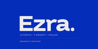
$20.00A modern and slightly wide sans serif, Ezra Sans Family! Ezra Sans is a casual and modern sans. With slightly wide form and modern details, this font looks more casual for your any project and designs. This font also contain an alternate in selected characters that will make this font even more stunning. You can use it for a tittle, logo, quotes, or become a pairing in any font. This font also support multi language! Support Multilingual up to 14 languages - Elvian Andreani by Scratch Design,
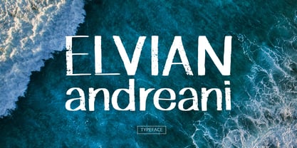
$9.00Elvian Andreani is a handwritten font with board marker style, and an authentic texture and casual look and vintage style. This font is useful in various designs such as quotes, menus, logos, branding, clothing and other designs with casual or vintage concept. Elvian Andreani also includes support for multiple languages. Feature: - Uppercase & Lowercase - Numbers - Punctuation - Multilingual Support (ÀÁÂÃÄÅÇDÐEÈÉÊËIÌÍÎÏNÑOØÒÓÔÕÖUÙÜÚÛWYÝŸỲŸÆŒßÞþ) Support in Mac and Windows OS, Easy to install We hope you like it and thank you so much for purchase :) Scratch Design - Elicit Script by Monotype,
$40.99Elicit Script is a hybrid script family, that can be as casual or formal as the occasion demands. Created by Laura Worthington and Jim Wasco, the design is based on pointed pen Spencerian Script handwriting. “It’s like one of those German italics from the early 20th century, that have beautiful shapes that hold their own,” says Wasco. Elicit Script spans five weights, from Extra Light to Bold, and three styles – Formal, Normal and Casual. This makes it an incredibly versatile script design, easily paired with other typefaces and able to be dressed up or down, depending on what it’s used for. The monoline Casual style offers a more relaxed tone of voice, while Formal sits at the more decorative end of the spectrum. Designers can keep things straightforward, tidy and practical with the typeface’s simple caps, or add in swash caps if they need more exuberance and expression. Generous spacing means Elicit Script works well at smaller sizes as well. Elicit Script Variable Set is a single font file that features two axes: Weight and Contrast. The Weight axis has instances from Extra Light to Bold. The Contrast axis has instances from Casual (low contrast) to Formal (high contrast). - Curwen Initials by ARTypes,
$30.00Transcribed from letters designed by Jan van Krimpen for The Curwen Press at Plaistow, London, in 1925; printed on pages 49, 51 & 53 of A Specimen Book of Types and Ornaments in Use at The Curwen Press (1928). A setting at 120 pt is recommended to match the size of the original. - Airbuzz by Spinefonts,
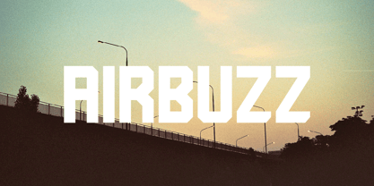
$14.00Airbuzz is a typeface created by Spinefonts in Warsaw, Poland. The idea was to create something between grotesk and 'lcd' typefaces; something which is strong and condensed. Airbuzz looks best in large sizes (30+ pts). You may find it useful for posters, titling, infographics, signage and corporate identity. Airbuzz features only uppercase characters. - Another Shabby by Zetafonts,
$39.00 - Sunday Market by Melonaqua,
$12.00 - Pepino by Robert Petrick,
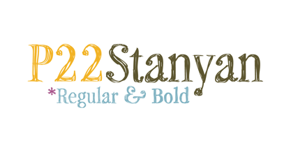
$19.95 - P22 Stanyan by P22 Type Foundry,
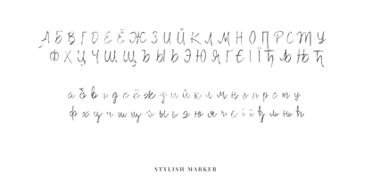
$24.95 - Stylish Marker by Pedro Teixeira,
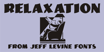
$14.00 - Relaxation JNL by Jeff Levine,
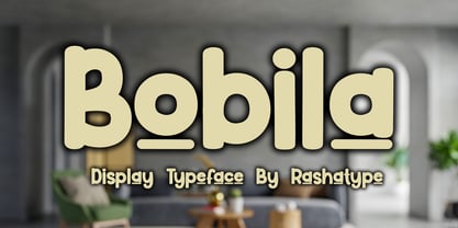
$29.00 - Bobila by Rashatype,
$10.00 - Swing Band JNL by Jeff Levine,
$29.00 - P22 Kaz by IHOF,
$24.95 - Moderator JNL by Jeff Levine,
$29.00 - Arco Web by Okaycat,
$29.95 - Love Radiate by Seemly Fonts,
$12.00 - Easter Discover by Seemly Fonts,
$14.00 - Caballero by Fabio Godoy,
$29.95Typographical Caballero is a family created by Fabio Eduardo Godoy Angel, the concept is inspired by a type with firm and clear, with perfect posture and personality to be used by Graphic Designers and Architects, in terms of print, TV Corporate Identity, Merchandising - Other Projects. Ideal for antetétulos, titles, subtitles, texts from 12 Pts. Caballero Outline and Caballero Outline Italic, are presented as an option for antetétulos, titles and subtitles as well as short texts from 20 Pts. Caballero in his presentation Outline, allows wide range of applications in regard to the use of color, and be combined with Caballero Regular and Caballero Italic. Font Project Caballero, is set with a vertical and horizontal logic calligraphic lines, amount of contrast medium, antlers mullet and its completions are straight. - Nouveau Work JNL by Jeff Levine,
$29.00 - Cardhonie by Cititype,
$12.00 - LD Cursive Flourish by Illustration Ink,
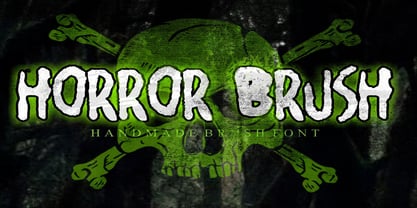
$3.00LD Cursive Flourish is the ultimate in casual elegance. This handwritten script comes complete with fancy flowing flourishes. Intricate and so unique! See LD Cursive for this font without flourishes. - Horror Brush by Gassstype,
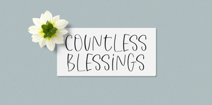
$27.00 - Countless Blessings by Epiclinez,
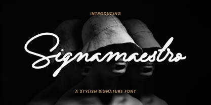
$14.00 - Signamaestro by Almarkha Type,
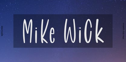
$35.00 - Mike Wick by Epiclinez,
$18.00

