6,589 search results
(0.035 seconds)
- Delicato Pro by MAC Rhino Fonts,
$59.00 In many aspects, built in a traditional way. Still, some modern details have been implemented which classic designs sometimes lack. The prime goal was to make a strong text font for books and longer texts in general. This fact does not exclude the possibilites for use elsewhere. Throughout history existing designs have often been the source of inspiration for newer ones. Delicato is no exception and looking closely, similarities can be found in the lowercase of Jeremy Tankard’s Enigma and the stems of Petr van Blokland’s Proforma. The goal is to respect these sources and turn the the typeface into something new with a unique and personal touch. Most text faces carry a basic set of weights like Regular, Italic, Bold and Small Caps. MRF wanted to expand that a little bit further and added a Medium, Alternates and a set of Ornaments to make the family complete and versatile.
 - Korolev by Device,
$39.00 DF Korolev is a 72 weight geometric sans serif family based on lettering by an anonymous Soviet graphic designer from the propaganda displays at the Communist Red Square parade in 1937. It has been named in honor of Sergey Pavlovich Korolyov, or Korolev, considered by many to be the father of practical astronomics. Rational and robust, it is also elegant and refined. Tracings done in Illustrator over a photograph featuring this type pinned down some of the basic character shapes. These were then imported into FontLab, where the full glyph complement was developed. The lower-case has been designed from scratch, and adheres to the structural logic of the uppercase as closely as possible. The complete Korolev super-family includes standard, italic, condensed, and compressed versions, each in five weights. Try the ‘rounded’ and ‘rough’ companion families. The Alternate families come with a double-story “a”.
 - Museum Tertia Cursive by T4 Foundry,
$21.00Museum Tertia Cursive is inspired by a beautiful set of 126 matrices in the Swedish Norstedts type collection. These types were probably manufactured in Germany before 1750. The matrices are part of a set imported to Sweden by J.P. Lindh from Breitkopf & Härtel 1818. Now this exquisite design is available again, thanks to type designer Torbjörn Olsson. Please note modern additions like the ?-mark, @-sign and €-sign. Museum Tertia Cursive is an OpenType creation, for both PC and Mac. Swedish type foundry T4 premiere new fonts every month. Museum Tertia Cursive is our eighth introduction. Museum Tertia Cursive is part of the growing Museum type family. Museum also includes three different border fonts, an ornament font with some of Granjon's arabesques and a flowery Fournier font with Rococo capitals. - Curtain Up JNL by Jeff Levine,
$29.00 The 1937 sheet music for the tune "Sweet Stranger" has the title hand lettered in a round cornered Art Deco sans with an inline featuring square corners. Now available as Curtain Up JNL, it is available in regular, oblique, solid and solid oblique versions (for those who prefer a version without the inline).
 - ITC Greengate by ITC,
$29.99ITC Greengate is the result of a time-traveling, intercontinental collaboration--one between 21st century South African designer Richard Every, and early 20th century Scottish artist Jessie Marion King. Jessie Marion King (1875-1949) began her professional career as a book designer and illustrator, but over time her creativity found its outlet in many forms, including posters, jewelry, ceramics, wallpaper, fabrics, murals, interior design and costumes. After eventually settling in Kirkcudbright, Scotland, she founded Green Gate Close, a center for women artists. Although her style is reminiscent of the Art Nouveau artist, Aubrey Beardsley, King's aesthetic was an offshoot of the “Glasgow Style,” a Scottish hybrid of the Arts and Crafts movement and Art Nouveau. Often, her illustrations included hand lettering. It was just this kind of lettering that gave Richard Every his inspiration for ITC Greengate. When he saw some children's book illustrations that King created in 1898, he knew on the spot he had to complete the hand lettering as a typographic font. He began working on the typeface in 1996, but it took six years to be released as an ITC typeface. Every simplified and harmonized King's letterforms slightly and, most importantly, added a suite of lowercase characters. The result is a somewhat earthy Art Nouveau design, with a character quite distinct from typical digital revivals. Every's career has been as diverse as King's. He was born in Durban, South Africa and studied graphic design at ML Sultan Technikon in Durban. He's been an art director, freelance designer, the owner and manager of a nightclub and co-manager of a South African band. “Through it all,” he says, “typography has always been one of my passions.” - Wood Bonnet Grotesque No.4 by astype,
$46.00 After release of Wood Bonnet Antique No.7 some of my clients asked for a sans serif version. So I printed my second batch of old wood type. I transferred these wood type into a digital font and tried to preserve the warm vintage look. » pdf specimen « The font offers up to four glyph variations of all the Latin base letters, figures and some additional letters - It has an build in letter randomizer. Please check you have turned on contextual alternates in your application. If you prefer a more common look and need more weights or to use the font in smaller text sizes I have done clean and sharp font family called Bonnet Grotesque Nr. It’s the preferred version for all the usages on websites, apps or ebooks. Have fun!
 - This Little Piggy - Personal use only

- Mislab Std by Typofonderie,
$59.00 A brighter slab n’ sans in 18 styles Referred to as Egyptian’s in the early years of the nineteenth century, today slab serifs are primarily used in display sizes but seldom used in body text. With Mislab, Xavier Dupré has designed a brighter and more legible slab serif than most. Mislab aptly combines the strength of a slab serif with the lightness of a sans serif. Bold and thick serifs make for strong impact in display uses while performing extremely well under the most stressful body text conditions. A slight cursive feel adds spice to the text while its delicate rounded rectangular structure is naturally adapted to screen displays. The capitals have fully assumed serifs while the lowercases have more discreet versions. Notable features include sanserif endings on the lowercase a, c, e & s, inducing fluidity and enhanced readability. This highly versatile typeface brings clarity to headlines. Mislab will provide foolproof stability to your layouts. Mislab, a new design by Xavier Dupré Type Directors Club 2014 Tokyo TDC 2014 Communication Arts Typography Awards 2014 Club des directeurs artistiques, 45e palmarès Slanted: Contemporary Typefaces #25
 - Verdana Pro by Microsoft,
$40.00 The Verdana typeface family was designed specifically to address the challenges of on-screen display. Verdana was originally designed by world-renowned type designer Matthew Carter, and tuned for screen display by the leading TrueType hinting expert, Tom Rickner. The Verdana fonts are unique examples of type designed specifically for the computer screen.The Verdana family received a major update in 2011 as a collaboration between The Font Bureau, Monotype Imaging and Matthew Carter. The original Verdana family included only four fonts: regular, italic, bold and bold italic. The new and expanded Verdana Pro family contains 20 fonts in total. The Verdana Pro and Verdana Pro Condensed families each contain 10 fonts: Light, Regular, Semibold, Bold and Black (each with matching italic styles).Verdana exhibits characteristics derived from the pixel rather than the pen, the brush or the chisel. The balance between straight, curve and diagonal were meticulously tuned to ensure that the pixel patterns at small sizes are pleasing, clear and legible. Commonly confused characters, such as the lowercase i j l, the uppercase I J L and the number 1, have been carefully drawn for maximum individuality - an important characteristic of fonts designed for on-screen use. Another reason for the legibility of the Verdana fonts on the screen is their generous width and spacing.Designed by David Berlow and David Johnathan Ross of the Font Bureau, with typographic consultation by Matthew Carter, the new Verdana Pro includes a variety of advanced typographic features including true small capitals, ligatures, fractions, old style figures, lining tabular figures and lining proportional figures. An OpenType-savvy application is required to access these typographic features. The expanded weights and completely new condensed range of fonts provide designers with an expanded palette of typographic options for use in print and on-screen, in both small text sizes and headlines.
 - Lapis Pro by Canada Type,
$29.95 Lapis was Jim Rimmer's venture into a territory he'd earlier explored with his Lancelot and Fellowship faces. This time he stayed much longer, dug pretty deep, and had plenty of fun in there. The end result is the kind of mosaic of influences only a guy like Jim could consider, gather, manage and apply in a way that ultimately makes sense and works as a type family. On the surface Lapis seems like something that can be billed as what Jim would have called an "advertising text face". But under the hood, it's a whole other story. On top of the calligraphic, nib-driven base Jim usually employed in his faces, Lapis shows plenty of typographic traits from a variety of genres, from Egyptian to Latin, from blackletter angularity to Dutch-like curvature, with an overall tension even reminiscent of wood type. There are some Goudy-informed shapes that somehow fit comfortably within all this. Then it's all strung together with a mix of wedged, tapered and leaning serifs, placed with precision to reveal expert spontaneity and a great command of guiding the forms through counterspace. In the fall of 2013, the Lapis fonts were scrutinized and remastered into versatile performers for sizes large and small. The three weights and their italic counterparts have been refined and expanded across the board to include small caps, alternates, ligatures, ordinals, case-sensitive forms, six kinds of figures, automatic fractions, and a character set that covers an extended range of Latin languages. Each of the Lapis Pro fonts contains over 760 glyphs. For more details on the fonts' features, text and display specimens and print tests, consult the Lapis Pro PDF availabe in the Gallery section of this page. 20% of Lapis Pro's revenues will be donated to the Canada Type Scholarship Fund, supporting higher typography education in Canada.
 - Remachine Script Personal Use - Personal use only

- BILLY ARGEL FONT - Personal use only

- Urban Brigade - Personal use only

- PORT118 - Unknown license

- Frangipani Rose - Personal use only

- TypographerGotisch Schmuck - Unknown license

- KD Arguru Stencil by Kassymkulov Design,
$20.00 KD Arguru Stencil is a geometric display font that will give your projects an elegant look. It breaks away from traditional stencil faces by using circle as a main design element. Originally published in 2014, it's now been updated with changes to letter shapes, curves, OT features.
 - Rauda Slab by Graviton,
$12.00 Ruda Slab font family has been designed for Graviton Font Foundry by Pablo Balcells in 2017. It is a display, slab serif, geometric typeface, with sharp angles that provides a strong and solid appearence. Ruda Slab consists of 8 styles. Each containing glyph coverage for several languages.
 - Bajka by Posterizer KG,
$16.00 Bajka (or Fairy tale in English) is a Baskerville font family made for children’s fairy tale books. Originally designed in 2010 ([www.behance.net/gallery/483582/Fairy-tale-font Fairy tale Font]). Today the family contains Regular, Bold, Italic, Bold Italic, Symbols and Ornaments (Latin, Cyrillic, dingbats, ornamental caps).
 - Dolce Caffe by Resistenza,
$39.00 Dolce Caffe is a pretty hand-written font, designed in 2011, that is very legible and high in style and carefully constructed all-uppercase letters. It was totally inspired by hand-written chalkboards in Berlin, a city that I love. Take also a look at Merendina
 - AT Move Bulky by André Toet Design,
$39.95 BULKY is the 19th Font of André Toet. It’s Unusual, it’s Heavy, it’s Irregular, it’s Rough, it’s Stripy, it’s Angular, it’s BULKY. But it has character and extremely useful for headings, posters and even logotypes. Just-Use-It! Concept/Art Direction/Design: André Toet © 2017
 - Violenta by Graviton,
$12.00 Violenta font family has been designed for Graviton Font Foundry by Pablo Balcells in 2015. It is a display, geometric typeface, with a condensed design and sharp angles that provides an aggresive and strong appearence. Violenta consists of 8 styles. Each containing glyph coverage for several languages.
 - Kiva Sans by Kosinsky,
$30.00 Kiva sans - it is a modern grotesque with open forms and visible contrast. The font is built according to the experimental principle, which, to some extent, makes it stand out. Perfect for both small text and headings. The font supports Cyrillic and Latin. Developed in 2021.
 - Linotype Authentic Sans by Linotype,
$29.99The German designer Karin Huschka created the fonts Linotype Authentic™ (1999), Chineze Dragon™ (2002) and Picture Yourself™ (2003, with Peter Huschka). The text font Linotype Authentic is part of the TakeType Library, chosen from the entries of the 1999 International Digital Type Design Contest. - Jumbo Sale by Eko Bimantara,
$19.00 Jumbo Sale is a bold and comical display font designed and published by Eko Bimantara in August 2022. This font has fun, bold and loud characteristics. Fit for titles, brand, product packaging and big size display. It has more than 300 glyphs which cover broad latin languages.
 - Industrial Arts JNL by Jeff Levine,
$29.00 In 1935, Morris Fuller Benton designed Phenix American for American Type Founders. For 2017, the classic Art Deco design has been reinterpreted in an all-caps display version with an ever-so-slight "hand made" feel. Industrial Arts JNL is available in both regular and oblique versions.
 - KD Bombarda by Kassymkulov Design,
$9.95 KD Bombarda is a piano-key, stencil and display face that will make your projects stand out from the crowd by introducing some interesting letter shapes. Originally designed in 2013, it's now been edited to provide smoother curves with broader character and feature support including Cyrillic.
 - Rodeo Drive by Vozzy,
$10.00 Introducing vintage label font duo named Rodeo Drive. This typeface was inspired by various signs and lettering from the Wild West.This font has an additional characters and multilungual support (check out all available characters on previews). Font family has four styles: Regular, Texture, Extrude and Extrude FX. This font will look good on any western styled designs like a poster, T-shirt, label, logo, etc.
 - Mothra by madeDeduk,
$15.00 Introducing MOTHRA use this font for any branding, product packaging, invitation, quotes, t-shirt, label, poster, logo etc. Feature Uppercase & Lowercase Number & Symbol International Glyphs Multilingual support Feel free to drop us a message any time and follow my shop for upcoming updates Shoot me on email at: dedukvic@gmail.com and find more previews on my Instagram here : https://www.instagram.com/acekelgondolayu/?hl=en Hope you enjoy it.
 - Fagetone by Prioritype,
$15.00 Dating back to the 60s 70s, this retro script font comes in bold bold and thin, perfect for your projects and supports multilingualism and other character additions. Can be applied to various print and digital media such as food packaging, clothing stores, accessories, clothing, creative goods, antique workshops, sports, entertainment and even logos. For reference, see preview. Features: -Uppercase -Lowercase -Numeral -Punctuation -Ligature -Multilingual
 - Angry&Hungry by Haksen,
$12.00 Hello Everybody, I just want to introduce my new twin cute fonts in one. These are "Angry & Hungry". As the preview images, This font comes with funny, cute taste. These fonts can be used in everything your requirement. What's include : - Angry & Hungry otf - Angry &Hungry Shadow otf - Angry & Hungry Script otf - Angry & Hungry Script Shadow otf If any question, please contact me. Happy Designs, Haksen
 - Fresh Milky by Forberas Club,
$16.00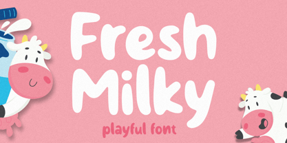 Fresh Milky Font is script font inspired by modern and ligature characters. It is especially designed for luxury, elegant, feminine projects, Fresh Milky Font is perfect for creating modern and chic designs such as logos, packaging, editorials and more. this Fresh Milky Font is only available for personal use. So, if you want to use its full features and license, get the premium version as well!
 - Donut Power by Forberas Club,
$16.00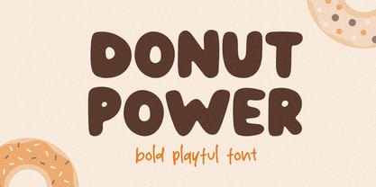 Donut Power Font is script font inspired by modern and ligature characters. It is especially designed for luxury, elegant, feminine projects, Donut Power Font is perfect for creating modern and chic designs such as logos, packaging, editorials and more. this Donut Power Font is only available for personal use. So, if you want to use its full features and license, get the premium version as well!
 - Neoreby by Graphicfresh,
$25.00 Starting the new year with a new font. We present something different. The font this time has a straight-line theme. This font is inspired by the lamp style of the past few years. Elongated incandescent lamp. We combine aesthetic and elegant styles in the preview. Actually suitable also for styles in neon form. But we're taking a little dive into the style of today's design trends.
 - South Pacific by Nicky Laatz,
$26.00 Say hello to South Pacific Marker , a new bold inky font with a casual handwritten feel. South Pacific includes a large selection of natural-looking ligatures and extra alternate characters ( see previews) in it's Opentype Features - make sure you have your stylistic alternates switched on to enjoy all the extras. Four handy swashes are also included in the glyphset - accessible via your glyphs panel.
 - Hello Youthen by Nathatype,
$29.00 Hello Youthen is a script font that comes with exquisite character changes, a kind of classic decorative copper script with a modern twist, designed with high detail for a fun style. Our font always includes Multilingual Support to make your branding reach a global audience. Features: Ligatures Alternates Stylistic Set PUA Encoded Numerals and Punctuation Thank you for downloading premium fonts from Natha Studio
 - Tiffany Laurence by Ronny Studio,
$24.00 Tiffany Laurence Serif is a classy eighties magazine-inspired font - with complementary italic versions. Both come in two versions one with more contrast and sharper than the other. In true Eighties style. This font looks premium and is very suitable for your design needs such as invitations, labels, logos, magazines, books, greeting / wedding cards, packaging, fashion, make up, stationery, novels, labels or any type of advertising purpose.
 - Time To Play by Vozzy,
$10.00 Introducing vintage label font named Time To Play. This font has a wide languages support with west european and cyrillic characters (check out all available characters on previews). The font family has four styles: Base, Grunge, Volume and Texture. All styles have the same metrics and kerning. This font will look good on any vintage styled designs like a poster, T-shirt, label, logo, etc.
 - Sweet Mones by Gatype,
$14.00 Introducing Sweet Mones for your better work. With a classy and natural handwriting style, it features a classy and chic typeface. Sweet Mones is best used for a variety of designs, such as posters, banners, logos, book covers, titles, print products, merchandise, social media, and more. Find out more ways to use this font by previewing the font. Thanks and good luck with your design
 - Bugleboy by Stiggy & Sands,
$29.00 Bugleboy started as a digitized version of "Wood Grotesk," a 1970s film typeface by LetterGraphics. It started with a bare bones character set which we added swash alternates for Capitals, Stylistic Alternates for a Unicase look, and crafted a Sans version without serifs. The Sans style lacks swashes but keeps Stylistic Alternate Unicase forms. See the last graphic for a comprehensive character map preview.


