10,000 search results
(0.04 seconds)
- PorschaC - Personal use only
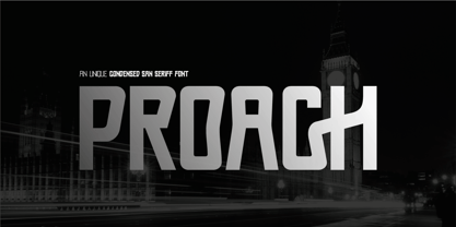
- Proach by Grontype,
$10.00 - 911 Porscha - Personal use only
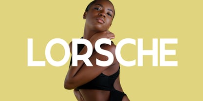
- Lorsche Display by FoxType,
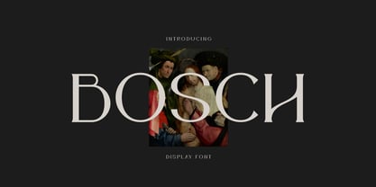
$10.00 - Bosch by iframe,
$32.00 - Gorchs by T-26,
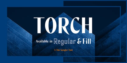
$19.00 - Torch by Bunny Dojo,
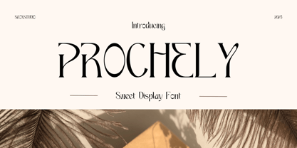
$23.00 - Prochely by Sronstudio,
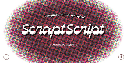
$23.00 - Scrapt Script by Brainware Graphic,
$12.00 - Posh by Lián Types,
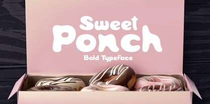
$49.00 - Sweet Ponch by Gleb Guralnyk,
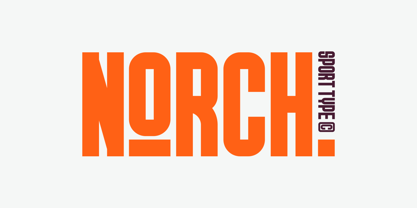
$12.00 - GR Norch by Garisman Studio,
$20.00 - Lane - Posh - Personal use only
- Scripty by Turtle Arts,
$20.00 - Escript by Linotype,
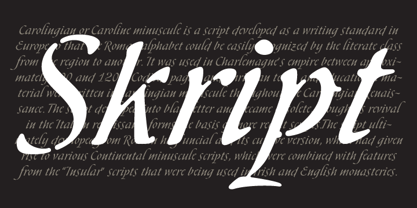
$29.99 - Skript by Wilton Foundry,
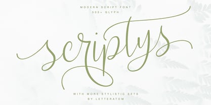
$49.00 - Scriptys by Atom,
$14.00 - Torches Realistic Brush Font by Maulana Creative,
$13.00 - Jatina Script - Personal use only
- Coors Script - Personal use only
- Isyana Script - Personal use only
- Blantick Script - Personal use only
- Bianka Script - Personal use only
- Kaushan Script - 100% free
- Brock Script - Personal use only
- Sweetheart Script - Personal use only
- Kelly Script - Unknown license
- Emalia Script - Personal use only
- Tipbrush Script - Personal use only
- Marcelle Script - Unknown license
- Annabel Script - Unknown license
- Rocket Script - Personal use only
- Mural Script - Unknown license
- ALS Script - Unknown license
- Marketing Script - Personal use only
- Reprise Script - Unknown license
- ILS Script - Unknown license
- SCRIPT 9 - Unknown license
- Maxine Script - Unknown license
- Structurosa Script - Unknown license
Page 1 of 250Next page

