10,000 search results
(0.021 seconds)
- Etruria by Dima Pole,
$34.00 Font Etruria is based on a real Etruscan inscriptions and realistic accurately simulates the writing of the Etruscans. The idea of the font Etruria is to give an opportunity for anyone to touch the past of mankind! The character of the Etruscan alphabet involves the creation of a font with only uppercase letters. However, I did not limit this font by that. Etruria has not only a lowercase is different from uppercase, but an additional sets of alternative characters. In General, the main characteristic of Etruscan writing is randomness and diversity of characters. Differs from lowercase to uppercase is only the first step on the road to make randomness effect. Next to the aid of the OT features. To recreate the randomness effect, in Etruria there are several OT features (Contextual Alternates, Stylistic Alternates and Stylistic Sets), which built a script to simulate randomness. Additionally, another script creates the effect of random positioning. Together they create incredibly realistic Etruscan inscription. Thus, any of these features can be disabled at will. I also used a small line spacing, because it is characteristic of the Etruscan writing. Actually the Etruscan writings is a mirror of the writings compared with the current European alphabets. I didn't use this feature all the letters, because this would make the font difficult to perceive, but to make the font characteristic of the Etruscan style, Etruria has a few letters in mirror image. However, if for someone it may seem unusual, mirrored letters can be disabled instead of them will appear more familiar to them. Another feature of Etruscan writing is the use instead of a space dotacentered. Font Etruria has this feature, there is a OT feature Stylistic set ss03. Naturally, it also can optionally be disabled. All these features can be used together, separately, or turn it off. The main goal achieved! The text typed in Etruria, creates full impression of these Etruscan inscriptions.
 - Bilhete by Vernacular,
$9.99 Bilhete ('note') is a font for a quick writing. You can write a poem, a shop list or your name in a coffee cup. Any note on your project will have a personal taste with Bilhete by Vernacular. :)
 - Rolling Pen by Sudtipos,
$79.00 After doing this for so many years, one would think my fascination with the old history of writing would have mellowed out by now. The truth is that alongside being a calligraphy history buff, I'm a pop technology freak. Maybe even keener on the tech thing, since I just can't seem to get enough new gadgets. And after working with type technologies for so many years, I'm starting to think that writing and design technologies as we now know them, being about 2.5 post-computer generations, keep becoming more and more detached from what the very old humanity arts/tasks they essentially want to facilitate. In a world where command-z is a frequently used key combination, it’s difficult to justify expecting a Morris-made book or a Zaner-drawn sentence, but accidental artistic “mutations” become welcome, marketable features. When fluid pens were introduced, their liquid saturation influenced type design to a great extent almost overnight an influence professional designers tend to play down. Now round stroke endings are a common sight, and the saturation is so clean and measured, unlike any liquid-paper relationship possible in reality. Some designers even illustrate their work by overlaying perfect circles at stroke ends, in order to illustrate how “geometric” their work was. Because if it’s measured with precise geometry, it’s got to be meaningful design. And once in a while, by a total freak accident, the now-cherished mutations prove to have existed long before the technology that caused them. Rolling Pen was cued by just such a thing: A rounded, circular, roll-flowing calligraphy from the late nineteenth century seemingly one of those experimental takes on what inspired Business Penmanship, another font of mine. Looking at it now it certainly seems to be friendlier, more legible, and maybe even more practical and easier to execute than the standard business penmanship of those days, but I guess friendliness and simplicity were at odds with the stiff manner business liked to present itself back then, so that kind of thing remained buried in the professional penman’s oddities drawer. It would be quite a few years before all this curviness and rounding were thought of as symbolic of graceful movement, which brought such a flow closer to the idea of fine art. Even though in this case the accidental mutation just happens to not be a mutation after all, the whole technology-transforms-application argument still applies here. I'm almost sure “business” will be the last thing on people’s minds when they use this font today. One extreme example of that level of disconnect between origin and current application is shown here, with the so-called business penmanship strutting around in gloss and neon. Rolling Pen is another cup of mine that runneth over with alternates, swashes, ligatures, and other techy perks. To explore its full potential, please use it in a program that supports OpenType features for advanced typography. Enjoy the new Rolling Pen designed by Ale Paul with Neon’s visual poetry by Tomás García.
 - Advertising Gothic by Scriptorium,
$12.00Advertising Gothic is based on a style of fonts from the 1920s which was commonly used in advertising and poster design. The style is clearly influenced by the Art Deco movement. It combines deco style decorated initials with dramatic capital letters. The font comes in two different versions. Advertising Gothic Plain features initials which do not have the deco decorations and less fancy letter forms. Advertising Gothic Deo features deco embellishments on the initials and more elaborate versions of the main letter forms. - Biofolio Ultimate by Formatype Foundry,
$30.00 Behance Biofolio Ultimate is geometric Grotesk typeface exploration proportion and simplicity in typeface, Inspired by the elegant plainness seen in many of the less common 20th centuries sans Comes in 10 weights matching Italics —20 fonts in all, Biofolio Ultimate supports around 150 languages in the Latin based languages, Designed with multiple OpenType features, such as powerful stylistic alternates, case-sensitive forms, contextual and stylistic alternates. The standard numerals set encompasses tabular figures and symbols, superiors and inferiors, numerators and denominators, plus fractions.
 - Atwin by Cubic Type,
$14.00Atwin is a modern remake of Franco Grignani’s Gemini. It is inspired by the unusual forms of the MICR numbers on bank cheques. Strangely rounded rectangles make the glyphs appear unfamiliar; an angular but also blobby design that disrupts and breaks away from tradition. Good in display sizes. You should use Atwin to add flair and confidence to sci-fi, futurist, outré, or just plain unusual materials. 13 additional alts are supplied in the A to Z alphabet. Kerned to perfection. Tight. - Salzmann Deco NF by Nick's Fonts,
$10.00This seriously styling family of typefaces is based on Dolmen and Zierdolmen, designed by Max Salzmann for the J. G. Schelter & Giesecke foundry of Leipzig in 1922 and 1923. Unlike previous revivals, these fonts remain true to Salzmann’s original designs. The plain version also features all of the standard German ligatures, accessible through the hlig feature, included in the original release. Both versions feature the complete Latin 1252, Central European 1250 and Turkish 1254 character sets, with localization for Lithuanian, Moldovan and Romanian. - Achispado by Linotype,
$29.99Achispado which means tipsy or slightly drunk in Spanish is the name of a crazy funk font that was designed by Richard Yeend in 2003. Full of comic almost architectural elements bit and pieces of the entire history of lettering come together to create the letterforms of this typeface. Text set in Achispado will look just plain fun if a little tipsy at the same time! Achispado could be used in large display settings, in fashion or on jewelry items. - Rosemont by Scriptorium,
$24.00Rosemont is a playful new font which hovers on the bordeline between Arts and Crafts style and Art Nouveau style. It has the narrowness of Art Nouveau fonts like Adresack, Spoonbill and Coloma, with the curls and unique character forms of Art Nouveau fonts like Beauvoir or Acadian. The result is an interesting looking font which could be at home in either design environment. Rosemont features two sets of upper case characters, one with more decoration and one which is more plain. - ATF Headline Gothic by ATF Collection,
$59.00 ATF Headline Gothic cries out to be used in headlines, and that is exactly how it was used after it was first created by American Type Founders in 1936 with newspapers in mind. It would be hard to imagine a better typeface for a shocking, front-page headline in a scene from an old black-and-white movie. With its all-caps character set, and its big, bold, condensed design, ATF Headline Gothic is the epitome of its name. “Extra! Extra!” The style of ATF Headline Gothic recalls the bold, condensed gothic display faces of the 19th century, but with more refinement in its details than many large types of the time (typically wood type). Its most recognizable trait is the restrained, high-waisted M, with short diagonal strokes that end with their point well above the baseline; this avoids the sometimes cramped look of a bold condensed M with a deep “V” in the middle, common in many similar headline faces. The digital ATF Headline Gothic comes in a single weight, all caps, like its predecessor, but offers two styles: one crisply drawn, and a “Round” version with softer corners, to suggest a more “printed” feel, reminiscent of wood type. Of course, in either style it includes a full modern character set, including symbols such as the Euro, Ruble, and Rupee, that didn’t exist in 1936.
 - KG Something To Believe In by Kimberly Geswein,
$5.00 Highly legible writing with a painted, stamped effect.
 - Fulgora by Sudtipos,
$39.00 Fulgora is a sort of ‘calligraphic typography’ or ‘typographic calligraphy’, depending on the point of view. Inspired by late-medieval Bâtarde and Civilité blackletter styles, the Kannada and Sinhala writing systems from Southern India, Celtic uncials, and diverse vernacular Mexican scripts, Fulgora was created straight from pen on paper as a personal calligraphic style where fantasy in the chief ingredient. The idea to take it to the digital realm came later, as an extension of the creative process. To this end, originals for each character were made, directly traced with the nib with no retouching, then vectorized to be digitally assembled. Work has been done on spacing and kerning with the aim to digitally reproduce an utterly calligraphic outcome keeping the natural, imperfect, manual finish of all signs. Fulgora has two variants: Blanca (white) and Negra (black), executed with different nib widths but the same style and proportions.
 - Quota by Ryan Williamson,
$- Quota is an investigation into the modularity of the Cyrillic alphabet. Unlike Latin and Greek, the Cyrillic alphabet owes much of its form to its development in early industrious printing and movable type. This lead the Cyrillic alphabet to be dominated by hard edge and straight lines, giving it a much more modular overall construction. The forms within the Cyrillic alphabet therefor allow for all the characters themselves to have somewhat unified side bearings without compromising ease of reading. Within Quota the default character set has only unified side bearing, giving a more relaxed mono-spaced appearance. While the first stylistic set unifies the entire character set with the same character width, creating a true mono-spaced typeface. Quota was initially designed in Cyrillic, catering to all languages using the alphabet. While the Latin was designed after, and is loosely based of the forms present within the Cyrillic alphabet.
 - Adorable Moggie by RagamKata,
$16.00 Adorable Moggie is a type of elegant display font that features large, bold lettering with unique decorative details on each character. The font gives off an elegant and classic feel, while still appearing modern and in line with current design trends. Adorable Moggie is well-suited for a variety of projects that require a high-end, eye-catching look, such as wedding invitations, luxury product packaging design, or promotional materials for brands looking to convey an exclusive and luxurious image. This serif font is also suitable for logo design or website design that aims to showcase a creative and elegant look, while still maintaining a professional and classic appearance." Features : - Ligatures & Alternates - Letters, numbers, symbols, and punctuation - No special software is required to use this typeface even work in Canva - Multilingual Support Please contact us if you have any questions. Enjoy crafting and thanks for supporting us! Thank you.
 - Nobody Home JNL by Jeff Levine,
$29.00 Nobody Home JNL is unusual in nature as it combines two vintage typestyles into one font. Both have been used for home and property identification for decades and still remain popular. Over the years the letters and numbers have been made of cast steel, aluminum, brass and plastic. The alphabet is in a distinctly bold, asymmetrical style, while the numbers almost take on a calligraphic feel. There is just a basic character set - alphabet, numerals and simple punctuation. While the font has been reasonably spaced and kerned, it's best to remember that neither type design was made with digital technology in mind, so it's suggested to adjust your layout manually for optimum results. Nobody Home JNL is best-suited for replicating street addresses, apartment numbers on doors, and homeowner (or apartment house) names on buildings - whether in print design or as plotter-cut vinyl graphics.
 - Bu Global by Butlerfontforge,
$18.00 While throned before your keys, under your drumming fingers awaits the most astounding standard computer typeface ever devised: BuGlobal. In addition to all the usual alphanumeric characters and symbols, this lone font lets you type more than 400 accented letters appearing in more than 80 English-variant languages worldwide, 70 common math and science symbols, and dozens of other useful characters —more than half a thousand all told— all within the digital parameters of one standard computer typeface, without needing any alternate keyboards or other clumsy digital luggage. Here is a sample: You can add any accent appearing in more than 80 English-variant languages used around the world to any letter appearing in all these languages simply by typing ANY letter then the accent. This includes more than 400 diacritic-laden letters in all —without needing to remember several keystrokes to type any of these letters as a few of them appear in standard computer typefaces. You can type more than 50 math/science symbols that do not appear in standard computer typefaces. These new symbols include several kinds of arrows plus constants, centerlines, dimensions, and graphs and scales that when retyped create continuous scales and graphs. Common symbols such as ballot boxes, rating stars, checkboxes, hearts, fancy fleurons, and similar motifs that do not appear in standard computer typefaces. Dozens of flashy arabesques like ========= [in BuGlobal these equal signs are kerned together so when you type them you create a continuous double line]. In this typeface more than 30 symbols that never appear twice in a row are kerned together so when you continuously type them you create all kinds of flashy arabesques that will make your typing more attractive. No other standard compute typeface allows you to do this. As for Beauty, BuGlobal’s characters are designed according to several axioms of ocular perception until each profile is as iconically simple as Shaker furniture. These axioms make BuGlobal’s letters easier to read compared to other typefaces, and a few of them are: Each letter should look much like the others but for one defining detail. The letters should be as similarly wide as possible. The letters’ midbars should be the same height and thickness. The higher the lowercase letters are compared to capital letters, the more legible and easily readable are their texts. BuGlobal has a typeface user’s guide, titled A Lovely Face, in which a description of each ocular axiom compares BuGlobal with Baskerville, Georgia, Palatino, and other commonly-used standard computer typefaces so you can quickly see why the other typefaces are inferior. You can download a pdf file of this typeface user’s guide, for free, at BuGlobal’s website, butlerfontforge.com, at any time so you can learn all about BuGlobal’s many amazingly new features before possibly buying it. BuGlobal’s plain letters are perfect for texts, its italics are gracefully emphatic, its bolds are ideal for titles and headers, and its arabesques are a fancy way to make your texts look dressy —all of which will add more shimmer to your semantic plumage. One good typeface is more useful than an infinity of poor ones. Robert Bringhurst
 - Caleuche by RodrigoTypo,
$25.00 Caleuche is a typeface family of 18 styles, from its standard version Light to UltraBold such as Rough and Inline, it is a display typeface that plays with the style of action, mythology, terror and suspense.
 - Apollonius by Typogama,
$25.00 Apollonius is a high contrast, display typeface designed by Michael Parson. Packed with Opentype features, this single weight font offers a whole range of options that designers can explore and play with to create stunning layouts.
 - Riangriung by Gartype Studio,
$13.00 Fun and friendly characters gave us the inspiration to make this funny layered font family called Riangriung, which means fun, happy, joyful, colorful. Riangriung comes in 4 different styles for you to enjoy and play with!
 - Hieroglyph Informal by Grummedia,
$20.00Designed for a role-playing scenario, this font uses Egyptian hieroglyphs closely relating to characters in the English alphabet as its starting point. It’s fun to use and has many extra hieroglyphs taken from monumental carvings. - Handy Cut by Los Andes,
$34.00 Handy Cut is an experimental project inspired by paper cutting only using fingers, designed by Paty Bean from south Chilean farm. It includes dingbats and alternate characters to play with in expressive and irregular short texts.
 - Liebelei Variable by Wannatype,
$138.00 The typeface Liebelei has its roots back in 1932, when Vienna-based painter Rudolf Vogl created the poster for a movie called Liebelei after the popular play by Arthur Schnitzler. Now also available as Variable font!
 - Enforcer by Tour De Force,
$25.00 Modern simple typeface expressing sharp and bright words without need for writing something really smart. Made by Dusan Jelesijevic one day when he left without anything smart to say or write, so he just grabbed a pencil and forced the paper to be cooperative. Someone said that this typeface looks like the ancient Greeks went in present future and used contemporary equipment for writing those letters. It is ideal for branding and avantgarde identities.
 - At Tupats by Arttype7,
$12.00 At Tupats is inspired by the name of a common food from Indonesia during Eid: ketupatfood. This font is in the Arabic style but for writing latin characters and words. The ligatures, stylistic sets, and contextual features of this font will make your writing similar to Arabic calligraphy. It is very suitable for writing in a Middle Eastern style and for use in restaurants, magazines, souvenirs, web, and many Ramadhan-themed projects.
 - 1917 Stencil by GLC,
$38.00 We have created this family inspired by the old-fashioned stencil letters like those the French army used during the WWI to write on soldiers' clothes, blankets, signals, ammunition, supplies and so on. This is a Didone-style font. We offer two variants for the same font: monospaced or proportionally spaced. Our Open Type specification allows automatic substitution of letters to avoid repeating the same glyph when a letter is repeated (for example “ee” or “bb”)(Not available with accented characters and a few others like “Q” that are never repeated in common use).
 - Interlude by Scriptorium,
$12.00Interlude originated with some title lettering which we found in an Austrian theatre program from the early 1900s. With some more research we found a similar style called Tradition which was designed by Bernard Naudin and produced by a Parisian type house during the period before World War I. Using those two sources we ultimately produced two variant versions of the font, combining elements of the two sources. Interlude features characters with open areas in the heavier strokes, while Prelude is a solid, more script-like version of the style. - Woolen by Magpie Paper Works,
$32.00 Woolen is a hand-inked & italicized serif, based upon a 17th century type specimen by Jean Jannon. Many of the capital letters are decorated with subtle sprigs and leaves, while the lowercase letters remain classically styled, giving the font a warm and natural look with just the right amount of dignity. Woolen is perfect for logos and branding – she shines in retail identities, particularly for farms, markets, and restaurants. Even though the font is slanted, it reads beautifully as body text and display headlines. Multi-language support is included in the font.
 - Trade Gothic by Linotype,
$42.99 The first cuts of Trade Gothic were designed by Jackson Burke in 1948. He continued to work on further weights and styles until 1960 while he was director of type development for Mergenthaler-Linotype in the USA. Trade Gothic does not display as much unifying family structure as other popular sans serif font families, but this dissonance adds a bit of earthy naturalism to its appeal. Trade Gothic is often seen in advertising and multimedia in combination with roman text fonts, and the condensed versions are popular in the newspaper industry for headlines.
 - Pandtos by dayflash,
$31.99 Pandtos is a clear sans serif typeface based on geometric shapes. Precise lines and accurate curves are the main characteristics of this fresh and modern font family. While unique letterforms constitute Pandtos’ distinctive appearance, extended widths, tall x-heights and clear shapes provide good legibility and nice readability even at smaller sizes. With its contemporary feel, Pandtos is suitable for almost any type of analogue and digital application. The Pandtos font family includes unique letterforms, exclusive ligatures and extensive OpenType features. Pandtos comes in four weights with matching italics.
 - Golum by Type Innovations,
$39.00 Deep in the bowels of the earth a tortured creature tries to mimic the writings of mankind. It labors long and hard carving the letter forms on the walls of its cave. Many years later, rubbings where taken of these impressions and fashioned to create this hideous font. All kidding aside, with such a formal training in type design, it was not easy for me to create these ill-shaped letters. I kept wanting to smooth out the outlines. Anyway, it was a good exercise and we now have this antique heavy-weight.
 - Chapter 11 by Canada Type,
$24.95 Chapter 11 is a pseudo-random typewriter font with the ribbon on the fritz. The single font contains four different character sets of varying ranges. If your program supports advanced OpenType features, activate the contextual alternates to see the ghost in the machine while you type. Otherwise, character variations are accessible through any character map or glyph palette, so you can manually mix and match your setting. This font is highly recommended for use in filling out government bailout forms. It will make the whole world believe you actually need it.
 - Carot Slab by Storm Type Foundry,
$39.00 Words in a blurry world want to be more firmly anchored in the line - this is the task of the Slab-serif, characterized by solid heels. They can be used in extreme sizes – under 6 points – as well as on huge tarpaulins covering trucks, boats and house facades. Carot serves its robust clarity. The eye takes a while to become accustomed to various character simplifications, but then comes a refreshing reading perception, familiar texts get actual sound. The whole Carot system of 64 members offers a modern alternative for all types of design work.
 - Momentic Yesterday by Flawlessandco,
$9.00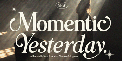 Momentic Yesterday is a Modern Font Duo that contains Serif and Italic Typeface also gives a feel of Elegant font type. There's some connected letters and some alternates that suitable for any graphic designs such as branding materials, t-shirt, print, business cards, logo, poster, t-shirt, photography, quotes .etc This font support for some multilingual. Also contains uppercase A-Z and lowercase a-z, alternate character, numbers 0-9, and some punctuation. If you need help, just write me! Thanks so much for checking out my shop!
 - Cavita by Underground,
$29.00 Cavita typeface is a mix between both grotesque and calligraphic models: regulars have a rough grotesque spirit; while the italics where inspired in calligraphic gestures. All of these details are reinforced with an inverted modulation (horizontals strokes are thicker than usual). The italics seem to move away from the traditional concept of type system, but work very well along side. This typeface has very particular shapes and rhythm, it's different and identifiable from the rest, making it a very good option to use on every piece of design.
 - Childfolk by Good Java Studio,
$23.00 Childfolk is the perfect font for all your fun designs. The main font file is equipped with ordinary characters, as well as more than 350 glyphs to support most Latin-based languages. Everything is made with the same brush, and everything is the same size as Letter Kids, so you can be sure they will work well together! It is suitable for you to use in making t-shirt design, quote, label, packaging, logo type, or long writing. Because we have compiled kerning and matrices that are tailored to your needs.
 - Dona by Harbor Type,
$30.00 🏆 Selected for Tipos Latinos 9. Dona is a non-boring sans serif. While very legible in text sizes, its friendly details really come to life on headlines, packaging and visual identities. To make it even more interesting, Dona Alt brings a different feeling with just a few different glyphs. The Dona type family comes in 5 weights, from Regular to Black, matching italics and an Alt version, totalling 20 fonts. If you need even more control, variable fonts are also available. Each font contains 528 glyphs and supports over 200 languages.
 - PR-Uncial by PR Fonts,
$10.00 This is our first font, based on Peter's own personal way of writing uncials, The rounded letters of the fourth to eighth centuries. The characters in the caps position are more closely related to the classical Roman forms, and the lowercase position has letters that are the more rounded, medieval forms, at the same size, so they can be freely mixed, for a hand lettered appearance. This typeface is currently used for the titles in the TNT Television show "the Librarians". It was originally designed in 1998, and is now available in Open Type Format.
 - Trade Gothic Paneuropean by Linotype,
$42.99The first cuts of Trade Gothic were designed by Jackson Burke in 1948. He continued to work on further weights and styles until 1960 while he was director of type development for Mergenthaler-Linotype in the USA. Trade Gothic does not display as much unifying family structure as other popular sans serif font families, but this dissonance adds a bit of earthy naturalism to its appeal. Trade Gothic is often seen in advertising and multimedia in combination with roman text fonts, and the condensed versions are popular in the newspaper industry for headlines. - Romantica Signature by Scratch Design,
$12.00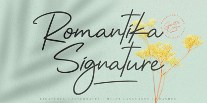 Introducing RomantiKa Signature! It's a modern script font with a signature style look. It's very recommended for you who want to make some designs with natural handwriting with signature style. Romantika will work for name card design, invitation design, wedding design, poster, packaging, book cover title, quote, social media post, etc. Just open your Opentype features ( Minimum Compatible with Adobe Photoshop CS 6 and Adobe Illustrator CS 6 ) while using the script font to use the ligatures, stylistic alternates, and swashes. As you type, your text will look like a natural signature or handwriting.
 - Slinkster by Will Ryan,
$- Big. Bold. Beautiful. Slinkster is an intricately unique display face created by carefully overlapping equally-sized circles. The geometric patterns formed become increasingly mesmerizing the larger the type is set. Slinkster works best for display, headers, logotypes, and any other large-scale applications that allow the viewer to become hypnotized by its complexity. Due to how detailed Slinkster is, you may experience some lagging as it can take a while to render. Like this font? Consider donating to encourage further development and new fonts! Donations accepted through this Paypal address: willryan042@gmail.com