10,000 search results
(0.029 seconds)
- Eckhardt Dualine JNL by Jeff Levine,
$29.00 While searching online for vintage type inspirations, an image was spotted of an old letterhead for a steel manufacturing company. The hand lettering of the word 'Ludlum' only offered D,L,M and E as visual examples, but from this Jeff Levine has designed Eckhardt Dualine JNL - a Deco-flavored dual-line type font. As with a number of other releases that emulate hand-lettering or sign painting, Jeff has named this font in honor of his good friend, the late Albert Eckhardt, Jr.; who ran Allied Signs in Miami from 1959 until his passing.
 - Linotype Octane by Linotype,
$29.99Linotype Octane is part of the Take Type Library, selected from the contestants of Linotype’s International Digital Type Design Contests of 1994 and 1997. The font was designed by German artist Norbert Reiners, a tall, thin font with a narrow line width and marked stroke contrast. The regular and bold weights seem somewhat static while the italic cuts make a dynamic impression. Linotype Octane is available in four weights, each of which contains a number of ligatures. The cool and reserved Octane is best used for shorter texts and headlines in larger point sizes. - Mellodate by Letterhend,
$19.00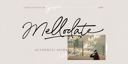 Introducing, Mellodate Script - an authentic hand writing with natural signature style. This type of font perfectly made to be applied especially in logo, and the other various formal forms such as invitations, labels, logos, magazines, books, greeting / wedding cards, packaging, fashion, make up, stationery, novels, labels or any type of advertising purpose. Features : uppercase & lowercase numbers and punctuation multilingual alternates and ligatures swashes PUA encoded We highly recommend using a program that supports OpenType features and Glyphs panels like many of Adobe apps and Corel Draw, so you can see and access all Glyph variations.
 - Ansylia by Letterhend,
$19.00 Introducing, Ansylia Script - an authentic hand writing with natural signature style. This type of font perfectly made to be applied especially in logo, and the other various formal forms such as invitations, labels, logos, magazines, books, greeting / wedding cards, packaging, fashion, make up, stationery, novels, labels or any type of advertising purpose. Features : uppercase & lowercase numbers and punctuation multilingual alternates and ligatures swashes PUA encoded We highly recommend using a program that supports OpenType features and Glyphs panels like many of Adobe apps and Corel Draw, so you can see and access all Glyph variations.
 - Evil Spin by PizzaDude.dk,
$20.00 Evil Spin is inspired by some old horror poster. It has this eerie feeling to it, which leaves you with terror...no matter what you write!!! I've made 4 different versions of each letter, and they automatically changes as you type. And that goes for every layer if Evil Spin - mix and match the layers for even more creepy effects!
 - Kuro by The Northern Block,
$- Kuro is a precisely rendered sans-serif type family. Modern geometric forms combined with subtle detailing create a charming, straightforward and versatile design. The lighter weights bring a contemporary touch to body copy while the bold weights add the strength of character to branding, identity and packaging. Details include eight weights, over 450 characters, manually edited kerning and Opentype features.
 - Raavi by Microsoft Corporation,
$49.00Raavi™ is an OpenType font for the Indic script Gurmukhi, used to write Punjabi. Raavi is based on Unicode, contains TrueType outlines and was designed by Raghunath Joshi (Type Design Director) and Apurva Joshi for use as a UI font. Copyright ™ 2001 Microsoft Corporation. All rights reserved. Character Set: Latin-1, Gurmukhi (Punjabi). NOTE: An OpenType-savvy application is required. - Chancy JNL by Jeff Levine,
$29.00 A short-lived TV game show from 1977 called “Second Chance” has its logo lettered in a bold, block type style with slightly chamfered corners. This inspired Chancy JNL, which is available in both regular and oblique versions. While “Second Chance” only lasted one season, the show was re-tooled - and debuted in 1983 as “Press Your Luck” – which ran until 1986.
 - FF Dynamoe by FontFont,
$59.99 Dutch type designer Just van Rossum created this display FontFont in 1992. The font is ideally suited for advertising and packaging, film and tv as well as music and nightlife. FF Dynamoe provides advanced typographical support with features such as ligatures. It comes with tabular lining figures. As well as Latin-based languages, the typeface family also supports the Greek writing system.
 - Sign Merchant JNL by Jeff Levine,
$29.00 There was a time in this country when many young people studied a trade via a correspondence course through the mail. While this method still exists, it's now more common to find students taking online classes. From an early-1960s course in sign painting comes Sign Merchant JNL, a classic brush stroke type design popularized on show cards and posters.
 - dearJoe 3 by JOEBOB graphics,
$39.00 Finally it’s done! The DearJoe 3 ‘Ultimate handwriting’ font, composed of scanned handwriting which makes it look quite convincingly real. It contains over 500 characters, 200 of them ligatures. Typing your text with this font feels like old-school writing with a pen, especially since every word will be constructed of different letter combinations. Give it a try and you’ll probably be surprised…
 - Swank by ITC,
$29.99Jill Bell's typefaces are energetic, highly decorative, and refreshingly unpredictable. Some are friendly and childlike, while others are rough and nervous. Her latest creation is ITC Swank, a connected script whose shabby-chic" sophistication communicates a worn elegance. Bell begins the design process "with black stuff on white paper," she explains, preferring to draw letters before she digitizes them. Often the inspiration for her typefaces comes from a piece of hand-lettering. "Bruno began as a reminder to buy cat food," she says, "and ITC Swank started out as a small bit of lettering for Wurlitzer Pianos." Bell finds that working with blocks of lettering is a good start for script typefaces. "If I'm drawing a script typeface, I have to write out sentences in the letters first," she explains. "Drawing each letter separately doesn't establish the flow and spontaneity that scripts deserve." Bell's newest design is ITC Swank. It's a somewhat tattered formal script with definite links to early copperplate scripts. Though probably not for wedding invitations, Swank's elegant underpinnings are evident, with its slightly narrow proportions and a baseline that can best be called "bouncy." Graphic designers will appreciate the abundance of swash letters, making it easy to create distinctive headlines and short blocks of copy. Bell has a fondness for the "open, genuine" quality of Chinese and Japanese calligraphy. "Eastern styles incorporate the natural flow of the hand," she says. "Natural, human qualities shine through. Mistakes are accepted, not scorned as in the 'white-out' Western culture." This philosophy is evident in Bell's own designs. Whether it's ITC Clover 's carefree spirit, the slightly spooky Hollyweird, Caribbean 's< rustic charm or the weathered elegance of ITC Swank, there is a natural honesty in her work." - Reading Frequency by Vladvertising,
$10.00 Ever wonder what language looks like? This type decided to dive into this idea... how audible and visual forms play with each other. The forms you see also have been waterjet-cut out of stainless steel sheets. With these physical forms, one day in a recording studio and a mallet in hand later... we get this. Link to Audio Files: http://vladrudakov.com/files/Reading%20Frequency%20Audio.zip (If you use for samples– have fun, just shoot me an email w/ final product) vlad (at) vladvertising.com
 - Hildegard by Linotype,
$29.99Hildegard is a sans serif text face that works well in both larger and smaller point sizes. On close inspection, one will discover a world of subtle angle variation within the letters' structure that is loosely inspired the stroke movements one uses in calligraphy. These built-up strokes create visible ink traps at many joints, which in smaller sizes play a functional as well as an aesthetic role. The Hildegard typefaces received one of several awards in the 2003 International Type Design Contest, sponsored by Linotype GmbH. - Strong Beast by Ironbird Creative,
$15.00 Strong Beast is a BOLD AND STRONG ALL CAPS organic hand-drawn typeface. This item consists of 7 FONTS in various styles which you can play around with it. NOTE : Please Check the Help File first and for all the characters are also available, accessible in the Adobe Illustrator Glyphs Panel, or in Adobe Photoshop Character Open Type Panel. We hope you enjoy the font, please feel free to comment if you have any thoughts or feedback. Thanks for purchasing and have fun! Regards, Ironbird Creative
 - Nido by Latinotype,
$19.00 Nido is a cute and funny childish typeface, designed for logos, book titles, invitations, birthday cards, flyers, posters, advertising, etc. It comprises 5 styles: black, white, black italic, white italic and dingbats, which can be used nicely together. Nido is a new design by Sofía Mohr. See also Café Brasil http://www.myfonts.com/fonts/sofia-mohr/cafe-brasil/
 - Bad Situation by Intellecta Design,
$24.90 The historical source to Bad Situation comes from "EXAMPLES OF MODERN ALPHABETS, PLAIN and ORNAMENTAL; including German, Old English, Saxon, Italic, Perspective, Greek, Hebrew, Court Hand, Engrossing, Tuscan, Riband, Gothic, Rustic, and Arabesque, etc." Collected and engraved by F. Delamotte, and first published in 1864. The original alphabet was called "Example Alphabet" (plate 48), by Delamotte.
 - Primrose Gardens by Rachel White Art,
$12.00 Primrose Gardens is a lovely, loopy all caps font. Mix and match loopy capitals with plain jane lowercase letters for a whimsical vibe. The loopy alternates are coded as uppercase letters for ease of use. Hit shift on b, e, k, m, r, w, and y for a loopy alternate. Includes characters for Western European languages.
 - Gildan by Sign Studio,
$15.00 Gildan fonts come in 7 measured thicknesses. Inspired by a charming classic style. Equipped with several OpenType features (plain version); Discretionary Ligatures, Small Caps, Stylistic Sets, Oldstyle Figures. We made the italic version simpler but with controlled thickness on each side. Everything is made with the aim of complementing each other and supporting the design well. Regards
 - Shesek by Hanoded,
$15.00 Shesek is an informal, loose, handwritten font without any frills. It is deceivingly plain, but when you use it, you will find out that Shesek has a distinct taste, not unlike its namesake, the Japanese plum, or Loquat. The Loquat is a soft, oval, yellow fruit which is grown mostly in Japan and Israel (where it is called ‘Shesek’).
 - Balboat by Ingrimayne Type,
$9.95 Balboat is a plain calligraphic face with a very small x-height, long descenders, and tall ascenders. Having the appearance of a pen-drawn sans serif, it has four styles: regular, bold, italic, and bold italic. Although Balboat is quite legible, it is condensed and may need to be printed at a larger point size than other typefaces.
 - Corvone by Greater Albion Typefounders,
$16.95 Corvone is a heavy bullnosed display family, inspired by the post war era's ideas of modernity. Two faces are offered, plain—a solid black face, and regular—which employs a three-dimensional pipeline effect to add real emphasis. Use Corvone to give work a retro feel, and/or where you want to really drive your point home.
 - Fansi Pensle by Ingrimayne Type,
$5.00 FansiPensle is a set of four decorative scripts. The capitals are fussy and ostentatious and a little weird with strange flourishes. The lower-case letters are neat and simple. Lower-case letters have the shapes of a cursive alphabet and they are connected in the cursive and cursive-bold styles but not in the plain and bold styles.
 - Boucle2 by TipografiaRamis,
$39.00 Bouclé.2 – an upgraded edition of Bouclé fonts (2009), with careful refinements to glyph shapes and extension of glyph amounts, which enabled support of more Latin languages. New edition consists of eight styles: Light, Regular, Bold weights for plain and round fonts respectably, plus Regular and Light italics. Typeface is released in OpenType format with some OpenType features.
 - Bodoni Highlight by Image Club,
$29.99Giambattista Bodoni (1740-1813) was called the King of Printers; he was a prolific type designer, a masterful engraver of punches and the most widely admired printer of his time. His books and typefaces were created during the 45 years he was the director of the fine press and publishing house of the Duke of Parma in Italy. He produced the best of what are known as modern" style types, basing them on the finest writing of his time. Modern types represented the ultimate typographic development of the late eighteenth and early nineteenth centuries. They have characteristics quite different from the types that preceded them; such as extreme vertical stress, fine hairlines contrasted by bold main strokes, and very subtle, almost non-existent bracketing of sharply defined hairline serifs. Bodoni saw this style as beautiful and harmonious-the natural result of writing done with a well-cut pen, and the look was fashionable and admired. Other punchcutters, such as the Didot family (1689-1853) in France, and J. E. Walbaum (1768-1839) in Germany made their own versions of the modern faces. Even though some nineteenth century critics turned up their noses and called such types shattering and chilly, today the Bodoni moderns are seen in much the same light as they were in his own time. When used with care, the Bodoni types are both romantic and elegant, with a presence that adds tasteful sparkle to headlines and advertising. This version of Bodoni was done by Morris Fuller Benton for American Typefounders between 1907 and 1911. Although some of the finer details of the original Bodoni types are missing, this family has the high contrast and vertical stress typical of modern types. It works well for headlines, logos, advertising, and text." - Bauer Bodoni by Linotype,
$45.99 Giambattista Bodoni (1740-1813) was called the King of Printers; he was a prolific type designer, a masterful engraver of punches and the most widely admired printer of his time. His books and typefaces were created during the 45 years he was the director of the fine press and publishing house of the Duke of Parma in Italy. He produced the best of what are known as "modern" style types, basing them on the finest writing of his time. Modern types represented the ultimate typographic development of the late eighteenth and early nineteenth centuries. They have characteristics quite different from the types that preceded them; such as extreme vertical stress, fine hairlines contrasted by bold main strokes, and very subtle, almost non-existent bracketing of sharply defined hairline serifs. Bodoni saw this style as beautiful and harmonious-the natural result of writing done with a well-cut pen, and the look was fashionable and admired. Other punchcutters, such as the Didot family (1689-1853) in France, and J. E. Walbaum (1768-1839) in Germany made their own versions of the modern faces. Even though some nineteenth century critics turned up their noses and called such types shattering and chilly, today the Bodoni moderns are seen in much the same light as they were in his own time. When used with care, the Bodoni types are both romantic and elegant, with a presence that adds tasteful sparkle to headlines and advertising. The Bauer Bodoni was done by Heinrich Jost for Bauer Typefoundry in 1927. This version has finer details of the original Bodoni types. It works well for headlines, logos, advertising.
 - Nawin Arabic by Letterjuice,
$43.00 Nawin is an informal Arabic typeface inspired by handwriting. The idea behind this design is to create a type family attractive and ownable for children but at the same time a design that keeps excellent letter recognition for reading. Handwriting has been a great source of inspiration in this particular typeface. By emulating the movements of the pen, we have obtained letter shapes that express spontaneity. A bright group of letters create a lively and beautiful paragraph of text. To get closer to handwriting and the variety of letter shapes that we draw while writing, this typeface offers a large number of alternative characters, which differ slightly from the default ones. Because we have programed the «Contextual Alternate» feature in the fonts, these alternate characters appear automatically as you set a text on your computer. The proportions and letter shapes are flexible, escaping from tradition to increase expressivity and personality in the design. For instance, variability on vertical proportions between letters Alef and initial Lam, create movement in text and avoid the cold mechanical feel of repetition. Nawin is quirky and elegant at the same time. Letter recognition is relevant when reading continuous text. For this reason, we have added another contextual alternate feature with alternate characters that help to avoid confusion when letters with similar or the same shape repeat inside one word. For instance, this is the case of medial «beh and Yeh» repeated three times continuously in the same word. The alternate characters change in shape and length, facilitating distinction to the reader. Since this typeface is inspired by handwriting and the free movement of the hand while writing, we considered ligatures a good asset for this design. The typeface has a wide range of ligatures that enhance movement and fluidity in text making look text alive.
 - Linotype Game Pi by Monotype,
$29.00The Game Pi font volume contains four fonts of game symbols, including chess, dominoes and playing cards. - DB Girly Soccer by Illustration Ink,
$3.00Whoever said that girls can't play sports was wrong! DoodleBat Girly Soccer highlights the fun in soccer. - Ledge by RagamKata,
$16.00 Ledge is a type of elegant display font that features large, bold lettering with unique decorative details on each character. The font gives off an elegant and classic feel, while still appearing modern and in line with current design trends. Ledge is well-suited for a variety of projects that require a high-end, eye-catching look, such as wedding invitations, luxury product packaging design, or promotional materials for brands looking to convey an exclusive and luxurious image. This serif font is also suitable for logo design or website design that aims to showcase a creative and elegant look, while still maintaining a professional and classic appearance."
 - Neue Kabel by Linotype,
$57.99 Marc Schütz, a type design teacher at the University for Art and Design Offenbach, took on the challenge of updating and re-imaging the original Kabel® typeface design. His goal was to create forms that perform well in modern imaging environments while keeping the original Kabel’s character and charm. View the Neue Kabel Video Neue Kabel maintains the spirit of Koch’s design, and adds to this the consistent traits and family structure of a 21st century design. Text copy set in Neue Kabel echoes the elegance and playfulness of Koch’s design, while delivering the versatility to shine in a wide variety of hardcopy and interactive environments.
 - MFC Hills Medieval by Monogram Fonts Co.,
$24.95 MFC Hills Medieval was developed from a unique historical Blackletter type specimen in the 1882 Hills Manual of Social and Business Forms. While you could use its ornate capitals to construct a monogram, this is not a monogram font, but a fully functional typeface for invitations and period lettering. From stylish and ornate capitals to a soft lowercase resembling bled ink, this period lettering style is a true eye-catcher. Because of some of the unique medieval letterforms, standardized letterforms were created as the default typeable letters while the true historical forms were setup as Stylistic Alternates. A sophisticated Blackletter for manuscripts and invitations alike.
 - Pill Gothic by Betatype,
$40.00 Pill Gothic walks the tightrope between a heads down, hard working, utilitarian sans and something that stands out, saying, "Look at me!" Designers looking for a type that will work in blocks of text for callouts, captions and headlines will find that unique balance with Pill. Pill Gothic asks the question: what is the effect of a few truly unique characters on the meaning of a type? In particular, the 'a' and the 'g', while relating strongly to the forms of the other characters, stand out from the traditional milieu of sans serif types. The name Pill Gothic came from early studies of the condensed weight where the lower case characters had the shape of a pill capsule.
 - Kropotkin Std by sugargliderz,
$30.00 This typeface design was influenced by the British Rail corporate type introduced in an old lettering instruction book published in Japan. Of course, the only clue to this typeface is the lettering instruction book at hand. Therefore, this typeface is based on the British Rail corporate type introduced in an old lettering instruction book published in Japan, and I have expanded the design variations. I started with the Bold design first. Then I designed Light, Regular, and Black in that order. Light and Regular are intended to be used as the text type, while Bold and Black are intended to be used as the base for logotypes, headlines, and other eye-catchers.
 - ITC New Baskerville by ITC,
$34.99 ITC New Baskerville is one of many contemporary type families based on the work of John Baskerville (1706-1775), a writing master and printer from Birmingham, England, whose types were cut by the punchcutter John Handy. Baskerville produced a masterpiece folio Bible for Cambridge University, and today, his types are considered to be fine representations of eighteenth-century rationalism and neoclassicism. ITC New Baskerville is a late 20th-century interpretation of Baskerville’s style, designed by John Quaranda. It makes an excellent and very readable text face; its sharp, high-contrast forms make it suitable for elegant advertising settings as well. ITC New Baskerville® font field guide including best practices, font pairings and alternatives.
 - Carnival by House Industries,
$33.00 Unlike the modest fonts in your menu content with discreetly imparting information, Carnival is conspicuous by design. Deliberately engineered to attract eyeballs, the typeface’s unmistakable silhouette produces a dramatic visual texture that stands out in print, on screen, or in any environment where your message demands to be noticed. The steady yet vibrant rhythm created by its letterforms also makes Carnival ideal for fashioning alphabet patterns and graphic devices. Flaunting a lean slender body anchored by stout stroke endings, Carnival turns conventional typographic thinking on its head by inverting the relative thickness of its stems and serifs. This reverse-contrast approach stretches all the way back to the roots of modern advertising, when similar types became the favorite for posters, packaging, and loads of consumer products during the 1800s. The striking style prevailed well into the next century, as Harold Horman, co-founder of New York City-based Photo-Lettering. Inc., modernized a version for the company’s popular film-typesetting service in the early 1940s. Digitized and expanded by Dan Reynolds in 2013, Carnival had previously been used exclusively for House Industries projects. Now you can get in on the action, and use this stunning slice of type history anytime you want your work to turn heads. SUGGESTED USES Carnival’s unique character commands attention, making it the perfect voice for promotional pieces, editorial design, labels, packaging, posters, and any other application that needs to strike the right tone. Like all good subversives, House Industries hides in plain sight while amplifying the look, feel and style of the world’s most interesting brands, products and people. Based in Delaware, visually influencing the world.
 - Ongunkan Swedish Runes by Runic World Tamgacı,
$60.00 Swedish Runes Swedish Runes is a way to write Swedish with medieval runes devised by Sven Salvenson. Proto-Norse was written with Elder Futhark runes, and viking age runes were in Younger Futhark (an adaptation of Elder Futhark). Then early Old Norse was written in medieval runes (an adaption of Younger Futhark). Sven decided to carry on that tradition and adapt the medieval runic alphabet for modern Swedish. General information can be found on this site. I used the data here while working on the font. https://omniglot.com/conscripts/swedishrunes.htm
 - ABC Dotted Tracing by Beast Designer,
$15.99 ABC Dotted Tracing Font is a user-friendly typeface designed specifically to aid in early childhood education and handwriting practice. Featuring clear, dotted outlines of each letter, this font serves as a guide for young learners as they trace and familiarize themselves with the alphabet. The dotted lines help children develop fine motor skills and hand-eye coordination while practicing proper letter formation. This font is often utilized in educational materials, worksheets, and apps aimed at supporting kids in mastering the fundamentals of writing in a fun and engaging way.
 - Aurelac by Harvester Type,
$20.00 Aurelac - is a font that was inspired by the cover of the book "Learn to sew" by authors Egorova R. I. and Monastyrnaya V. P. This is a contrasting font that has unusual serifs and combines elegance and brutalism. Many uppercase letters are bold, while lowercase letters are lighter, which gives a more unusual effect to the text and the beginning of the sentence. It is perfect for headlines, posters, logos, banners, covers and much more. If you find errors in the font, kerning, then a huge request to write to the address: bunineugene@gmail.com
 - CA Smut by Cape Arcona Type Foundry,
$19.00 Sometimes the ugliest pets can be the cutest ones. And the dirtiest fonts can be the most charming ones. Like CA Smut which comes in two styles that can be stacked on top of each other. “Regular” is the shadow, while “Fill” is the filling. Create little masterpieces by playing with different colors, offset or deviating tracking. You can even try to use the “Fill” style on its own, but do so at you own risk. The spacing and kerning is optimized for the use with “Regular”, so be open minded for surprising results. If you ever had the intention to design a horror movie poster, there’s no way around CA Smut.