10,000 search results
(0.05 seconds)
- Speech Bubbles by Harald Geisler,
$68.00 The font Speech Bubbles offers a convenient way to integrate text and image. While the font can be used to design comics, it also gives the typographer a tool to make text speak – to give words conversational dynamics and to emphasize visually the sound of the message. The font includes a total of seventy outlines and seventy bubble backgrounds selected from a survey of historic forms. What follows is a discussion of my process researching and developing the font, as well as a few user suggestions. My work on the Speech Bubbles font began with historic research. My first resource was a close friend who is a successful German comic artist. I had previously worked with him to transform his lettering art into an OpenType font. This allowed his publishing house to easily translate cartoons from German to other languages without the need to use another font, like Helvetica rounded. My friend showed me the most exciting, outstanding and graphically appealing speech bubbles from his library. I looked at early strips from Schulz (Peanuts), Bill Waterson (Calvin & Hobes), Hergé (TinTin), Franquin, as well as Walt Disney. The most inspiring was the early Krazy Kat and Ignatz (around 1915) from George Herriman. I also studied 1980’s classics Dave Gibbon’s Watchmen, Frank Miller’s Ronin and Alan Moore and David Lloyd’s V for Vandetta. Contemporary work was also a part of my research—like Liniers from Macanudo and work of Ralf König. With this overview in mind I began to work from scratch. I tried to distill the typical essence of each author’s or era’s speech bubbles style into my font. In the end I limited my work down to the seventy strongest images. An important aspect of the design process was examining each artist’s speech bubble outlines. In some cases they are carefully inked, as in most of the 80’s work. In others, such as with Herriman, they are fast drawn with a rough impetus. The form can be dynamic and round (Schultz) with a variable stroke width, or straight inked with no form contrast (Hergé). Since most outlines also carry the character of the tool that they are made with, I chose to separate the outline from the speech bubble fill-in or background. This technical decision offers interesting creative possibilities. For example, the font user can apply a slight offset from fill-in to outline, as it is typical to early comic strips, in which there are often print misalignments. Also, rather than work in the classic white background with black outline, one can work with colors. Many tonal outcomes are possible by contrasting the fill-in and outline color. The Speech Bubbles font offers a dynamic and quick way to flavor information while conveying a message. How is something said? Loudly? With a tint of shyness? Does a rather small message take up a lot of space? The font’s extensive survey of historic comic designs in an assembly that is useful for both pure comic purposes or more complex typographic projects. Use Speech Bubbles to give your message the right impact in your poster, ad or composition.
 - Bowling Script by Sudtipos,
$69.00 There is plenty of lyric and literature about looking over one's shoulder in contemplation. What would you have done differently if you knew then what you know now? This is the kind of question that comes out of nowhere. When it does and whether its context is personal or professional make very little difference. It's a question that can cause emotions to rise and passions to run hot. It can trigger priority shifts and identity crises. It's never easy to answer. Three years ago, I published a font called Semilla. My aim with that was to distill the work of Bentele, a lettering artist from early 1950s Germany. Picking such an obscure figure back then was my way of pondering the meaning and efficiency of objectivity in a world where real human events and existences are inevitably filtered through decades of unavoidably subjective written, printed and oral history. And maybe to pat myself on the back for surviving surprises mild and pleasant. Having been fortunate enough to follow my professional whims for quite some time now, I took another, longer look at my idea of distilling Bentele's work again. I suppose the concepts of established history and objectivity can become quite malleable when personal experience is added to the mix. I say that because there I was, three years later, second-guessing myself and opining that Bentele's work can be distilled differently, in a manner more suited to current cultural angles. So I embarked on that mission, and Bowling Script is the result. I realize that it's difficult to reconcile this soft and happy calligraphic outcome with the introspection I've blathered about so far, but it is what is. I guess even self-created first world problems need to be resolved somehow, and the resolution can happen in mysterious ways. Bowling Script is what people who like my work would expect from me. It's yet another script loaded with all kinds of alternation, swashing and over-the-top stuff. All of that is in here. These days I think I just do all that stuff without even blinking. But there are two additional twists. The more noticeable one is ornamental: The stroke endings in the main font are of the typical sharp and curly variety found in sign painting, while the other font complements that with ball endings, sometimes with an added-on-afterwards impression rather than an extension of the actual stroke. In the philosophical terms I was mumbling earlier, this is the equivalent of alternate realities in a world of historical reduxes that by their very nature can never properly translate original fact. The second twist has to do with the disruption of angular rhythm in calligraphic alphabets. Of course, this is the kind of lettering where the very concept of rhythm can be quite flexible, but it still counts for something, and experimenting with angular white space in a project of a very dense footprint was irresistible. After playing for a bit, I decided that it would interesting to include the option of using optically back-slanted forms in the fonts. Most scripts out there, including mine, have a rhythm sonically comparable to four-to-the-floor club beats. So the weirdly angled stuff here is your chance to do the occasional drumroll. Everyone knows we need one of those sometimes. Bowling Script and Bowling Script Balls fonts comes with 1600 characters and features extended Latin-based language support. There are also a basic version of both fonts without all the alternates and extra OpenType features. Bowling family ships in cross-platform OpenType format. We also want to present “Mute”, a visual essay narated by Tomás García and Valentín Muro, about digital life created specially to introduce Bowling Script.
 - Brush Hand New - Personal use only

- Boldye by Logofonts,
$10.00 Boldye Font Inspired by the Reebok Logo and Sport typeface style. Boldye are strong on the curves and sharp on the edges of some of the letters suitable for logo projects, branding, posters with sports themes. Easily creates your own logo type with fonts. Boldye has an Open Type feature to access a large selection of unique alternative letters and many ligatures to make it easier for you to create. Boldye can be accessed perfectly on design applications such as Adobe Illustrator, Adobe Photoshop, Corel Draw, Affinity Designer but does not rule out the possibility that it can also be accessed using web-based applications such as kittl, canva, artboard studio and others.
 - Adaniya by Sealoung,
$15.00 Introducing, Adaniya - a standout bold script with a touch of nostalgic look and feel. Inspired by 50s 60s signages, this font made to bring back the good ol' days. This type of font perfectly made to be applied especially in logo, headline, signage and the other various formal forms such as invitations, labels, logos, magazines, books, greeting / wedding cards, packaging, fashion, make up, stationery, novels, labels or any type of advertising purpose. Features : Uppercase & lowercase Numbers and punctuation Multilingual Alternates / swashes and ligatures PUA encoded We highly recommend using a program that supports OpenType features and Glyphs panels like many of Adobe apps and Corel Draw, so you can see and access all Glyph variations.
 - Crepes by cretype,
$20.00 The Crepes is a layered type family consisted of 25 effect layer fonts. The basic shape of Crepes is re-designed based on 'Geon' and lower-case letters are replaced to small-capitals. Endless effects can be created by combining each of different colored layer fonts. Variety of check and stripe patterns can be made with 9 stripe layer fonts. The Open Type fonts contain complete Latin 1252, Central European 1250, Turkish 1254 character sets. Each font includes proportional figures, old-style figures, tabular figures, numerators, denominators, superscript, scientific inferiors, subscript, fractions and case features. We highly recommend it for use in headlines, logotypes, signs, posters, greeting cards, letterhead, t-shirts and so on.
 - Accia Forte by Mint Type,
$39.00 Accia Forte is a strong serif typeface with high contrast, large x-height and prominent serifs. Its loud contemporary feel will be ideal for titles as well as posters and web appearance. The font family contains 8 weights from Thin to Extra Bold, with matching true italics. It supports extensive language support including Cyrillic, as well as numerous OpenType features such as small caps, ligatures, several sets of figures, case-sensitive punctuation, ordinals. Accia Forte is a member of Accia Type System. It encompasses five typefaces ranging from sans-serif to expressive serif, giving you the possibility to create sophisticated cohesive designs. Accia Type system consists of Accia Sans, Accia Flare, Accia Piano, Accia Moderato, and Accia Forte.
 - Starsigns by Tarallo Design,
$9.99 Starsigns is a unique set of zodiac symbols with a handmade feel. This font includes twelve astrology symbols: Aquarius, Pisces, Aries, Taurus, Gemini, Cancer, Leo, Virgo, Libra, Scorpio, Sagittarius, and Capricorn. Additionally, it features a moon and a sun symbol. The symbols were created from watercolor originals, giving them a warm and fluid quality. To utilize Starsigns, simply install it as a regular font. As you type, instead of letters, you will see the corresponding zodiac symbols. For accessing the symbols, type any lowercase letter on your keyboard between 'a' and 'm'. Most design software, such as Illustrator, InDesign, and Photoshop, provide a glyphs palette where you can select the desired symbol precisely.
 - Morguns by Ronny Studio,
$19.00 Morguns is a bold type of font that has a different character from other bold fonts, Morguns has a strong but soft character, with an elegant and fresh theme, supported by 4 choices of font types, Morguns is able to answer your current needs who are designing something great . Its weight excels in logos, posters, social media, magazine titles, clothing, large print formats - and anywhere you want to see it. Inspired by the design styles that are currently popular, let's make your imagination come true with Morguns. Features : Lowercase & Uppercase numbers and punctuation multilingual ligatures alternates PUA encoded Please contact us if you have any questions. Enjoy Crafting and thanks for supporting us! :) Thank you
 - Hermush by Letterhend,
$19.00 Hermush Display is a condensed unique typeface with unusual anatomy. This type of font perfectly made to be applied especially in logo, headline, signage and the other various formal forms such as invitations, labels, logos, magazines, books, greeting / wedding cards, packaging, fashion, make up, stationery, novels, labels or any type of advertising purpose. Features : numbers and punctuation multilingual alternates / swashes and ligatures PUA encoded We highly recommend using a program that supports OpenType features and Glyphs panels like many of Adobe apps and Corel Draw, so you can see and access all Glyph variations. How to access opentype feature : letterhend.com/tutorials/using-opentype-feature-in-any-software/ Email us to letterhend@gmail.com if you need something! Happy Designing!
 - Chevin Pro by G-Type,
$72.00 Chevin is a contemporary rounded type family in 6 weights which was designed with functionality and legibility in mind. With its open counters and slightly condensed style, Chevin can be used for text and is particularly suited to signage. Erik Spiekermann is a fan, noting that Chevin “is charming without being cute, and very legible even in small sizes because of its restrained shapes and simple construction.” Chevin is named after a hill on the outskirts of Otley in West Yorkshire. Since 2007, the type family has been highly prominent in the UK as Royal Mail’s corporate font and the typeface that adorns every Post Office in the country. The Chevin Pro set includes additional Greek and Cyrillic layouts.
 - Regional by Sudtipos,
$39.00 Sudtipos is really proud to announce the release of Regional, a solid workhorse type family of 27 styles inspired by the Old Style Bold models from the late XIX century by different type foundries. The unique diagonal in the "R" has been the key that inspired us to create many of the several alternates included in the set. From a delicate and expressive thin condensed to an exaggerated expanded black, Regional merges the past with the present, making it useful for a wide range of designs. We have imagined Regional to be used in magazines, packaging labels and posters. The addition of a complementary one-file variable format is included when you license the complete set.
 - Nachinta by Letterhend,
$19.00 Nagintha is a handwritten script with natural look and feel. You can use also for headline or signature. This type of font perfectly made to be applied especially in logo, and the other various formal forms such as invitations, labels, logos, magazines, books, greeting / wedding cards, packaging, fashion, make up, stationery, novels, labels or any type of advertising purpose. Features : uppercase & lowercase numbers and punctuation multilingual alternates and ligatures PUA encoded We highly recommend using a program that supports OpenType features and Glyphs panels like many of Adobe apps and Corel Draw, so you can see and access all Glyph variations. How to access opentype feature : letterhend.com/tutorials/using-opentype-feature-in-any-software/
 - FT Massachusettz by Foxys Forest Foundry,
$9.00 FT Massachusetts is a dense, hand-drawn sans-serif typeface with uneven edges and a dancing baseline. It creates a vivid impression, feels friendly, playful, and communicative. The font is full of alternate letters, symbols, and graphics. It easily adapts, confidently engages with the customer, and transforms slightly depending on the space and purpose. Change letters to alternates for the uniqueness of spellings. For convenience, alternative characters are used when typing in lowercase, and normal letters are used when typing in uppercase. Additionally, you can always switch letters to additional alternative ones and insert symbols. Furthermore, to add visual interest, the font is equipped with auto-replacements for prepositions and word endings.
 - Digtos by Keristyper Studio,
$14.00 Introducing, Digtos Brush a masculine display font that is made with hand lettering with the brush pen. This type of font is perfectly made to be applied especially in logos, and the other various formal forms such as invitations, labels, logos, magazines, books, greeting/wedding cards, packaging, fashion, makeup, stationery, novels, labels, or any type of advertising purpose. Multilingual support: Afrikaans, Albanian, Catalan, Danish, Dutch, English, Estonian, French, Finnish, German, Icelandic, Indonesian, Italian, Malay, Norwegian, Portuguese, Spanish, Swedish, Zulu, and many more. What’s Included : Web Fonts Standard & Multilingual glyphs Ligature Works on PC & Mac Simple installations Accessible in Adobe Illustrator, Adobe Photoshop, Adobe InDesign, and even work on Microsoft Word. Hope you enjoy our font!
 - Krostenia by Letterhend,
$19.00 Introducing, Krostenia - a monoline script with a touch of vintage look and feel. You will also get 12 detailed hand drawn objects ready to use. This type of font perfectly made to be applied especially in logo, headline, signage and the other various formal forms such as invitations, labels, logos, magazines, books, greeting / wedding cards, packaging, fashion, make up, stationery, novels, labels or any type of advertising purpose. Features : uppercase & lowercase numbers and punctuation multilingual alternates / swashes and ligatures PUA encoded 12 hand drawn objects We highly recommend using a program that supports OpenType features and Glyphs panels like many of Adobe apps and Corel Draw, so you can see and access all Glyph variations.
 - Boosley by Letterhend,
$19.00 Introducing, the Boosley - a standout bold script with a touch of nostalgic look and feel. Inspired by 50s 60s signages, this font made to bring back the good ol' days. This type of font perfectly made to be applied especially in logo, headline, signage and the other various formal forms such as invitations, labels, logos, magazines, books, greeting / wedding cards, packaging, fashion, make up, stationery, novels, labels or any type of advertising purpose. Features : uppercase & lowercase numbers and punctuation multilingual alternates / swashes and ligatures PUA encoded We highly recommend using a program that supports OpenType features and Glyphs panels like many of Adobe apps and Corel Draw, so you can see and access all Glyph variations.
 - Discordia by Naipe Foundry,
$60.00 Discórdia is a type-family of contrasting contrasts. Each of the four members of the family has a different contrast type. Regular has broad-nib contrast, Bold has horizontal contrast, the Italic is monoline, which means it has no apparent contrast, and Bold Italic is... Well, it’s probably best if see for yourself. These different design structures were fine-tuned to work well together in the same line, creating emphasis and hierarchy through a mini-super-family that groups a wedge-serif Regular, a slab-serif Bold, a sans-serif-ish Italic and a twisted Bold Italic. Naipe teamed up with Ben Nathan of Hafontia to extend Discórdia and give full Hebrew Support. Coming soon!
 - Accia Flare by Mint Type,
$39.00 Accia Flare is an elegant glyphic typeface with large x-height and low contrast. Its subtle curviness will create a tender but notable image in packaging applications. The font family contains 8 weights from Thin to Extra Bold, with matching true italics. It supports extensive language support including Cyrillic, as well as numerous OpenType features such as small caps, ligatures, several sets of figures, case-sensitive punctuation, ordinals. Accia Flare is a member of Accia Type System. It encompasses five typefaces ranging from sans-serif to expressive serif, giving you the possibility to create sophisticated cohesive designs. Accia Type system consists of Accia Sans, Accia Flare, Accia Piano, Accia Moderato, and Accia Forte.
 - Classicismo by IKIIKOWRK,
$19.00 Introducing Classicismo - Gentleman Type, created by ikiiko. Classicismo is inspired by typography of classic motorcycle brand. The letters are bold serif fonts with a classic swashes type. This font has a characteristic serif font that is firm and sturdy but still has flexibility. This typeface is perfect for an vintage vehicle logo, motorcycle enthusiast, manly product, magazine cover, poster & flyer design for automotive event, and also good for vintage product, or simply as a stylish text overlay to any background image. What's included? Uppercase & Lowercase Number & Punctuation Alternates & Swashes Multilingual Support Get also a good offer & FREEBIE at our site : www.ikiiko.com Enjoy our font and if you have any questions, you can contact us by email : ikiikowrk@gmail.com
 - Composer JNL by Jeff Levine,
$29.00 There are thousands of pieces of vintage sheet music available for collectors and curiosity seekers. Prior to the 1930s, a large percentage of them had wonderfully hand-lettered titles on the covers, but gradually there was a shift by music publishers to utilizing metal type for the bulk of their output. Normally set in an all-caps format, certain type faces reappeared in growing frequency and familiarity. Composer JNL is one such example of a “workhorse” font, and has been re-drawn and reinterpreted by Jeff Levine Fonts in both regular and oblique versions. It is based on the design "Glamour", released by Lanston Monotype in 1948; which in turn was based on "Corvinus", designed by Imre Reiner.
 - Carton by Nowak & Degeilh,
$45.00 Carton is a font family whose origin comes from his Display version, which is made up of a parallelepiped in isometric projection on a large grid. The Carton type family boasts an entire range of original forms with a number of different constraints other than calligraphic strokes or modular construction techniques. The constraints chosen in the process of creating this alphabet allowed us to give it specific features which would lead to the development of a coherent family of type. The design of the Bold and Regular departs from the earlier strict geometrical forms and increases in contrast and complexity. It paved the way for the creation of a thinner character for the reading of ordinary texts.
 - Hinzatis by Aga Silva,
$39.99 It is up to you how big and voluptuous statement you will be making with this font, as Hinzatis is about old Hollywood glamour and attitude. With lots of options encoded in handy open type files you can easily fine-tune your text for best visual effect. Looks perfect when placed as: titles, headers, labels, names, business cards, just to name a few. Open-type Pro version features 1200 + characters including initial and terminal letters, numerous caps styles, ligatures and alternates. Other versions feature over 1000+ characters and focus mostly on foreign languages with accented letters (incl. Vietnamese); So depending on option you choose you can create realistic and multilingual hand-calligraphy on all of your creations!
 - Caslon Bold by ParaType,
$30.00 The Bitstream version of Caslon Bold of the American Type Founders, 1905. Based on William Caslon I’s first English Old Style typefaces of 1725. Caslon modeled his designs based on late 17th century Dutch types, but his artistic skills enabled him to improve those models, bringing a variety of forms and subtlety of details. Strokes in Caslon fonts are somewhat heavier than in earlier Old Style fonts, serifs are thicker and a bit stubby. Italic letters have uneven slope. A text set in Caslon looks legible and aesthetically appealing. Caslon is a favorite font of English printers for setting of classical literature. Cyrillic version was developed for ParaType in 2002 by Isay Slutsker and Manvel Shmavonyan.
 - MFC Brass Rules Grand by Monogram Fonts Co.,
$9.95 The inspiration source for Brass Rules Grand is a collection of the brass rules from the 1889 “Convenient Book of Specimens” from Franklin Type Foundry in Cincinnati. This is a collection of basic utilitarian brass rules that has been created as combinable and endlessly expanding. Filling the Numerals and all Capital and Lowercase glyph slots are a total of 62 traditional Brass Rule designs, all extendable by combining with other rules, or by extending the pin line by simply typing a dash "-" or ".". A truly sleek and simple utilitarian font for invitations, menus, business cards, and whatnot. Download and view the “MFC Brass Rules Grand Guidebook” if you would like to learn a little more.
 - New Journey by Letterhend,
$16.00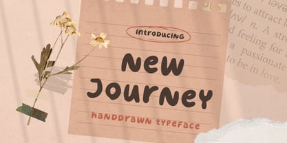 New Journey is a display font with fun and playful looks. This type of font perfectly made to be applied especially in storybook children or child theme which is need a standout font, and the other various formal forms such as invitations, labels, logos, magazines, books, greeting / wedding cards, packaging, fashion, make up, stationery, novels, labels or any type of advertising purpose. Features : uppercase and lowercase numbers and punctuation multilingual ligatures PUA encoded We highly recommend using a program that supports OpenType features and Glyphs panels like many of Adobe apps and Corel Draw, so you can see and access all Glyph variations. Email us to letterhend@gmail.com if you need something! Happy Designing!
 - Meta Link by Logofonts,
$10.00 Meta Link is Sans Serif inspired by future techno and sport great for product logo, poster, headline, card logo, web, magazine, packaging, stationery and much more. Easily creates your own logo types with font. Meta Link have 4 weight fonts with italic style also has an Open Type feature to access a large selection of unique alternative letters and many ligatures to make it easier for you to create. Meta Link can be accessed perfectly on design applications such as Adobe Illustrator, Adobe Photoshop, Corel Draw, Affinity Designer but does not rule out the possibility that it can also be accessed using web-based applications such as kittl, canva, artboard studio and others.
 - Stano Sans by Letterhend,
$17.00 Stano is a strong and bold sans serif with a touch of vintage look and feel. This type of font perfectly made to be applied especially in logo, headline, signage and the other various formal forms such as invitations, labels, logos, magazines, books, greeting / wedding cards, packaging, fashion, make up, stationery, novels, labels or any type of advertising purpose. Features : uppercase & lowercase numbers and punctuation multilingual alternates / swashes and ligatures PUA encoded We highly recommend using a program that supports OpenType features and Glyphs panels like many of Adobe apps and Corel Draw, so you can see and access all Glyph variations. How to access opentype feature : letterhend.com/tutorials/using-opentype-feature-in-any-software/
 - Nero by Skinny Type,
$19.00 Nero is built on the Nero framework, our popular family of geometric types. Like the sans-serif Nero letterform, it has two contemporary look and feel styles. Echoing late 20th-century modernism, the Rounded's overall look is clean and sleek, more ephemeral and dynamic than pared-down bourgeois asceticism. Nero's place in font history is a complex one. Praised for their readability and also at the same time their fashionable qualities, they look very modern and nostalgic, easy to read and very stylish, authoritative and fun. Nero and Nero Rounded when combined, offer 2 styles to suit all text types and sizes. Both are excellent for short texts that require a sense of urgency or playfulness.
 - Lovely Kiss by Fidan Fonts,
$19.80 Lovely Kiss is a handwritten classy script font. It includes full set of uppercase and lowercase basic characters, multilingual symbols, numerals, punctuation and ligatures (check the previews in order to see them all). It's works perfectly for wedding stationery, elegant branding, book cover designs, packaging, album covers, handwritten quotes, greeting cards, social media posts, and many more. Latin-based Language Support (You can check your language typing characters in text box below). If you want to type with stylistic ligatures make sure you have them turned on (use a capable software like Photoshop, Illustrator, InDesign, Word, Pages etc). Note: If you don't use this font with these programs stylistic ligatures won't work. Happy creating!
 - RTCO Flinton by Roams Type Co,
$9.00Flinton is a basic Vintage Serif Display Font. Flinton Font Family consists of 3 types of letters that have several variants into 14 font style, Include Regular Serif, Bold Serif & Script Demo and Catchwords & Illustrations for extras. This font is suitable for types of designs that have elements of Vintage Concepts, such as logotypes, posters, merchandise designs, etc. And this font has an opentype feature, also supported for several languages, Which consists of several styles: Clean Outline Roughen Texture Slant Texture Slant Script Demo Catchwords what is included in this font are as follows: Opentype Feature Multilanguage Support Numeral Sepparators Math Symbol More 1000 Count Glyphs I hope you enjoy using this Flinton Font Thanks For Support - Silverland by FontMesa,
$49.00 Silverland is a revival of an old type font from the Bruce Type Foundry of New York, the original font from 1874 included uppercase only plus 22 end caps. This 21st. century version has been expanded to include many more decorative end caps plus new lowercase, small caps, italic, italic small caps, swash, swash small caps and gothic version. Approximately six months of painstaking work has gone into making this font family over the last 22 months. The OpenType versions of Silverland include between 230 and 370 kerning pairs each setup as auto ligature replacements, you will need an application such Adobe CS products in order to take advantage of this OpenType feature.
 - Market Street Neon by LLW Studio,
$22.00 Market Street Neon is an all-caps condensed display font constructed with two rounded-end strokes; the lowercase set is included as a repeat of the uppercase to make setting type just that little bit easier. I designed this font to be a little bit more “San Francisco” (hence the name of the font), with a contemporary and upscale feeling. It’s intended for use in larger sizes of type, upwards of 48 pt. Market Street Neon is perfect for a design that wants to imitate neon—use it in Photoshop, InDesign, Illustrator or Corel with color & blend effects, and its geometry also lends itself well to simple color for signage, packaging, posters etc. that will pop.
 - Skiltmaler by Imagi Type,
$15.00 Skiltmaler is the typeface that refers to the style of decorative arts during the Victorian era 1837 to 1901, the Victorian era was the period in which fly poster typography emerged. The large amount of colour in combination with large font sizes were created from movable metal type. As well as being made from wood, this was used to create the two-coloured typefaces. You would imagine this would be specific to the '3D' styled type seen on the poster to create the drop shadow. Skiltmaler works well with normal size text, but it works even better for large displays, short words, or even just to incorporate a few or single characters in a design.
 - Edgeriver by Letterhend,
$16.00 The Edgeriver is a serif display typeface with a touch of vintage look and feel. it was made hand drawn, so it makes looks more natural. it comes with regular and slant version. This type of font perfectly made to be applied especially in logo, headline, signage and the other various formal forms such as invitations, labels, logos, magazines, books, greeting / wedding cards, packaging, fashion, make up, stationery, novels, labels or any type of advertising purpose. Features : uppercase & lowercase numbers and punctuation multilingual alternates / swashes and ligatures PUA encoded We highly recommend using a program that supports OpenType features and Glyphs panels like many of Adobe apps and Corel Draw, so you can see and access all Glyph variations.
 - Al Boldest Enough by Aluyeah Studio,
$119.00 Boldest Enough, modern and mystical bold display typeface. Inspired by the mystical vibe from animation horror movie for kids. It gives you fear, curiosity, and amazement at the same time. Coming with 160+ stunning and super easy to use alternates. Very suitable for magazine, headline, website, ads, product package and all type of design project you have. Features: OpenType support Multilingual support (15 languages) PUA Encoded Super Easy to Use alternates - It's OpenType support but you can easily call alternates character using special combination like A.2 R.3 h.5 etc so you don't need special software. To get results like the preview just type B.4ol.9d.2es.2t.2 E.4n.5ough.7
 - Chevin Std by G-Type,
$60.00 Chevin is a contemporary rounded type family in 6 weights which was designed with functionality and legibility in mind. With its open counters and slightly condensed style Chevin can be used for text and is particularly suited to signage. Erik Spiekermann is a fan, noting that Chevin “is charming without being cute, and very legible even in small sizes because of its restrained shapes and simple construction.” Chevin is named after a hill on the outskirts of Otley in West Yorkshire. Since 2007 the type family has been highly prominent in the UK as Royal Mail’s corporate font and the typeface that adorns every Post Office in the country. The Chevin Pro set includes additional Greek and Cyrillic layouts.
 - Accia Piano by Mint Type,
$39.00 Accia Piano is a quiet, friendly serif typeface. Its relatively short serifs, low contrast and large x-height will make a perfect appearance in newspapers as well as branding projects. The font family contains 8 weights from Thin to Extra Bold, with matching true italics. It supports extensive language support including Cyrillic, as well as numerous OpenType features such as small caps, ligatures, several sets of figures, case-sensitive punctuation, ordinals. Accia Piano is a member of Accia Type System. It encompasses five typefaces ranging from sans-serif to expressive serif, giving you the possibility to create sophisticated cohesive designs. Accia Type system consists of Accia Sans, Accia Flare, Accia Piano, Accia Moderato, and Accia Forte.
 - Silverland Gothic by FontMesa,
$49.00 Silverland is a revival of an old type font from the Bruce Type Foundry of New York, the original font from 1874 included uppercase only plus 22 end caps. This 21st. century version has been expanded to include many more decorative end caps plus new lowercase, small caps, italic, italic small caps, swash, swash small caps and gothic version. Approximately six months of painstaking work has gone into making this font family over the last twenty two months. The OpenType versions of Silverland include between 230 and 370 kerning pairs each setup as auto ligature replacements, you will need an application such Adobe CS products in order to take advantage of this OpenType feature.
 - Italienne by Linotype,
$29.99Inspired by the large American wood type of the Wild West, Richard Yeend created Italienne Std in 2002. Italienne Std is both very condensed and very decorative. It sports heavy, band like serifs, reminiscent of other italienne-style fonts, like Westside. Italienne-style fonts rose in popularity during the early 19th Century, when designers were first beginning to experiment with extreme contrast within letterforms, and across lines of text. Interestingly enough, letterforms with similar designs were just as common during the 1970s as during the 1870s, so you may use Italienne Std for applications ranging from country music concerts to disco parties. Italienne Std is part of the Take Type 5 collection from Liinotype GmbH."
