10,000 search results
(0.043 seconds)
- Krete by BluHead Studio,
$29.00 BluHead Studio continues its collaboration with British designer Roy Preston by producing Krete, Roy’s latest text family. This first release of 12 weights includes Light, Book, Regular, Medium, Bold, and Black, each with a drawn italic.
 - Berliyan by Sulthan Studio,
$12.00 Berliyan Script is a beautiful font with OpenType features and includes start and end swashes, numbers, punctuation, alternatives, binders and also supports other languages. Berliyan Script is a beautiful and sweet script font with extraordinary nuances.
 - Vagabundo by Juraj Chrastina,
$39.00 Vagabundo is a hand brushed family with three styles and some extra goodies. You can combine different weights with icons, ornaments and banners to get a nice original design. You can download the instruction PDF here.
 - Danza Macabra by 2D Typo,
$36.00 That's a special horrific font with an intricate pattern of bones. All letters are put together of nonrecurring elements drawn individually by hand. The classical forms as we see it sound afresh with the bones attire.
 - Kally Dreams by Hishand Studio,
$14.00 Kally dreams is a beautiful monoline font with signature style that really good for water mark, logotype, advertisement, social media posts, product packaging, clothing design and more. complete with uppercase lowercase ligatures swashes alternates multilingual support
 - PF Diplomat Sans by Parachute,
$45.00 A clean humanistic sans-serif typeface which complements its serif version Diplomat Serif. It has preserved several of its original characteristics and comes complete with true-italics with a distinct flowing structure. Supports Latin and Greek.
 - Shorthalt by Brittney Murphy Design,
$8.00 Shorthalt is a dashingly handsome upright script- all dressed up, but not too stuffy, with lots of ligatures and contextual alternates. Shorthalt works great for headlines or bylines paired with a nice simple sans or serif.
 - Florid Sans by S6 Foundry,
$15.00 Florid Sans perfectly balances minimalist quality with a combination of contemporary details and classic styles. Florid Sans is geometric in nature with humanist quality rooted in the Swiss tradition. Comfortable, breathable apertures make it stunningly versatile.
 - Apollonius by Typogama,
$25.00 Apollonius is a high contrast, display typeface designed by Michael Parson. Packed with Opentype features, this single weight font offers a whole range of options that designers can explore and play with to create stunning layouts.
 - Porcupine Pickle by Hanoded,
$20.00 Porcupine Pickle - a weird font with a weird name. It is loose, it is girly, it is fun. It has an uneven baseline, yet is very easy to read. It comes with all the accents. Yay!
 - Marde Sauve by Hishand Studio,
$15.00 Introducing MARDE SAUVE, an elegant display with aesthetic look. Perfect for who needs touch of elegancy, stylish, classy beautiful bold type, and modernity for their design. Complete with ligatures alternates regular hollow icon kerning multilingual support
 - Better Friend by Trustha,
$17.00 Better Friend is an authentic handwritten signature font with personal touch. Created with a marker by hand makes each stroke more natural. This font fits all creative projects and will make each of your projects amazing!
 - Festany by FHFont,
$19.00 Festany is script font with handlettering brush style, this is handmade ink, and with dry ink for finished the texture font. Suitable for design, element design, wedding, event, t-shirt, logo, badges, sticker, and awesome work.
 - Typogravure by Jonahfonts,
$40.00 A family with a retro feel with 12 styles in 6 weights, for both headlines and body text use as well editorial and corporate design from advertising to packaging and digital design. Supports Central/European languages.
 - Urbano Handwritten by HayyType Foundry,
$12.00 Introducing: Urbano Handwritten! A fancy handwritten font with a urban style. With strong strokes and ae extraordinary style, Urbano Handwritten is perfect for branding projects, daily text, product packaging - or simple style for your photography text.
 - Muirne by Typomancer,
$20.00 Muirne, a cheerful semi-serif inspired by a Celtic calligraphy and figure. Font family contains from Light to Black weights and suitable Italic. With a dozen of alternates to enhance your typesetting with a Celtic touch.
 - Aqrada Display by Hishand Studio,
$15.00 Introducing AQRADA, an elegant display with aesthetic look. Perfect for who needing a touch of elegancy, classy, stylish, beautiful bold type, and modernity for their design. Complete with ligatures alternates regular hollow icon kerning multilingual support
 - Wind Factor by Thaddeus Typographic Center,
$25.00Wind Factor is a display typeface with rough features and roman italic essences. This type features elements of crafting and design along with a bold elegance. Ideal for brochure design, menus, invitations, package design, and advertising. - Aspektogram by PizzaDude.dk,
$20.00A slim, crunchy and slightly worn-looking font. Comes with unique accented letters, ligatures for double letters and numbers along with OpenType alternate letters. You will need to use OpenType supporting applications to use the autoligatures. - Souplesse by Hanoded,
$15.00 Souplesse (flexibility in French) is a nice, uncomplicated typeface; happy beyond words, yet with a bit of a bite. The glyphs have a rough edge, yet remain very legible. Souplesse comes with a bagful of diacritics.
 - Aorytha by Namara Creative Studio,
$20.00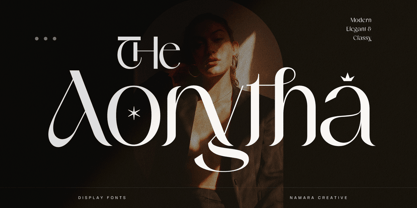 Modern display typeface with beautiful contrast. Decorative details on each character maintain its classy composure. Perfect for logo/branding identity, headline, wedding invitation, poster, and more, to create a project with a classy and luxury touch.
 - Venture by Linotype,
$29.99Venture Script reflects Hermann Zapf's handwriting. It was originally written with a Japanese feltpen. And like with Zapf's typeface Noris Script he wanted to preserve the rough outline of the handwritten form in the final drawings. - Wardrum Pro by Letterhend,
$14.00 Wardrum is an expanded sans with two styles. Use this font for your new project. Suitable for branding, poster, or your headline! This font contain uppercase only with numbers, symbols, punctuation and also multi-lingual support.
 - Gallivant by Jonahfonts,
$39.00 Slightly condensed with a taller lowercase, Gallivant carries itself very well. Similar to classic thick-and-thin san-serif faces with stems slightly facing inward. Note: OpenType variants may only be accessible via OpenType-aware applications.
 - Arizona Futur by Fonts of Chaos,
$10.00 Hello. Arizona Futur is a pixel font with little pixel guys. Easy to use to make cool artworks. The little guys have the same size than the alphabet. So you can mix the words with illustration.
 - Stay Peach by Sans And Sons,
$19.00 Stay Peach is Modern Retro Serif with Unique Elegant and Retro Style. Each unique come with alternate letters designed to create harmoniously, charming and lend themselves to high end branding, product packaging, logo designs & invitation designs.
 - Lidaxid by Aga Silva,
$9.99 With this font, the true fun is ornaments, and there are tons of them. Design conveys either adventurous or eco friendly look, which coupled with many alternate characters adds up to uniqueness in your final design.
 - Glaster by Sulthan Studio,
$14.00 Glaster is a beautiful calligraphy typeface with a distinctive style of its own. It is a bold and elegant script font. Fall in love with its incredibly versatile style and use it to create spectacular designs!
 - Queen Anne Hill by Great Lakes Lettering,
$40.00 Queen Anne Hill is an modern Calligraphy style font with upright strokes and bold flourishes. Revealing the styling of fine artist and calligrapher Alissa Mazzenga, this font communicates refinement with a hint of playful artistic individualism.
 - Plowright by Scriptorium,
$18.00Plowright is a new font based on hand lettering from the 1880s. It's a great example of the style we often associate with signmaking in the old west, with a lot of quirks and original character. - Poisoni Pro by Otto Maurer,
$19.00 Old styled Brushwork-Font. Poisoni Pro comes with many OpenType-Features. Three Styles of Numbers, Three Styles of Caps, many Ligatures and alternate Ends with Swashes. Also Ligatures for the Glyphes "Th", Td, Tk and more.
 - Head Strung by PizzaDude.dk,
$17.00 The Head Strung font is designed with a simple and basic serif structure, but has its oddities and curly lines. It comes with 4 different versions of each letter, and these automatically cycle as you type.
 - Scratchers by PizzaDude.dk,
$15.00 Scratch me here and scratch me there - use my font to get some atmosphere. A quirky sans with scratchy lines, with contextual alternates in 4 different versions of each lowercase letter and multilingual support. Enjoy Scratchers.
 - Aqille by Creaditive Design,
$12.00 Aqille is an elegant script font with a contemporary atmosphere and impeccable form, inspired by timeless classic calligraphy. This font is PUA encoded which means you can access all of the glyphs and swashes with ease!
 - Quercus 10 by Storm Type Foundry,
$69.00 Quercus is characterised by open, yet a little bit condensed drawing with sufficient spacing so that the neighbouring letters never touch. It has eight interpolated weights with respective italics. Their fine gradation allows to find an exact valeur for any kind of design, especially on the web. Quercus serif styles took inspiration from classicistic typefaces with vertical shadows, ball terminals and thin serifs. The italics have the same width proportion as upright styles. This “modern” attitude is applied to both families and calls for use on the same page, e g in dictionaries and cultural programmes. Serif styles marked by “10” are dedicated to textual point sizes and long reading. The sans-serif principle is rather minimalistic, with subtle shadows and thinned joints between curved shapes and stems. Quercus family comprises of the usual functionality such as Small Caps, Cyrillics, diacritics, ligatures, scientific and aesthetic variants, swashes, and other bells & whistles. It excels in informational and magazine design, corporate identity and branding, but it’s very well suited for book covers, catalogues and posters as well. When choosing a name for this typeface I've been staring out from my studio window, thinking helplessly without any idea in sight. Suddenly I realised that all I can see is a spectacular alley of oaks (Quercus in Latin) surrounding my house. These oaks were planted by the builders of local ponds under the leadership of Jakub Krčín in the fifteenth century.
 - Quercus Whiteline by Storm Type Foundry,
$69.00 Quercus is characterised by open, yet a little bit condensed drawing with sufficient spacing so that the neighbouring letters never touch. It has eight interpolated weights with respective italics. Their fine gradation allows to find an exact valeur for any kind of design, especially on the web. Quercus serif styles took inspiration from classicistic typefaces with vertical shadows, ball terminals and thin serifs. The italics have the same width proportion as upright styles. This “modern” attitude is applied to both families and calls for use on the same page, e g in dictionaries and cultural programmes. Serif styles marked by “10” are dedicated to textual point sizes and long reading. The sans-serif principle is rather minimalistic, with subtle shadows and thinned joints between curved shapes and stems. Quercus family comprises of the usual functionality such as Small Caps, Cyrillics, diacritics, ligatures, scientific and aesthetic variants, swashes, and other bells & whistles. It excels in informational and magazine design, corporate identity and branding, but it’s very well suited for book covers, catalogues and posters as well. When choosing a name for this typeface I've been staring out from my studio window, thinking helplessly without any idea in sight. Suddenly I realised that all I can see is a spectacular alley of oaks (Quercus in Latin) surrounding my house. These oaks were planted by the builders of local ponds under the leadership of Jakub Krčín in the fifteenth century.
 - Quercus Serif by Storm Type Foundry,
$69.00 Quercus is characterised by open, yet a little bit condensed drawing with sufficient spacing so that the neighbouring letters never touch. It has eight interpolated weights with respective italics. Their fine gradation allows to find an exact valeur for any kind of design, especially on the web. Quercus serif styles took inspiration from classicistic typefaces with vertical shadows, ball terminals and thin serifs. The italics have the same width proportion as upright styles. This “modern” attitude is applied to both families and calls for use on the same page, e g in dictionaries and cultural programmes. Serif styles marked by “10” are dedicated to textual point sizes and long reading. The sans-serif principle is rather minimalistic, with subtle shadows and thinned joints between curved shapes and stems. Quercus family comprises of the usual functionality such as Small Caps, Cyrillics, diacritics, ligatures, scientific and aesthetic variants, swashes, and other bells & whistles. It excels in informational and magazine design, corporate identity and branding, but it’s very well suited for book covers, catalogues and posters as well. When choosing a name for this typeface I've been staring out from my studio window, thinking helplessly without any idea in sight. Suddenly I realised that all I can see is a spectacular alley of oaks (Quercus in Latin) surrounding my house. These oaks were planted by the builders of local ponds under the leadership of Jakub Krčín in the fifteenth century.
 - Quercus Sans by Storm Type Foundry,
$69.00 “Quercus” is characterised by open, yet a little bit condensed drawing with sufficient spacing so that the neighbouring letters never touch. It has eight interpolated weights with respective italics. Their fine gradation allows to find an exact valeur for any kind of design, especially on the web. Quercus serif styles took inspiration from classicistic typefaces with vertical shadows, ball terminals and thin serifs. The italics have the same width proportion as upright styles. This “modern” attitude is applied to both families and calls for use on the same page, e g in dictionaries and cultural programmes. Serif styles marked by “10” are dedicated to textual point sizes and long reading. The sans-serif principle is rather minimalistic, with subtle shadows and thinned joints between curved shapes and stems. Quercus family comprises of the usual functionality such as Small Caps, Cyrillics, diacritics, ligatures, scientific and aesthetic variants, swashes, and other bells & whistles. It excels in informational and magazine design, corporate identity and branding, but it’s very well suited for book covers, catalogues and posters as well. When choosing a name for this typeface I've been staring out from my studio window, thinking helplessly without any idea in sight. Suddenly I realised that all I can see is a spectacular alley of oaks (Quercus in Latin) surrounding my house. These oaks were planted by the builders of local ponds under the leadership of Jakub Krčín in the fifteenth century.
 - Karlo by The Northern Block,
$28.95 Karlo is a super family of several branches, originating in the same lightweight skeleton. The lightweights are based on a pen of an even stroke-width. Inspired by the writings of calligrapher Edward Johnston, the family moves on in two directions in the heavier weights. Johnston demonstrated that the broad nib pen can produce different writing styles. Following this, one heavy weight has a humanistic low stroke contrast (KarloSerifBold and KarloSansBold), and another has a high stroke contrast of vertical axis with references to the 19th century jobbing typefaces (KarloOpen). The latter is inspired by Johnston’s demonstration of the broad nib pen, where he suggested fastening two pencils together. With each pencil representing an edge of the pen, it becomes more evident how the pen works in writing. The friendly informal look makes KarloSans and KarloSerif usable for both running text and for display sizes. KarloOpen, on the other hand, is solely designed for display purpose showing few words at a time. In Denmark, a guy named Karlo would typically be an old fellow with a slick hairstyle that makes an effort with his appearance. He is a handyman who can do a bit of this and that when needed. He is a happy go lucky kind of guy that takes one day at a time. To me, the typeface family has some of the same qualities. Check out Pyke which is a great pair for Karlo.
 - Fundstueck by Ingo,
$12.00 Inspired by a find a coarse but decorative font was created. "Fundstueck" ist the German term for it. Fonts can be so simple. That is what I was thinking as my attention was turned to this rusty piece of metal. Only a few centimeters in size, I couldn’t imagine which purpose it might truly serve. But my eyes also saw an E, even a well-proportioned E: a width to height ratio of approximately 2/3, black and fine strokes with a 1/2 proportion — could I create more characters on this basis? Thought it, did it. The form is based on a 5mm unit. The strikingly thick middle stroke of E suggests that the emphasis is not necessarily placed on the typical stroke, and likewise with the other characters. But if the font is going to be somewhat legible, then you cannot leave out slanted strokes completely. Eventually I found enough varying solutions for all letters of the alphabet and figures. A font designed in this way doesn’t really have to be extremely legible, which is why I forwent creating lower case letters. Nevertheless, Fundstueck still contains some diverse forms in the layout of upper and lower case letters. Thus, the typeface is a bit richer in variety. By the way — the “lower” letters with accents and umlauts stay between the baseline and cap height. And with that, you get wonderful ribbon-type lines.