10,000 search results
(0.053 seconds)
- KS Foo by Kreuk Type Foundry,
$12.00 KS Foo is Display typeface with countless possibilities. Sub-culture inspired display with sharp & striking form display. From Gigs posters to skateboard to clothing industries. Ideally suited for headline, logo, branding, posters etc.
 - Biloxi Calligraphy by Roland Hüse Design,
$15.00 Biloxi Calligraphy is heavier weight version with calligraphic strokes of a handwritten font of mine called "Biloxi Script". Casual handwritten style with a calligraphy feel, ideal for blog headers, menus, headlines and logotypes.
 - sideburnBob by JOEBOB graphics,
$19.00 A handwritten font created with a 0.5 - 1 mm felt tip pen that works great with illustrations and comics. It seems a bit creepy because of the strokes getting smaller at the bottom.
 - Micholas by Rockboys Studio,
$19.00 Micholas is a simple and casual serif font with an undeniably clean feel. With its neat and beautiful arrangement of letters, this typeface will look outstanding in both formal and non-formal designs.
 - Desmond Text by MADType,
$24.00 Desmond Text is a highly readable and quirky serif face with a tall x-height and glyphic serifs. It is easy to read small, but with pleasing details that shine at display sizes.
 - Hadrianus by Scriptorium,
$18.00Hadrianus is a full-featured text font with calligraphic qualities. It's derived from Roman period lettering, but with the weight and style of pen-drawing and the features of a sophisticated text font. - Mafieso by Rometheme,
$6.00 Mafieso is a fun, playful display font created for a large range of different designs. It features a sweet, cute style with bold letters, that will help you with getting your message across.
 - Gritstomper by Hanoded,
$15.00 Gritstomper is a gritty, charcoaly, pencilly font. Quickly written, handcrafted and with sharpened edges. Comes with a full load of diacritics, double letter ligatures for the lower case and a boss-like attitude.
 - Dynamic Schematic by Trustha,
$17.00 Dynamic Schematic is a natural handwritten font, written with fun and relaxed. It comes with 400+ glyphs, which also include multilingual languages. Dynamic Schematic is perfect for headlines, branding, quotes, and many more.
 - Hefty Galloon by PizzaDude.dk,
$20.00Letters torn apart...did you say punk? Or did you say misprinted? Comes with 2 alternatives for each letter, and with kerning for both lower/lower, caps/lower, caps/caps and lower/caps - Calgera by TRF,
$20.00 Calgera, is a typeface designed by Teuku Riski Firmana. Calgera is a contemporary serif typeface with a distinctive look. Calgera creates an unique character, with different stylistic sets you can change the feel of your design from more organic to more standard. with 9 weights ranging from Thin to Black. This is an elegant font, with beautiful and harmonious alternate, which makes it ideal for use in magazines, in the fashion industry, branding, logo design, dynamic packaging and countless other projects. When starting this project, we wanted to try to draw a modern serif with the precisely verified shapes and detailed elaboration of each character, making your text look great both on paper and on the screens. Calgera in numbers: • 108 styles and 1 variable fonts • 843 glyphs and 441 characters in each style • Support for more than 48+ languages • 27 OpenType features in each style • Amazing Manual TrueType Hinting • 4 variable exes (Weight, Width, Slant, Contrast) Useful OpenType features: Access All Alternates, Historical Forms, Stylistic Alternates, Stylistic Set 1, Stylistic Set 2, Stylistic Set 3, Stylistic Set 4, Stylistic Set 5, Stylistic Set 6, Stylistic Set 7, Stylistic Set 8, Fractions, Oldstyle Figures, Ordinals, Numerators, Small Capitals, Discretionary Ligatures, Standard Ligatures, Small Capitals From Capitals, Case-Sensitive Forms, Denominators, Scientific Inferiors, Subscript, Superscript, Kerning. Calgera language support: Acehnese, Afrikaans, Albanian, Basque, Bosnian, Catalan, Croatian, Czech, Danish, Dutch, English, Estonian, Faroese, Filipino, Finnish, French, Galician, German, Hungarian, Icelandic, Indonesian, Irish, Italian, Latvian, Lithuanian, Malay, Norwegian Bokmål, Polish, Portuguese, Romanian, Slovak, Slovenian, Spanish, Swahili, Swedish, Turkish, Welsh, Zulu, Tagalog, Serbian, Zazaki, West Frisian, Breton, Gagauz, Scottish Gaelic, Northern Sami, Esperanto, Latin.
 - Gimbal Egyptian by AVP,
$19.00 Gimbal Egyptian is a richly-featured font family providing many style options across a broad range of languages. It is twinned with Gimbal Grotesque, a sans-serif family with an identical range of weights and features. Originally conceived as a small webfont family, the letterforms have been revitalised to put a spring in their step and the family has been extended to create a versatile multi-script text face equally at home on the printed page. Carefully crafted at all weights, Gimbal also lends itself to headlines and display applications such as posters, exhibitions and signage while resolving well on-screen for general document creation and web-based applications. The letters are spaced for best readability on-screen and in the usual printed body text ranges but are tolerant of tracking adjustment to suit other uses. The styles are divided by width into four families (Compressed, Condensed, Normal, Extended), each family possessing six weights plus corresponding italics. Within each family, the 'regular' and 'bold' weights are style-linked, and all upright forms have an italic counterpart. The full opentype character set includes latin, greek and cyrillic scripts with appropriate local variants (also as stylistic sets) for Turkish, Polish and Romanian (latin) and Russian, Bulgarian and Serbian (cyrillic). All fonts contain small capitals for all scripts, superscript for latin and commonly used greek together with the usual numeral style, size and positioning options. The default numerals are 'proportional lining'. Other opentype features include case-sensitive marks, fractions, and some discretionary ligatures. A set of circled numerals and circled latin capitals is included, along with an unusual feature that composes 2-character country codes.
 - Abril by TypeTogether,
$39.00 Conceived specifically for intensive editorial use, whether it is in newspapers, magazines or digital media, Abril is a font family of two worlds. The titling weights, based on a contemporary revamp of classic Didone styles, display both neutrality and strong presence on the page, attracting the reader’s attention with measured tension in its curves, good color and high contrast. It also features typographic niceties such as ornaments, borders, special dingbats and alternate letters and numbers that propose a broad palette of tools to the designer. The text weights are more closely inspired by both, 19th century slab serifs and scotch roman types. They maintain consistency with the headline styles, and at first glance may appear to have the same shapes only with lower contrast. However, in reality the letter forms of Abril Text were engineered from scratch to achieve a color, texture and overall width that allow using the font comfortably in the most challenging environments for continuous reading, such as newspapers. This also makes it a great font family for pocketbooks and magazines. Abril competes, in terms of economy of space, head to head with some newspaper classics such as Utopia or Nimrod, but featuring a more contemporary look and feel; and unlike them, includes a full set of small caps with numbers and punctuation. The four main text weights of Abril Text were also manually hinted which grants the possibility of a smooth transition from printed media to web platform. Abril consists of 8 text styles and 12 display styles, all of them containing the standard TypeTogether character set that supports over 50 languages including those from Central and Northern Europe.
 - Gimbal Grotesque by AVP,
$19.00 Gimbal Grotesque is a richly-featured font family providing many style options across a broad range of languages. It is twinned with Gimbal Egyptian, a slab-serif family with an identical range of weights and features. Originally conceived as a small webfont family, the letterforms have been revitalised to put a spring in their step and the family has been extended to create a versatile multi-script text face equally at home on the printed page. Carefully crafted at all weights, Gimbal also lends itself to headlines and display applications such as posters, exhibitions and signage while resolving well on-screen for general document creation and web-based applications. The letters are spaced for best readability on-screen and in the usual printed body text ranges but are tolerant of tracking adjustment to suit other uses. The styles are divided by width into four families (Compressed, Condensed, Normal, Extended), each family possessing six weights plus corresponding italics. Within each family, the 'regular' and 'bold' weights are style-linked, and all upright forms have an italic counterpart. The full opentype character set includes latin, greek and cyrillic scripts with appropriate local variants (also as stylistic sets) for Turkish, Polish and Romanian (latin) and Russian, Bulgarian and Serbian (cyrillic). All fonts contain small capitals for all scripts, superscript for latin and commonly used greek together with the usual numeral style, size and positioning options. The default numerals are 'proportional lining'. Other opentype features include case-sensitive marks, fractions, and some discretionary ligatures. A set of circled numerals and circled latin capitals is included, along with an unusual feature that composes 2-character country codes.
 - Brandogram Monogram Typeface by Design A Lot,
$45.00 After months of testing and development, we have managed to put together the Brandogram Typeface, an ultimate tool for monogram design. With the help of this typeface you can easily create a monogram in less than a minute. Thanks to the way we have created and optimised Brandogram, the uppercase letters effortlessly fit together with the small caps that are activated by the lowercase letters. Using the Brandogram typeface you can create unlimited monogram combos with 2, 3 or even 4 letters in some cases. And these are all possible thanks to features like: Multiple letter widths, from condensed to wide; Both sans serif and slab serif letter designs; Up to 24 different designs per letter; All letter variations are available as alternates so you can easily choose your favorite; Accents are available for each letter alternate; Uppercase and lowercase activated letters are constructed to perfectly center and middle align; There are 5 solid ready-made weights; There are another 2 stencil weights that can bring a new touch to your designs. The 7 weights of Brandogram Monogram Typeface: Thin Light Regular Medium Bold Stencil One Stencil Two Each of these weights are thought to express different levels of heaviness. The thicker the weight of the font gets, the less white space will be left between the letters when they are combined, therefore your design gets heavier. The role of the stencil weights is to create depth in the monogram designs. With those you can easily delete the extra overlapping shapes of the letters and create passages between the letters and give an interlocking impression. This typeface combined with your creativity can have no limits!
 - Fault by Dharma Type,
$14.99 Experimental type with striped elements.
 - Obstacle by Bogstav,
$17.00 Handmade font with thin brush.
 - Everlasting by Bogstav,
$17.00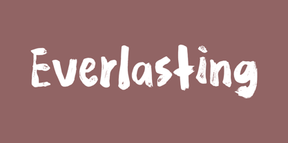 Handmade with an organic feeling.
 - Roller Blind by Volcano Type,
$19.00Computer-related font with grid. - Tolstoy by TypeArt Foundry,
$45.00 Eucaliptus Companion with rounded corners.
 - Lemonism by Bogstav,
$17.00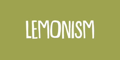 Handmade with an organic feeling.
 - Ahorn by Bogstav,
$17.00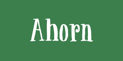 Handmade with an organic feeling.
 - Talkback by Bogstav,
$17.00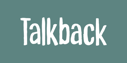 Handmade with an organic feeling.
 - Osculate by Bogstav,
$17.00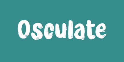 Handmade with an organic feeling.
 - Ameche Padua by Bogusky 2,
$20.00Outline font with drop shadoww - Hallock by Arabetics,
$39.00 A text typeface design with completely isolated letters and extra emphasis on vertical feel and visual connectivity to aid easy reading. The Hallock font family is named after Homan Hallock, a New York based American type designer and typographer who created the first documented unified and isolated Arabic font design in July 1864. The Hallock font family has two styles, regular and left-slanted italic styles. This font family design follows the guidelines of Mutamathil Taqlidi type style with one glyph for every basic Arabic Unicode character or letter, as defined in the latest Unicode Standards, and one additional final form glyph, for the freely-connecting letters in traditional Arabic cursive text. Hallock employs variable x-height values. It includes only the Lam-Alif ligatures. Soft-vowel diacritic marks, harakat, are selectively positioned. Most of them appear by default on the same level, following a letter, to ensure that they would not interfere visually with letters. Tatweel is a zero-width glyph. Keying the tatweel key before Alif-Lam-Lam-Ha will display the Allah ligature. Hallock includes both Arabic and Arabic-Indic numerals, in addition to standard punctuations.
 - Eknaton by T4 Foundry,
$21.00The powerful Eknaton comes with slanted slabserifs, a new way to add some spring to the old Egyptian slabs. Eknaton echoes the tradition that started with Napoleon's Egyptian campaign 1798, and the simultaneous looting of Egyptian art. The imports led to new ladies fashion in Europe, new architecture and new typefaces like Antique (Figgins, 1815) and Egyptian (Caslon, 1816). The Egyptian faces were also the origin of the famous Clarendon (1845) and Ionic No.5 (1925) as well as the rest of "the legibility types". In the 20th century the slabserifs became popular again with Bauhaus incarnations like Memphis (Wolf, 1929) and Beton (Jost, 1931). The Bauhaus movement, otherwise anti-serif, liked the architectural influence in Egyptian slabserifs. The Bo Berndal design of Eknaton puts some speed into the old Sphinx - the cat is back, in better form than ever! Bo Berndal, born 1924, has been designing typefaces for 56 years, for Monotype, Linotype and other foundries. Eknaton comes in five different widths, from Tight to Expanded, and is an OpenType typeface for both PC and Mac. Swedish type foundry T4 premiere new fonts every month. Eknaton is our eleventh introduction. - ASTYPE Ornaments Accolades A by astype,
$28.00 The astype series Accolades A offers the designer a fine balanced set of calligraphic swashes, swirls and floral ornaments. The shapes are in systematic order and harmonize in contrast and detail. The shapes can be combined easily and the advanced designer can build hundreds of sophisticated compositions. No matter, whether packaging lables, invitations or greeting cards - every assignment with the need of a delightful appeal will be served well. Accolades A and A2 share the same base set of ornaments but differ in some of the major shapes. Despite these differences, the total width of the shapes will be always the same. If you are looking for some good companion fonts, give Gracia and Adana a try. Every classic high contrast stroke design like Didot or Bodoni works well. Note: To look perfect, adjust the size of the ornament font to fit in contrast the design of the companion font. So if you use a Bodoni font as companion, try to match the thickness of the thinnest part of a upper case Bodoni letter with the thinnest part of a shape from the ornament. Note 2: Each package comes with a technical documentation and an InDesign2 sample file.
 - FF Cocon by FontFont,
$65.99 FF Cocon’s designer, Evert Bloemsma (1958—2005) described it as a “serious typeface”. Despite first impressions, the description holds up well. Since its 2001 release, FF Cocon has been used in an astoundingly wide variety of design applications. At large sizes, FF Cocon works as a display face, with beautiful detailing. And at small sizes, it remains surprisingly readable. The lowercase letters a, b, d, g, h, m, n, p, q, r and u, were drawn without spurs, as Bloemsma made an attempt to erase every trace of handwriting; even “normal,” neutral sans serif typefaces still retain elements in their letterforms like this. Bloemsma wanted none of it. Although a difficult starting point for a typeface, this proved successful. Bloemsma’s design is a family of rounded yet rather asymmetrical forms with details reminiscent of brush-strokes, but that were not made with a brush in hand. In spite of its claim to seriousness, FF Cocon is a family of seductive, voluptuous styles. The original FF Cocon had two widths—normal and condensed. Later, a more compact Extra Condensed version was introduced, as well as italics.
 - Newbery Sans Pro by Sudtipos,
$49.00 Newbery Sans is a new contrasted sans serif designed by Alejandro Paul and the Sudtipos team. As Paul has lately found inspiration from different German instructional books, Newbery Sans finds its initial inspirations from the lettering work of E. Nerdinger and invokes the spirit of German designs but is imbued with personality all its own. The idea was to make the letterforms more usable and suitable for everything from corporate branding to editorial. It is an elegant, functional family with contemporary detail that will effortlessly meet the demands of the screen and printed page. From a condensed thin to an expanded black, Newbery Sans provides a usable workhorse system of three widths and seven weights, each with the original design of real italics, a selection of alternate glyphs and a complete set of small caps. Each weight is professionally crafted and includes extended Latin support for Central, East and Western Europe languages. The font’s name nods to its imagined uses in airports and street signage: Jorge Newbery was one of the first Latin American aircraft pilots, Newbery is the street where I live and it is also the name of Buenos Aires’s local airport.
 - Nomenclatur by Aronetiv,
$9.99 The font was created under the influence of German tabular inscriptions. Especially, DIN font influenced on Nomenclatur graphic. It adds clarity and conciseness in the font. Nomenclatur is intended for use in architectural and design topics. It is also intended for a set of instructions and manuals. The font has the aesthetics of the Bauhaus and other constructivist movements. Characters of font are designed with high intelligibility, which makes it well readable in a small size. The lowercase letter "l" has a tail, so as not to confuse it with the capital letter "I", which has serifs. It avoids confusion in words like "Illinois". The font is well suited for the design of signs and navigation texts. A wide selection of styles allows you to design complex typography. The font family includes 15 styles. The font family has a variable font with two axes of weight and width. The font contains a set of alternative characters that will allow you to create different moods. The font contains Western European Latin and standard Cyrillic. The font has more than 3,600 kerning pairs configured. The font contains beautiful ampersand.
 - Salome by Canada Type,
$24.95 Salome is a revival, normalization and elaborate expansion of a 1972 film face called Cantini. The original film type, released by a tiny independent outfit called Letter Graphics, looked like it was hand drawn with little consideration for consistency in essential lettering flow measurements, like angles, stroke widths, and vertical metrics. All these issues have been resolved in this digital version, and the original character set, including the whole lot of alternates, was entirely redrawn and expanded to include even more alternates and many useful ligatures, as well as extended support for Latin-based languages. Combining elements of early 20th century art nouveau with common 1960s and 1970s signage and poster lettering flair, Salome uses curls and curves to wave its fantastic shapes in a most hypnotic dance. Salome simply cannot be unseen. Just like its namesake, the female seduction icon, it does not hesitate to put all of its natural beauty and energy on display in order to get what it wants. Salome comes in all popular font formats. The OpenType version, Salome Pro, combines the main font with the alternates one, and contains convenient features for push-button alternation and ligature substitution in supporting software programs.
 - Shape Variable Script by Roland Hüse Design,
$32.00 A shape-shaky script font that reacts to audio! Thanks to the variable font technology, fonts today can be variable be it weight, width or any other parameters that are defined by values such as shape! Even better: in html, with a bit of css (and in this case, javascript as well) it is possible to animate them between these values. This gave me the idea to create something really fun which is a quirky, informal handwritten font that can react to sound. The html file along with css and javascript is taken from codepen.io and I was using and tweaking it to this specific project. Please read more details in this pdf where you can also find link to a demo and download the txt files: https://drive.google.com/file/d/15J_6g3NgmZKJYO6SrnOHj4Rk7qltkfwE/view?usp=sharing The character set of this font contains Western, Eastern and South-Eastern Latin accented characters, special characters, basic symbols, punctuation and signs. Best use is with large size and a few words rather than large sentences. I hope you guys like it and it will add up to your next creative project! Have fun and happy creating!
 - Linotype Typo American by Linotype,
$29.99Mark Stanczyk designed Linotype Typo American in 1999. The font is an excellent revival of American style typewriter type. As most of us can remember from our childhood years, or through old stories and movies, everyone used to type with typewriters before the invention of computers. Unlike computers, most individual typewriters only had one typestyle, or font, to chose from. To make matters worse, the letters in a typewriter font would wear down with use. Over time, text typed out on a typewriter would look more and more corroded, old, and uneven. Stanczyk has captured exactly these features in this “revival” font! Also like most older typewriter styles, Linotype Typo American’s letters are all mono-spaced, i.e., the letter i is the same width as the letter w. Typewriter letters also all tended to be cast in the same size, around 12 points or so. When using typewriter-style fonts, it is best to keep setting your text in similar sizes. (Of course, you can set really large and fun headlines with Linotype Typo American, too; if anything the unevenness of the design will come even more across in these applications.) - Pawl by The Ampersand Forest,
$20.00 Meet Pawl, an affordable 48-font squarish sans family with a little grotesque in him! Oh, you may think you’ve got him pegged at first glance, but he’ll surprise you with his versatility. AND he's just been totally refurbished from top to bottom and boy, did he need it! Pawl lives in the same visual landscape as fantastic modular superfamilies like Eurostile, Agency, Geogrotesque, Barlow, and even the great American Gothics. Unlike those faces, though, he's nimble enough to switch between looks effortlessly. Pawl is energetic, aggressive, strident, and structural. Depending on how you use him, his voice can be retro, futuristic, industrial, or sleek. He can be sober or splashy, techy or oldschool. Use his alternate characters and stylistic sets to create looks ranging from Streamline Moderne to Futurism to Brutalism to Swiss. He works from small paragraphs all the way up to monumental signage. This guy is smart and useful, with a lotta looks! How many times have you needed multiple weights, styles, and widths for your hierarchy, but standard type families were either shockingly expensive or couldn't deliver? Pawl delivers. Give him a shot!
 - Axeo by Asritype,
$13.00 Axeo is a freeform serif typeface. With more than 500 glyphs for each cut, Axeo supporting wide Latin Base Languages. The font structures is sans-serif typeface. Then, the fonts is made into serif (serifed) using rhombus and adapted/modified rhombus (before remove overlaps) placed on its appropriate positions. This fonts is released first, while the sans-serif is being in process. There are 10 fonts; 5 weight in normal width: Light, Regular, Medium, Bold, and Black; and 4 in semi-condensed: Light, Regular, Medium, Bold and Black, too. The fonts has some minor character variations, all are sets in SS01.There are also standard and discretionary ligatures, arrow, some geometric shapes and ornaments. With its sansserif structure, the Medium, Bold and Black fonts is playful with text effect in various applications such MS Word, CorelDraw or others to enhance the appearance. Its serif form will make unique enhancements. Thus, the fonts is suitable for Branding, logos, cards, advertisements, banners, display and more; for the main texts or its companions. While the light, regular and medium fonts can also be used as description text, card text, note, caption and longer non-formal texts or other usages.
 - New Icon by Set Sail Studios,
$34.99 Introducing the New Icon Font Duo. This luxury script and timeless serif are perfectly designed for one another-not only are they strong standalone fonts, but will pair beautifully when placed side by side. Feeling creative? They can even be mixed together within the same word for a more eye-catching layout, giving you a versatile set of fonts which can be used & loved across a range of design projects. Included in this family; New Icon Serif • A classic, all caps serif font with nostalgic notes. Contains alternate large-width O,G,Q,C characters in the ‘uppercase’ set. New Icon Serif Condensed • A thinner version of the New Icon Serif. New Icon Script • A luxury, cursive script font containing upper & lowercase characters. A beautiful letter set inspired by traditional calligraphy, which can be used on it’s own or paired effortlessly with the serif font. Contains alternate lowercase y & g with elongated tails, accessible by turning on ‘Stylistic Alternates’ or via a Glyphs panel. Language Support • English, French, Italian, Spanish, Portuguese, German, Swedish, Norwegian, Danish, Dutch, Finnish, Indonesian, Malay, Hungarian, Polish, Croatian, Turkish, Romanian, Czech, Latvian, Lithuanian, Slovak, Slovenian.
 - Frosty Xmas by SilverStag,
$19.00 Get ready to unwrap a typographic delight with Frosty Xmas, the holiday-themed serif font designed to infuse your projects with festive charm and timeless elegance. With its soft round corners, delicate serifs, and all-uppercase characters, Frosty Xmas exudes a timeless charm that complements a wide range of holiday designs. Its classic serif letters, adorned with swirls, swashes, and star elements, add a touch of whimsy and magic to your creations. Whether you're crafting holiday cards, designing festive branding, or creating typographic posters that echo the joy of the season, Frosty Xmas is your go-to companion. Its versatility knows no bounds, making it equally suited for standard branding, logo design, and a wide array of creative ventures. But that's not all – Frosty Xmas comes bundled with 40 hand-drawn holiday doodles, adding an extra layer of whimsy to your projects. From snowflakes to stockings, candy canes to Christmas trees, these doodles are the perfect embellishments for all your holiday-themed endeavors. Crafted with over 450 carefully designed glyphs, Frosty Xmas supports over 90 languages, making it a versatile tool for designers and crafters worldwide. Whether you're creating holiday greeting cards, packaging labels, or typography posters, Frosty Xmas will infuse your designs with festive cheer. Elevate your designs, captivate your audience, and make this holiday season truly memorable with Frosty Xmas. The magic begins with each letter – are you ready to unwrap the joy? Happy designing and Merry Frosty Xmas! 🎄✨
 - Camper by Fenotype,
$35.00 Camper is an original font collection of sixteen display fonts and extras. Camper’s core is a low-contrast connected script with three weights. In addition there are Sans, Serif and Slab fonts. All Camper fonts have a coherent style of solid forms with soft edges. They all play well together but work as themselves too. Camper’s Print is the same family with rugged “printed” edges and print texture. Camper Script is packed with several OpenType features: Contextual Alternates and Standard Ligatures help to maintain smooth flow while typing and they’re normally on. If you need more flashy characters try Swash, Stylistic or Titling Alternates or seek for even more Alternates from the Glyph Palette. Camper Script is PUA encoded and you can access extra characters in most graphic design softwares even without OpenType support. From Discretionary Ligatures you will find several flashier ligatures and a set of Catchwords: Access them by typing “The”, “And” or “With” with Discretionary Ligatures turned on. Camper Extras is a pack of strokes and swashes designed to go with the script. Many strokes can also be directly combined with a letter to make a custom “swash letter”. Check out posters for more inspiration. All Camper’s fonts have a wide language support — even Cyrillic. Camper is a recognizable and sturdy display pack with smooth and friendly outfit. It’s great for any display project from posters to identities and from online to print.
 - Marleen Script by Ingo,
$81.00 An authentic style of feminine handwriting with a pencil Who still writes by hand? And who still writes nicely? What constitutes beautiful handwriting anyway? In Marleen Script nearly 100 stylistic alternates for individual letters and more than 400 ligatures are included. With these options it is finally possible to convincingly simulate the effect of true handwriting with a typeface. So, the form of the single character seldom repeats itself since it is mostly replaced with a ligature; and, with each combination of characters the result is a slightly different form of the individual character. Type set in Marleen Script appears remarkably similar to a text actually handwritten with a pencil. The characters of Marleen Script have intentionally been digitalized as a bit loose and irregular. Stylistic alternates are available for many of the letters, some even with various alternates to choose from, in order to produce a font with a very lively appearance. This typeface also fills a completely different kind of gap: finally, a ”typically female“ font. Spirited capital letters, the tendency toward loops and the obvious inclination toward the left are all common characteristics of ”female scripts.“ The original for Marleen Script was created by Marleen Baumann from Augsburg in the spring of 2010 using a sharp pencil on rough handmade paper. In spite of irregularities, this font is aesthetical. Although most people rarely put forward an effort with their handwriting, in Marleen Script one can see the desire for an attractive form.