10,000 search results
(0.044 seconds)
- Jazz Script by Fenotype,
$35.00 - Sequel Geo by OGJ Type Design,
$35.00 - Syntha Nova - Personal use only
- Dawning of a New Day - Personal use only
- CANDY INC. - Personal use only
- Havent Slept in Two Days Shadow - Personal use only
- Janda Fabulous - Personal use only
- Swanky and Moo Moo - Personal use only
- Love Ya Like A Sister - Personal use only
- Shining Like Stars - Personal use only
- Alpha Flight Solid Small Caps - Unknown license
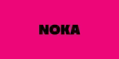
- Noka by Blackletra,
$50.00 - Spring Fashion JNL by Jeff Levine,
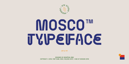
$29.00 - Mosco by ATK Studio,
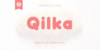
$15.00 - Qilka by RahagitaType,
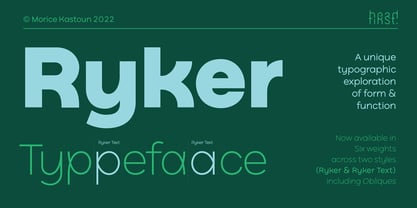
$24.00 - Ryker by HeadFirst,
$23.99 - Greyton Script by ITC,
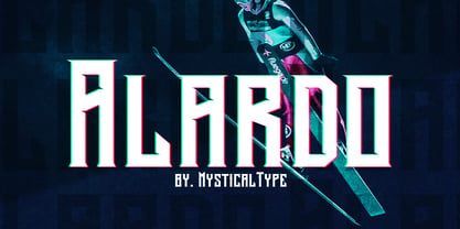
$29.99 - Alardo by MysticalType,
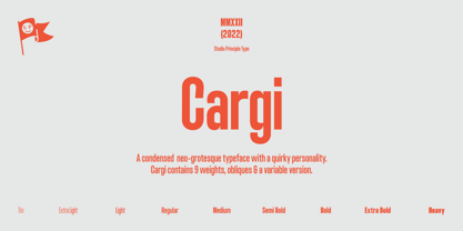
$12.00 - Cargi by Studio Principle Type,
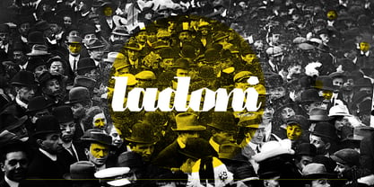
$12.00 - Ladoni by Diogo Pisoeiro,
$15.00 - SEISDEDOS DEAD - Personal use only
- PLATOoN - Personal use only
- Ruthless Drippin ONE - Personal use only
- Ruthless Drippin TWO - Personal use only
- NFL Jaguars - Personal use only
- Calligraphy Pen - Personal use only
- I AM SHERLOCKED - Personal use only
- Some Weatz Symbols - Personal use only
- The Mighty Avengers - Personal use only
- LICENSE PLATE USA - Personal use only
- etaoin shrdlu - Personal use only
- Let Me Ride - Personal use only
- Ruthless Wreckin TWO - Personal use only
- The X-Files - Personal use only
- Rider Wide - Personal use only
- HEROES - Personal use only
- Generator REX - Personal use only
- Ruthless Wreckin ONE - Personal use only
- GARFIELD the CAT - Personal use only
- First Lyrics - Personal use only


