10,000 search results
(0.097 seconds)
- Little Micro Sans by Caron twice,
$39.00 It is 1984 and Ridley Scott’s commercial for Apple tells us, “You’ll see why 1984 won’t be like ‘1984’.” The first Mac comes on the market. The Mac interface includes a font for use in small sizes called Chicago. The first version was designed by Susan Kare. The font’s modern grid-like character was also used for the first iPod screens, which is why this font is also associated with music. Today’s font upgrade, Little Micro Sans, is suited for small-point texts, product labels, lists of ingredients, and small captions in books, magazines, websites or applications. For online use, a variable format is particularly handy as it offers all font styles in a single file, has a faster display time and takes up less memory. Little Micro Sans is a revolution for small sizes. Specimen: http://carontwice.com/files/specimen_Little_Micro_Sans.pdf
 - Litfass by RMU,
$30.00 Litfass is a revival which follows a turn-of-the-century German Art Nouveau font, once released by the Flinsch Foundry. To get access to all ligatures, it is recommended to activate both Standard and Discretionary Ligatures.
 - FF Assuri by FontFont,
$30.99 German type designer Fabian Rottke created this display FontFont in 1994. The font is ideally suited for poster and billboards. FF Assuri provides advanced typographical support with features such as ligatures. It comes with proportional lining figures.
 - FF Littles by FontFont,
$30.99 German type designer Simone May created this display FontFont in 1995. The font is ideally suited for poster and billboards. FF Littles provides advanced typographical support with features such as ligatures. It comes with proportional lining figures.
 - Million Dreams by Sansakerta,
$13.00 Million Dreams is an elegant and bold display font. Unique, playful and versatile serif Fot that you can combine to get curves and beautiful shapes just in seconds. Play with the ornaments to create a more stunning display. This font is suitable for use in many design forms, for example magazines, postcards, logos, vintage look, old classic ,60s, 70s, 80s era, wedding projects and many more. We recommend using Adobe Illustrator or Photoshop. Fall in love with its incredibly versatile style and use it to create gorgeous wedding invitations, beautiful stationary art, eye-catching social media posts, and much more! Cheers! Sansakerta
 - Culoare by Luxfont,
$18.00 Introducing space-bright COLORED hologram font. Soft color transitions combined with minimalistic clean glyphs. Ideal for modern web and print design. Excellent readability of glyphs for both the title and the large volume of text is preserved. Multi-colored modern family with different types of coloring - a highlighted gradient border of letters or fully hologram glyphs - a large selection of 11 ready-made font styles. Originality of the font will fit well into the fashionable logo, headline in the magazine or on the website, emphasize the trend of the product in branding and complement web advertising on social media. This font family is based on the Regular font Boldini - which means that if necessary you can combine these two families and they will be absolutely stylistically identical and complement each other. Check the quality before purchasing and try the FREE DEMO version of the font to make sure your software supports color fonts. Features: Free Demo font to check it works. 11 OTF SVG color fonts in the family Free Demo font to check it works. Gradient and hologram fonts Kerning IMPORTANT: - OTF SVG fonts contain vector letters with gradients and transparency. - Multicolor OTF version of this font will show up only in apps that are compatible with color fonts, like Adobe Photoshop CC 2017.0.1 and above, Illustrator CC 2018. Learn more about color fonts & their support in third-party apps on www.colorfonts.wtf -Don't worry about what you can't see the preview of the font in the tab "Individual Styles" - all fonts are working and have passed technical inspection, but not displayed, they just because the website MyFonts is not yet able to show a preview of colored fonts. Then if you have software with support colored fonts - you can be sure that after installing fonts into the system you will be able to use them like every other classic font. Question/answer: How to install a font? The procedure for installing the font in the system has not changed. Install the font as you would install the classic OTF | TTF fonts. How can I change the font color to my color? · Adobe Illustrator: Convert text to outline and easily change color to your taste as if you were repainting a simple vector shape. · Adobe Photoshop: You can easily repaint text layer with Layer effects and color overlay. ld.luxfont@gmail.com
 - Atoverz by Twinletter,
$17.00 Introducing Atoverz, the perfect retro condensed font for your next project. This font features a classic retro design that is both stylish and functional. With 49 curved alternate characters and 32 beautiful ligatures, Atoverz allows you to easily create unique and stunning designs. Its multilingual support also ensures you can use it for projects in any language. The sleek and elegant design of Atoverz makes it perfect for a wide range of projects, from logos and branding to posters and advertisements. Its retro classic style is sure to catch the eye of your audience and leave a lasting impression. So why wait? Add Atoverz to your font collection today and take your designs to the next level. Browse our collection now to discover the versatility and charm of Atoverz retro condensed font. What’s Included : - File font - All glyphs Iso Latin 1 - Alternate, Ligature - Simple installations - We highly recommend using a program that supports OpenType features and Glyphs panels like many Adobe apps and Corel Draw so that you can see and access all Glyph variations. - PUA Encoded Characters – Fully accessible without additional design software. - Fonts include Multilingual support
 - Hikran by Twinletter,
$18.00 Introducing Hikran, a stylish retro condensed font perfect for various design projects. With its tall and unique letter shapes, Hikran is a great choice for both headlines and body text. The font comes with stylistic alternates and ligatures, giving you plenty of options to create a personalized look. Hikran’s retro theme adds a touch of nostalgia to your designs, making it perfect for vintage-inspired projects or any design that needs a bold and classic feel. Whether you’re designing a poster, logo, or branding materials, Hikran is sure to make an impact. Its sleek and elegant style pairs well with any design, and its multi-language support makes it accessible to a wider audience. With Hikran, you’ll have a versatile and reliable font that will elevate your design game. Don’t miss out on this must-have font for your collection! What’s Included : - File font - All glyphs Iso Latin 1 - Alternate, Ligature - Simple installations - We highly recommend using a program that supports OpenType features and Glyphs panels like many Adobe apps and Corel Draw so that you can see and access all Glyph variations. - PUA Encoded Characters – Fully accessible without additional design software. - Fonts include Multilingual support
 - Summer Rose by Krafted,
$10.00 Roses are the epitome of beauty, simplicity, and love. Summer provides us with warmth, laughter, and happiness. Combine the two and you get a shimmeringly spectacular combination. Introducing Summer Rose - A Sweet, Casual Handwritten Font. Summer Rose can be used for a variety of different content needs such as headings, logos, business cards, printed quotes, cards, packaging, resumes, and even your website or social media branding. Breathe the sweet-smelling freshness of Summer Rose into your branding and dazzle your guests, audience, or clients. Let the world see your beautiful ideas with this Sweet, Casual Handwritten Font. What you’ll get: Multilingual & Ligature Support Full sets of Punctuation and Numerals Compatible with: Adobe Suite Microsoft Office KeyNote Pages Software Requirements: The fonts that you’ll receive in the pack are widely supported by most software. In order to get the full functionality of the selection of standard ligatures (custom created letters) in the script font, any software that can read OpenType fonts will work. We hope you enjoy this font and that it makes your branding sparkle! Feel free to reach out to us if you’d like more information or if you have any concerns.
 - ANWUTOK by Twinletter,
$17.00 Say hello to summer freshness with the Anwutok font! With a cheerful Display theme, this font is the perfect solution for creating projects with a relaxed and bright feel. Anwutok comes with impressive features. With ligatures and alternates, you can easily combine interesting characters and create unique and creative typography designs. Apart from that, Anwutok also supports multilingualism, allowing you to adapt this font to different languages. This gives you flexibility and extends the reach of your project to a wider market. With a fresh and playful style, Anwutok brings a fun and uplifting touch to your designs. Each letter is designed with care to convey evocative beauty. Choose Anwutok as your constant companion in creating enthralling and relaxing projects. Get this font now and let summer inspiration decorate your creations. What’s Included : File font All glyphs Iso Latin 1 Alternate, Ligature Simple installations We highly recommend using a program that supports OpenType features and Glyphs panels like many Adobe apps and Corel Draw so that you can see and access all Glyph variations. PUA Encoded Characters – Fully accessible without additional design software. Fonts include Multilingual support
 - Mollaroid Signature by Aldedesign,
$15.00 Mollaroid - Signature Font - A stylish and quirky new signature font script. Mollaroid font was created to look as close to a natural handwritten script as possible by including over a lot ligatures, titling, and swash. This font is for those who want to show something smooth and modern. You may use this font if you want to attract modern buyers. The font design seems to show that you have a passion in the business and give your love to the products and services you are offered to customers. Because it is an eye-catching signature font, you can use it for a variety of purposes including design, branding, signature, logo, poster, and many more. Even, you can just print it in a t-shirt and the font makes the t-shirt looks interesting to see.
 - Bhuyin by Twinletter,
$17.00 "Welcome to the world of one-of-a-kind typography!" Bhuyin is a display typeface with a totally unique sense of design. Bhuyin is the ideal choice if you need a bold and distinct style for a wide range of visual design tasks. What distinguishes Bhuyin from others? Its attributes are fantastic. With ligatures and alternatives available, Bhuyin allows you to express yourself in an infinite number of ways. You can quickly construct one-of-a-kind letter combinations to lend a particular, personalized touch to any project. Because we understand the value of interacting with a worldwide audience, Bhuyin supports several languages. Your message will be clearly and successfully delivered to individuals all around the world. Are you ready to take your design to the next level? Bhuyin is ready to take your projects to the next level. Get this font now and see how Bhuyin turns every design into an unforgettable work of art.
 - Better Grade by Heinzel Std,
$20.00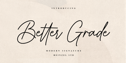 Better Grade is a flowing handwritten font, described by an elegant touch, perfect for your favorite projects. It looks stunning on wedding invitations, thank you cards, quotes, greeting cards, logos, business cards and every other design which needs a handwritten touch. Fall in love with its incredibly distinct and timeless style and use it to create spectacular designs! What's Included : Better Grade Web Font PUA Encoded Multilingual Support
 - Alyesina by Sealoung,
$15.00 Alyesina is a very luxurious elegant calligraphy font for your classy projects that is complemented by a pretty and stylish alternative. This font includes alternatives, style sets, ligatures, swashes and multilingual support with the Pua encode opentype feature. In some glyphs it has a pretty stylistic alternative. Perfect for startup projects, wedding invitations, logos, packaging, quotes, branding, web, blogs, etc. FEATURES : Uppercase Lowercase Number Punctuation Multilingual PUA Encode Opentype Stylistic Alternate
 - Futura BT by Bitstream,
$39.99 Futura is the fully developed prototype of the twentieth century Geometric Sanserif. The form is ancient, Greek capitals being inscribed by the Cretans twenty-five hundred years ago at the time of Pythagoras in the Gortyn Code, by the Imperial Romans, notably in the tomb of the Scipios, by classical revival architects in eighteenth century London, which formed the basis for Caslon’s first sanserif typeface in 1817. Some aspects of the Geometric sanserif survived in the flood of Gothics that followed, particularly in the work of Vincent Figgins. In 1927, stimulated by the Bauhaus experiments in geometric form and the Ludwig & Mayer typeface Erbar, Paul Renner sketched a set of Bauhaus forms; working from these, the professional letter design office at Bauer reinvented the sanserif based on strokes of even weight, perfect circles and isosceles triangles and brought the Universal Alphabet and Erbar to their definitive typographic form. Futura became the most popular sanserif of the middle years of the twentieth century. Ironically, given its generic past, Futura is the only typeface to have been granted registration under copyright as an original work of art, and, further irony, given the key part played by the Bauer letter design office, the full copyright belongs to Renner and his heirs. This decision in a Frankfurt court implies that a further small group of older typefaces may also be covered by copyright in Germany, particularly those designed for Stempel by Hermann Zapf. This situation appears to be limited to this small group of faces in this one country, although protection of designers’ rights in newer typefaces is now possible in France and Germany through legislation deriving from the 1973 Vienna Treaty for the protection of typefaces. Mergenthaler’s Spartan is a close copy of Futura; Ludlow’s Tempo is less close. Functional yet friendly, logical yet not overintellectual, German yet anti-Nazi... with hindsight the choice of Futura as Volkswagen’s ad font since the 1960s looks inevitable.
 - Molex Shoora by Jolicia Type,
$15.00 Molex Shoora is a typeface that is inspired by retro-style writing. We make each element with a unique style, made on the top and bottom edges thick and in the middle it starts to thin which is consistent with each letter There are 14 font family for the choice of the desired letter design 31 ligatures combined with each other add to the fun style 410 total glyphs Support 88 languages: Afrikaans Albanian Asu Basque Bemba Bena Breton Catalan Chiga Colognian Cornish Croatian Czech DanishDutch Embu English Esperanto Estonian Faroese Filipino Finnish French Friulian Galician German GusiiHungarian Indonesian Irish Italian Kabuverdianu Kalaallisut Kalenjin Kamba Kikuyu Kinyarwanda LatvianLithuanian Lower Sorbian Luo Luxembourgish Luyia Machame Makhuwa-Meetto Makonde Malagasy MalteseManx Meru Morisyen North Ndebele Norwegian Bokmål Norwegian Nynorsk Nyankole Oromo Polish PortugueseQuechua Romanian Romansh Rombo Rundi Rwa Samburu Sango Sangu Scottish Gaelic Sena Serbian ShambalaShona Slovak Soga Somali Spanish Swahili Swedish Swiss German Taita Teso Turkish Upper Sorbian Uzbek (Latin) Volapük Vunjo Walser Zulu
 - MVB Calliope by MVB,
$39.00Gayle Sato, longtime friend of MVB Fonts, has amazing handwriting. It’s a natural, simple hand, with perfect rhythm. Devoid of flourishes, it doesn’t try to be beautiful. It’s just genuine, quick, and clean — the handwriting we all wish we had. The digitization by Mark van Bronkhorst captures these qualities. Retaining the roughness of a felt pen, MVB Calliope is a handwriting typeface that feels much more authentic than most, highly legible but still raw. The Regular was released in 2005, with the other weights shortly thereafter. - Savigny by insigne,
$22.00 Savigny began as an offshoot of Le Havre. Le Havre met my design objective of a geometric sans serif with a strong art deco touch. Le Havre’s primary inspiration came from the art deco titling of the 1930’s, and the lower case was just icing. The art of the 1930’s is of particular interest to me, and I love the art deco era and its art, and the simplicity of geometric shapes. I am mostly interested in designing display typefaces. In many ways Le Havre was the exact opposite of another popular insigne offering, Aviano Sans. Le Havre has very high ascenders, a lower case and is very condensed. Aviano Sans has no lowercase and extremely extended capitals. With the rise of webfonts I began to see Le Havre being used frequently online. It’s short x-height and very tall ascenders made it difficult to read in on screen text settings as it was intended as display type. With this observation, I felt that there is more room for a geometric sans in the insigne catalog. So I set about to design a new geometric sans using the successful skeleton of the Le Havre family. Although I planned to extend the Le Havre line, the new family is so drastically different I decided on a new name: Savigny. The face evolved and began to take on a few humanist touches. Designed from the very beginning as a webfont, the design is open and pleasing to the eye, with a tall x-height. To optimize it for onscreen settings, the spacing is generous. In addition, it includes extended and condensed members, making it insigne’s first superfamily. The family includes over 100 OpenType alternate characters. These include several style sets. Some are stemless, others are purely geometric, and in a nod to Savigny’s origins, Art Deco titling alternates. Please see the informative .pdf brochure to see these features in action. OpenType capable applications such as Quark or the Adobe suite can take full advantage of the automatically replacing ligatures and alternates. This family also includes the glyphs to support a wide range of languages. Savigny is a great choice for a professional designer who wants a well rounded typeface family that is ready for the web.
 - Bally by Studio&Story,
$19.00 Bally is is a hand-written Script font ,It's a mix between a luxurious and fashionable, Combining texture and movement it creates a readable and clear message. Bally can work as a signature font but also understandable for longer texts like classic script font. The inspiration was minimalism so it could work best with any of your projects. Created for beautiful logos, Branding projects, Posters, Blog posts, Social media, Campaigns, Advertising, Web design and more! Here is what you get : bally • A hand-made script font containing upper & lowercase characters, numerals and large range of punctuation. superfast Include multilingual support: English, Italian, French, Polish, German, Swedish, Spanish, Danish, Dutch, Portuguese, Norwegian, Malaya, Indonesian, Finnish, Filipino. Malaya . feel free to send me a message ;) Studio&Story Instagram! https://bit.ly/2Di49cv :) Thank you!
 - Vendetta by Emigre,
$69.00 The famous roman type cut in Venice by Nicolas Jenson, and used in 1470 for his printing of the tract, De Evangelica Praeparatione, Eusebius, has usually been declared the seminal and definitive representative of a class of types known as Venetian Old Style. The Jenson type is thought to have been the primary model for types that immediately followed. Subsequent 15th-century Venetian Old Style types, cut by other punchcutters in Venice and elsewhere in Italy, are also worthy of study, but have been largely neglected by 20th-century type designers. There were many versions of Venetian Old Style types produced in the final quarter of the quattrocento. The exact number is unknown, but numerous printed examples survive, though the actual types, matrices, and punches are long gone. All these types are not, however, conspicuously Jensonian in character. Each shows a liberal amount of individuality, inconsistency, and eccentricity. My fascination with these historical types began in the 1970s and eventually led to the production of my first text typeface, Iowan Old Style (Bitstream, 1991). Sometime in the early 1990s, I started doodling letters for another Venetian typeface. The letters were pieced together from sections of circles and squares. The n, a standard lowercase control character in a text typeface, came first. Its most unusual feature was its head serif, a bisected quadrant of a circle. My aim was to see if its sharp beak would work with blunt, rectangular, foot serifs. Next, I wanted to see if I could construct a set of capital letters by following a similar design system. Rectangular serifs, or what we today call "slab serifs," were common in early roman printing types, particularly text types cut in Italy before 1500. Slab serifs are evident on both lowercase and uppercase characters in roman types of the Incunabula period, but they are seen mainly at the feet of the lowercase letters. The head serifs on lowercase letters of early roman types were usually angled. They were not arched, like mine. Oddly, there seems to be no actual historical precedent for my approach. Another characteristic of my arched serif is that the side opposite the arch is flat, not concave. Arched, concave serifs were used extensively in early italic types, a genre which first appeared more than a quarter century after roman types. Their forms followed humanistic cursive writing, common in Italy since before movable type was used there. Initially, italic characters were all lowercase, set with upright capitals (a practice I much admire and would like to see revived). Sloped italic capitals were not introduced until the middle of the sixteenth century, and they have very little to do with the evolution of humanist scripts. In contrast to the cursive writing on which italic types were based, formal book hands used by humanist scholars to transcribe classical texts served as a source of inspiration for the lowercase letters of the first roman types cut in Italy. While book hands were not as informal as cursive scripts, they still had features which could be said to be more calligraphic than geometric in detail. Over time, though, the copied vestiges of calligraphy virtually disappeared from roman fonts, and type became more rational. This profound change in the way type developed was also due in part to popular interest in the classical inscriptions of Roman antiquity. Imperial Roman letters, or majuscules, became models for the capital letters in nearly all early roman printing types. So it was, that the first letters in my typeface arose from pondering how shapes of lowercase letters and capital letters relate to one another in terms of classical ideals and geometric proportions, two pinnacles in a range of artistic notions which emerged during the Italian Renaissance. Indeed, such ideas are interesting to explore, but in the field of type design they often lead to dead ends. It is generally acknowledged, for instance, that pure geometry, as a strict approach to type design, has limitations. No roman alphabet, based solely on the circle and square, has ever been ideal for continuous reading. This much, I knew from the start. In the course of developing my typeface for text, innumerable compromises were made. Even though the finished letterforms retain a measure of geometric structure, they were modified again and again to improve their performance en masse. Each modification caused further deviation from my original scheme, and gave every font a slightly different direction. In the lower case letters especially, I made countless variations, and diverged significantly from my original plan. For example, not all the arcs remained radial, and they were designed to vary from font to font. Such variety added to the individuality of each style. The counters of many letters are described by intersecting arcs or angled facets, and the bowls are not round. In the capitals, angular bracketing was used practically everywhere stems and serifs meet, accentuating the terseness of the characters. As a result of all my tinkering, the entire family took on a kind of rich, familiar, coarseness - akin to roman types of the late 1400s. In his book, Printing Types D. B. Updike wrote: "Almost all Italian roman fonts in the last half of the fifteenth century had an air of "security" and generous ease extremely agreeable to the eye. Indeed, there is nothing better than fine Italian roman type in the whole history of typography." It does seem a shame that only in the 20th century have revivals of these beautiful types found acceptance in the English language. For four centuries (circa 1500 - circa 1900) Venetian Old Style faces were definitely not in favor in any living language. Recently, though, reinterpretations of early Italian printing types have been returning with a vengeance. The name Vendetta, which as an Italian sound I like, struck me as being a word that could be taken to signifiy a comeback of types designed in the Venetian style. In closing, I should add that a large measure of Vendetta's overall character comes from a synthesis of ideas, old and new. Hallmarks of roman type design from the Incunabula period are blended with contemporary concerns for the optimal display of letterforms on computer screens. Vendetta is thus not a historical revival. It is instead an indirect but personal digital homage to the roman types of punchcutters whose work was influenced by the example Jenson set in 1470. John Downer.
 - Salient by Device,
$39.00 Elegant, classic yet contemporary. Salient is a updated interpretation of the Didot school of type design, typified by Giambattista Bodoni in Italy and the “modern” French styles of high-contrast fonts cut by Fermin Didot in Paris the early 19th century. Salient is not a historical revival but a contemporary reworking, using fewer pen-derived forms especially in the lower case. This gives it a cleaner edge. Instead of ball serifs, it uses lightly flicked stroke terminals. It is suitable for both text and headline, and the wide range of weights make it a versatile choice for books, magazines, reports, posers, packaging and corporate identities.
 - Taka Sans by FSodic.com,
$15.00 Taka is a font that can be used in all situations, be it Articles, News, Titles and so on. We will be adding variants of the font in the coming weeks which will make this font even more complete. This font is only sold by Monotype and its subsidiaries, make sure you get the original only here!
 - Urban Tags by Tomatstudio,
$15.00 Inspired from tagging graffiti marker in the streets and my real experiences in graffiti scenes, Urban Tags comes with iconic rounded tip marker, this style often used by several graffiti artist around the world because the style is very unique, very fun to write in markers. Perfect if you want realistic Street art style or hip hop for your designs, poster, props etc. Because this is real graffiti fonts, "urban Tags" is different like other fonts, the space letter is shorter, for perfect result the Kerning you can adjust manually, because it's impossible to setting kerning like other regular fonts. I put extra glyphs for make the fonts looks more street art, use "åß∂ƒ©˙∆˚¬Ω≈ç" you can see in the preview.
 - Vintage Feeling by Nathatype,
$29.00 Looking for a font that’ll make your branding radiate elegance? Something that’s versatile, stylish, and eternal? Get ready to transcend to a world of magic, laughter, and butterflies. Your branding will spark delight and engage everyone who sees it! Vintage Feeling-A Script Font A beautifully script font that’ll make your guests sing and elevate your projects! Every stroke, and curve was created to entice happiness and elegance. Use it to create standout headings, promote your online sales, Instagram quotes, and even printed materials like business cards, t-shirts, or invitations. Vintage Feeling includes Multilingual Options to make your branding globally acceptable. Features: Alternates Ligatures Stylistic Sets Bonus Ornament PUA Encoded Numerals and Punctuation Thank you for downloading premium fonts from Nathatype
 - Crofelo Delight by Nathatype,
$29.00 What really suits your design? The answer is here. It’s the ultimate way to be you. Crofello Delight-with the combination between cute script and gorgeous display font style you can mix, match, and call your own. This harmonious font duo supporting and advocating each other to make awesome result in your design. Features: Ligatures Stylistic Sets Swashes Lower and uppercases Numerals and Punctuations It is perfectly used for many design projects, such as poster, logo, book cover, branding, heading, printed product, merchandise, quotes, social media campaign, etc. Get more inspiration about how to use it by seeing the font preview. Thank you for purchasing our fonts. Please don’t hesitate to contact us, if you have any further question or issues. We’re happy to help. Happy Designing.
 - Ale by Linotype,
$29.99The Ale symbol fonts designed by Alessio Leonardi supply a large range of different characters. The two "Ale Ornaments" fonts contain a large set of different spirals, which can be used on tapestries, or as placeholders in presentations. The four separate "Ale Signs" fonts contain a set of daily glyphs, like male and female, smoking and non-smoking, danger, ying and yang, arrows and mathematical signs. The "Ale Transport" font is a large collection of funny pictures for the various kinds of transportation available over air, land and water. Here you can see Alessio's Italian design joy, which he has presented in many ways. Have fun in discovering the various pictures such as the submarine on the railway, or the airplane with a "Do it again" banner. - Lifeform by Supremat,
$12.00 Lifeform is a modern display font created as a result of my experiments on the forms of letters. While working on the font, I had ambivalent feelings, on the one hand I liked the individual curved lines, on the other hand they seemed very strange, alien and illogical. It was like looking into a microscope and seeing something strange. I wanted to develop and study these forms as something new, because I had never seen anything similar before. The result is a contrasting font that has both curves and sharp, and smooth lines that resemble some kind of organic matter. The font is well suited for large headlines, posters and covers. Its strange design catches the eye and will not leave the viewer indifferent.
 - Machinas Typeface by Gian Studio,
$16.00 The Machines Typeface is a retro and classic typeface inspired by the 70s - 90s designs with more unique explored styles like swosh and alternate characters. This font is made from a manual sketch with many many scratches then finished with the font. there are 493 glyphs, so many options that you can use for your projects, Make your designs project with this font and extras illustration to give more superb. This font is also suitable to design like logos, stickers, tees design, banners, posters, sign, display design, packaging, and more superb designs! Enjoy our product and feel free to contact us for support! Features : Full set of Upper & Lowercase Character Number & Punctuation Swosh Alternate Extras Illustration Multilingual Language PUA encoded Opentype Features Thank You for your purchase!
 - 1491 Cancellaresca by GLC,
$38.00 This font was inspired by the very well-known humanistic script called "Cancellaresca". This variant was used by a lot of calligraphers in the late 1400s, specially by the Venetian Giovannantonio Tagliente, whose patterns were mainly used for this font. You can compare this with 1610 Cancellaresca. Numerals were inspired by Da Vinci manuscripts, from the same period. We added accented characters and a few others not currently existing at the time. A lot of titling alternates and ligatures are also included.
 - Ongunkan Sweden Dalecarlian Run by Runic World Tamgacı,
$50.00 The Dalecarlian runes, or dalrunes, was a late version of the runic script that was in use in the Swedish province of Dalarna until the 20th century.The province has consequently been called the "last stronghold of the Germanic script. When Carl Linnaeus visited Älvdalen in Dalarna in 1734, he made the following note in his diary: The peasants in the community here, apart from using rune staves, still today write their names and ownership marks with runic letters, as is seen on walls, corner stones, bowls, etc. Which one does not know to be still continued anywhere else in Sweden. The Dalecarlian runes were derived from the medieval runes, but the runic letters were combined with Latin ones, and Latin letters would progressively replace the runes. At the end of the 16th century, the Dalecarlian runic inventory was almost exclusively runic, but during the following centuries more and more individual runes were replaced with Latin characters. In its last stage almost every rune had been replaced with a Latin letter, or with special versions that were influenced by Latin characters.
 - Typoskript AR by ARTypes,
$35.00Typoskript AR is based on a metal type which was produced in 1968 by VEB Typoart, Dresden, from a design of the German calligrapher and lettering artist Hildegard Korger. It bears all the qualities of the artist’s inimitable style which will be immediately recognizable to anyone who’s familiar with her Handbook of Type and Lettering (Lund Humphries, 1992) (Schrift und Schreiben, Leipzig, Fachbuchverlag, 1971). The ARTypes transcription retains the roughness of the artist’s pen on paper as it was featured in the original type, as well as the letterfit, ch, ck and f-ligatures. ARTypes have supplied the font with all the standard accents, monetary signs, etc. The original qu logotype is provided as an alternative letter. A printable .pdf specimen of the type can be downloaded from the gallery. - Ourgrown by Yumna Type,
$12.00 Looking for an awesome font? Ourgrown is an awesome display font. It projects friendly, cute, and warm feel. The weight of characters makes this font easy to read and works equally well in header and body text. On the other hand, the shape curves, and shadow style brings a sense of cuteness. This font family also includes special illustrations that you can use as you wish. Features: Multilingual Supports Uppercase and lowercase PUA Encoded Numerals and Punctuation This font would looks great on your branding, logos, social media quotes, stickers, posters, wall art, merchandise, social media, and many more. Get more inspiration about how to use it by seeing the font preview. Thank you for purchasing our fonts. If you have any further questions, don't hesitate to contact us. Happy Designing.
 - Enthusiast Behavior by Aldedesign,
$18.00 Enthusiast Behavior - A stylish and quirky new signature font script. Enthusiast Behavior font was created to look as close to a natural handwritten script as possible by including a lot of ligatures, titling, and swash. This font is for those who want to show something smooth and modern. You may use this font to attract modern buyers. The font design seems to show that you have a passion in the business and are giving your love to the products and services you are offering to customers. Because it is an eye-catching signature font, you can use it for a variety of purposes including design, branding, signature, logo, poster, and many more. Or you can just print it on a t-shirt and the font makes the t-shirt looks interesting to see.
 - Relate by Panritype Studio,
$20.00 Relate is modern, elegant, beautiful script. it is made by real pen brush, and shaping carefully. It's perfect for logotype project, wedding invitation, social media headlines, birthday card, quotes, t-shirt and also match with other design project. Relate comes with natural handwriting ligatures and extra final word alternates and swashes that can make your project more beautiful and elegant.
 - A Likely Story by Comicraft,
$39.00 Finally an animated alphabet with a tall tale to tell -- perfectly suited to putting words in the mouths of mutts, talking tigers and anthropomorphic animal characters of all kinds. The precise thick and thin pen strokes of these eight versatile weights are well suited to gag strips, classic cartoons and maybe even that internet meme you've been thinking about for weeks!
 - Yekow by Product Type,
$15.00 Yekow is a typeface with a Japan Style motif, making it ideal for projects that require a distinctly Japanese and Asian aesthetic. This font’s elegant and unique design will add an authentic and appealing vibe to your work. The Yekow font family includes a wide range of characters inspired by traditional Japanese characteristics, combining beauty with a contemporary touch. Each character is rich with delicate and vivid features, creating an enticing environment and exuding Japanese culture’s charm. You may add a genuine and distinctly Japanese ambiance to your advertising materials, posters, websites, and other projects by utilizing the Yekow font. This font will make an immediate impression and capture the attention of potential customers. Make your project stand out by using Yekow as the main typeface. With its rich detail and distinctiveness, this typeface provides a spectacular visual experience. Get on Yekow and take your designs on a memorable cultural tour. What’s Included : - File font - All glyphs Iso Latin 1 - We highly recommend using a program that supports OpenType features and Glyphs panels like many Adobe apps and Corel Draw, so you can see and access all Glyph variations. - PUA Encoded Characters – Fully accessible without additional design software. - Fonts include Multilingual support
 - Alpengeist JF by Jukebox Collection,
$32.99 This typeface was inspired by a hand lettered sign for a German-themed attraction. A good choice when a legible blackletter face is needed, this font is useful for a variety of designs or for personalizing your Alpenhorn.
 - Rasoav by Fo Da,
$12.00 Rasoav is a Display “ALL CAPs” font, derivative from Glyphic Serif consisting of a single weight. It supports English, Spanish, German, French, Extended Latin and more … Main Features: • Perfect for headlines • 265 glyphs • 78 ligatures • Support many languages
 - Bogesta by Mantype Studio,
$14.00 Bogesta Typeface - Stylish OpenType rich serifs with letters that seem to dance and swirl harmoniously together - to form unique & elegant typographic designs. The wide selection of interwoven binders and Opentype alternatives means lots of choice and variety in your final look. To access these OpenType features, you need Opentype-enabled software such as: Word, Textedit, Photoshop, Sketch, Pages, Keynote, Numbers, iBooks Author, QuarkXPress, Indesign and Illustrator. A wide variety of useful glyphs are included - see preview images of all glyphs.
 - Kahlo Rounded by Latinotype,
$25.00 Kahlo Rounded is a new version that plays hipster style with a Latin flavor. It was inspired by the strong influence of Mexican decorative elements as you can see in the set of ornaments and patterns. Kahlo Rounded has four weights and italics, initial capital letters, some alternate characters and ending. It works well for magazine headlines, posters, logos, cosmetics packaging, advertising etc. Salud! Languages include: Basic Latin, Western European, Euro, Catalan, Baltic, Turkish, Central European, Romanian and Pan Africa Latin.