10,000 search results
(0.049 seconds)
- Mancino by JCFonts,
$15.00 Mancino is an all caps family of 4 fonts, inspired by hand painted signs and advertising. Uppercase and "lowercases" are slightly different, for a more natural look. You can also turn on discretionary ligatures to replace the second letter of any pair (EE, LL, OO) by its other variant.
 - Eolia A by Eurotypo,
$24.00 In ancient Greece, the inhabitants of the Aegean islands and the northwest coast of Asia Minor were called "Eolia". Eolia is a family of sans serif fonts that combine grotesque style with certain geometric characteristics. This family composed of six weights harmonically controlled, has blunt strokes, perfectly defined with subtle modulations as a result of careful optical corrections. The control of the counterforms and accurate kerning gives it great readability, personality, aesthetic value and visual impact.
 - PM Doorbuster Casual by Paper Moon Type & Graphic Supply,
$17.00 The PM Doorbuster Collection is based on retro hand-painted paper signs primarily seen in grocery stores from the 1940s through today. We meticulously hand-drew each font, modeling the spacing and uneven baseline found in vintage sign painting. The purposely organic ascenders and descenders, along with a huge set of ligatures/contextual alternates to avoid the same letters repeating when paired, give it a real hand-lettered look. PM Doorbuster Casual is perfect for both vintage-inspired and contemporary marketing, branding, and packaging designs. It's a classic uppercase sign painter font that has been used from the 1950s thru today. You've probably seen hand-lettered versions used in tattoo studios, workshops, and chalkboard menus. Now it's available in a digital format with all of the authentic look and feel of actual hand-painted letters. Check out a few of the samples included in the thumbnails to see what can be done with it.
 - Envisage by Type Innovations,
$39.00 Envisage is a distinctive new grotesk design by Alex Kaczun. Characterized by distinct details throughout as particularly visable in the capitals A, H and N. There is a more organic and natural feel to the overall design as in the sutle curves introduced in many of the lower case letter forms, specifically the a, h, m and n. And, especially evident in the warm overall curves within the l‘case g. In addition, incorporating flexibility in form and function, Alex has also included alternate letter forms in this OpenType font; allowing the graphic designer a choice in the overall look and feel. Envisage has impact and zeal. It's a wonderful choice for a distinctively unique headline treatment, and works equally well in text in a large range of point sizes. Use this friendlier sans serif as an alternate to Futura and Gill Sans. We think you will like what you see. The large Pro font character set supports most Central European and many Eastern European languages.
 - Alpha Kosty by Lettersams,
$18.00 Alpha kosty is a stylish display font, perfect for creating bold and beautiful designs by combining modern style with classic style resulting in a very attractive design to display in a variety of projects, such as posters, magazines, logos, quotes, vintage looks, old classics, posts. social media, web, journals, wedding projects and more. Try to change alternatives, binders and you will get many options for your project which will make it bold, beautiful & attractive. We recommend using Adobe Illustrator or Photoshop. Alpha Kosty has opentype, kerning, ligature and alternative features that are packaged in 2 style : Regular and Italic. Alpha kosty includes uppercase, lowercase, numbers, punctuation and multilingual support.
 - Alfabetica by Eurotypo,
$22.00 Alfabetica is a modern and humanist Sans Serif typeface. We were looking for a new grotesque energetic but with some classical features. The result of the design is a grotesque slightly condensed with soft strokes, open counters and terminals; giving it a great readability with an esthetic elegance and sensitive appeal. Alfabetica comes in eight weights from Thin to Black, with a matching italic for every weight. This family of fonts provide advanced typographical support with OpenType features such as CE languages, ligatures, oldstyle numeral, case- sensitive forms, fraction and small capitals. Alfabetica is perfectly suited for texts, signage, magazines, web pages, packaging design, advertising, corporate identity and logotypes.
 - Legende by profonts,
$41.99 Legende was originally designed by Friedrich Hermann Ernst Schneidler. In reminiscence to the good old times, Ralph M. Unger redrew and digitized this font in 2003. His work is based on artwork taken from old font catalogues.
 - Resgak by Kulokale,
$30.00 Resgak is a contemporary serif font with 20 fonts, ranging from thin to extra black with its matching italics, Resgak offers many possibilities to be applied in many graphic or editorial projects. Lighter weights are suitable for body text, and the heavier weights are perfect for striking headlines. Resgak is perfect for many different projects such as logos and branding, invitations, stationery, social media posts, advertisements, printed quotes, product packaging, product designs, labels, photography, watermark, special events and many more. This font is encoded with Unicode PUA, which allows full access to all additional characters without having special design software. Mac users can use Font Book, and Windows users can use Character Map to view and copy one of the extra characters to paste into your favorite text editor / application. I highly recommend using a program that supports OpenType features and Glyphs panels such as Adobe Illustrator, Adobe Photoshop CC, Adobe InDesign, or CorelDraw, so you can see and access all Glyph variations. We hope you enjoy the font and have fun! Thank You.
 - Galliso by Dora Typefoundry,
$18.00 Galliso is a serif font with a classic yet modern style with subtle curves and a beautiful binding, consisting of regular and italic versions with four types. allowing for a very sophisticated and contemporary typographical approach and the unique look of this font also features ligatures and multi-language support. This font is perfectly made to apply especially to logos, and many other formal forms Galliso provides a distinct, creative, and expressive message for branding, advertising, packaging, headlines, magazines, websites and more. Features: All Caps Font with different uppercase and lowercase Number & Symbol Supported Languages Alternates and Ligatures PUA Encoded What is included: Galliso Regular +Outline Galliso Italic+Outline We highly recommend using a program that supports OpenType features and Glyphs panels like Adobe apps and Corel Draw, so you can see and access all Glyph variations. This type of family has become the work of true love, making it as easy and fun as possible.I really hope you enjoy it! Thank you Enjoy the font and go get creative :)
 - Gafineth by Twinletter,
$17.00 Introducing Gafineth, a Serif Classic Modernism Font with a retro classic touch. Elevate your designs with this sophisticated and elegant font that seamlessly blends the best of both classic and modern typography. With 52 alternate characters and 36 ligatures, Gafineth offers endless possibilities for creative expression and customization. Whether you’re designing for print or digital media, this font is a versatile choice for a wide range of projects. Gafineth also supports multilingual characters, making it an ideal choice for global brands and businesses. With its timeless and refined aesthetic, Gafineth is perfect for logos, branding, editorial design, packaging, and more. Try Gafineth today and add a touch of classic modernism to your next design project. What’s Included : - File font - All glyphs Iso Latin 1 - Alternate, Ligature - Simple installations - We highly recommend using a program that supports OpenType features and Glyphs panels like many Adobe apps and Corel Draw so that you can see and access all Glyph variations. - PUA Encoded Characters – Fully accessible without additional design software. - Fonts include Multilingual support
 - Lui by Joachim Frank,
$22.00 The German typeface designer Joachim Frank designed this font 2022. The name stands for his youngest grandson Lui. Naturalness and harmony, soft lines and uniqueness are the characteristics of this font. This font is ideal for logos, advertising, branding, posters, billboards.
 - Nimbus Sans Novus by URW Type Foundry,
$89.99 The first versions of Nimbus Sans have been designed and digitized in the 1980s for the URW SIGNUS sign-making system. Highest precision of all characters (1/100 mm accuracy) as well as spacing and kerning were required because the fonts should be cut in any size in vinyl or other material used for sign-making. During this period three size ranges were created for text (T), the display (D) and poster (P) for small, medium and very large font sizes. In addition, we produced a so-called L-version that was compatible to Adobe’s PostScript version of Helvetica. Nimbus was also the product name of a URW-proprietary renderer for high quality and fast rasterization of outline fonts, a software provided to the developers of PostScript clone RIPs (Hyphen, Harlequin, etc.) back then. Also in the 80s, a new, improved version of the Nimbus Sans, namely Nimbus Sans Novus was designed. Nimbus Sans Novus was conceptually developed entirely with URW’s IKARUS system, i.e. all styles harmonize perfectly with each other in terms of line width, weight, proportions, etc. On top of that, Nimbus Sans Novus contains more styles than Nimbus Sans.
 - Rivage by Nathatype,
$29.00 Ready to elevate your design? For a dramatic design result, you can take it up a notch with our lovely font, Rivage. It is an elegant sans serif font. This font is quite enigmatic, in that its geometric but also has an open curves. The result is a font that looks friendly and professional at the same time. Also, Rivage is versatile enough to be used on tittle or body text. Features: Stylistic Sets Ligatures Alternates Multilingual Supports Numerals and Punctuation It can be used for branding, logos, social media quotes, stickers, posters, vintage designs, wall art, merchandise, social media, and many more. Get more inspiration by seeing the preview. Thank you for purchasing our premium fonts! Happy Designing!
 - Protagonice by Invasi Studio,
$17.00 Designed by hand-drawn slab serif style font, Protagonice font comes in two varieties of regular and dotted textures. You can enhance your project with a retro-style using Protagonice Font. Ensuring carefully crafted styles result from the use of this font. Its imperfections keep it casual but allow it to still be legible. There is an incredibly wide range of uses for it, so give it a try and see how it inspires your creativity! It's ideal for headlines, flyers, posters, greeting cards, product packaging, book covers, printed quotes, logotype, and album covers, among other applications. Because this font is PUA encoded, you can easily access all of the glyphs and swashes!
 - Fleischmann Gotisch PT by preussTYPE,
$29.00 Johann Michael Fleischmann was born June 15th, 1707 in Wöhrd near Nuremberg. After attending Latinschool he started an apprenticeship as punchcutter in the crafts enterprise of Konstantin Hartwig in Nuremberg, which ought to last six years. For his extraordinary talent Fleischmann completed his apprenticeship after four and a half years, which was very unusual. 1727 his years of travel (very common in these days) began, during which he perfected his handcraft by working in different enterprises as journeyman. First location was Frankfurt/Main where he worked for nearly a year at the renowned type foundery of Luther and Egenolff. Passing Mainz he continued to Holland, where he arrived in November 1728 and stayed till he died in 1768. In Amsterdam he worked for several type founderies, among others some weeks for Izaak van der Putte; in The Hague for Hermanus Uytwerf. Between 1729 and 1732 he created several exquisite alphabets for Uytwerf, which were published under his own name (after his move to Holland Fleischmann abandoned the second n in his name), apparently following the stream of the time. After the two years with Uytwerf, Fleischmann returned to Amsterdam, where he established his own buiseness as punchcutter; following an advice of the bookkeeper and printer from Basel Rudolf Wetstein he opened his own type foundery 1732, which he sold in 1735 to Wetstein for financial reasons. In the following Fleischmann created several types and matrices exclusively for Wetstein. In 1743 after the type foundery was sold by Wetstein’s son Hendrik Floris to the upcoming enterprise of Izaak and Johannes Enschedé, Fleischmann worked as independent punchcutter mostly for this house in Haarlem. Recognizing his exceptional skills soon Fleischmann was consigned to cutting the difficult small-sized font types. The corresponding titling alphabets were mostly done by Jaques-Francois Rosart, who also cut the main part of the ornaments and borders used in the font examples of Enschedé. Fleischmann created for Enschedé numerous fonts. The font example published 1768 by Enschedé contains 3 titling alphabets, 16 antiquacuts, 14 italic cuts, 13 textura- and 2 scriptcuts, 2 greek typesets (upper cases and ligatures), 1 arabic, 1 malayan and 7 armenian font systems, 5 sets of musicnotes and the poliphonian musicnotesystem by Fleischmann. In total he brought into being about 100 alphabets - the fruits of fourty years of creative work as a punchcutter. Fleischmann died May 27th, 1768 at the age of 61. For a long time he was thought one of the leading punchcutters in Europe. A tragedy, that his creating fell into the turning of baroque to classicism. The following generations could not take much pleasure in his imaginative fonts, which were more connected to the sensuous baroque than to the bare rationalism of the upcoming industrialisation. Unfortunately therefore his masterpieces did not survive the 19th century and person and work of Fleischmann sank into oblivion. The impressive re-interpretation of the Fleischmann Antiqua and the corresponding italics by Erhard Kaiser from Leipzig, which were done for the Dutch Type Library from 1993 to 1997, snatched Fleischmann away from being forgotten by history. Therefore we want to place strong emphasis on this beautiful font. Fleischman Gotisch The other fonts by Fleischmann are only known to a small circle of connoisseurs and enthusiasts. So far they are not available in adequat quality for modern systems. Same applies the "Fleischman Gotisch", which has been made available cross platform to modern typeset-systems as CFF Open Type font through the presented sample. The Fleischman Gotisch has been proved to be one of the fonts, on which Fleischmann spent a good deal of his best effort; this font simply was near to his heart. Between 1744 and 1762 he created 13 different sizes of this font. All follow the same principles of forms, but their richness of details has been adapted to the particular sizes. In later times the font was modified more or less sensitive by various type founderies; letters were added, changed to current taste or replaced by others; so that nowadays a unique and binding mastercopy of this font is missing. Likewise the name of the font underwent several changes. Fleischmann himself probably never named his font, as he did with none of his fonts. By Enschedé this textura was named Nederduits, later on Nederduitsch. When the font was offered by the german type foundery Flinsch in Frankfurt/Main, the more convenient name of Fleischmann-Gotisch was chosen. In his "Masterbook of the font" and his "Abstract about the Et-character" Jan Tschichold refered to it as "Duyts" again. To honour the genious of Johann Michael Fleischmann we decided to name the writing "Fleischmann Gotisch PT" (unhyphenated). Developing the digital Fleischman Gotisch I decided not to use one of the thirteen sizes as binding mastercopy, but corresponding to the typical ductus of the font to re-create an independent use of forms strongly based on Fleischmann´s language of forms. All ascenders and descenders were standardised. Some characters, identified as added later on, were eliminated (especially the round lower case-R and several versions of longs- respectively f-ligatures) and others were adjusted to the principles of Fleischmann. Where indicated the diverse characters were integrated as alternative. They can be selected in the corresponding menu. All for the correct german black letter necessary longs and other ligatures were generated. Through the according integration into the feature-code about 85% of all ligatures in the type can be generated automatically. Problematic combinations (Fl, Fk, Fh, ll, lh, lk, lb) were created as ligatures and are likewise constructed automatically. A historically interesting letter is the "round r", which was already designated by Fleischmann; it is used after preceding round letters. Likewise interesting is the inventive form of the &-character, which is mentioned by Tschichold in his corresponding abstract. Nevertheless despite all interpretation it was very important to me to maintain the utmost fidelity to the original. With this digital version of a phantastic texturfont of the late baroque I hope to contribute to a blossoming of interest for this genious master of his kind: Johann Michel Fleischmann. OpenType features: - Unicode (ISO 10646-2) - contains 520 glyphes - Basic Latin - Latin-1 Supplement - Latin Extended-A - Latin Extended-B - Central European Glyhps - Ornaments - Fractions - Standard ligatures - Discretionary ligatures - Historical ligatures - Kerning-Table
 - Mural by Solotype,
$19.95Another caps-only font for which we have designed a lowercase. It was originally brought out in smaller sizes for card work, but proved to be so popular that sizes up to 48 point were soon added. - Hoojuy by Twinletter,
$17.00 Hoojuy is a classic serif typeface ideal for projects involving classic or retro modernism. This font’s stylish and refined attributes will add a distinctive touch to your designs. Hoojuy’s distinctive characteristics, like ligatures and alternatives, give it versatility and generate unexpected changes in the appearance of your text. You may quickly change the look and feel of your creative work. Furthermore, Hoojuy supports multilingualism, therefore it may be used for a variety of languages worldwide. This allows you to reach a global audience and increase the visual impact of your designs. By using Hoojuy as the primary typeface for your project, you’ll add an appealing modern twist to your classic style. Use Hoojuy right away to add the elegance of typography to your outstanding design. What’s Included : - File font - All glyphs Iso Latin 1 - Alternate, Ligature - Simple installations - We highly recommend using a program that supports OpenType features and Glyphs panels like many Adobe apps and Corel Draw so that you can see and access all Glyph variations. - PUA Encoded Characters – Fully accessible without additional design software. - Fonts include Multilingual support
 - Garlic by Java Pep,
$15.00 The proudly present an elegant font that always outstanding in every your project design. Garlic font is a versatile typeface that perfect for designing a headline, title, wedding invitations, logotype, quotes, advertisements, and more. Garlic font offered 4 styles set such as regular, italic, outline regular, and outline italic so you can be combining to make a more elegant and beautiful design. What's included Garlic regular and italic (otf, ttf, and web font) Garlic Outline regular and italic (otf, ttf, and web font) Multilingual, support 17 languages If you have any questions don't hesitate to drop me a message. Stay safe, healthy, and have a nice day
 - Cinnamon Peach by Abbasy Studio,
$8.50 Let me introduce my first ever product on my shop. Cinnamon Peach - Layered Font After 2 years of learning how to create a fonts, learn about the anatomy of typography, features of the OpenType fonts, and all of the experience on my collaborations with many friends, Finally I just launched my first personal product with the name Cinnamon Peach. Cinnamon Peach is beauty combinations of layered font. It has a Serif and Script style inside. Both of them are layered font, which is you can express the style on both of it. You can add shadow, inline or hatch on Serif style. Changing the color of the other layer as just easy as change standard color of the fonts but it’s more deep in detail. On the Script style, I give you more freedom of choosing which style do you want, if you want a deep style of layer, you can choose regular and inside with different color. but if you want the outline style, it also available as a single fonts. Looks like on the display that I Created, You can see the most of combinations font in there are perfectly matched even on script version doesn’t include the Uppercase character. Because of the strong characteristic of this fonts you can see the combinations are great with or without layer, monochrome or multi color, pastel or watercolour. It’s great for posters, display, logos, header website, magazine, animation text, etc. Thank You very much, hope you enjoy this fonts !
 - Heroe by Lián Types,
$37.00 DESCRIPTION Now my feelings about didones are more than evident. After some years of roman-abstinence (1) I present Heroe, an interesting combination of elegance and sensuality. Heroe, spanish for hero, takes some aspects of roman typefaces to the extreme like my main inspiration, the great Herb Lubalin, did in the majority of his works: Thins turned into hairlines, altered proportions (for display purposes), unique ball terminals, poetic curves and a graceful way of placing them together on a layout. Its classy style makes the font perfect for a wide range of uses. Imagine Heroe Inline (my favorite) dancing over a bottle of perfume; printed on the cover of a fashion magazine; lighting wedding invitations up. Its partner, Heroe Monoline, may help you to make more elaborated pieces of design. Just combine it with Heroe, or Heroe Inline and see how perfect they match. TECHNICAL The difference between Pro and Std styles is the quantity of glyphs. While Pro styles have all the decorative characters available, Standard ones have only the basic set of them. Heroe Monoline Big and Heroe Monoline Small were made for better printing purposes. If you need to print the font in small sizes, then your choice should be Small. Heroe Monoline has the same alternates (and open-type code) as Heroe Pro and Inline, plus some decorative ligatures. NOTES (1) After fonts like Breathe , Aire , and the award winning Reina , I started experimenting with scripts a little more. Erotica , Bird Script and Dream Script are examples of that.
 - Minnesota by Solotype,
$19.95Another of the “must have” wood types for those doing poster work with an old-time flavor. Very readable, therefore very useful. We did ads for an old western tourist railroad, and used this often. William Page was a prolific designer of wood types, and his fonts were at every poster print shop we visited. - FS Shepton by Fontsmith,
$80.00 Handy Andy Andy Lethbridge had only just completed his graphic design BA at the University of Portsmouth when he was spotted by Jason, who’d seen Andy’s exquisite hand lettering at his degree show and on Instagram. Keen to push the handwritten theme further, having recently launched a digitally-created, chalky script font (FS Sammy), Jason offered Andy a job and the chance to develop a suite of more stylised, truly hand-drawn fonts. Andy duly got out his pads, pencils and pens, and started experimenting with styles and textures. Magic followed. Imperfection perfected Most ‘handwritten’ typefaces are created entirely digitally. Not FS Shepton. From the start, the intention was to create a collection of alphabets of similar character but different texture and style – 100% hand-drawn and purposely imperfect, with the kind of inconsistent, organic shapes and textures of market stall signs, dashed off in chalk or paint. FS Shepton Regular, drawn with a wet brush pen, is solid with a rough outer edge and a casual but controlled feel. The dry brush used to create FS Shepton Light gives it more inner texture and a more formal, slanted, calligraphic style. FS Shepton Bold, drawn using a wider, looser dry brush pen, has a woody grain in the middle of its broad strokes and greater solidity where the brush moves more slowly. Fresh as a daisy Think of FS Shepton not as a family of three weights of the same font so much as a collection of three fonts penned by the same author. All of them – the light, regular and bold – were created independently as display fonts that offer something different to labelling, packaging, point-of-sale and advertising. Lovingly crafted by hand, they’re a good match for products and settings that share the same artisinal qualities: organic foods, drinks and healthcare products, as well as premium chocolate, coffee and condiments.
 - Linotype Mega by Linotype,
$29.00Linotype Mega is part of the Take Type Library, chosen from the entries of the Linotype-sponsored International Digital Type Design Contests of 1994 and 1997. The fun schrift of German designer Till F. Teenck is available in three weights whose names are word plays in themselves. Mega in (which we hope the font will be) contains relatively light, somewhat irregularly-drawn characters which look as though they were printed by hand and the characters are set rather far apart from each other. This weight is good for short and middle length texts in point sizes of 10 and larger. Mega normal is anything but. The characters are the outline forms of Mega in and their larger width reduces the distance between them. This weight is generally a headline font. Mega out is a very heavy weight and is the filled-in version of Mega normal. The characters flow into each other and look almost like silhouettes. The reduced legibility makes this font suitable exclusively for headlines in larger point sizes. - Billistone by Ergibi Studio,
$14.00 Billistone is a unique handwritten font. Its natural flow and easy signature style makes it perfect to use for logos, signatures, quotes, badges, labels, packaging design, blog headlines or any other design project. What's Included : Uppercase, Lowercase, Numerals & Punctuations, Ligature Multilingual support for the following languages : Cornish, Danish, Dutch, English, Estonian, Faroese, Filipino, Finnish, French, Galician, German, Icelandic, Indonesian, Irish, Italian, Norwegian Bokmål, Norwegian Nynorsk, Portuguese, Spanish, Swahili, Swedish, Swiss German. If you have any Question please message me.
 - Costyle by Ergibi Studio,
$19.00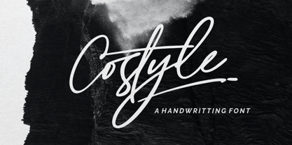 Costyle is a handwritten font. Its unique flow and easy signature style makes it perfect to use for logos, signatures, quotes, badges, labels, packaging design, blog headlines or simply use it in your next design project. multilingual support for the following languages : Cornish, Danish, Dutch, English, Estonian, Faroese, Filipino, Finnish, French, Galician, German, Icelandic, Indonesian, Irish, Italian, Norwegian Bokmål, Norwegian Nynorsk, Portuguese, Spanish, Swahili, Swedish, Swiss German. if you have any Question please Message Me. Big Thanks Ergibi Studio
 - Badehaus by Hanoded,
$15.00 In the German city of Bad Neuenahr you can visit a spa called Thermal Badehaus. This beautiful art deco building has an even more beautiful art deco lettering covering its facade. I had to work with only a couple of glyphs ('Thermal Badehaus' to be exact) and tried to capture their beauty in the remaining glyphs. The result is a font called Badehaus (Bath House in German). It is a bold, all caps typeface, with some unique glyphs.
 - Virtuosa Classic by Linotype,
$29.99 Virtuosa Classicis the 21st century OpenType re-release of a classic Hermann Zapf design, his very first script typeface, Virtuosa. Based on the same sketches that would inspire Zapfino 50 years later, Hermann Zapf developed Virtuosa in 1948-49. It was originally released in metal in 1952. Virtuosa nova is an English copperplate script with character. The font includes two form variants for each capital letter, and there are a number of lowercase alternates and ligatures, too.
 - Durer Display by iframe,
$28.00 Durer is a modern font, its soft curves and refined details create a sense of elegance. Inspired by the work of Albrecht Dürer (21 May 1471 – 6 April 1528), who was a German painter, printmaker, and theorist of the German Renaissance. Born in Nuremberg, Dürer established his reputation and influence across Europe in his twenties due to his high-quality woodcut prints. 551 Glyphs Upper / lower case, numbers, punctuation Language support: Latin / Greek Designed by iframe type foundry
 - Doohickey Lower by Comicraft,
$29.00So your widget’s stuck between the framistat and the whatchamacallit, there’s a spanner in the works and your avengers just won't assemble? Hey, if you want to get any more work done, you know you're gonna have to hook the hoojamajigger up to the Doohickey! And if those instructions aren't already confusing enough, DoohickeyLower is also available in a variety of languages for our international customers. See the families related to Doohickey Lower: Doohickey. - Biglove by Lucky Type,
$22.00 Biglove is as a handwritten script with initial letters and ending swash characters. With its alternative characters, you will see a unique, handmade look. Biglove has a few characters for each lowercase characters and you can even use it as a swoosh. You will find it easier for modern designs such as advertising, sales, branding, poster, logos, social media text overlays. Both textured with uppercase and lowercase characters, number, punctuation and extensive language support.
 - Geogrotesque Expanded Series by Emtype Foundry,
$69.00 Geogrotesque Expanded Series comes in three widths: Wide, Extended and Expanded, that go between 120% and 200% of the normal width. Since the original Geogrotesque is slightly condensed, the Wide family becomes a good option for texts. Whereas the Extended and Expanded are ideal for display sizes. With the inclusion of the Expanded Series and the preceding Condensed ones, the Geogrotesque super family is now a complete widths system. For more details see the PDF.
 - Skylines by Zamjump,
$19.00 Skylines- a chic modern serif with letters that seem to accentuate their character.Lots of ligatures for both uppercase and lowercase, as well as several alternates, to add typographical style to your designs.To access these OpenType features, you need software that supports Opentype such as: Word, Textedit, Photoshop, Sketch, Pages, Keynote, Numbers, iBooks Author, QuarkXPress, Indesign, and Illustrator. A wide variety of useful glyphs are included - see preview images of all glyphs. Thank you
 - Fractul by Adam Ladd,
$25.00 Fractul is a geometric sans with architectural qualities. Built from the Konnect family, this typeface introduces even more unique and display oriented design details, which you'll see in characters like a, f, g, t, y, etc. where certain strokes have been straightened for an angular and modern appearance. Also included is Fractul that takes the angular design further by styling characters like m, n, u, etc. to be rectangular and avant garde.
 - Modula by Emigre,
$39.00 Modula was the first high resolution headline face that Zuzana Licko designed with the Macintosh computer. In 1985, the computer was very crude as far as being able to produce subtle curves, but it was outstanding at producing perfect geometric elements. As a guide, she used the proportions of her earlier Emperor Fifteen bitmap design and applied the precision of the computer's geometric elements. See also Modula Round and Ribbed. Greek version by Dimitris Arvanitis.
 - AZN Knuckles Varsity by AthayaDZN,
$10.00 Introducing "AZN Knuckles Varsity" font by AthayaDZN. Revolutionizing a varsity slab serif, combining sharp and rounded edges, angled serif, and a variety of weights, fitting it into the modern scene. Equipped with 3 styles ( Defined, Regular, Stencil ) Use the Defined version if you are aiming for that slab serif look, just like the name suggested, it defines the modernized slab serif on each letter, giving it that retro look yet still in the modern scene. Especially on the light weight of this version, the slab serif is really prominent. Use the Regular Version if you are aiming for any type of design that you see this font fits especially the modern scene, just like how it's advertised. Use the Stencil version if you are aiming to make a statement, my favorite one is the Bold and Italic version of the Stencil if I was to make a statement, just like the preview where it says "Anarchy", the separated shapes of the letter combined with it's bold and slanted shape is perfect to make a strong statement. Language Support : Afrikaans, Albanian, Danish, Dutch, English, Estonian, Filipino, Finnish, French, Galician, Indonesian, Irish, Italian, Luxembourgish, Norwegian, Portuguese, Romansh, Scottish Gaelic, Spanish, Swedish, Swiss German, Uzbek (Latin). And that's it for this font, thank you for purchasing the product, I wish you success on your projects. Please enjoy the font and let me know if you needed any help or if you have any questions -Athaya twitter.com/Athaya_DZN behance.net/athayadzn
 - DelitschAntiqua - Unknown license

- Alan Den - Unknown license

- Last Dance by Wing's Art Studio,
$10.00 Last Dance: Redux - The 80s Feel-Good Script Font - Updated! Welcome to Last Dance: Redux, a new and improved version of my popular brush-script font inspired by 80s movie posters, VHS covers and Friday nights at the video store! This hand-drawn script aims to capture the feel-good vibes of movie blockbusters that won our teenage imaginations, while serving as the go-to font for recreating this unique and nostalgic period. The original Last Dance font features a gritty, hand-drawn texture that looks equally at home on an aerobics competition poster or steamy urban thriller - making great titles that look distinctly cinematic. Last Dance: Redux takes that original design and strips it back to it’s bare essentials resulting in a clean, uniform look that improves letter flow and readability. It’s also much lighter on system resources making it the preferred choice when using extensively across print and web projects. Both versions come with upper and lowercase characters along with punctuation, numerals and language support, plus two full sets of alternatives and a selection of underlines. Check out the visuals to see it in action!
 - FranklinGothicHandLight by Wiescher Design,
$39.50 FranklinGothicHandLight is part of a series of hand-drawn fonts from way back in time – before computers changed the way we worked. When I was in advertising – before computers – a very time consuming part of my daily work was sketching headlines. I used to be able to sketch headlines in Franklin Gothic, Times, Futura, Helvetica and several scripts. We had a kind of huge inverted camera – which we called Lucy. We projected the alphabet onto a sheet of transparent paper, outlined the letters with a fineliner and then filled them in. It was very tedious work, but the resulting headline had its own charm and we had a permanent race going on who was best and fastest. I won most of the time! They used to call me the fastest "Magic Marker" this side of the Atlantic. Great days, just like today! Your sentimental type designer from the past Gert Wiescher
 - FranklinGothicHandDemi by Wiescher Design,
$39.50 FranklinGothicHandDemi is part of a series of hand-drawn fonts from way back in time – before computers changed the way we worked. When I was in advertising – before computers – a very time consuming part of my daily work was sketching headlines. I used to be able to sketch headlines in Franklin Gothic, Times, Futura, Helvetica and several scripts. We had a kind of huge inverted camera – which we called Lucy. We projected the alphabet onto a sheet of transparent paper, outlined the letters with a fineliner and then filled them in. It was very tedious work, but the resulting headline had its own charm and we had a permanent race going on who was best and fastest. I won most of the time! They used to call me the fastest "Magic Marker" this side of the Atlantic. Great days, just like today! Your sentimental type designer from the past Gert Wiescher

