10,000 search results
(0.027 seconds)
- Doretypo by Rosario Nocera,
$10.00 - Zombie Apocalypse by Matthias Luh,
$30.00 - Bix Bats by Linotype,
$29.99 - Découpe by Sudtipos,
$39.00 - Sticky Fingers by Comicraft,
$19.00 - Garota Sans - Personal use only
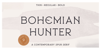
- Bohemian Hunter by Hustle Supply Co,
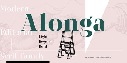
$14.00 - Alonga by Tour De Force,
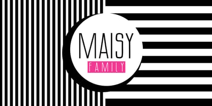
$25.00 - MAISY by Cultivated Mind,
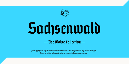
$29.00 - Sachsenwald by Monotype,
$50.99 - Sunlight JNL by Jeff Levine,
$29.00 - Highrise by Michael Hill Design,
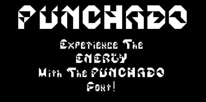
$6.00 - Punchado by MyAnvil,
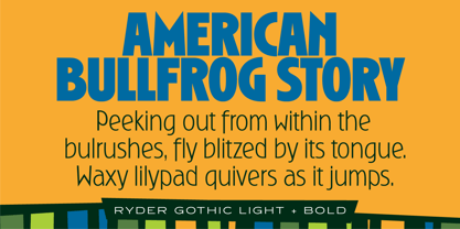
$20.00 - Ryder Gothic Pro by Red Rooster Collection,
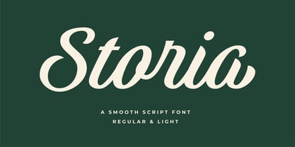
$60.00 - Storia by Letteralle,
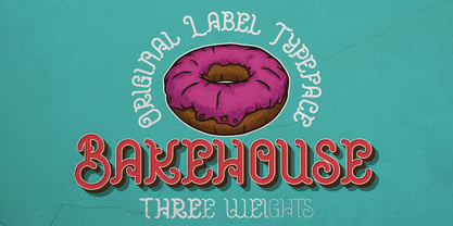
$23.00 - Bakehouse by Vozzy,
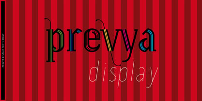
$10.00 - Prevya Display by TipoType,
$13.90 - Liberty Script by Monotype,
$29.99 - Egyptian Oldstyle by Solotype,
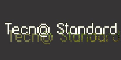
$19.95 - Tecna Standard by Descarflex,
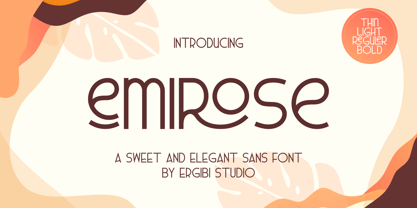
$20.00 - Emirose by Ergibi Studio,
$16.00 - Shinn by Red Rooster Collection,
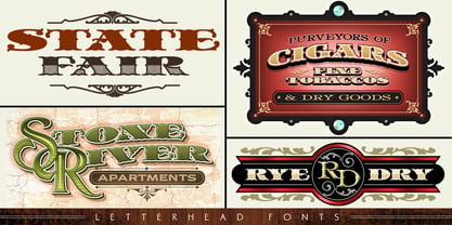
$45.00 - LHF State Fair by Letterhead Fonts,
$39.00 - Brock Script - Personal use only
- Blackwood Castle - Unknown license
- Flaemische Kanzleischrift - Personal use only
- Royal Initialen - Personal use only
- Biffe Calligraphy - 100% free
- ISOCPEUR - Unknown license
- Mayflower Antique - Personal use only
- MelonSeeds - Unknown license
- Grusskarten Gotisch - Personal use only
- GE Zodiac - Unknown license
- GE Zoom - Unknown license
- Art Nouveau Caps - Unknown license
- Kalenderblatt Grotesk - Personal use only
- Arrière Garde - Unknown license
- Pilsen Plakat - Unknown license
- BigDots - Unknown license
- Alphasnail - Unknown license


