10,000 search results
(0.028 seconds)
- Koi by Talbot Type,
$19.50
- Ton by Katatrad,
$22.00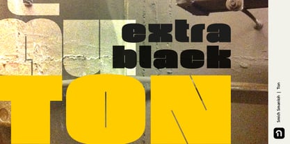
- VLNL Bon Bon by VetteLetters,
$35.00
- Boo Boo Kitty by Lauren Ashpole,
$15.00
- Type Toys JNL by Jeff Levine,
$29.00
- Toy Letters JNL by Jeff Levine,
$29.00
- Toy Decals JNL by Jeff Levine,
$29.00
- Too Sweet To Eat by Cuda Wianki,
$20.00
- Anderson Torchy The Battery Boy - Unknown license

- Black - Unknown license

- Blackness by Letterara,
$12.00
- Blonk by Zeptonn,
$-
- Clocks by Pen Culture,
$15.00
- Blick by ParaType,
$25.00
- Black by Runsell Type,
$16.00
- Brocks by Par Défaut,
$9.00 - Blocky by Garisman Studio,
$22.00
- Black by Intellecta Design,
$16.90 - Lifetime Font - Personal use only

- Sucker Font - Personal use only

- Charming Font - Unknown license

- HEX Font - Personal use only

- Glitter Font - Unknown license

- #44 Font - Personal use only

- Babylon Font - Unknown license

- barcode font - Unknown license

- moon font - Unknown license

- Schindler’s Font - Personal use only

- Dot Font - Unknown license

- Jacks Font - Unknown license

- Ticky font - Unknown license

- Oblivious font - Unknown license

- Still Font - Unknown license

- ADIstiLleRS Font - Personal use only

- Lucky Font - Unknown license

- Jim’s Font - Unknown license

- El&Font - Unknown license

- sai Font - Unknown license

- Cher Font - Unknown license

- kero Font - Unknown license


