10,000 search results
(0.032 seconds)
- Blantika by Letterhend,
$19.00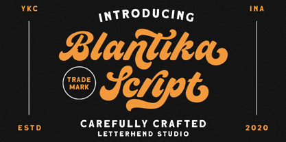 Introducing, Blantika Script - a bold script which is purposely made for logotype. This type of font perfectly made to be applied especially in logo, and the other various formal forms such as invitations, labels, logos, magazines, books, greeting / wedding cards, packaging, fashion, make up, stationery, novels, labels or any type of advertising purpose. Features : uppercase & lowercase numbers and punctuation multilingual alternates and ligatures PUA encoded We highly recommend using a program that supports OpenType features and Glyphs panels like many of Adobe apps and Corel Draw, so you can see and access all Glyph variations.
 - Sattin by Khaiuns,
$15.00 Introducing Sattin Font Duo - Two types of fonts with a modern serif style and Script which has an elegant style flow with two fonts having textures Sattin is a very versatile font, covering a wide range project types, from bold magazine imagery , to wedding invitations, to branding, poster design and so much more. Please message me if you want your language included or If there are any features or glyph requests, feel free to send me a message, I would like to update it. I hope you have a blast using Sattin Font Duo!
 - Linotype Tapeside by Linotype,
$29.99Linotype Tapeside is part of the Take Type Library, chosen from the entries of the Linotype-sponsored International Digital Type Design Contests of 1994 and 1997. British designer Stephan B. Murphy created this typeface with light, regular and bold weights, each with its matching italic. Consciously awkward, the characters line themselves up and produce a young, lively image. Linotype Tapeside is best for headlines and shorter texts in point sizes of 12 and larger and its varying stroke strengths allow this font to be set more universally than others of its kind. - Mayburn by Letterhend,
$19.00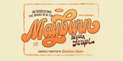 Introducing, Mayburn Script - a bold script with a touch of retro feel. This type of font perfectly made to be applied especially in logo, and the other various formal forms such as invitations, labels, logos, magazines, books, greeting / wedding cards, packaging, fashion, make up, stationery, novels, labels or any type of advertising purpose. Features : uppercase & lowercase numbers and punctuation multilingual alternates and ligatures PUA encoded We highly recommend using a program that supports OpenType features and Glyphs panels like many of Adobe apps and Corel Draw, so you can see and access all Glyph variations.
 - Sogate by Letterhend,
$19.00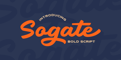 Introducing, Sogate - a bold script which is purposely made for logotype. This type of font perfectly made to be applied especially in logo, and the other various formal forms such as invitations, labels, logos, magazines, books, greeting / wedding cards, packaging, fashion, make up, stationery, novels, labels or any type of advertising purpose. Features : uppercase & lowercase numbers and punctuation multilingual alternates and ligatures PUA encoded We highly recommend using a program that supports OpenType features and Glyphs panels like many of Adobe apps and Corel Draw, so you can see and access all Glyph variations.
 - Chatterink by Creative17studio,
$14.00 Introducing, "Chatterink" a new serif font family that is bold, powerful and modern. Inspired by the shape of a flower petal, this font has its own characteristics. If you're looking for a stylish font, then this font is for you. The combination of modern types with flower petals is a masterpiece for you. Available in 2 types, regular and italic. Feature : 1. Full set of basic characters 2. Numbers and punctuation marks 3. Multilingual support 4. Extra characters that are easy to access Any questions? Just ask. Free updates
 - Bellasmith by Abbasy Studio,
$15.00 Bellasmith, is a pair of bold sans and monoline script with a touch of vintage look. This script font comes with multiple alternates that will make your words look like a custom lettering. With additional sans font you will be able to create the beautiful combination. This type of font perfectly suitable for made to be applied especially in logo, and the other various formal forms such as invitations, labels, logos, magazines, books, greeting / wedding cards, packaging, fashion, make up, stationery, novels, labels or any type of advertising purpose.
 - Thirtylane Script by Letterhend,
$19.00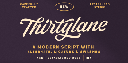 Introducing, Thirtylane - a bold script which is purposely made for logotype. This type of font perfectly made to be applied especially in logo, and the other various formal forms such as invitations, labels, logos, magazines, books, greeting / wedding cards, packaging, fashion, make up, stationery, novels, labels or any type of advertising purpose. Features : uppercase & lowercase numbers and punctuation multilingual alternates and ligatures PUA encoded We highly recommend using a program that supports OpenType features and Glyphs panels like many of Adobe apps and Corel Draw, so you can see and access all Glyph variations.
 - Linotype Octane by Linotype,
$29.99Linotype Octane is part of the Take Type Library, selected from the contestants of Linotype’s International Digital Type Design Contests of 1994 and 1997. The font was designed by German artist Norbert Reiners, a tall, thin font with a narrow line width and marked stroke contrast. The regular and bold weights seem somewhat static while the italic cuts make a dynamic impression. Linotype Octane is available in four weights, each of which contains a number of ligatures. The cool and reserved Octane is best used for shorter texts and headlines in larger point sizes. - Glady Script by Letterhend,
$19.00 Introducing, Glady - A bold script based with standout look. Added with swashes to make this font even more unique. This type of font perfectly made to be applied especially in wedding invitation, labels, logos, magazines, books, greeting / wedding cards, packaging, fashion, make up, stationery, novels, labels or any type of advertising purpose. Features : uppercase & lowercase numbers and punctuation multilingual swash and ligature alternates PUA encoded We highly recommend using a program that supports OpenType features and Glyphs panels like many of Adobe apps and Corel Draw, so you can see and access all Glyph variations.
 - QuickType by Wiescher Design,
$39.50 QuickType is a typeface I designed for demonstration purposes. I used it to illustrate my first book about type design. It has crooked slab serifs and looks very much like a typewriter font. But in order to make things clear I had to overdo some curves and so QuickType turned out a very distinct typewriter typeface. Since those days I worked on the shapes from time to time, so it got better and I extended it to include several neccessary cuts. Now it is a full fledged very usable font. Yours very quick Gert Wiescher.
 - Favela by Borutta Group,
$29.00 Favela is an experimental, geometric and sans serif type family. It is characterised by scalable construction of glyphs – hairline version is at the same time condensed, regular is normal, and black is super extended, with short ascenders. Favela was made mainly for branding and display purposes but middle weights are prefect for short texts. Thanks to characteristic features compilation of extreme styles will work on layouts, websites and prints. Favela type Family consist 18 styles with scalable x-height and width.. All styles include over 500 glyphs with set of small caps.
 - Houstonville by Veteran Type,
$14.00 Houstonville is the debut letterfrom of Veteran Type. Design by Abdul Rochman a.k.a Veteran Type. This font is inspired by ancient letters in the 19th century. This font is very suitable for designs with ancient concepts, such as print, logo design, and others. This consists of : 20 stylistic set 520 ± glyph count Multilingual support Support for multiple languages Math Symbol Numerals & Punctuation I am very grateful, to my friend and mentor, namely Spencerandsons a.k.a Gilang Purnama, for sharing their knowledge, time, and teaching me. Thank you again Spencer and Sons, always be great !!!
 - Cat Burglar PB by Pink Broccoli,
$16.00 Cat Burglar is another off-kilter sans-serif font by Pink Broccoli, this time inspired by the titling of a 1961 Looney Tunes cartoon called "The Pied Piper of Guadalupe". As with some of my previous type designs, it is a typographic drunken stumble, wonderfully and awkwardly stumbling across designs, surprising with each letter typed. With an extensive character set, and offbeat letter weighting, Cat Burglar is fun to typeset with, with a collection of double letter ligatures, as well as discretionary ligature combinations that add to the quirky playfulness.
 - Bamberforth by Greater Albion Typefounders,
$12.95 Bamberforth is a new take on the type of lettering that was often seen on Railway timetables, share certificates and anything else that needed a distinctive heading in the mid-19th Century. This sort of thing was used on both sides of the Atlantic and can carry us back to another time. Bamberforth aims to give a modern clarity to a style of lettering that, in all other particulars, harks straight back to Victorian times. Bamberforth is ideal for giving anything a 19th century feel-especially posters, book headings, dust jackets and invitations.
 - Juvenis by Storm Type Foundry,
$32.00Designs of characters that are almost forty years old can be already restored like a historical alphabet – by transferring them exactly into the computer with all their details. But, of course, it would not be Josef Tyfa, if he did not redesign the entire alphabet, and to such an extent that all that has remained from the original was practically the name. Tyfa published a sans-serif alphabet under the title Juvenis already in the second half of the past century. The type face had a large x-height of lower-case letters, a rather economizing design and one-sided serifs which were very daring for their time. In 1979 Tyfa returned to the idea of Juvenis, modified the letter “g” into a one-storey form, narrowed the design of the characters even further and added a bold and an inclined variant. This type face also shows the influence of Jaroslav Benda, evident in the open forms of the crotches of the diagonal strokes. Towards the end of 2001 the author presented a pile of tracing paper with dozens of variants of letter forms, but mainly with a new, more contemporary approach: the design is more open, the details softer, the figures and non-alphabetical characters in the entire set are more integral. The original intention to create a type face for printing children’s books thus became even more emphasized. Nevertheless, Juvenis with its new proportions far exceeds its original purpose. In the summer of 2002 we inserted all of this “into the machine” and designed new italics. The final computer form was completed in November 2002. All the twelve designs are divided into six variants of differing boldness with the corresponding italics. The darkness of the individual sizes does not increase linearly, but follows a curve which rises more steeply towards the boldest extreme. The human eye, on the contrary, perceives the darkening as a more fluent process, and the neighbouring designs are better graded. The x-height of lower-case letters is extraordinarily large, so that the printed type face in the size of nine points is perceived rather as “ten points” and at the same time the line spacing is not too dense. A further ingenious optical trick of Josef Tyfa is the figures, which are designed as moderately non-aligning ones. Thus an imaginary third horizontal is created in the proportional scheme of the entire type face family, which supports legibility and suitably supplements the original intention to create a children’s type face with elements of playfulness. The same applies to the overall soft expression of the alphabet. The serifs are varied; their balancing, however, is well-considered: the ascender of the lower-case “d” has no serif and the letter appears poor, while, for example, the letter “y”, or “x”, looks complicated. The only serif to be found in upper-case letters is in “J”, where it is used exclusively for the purpose of balancing the rounded descender. These anomalies, however, fit perfectly into the structure of any smoothly running text and shift Juvenis towards an original, contemporary expression. Tyfa also offers three alternative lower-case letters *. In the case of the letter “g” the designer follows the one-storey form he had contemplated in the eighties, while in “k” he returns to the Benda inspiration and in “u” adds a lower serif as a reminder of the calligraphic principle. It is above all the italics that are faithful to the tradition of handwritten lettering. The fairly complicated “k” is probably the strongest characteristic feature of Juvenis; all the diagonals in “z”, “v”, “w”, “y” are slightly flamboyant, and this also applies to the upper-case letters A, V, W, Y. Juvenis blends excellently with drawn illustrations, for it itself is modelled in a very creative way. Due to its unmistakable optical effect, however, it will find application not only in children’s literature, but also in orientation systems, on posters, in magazines and long short-stories. - C-Nation by URW Type Foundry,
$39.99 Marit Otto about C-Nation: The building typeface. Although the 70ties were very liberating and progressive, still girls played mainly with dolls and sweet things and boys with all kinds of challenging stuff. They did all sorts of basic scientific experiments in mini labs and of course built cool things with Meccano building sets. As a girl I was perfectly happy with the toys I had access to. But at the same time I was very curious about all the adventure toys and discoveries my brother did. It also made me wonder why the grown up people thought that our world could be separated so easily by separating our toys in pink and blue sections. At this day of age Meccano is probably hopelessly old fashioned and far to manual. Children of today are fed by fast images and cool animations on screen, they learn, play, communicate and relax in the same space, the digital space. The special feature of Meccano was that even though it was very basic there was the promise you could create anything. It might even contribute to a logical mind. The typeface I designed refers to the Meccano feel. It is a creative typeface. A bit masculine and bold looking perhaps but after the first impression a subtle and refined female touch is revealed. It has links to architecture and associations with metal constructions like ‘The Eiffel Tower’ and (old railway) bridges. I am convinced that we all think of that as very charming man-made objects.
 - Qwatick by Ingrimayne Type,
$7.95 Qwatick is a decorative serifed family with three weights, each with an italic style. It is squarish and has small serifs. The bold style has high contrast and the regular style remains readable even at small point sizes. The family originated as a reworking of the odd display font Quidic, moving it toward normality and greater legibility.
 - Frames1 - Unknown license

- Grotesca by GroupType,
$19.00 Grotesca Extra Condensed™ defines the term ""extra condensed"". With some unusual design quirks, this sturdy design has roots in styles popular in 1920s Germany. First brought to market by the Fundicion Tipografica Richard Gans type foundry (1888-1975) in Spain, the designer of Grotesca is unknown and the font was formerly sold only in Spain.
 - Suomi Script by Suomi,
$80.00Suomi Script is a typeface with a twist (pun intended): it has more than 1600 ligatures with two or more glyphs connected to make it look like an odd hand-written script polished by ITC. With Open Type savvy programs this font automatically replaces single characters with the ligatures. Some hand kerning is needed here and there. - Tulip Algarve by Brenners Template,
$19.00 Tulip Algarve font family showcases elegant and trendy glamour through a bold contrast between horizontal and vertical stems. The basic glyph design was inspired by the beautiful silhouette of a tulip flower, and a classical beauty was added to the typeface system. With a modern display sans serif personality, this type system will interact well with any layout design.
 - Neue Metana by Dirtyline Studio,
$20.00 Neue Metana is a modern minimalist design typeface with geometric type and more feature alternative character. there include some ligature. It is inspired by hype and urban design - a font suited for lifestyle with trend design. It was designed to be versatile, to blend in your design with light through bold weights add touch a lot of personality.
 - Nikaru by Twinletter,
$18.00 Nikaru is a retro-inspired display font designed in a simple and contemporary style that gives it a modern feel. This elegant typography is perfect for designing any project, especially editorial work, branding, product packaging, and promotional designs with bold and fun characters. It’s time to add some zest to your next project with this font.
 - Juki by Illushvara,
$14.00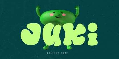 Juki is a handwritten font with bold display fun character. The groovy letters make this font great for logotype, headline, poster film, food packaging, magazine, labels or any type of advertising purpose. FEATURES : Uppercase, Lowercase, Number, Punctuation, Multilingual, PUA Encode, Opentype. If you have any question, don’t hesitate to contact me. Happy Designing !!! Thank You, Illushvara Design
 - Mercurius Script by Monotype,
$29.99 Mercurius Script font was designed by the Hungarian wood engraver and type designer Imre Reiner in 1957 for the Monotype Corporation. The expressiveness of this bold script typeface is the result of Reiner's use of a bamboo pen for Mercurius Script's elemental shapes. Used sparingly, Mercurius Script font gives even the dullest headlines genuine spirit and excitement.
 - Balig Script by Panatype Studio,
$7.00 Balig Script is signature pen script, available in 2 fonts with 2 styles ( Normal & Bold ), and includes Swashes. It's perfect for signatures, logo type, weddings, posters, brochure or any display use. Balig Script comes with more OpenType features like Stylistic Alternates, Initial Forms, Terminal Forms, and also Standard Ligatures make this font more natural and letter nicely.
 - Mastji by Wildan Type,
$15.00 Proudly present- Mastji, created by Wildan Type, A serif modern and bold typeface, Mastji has decorative alternate & beauty ligature. This typeface is perfect for an elegant & luxury logo, book or movie title design, fashion brand, magazine, clothes, lettering, quotes, and so much more. Add to your most creative ideas and watch how they bring them to life!
 - Blop11 by osialus,
$15.00 Blop11 is a geometric sans-serif type family, consisting of 3 weights. Blop11 Bold is inspired by 1800s-style wood, poster typeface. Owing to its rounded terminals, Blop preserves natural organic quality of wood typeface. The Regular and Light versions are contemporary original projects. Blop11 is well-suited to headlines and short text. See also Blop77
 - FF Amoeba by FontFont,
$41.99 British type designer Peter G. Warren created this display FontFont in 1995. The family contains 3 weights: Light, Regular, and Bold and is ideally suited for festive occasions, music and nightlife as well as software and gaming. FF Amoeba provides advanced typographical support with features such as alternate characters and case-sensitive forms. It comes with proportional lining figures.
 - Marige by Azzam Ridhamalik,
$16.00 Introducing Marige, a bold, high contrast typeface that stands out and exudes strength and confidence. Marige has 550+ glyphs, including advanced open type features like stylistic set, standard ligature, discretionary ligature, oldstyle figure, and smallcap. Ideal for any aspect of design, such as logos, headlines, posters, and so on, and will give your projects a classic yet contemporary look.
 - Maybrook JNL by Jeff Levine,
$29.00 One of the type examples found within the pages of “Lettering” by Harry B. Wright (1950) is a bold hand lettered serif typeface with a unique twist – the slab serifs had rounded corners, looking very much like show card lettering of the early 1900s. This design is now available digitally as Maybrook JNL, in both regular and oblique versions.
 - Vidalia Sunshine NF by Nick's Fonts,
$10.00A single line of type, identified as "Ornamented No. 5" and spelling out "ROPE ONIONS", from the 1888 MacKellar, Smiths & Jordan specimen book provided the pattern for this whimsical face. Offbeat yet elegant, graceful yet bold, it’s a natural choice for distinctive headlines. Both versions of the font include 1252 Latin, 1250 CE (with localization for Romanian and Moldovan). - Easter West by Sipanji21,
$17.00 "Easter West" is a display font with straight and sharp character shapes. Fonts like this are often chosen for designs that require a clean, modern, and bold appearance. This type of font can work well in a variety of design projects, including logos, headlines, posters, and other creative applications where a sharp and straightforward typography style is desired.
 - Avalaqus by Amera Type,
$10.00 Avalaqus is a font inspired by certificate, labels, posters, F&B packaging and has ligatures with alternate style that can make your display better than before. You will get a decorative font, sans, serif with bold and outline styles. And you will also get a set of badges with the open type feature format that match this typeface
 - Alnis by Daily Studio,
$16.00 Alnis is a bold type font with a round but straight shape. This font creates a formal yet relaxed vibe for any of your projects. Best font for designers. Alnis is excellent for logos, posters, cards, ext. Make your project look fascinating by combining it with another font. This font comes up with full uppercase, lowercase, and multilingual letters.
 - Roshmary by Putracetol,
$28.00 Roshmary is a Display sans serif font with beautiful ligatures, tons of alternative glyphs and multilingual support. It's bold clean and simple. Come with open type feature with a lot of alternates, its help you to make great lettering. Roshmary best uses for heading headlines, cover, poster, logos, quotes, product packaging, merchandise, social media & greeting cards and many more.
 - Curlaight by Outerend,
$18.00 The type family “Curlaight” has whimsical curly shapes but has some level of uniformity with straight lines and angles. These modern retro feel fonts look great for children’s books, posters, book covers, packaging labels, or even logos like TV and movie titles. Seven weights - thin, light, regular, medium, semibold, bold, and black - are available for your creative projects.
 - Eckhardt Headline JNL by Jeff Levine,
$29.00 Eckhardt Headline JNL is a bold, condensed sans serif font. This is part of a series of typefaces popular with the sign trade. Named in honor of the late Albert Eckhardt, Jr. - a talented sign writer and a good friend of type designer Jeff Levine - it is available in both regular and "slant" for extra emphasis.
 - Othelie by Creativemedialab,
$15.00 Othelie - Fashionable Gothic Font Bold and Beautiful Othelie comes in Regular & Line version with tons of alternates. Othelie is Perfect for Heading, Logo creation, Clothing design, Tattoo Lettering, Advertisements, Labels, Halloween concept, Poster and much more! Get inspired by its Gothic appeal! To access alternate: Adobe Photoshop go to Window - glyphs Adobe Illustrator go to Type - glyphs
