10,000 search results
(0.066 seconds)
- Martel by Scriptorium,
$18.00Martel is a variation on Carolingian Uncial calligraphy, with some elements of classic Celtic calligraphy and some characteristics peculiar to continental lettering of the early middle ages. - Streeter JNL by Jeff Levine,
$29.00 Streeter JNL is an all caps titling font based on the classic Beton Bold Condensed typeface. The Beton family of fonts was a printer's favorite for decades.
 - P22 Albion by IHOF,
$24.95 An open, lightweight font of classical Roman proportions, designed for text or display setting. The serifs are slightly hooked, giving the face a liveliness on the baseline.
 - Juga by Phoenix Group,
$13.00 Juga font is a classic retro game-themed font, this font is adjusted so it doesn't look pixelated, and is more modern to use at this time.
 - Wolfsburg by MADType,
$21.00 Wolfsburg is a classic blackletter stencil typeface. It is reminiscent of the days before computers when the best way to reproduce letters quickly was to stencil them.
 - Bros Rover by Blankids,
$27.00 Introducing a new font is Bros Rover Classic Sans Serif. Bros Rover good for logotype, poster, badge, wedding invitation, book cover, tshirt design, packaging and any more.
 - Alderman JNL by Jeff Levine,
$29.00 Alderman JNL is a wide slab serif typeface based on the classic wood type Antique Light Face Extended, and is available in both regular and oblique versions.
 - Gloriance by Mevstory Studio,
$25.00 Gloriance is a classic serif font adapted from the art deco style, a visual style that emerged in the 1920s and 1930s. This font is characterized by bold geometric shapes, a symmetrical design, and a sense of modernity and glamour. Gloriance is designed to have a distinctive classic impression with the presence of decorative elements such as extended lines, neat and tidy decorative shapes and types. These decorative elements can add a sense of sophistication and luxury to text. With a wide selection of alternates and ligatures, you can create a variety of styles and play with this unique fonts. This typeface is perfect for an elegant logo, jewelry stuff, packaging, magazine design, fashion brand, classic stuff, poster, flyer, wedding invitation, quotes, or simply as a stylish text overlay to any background image.
 - Golden Jewelry by Putracetol,
$20.00 Golden Jewelry - Classic And Luxury Script. GoldenJewelry is calligraphy font with a classic style and a luxury touch of elegance, and this font font inspired by delicate inky hand lettering, gorgeous wedding calligraphy and trending minimal branding designs Golden Jewelry designed to work together in harmony that makes it very suitable for wedding media, book covers, greeting cards, logos, branding, business cards and certificates, even for any design work that requires a classic, formal or luxurious The alternative characters were divided into several Open Type features such as Swash, Stylistic Sets, Stylistic Alternates, Contextual Alternates, and Ligature. The Open Type features can be accessed by using Open Type savvy programs such as Adobe Illustrator, Adobe InDesign, Adobe Photoshop Corel Draw X version, And Microsoft Word. This font is also support multi language.
 - Qilky by Khaiuns,
$18.00 I'm present to you, new retro serif called Qilky! Qilky is a stylish font It has both modern and retro look - clear, modern and fun. Helps to create layout design in 60s or 70s design projects. Perfect for branding, weddings, social media, product design, stationery and advertising - Qilky is versatile enough to add that classic element to just about any project where a special touch of class is required. This font have more than 50 unique alternate and ligature that to give your logo,business card and another project to a unique vintage look. I hope you have a blast using Qilky. Thanks for use this font ~ Khaiuns
 - Salosendo by IbraCreative,
$17.00 Salosendo, an elegant serif typeface, exudes sophistication and refinement in every stroke. With its graceful letterforms and balanced proportions, Salosendo adds a touch of timeless class to any design project. The serifs are subtly crafted, conveying a sense of tradition while maintaining a modern and versatile appeal. The letter spacing is meticulously tuned, ensuring a harmonious flow that enhances legibility. Salosendo’s versatility shines through in both print and digital applications, making it an ideal choice for editorial layouts, branding, and high-end invitations. Its graceful curves and meticulous details make Salosendo a typeface that effortlessly elevates the visual aesthetic, embodying a perfect blend of classic charm and contemporary finesse.
 - BB Casual Pro by Bold Studio,
$49.00 BB Casual™ (Std/Pro) is a font family that appears between a contemporary neo and geogrotesque design. The characteristic is formed by the intermediate step of the font classifications on the most relevant shapes: geometry (shape and with), contrast (text and display), white space (initial and terminal) and chiriographic elements (linework, punctuation, style and variant). The character set also has a large selection of matching symbols and superscripts. ● 2 Variants: characterized and simplified ● 20 Stylistic-Sets ● 34 Styles ● 41 OpenType features ● 95 Languages Support ● 41,854 Glyphs (1,231/Style) Designer: Bold Publisher: Bold Design date: 2019-2020 Release date: 2020 Version: 2.0
 - VAKOZI by Twinletter,
$17.00 Vakozi is a stunning classic serif font with timeless elegance and alluring modern touch. Able to be the perfect solution for various projects that require an elegant classic modernism theme. Showing the beauty of a well-proportioned serif design, Vakozi presents a visual harmony that captivates the eye. Each letter is exquisitely detailed, creating a look that embodies the luxury and sophistication of a timeless classic. In order to provide flexibility and creativity, Vakozi is equipped with impressive features. From eye-catching ligatures to alternative variations that provide a unique style, this font allows you to express ideas and concepts with complete freedom. In addition, with extensive multilingual support, Vakozi can be used in multiple languages without a hitch. Are you looking for a font that combines classic elegance with a stunning modern twist? Vakozi is the perfect choice. With a stunning classic serif style, creative features such as alternate ligatures and variations, and the ability to support multiple languages, this font will quickly grab the attention of your prospects and provide a stunning aesthetic feel in no time. What’s Included : File font All glyphs Iso Latin 1 Alternate, Ligature Simple installations We highly recommend using a program that supports OpenType features and Glyphs panels like many Adobe apps and Corel Draw so that you can see and access all Glyph variations. PUA Encoded Characters – Fully accessible without additional design software. Fonts include Multilingual support
 - Schism One by Alias,
$55.00 Schism is a modulated sans-serif, originally developed from our Alias Didot typeface, as a serif-less version of the same design. It was expanded to three sub-families, with the thin stroke getting progressively heavier from Schism One to Schism Three. The different versions explore how this change in contrast between thick and thin strokes changes the character of the letterforms. The shape is maintained, but the emphasis shifts from rounded to angular, elegant to incised. Schism One has high contrast, and the same weight of thin stroke from Light to Black. Letter endings are at horizontal or vertical, giving a pinched, constricted shape for characters such as a, c, e and s. The h, m, n and u have a sharp connection between curve and vertical, and are high shouldered, giving a slightly square shape. The r and y have a thick stress at their horizontal endings, which makes them impactful and striking at bolder weights. Though derived from an elegant, classic form, Schism feels austere rather than flowery. It doesn’t have the flourishes of other modulated sans typefaces, its aesthetic more a kind of graphic-tinged utility. While in Schism Two and Three the thin stroke gets progressively heavier, the connections between vertical and curves — in a, b, n etc — remain cut to an incised point throughout. The effect is that Schism looks chiselled and textural across all weights. Forms maintain a clear, defined shape even in Bold and Black, and don’t have the bloated, wide and heavy appearance heavy weights can have. The change in the thickness of the thin stroke in different versions of the same weight of a typeface is called grading. This is often used when the types are to used in problematic print surfaces such as newsprint, or at small sizes — where thin strokes might bleed, and counters fill in and lose clarity, or detail might be lost or be too thin to register. The different gradings are incremental and can be quite subtle. In Schism it is extreme, and used as a design device, giving three connected but separate styles, from Sans-Didot to almost-Grotesk. The name Schism suggests the differences in shape and style in Schism One, Two and Three. Three styles with distinct differences, from the same start point.
 - Schism Three by Alias,
$55.00 Schism is a modulated sans-serif, originally developed from our Alias Didot typeface, as a serif-less version of the same design. It was expanded to three sub-families, with the thin stroke getting progressively heavier from Schism One to Schism Three. The different versions explore how this change in contrast between thick and thin strokes changes the character of the letterforms. The shape is maintained, but the emphasis shifts from rounded to angular, elegant to incised. Schism One has high contrast, and the same weight of thin stroke from Light to Black. Letter endings are at horizontal or vertical, giving a pinched, constricted shape for characters such as a, c, e and s. The h, m, n and u have a sharp connection between curve and vertical, and are high shouldered, giving a slightly square shape. The r and y have a thick stress at their horizontal endings, which makes them impactful and striking at bolder weights. Though derived from an elegant, classic form, Schism feels austere rather than flowery. It doesn’t have the flourishes of other modulated sans typefaces, its aesthetic more a kind of graphic-tinged utility. While in Schism Two and Three the thin stroke gets progressively heavier, the connections between vertical and curves — in a, b, n etc — remain cut to an incised point throughout. The effect is that Schism looks chiselled and textural across all weights. Forms maintain a clear, defined shape even in Bold and Black, and don’t have the bloated, wide and heavy appearance heavy weights can have. The change in the thickness of the thin stroke in different versions of the same weight of a typeface is called grading. This is often used when the types are to used in problematic print surfaces such as newsprint, or at small sizes — where thin strokes might bleed, and counters fill in and lose clarity, or detail might be lost or be too thin to register. The different gradings are incremental and can be quite subtle. In Schism it is extreme, and used as a design device, giving three connected but separate styles, from Sans-Didot to almost-Grotesk. The name Schism suggests the differences in shape and style in Schism One, Two and Three. Three styles with distinct differences, from the same start point.
 - Schism Two by Alias,
$55.00 Schism is a modulated sans-serif, originally developed from our Alias Didot typeface, as a serif-less version of the same design. It was expanded to three sub-families, with the thin stroke getting progressively heavier from Schism One to Schism Three. The different versions explore how this change in contrast between thick and thin strokes changes the character of the letterforms. The shape is maintained, but the emphasis shifts from rounded to angular, elegant to incised. Schism One has high contrast, and the same weight of thin stroke from Light to Black. Letter endings are at horizontal or vertical, giving a pinched, constricted shape for characters such as a, c, e and s. The h, m, n and u have a sharp connection between curve and vertical, and are high shouldered, giving a slightly square shape. The r and y have a thick stress at their horizontal endings, which makes them impactful and striking at bolder weights. Though derived from an elegant, classic form, Schism feels austere rather than flowery. It doesn’t have the flourishes of other modulated sans typefaces, its aesthetic more a kind of graphic-tinged utility. While in Schism Two and Three the thin stroke gets progressively heavier, the connections between vertical and curves — in a, b, n etc — remain cut to an incised point throughout. The effect is that Schism looks chiselled and textural across all weights. Forms maintain a clear, defined shape even in Bold and Black, and don’t have the bloated, wide and heavy appearance heavy weights can have. The change in the thickness of the thin stroke in different versions of the same weight of a typeface is called grading. This is often used when the types are to used in problematic print surfaces such as newsprint, or at small sizes — where thin strokes might bleed, and counters fill in and lose clarity, or detail might be lost or be too thin to register. The different gradings are incremental and can be quite subtle. In Schism it is extreme, and used as a design device, giving three connected but separate styles, from Sans-Didot to almost-Grotesk. The name Schism suggests the differences in shape and style in Schism One, Two and Three. Three styles with distinct differences, from the same start point.
 - Melcheburn by Scriptorium,
$18.00Melcheburn is a classic late-medieval gothic font based on original lettering by Samuel Welo. It has strong, formal lower case letters and extremely ornate and decorative capitals. - Park Lane by Alan Meeks,
$45.00 A Classic italic Roman with a set of alternative swash caps and a number of original swash lower case characters that can create a number of unusual ligatures.
 - Madison by MADType,
$21.00 Madison is a classic slab serif stencil typeface. It is reminiscent of the days before computers when the best way to reproduce letters quickly was to stencil them.
 - Andina Janelia by Rockboys Studio,
$17.00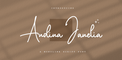 Andina Janelia is a modern signature font which is combining classic calligraphy with a modern style. Its dancing baseline will give your design an elegant and modern touch.
 - Ron by Brainware Graphic,
$12.00 Ron is a vintage medium block typeface, a classic and bold display font with a cool vibe. Use it to add a smart feel to any design project.
 - Petra by Phoenix Group,
$13.00 Petra is a classic fantasy kingdom font that has bold and consistent lines in every letter, this font symbolizes strength and screams from the bottom of the heart.
 - Astallya Script by Rockboys Studio,
$24.00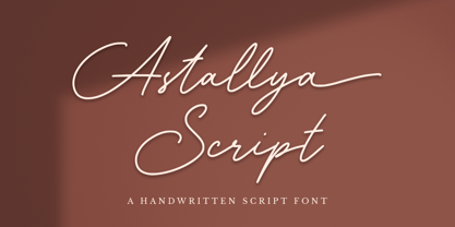 Astallya Script is a modern signature font which is combining classic calligraphy with a modern style. Its dancing baseline will give your design an elegant and modern touch.
 - Weekend Tabloid JNL by Jeff Levine,
$29.00Weekend Tabloid JNL is a classic sans serif wood type design that found its way into the setting of newspaper headlines during the pre-electronic age of publishing. - Melior by Linotype,
$40.99 Hermann Zapf’s Melior exhibits a robust character through classic and objective forms. Versatile and extremely legible, it can be used for a variety of texts and point sizes.
 - Mogenta Signature by Rockboys Studio,
$29.00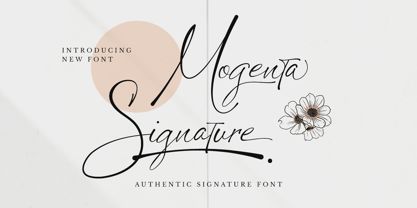 Mogenta Signature is a modern signature font which is combining classic calligraphy with a modern style. Its dancing baseline will give your design an elegant and modern touch.
 - Mad Props by Graffiti Fonts,
$19.99Classic & clean tag style lettering that's easy to read & flexible. Mad Props includes 2 full alphabets, full numbers, punctuation & other symbols. This style works well with outlines & effects. - Robuck by Martype co,
$15.00 ROBUCK is a family Sans Serif font designed with carefully handcrafted. Also suitable for branding, T-shirt, Wedding Invitation, Classic Design, Logotype, and any project. All caps fonnts.
 - 1up by Fly Fonts,
$15.001up is a retro font that is influenced by classic video games and modern pixel fonts. Looks great in display sizes and also works well when used smaller. - Brilliant Gemstone by Rockboys Studio,
$24.00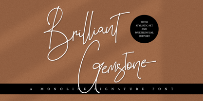 Brilliant Gemstone is a modern signature font which is combining classic calligraphy with a modern style. Its dancing baseline will give your design an elegant and modern touch.
 - EgyptianTwo by Wooden Type Fonts,
$15.00 A revival of one of the popular wooden type fonts of the 19th century, with classic flat slab serifs, unbracketed, short descenders. Very popular in the 19th century.
 - Sildetas by insigne,
$22.00 Sildetas is an elegant high-contrast script face. Sildetas was conceived as non-connected, high-contrast and ultra heavy script, as best exemplified by the Black weight. However, it was too much of a temptation to design a hairline variant, and this exploration gave the family’s lighter weights an elegant, graceful feel. The script was modified further to use connected letterforms as the primary glyphs. With its unique swirled ball terminals, this versatile script draws immediate attention. The face glides and flows across the page and the swirling ball terminals provide an interesting diversion to the flow. The lighter weights have an almost spencerian look. Sildetas includes six weights and is a very unique script face. Lighter weights can be used for elegant invitiations. Sildetas can get the job done for many unique design tasks. Sildetas includes many useful OpenType features, including a set of non-connecting and titling alternates, ligatures, and two types of end swashes. Opentype features include simplified swashed stylistic alternates without ball terminals, swash endings, ending contextual alternates, discretionary ligatures, ligatures and five different stylistic sets filled with alternates. In total, there are over 60 alternate letterforms. OpenType-capable applications such as Quark or the Adobe suite can take full advantage of the automatically replacing ligatures and alternates. This family also includes the glyphs to support a wide range of languages.
 - Doctor Fibes DEL - Personal use only

- Dry Brush Serif by Kaer,
$28.00 I'm happy to present you my new classic style font. It's a vintage serif font with my brush touches. I used dry strokes with rough edges decoration elements. Perfect if you want to add slight retro style to your project. I designed it for fashion labels, classic headlines, glamour posters, luxury identity, wedding invitations. You will get: * Uppercase glyphs * Numbers and symbols * Multilingual support * Free future updates Please feel free to request to add characters you need: kaer.pro@gmail.com Thank you!
 - Hulahoy Typeface by Alit Design,
$19.00 Introducing Hulahoy Typeface. This font is inspired by the design styles of the 70s. The style is funny, groovy, classic, not serious but has aesthetic and unique value, besides that the Hulahoy font is very easy to remember and becomes the image of a design. Hulahoy is very good for being your font collection because this font is very unique and easy to apply to any media that has a design concept that is not so serious, groovy, classic, funny and unique.
 - Candrika by Putracetol,
$22.00 Candrika is a classic label display typeface. Come up with solid and decorative style. This font inspired by the vintage package label and old signboards. The style of this font is strong, classic and dynamic. So that makes this font good for normal text sizes or large headline text sizes. Candrika is also great for any kind of display purpose from logos, label, tshirt, apparel, barbershops, tattoo, packaging, poster, signage, greeting card and logotype. This font is also support multi language.
 - Aesthetic by Figuree Studio,
$12.00 Aesthetic Typeface is a handmade vintage lettering, which is combining modern and classic typography with some awesome features. Aesthetic Features - Uppercase - Lowercase - Numerals & Punctuations - Accents (Multilingual characters) OpenType features -Ligatures - Stylistic Alternates - ss01 - ss02 - ss03 - swosh There are more than 310 glyphs in the font including Stylistic Alternates, Ligatures, Stylistic sets etc. OpenType features with Stylistic Alternates, Contextual Alternate in some characters that allow making an awesome vintage look. this is suit for: labeling, logo, classic shop, coffee shop, movie title, etc
 - Wild Believers by Prestige Artsy Studio,
$19.00 Introducing Wild Believers, a bold vintage serif treasure that takes you back to the golden era of classic typography. This font embodies the timeless charm and elegance of vintage serif typefaces, with a bold twist that adds a modern edge. Elevate your designs with the charm and character Wild Believers. Let it transport your audience to a bygone era, where elegance and tradition reigned supreme. Rekindle the nostalgia of classic typography and make a bold statement with this captivating font.
 - Schola Serif by StudioJASO,
$56.00 Schola Serif is a neo classic serif font that reinterpret the classic Latin style structure and expression in a modern and intriguing way. Schola Serif looks sharply defined, giving clear-cut impression. It features sharp serif and details and presents its own distinctive character when used in title or sub headline or written with over 16pt. Font with 5 different weights, over 60+ languages, 9 OpenType features. It really does work in everything ranging from editorial design, graphic, and even integrated branding design.
 - Scholastyca Typeface by Almeera Studio,
$17.00 Introducing the new Scholastica Modern & Classic Typeface!!! Scholastica is a luxury and glamour serif typeface.This font is both modern and nostalgic and works great for logos, magazine, social media. Already matched up and ready to be used together for your next design! For those of you who are needing a touch of elegant, stylish, classy, chic and modernity for your designs, this font was created for you! Perfect for editorial projects, Logo design, Clothing Branding, product packaging, magazine headers, or simply as a stylish text overlay to any background image. No special software is required to type out the standard characters of the Typeface. To access the Opentype Ligatures, you will need software that supports Opentype features in fonts. Current Language Support : Danish, English, Finnish, French, German, German (Switzerland), Norwegian Bokmål, Norwegian Nynorsk, Portuguese, Spanish, Swedish, Swiss German.
