10,000 search results
(0.033 seconds)
- Brannboll Connect by Mans Greback,
$59.00 Brannboll Connect is a script sport typeface. The baseball-style lettering was drawn by Måns Grebäck in 2020. It is a specialist connected typeface: Each character and all their parts are physically connected, making it a lettering perfect for laser cutting, signs, jewelry, woodworking and embroidery. It also comes with the additional, decorative style Brannboll Connect Swash, which contains ten cool swashes to give the graphic extra expression. It has a very extensive lingual support, covering all European Latin scripts. The font contains all characters you'll ever need, including all punctuation and numbers.
 - Cabrito Contrast by insigne,
$29.99 The Cabrito family is back again to make a statement. Released as a complement to the children's book, The Clothes Letters Wear, the original Cabrito is light-hearted, fun, and easy to read. Now, balancing this friendliness with a new elegance, Cabrito Contrast steps forward--a handsome typeface with an extra-sophisticated sensibility injected into the design. Still bright and playful in its Cabrito ancestry, this new Cabrito member approaches the field with a cleaner, more reductionist form, ensuring that its polished look retains the readability. Regular features and Italic forms of the 54 fonts include upright alternates, ligatures, and old figures. A range of weights include extended and condensed variants. To preview any of these interactive features, see the PDF manual. The family also includes language support for 72 Latin-based languages, and there are over 600 glyphs for further refining your work. Cabrito Contrast is best used for logos and packaging as well as flyers and websites, though its readability makes it a great option across a wide variety of works. In short, it’s well-designed just for you. Take a stroll with Cabrito Contrast, and see how much fun refinement can be. Along the way, take a look at a few other members of Cabrito, too and see how well the likes of Original, Inverto or Didone can pair with the new Contrast.
 - Ainslie Contrast by insigne,
$35.00 Ainslie Contrast is the newest in the Ainslie series, named for the famous mountain overlooking the Australian city of Canberra. The Ainslie series currently consists of four typefaces. The Ainslie design is very unique and originally began life as a semi-serif. Also available are a normalized sans serif and slab variants. This contemporary typeface’s high contrast catches the eye. The design flows with ease and sophistication. There are a mix of influences from Australia, which gives it a unique flavor. The original Ainslie was designed for the Canberra Australia Centennial Typeface Competition and named for the mountain that overlooks the beautiful capital city of Australia. Ainslie takes Canberra's distinct geometric design and blends it with the organic, flowing essence of aboriginal art and the smooth aerodynamic design of the boomerang. The typeface includes a multitude of alternates that can be accessed in any OpenType application. There are swashes and other details such as small caps, alternative titling caps and swash alternates. If you’re searching for a contemporary high contrast typeface with geometric simplicity and a hint of antipodean flair, Ainslie Contrast is fair dinkum.
 - Matita Connected by Trine Rask,
$12.00 Warning: works with contextual alternate-feature, which is not showing here. Matita Connected is part of a larger type family developed from 2005-2019 with handwriting in mind. A solid script face in two weights and a dotted instructional version. With alternative glyphs based on different writing habits. For teaching, teaching material or just typography. An unchildish handwritten type family for many purposes.
 - Aviano Contrast by insigne,
$22.00 The Aviano series returns, refined and sophisticated with an extended, high-contrast sans-serif family. Aviano Contrast is a contemporary typeface radiating with luxury. It's classic elegance makes it perfect for high-end applications such as cosmetic, jewelry or fashion brands. Aviano Contrast's extended forms give the face a smart look, and the curves are carefully honed to be sinuous and seductive. This high-contrast face is in a class of its own, composed in the style of a classic Didone but lacking the typical serifs. Aviano Contrast comes in six different weights and is packed with OpenType features. Need swash forms? Ball terminals? Art Deco alternates inspired by the inscriptions and signage of the '20s and '30s? Aviano Contrast includes 230 alternate characters. Twelve style sets are available, including four complete sets of art deco-inspired alternates, small forms, swash, titling and a wide array of other alternates to make your designs unique. As a complement to these characters, Aviano Contrast also includes 40 discretionary ligatures for artistic typographic compositions. Please see the informative .pdf brochure to see these features in action. OpenType capable applications such as Quark or the Adobe Creative suite can take full advantage of the automatically replacing ligatures and alternates. This family also includes the glyphs to support a wide range of languages. The rest of the Aviano series pairs very well with this face. These include Aviano, Aviano Serif, Aviano Sans, Aviano Didone, Aviano Flare, Aviano Future and Aviano Slab.
 - OL Hairline Gothic by Dennis Ortiz-Lopez,
$75.00 There is just one subtle difference between these two fonts. The A version has a straight lowercase 'e'; the B version has an angled lowercase 'e'.
 - OL Egiziano Comstock by Dennis Ortiz-Lopez,
$30.00 - OL Corvinus Versailles by Dennis Ortiz-Lopez,
$30.00 - OL Round Gothic by Dennis Ortiz-Lopez,
$30.00 - OL Marla Comstock by Dennis Ortiz-Lopez,
$30.00 - OL Headline Gothic by Dennis Ortiz-Lopez,
$30.00 - OL Hebrew Cursive by Dennis Ortiz-Lopez,
$30.00 This font contains every variant found in the Hebrew Bible such as the “mutilated” Waw in Numbers 25: verse 12, the small Heh in Genesis 2: verse 4 and the Nun Inversum before Numbers 10: verse 35 and after verse 36 and elsewhere as well as oversized consonants and various double-wide consonants used in inscriptions.
 - OL Avril Roman by Dennis Ortiz-Lopez,
$30.00 - OL Hebrew Prismatic by Dennis Ortiz-Lopez,
$30.00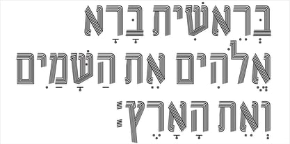
- OL Marla Bold by Dennis Ortiz-Lopez,
$30.00 - OL Subway Tiles by Dennis Ortiz-Lopez,
$30.00 - OL Siynnamin Gothic by Dennis Ortiz-Lopez,
$40.00
- OL Skeleton Gothic by Dennis Ortiz-Lopez,
$30.00 - OL Gotham Gothic by Dennis Ortiz-Lopez,
$40.00 - OL Forum Titling by Dennis Ortiz-Lopez,
$40.00 - OL Radiant Slender by Dennis Ortiz-Lopez,
$40.00
- OL Machina Black by Dennis Ortiz-Lopez,
$30.00 - OL Brierwood Grecian by Dennis Ortiz-Lopez,
$30.00 - OL Hebrew David by Dennis Ortiz-Lopez,
$30.00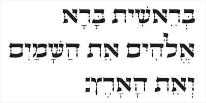
- Clasica by Latinotype,
$26.00 The font family "Clasica" is ideal to cover every design need. Excellent for titles, paragraphs, magazines, books, editorials and logos. The particularity and identity of this font is found in the thinness of its vertical strokes and symmetrical serif. Inspired by the "Optima" font but with a serif that gives a different and new feel. "Clasica" counts with glyphs for the letters: a, e, f, g, r and y. This font family comes with 9 different weights with their respective italics.
 - Classist by Sohel Studio,
$10.00 Classist sans serif is a bold font style with a classic and modern touch . There are 4 different styles that you can apply in your design projects. This font is designed with a curved and bold style so it is very perfect for branding projects, logos, business cards, t-shirts, clothing, magazines, product branding, advertisements, posters, quotes etc. Classist Features: · 4 Weights font (Regular,Italic,Bold,Outline) · Uppercase · Numerals & Punctuation · Accented characters · Multilingual Support Thanks and have a wonderful day
 - Contane Condensed by Hoftype,
$49.00 Contane Condensed is the slim complement to the Contane Family. Its economic proportions permit space saving applications, in particularly, eye catching headlines and subheads. Contane Condensed is high-contrasted, and the spiky wedge shaped serifs, still result in an elegant text flow. Contane supports up to 80 languages and it’s OpenType format allows a wide range of typographic applications. 20 styles offer fine graduation of the weights. All weights contain small caps, ligatures, superior characters, proportional lining figures, tabular lining figures, proportional old style figures, lining old style figures, matching currency symbols, fraction- and scientific numerals, matching arrows and alternate characters.
 - Contane Text by Hoftype,
$49.00 Contane Text is the text optimized version of the Contane family. More solid, more robust, it repesents the down-home addition to the more subtle Contane family. Stronger hairlines, solid serifs, and slightly more comfortable proportions make it appropriate for bold headlines, as well as for small text sizes. 20 styles offer fine graduation of the weights. All weights contain small caps, ligatures, superior characters, proportional lining figures, tabular lining figures, proportional old style figures, lining old style figures, matching currency symbols, fraction- and scientific numerals, matching arrows, and alternate characters.
 - Contax Pro by Type Innovations,
$39.00 Contax Pro is a contemporary design based on generous proportions and clean, crisp lines. Forget about 'Helvetica'. Look out 'Univers'. Contax Pro is the new geometric sans typeface series for the 21st century. Contax Pro makes for easy reading and is ideal for long lines of copy. Contax Pro includes true drawn small capitals and old style figures. The family comes in 6 weights: ultra light, thin, light, regular, medium and bold.
 - Kis Classico by Linotype,
$29.99Kis Classico™ is named after the Hungarian monk Miklós Kis who traveled to Amsterdam at the end of the seventeenth century to learn the art of printing. Amsterdam was a center of printing and punchcutting, and Kis cut his own type there in about 1685. For centuries, Kis's type was wrongly attributed to Anton Janson, a Dutch punchcutter who worked in Leipzig in the seventeenth century. Most versions of this type still go by the name Janson. In 1993, the Italian/Swedish type designer Franko Luin completed Kis Classico, his own contemporary interpretation of the Kis types. About the Kis/Janson story, Luin says: If you understand Hungarian I recommend you read the monograph, 'Tótfalusi Kis Miklós' by György Haiman, published in 1972 by Magyar Helikon. It has hundreds of reproductions from his Amsterdam period and from the time when he was an established printer in Kolozsvár (today's Cluj in Romania)." Kis Classico has five weights, and is an admirable version of this classic type. - Classification JNL by Jeff Levine,
$29.00 Sometimes it's easy to find a name to fit a font design, other times it's a struggle because of the sheer number of digital fonts available and the number of names already taken. Classification JNL stretches a point to arrive at its name. The attractive sans design was found as a hand-lettered title on a piece of vintage sheet music called "My Hawaiian Souvenirs". During the 1940s, the popular mode of travel to other countries was by steamship. Steamship passengers were assigned their accommodations by the type of passage they booked (such as First Class and Tourist), thus they were in various levels of classification. This aside, Classification JNL is a nice alternative to "standard" condensed fonts for design projects.
 - Classica MF by Masterfont,
$59.00 Geometric forms with subtle curves make this elegant font family a great companion for titles, invitations and signs, indoor and outdoor.
 - Bodoni Classico by Linotype,
$40.99Giambattista Bodoni (1740–1813) was called the King of Printers and the Bodoni font owes its creation in 1767 to his masterful cutting techniques. Predecessors in a similar style were the typefaces of Pierre Simon Fournier (1712–1768) and the Didot family (1689–1836). The Bodoni font distinguishes itself through the strength of its characters and embodies the rational thinking of the Enlightenment. The new typefaces displaced the Old Face and Transitional styles and was the most popular typeface until the mid-19th century. Bodoni’s influence on typography was dominant until the end of the 19th century and, even today, inspires new creations. The Bodoni Classico of Franco Luin displays less stroke contrast than the original and is therefore also appropriate for smaller point sizes. - Classica Pro by URW Type Foundry,
$35.99 Classica Pro by Bernd Möllenstädt A real alternative for letterpress printing A masterpiece It was only after many years, shortly before the end of his life, Bernd Möllenstädt brought out these early drafts of his Classica Light and Light Italic from his drawer, and asked me to produce for him on the computer a Bold and Bold Italic, from which we later wanted to interpolate further cuts like Regular and so on. The boldening of letters with an oblique axis and with hairlines which should not grow to the same extent as the general line widths, is hard to cope with perfectly, even for the smartest computer program, and even more so, when it concerns an as complicated set of data as those conceived by Bernd. The automatically generated result could therefore only be a first step that had to be improved manually later. This was about the stage that we had reached when Bernd died in March 2013, leaving me behind with comprehensive corrections on proofs of this automatically generated Bold. Although I was aware that it would mean a lot of work to complete the project, I did not want to leave it unfinished and decided to finalize and publish the Classica, also in Bernd‘s honor. In the course of the two years that I worked on this font family it somewhat naturally became also my own. New details were added and some of the existing changed. A book typeface requires the supreme and forgives rarely, it represents a true masterpiece. My intention and my ambition were to create a real alternative for letterpress printing, with a font family that contains all the typographic options for an excellent typesetting, and is better readable and has a better appearance than other existing typefaces. Whether this was achieved, the reader may decide. Volker Schnebel, Hamburg, december 2014
 - Griffo Classico by Linotype,
$29.99Griffo Classico™ was produced by Franko Luin in 1993. It is a revival inspired by the types cut by Francesco Griffo for the Venetian printer Aldus Manutius at the end of the fifteenth century. The roman is based on the type Griffo cut in 1496 for Bembo's de Aetna," and the italic on a type he cut in 1501 for an edition of Virgil. Griffo did not make separate italic caps, so Luin designed his own for Griffo Classico. This is a serviceable family with five weights, including small caps. - Baskerville Classico by Linotype,
$29.99John Baskerville (1706-1775) was an accomplished writing master and printer from Birmingham, England. He was the designer of several types, punchcut by John Handy, which are the basis for the fonts that bear the name Baskerville today. The excellent quality of his printing influenced such famous printers as Didot in France and Bodoni in Italy. Though he was known internationally as an innovator of technique and style, his high standards for paper and ink quality made it difficult for him to compete with local commercial printers. However, his fellow Englishmen imitated his types, and in 1768, Isaac Moore punchcut a version of Baskerville's letterforms for the Fry Foundry. Baskerville produced a masterpiece folio Bible for Cambridge University, and today, his types are considered to be fine representations of eighteenth century rationalism and neoclassicism. Legible and eminently dignified, Baskerville makes an excellent text typeface; and its sharp, high-contrast forms make it suitable for elegant advertising pieces as well. The Linotype portfolio offers many versions of this design: ITC New Baskerville® was designed by John Quaranda in 1978. Baskerville Cyrillic was designed by the Linotype Design Studio. Baskerville Greek was designed by Matthew Carter in 1978. Baskerville™ Classico was designed by Franko Luin in 1995." - The Clastic by Abbasy Studio,
$15.00 Proudly presents The Clastic Font Family with 2 different style Script and Sans. The Script also has combination layer style with inner shadow and drop shadow. The Characters include over 650++, allowing each character to be combined. These two cool fonts would be perfect to combine in your design. It will be great for Logotypes, Posters, Digital Lettering Arts, Clean design, Branding Design, Sign, and many more application. Features Contextual Alternates Stylistic Alternates (up to 12 style in some letters) Ligatures Initial & Terminal (also comes with alternate initial and terminal glyphs) Thank You very much, I hope you enjoy this fonts !
 - Elegante Classica by Mokatype Studio,
$18.00 Hello Introducing, Elegante Classica - Luxurious Serif Display is an elegant, inspired by the famous minimalist logo, perfect for the purposes of designing templates, brochures, videos, advertising branding, logos and more. Perfect for adding a unique twist to word-mark logos, monograms or pull quotes. Accessible in the Adobe Illustrator, Adobe Photoshop, Adobe InDesign, even work on Microsoft Word. PUA Encoded Characters - Fully accessible without additional design software. Fonts include multilingual support Image used : All photographs/pictures/vector used in the preview are not included, they are intended for illustration purpose only. Thank You
 - Caslon Classico by Linotype,
$29.99The Englishman William Caslon (1672-1766) first cut his typeface Caslon in 1725. His major influences were the Dutch designers Christoffel van Dijcks and Dirck Voskens. The Caslon font was long known as the script of kings, although on the other side of the political spectrum, the Americans used it as well for their Declaration of Independence. The characteristics of the earlier Renaissance typefaces are only barely detectable. The serifs are finer and the axis of the curvature is almost or completely vertical. The overall impression which Caslon makes is serious, elegant and linear. Next to Baskerville, Caslon is known as the embodiment of the English Baroque-Antiqua and has gone through numerous new interpretations, meaning that every Caslon is slightly different. Caslon Classico appeared in 1993 and was designed by Franco Luin, the designer of various interpretations of classic typefaces. Luin kept his design true to the original and Caslon Classico consists of two cuts with corresponding italic and small caps characters. - Festa Classica by Green Type,
$37.00 Festa Classica is a multilingual handwritten type family, supports Latin, Cyrillic, Greek, Eastern European, Baltic and Turkish scripts. The family uses a large number of useful Open Type features: ligatures, swashes and stylistic alternates. This makes it possible to achieve variability in typing and simulate lettering with this font.