10,000 search results
(0.026 seconds)
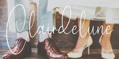
- Clairdelune by Maulana Creative,
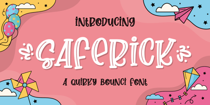
$14.00 - Saferick by Awan Senja,
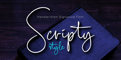
$14.00 - Scripty Style by MaxnorType,
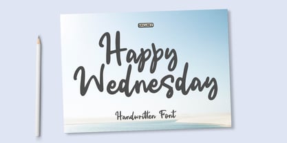
$15.00 - Happy Wednesday by Epiclinez,
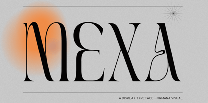
$18.00 - Mexa by Nirmana Visual,
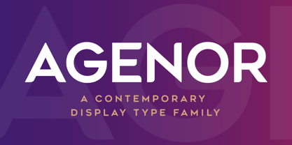
$22.00 - Agenor by Graphite,
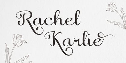
$17.00 - Rachel Karlie by Salamahtype,
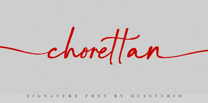
$17.00 - Chorettan by OCSstudio,
$12.00 - Lemos by Goodigital13,
$20.00 - The British Telegraph by Vintage Voyage Design Supply,
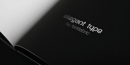
$14.00 - Kvant by Fontfabric,
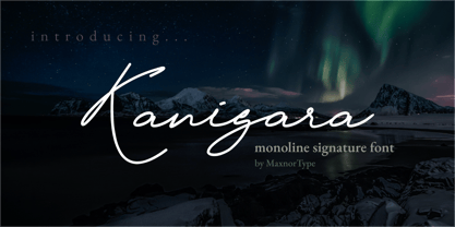
$35.00 - Kanigara by MaxnorType,
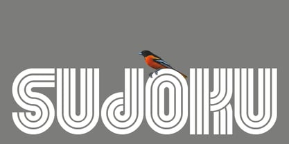
$15.00 - Sudoku by Fontfabric,
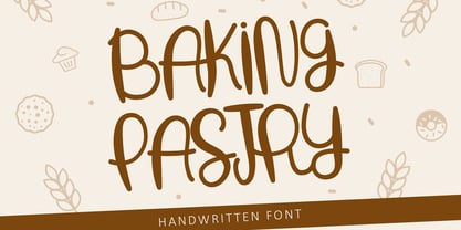
$35.00 - Baking Pastry by Illushvara,
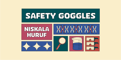
$10.00 - Safety Goggles by Ali Hamidi,
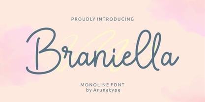
$10.00 - Braniella by Arunatype,
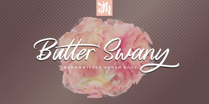
$15.00 - Butter Swany by FHFont,
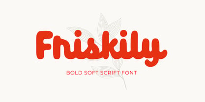
$17.00 - Friskily by Ali Hamidi,
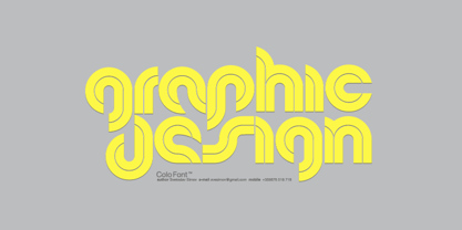
$12.00 - Colo by Fontfabric,
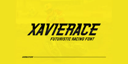
$25.00 - Xavierace by Portograph Studio,
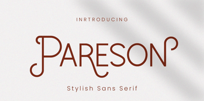
$20.00 - Pareson by Balevgraph Studio,
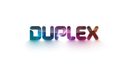
$12.00 - Duplex by Fontfabric,
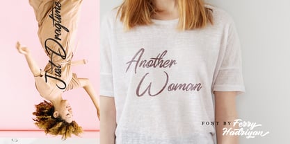
$25.00 - Dragtime by FHFont,
$17.00 - Wigan by Fontfabric,
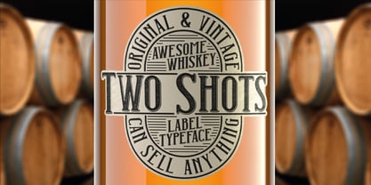
$25.00 - Two Shots by Vozzy,
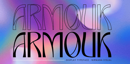
$10.00 - Armouk by Nirmana Visual,
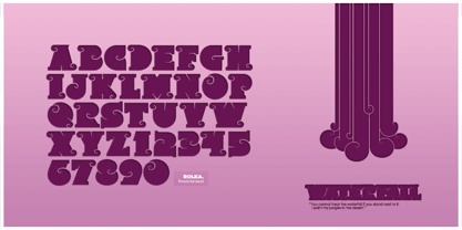
$19.00 - Rolka by Fontfabric,
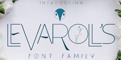
$21.00 - Levarolls by Jehansyah,
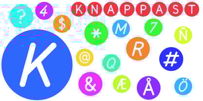
$9.00 - Knappast by Cercurius,
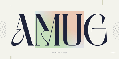
$19.95 - Amug by Nirmana Visual,
$22.00 - Bathilda by Subectype,
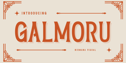
$14.00 - Galmoru by Nirmana Visual,
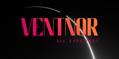
$22.00 - Ventnor by Lemonthe,
$14.00 - Greywall by Khurasan,
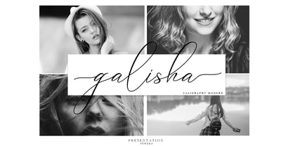
$8.00 - Galisha by Teweka,
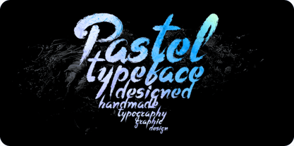
$5.00 - Pastel by Fontfabric,
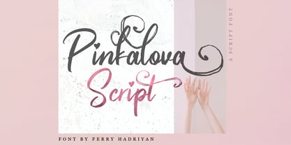
$25.00 - Pinkalova by FHFont,
$15.00 - Noveu by Fontfabric,
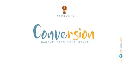
$35.00 - Conversion by Wildan Type,
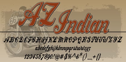
$10.00 - AZ Indian by Artist of Design,
$25.00
