10,000 search results
(0.025 seconds)
- Roniq by Negara Studio,
$19.00 RONiQ is a display font. A type which should not be taken too seriously, a mixture in styles as per usual. this one is also quite juicy. Ready to be used in fun projects. Supports some languages, a lil bit multingual.
 - Display Dots Two Sans by Gerald Gallo,
$20.00 Display Dots Two Sans is a display font not intended for text use. It, along with its serif counterpart were designed specifically for display, headline, logotype, branding, and similar applications. Display Dots Two Sans has an uppercase alphabet, numbers, and punctuation.
 - Courant by Hanoded,
$20.00 Courant means "newspaper". Courant font was modeled on 17th century Dutch newspapers and most of the glyphs are authentic. The 'modern' glyphs, like @, $, €, * and several others have been designed by me, as they were not in use in the 1600's.
 - Heldustry by URW Type Foundry,
$35.99 Heldustry is a sans serif design with letterforms partway between Helvetica and Eurostile. The Heldustry font family has a large x-height and wide characters, making it ideal for situations where there is not much copy but pages must be filled.
 - Relaxa by ahweproject,
$10.00 Relaxa is a fun, retro-style script display font that is ready to take your designs to the next level. Add it to your vintage-inspired posters, stickers, apparel, or social media posts and you will definitely impress your audience.
 - Fairfield by Linotype,
$41.99 Rudolph Ruzicka designed his font Fairfield as a legible text font. His philosophy: The reader expects optical assistance with reading. He does not want to be distracted while interpreting and understanding the ideas of a text." Fairfield font is based on the forms of Venecian Old Face fonts as well as on the designs and details of Art Deco, giving the font a distinctive appearance"
 - Murisa Baby Fish by Murisa Studio,
$10.00 Murisa BabyFish is our next font in early 2022. This font is inspired by the joy of children playing. Their joy is reflected in the creation of this font. Cheerful, joyful and colorful, are the strengths of this font. This font is perfect for use in your products that are targeting children and teenagers. Babyfish will lead your product to success. Get it right now.
 - P22 Amelia Jayne by IHOF,
$39.95Amelia Jayne is Ted Staunton's updated revision and expansion of his own Amelia decorative cap font. Amelia Jayne started as a Roman font to accompany the Amelia initials but has taken on a new life as a Pro Roman font with small caps and several variations of new matching initial companion fonts. (The initials are not included in the pro font but come bundled with the set.) - Jerk - Unknown license

- Soup Du Jour by PizzaDude.dk,
$18.00 "Soup Du Jour" is French and simply means "Soup Of the Day" - may not sound interesting, but I can tell you that I have had several tasty soup of the day served. I wanted to make a font that resembles that feeling of not really knowing what you get served, but you got a feeling that it is something good! The font has got 6 different versions of each letter, and they automatically changes as you type - it makes your text organic and lively, and probably quite tasty too! :) "Soup Du Jour" is also a well-known quote from one of my favourite movies: "Dumb and dumber"
 - Freehouse by Device,
$39.00 Freehouse is a reinterpretation of the well-remembered Watney’s logo, a brewery and pub chain infamous for its poor quality beer and brutalist decor. In Design Research Unit’s corporate guidelines from 1966 the font is described as Clarendon Bold Expanded — however, this is not the case. Clarendon has square serifs, whereas the Watney’s font is rounder and friendlier. A fixture of the British high street landscape for decades, this digitisation adds a full international character set, numbers, punctuation and many other characters that did not exist in the original. A distressed version that evokes rough print on a wet beermat has also been developed.
 - Hodgepodge by Outside the Line,
$19.00 Hodgepodge is a confused mixture of letters that somehow work together. While I know this has been done before I create fonts that I need. And I occasionally have found a need for this. And it was not there, so now it is. There is a mixture of light and dark, bold and regular, caps and lower case but not where you would expect them to be. Since this is a headline font you can set the headline and then easily go back and change a letter here or there to get the best-looking combination. Hodgepodge was in the 2011 Typodarium Page-A-Day Calendar on 7-17-2011.
 - Mr Robot by Hipopotam Studio,
$16.00 Mr Robot is a typeface designed for our next book for children. We wanted to have a colorful, dimensional and edgy looking letters for headlines. There are three ways to use Mr Robot. You can align three text frames with same text but with different colors and font styles (Regular, Shadow 1 or Shadow 3 and Shadow 2) or with ALLinONE font style but select a different OpenType Stylistic Sets (set 1 is like Shadow 1, set 2 like Shadow 2 and set 3 like Shadow 3). This works great but we don’t like to have unnecessary text frames in our layouts so we added a very cool Contextual Alternates OpenType feature. You just need Mr Robot ALLinONE style and only one text frame. First make sure that Contextual Alternates is off. Type every character three times (RRROOOBBBOOOTTT), select colors for each letter (first letter of every three is a side shadow, second is bottom shadow and third is a front of the dimensional letter). When everything is set just turn Contextual Alternates back on. Styles and alignment will be set automatically. Check out the Users Manual for a visual explanation. For web fonts it is better (at least for now) to use the first method (with font styles) as the OpenType features are not supported in older browsers.
 - Tanto by Lomax Design,
$17.00 Tanto is a boxy, futuristic sans-serif that is not directly inspired by any particular typestyle, but is more of an exploration of shapes. It has a very modern feel and although very geometric, still has a character that's not robotic.
 - Kompot by VP Creative Shop,
$19.00 Introducing Kompot - This is the Greatest Font... actually typeface with 4 styles Kompot is swirly, vintage typeface with 4 styles to enchant your next project. They are loaded alternate glyphs, ligatures and multilingual support. Very versatile fonts that works great in large and small sizes. Basic latin, advanced latin, basic Cyrillic and advanced Cyrillic character sets are supported! Kompot is perfect for branding projects, home-ware designs, product packaging, magazine headers - or simply as a stylish text overlay to any background image. Uppercase numeral, punctuation & Symbol Regular Styled Outline Styled Outline Alternate glyphs Ligatures Multilingual support Basic and Advanced Cyrillic support How to access alternate glyphs? To access alternate glyphs in Adobe InDesign or Illustrator, choose Window Type & Tables Glyphs In Photoshop, choose Window Glyphs. In the panel that opens, click the Show menu and choose Alternates for Selection. Double-click an alternate's thumbnail to swap them out. Feel free to contact me if you have any questions! Mock ups and backgrounds used are not included. Thank you! Enjoy!
 - Bodoni Classic Cyrillic by Wiescher Design,
$55.00 One day shortly after Christmas 2004, the art-director of Vogue Moscow called me. Would I maybe make a Cyrillic version of my Bodoni Classic Text typeface? Well, since I had been thinking about doing it since a long time, this was the perfect reason to finally do it. It was not an easy venture, since I do not have the faintest idea of Russian but, together with those nice people in Russia and a fellow helpful type designer in Kiev, I managed. I did an enormous amount of kerning, thanks to the help of the Moscow Vogue office. Here the fonts are now for all of you: five text cuts, plus one standard roman cut that has no Cyrillic letters but an extra set of medieval numbers. At Vogue they are happy with the fonts, even though I did not quite adhere to Bodoni's originals in this case. Nastarowje (or whatever you say in Russia), Gert Wiescher
 - Cadogan by Device,
$39.00 A freeform linking script that uses OpenType programming to replace beginning and ending characters with uniquely designed variants. Also includes ligatures and an extended t-bar carefully designed to not collide with ascenders. (Note: Please view the image above for correct versions of the end and beginning letters, as they will appear in Indesign, Illustrator, etc. The Myfonts previews below are not Opentype savvy, and so these specially designed versions do not substitute themselves.)
 - TA Bankslab by Tural Alisoy,
$33.00 The building of the Northern Bank of St. Petersburg's Baku branch was built in 1903-1905. It was the first Art Nouveau-style building in Baku, Azerbaijan. Later the bank was transformed into the Russian-Asian Bank. After the oil boom in Baku in the 19th century, branches of many banks and new banks were opened in the city. The branch of the Northern Bank of St. Petersburg was among the first banks that was opened in Baku. N.Bayev was the architect of the building for the branch of the Northern Bank of St. Petersburg located at Gorchakovskaya 3 in 1903-1905. The building currently houses the Central Branch of the International Bank of Azerbaijan. My purpose in writing this is not to copy and paste the information from Wikipedia. What attracted me to the building was the word "Банкъ" (Bank) written in Cyrillic letters, which was also used in Azerbaijan during the Soviet era. The exact date of the writing is not known. Every time I pass by this building, I always thought of creating a font of this writing someday. I had taken a photo of the building and saved it on my phone. I did a lot of research on the font and asked a lot of people. However, some did not provide information at all and some said they did not have any information. I was interested in the history of this font but I do not know if this font really existed or it was created by the architect out of nowhere. If there was such a history of this font, I wanted to recreate this font and make it available. If not, I had to create it from scratch in the same way, using only existing letters on the building. Finally, I made up my mind and decided to develop the font with all letters I have got. It was difficult to create a font based on the word, Банкъ. Because in the appearance of the letters, the midline of the letters on A, H, K was very distinct, both in the form of inclination and in more precise degrees. The serif part of the letters, the height of the upper and lower sides, differed from each other. I don't know whether it was done this way when the building was constructed or it happened over time. I prepared and kept the initial version of the font. I took a break for a while. I started digging on the story of the font again. Meanwhile, I was researching and got inspired by similar fonts. Unfortunately, my research on the font's history did not yield any results. I decided to continue finishing up the font. After developing the demo, I created the font by keeping certain parts of these differences in the letters. In addition, I had to consider the development of letters in the Cyrillic, as well as the Latin alphabet, over the past period. Thus, I began to look at the appearance of slab-serif or serif fonts of that time. In general, as I gain more experience in developing fonts, I try to focus on the precision of the design for each font. In recent years, I specifically paid attention to this matter. YouTube channel and articles by Alexandra K.'s of ParaType, as well as, information and samples from TypeType and Fontfabric studios on the Cyrillic alphabet were quite useful. I gathered data regarding the Latin alphabet from various credible sources. I do not know if I could accomplish what I aimed at but I know one thing that I could develop the font. Maybe someday I'll have to revise this font. For now, I share it with you. I created the font in 10 styles. 7 weight from Thin to Extra Black, an Outline, Shadow, and Art Nouveau. The Art Nouveau style was inspired by the texture in the background used for the text on the building. The texture I applied to capital letters adds beauty to the font. If you like the font feel free to use it or simply let me know if your current alphabet doesn't support this font.
 - TA Bankslab Art Nouveau by Tural Alisoy,
$40.00 TA Bankslab graphic presentation at Behance The building of the Northern Bank of St. Petersburg's Baku branch was built in 1903-1905. It was the first Art Nouveau-style building in Baku, Azerbaijan. Later the bank was transformed into the Russian-Asian Bank. After the oil boom in Baku in the 19th century, branches of many banks and new banks were opened in the city. The branch of the Northern Bank of St. Petersburg was among the first banks that was opened in Baku. N.Bayev was the architect of the building for the branch of the Northern Bank of St. Petersburg located at Gorchakovskaya 3 in 1903-1905. The building currently houses the Central Branch of the International Bank of Azerbaijan. My purpose in writing this is not to copy and paste the information from Wikipedia. What attracted me to the building was the word "Банкъ" (Bank) written in Cyrillic letters, which was also used in Azerbaijan during the Soviet era. The exact date of the writing is not known. Every time I pass by this building, I always thought of creating a font of this writing someday. I had taken a photo of the building and saved it on my phone. I did a lot of research on the font and asked a lot of people. However, some did not provide information at all and some said they did not have any information. I was interested in the history of this font but I do not know if this font really existed or it was created by the architect out of nowhere. If there was such a history of this font, I wanted to recreate this font and make it available. If not, I had to create it from scratch in the same way, using only existing letters on the building. Finally, I made up my mind and decided to develop the font with all letters I have got. It was difficult to create a font based on the word, Банкъ. Because in the appearance of the letters, the midline of the letters on A, H, K was very distinct, both in the form of inclination and in more precise degrees. The serif part of the letters, the height of the upper and lower sides, differed from each other. I don't know whether it was done this way when the building was constructed or it happened over time. I prepared and kept the initial version of the font. I took a break for a while. I started digging on the story of the font again. Meanwhile, I was researching and got inspired by similar fonts. Unfortunately, my research on the font's history did not yield any results. I decided to continue finishing up the font. After developing the demo, I created the font by keeping certain parts of these differences in the letters. In addition, I had to consider the development of letters in the Cyrillic, as well as the Latin alphabet, over the past period. Thus, I began to look at the appearance of slab-serif or serif fonts of that time. In general, as I gain more experience in developing fonts, I try to focus on the precision of the design for each font. In recent years, I specifically paid attention to this matter. YouTube channel and articles by Alexandra K.'s of ParaType, as well as, information and samples from TypeType and Fontfabric studios on the Cyrillic alphabet were quite useful. I gathered data regarding the Latin alphabet from various credible sources. I do not know if I could accomplish what I aimed at but I know one thing that I could develop the font. Maybe someday I'll have to revise this font. For now, I share it with you. I created the font in 10 styles. 7 weight from Thin to Extra Black, an Outline, Shadow, and Art Nouveau. The Art Nouveau style was inspired by the texture in the background used for the text on the building. The texture I applied to capital letters adds beauty to the font. If you like the font feel free to use it or simply let me know if your current alphabet doesn't support this font.
 - LiebeGerda by LiebeFonts,
$29.00 Go out into the wilderness. Cut down a tree. Stop and smell the roses. And then treat yourself with this unplugged, hand-lettered typeface. LiebeGerda is an effortless-but-refined, spontaneous-but-elegant brush font. She is ready for your next project, and she wants to add that little crafty something that makes the difference. Her natural breath of fresh air lets you escape those same old monotonous script fonts you’ve been using. After our successful first brush font, LiebeDoris, and our first interconnected script, LiebeLotte, we’re combining both genres and taking them to the next level: an interconnected brush script. OpenType magic varies LiebeGerda’s letterforms: Most characters have no less than three different variations that are automatically shuffled and inserted as you type. Plus, the “All-Caps” OpenType feature exchanges uppercase letters with less-swashy variants. Now you know why every one of the four styles contains more than 1,200 characters! Ulrike of LiebeFonts painted LiebeGerda’s four styles individually from scratch and carefully adjusted every detail by hand. Rather than being one typeface with different weights, LiebeGerda is a package of four individual fonts that go together really well. Ulrike’s high level of type-nerdy craftsmanship shows. When you use LiebeGerda, your designs will easily convince your audience that they’re looking at a hand-crafted piece of lettering. Feel free to add a few of the stacked ligatures like “the”, “for”, and “new” to round off the illusion. Last but not least, LiebeGerda has a lot more detail than most other brush fonts. That means there’s no ugly, lazy bézier artifacts in the brush traces. You can print words at billboard size, and people will still believe they smell the paint from your brush!
 - Pecita - 100% free

- Pfennig - 100% free

- Aurulent Sans - Unknown license

- Nibby - 100% free

- Aurulent Sans Mono - Unknown license

- Punkstoric - Personal use only

- Spoonge Punk - Personal use only

- Echowarp by Luxfont,
$18.00 Introducing Echowarp is an unusual COLORED font family. Main idea of this font is that a colored echo spreads and fades from minimalistic letters to the sides. Distorted letters give the effect of temporary refraction. The originality of this family is primarily suitable for a bold design. And if you add a random distortion in a graphics program to the finished heading written in this font, the inscription will turn into an absolutely unique and inimitable one. Futuristic set has 23 fonts in the family! Do not limit your imagination, because the font opens up a huge space for creative experiments. Check the quality before purchasing and try the FREE DEMO version of the font to make sure your software supports color fonts. Features: Free Demo font to check it works Letters with color echo & distortion 23 OTF SVG color fonts in the family Gradient and hologram fonts Kerning IMPORTANT: - OTF SVG fonts contain vector letters with gradients and transparency. - Multicolor OTF version of this font will show up only in apps that are compatible with color fonts, like Adobe Photoshop CC 2017.0.1 and above, Illustrator CC 2018. Learn more about color fonts & their support in third-party apps on www.colorfonts.wtf - Don't worry about what you can't see the preview of the font in the tab "Individual Styles" - all fonts are working and have passed technical inspection, but not displayed, they just because the website MyFonts is not yet able to show a preview of colored fonts. Then if you have software with support colored fonts - you can be sure that after installing fonts into the system you will be able to use them like every other classic font. Question/answer: How to install a font? The procedure for installing the font in the system has not changed. Install the font as you would install the classic OTF | TTF fonts. How can I change the font color to my color? Adobe Illustrator: Convert text to outline and easily change color to your taste as if you were repainting a simple vector shape. Adobe Photoshop: You can easily repaint text layer with Layer effects and color overlay. ld.luxfont@gmail.com
 - Celeb Faces - 100% free

- Aiolos by Nantia.co,
$16.00 This font is a hand-made typeface with Greek Character support. With cute doodles icons in PUA encoding, this typeface can be a mighty companion to your next graphic design project. From “hand-written” quotes to product packaging, merchandise, and branding projects, this font is so versatile that it can cover them all.
 - Contenu EBook by Hackberry Font Foundry,
$19.95 Because ebooks will not normally accept .otf fonts, and they don't support Opentype features, this font family was designed to be used for the ebook conversions of print books. It uses old style figures. The italics are slanted a bit more. And Heavy is a little bolder than the bold in Contenu Book.
 - The Bafger by Muksal Creatives,
$12.00 The Bafger is modern vintage serif font, and The Bafger features unique and modern serif look and feel.is a fancy and modern serif font will elevate a wide variety of projects, from logos and stationery to magazine covers and social media posts. This typeface will take your designs to the next level!
 - Dominatrix BB by Blambot,
$20.00Dominatrix is a dirty little font who won't let up until you say the safe word. And I'm not telling you what the safe word is. This font comes with autoligatures so consecutive duplicate letters won't look identical. It also has more European characters than you can shake a leather whip at. - Ramadesh by Typotheticals,
$5.00Lightly playful, this font had a lot of influences in its design. I liked the look of this style in three fonts and decided to create my own version. This is it. Included is a version called Italic, but it is not a true Italic, just a variation in some lower case letters. - Modern Fantasy by Hanoded,
$15.00 I have no idea why I named this font Modern Fantasy: it just popped up in my head and it stuck. I don’t consider myself to be ‘modern’ (but I’m certainly not old fashioned!), nor do I have particularly modern fantasies… Modern Fantasy is an elegant all caps font: thin, tall and lovely.
 - Consonant SRF by Stella Roberts Fonts,
$25.00 This imaginative and unusual serif text face was developed by Jeff Levine from an old Ray Larabie design. Improved and updated, it is exclusive to Stella Roberts Fonts. The net profits from my font sales help defer medical expenses for my siblings, who both suffer with Cystic Fibrosis and diabetes. Thank you.
 - Rahella by Balevgraph Studio,
$12.00 Rahella is an enchanting handwritten font. This versatile script font has a wide spectrum of applications ranging from greeting cards to headlines and is guaranteed to add a romantic feel to your next project. What's Included : - Uppercase, Lowercase, Numerals & Punctuations - Ligature & Alternate - Works on PC & Mac - Simple installations - Multilingual support - PUA Encoded
 - Drillepind by Bogstav,
$17.00 Drillepind is a kidder in danish. You know, someone who teases, without being rude. Once you start typing with Drillepind, you will notice that the font does the same, in a playful way. You never know what happens next, when using the font - but you do know that it'll be loads of fun!
 - Vintage Rough by Nirmana Visual,
$22.00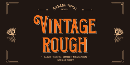 Introducing Vintage Rough. A Vintage display font that has a classy, clean, and has dramatic movement. This font is great for your next creative project such as logos, quotes, invitations, product packaging, posters, and social. It is also great for watermarks on photography and product merchandise, or anything that needs a vintage taste.
 - Hillusy by BaronWNM,
$12.00 Hillusy is a scrip font traced from handwriting using a pen monoline. displays a variety of letters so that it looks more casual and less stiff. This font is suitable for use in almost any casual style design and is not rigid, such as branding, advertising, printing, portfolio, business cards,signature, etc.


