1,021 search results
(0.024 seconds)
- Xcelsion Italic - Unknown license

- Mordred - Unknown license

- SelznickNormal - 100% free

- Saiyan Sans - Unknown license

- Sun n Moon - Unknown license

- Lady Starlight - Unknown license

- D3 Egoistism outline - Unknown license

- abc - Personal use only

- Semiramis - Unknown license

- rockdafonkybit - Personal use only

- Franken's-SteinA - 100% free

- Burgundian - Unknown license

- Shadow of Xizor - Unknown license

- Shoguns Clan - Unknown license

- Blick by ParaType,
$25.00
- Cyra by Intellecta Design,
$27.00
- Chiara Script by Greater Albion Typefounders,
$14.95
- Tumb by That That Creative,
$18.00
- Bases Loaded JNL by Jeff Levine,
$29.00
- Printers Helpmates JNL by Jeff Levine,
$29.00
- Detective Case JNL by Jeff Levine,
$29.00
- Sign Trade JNL by Jeff Levine,
$29.00 - Churchward Chinatype by BluHead Studio,
$20.00 - Trade Gothic by Linotype,
$42.99
- Trade Gothic Paneuropean by Linotype,
$42.99 - East Village JNL by Jeff Levine,
$29.00
- Clear Prairie Ornaments by Quadrat,
$25.00 - Snack Stand JNL by Jeff Levine,
$29.00
- Maxos by Mysterylab,
$17.00
- Hello Doll by The Arborie,
$11.00
- NK Fracht Square by HouseOfBurvo,
$15.00
- Mystery Story JNL by Jeff Levine,
$29.00
- NK Fracht Round by HouseOfBurvo,
$15.00
- Athabasca by Greater Albion Typefounders,
$16.00
- Grunge Decay by Okaycat,
$29.50
- Atenea Egyptian by Eurotypo,
$28.00
- Bumerang by Nirmana Visual,
$22.00
- SpeedSwash by Greater Albion Typefounders,
$16.00
- Kondo by Surplus Type Co,
$18.00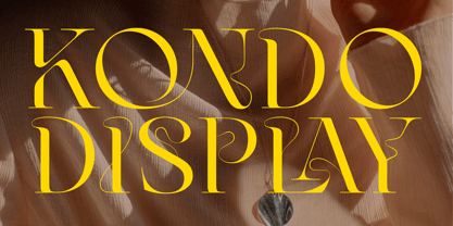
- Baldione by Greater Albion Typefounders,
$15.00


